Posts tagged ‘Al Gore’

Global Temperature Update

I just updated my climate presentation with data through December of 2016, so given "hottest year evah" claims, I thought I would give a brief update with the data that the media seldom ever provides.  This is only a small part of my presentation, which I will reproduce for Youtube soon (though you can see it here at Claremont-McKenna).  In this post I will address four questions:

  • Is the world still warming?
  • Is global warming accelerating?
  • Is global warming "worse than expected"?
  • Coyote, How Is Your Temperature Prediction Model Doing?

Is the world still warming:  Yes

We will use two data sets.  The first is the land surface data set from the Hadley Center in England, the primary data set used by the IPCC.  Rather than average world absolute temperature, all these charts show the variation or "anomaly" of that absolute temperature from some historical average (the zero point of which is arbitrary).  The theory is that it is easier and more accurate to aggregate anomalies across the globe than it is to average the absolute temperature.  In all my temperature charts, unless otherwise noted, the dark blue is the monthly data and the orange is a centered 5-year moving average.

You can see the El Nino / PDO-driven spike last year.  Ocean cycles like El Nino are complicated, but in short, oceans hold an order of magnitude or two more heat than the atmosphere.  There are decadal cycles where oceans will liberate heat from their depths into the atmosphere, creating surface warming, and cycles where oceans bury more heat, cooling the surface.

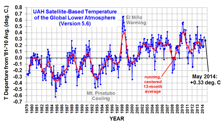
The other major method for aggregating global temperatures is using satellites.  I use the data from University of Alabama, Huntsville.

On this scale, the el nino peaks in 1999 and 2017 are quite obvious.  Which method, surface or satellites, gets a better result is a matter of debate.  Satellites are able to measure a larger area, but are not actually measuring the surface, they are measuring temperatures in the lower tropospehere (the troposphere's depth varies but ranges from the surface to 5-12 miles above the surface).  However, since most climate models and the IPCC show man-made warming being greatest in the lower troposphere, it seems a good place to measure.  Surface temperature records, on the other hand, are measuring exactly where we live, but can be widely spaced and are subject to a variety of biases, such as the urban heat island effect.  The station below in Tucson, located in a parking lot and surrounded by buildings, was an official part of the global warming record until my picture became widely circulated and embarrassed them in to closing it.

This argument about dueling data sets goes on constantly, and I have not even mentioned the issues of manual adjustments in the surface data set that are nearly the size of the entire global warming signal.  But we will leave these all aside with the observation that all data sources show a global warming trend.

Is Global Warming Accelerating?  No

Go into google and search "global warming accelerating".  Or just click that link.  There are a half-million results about global warming accelerating.  Heck, Google even has one of those "fact" boxes at the top that say it is:

It is interesting by the way that Google is using political advocacy groups for its "facts" nowadays.

Anyway, if global warming is so obviously accelerating that Google can list it as a fact at the top of its search page, it should be obvious from the data, right?  Well let's look.  First, here is the satellite data since I honestly believe it to be of higher quality than the surface records:

This is what I call the cherry-picking chart.  Everyone can find a peak for one end of their time scale and a valley for the other and create whatever story they want.  In economic analysis, to deal with the noise and cyclicality, one will sometimes see economic growth measured peak-to-peak, meaning from cyclical peak to the next cyclical peak, as a simple way to filter out some of the cyclicality.  I have done the same here, taking my time period as about 18 years from the peak of the 1999 El Nino to 2017 and the peak of the recent El Nino.  The exact data used for the trend is show in darker blue.  You can decide if I have been fair.

The result for this time period is a Nino to Nino warming trend of 0.11C.  Now let's look at the years before this

So the trend for 36 years is 1.2C per century but the trend for the last half of this is just 0.11C.  That does not look like acceleration to me.  One might argue that it may again accelerate in the future, but I cannot see how so many people blithely treat it as a fact that global warming has been accelerating when it clearly has not.  But maybe its just because I picked those darn satellites.  Maybe the surface temperatures show acceleration?

Nope.  Though the slow down is less dramatic, the surface temperature data never-the-less shows the same total lack of acceleration.

Is Global Warming "Worse Than Expected"?  No

The other meme one hears a lot is that global warming is "worse than expected".  Again, try the google search I linked.  Even more results, over a million this time.

To tackle this one, we have to figure out what was "expected".  Al Gore had his crazy forecasts in his movie.  One sees all kinds of apocalyptic forecasts in the media.  The IPCC has forecasts, but it tends to change them every five years and seldom goes back and revisits them, so those are hard to use.  But we have one from James Hansen, often called the father of global warming and Al Gore's mentor, from way back in 1988.  His seminal testimony in that year in front of Congress really put man-made global warming on the political map.  Here is the forecast he presented:

Unfortunately, in his scenarios, he was moving two different variables (CO2 levels and volcanoes) so it is hard to tell which one applies best to the actual history since then, but we are almost certainly between his A and B forecasts.  A lot of folks have spent time trying to compare actual temperatures to these lines, but it is very hard.  The historical temperature record Hansen was using has been manually adjusted several times since, so the historical data does not match, and it is hard to get the right zero point.  But we can eliminate the centering issues altogether if we just look at slopes -- that is all we really care about anyway.  So I have reproduced Hanson's data in the chart on the left and calculated the warming slopes in his forecast:

As it turns out, it really does not matter whether we choose the A or B scenario from Hansen, because both have about the same slope -- between 2.8C and 3.1C per century of warming from 1986 (which appears to be the actual zero date of Hansen's forecast) and today.  Compare this to 1.8C of actual warming in the surface temperature record for this same period, and 1.2C in the satellite record.  While we have seen warming, it is well under the rates predicted by Hansen.

This is a consistent result to what the IPCC found in their last assessment when they evaluated past forecasts.  The colored areas are the IPCC forecast ranges from past forecasts, the grey area was the error bar (the IPCC is a bit inconsistent when it shows error bars, including error bands seemingly only when it helps their case).  The IPCC came to the same result as I did above:   that warming had continued but was well under the pace that was "expected" form past forecasts.

By the way, the reason that many people may think that global warming is accelerating is because media mentions of global warming and severe weather events has been accelerating, leaving the impression that things are changing faster than they truly are.  I wrote an article about this effect here at Forbes.  In that I began:

The media has two bad habits that make it virtually impossible for consumers of, say, television news to get a good understanding of trends

  1. They highlight events in the tail ends of the normal distribution and authoritatively declare that these data points represent some sort of trend or shift in the mean
  2. They mistake increases in their own coverage of certain phenomenon for an increase in the frequency of the phenomenon itself.

Coyote, How Is Your Temperature Prediction Model Doing?  Great, thanks for asking

Ten years ago, purely for fun, I attempted to model past temperatures using only three inputs:  A decadal cyclical sin wave, a long-term natural warming trend out of the little ice age (of 0.36 C per century), and a man-made warming trend really kicking in around 1950 (of 0.5C per century).  I used this regression as an attribution model, to see how much of past warming might be due to man (I concluded about half of 20th century warming may be due to manmade effects).  But I keep running it to test its accuracy, again just for fun, as a predictive tool.  Here is where we are as of December of 2016 (in this case the orange line is my forecast line):

Still hanging in there:  Despite the "hottest year evah" news, temperatures in December were exactly on my prediction line.  Here is the same forecast with the 5-year centered moving average added in light blue:

Denying the Climate Catastrophe: 5a. Arguments For Attributing Past Warming to Man

This is part A of Chapter 5 of an ongoing series.  Other parts of the series are here:

  1. Introduction
  2. Greenhouse Gas Theory
  3. Feedbacks
  4.  A)  Actual Temperature Data;  B) Problems with the Surface Temperature Record
  5. Attribution of Past Warming:  A) Arguments for it being Man-Made (this article); B) Natural Attribution
  6. Climate Models vs. Actual Temperatures
  7. Are We Already Seeing Climate Change
  8. The Lukewarmer Middle Ground
  9. A Low-Cost Insurance Policy

Having established that the Earth has warmed over the past century or so (though with some dispute over how much), we turn to the more interesting -- and certainly more difficult -- question of finding causes for past warming.  Specifically, for the global warming debate, we would like to know how much of the warming was due to natural variations and how much was man-made.   Obviously this is hard to do, because no one has two thermometers that show the temperature with and without man's influence.

I like to begin each chapter with the IPCC's official position, but this is a bit hard in this case because they use a lot of soft words rather than exact numbers.  They don't say 0.5 of the 0.8C is due to man, or anything so specific.   They use phrases like "much of the warming" to describe man's affect.  However, it is safe to say that most advocates of catastrophic man-made global warming theory will claim that most or all of the last century's warming is due to man, and that is how we have put it in our framework below:

click to enlarge

By the way, the "and more" is not a typo -- there are a number of folks who will argue that the world would have actually cooled without manmade CO2 and thus manmade CO2 has contributed more than the total measured warming.  This actually turns out to be an important argument, since the totality of past warming is not enough to be consistent with high sensitivity, high feedback warming forecasts.  But we will return to this in part C of this chapter.

Past, Mostly Abandoned Arguments for Attribution to Man

There have been and still are many different approaches to the attributions problem.  In a moment, we will discuss the current preferred approach.  However, it is worth reviewing two other approaches that have mostly been abandoned but which had a lot of currency in the media for some time, in part because both were in Al Gore's film An Inconvenient Truth.

Before we get into them, I want to take a step back and briefly discuss what is called paleo-climatology, which is essentially the study of past climate before the time when we had measurement instruments and systematic record-keeping for weather.   Because we don't have direct measurements, say, of the temperature in the year 1352, scientists must look for some alternate measure, called a "proxy,"  that might be correlated with a certain climate variable and thus useful in estimating past climate metrics.   For example, one might look at the width of tree rings, and hypothesize that varying widths in different years might correlate to temperature or precipitation in those years.  Most proxies take advantage of such annual layering, as we have in tree rings.

One such methodology uses ice cores.  Ice in certain places like Antarctica and Greenland is laid down in annual layers.  By taking a core sample, characteristics of the ice can be measured at different layers and matched to approximate years.  CO2 concentrations can actually be measured in air bubbles in the ice, and atmospheric temperatures at the time the ice was laid down can be estimated from certain oxygen isotope ratios in the ice.  The result is that one can plot a chart going back hundreds of thousands of years that estimates atmospheric CO2 and temperature.  Al Gore showed this chart in his movie, in a really cool presentation where the chart wrapped around three screens:

click to enlarge

As Gore points out, this looks to be a smoking gun for attribution of temperature changes to CO2.  From this chart, temperature and CO2 concentrations appear to be moving in lockstep.  From this, CO2 doesn't seem to be a driver of temperatures, it seems to be THE driver, which is why Gore often called it the global thermostat.

But there turned out to be a problem, which is why this analysis no longer is treated as a smoking gun, at least for the attribution issue.  Over time, scientists got better at taking finer and finer cuts of the ice cores, and what they found is that when they looked on a tighter scale, the temperature was rising (in the black spikes of the chart) on average 800 years before the CO2 levels (in red) rose.

This obviously throws a monkey wrench in the causality argument.  Rising CO2 can hardly be the cause of rising temperatures if the CO2 levels are rising after temperatures.

It is now mostly thought that what this chart represents is the liberation of dissolved CO2 from oceans as temperatures rise.  Oceans have a lot of dissolved CO2, and as the oceans get hotter, they will give up some of this CO2 to the atmosphere.

The second outdated attribution analysis we will discuss is perhaps the most famous:  The Hockey Stick.  Based on a research paper by Michael Mann when he was still a grad student, it was made famous in Al Gore's movie as well as numerous other press articles.  It became the poster child, for a few years, of the global warming movement.

So what is it?  Like the ice core chart, it is a proxy analysis attempting to reconstruct temperature history, in this case over the last 1000 years or so.  Mann originally used tree rings, though in later versions he has added other proxies, such as from organic matter laid down in sediment layers.

Before the Mann hockey stick, scientists (and the IPCC) believed the temperature history of the last 1000 years looked something like this:

click to enlarge

Generally accepted history had a warm period from about 1100-1300 called the Medieval Warm Period which was warmer than it is today, with a cold period in the 17th and 18th centuries called the "Little Ice Age".  Temperature increases since the little ice age could in part be thought of as a recovery from this colder period.  Strong anecdotal evidence existed from European sources supporting the existence of both the Medieval Warm Period and the Little Ice Age.  For example, I have taken several history courses on the high Middle Ages and every single professor has described the warm period from 1100-1300 as creating a demographic boom which defined the era (yes, warmth was a good thing back then).  In fact, many will point to the famines in the early 14th century that resulted from the end of this warm period as having weakened the population and set the stage for the Black Death.

However, this sort of natural variation before the age where man burned substantial amounts of fossil fuels created something of a problem for catastrophic man-made global warming theory.  How does one convince the population of catastrophe if current warming is within the limits of natural variation?  Doesn't this push the default attribution of warming towards natural factors and away from man?

The answer came from Michael Mann (now Dr. Mann but actually produced originally before he finished grad school).  It has been dubbed the hockey stick for its shape:


click to enlarge

The reconstructed temperatures are shown in blue, and gone are the Medieval Warm Period and the Little Ice Age, which Mann argued were local to Europe and not global phenomena.  The story that emerged from this chart is that before industrialization, global temperatures were virtually flat, oscillating within a very narrow band of a few tenths of a degree.  However, since 1900, something entirely new seems to be happening, breaking the historical pattern.  From this chart, it looks like modern man has perhaps changed the climate.  This shape, with the long flat historical trend and the sharp uptick at the end, is why it gets the name "hockey stick."

Oceans of ink and electrons have been spilled over the last 10+ years around the hockey stick, including a myriad of published books.  In general, except for a few hard core paleoclimatologists and perhaps Dr. Mann himself, most folks have moved on from the hockey stick as a useful argument in the attribution debate.  After all, even if the chart is correct, it provides only indirect evidence of the effect of man-made CO2.

Here are a few of the critiques:

  • Note that the real visual impact of the hockey stick comes from the orange data on the far right -- the blue data alone doesn't form much of a hockey stick.  But the orange data is from an entirely different source, in fact an entirely different measurement technology -- the blue data is from tree rings, and the orange is form thermometers.  Dr. Mann bristles at the accusation that he "grafted" one data set onto the other, but by drawing the chart this way, that is exactly what he did, at least visually.  Why does this matter?  Well, we have to be very careful with inflections in data that occur exactly at the point that where we change measurement technologies -- we are left with the suspicion that the change in slope is due to differences in the measurement technology, rather than in the underlying phenomenon being measured.
  • In fact, well after this chart was published, we discovered that Mann and other like Keith Briffa actually truncated the tree ring temperature reconstructions (the blue line) early.  Note that the blue data ends around 1950.  Why?  Well, it turns out that many tree ring reconstructions showed temperatures declining after 1950.  Does this mean that thermometers were wrong?  No, but it does provide good evidence that the trees are not accurately following current temperature increases, and so probably did not accurately portray temperatures in the past.
  • If one looks at the graphs of all of Mann's individual proxy series that are averaged into this chart, astonishingly few actually look like hockey sticks.  So how do they average into one?  McIntyre and McKitrick in 2005 showed that Mann used some highly unusual and unprecedented-to-all-but-himself statistical methods that could create hockey sticks out of thin air.  The duo fed random data into Mann's algorithm and got hockey sticks.
  • At the end of the day, most of the hockey stick (again due to Mann's averaging methods) was due to samples from just a handful of bristle-cone pine trees in one spot in California, trees whose growth is likely driven by a number of non-temperature factors like precipitation levels and atmospheric CO2 fertilization.   Without these few trees, most of the hockey stick disappears.  In later years he added in non-tree-ring series, but the results still often relied on just a few series, including the Tiljander sediments where Mann essentially flipped the data upside down to get the results he wanted.  Taking out the bristlecone pines and the abused Tiljander series made the hockey stick go away again.

There have been plenty of other efforts at proxy series that continue to show the Medieval Warm Period and Little Ice Age as we know them from the historical record


click to enlarge

As an aside, Mann's hockey stick was always problematic for supporters of catastrophic man-made global warming theory for another reason.  The hockey stick implies that the world's temperatures are, in absence of man, almost dead-flat stable.   But this is hardly consistent with the basic hypothesis, discussed earlier, that the climate is dominated by strong positive feedbacks that take small temperature variations and multiply them many times.   If Mann's hockey stick is correct, it could also be taken as evidence against high climate sensitivities that are demanded by the catastrophe theory.


The Current Lead Argument for Attribution of Past Warming to Man

So we are still left wondering, how do climate scientists attribute past warming to man?  Well, to begin, in doing so they tend to focus on the period after 1940, when large-scale fossil fuel combustion really began in earnest.   Temperatures have risen since 1940, but in fact nearly all of this rise occurred in the 20 year period from 1978 to 1998:


click to enlarge

To be fair, and better understand the thinking at the time, let's put ourselves in the shoes of scientists around the turn of the century and throw out what we know happened after that date.  Scientists then would have been looking at this picture:

click to enlarge

Sitting in the year 2000, the recent warming rate might have looked dire .. nearly 2C per century...

click to enlarge

Or possibly worse if we were on an accelerating course...

click to enlarge

Scientists began to develop a hypothesis that this temperature rise was occurring too rapidly to be natural, that it had to be at least partially man-made.  I have always thought this a slightly odd conclusion, since the slope from this 20-year period looks almost identical to the slope centered around the 1930's, which was very unlikely to have much human influence.


click to enlarge

But never-the-less, the hypothesis that the 1978-1998 temperature rise was too fast to be natural gained great currency.  But how does one prove it?

What scientists did was to build computer models to simulate the climate.  They then ran the computer models twice.  The first time they ran them with only natural factors, or at least only the natural factors they knew about or were able to model (they left a lot out, but we will get to that in time).  These models were not able to produce the 1978-1998 warming rates.  Then, they re-ran the models with manmade CO2, and particularly with a high climate sensitivity to CO2 based on the high feedback assumptions we discussed in an earlier chapter.   With these models, they were able to recreate the 1978-1998 temperature rise.   As Dr. Richard Lindzen of MIT described the process:

What was done, was to take a large number of models that could not reasonably simulate known patterns of natural behavior (such as ENSO, the Pacific Decadal Oscillation, the Atlantic Multidecadal Oscillation), claim that such models nonetheless accurately depicted natural internal climate variability, and use the fact that these models could not replicate the warming episode from the mid seventies through the mid nineties, to argue that forcing was necessary and that the forcing must have been due to man.

Another way to put this argument is "we can't think of anything natural that could be causing this warming, so by default it must be man-made.  With various increases in sophistication, this remains the lead argument in favor of attribution of past warming to man.

In part B of this chapter, we will discuss what natural factors were left out of these models, and I will take my own shot at a simple attribution analysis.

The next section, Chapter 6 Part B, on natural attribution is here

Thank God We Don't Have Cable Neutrality

Time Warner Cable, the owners of the Dodgers local broadcast rights is continuing to battle with local cable channels to be added to their cable package.  Like last year, it appears that no deal will be forthcoming and the Dodgers (and perhaps more disheartening, Vin Scully in his last year) won't be on many TV sets this summer in LA.  Kevin Drum essentially says bravo to the cable companies for opposing the Dodgers bid to jack up basic cable rates in the area.

Boo hoo. They tried everything—everything, I tell you. Except, of course, for the one thing that would have worked: the right to make the Dodgers an extra-cost option, not part of basic cable. Most cable operators see no reason that every television viewer in the LA basin should have to pay 60 bucks a year more in cable fees regardless of whether or not they care about baseball.

And that's the one thing TWC won't do. Why? Because then it will become crystal clear just how few households actually care enough about the Dodgers to pay for them. And that would truly be a disaster beyond reckoning. There's a limit to the amount of sports programming that people are willing to have crammed down their throats!

I actually agree with him, and will add that it is always great to see a progressive acknowledge consumers do actually exercise accountability on businesses.

But I will observe that had we adopted cable neutrality rules** as we have for net neutrality, the cable companies would have found it impossible, or at least much more difficult, to oppose carriage by a pushy and expensive content provider.  It is this sort of intra-supply-chain tug of war that generally benefits consumers in the long run (as it has in LA, at least for Drum) that is essentially outlawed by net neutrality rules which basically declare content providers the victors by default.  As I wrote before:

Net Neutrality is one of those Orwellian words that mean exactly the opposite of what they sound like.  There is a battle that goes on in the marketplace in virtually every communication medium between content creators and content deliverers.  We can certainly see this in cable TV, as media companies and the cable companies that deliver their product occasionally have battles that break out in public.   But one could argue similar things go on even in, say, shipping, where magazine publishers push for special postal rates and Amazon negotiates special bulk UPS rates.

In fact, this fight for rents across a vertical supply chain exists in virtually every industry.  Consumers will pay so much for a finished product.  Any vertical supply chain is constantly battling over how much each step in the chain gets of the final consumer price.

What "net neutrality" actually means is that certain people, including apparently the President, want to tip the balance in this negotiation towards the content creators (no surprise given Hollywood's support for Democrats).  Netflix, for example, takes a huge amount of bandwidth that costs ISP's a lot of money to provide.  But Netflix doesn't want the ISP's to be be able to charge for this extra bandwidth Netflix uses - Netflix wants to get all the benefit of taking up the lion's share of ISP bandwidth investments without having to pay for it.  Net Neutrality is corporate welfare for content creators....

I am still pretty sure the net effect of these regulations, whether they really affect net neutrality or not, will be to disarm ISP's in favor of content providers in the typical supply chain vertical wars that occur in a free market.  At the end of the day, an ISP's last resort in negotiating with a content provider is to shut them out for a time, just as the content provider can do the same in reverse to the ISP's customers.  Banning an ISP from doing so is like banning a union from striking.

** Footnote:  OK, we sortof did have cable neutrality in one respect -- over the air broadcasters were able to obtain crony legislation that cable companies had to carry every locally broadcast channel.  So that channel 59 that you never bothered to watch now get's equal treatment with the NBC affiliate.   This was a huge boon for these stations, and the value of these often tiny stations exploded with this must-carry rule.  Essentially they were given an asset for free, ie position in a cable lineup, that other competitors had to fight for.

Al Gore, as an aside, actually became rich with exactly this game.   It is hard to fight your way into a cable lineup nowadays.  Al Gore did it with this Current TV startup based on his name and a promise of a sort of MTV for politics.  The channel went nowhere and lost a lot of money, but it now had one valuable asset -- placement in cable TV lineups.  So it sold this asset to Al Jazzera, which had struggled to get placement.

Adjusting the Temperature Records

I have been getting inquiries from folks asking me what I think about stories like this one, where Paul Homewood has been looking at the manual adjustments to raw temperature data and finding that the adjustments actually reverse the trends from cooling to warming.  Here is an example of the comparisons he did:

Raw, before adjustments;

puertoraw


After manual adjustments

puertoadj2


I actually wrote about this topic a few months back, and rather than rewrite the post I will excerpt it below:

I believe that there is both wheat and chaff in this claim [that manual temperature adjustments are exaggerating past warming], and I would like to try to separate the two as best I can.  I don't have time to write a well-organized article, so here is just a list of thoughts

  1. At some level it is surprising that this is suddenly news.  Skeptics have criticized the adjustments in the surface temperature database for years.
  2. There is certainly a signal to noise ratio issue here that mainstream climate scientists have always seemed insufficiently concerned about.  For example, the raw data for US temperatures is mostly flat, such that the manual adjustments to the temperature data set are about equal in magnitude to the total warming signal.  When the entire signal one is trying to measure is equal to the manual adjustments one is making to measurements, it probably makes sense to put a LOT of scrutiny on the adjustments.  (This is a post from 7 years ago discussing these adjustments.  Note that these adjustments are less than current ones in the data base as they have been increased, though I cannot find a similar chart any more from the NOAA discussing the adjustments)
  3. The NOAA HAS made adjustments to US temperature data over the last few years that has increased the apparent warming trend.  These changes in adjustments have not been well-explained.  In fact, they have not really be explained at all, and have only been detected by skeptics who happened to archive old NOAA charts and created comparisons like the one below.  Here is the before and after animation (pre-2000 NOAA US temperature history vs. post-2000).  History has been cooled and modern temperatures have been warmed from where they were being shown previously by the NOAA.  This does not mean the current version  is wrong, but since the entire US warming signal was effectively created by these changes, it is not unreasonable to act for a detailed reconciliation (particularly when those folks preparing the chart all believe that temperatures are going up, so would be predisposed to treating a flat temperature chart like the earlier version as wrong and in need of correction. 1998changesannotated
  4. However, manual adjustments are not, as some skeptics seem to argue, wrong or biased in all cases.  There are real reasons for manual adjustments to data -- for example, if GPS signal data was not adjusted for relativistic effects, the position data would quickly get out of whack.  In the case of temperature data:
    • Data is adjusted for shifts in the start/end time for a day of measurement away from local midnight (ie if you average 24 hours starting and stopping at noon).  This is called Time of Observation or TOBS.  When I first encountered this, I was just sure it had to be BS.  For a month of data, you are only shifting the data set by 12 hours or about 1/60 of the month.  Fortunately for my self-respect, before I embarrassed myself I created a spreadsheet to monte carlo some temperature data and play around with this issue.  I convinced myself the Time of Observation adjustment is valid in theory, though I have no way to validate its magnitude  (one of the problems with all of these adjustments is that NOAA and other data authorities do not release the source code or raw data to show how they come up with these adjustments).   I do think it is valid in science to question a finding, even without proof that it is wrong, when the authors of the finding refuse to share replication data.  Steven Goddard, by the way, believes time of observation adjustments are exaggerated and do not follow NOAA's own specification.
    • Stations move over time.  A simple example is if it is on the roof of a building and that building is demolished, it has to move somewhere else.  In an extreme example the station might move to a new altitude or a slightly different micro-climate.  There are adjustments in the data base for these sort of changes.  Skeptics have occasionally challenged these, but I have no reason to believe that the authors are not using best efforts to correct for these effects (though again the authors of these adjustments bring criticism on themselves for not sharing replication data).
    • The technology the station uses for measurement changes (e.g. thermometers to electronic devices, one type of electronic device to another, etc.)   These measurement technologies sometimes have known biases.  Correcting for such biases is perfectly reasonable  (though a frustrated skeptic could argue that the government is diligent in correcting for new cooling biases but seldom corrects for warming biases, such as in the switch from bucket to water intake measurement of sea surface temperatures).
    • Even if the temperature station does not move, the location can degrade.  The clearest example is a measurement point that once was in the country but has been engulfed by development  (here is one example -- this at one time was the USHCN measurement point with the most warming since 1900, but it was located in an open field in 1900 and ended up in an asphalt parking lot in the middle of Tucson.)   Since urban heat islands can add as much as 10 degrees F to nighttime temperatures, this can create a warming signal over time that is related to a particular location, and not the climate as a whole.  The effect is undeniable -- my son easily measured it in a science fair project.  The effect it has on temperature measurement is hotly debated between warmists and skeptics.  Al Gore originally argued that there was no bias because all measurement points were in parks, which led Anthony Watts to pursue the surface station project where every USHCN station was photographed and documented.  The net result was that most of the sites were pretty poor.  Whatever the case, there is almost no correction in the official measurement numbers for urban heat island effects, and in fact last time I looked at it the adjustment went the other way, implying urban heat islands have become less of an issue since 1930.  The folks who put together the indexes argue that they have smoothing algorithms that find and remove these biases.  Skeptics argue that they just smear the bias around over multiple stations.  The debate continues.
  5. Overall, many mainstream skeptics believe that actual surface warming in the US and the world has been about half what is shown in traditional indices, an amount that is then exaggerated by poorly crafted adjustments and uncorrected heat island effects.  But note that almost no skeptic I know believes that the Earth has not actually warmed over the last 100 years.  Further, warming since about 1980 is hard to deny because we have a second, independent way to measure global temperatures in satellites.  These devices may have their own issues, but they are not subject to urban heat biases or location biases and further actually measure most of the Earth's surface, rather than just individual points that are sometimes scores or hundreds of miles apart.  This independent method of measurement has shown undoubted warming since 1979, though not since the late 1990's.
  6. As is usual in such debates, I find words like "fabrication", "lies",  and "myth" to be less than helpful.  People can be totally wrong, and refuse to confront their biases, without being evil or nefarious.

To these I will add a #7:  The notion that satellite results are somehow pure and unadjusted is just plain wrong.  The satellite data set takes a lot of mathematical effort to get right, something that Roy Spencer who does this work (and is considered in the skeptic camp) will be the first to tell you.  Satellites have to be adjusted for different things.  They have advantages over ground measurement because they cover most all the Earth, they are not subject to urban heat biases, and bring some technological consistency to the measurement.  However, the satellites used are constantly dieing off and being replaced, orbits decay and change, and thus times of observation of different parts of the globe change [to their credit, the satellite folks release all their source code for correcting these things].   I have become convinced the satellites, net of all the issues with both technologies, provide a better estimate but neither are perfect.

Trend That Is Not A Trend: Creating a Trend From Measurement Changes

I was watching some excellent videos of recent Phoenix dust storms roll across the city.  I started thinking about a joke story:

Scientists report that the number of Phoenix dust storms have likely increased substantially since 1990.  Before that date, almost no cell phone videos exist of large dust storms in Phoenix.  Today, one can find hundreds of such videos on Youtube, mostly from the last three or four years.  Obviously we are seeing some sort of climate change

This would clearly be absurd -- there has been a change in measurement technology.  No cell phone cameras existed before 1990.  But equally absurd examples can be found every day.

  • With the summer of the shark, an increase in frequency of media coverage of shark attacks was mistaken for an increase in frequency of shark attacks themselves.
  • With tornadoes, improving detection of smaller twisters (e.g. by doppler radar and storm chasers)  has been mistaken by many (cough Al Gore cough) for an increase in the frequency of tornadoes.  In fact, all evidence points to declining tornado frequency
  • With electrical grid disturbances, a trend was created solely by the government owner of the data making a push with power companies to provide more complete reporting.
  • I have wondered whether the so-called cancer epidemic in India is real, or the results of better diagnosis and longer life spans

Postscript:  I remember when I first saw one of these storms rolling towards me after I moved to Phoenix.  Perhaps I should not have read Stephen King's The Mist, but I honestly wondered for a minute if I would live to regret not hopping in my car and racing to stay ahead of the wall coming towards me.


"Trend that is not a trend" is an occasional feature on this blog.  I could probably write three stories a day on this topic if I wished.  The media is filled with stories of supposed trends based on single data points or anecdotes rather than, you know, actual trend data.  More stories of this type are here.  It is not unusual to find that the trend data often support a trend in the opposite direction as claimed by media articles.

Appeals to Authority

A reader sends me a story of global warming activist who clearly doesn't know even the most basic facts about global warming.  Since this article is about avoiding appeals to authority, so I hate to ask you to take my word for it, but it is simply impossible to immerse oneself in the science of global warming for any amount of time without being able to immediately rattle off the four major global temperature data bases (or at least one of them!)

I don't typically find it very compelling to knock a particular point of view just because one of its defenders is a moron, unless that defender has been set up as a quasi-official representative of that point of view (e.g. Al Gore).  After all, there are plenty of folks on my side of issues, including those who are voicing opinions skeptical of catastrophic global warming, who are making screwed up arguments.

However, I have found over time this to be an absolutely typical situation in the global warming advocacy world.  Every single time I have publicly debated this issue, I have understood the opposing argument, ie the argument for catastrophic global warming, better than my opponent.   In fact, I finally had to write a first chapter to my usual presentation.  In this preamble, I outline the case and evidence for manmade global warming so the audience could understand it before I then set out to refute it.

The problem is that the global warming alarm movement has come to rely very heavily on appeals to authority and ad hominem attacks in making their case.  What headlines do you see? 97% of scientists agree, the IPCC is 95% sure, etc.  These "studies", which Lord Monkton (with whom I often disagree but who can be very clever) calls "no better than a show of hands", dominate the news.  When have you ever seen a story in the media about the core issue of global warming, which is diagnosing whether positive feedbacks truly multiply small bits of manmade warming to catastrophic levels.  The answer is never.

Global warming advocates thus have failed to learn how to really argue the science of their theory.  In their echo chambers, they have all agreed that saying "the science is settled" over and over and then responding to criticism by saying "skeptics are just like tobacco lawyers and holocaust deniers and are paid off by oil companies" represents a sufficient argument.**  Which means that in an actual debate, they can be surprisingly easy to rip to pieces.  Which may be why most, taking Al Gore's lead, refuse to debate.

All of this is particularly ironic since it is the global warming alarmists who try to wrap themselves in the mantle of the defenders of science.  Ironic because the scientific revolution began only when men and women were willing to reject appeals to authority and try to understand things for themselves.


** Another very typical tactic:  They will present whole presentations without a single citation.   But make one statement in your rebuttal as a skeptic that is not backed with a named, peer-reviewed study, and they will call you out on it.  I remember in one presentation, I was presenting some material that was based on my own analysis.  "But this is not peer-reviewed" said one participant, implying that it should therefore be ignored.  I retorted that it was basic math, that the data sources were all cited, and they were my peers -- review it.  Use you brains.  Does it make sense?  Is there a flaw?  But they don't want to do that.  Increasingly, oddly, science is about having officially licensed scientists delivery findings to them on a platter.

Because Shut Up

Via the Hill

Former vice president Al Gore on Monday called for making climate change "denial" a taboo in society.

“Within the market system we have to put a price on carbon, and within the political system, we have to put a price on denial,” Gore said at the Social Good Summit New York City.

Incredibly, the suggestion of introducing taboos and penalties in a scientific debate is coming from the side that claims to be the great defenders of science.

Great Moments in Predictions -- Al Gore's Ice Forecast

Via Icecap (I still don't think they have permalinks that work)

In his Dec. 10, 2007 “Earth has a fever” speech, Gore referred to a prediction by U.S. climate scientist Wieslaw Maslowski that the Arctic’s summer ice could “completely disappear” by 2013 due to global warming caused by carbon emissions.

Gore said that on Sept. 21, 2007, “scientists reported with unprecedented alarm that the North Polar icecap is, in their words, ‘falling off a cliff.’ One study estimated that it could be completely gone during summer in less than 22 years. Another new study to be presented by U.S. Navy researchers later this week warns that it could happen in as little as seven years, seven years from now.”

Maslowski told members of the American Geophysical Union in 2007 that the Arctic’s summer ice could completely disappear within the decade. “If anything,” he said, “our projection of 2013 for the removal of ice in summer...is already too conservative.”

The former vice president also warned that rising temperatures were “a planetary emergency and a threat to the survival of our civilization.”

However, instead of completely melting away, the polar icecap is at now at its highest level for this time of year since 2006.

Global Warming Hits Phoenix

phoenix-global-warming


Is Al Gore in town?

Worst Chart Ever?

Kevin Drum posts this chart with a straight face as "proof" that sea level rise is out-pacing forecasts.

I don't really think I need to even point out the problem to most of my readers, but you can see the differences in ending value is because the starting values are different.  Likely the two are drawing from different data sources with a shifted zero value.  The slopes are the same, confirmed by the fact that the 3.2 mm trend per year is well within the IPCC forecast range that was centered, if I remember right, around 3.3 mm per year.  It is also well under Al Gore's forecast, which was for 20 feet by 2100, or about 61 mm per year.

Katrina Flashback

It is December, 2005.  The Gulf Coast had just been pounded, in succession, by Katrina, Rita, and Wilma.  Everyone was talking about how global warming seemed to be intensifying hurricanes.  In a speech just after Katrina, Al Gore said

 When the corpses of American citizens are floating in toxic floodwaters five days after a hurricane strikes, it is time not only to respond directly to the victims of the catastrophe but to hold the processes of our nation accountable, and the leaders of our nation accountable, for the failures that have taken place....

There are scientific warnings now of another onrushing catastrophe. We were warned of an imminent attack by Al Qaeda; we didn't respond. We were warned the levees would break in New Orleans; we didn't respond. Now, the scientific community is warning us that the average hurricane will continue to get stronger because of global warming. A scientist at MIT has published a study well before this tragedy showing that since the 1970s, hurricanes in both the Atlantic and the Pacific have increased in duration, and in intensity, by about 50 percent....

Two thousand scientists, in 100 countries, engaged in the most elaborate, well-organized scientific collaboration in the history of humankind, have produced long-since a consensus that we will face a string of terrible catastrophes unless we act to prepare ourselves and deal with the underlying causes of global warming....

At about the same time, the IPCC was in the process of preparing its fourth report, later released in 2007.  It said, in part:

Several peer-reviewed studies show a clear global trend toward increased intensity of the strongest hurricanes over the past two or three decades. The strongest trends are in the North Atlantic Ocean and the Indian Ocean. According to the 2007 Fourth Assessment Report of the Intergovernmental Panel on Climate Change (IPCC-AR4), it is “more likely than not” (better than even odds) that there is a human contribution to the observed trend of hurricane intensification since the 1970s. In the future, “it is likely [better than 2 to 1 odds] that future tropical cyclones (typhoons and hurricanes) will become more intense, with larger peak wind speeds and more heavy precipitation associated with ongoing increases of tropical [sea surface temperatures].”

So what happened?  Since Wilma in 2005, we have gone 6 full years without a category 3+ hurricane making landfall in the US, the longest span since 1900 without such an event.  And the clock is still counting.  When alarmists of all stripes were breathlessly predicting hurricane after hurricane in late 2005, the reality is that we wouldn't see another in the US for  over six years.

Of course, US landfall is in fact a terrible indicator of hurricane activity.  Its relevant to us, but it is a pretty random metric.  I said this when there were a lot of landfalls and I say it again since there have been so few.

A better metric is accumulated cyclonic energy, a sort of time integral of all large cyclonic storms worldwide.  Here is the most recent ACE figures:

As it turns out, the total strength of hurricane and hurricane-like storms has been falling almost since the exact day of Al Gore's speech in 2005 (another Gore effect!)  In fact, of late, it has hit numbers close to all-time lows.

Of course this chart will go back up some day, and then back down, and then up ... because hurricane activity has always been cyclical over decadal time scales.

The media loves to trumpet end-of-the-world predictions from folks like Al Gore and Paul Ehrlich, but they never go back five years later and back-check their predictions.  And despite their horrendous record for accuracy, the media eagerly publishes the next one.  Here is a proposed editorial rule for the MSM -- no breathless publication of anyone's next prediction without first revisiting the last one.

Fisker Chairman in 2009: Obama is Great Because He Invested in Solyndra

Ray Lane of VC Kleiner Perkins is seen in this video trumpeting how the Obama Administration is, for the first time in his memory, succesfully making investments in private companies.  His main example:  Solyndra!

The reason this is particularly timely and fascinating is that just a few weeks ago, Ray Lane took delivery of the first Fisker Karma electric car, financed with $529 million of our tax money and promoted with $7500 of our tax money on every sale,  Mr. Lane and Kleiner are investors in Fisker (and Lane is Fisker's Chairman) and therefore huge beneficiaries of Obama's largess, and Mr. Lane got the first Karma as a big thank you for his political connections that helped score the cash.

Of course Kleiner (who also hired green Crony-in-chief Al Gore) is going to be thrilled with the government money. Nothing is worse than being a VC in with a large early round position in a company and being unable to get the next stage of investment. Since it appears they could not get any private investors to fund this, the taxpayer money probably saved their investment .... at least for a while.

Update: Ray Lane is apparently ticked off by the negative publicity surrounding the Fisker Karma and the money they received from taxpayers. Tough. Surely he is used to his investors being ticked off about bad outcomes. Well, now he gets to see how REALLY ticked off his investors can be when their money was taken against their will, even without their knowledge. At least he can tell his institutional guys, when things go bad, that they came in with eyes open. What's his response to taxpayers?

For those who have not seen it, my article on how the Fisker Karma, even on all electric, uses more fossil fuels per mile than an SUV is here.

In Honor of Today's Gore-Fest, My Climate Video

Al Gore is doing his best Jerry Lewis imitation by holding an all day climate telethon today.  In honor of this, let me repost my climate video for those who have not seen it.

Catastrophe Denied: The Science of the Skeptics Position (studio version) from Warren Meyer on Vimeo.

Other viewing options, as well as links to download the powerpoint presentation, are here.

An Emerging Front in Attacking Free Speech

I have seen several stories of late where folks are attempting to use Federal and state anti-stalking statutes to create prior restraints on speech.   Not only is this wrong, but it is more likely than not to be enforced in a non-neutral way vis a vis content -- ie frequent criticism of a climate skeptic is justified defense of science, frequent criticism of Al Gore is stalking.

A Window on Climate Peer Review

I have written before that peer review is not a guarantee of correctness.  Most academics would laugh at that portrayal, yet that is exactly how climate peer review is treated in the media.

A number of years ago, Charles Monnett, flying over the Arctic to do some sort of whale study, saw 3-4 polar bears floating dead in the water.  Without either a) retrieving the bear carcasses or b) even getting a picture of them, he wrote up a paper that discussed the siting and hypothesized the bears drowned in a storm and further that more bears would likely drown in the future if global warming melts more Arctic ice in the summer.  The findings were the basis for a lot of worry about polar bears, and played a key role in Al Gore's movie.   Panic over the dead bears and Monnett's wild hypotheses about them helped fuel calls for declaring the bears endangered, despite all evidence that their populations have actually been increasing over the last few years.  Monnett did quite well from the work, parlaying his fame into management of a $50 million study budget, the dream of all academics.

Monnett's study has come back into the news because there has been some kind of investigation of him and his work by the Feds.  There has been a lot of speculation among skeptics that the investigation focuses on academic fraud, but I thought that a stretch.  As I wrote here

  1. If you read between the lines in the news articles, we really have no idea what is going on.  The guy could have falsified his travel expense reports
  2. The likelihood that an Obama Administration agency would be trying to root out academic fraud at all, or that if they did so they would start here, seems absurd to me.
  3. There is no room for fraud because the study was, on its face, facile and useless.  The authors basically extrapolated from a single data point.  As I tell folks all the time, if you have only one data point, you can draw virtually any trend line you want through it.  They had no evidence of what caused the bear deaths or if they were in any way typical or part of a trend — it was all pure speculation and crazy extrapolation.  How could there be fraud when there was not any data here in the first place?  The fraud was in the media, Al Gore, and ultimately the EPA treating this with any sort of gravitas.

Seriously, you see four floating bear bodies from 1500 feet, once.  You don't have any facts about how they died.  You only have one data point in time.  Where is there room for fraud?  It's one freaking useless data point.    Here is just a taste of what a joke this study was:

The actual survey Monnett was conducting when he observed the dead bears in 2004 was the migration of bowhead whales.  Investigators questioned how he later obtained data for a table listing live and dead polar bear sightings from 1987 to 2004.

“So how could you make the statement that no dead polar bears were observed” during that time period? May asked.

“Because we talked to the people that had flown the flights, and they would remember whether they had seen any dead polar bears,” Monnett said.

They only mystery is how this unbelievably trivial piece of work was published.

Well, now we have a better idea.  The reviewers for the article were Lisa Rotterman and Andrew Derocher.   Incredibly, it turns out Ms. Rotterman is his wife - yes, some people are more peers than others - and Derocher was awarded a large research contract by Monnett just before he reviewed the article.  Wow.

By the way, I think I will be both right and wrong.  I was pretty sure any government investigation would be about misuse of funds, and that does seem to be the main thrust here, though I was wrong in that it does seem to touch on academic fraud as well, in particular the idea of giving out grant money as a quid pro quo for a positive review  (a practice that skeptics have long sustpected in the climate community).

By the way, both Monnett and his partner Gleason now are claiming that everyone blew their study out of proportion and it wasn't really about global warming.  If this is true, they were sure silent about this when they were basking in all kinds of attention and press and grant money.  Either of them could have stepped forward and stopped the momentum that built from this article and they did not.

By the way, for those who still want to believe that the EPA is drive by science,

Gleason concedes that the study had a major impact on the controversial listing of the bear as an endangered species because of global warming.

“As a side note, talking about my former supervisor, he actually sent me an e-mail at one point saying, ‘You’re the reason polar bears got listed,’” Gleason said.

One sighting in history of four floating dead polar bears and suddenly our whole fossil fuel economy has to be shut down.


CO2 and Tornadoes

Well, you now have a simple algorithm for sorting flakes and politicized hacks from honest scientists -- anyone who is going around this week saying that the tornadoes in Alabama this week were due to manmade CO2 sit firmly in the former category.  First up, Dr. Roy Spencer

If there is one weather phenomenon global warming theory does NOT predict more of, it would be severe thunderstorms and tornadoes.

Tornadic thunderstorms do not require tropical-type warmth. In fact, tornadoes are almost unheard of in the tropics, despite frequent thunderstorm activity.

Instead, tornadoes require strong wind shear (wind speed and direction changing rapidly with height in the lower atmosphere), the kind which develops when cold and warm air masses “collide”. Of course, other elements must be present, such as an unstable airmass and sufficient low-level humidity, but wind shear is the key. Strong warm advection (warm air riding up and over the cooler air mass, which is also what causes the strong wind shear) in advance of a low pressure area riding along the boundary between the two air masses is where these storms form.

But contrasting air mass temperatures is the key. Active tornado seasons in the U.S. are almost always due to unusually COOL air persisting over the Midwest and Ohio Valley longer than it normally does as we transition into spring.

For example, the poster child for active tornado seasons was the Superoutbreak of 1974, which was during globally cool conditions. This year, we are seeing much cooler than normal conditions through the corn belt, even delaying the planting schedule. Cool La Nina years seem to favor more tornadoes, and we are now coming out of a persistent La Nina. The global-average temperature has plummeted by about 1 deg. F in just one year.

An unusually warm Gulf of Mexico of 1 or 2 degrees right now cannot explain the increase in contrast between warm and cold air masses which is key for tornado formation because that slight warmth cannot compete with the 10 to 20 degree below-normal air in the Midwest and Ohio Valley which has not wanted to give way to spring yet.

The “extra moisture” from the Gulf is not that important, because it’s almost always available this time of year…it’s the wind shear that caused this outbreak.

More tornadoes due to “global warming”, if such a thing happened, would be more tornadoes in Canada, where they don’t usually occur. NOT in Alabama.

Thus we yet again run into the logic of the marketing campaign to change the effect of CO2 from global warming to climate change, as if CO2 could somehow make for random climate changes without the intermediate step of warming.

We all draw upon fallible memories to come to conclusions about whether events are more or less prevalent today, and in many cases our memories fail us (often due to observer bias, in particular the increasing frequency of an event in the media being mistaken for the increasing underlying frequency of the event).  I will say that my memory is that the seventies were the time in my life with the most severe weather (including horrible regional famines) and the seventies were the coldest decade of my life so far.

Anyway, tornadoes are something we can measure, rather than just remember, so let's go to the data:

In An Inconvenient Truth, Al Gore and company said that global warming was increasing the number of tornadoes in the US.  He claimed 2004 was the highest year ever for tornadoes in the US.  In his PowerPoint slide deck (on which the movie was based) he sometimes uses this chart (form the NOAA):

Whoa, that’s scary.  Any moron can see there is a trend there.  Its like a silver bullet against skeptics or something.  But wait.  Hasn’t tornado detection technology changed over the last 50 years?  Today, we have doppler radar, so we can detect even smaller size 1 tornadoes, even if no one on the ground actually spots them (which happens fairly often).  But how did they measure smaller tornadoes in 1955 if no one spotted them?  Answer:  They didn’t.  In effect, this graph is measuring apples and oranges.  It is measuring all the tornadoes we spotted by human eye in 1955 with all the tornadoes we spotted with doppler radar in 2000.   The NOAA tries to make this problem clear on their web site.

With increased national doppler radar coverage, increasing population, and greater attention to tornado reporting, there has been an increase in the number of tornado reports over the past several decades. This can create a misleading appearance of an increasing trend in tornado frequency. To better understand the true variability and trend in tornado frequency in the US, the total number of strong to violent tornadoes (F3 to F5 category on the Fujita scale) can be analyzed. These are the tornadoes that would have likely been reported even during the decades before Dopplar radar use became widespread and practices resulted in increasingtornado reports. The bar chart below indicates there has been little trend in the strongest tornadoes over the past 55 years.

So itt turns out there is a decent way to correct for this.  We don’t think that folks in 1955 were missing many of the larger class 3-5 tornadoes, so comparing 1955 and 2000 data for these larger tornadoes should be more apples to apples (via NOAA).

Well, that certainly is different (note 2004 in particular, given the movie claim).  No upward trend at all when you get the data right.  I wonder if Al Gore knows this?  I am sure he is anxious to set the record straight.

The last chart is dated - am I hiding something?  Nope, here is the update (from here)

By the way, note the 2nd to last bar, which I believe it the 2008 bar (this chart is really hard to read, but it is the only way I have found the data from the NOAA).  In spring of 2008, the media went nuts with a spring spate of tornadoes, saying that the apocalypse was here and this was the ultimate proof of global warming.  In particular, ABC ran a story about how the frequency was twice the previous year.  Beyond the insanity of drawing long term trends in a noisy system from 2 data points, notice that the previous year was virtually the lowest number in half a century, and despite being twice as high, 2008 turned out to be an average to lower-than-average tornado year.  This is what the media does with the climate issue, and why you can trust almost none of it.

Update: By the way, 10 of the top 10 deadliest tornadoes occurred before 1955?  An artifact of increasing wealth, better construction, and in particular better warning and communication systems?  Likely -- it is no accident, I think, these all occurred before the popularization of TV.  However, remember this argument when you see charts of increasing property damage from hurricanes.  These are also an artifact of increasing wealth, but the other way around -- more rich people build expensive houses on the beech, the more property damage from hurricanes irregardless of hurricane strength or frequency.

Update#2:  The entire outbreak may be the third deadliest in the century.

No Wonder Al Gore Is So Obsessed With Weather!

Bryan Caplan links a 2007 study that looks at voter turnout and weather, and specifically tests the conventional wisdom that rain helps Republicans (by disproportionately surpressing the Democratic vote).

The findings appear to be that bad weather does help Republicans and does supress turnout.  However, in studying presidential elections, he finds few that would have had their outcome changed.  Here, however, was one exception:

The results of the zero precipitation scenarios reveal only two instances in which a perfectly dry election day would have changed an Electoral College outcome. Dry elections would have led Bill Clinton to win North Carolina in 1992 and Al Gore to win Florida in 2000. This latter change in the allocation of Florida's electors would have swung the incredibly close 2000 election in Gore's favor.

Since we know from Gore that heavy snow, no snow, heavy rain, and no rain are all caused by global warming, his 2000 electoral defeat was obviously caused by manmade CO2.

Now He Tells Us -- Gore Figures Out Ethanol is Stupid

A little late Al -- some of us realized this way back when it could have done some good, like before we spent billions of tax dollars and subsidized a stupid industry into being:

ATHENS, Nov 22 (Reuters) - Former U.S. vice-president Al Gore said support for corn-based ethanol in the United States was "not a good policy", weeks before tax credits are up for renewal.
...
"It is not a good policy to have these massive subsidies for (U.S.) first generation ethanol," said Gore, speaking at a green energy business conference in Athens sponsored by Marfin Popular Bank.

"First generation ethanol I think was a mistake. The energy conversion ratios are at best very small.
"It's hard once such a programme is put in place to deal with the lobbies that keep it going."
He explained his own support for the original programme on his presidential ambitions.

"One of the reasons I made that mistake is that I paid particular attention to the farmers in my home state of Tennessee, and I had a certain fondness for the farmers in the state of Iowa because I was about to run for president."
...
Gore said a range of factors had contributed to that food price crisis, including drought in Australia, but said there was no doubt biofuels have an effect.

"The size, the percentage of corn particularly, which is now being (used for) first generation ethanol definitely has an impact on food prices.

"The competition with food prices is real."

A couple of thoughts here.  First, many detractors like myself have made the link between Iowa's role in the Presidential nomination process and support for corn ethanol, but it is nice to see a supporter confirm the link.  Second, I wonder how many other scientific opinions Gore holds where political expediency blinds him to the reality of the data?  I can think of at least one big one....

Al Gore Meets Movie Gore: Climate Alarmism Jumps the Bandersnatch

I suppose one cold say that climate alarmism jumped the shark years ago.  But they have certainly moved to a new level, one for which there is not even a term, in this video.  This video has everything - the government school teacher politically indoctrinating the kids, followed by bloody gory death dealt out to the kids who refuse to toe the government line.  I am not kidding.

When I first saw it, I was sure it was a skeptic satire, ala Jonathon Swift's 'A Modest Proposal,'  and I am still afraid that this may be some elaborate put-on because the video and its message -- that skeptics need to be killed -- is so obscene.   But apparently, according to this article at the Guardian, it is totally for real and includes contributions from some fairly prominent artists, as well as funding from the UK government and the 10:10 program  (a plea to reduce carbon emissions by 10% per year, eerily with a name probably purposely similar to 9-11).

Our friends at the 10:10 climate change campaign have given us the scoop on this highly explosive short film, written by Britain's top comedy screenwriter Richard Curtis, ahead of its general release....

Had a look? Well, I'm certain you'll agree that detonating school kids, footballers and movie stars into gory pulp for ignoring their carbon footprints is attention-grabbing. It's also got a decent sprinkling of stardust "“ Peter Crouch, Gillian Anderson, Radiohead and others.  But it's pretty edgy, given 10:10's aim of asking people, businesses and organisations to take positive action against global warming by cutting their greenhouse gas emissions by 10% in a year, and thereby pressuring governments to act.

"Doing nothing about climate change is still a fairly common affliction, even in this day and age. What to do with those people, who are together threatening everybody's existence on this planet? Clearly we don't really think they should be blown up, that's just a joke for the mini-movie, but maybe a little amputating would be a good place to start?" jokes 10:10 founder and Age of Stupid film maker Franny Armstrong.

But why take such a risk of upsetting or alienating people, I ask her: "Because we have got about four years to stabilise global emissions and we are not anywhere near doing that. All our lives are at threat and if that's not worth jumping up and down about, I don't know what is."

The latter claim is hilarious.  Over the next four years, CO2 levels will likely increase, if they stay on trend, from .0392% of the atmosphere to .0400% of the atmosphere.  I would love to see these so-called science-based folks demonstrate how the next .0008% shift in atmospheric concentration triggers the point-of-no return tipping point.  In actual fact, the have just latched onto the round number of 400ppm and declared, absolutely without evidence, that this number (which the Earth has crossed many times in the past) will somehow lead to a runaway chain reaction.

Anyway, I have teased it long enough,  here is the video.  Beware -- there is gore (no pun intended) here worthy of a zombie movie.

Wow, its sure good that the world has decided that skeptics are the mindless, thuggish, anti-science side of this debate, because if that had not already been made clear, we might think that key climate alarmism groups had lost their freaking minds.  It will be interesting to see if this gets any play in the US media -- my guess is it will not.  Magazines are happy to spend twenty pages dissecting the motives of the Koch family in funding skeptic and libertarian causes, but environmentalists get a free pass, even with stuff like this.

Lubos Motl is all over this, and has mirror sites for the video if (or more likely when) the video gets taken down. This is one of those propaganda offers that are the product of an echo chamber, with a group of like-minded people all patting themselves on the back only to be surprised at the inevitable public backlash.

I have mirrored the video here in case it gets a youtube takedown.

Update: As a reminder, this is not satire.  It is made by a group of true believers.  It was funded and approved and released by a climate alarmism group, which paid top dollar (including UK taxpayer funds) for a large professional team of actors, writers, and directors.  All interviewed participants, including the first little actor blown up, have stated how proud they were of the film and its contribution to educating people on the need for immediate action on global warming.

For the last hour, I have sat and tried to think if, as a skeptic, I had wanted to make a satire critiquing the excesses of global warming alarmism, could I have made a better video.  The only thing that might have made it better would have been if the final button-pusher was someone famous like James Cameron or Bono, who after then pushed the button climbed on their Gulfstream jet to fly home.  But that's just a quibble.   I have changed my opinion.  This may be the greatest skeptic video ever, and the Koch family didn't even have to pay a dime for it.  Thanks 10:10.

Update #2: This movie reminds me of nothing so much as Tarantino's Inglorious Bastards.  It is clearly not reality, but the author's fantasy.  Tarantino fantasizes about a group of jews kicking ass on the Nazi high command and ending the war early.  10:10 fantasizes about blowing up skeptics, in a video that, amazingly, is more blood-spattered than Tarantino's.

Update #3: The group pulls the video with a classic "I'm sorry you guys are so easily offended" apology.

Update #4: Unsurprisingly, Joe Romm (in the italics in this post) goes to the kindergarten argument of "he started it," arguing that the video is just the flip side of the stuff skeptics are doing all the time.  In making  his pitch, he shows the mindset that allowed this stupid film to get made.

I am not sure exactly what comparable films skeptics have produced that are similar, and the only example he can cite is Anthony Watt's blog post comments on the shooting of an eco-terrorist.  I did not even go back and look at Watt's comments, but I generally think that lots of people are too gleeful when suspected criminals, who are innocent before the law, are gunned down by police.

Never-the-less, its seems a stretch to equate  the offhand comments in real time of an independent blogger with a film involving probably a hundred people (including those who commissioned it in the 10:10 organization), commissioned in an official and thoughtful act (after all this had to be months in the works), and funded in part by the British government.  He takes the opportunity of his team's screw-up to launch this broadside on people like me (in bold no less).

None of this excuses that disgusting video.  But the difference is that those who are trying to preserve a livable climate and hence the health and well-being of our children and billions of people this century quickly denounce the few offensive over-reaches of those who claim to share our goals "” but those trying to destroy a livable climate, well, for them lies and hate speech are the modus operandi, so such behavior is not only tolerated, but encouraged.

Is anyone else getting tired of this working definition that "hate speech" is any speech by people who disagree with me, because I have the best interest of humanity in mind so clearly those who oppose me hate the human race?

Note you can see this right in his statement -- "for those trying to destroy a livable climate."  That's absurd.  Does he really think anyone is trying to destroy a livable climate?  I could say that through CO2 controls he is trying to impoverish billions of poor people in lesser developed countries by halting development, but I don't think that is really his motive.  I think that is an outcome of what he advocates, just as he thinks an unlivable climate is an outcome of what I advocate, but I can distinguish between motives and assumptions, but he apparently cannot.   This attitude is EXACTLY what causes this kind of unfortunate video to be made -- it is only a small step from believing, as he says he does, that skeptics are "trying to destroy a liveable climate" to making a movie that jokes about killing them all (or, to be frank, to feeling justified in acts of eco-terrorism).

I encourage you to watch my climate video and decide if folks like me are trying to thoughtfully decipher nature or are engaging in hate speech.

Update #5: Funny -- Gillian Anderson, actress from the 10:10 video, warning of Y2K dangers.

Update #6: I guess this was inevitable, but all the rats in the 10:10 ship are claiming that they had no idea what the video would be like and were appalled when they saw it.  Right.  An organization funds a major film production, including any number of high profile participants, and no one asked to see a script, screened the video before release, or even asked for some kind of written treatment of the concept?  Yeah, right.   No one in the 10:10 organization or who funded the video even peeked at it before it was released to the entire planet?  This is so utterly lame but will probably be enough of a fig leaf for most of the media to hide behind and allow them not to follow up on a video whose basic premises they likely agree with.

Sheriff Arpaio Meets Al Gore

Not since the Reese's Peanut Butter Cups have there been two great populist tastes that go so great together.  In an amazing bit of fact-free scare mongering gauged to panic everyone across the political spectrum, Michael Oppenheimer (embarrassingly a professor at my alma mater) manages to combine demagoguing against Mexican immigration with climate alarmism

Climbing temperatures are expected to raise sea levels and increase droughts, floods, heat waves and wildfires.

Now, scientists are predicting another consequence of climate change: mass migration to the United States.

Between 1.4 million and 6.7 million Mexicans could migrate to the U.S. by 2080 as climate change reduces crop yields and agricultural production in Mexico, according to a study published online this week in the Proceedings of the National Academy of Sciences. The number could amount to 10% of the current population of Mexicans ages 15 to 65.

The proceedings of the NAS has become a joke of late.  Roger Pielke Jr responded:

To be blunt, the paper is guesswork piled on top of "what ifs" built on a foundation of tenuous assumptions. The authors seem to want to have things both ways -- they readily acknowledge the many and important limitations of their study, but then go on to assert that "it is nevertheless instructive to predict future migrant flows for Mexico using the estimates at hand to assess the possible magnitude of climate change"“related emigration." It can't be both -- if the paper has many important limitations, then this means that that it is not particularly instructive. With respect to predicting immigration in 2080 (!), admitting limitations is no serious flaw.

To use this paper as a prediction of anything would be a mistake. It is a tentative sensitivity study of the effects of one variable on another, where the relationship between the two is itself questionable but more importantly, dependent upon many other far more important factors. The authors admit this when they write, "It is important to note that our projections should be interpreted in a ceteris paribus manner, as many other factors besides climate could potentially influence migration from Mexico to the United States." but then right after they assert, "Our projections are informative,nevertheless, in quantifying the potential magnitude of impacts of climate change on out-migration." It is almost as if the paper is written to be misinterpreted

I thought this response was instructive

Philip Martin, an expert in agricultural economics at UC Davis, said that he hadn't read the study but that making estimates based solely on climate change was virtually impossible.

"It is just awfully hard to separate climate change from the many, many other factors that affect people's decisions whether to stay in agriculture or move," he said.

The same exact statement, by the way, could be made as to the relationship of climate change to the single variable manmade CO2 without reference to the myriad of other factors that affect the complex climate system.

Catastrophe Denied: The Science of the Skeptic's Position

Once upon a time, Al Gore had a PowerPoint deck. Several years ago, I came to the conclusion that Gore's presentation was deeply flawed, so I made my own PowerPoint deck in response, and have been updating it ever since. Here is the most recent version (UPDATE: Links Fixed)

Powerpoint presentation with notes pages (.ppt)

Adobe Acrobat .pdf file

Then, Al Gore made a movie from his PowerPoint deck. He won an Oscar and a Nobel prize for his movie. Those are a bit out of my reach, so I will have to settle for actually being right. My previous movie showed my PowerPoint deck presented to a live audience, and can still be found online here. I felt the sound quality could be improved and the narration could be tighter, so I went into the "studio" to create a tighter version. The product of this is what I believe to be my best effort yet at explaining, in a comprehensive but simple manner, the science of the skeptic's position to laymen.

I have become a big fan of Vimeo because I don't have to break videos up into 10-minute chunks as on YouTube. The Vimeo version is here and is embedded below:

Other Viewing Options

When I get the time to break this into 9(!) parts, I will post a link here to YouTube.

You can download the 212MB .wmv file here (link on the lower right). Alternatively, it can also be found here. The .wmv is also available via BitTorrent: You can find its page at or the torrent directly .

Download the .iso file (DVD disk image) to make you own playable DVD here (beware: 1.6GB). A free tool to burn the DVD from the image is ImgBurn

The .iso file is also available via BitTorrent: you can find its page at with the torrent .

Finally, you can buy the DVD at cost, here, for $7.50 plus shipping.

It's Official: Global Warming Alarmism is a Religion (at Least in the UK)

Via Anthony Watt, from the UK Telegraph:

An executive has won the right to sue his employer on the basis that he was unfairly dismissed for his green views after a judge ruled that environmentalism had the same weight in law as religious and philosophical beliefs.

In a landmark ruling, Mr Justice Michael Burton said that "a belief in man-made climate change "¦ is capable, if genuinely held, of being a philosophical belief for the purpose of the 2003 Religion and Belief Regulations".

The ruling could open the door for employees to sue their companies for failing to account for their green lifestyles, such as providing recycling facilities or offering low-carbon travel.

John Bowers QC, representing Grainger, had argued that adherence to climate change theory was "a scientific view rather than a philosophical one", because "philosophy deals with matters that are not capable of scientific proof."

That argument has now been dismissed by Mr Justice Burton, who last year ruled that the environmental documentary An Inconvenient Truth by Al Gore was political and partisan.

The decision allows the tribunal to go ahead, but more importantly sets a precedent for how environmental beliefs are regarded in English law.

Wow!  Its a  religion, not a scientific position.  I probably should be laughing, but I'm not.

Reminder: Nov. 10 Phoenix Climate Presentation

I will be making a free presentation in Phoenix on climate change and the science behind the skeptic's case.  It is free to the public, and in answer to numerous inquiries, it is not sponsored or paid for by any organization and I am not promoting a book or any commercial product.  This is simply my personal hobby and style of activism (e.g. cerebral lecture rather than circling around carrying a sign).

But here is the really interesting coincidence:  It turns out Al Gore will be making the keynote address at the Greenbuild Conference in Phoenix on the next day (Nov 11).  Those who would like to be immunized in advance against his silliness should come to my presentation the night before.

The web site and directions for the presentation are hereNov 10 Climate Lecture Brochure (pdf).   We have a pretty large auditorium, so everyone is welcome.  Feel free to send the link or brochure to your friends in the area.

You can sign up for email updates on the event here.

Update: I can see the local climate is already reacting to Gore's visit, as we get an early dose of the Gore effect:

Temperatures in the Valley are expected to fall more than 20 degrees to the 60s by midweek, according to the National Weather Service.

More on Wind Capacity

The other day I wrote to beware of rated capacity for wind and solar, because such plants tend to run way below their rated capacity on a 24-hour average.  MaxedOutMamma reads the wind report of the largest utility in Germany, which is as a country is among the largest adopters of wind power.  She finds this interesting bit:

As
wind power capacity rises, the lower availability of the wind farms
determines the reliability of the system as a whole to an ever
increasing extent. Consequently the greater reliability of traditional
power stations becomes increasingly eclipsed.

As
a result, the relative contribution of wind power to the guaranteed
capacity of our supply system up to the year 2020 will fall
continuously to around 4% (FIGURE 7). In concrete terms, this means
that in 2020, with a forecast wind power capacity of over 48,000MW
(Source: dena grid study), 2,000MW of traditional power production can
be replaced by these wind farms.

This is an even lower substitution factor than I mentioned previously, and is so because this report looks not just at the percent of time wind is blowing at full speed, but also at the peak load conventional power plants that must be kept running on standby due to the unreliability of wind.  At this 24:1 substitution ratio, folks like Al Gore and Boone Pickens will bankrupt us.  But of course, their investment portfolios, laden with alt-energy investments, will be paying off.


From the Guy Who Really Deserved His Peace Prize

Last year, Al Gore won the Nobel Peace Prize for proposing world-wide government actions that will prevent a billion of more people form escaping poverty.  But, once upon a time, Norman Borlaug won a Peace Prize for actually helping the poor help themselves.  Here is what he is saying today.  Folks from the EU to Bono to Al Gore are standing in the way, again, of people feeding themselves by aggressively applying the technology we take for granted in America:

Yields can still be increased by 50-100% in much of the Indian sub-Continent,
Latin America, the former USSR and Eastern Europe, and by 100-200% in much of
sub-Saharan Africa, providing political stability is maintained, bureaucracies
that destroys entrepreneurial initiative are reigned in, and their researchers
and extension workers devote more energy to putting science and technology to
work at the farm level....

I now say that the world has the technology - either available or
well-advanced in the research pipeline - to feed a population of 10 billion
people. The more pertinent question today is whether farmers and ranchers will
be permitted to use this new technology. Extremists in the environmental
movement from the rich nations seem to be doing everything they can to stop
scientific progress in its tracks. Small, but vociferous and highly effective
and well-funded, anti-science and technology groups are slowing the application
of new technology, whether it be developed from biotechnology or more
conventional methods of agricultural science. I am particularly alarmed by those
who seek to deny small-scale farmers of the Third World -and especially those in
sub-Saharan Africa - access to the improved seeds, fertilizers, and crop
protection chemicals that have allowed the affluent nations the luxury of
plentiful and inexpensive foodstuffs which, in turn, has accelerated their
economic development.