Most of the observed increase in global average temperatures since the mid-20th century is very likely due to the observed increase in anthropogenic GHG concentrations.[7] It is likely that there has been significant anthropogenic warming over the past 50 years averaged over each continent (except Antarctica)
I want to come back to this in a second, but here is a story the Bryan Caplan posted on his blog. He is quoting from Tetlock and Gardner's Superforecasting
In March 1951 National Intelligence Estimate (NIE) 29-51 was published. "Although it is impossible to determine which course of action the Kremlin is likely to adopt," the report concluded, "we believe that the extent of [Eastern European] military and propaganda preparations indicate that an attack on Yugoslavia in 1951 should be considered a serious possibility." ...But a few days later, [Sherman] Kent was chatting with a senior State Department official who casually asked, "By the way, what did you people mean by the expression 'serious possibility'? What kind of odds did you have in mind?" Kent said he was pessimistic. He felt the odds were about 65 to 35 in favor of an attack. The official was started. He and his colleagues had taken "serious possibility" to mean much lower odds.
Disturbed, Kent went back to his team. They had all agreed to use "serious possibility" in the NIE so Kent asked each person, in turn, what he thought it meant. One analyst said it meant odds of about 80 to 20, or four times more likely than not that there would be an invasion. Another thought it meant odds of 20 to 80 - exactly the opposite. Other answers were scattered between these extremes. Kent was floored.
Let's go back to the IPCC summary conclusion, which is quoted and used all over the place (no one in the media ever actually digs into the charts and analysis, they just stop at this quote). A few thoughts:
This kind of conclusion is typical of team process and perhaps is a reason that large teams shouldn't do scientific studies. We wouldn't have aspirin if 500 people all had to agree on a recommendation to allow it.
Climate alarmists often claim "consensus". Part of the way they get consensus is by excluding anyone who disagrees with them from the IPCC process and publication. But even within the remaining core, scientists have vast differences in how they evaluate the data. Consensus only exists because the conclusions use weasel words with uncertain meaning like "most" and "significant" (rather than a percentage) and "very likely" (rather than a probability).
Is "most" 51% or 95%? The difference between these two is almost a doubling of the implied temperature sensitivity to CO2 -- close to the magnitude of difference between lukewarmer and IPCC estimates. Many skeptics (including myself) think past warming due to man might be 0.3-0.4C which is very nearly encompassed by "most".
It may be that this uncertainty is treated as a feature, not a bug, by activists, who can take a word scientists meant to mean 51% and portray it as meaning nearly 100%.
For an example of this sort of thing taken to an extreme, arguably corrupt level, consider the original 97% global warming consensus survey which asked 77 scientists hand-selected from a pool of over 10,000 working on climate-related topics two questions. Answering yes to the two questions put you in the 97%. In the context of what was written above, note the wording:
That anything-but-scientific survey asked two questions. The first: “When compared with pre-1800s levels, do you think that mean global temperatures have generally risen, fallen, or remained relatively constant?” Few would be expected to dispute this…the planet began thawing out of the “Little Ice Age” in the middle 19th century, predating the Industrial Revolution. (That was the coldest period since the last real Ice Age ended roughly 10,000 years ago.)
The second question asked: “Do you think human activity is a significant contributing factor in changing mean global temperatures?” So what constitutes “significant”? Does “changing” include both cooling and warming… and for both “better” and “worse”? And which contributions…does this include land use changes, such as agriculture and deforestation?
Good Lord, I am a hated skeptic frequently derided as a denier and I would answer both "yes" and be in the 97% consensus. So would most all of the prominent science-based skeptics you have ever heard of.
I really wasn't going to do much with this Skeptical Science post by Rob Honeycutt called "Correcting Warren Meyer on Forbes," but several readers have asked me about it and it's Friday and I am sort of bored in the office so here goes. I may skip parts of his critique. That does not necessarily mean I agree with it, but several sections of this article are just so trivial (let's defend Al Gore!) that it is hard to work up any energy about it. As reference, my original article published back in 2012 is here.
Dammit Meyer, You Changed The Words to the Doxology!
The author begins his critique this way:
Mr. Meyer opens with a misleading attempt to frame the issue as a debate on "catastrophic man-man global warming theory." This approach conflates two very distinct elements of the science on anthropogenicclimate change. Nowhere in the published scientific literature can you find the phrase he uses. When I did a search on this term in Google Scholar, what did I find? Mr. Meyer's Forbes article. Also searching "catastrophic man-made climate change" I get a smattering of non-research related materials coming from people who rejecting human influence on climate. Meyer has formed a completely irrelevant and fabricated framing of the issue for the basis of his discussion.
In Mr. Meyer's article he claims this is the "core theory" and states that he will use the IPCC as the primary source for this, even though there is no place where the IPCC frames climate change in this manner.
Hey, thanks for making my point! I always start climate discussions by saying that supporters of climate action are frequently sloppy with the way they frame the debate. They use phrases like "climate denier" for folks like me which make no sense, since I don't deny there is a climate. Clearly "climate denier" is a shortcut term for my denying some other more complex proposition, but what proposition exactly? Merely saying "global warming" as a proposition is sloppy because it could include both natural and manmade effects. Climate change is even sloppier (I would argue purposely so) because it obscures the fact that deleterious effects from anthropogenic CO2 must be via the intermediate stage of warming (i.e. there is no theory that CO2 causes hurricanes directly).
With this in mind, I begin nearly every discussion of climate change by doing what many proponents of climate action fail to do -- I am very precise about the proposition I am going to discuss. It's not just global warming, it's man-made global warming. And since the climate alarmists are urging immediate action, it is not just man-made global warming but it is catastrophic man-made global warming, ie man-made global warming with negative effects so severe it requires urgent and extensive actions to circumvent. I think that is a very fair reading of what folks like James Hansen have in mind (if he does not think it will be catastrophic, why is he getting arrested in front of power plants?) The fact that Google searches do not yield these precise terms but rather yield millions of hits for meaningless phrases like "climate denier" just go to support one of the themes of my original piece, that the climate debate is made much muddier by the sloppy framing of the issues in the media.
However, while Mr. Honeycutt criticizes my framing as non-canon, he offers no specific critiques of how the phrase "catastrophic man-made global warming" might be wrong and offers no alternative framing. I really do try to pass Bryan Caplan's ideological Turing test on this stuff, so I am interested -- if advocates for climate action do not think "Catastrophic Man-Made Global Warming" is a fair statement of their theory, what would they use instead?
So Is Feedback a Critical Assumption or Not?
I really don't want to repeat my article, but it is useful to understand my thesis: Catastrophic Man-Made Global Warming Theory is actually a two-part theory, with two chained steps. In the first, CO2 (and methane and other stuff) act as greenhouse gasses and incrementally warm the planet (about 1-1.2C per doubling of CO2 levels). In the second step, via a second theory unrelated to greenhouse gas theory, the initial warming from greenhouse gasses is multiplied several times by positive feedbacks that dominate the Earth's climate system, up to the IPCC's estimate of 3-5 C per doubling. Most of the projected warming in forecasts, such as those from the IPCC, are actually from this second step. My position is that I largely agree with the first step, which is well understood, but believe there is little real understanding of the second, that feedbacks could be net positive or negative, and that scientists either over-estimate their certainty on feedbacks or, more commonly, bury the feedback assumptions and don't even talk about them in public.
As an aside, I have presented this in front of many climate scientists and no one has really disputed that my summary of the logic is correct (they have of course disputed my skepticism with the feedback number). In fact Wikipedia, no climate denier, has this in their article about climate sensitivity:
CO2 climate sensitivity has a component directly due to radiative forcing by CO2, and a further contribution arising from climate feedbacks, both positive and negative. "Without any feedbacks, a doubling of CO2 (which amounts to a forcing of 3.7 W/m2) would result in 1 °C global warming, which is easy to calculate and is undisputed. The remaining uncertainty is due entirely to feedbacks in the system, namely, the water vapor feedback, the ice-albedo feedback, the cloud feedback, and the lapse rate feedback";[12] addition of these feedbacks leads to a value of the sensitivity to CO2 doubling of approximately 3 °C ± 1.5 °C, which corresponds to a value of λ of 0.8 K/(W/m2).
In a critique, I would expect someone to say, "your description of the theories is wrong because of X" or "I agree with your basic description of the theories but think there are good reasons why we expect feedbacks to be strongly positive". But this is what we get instead from Mr. Honeycutt
New errors pop up when trying to describe this "theory" where he attempts to describe water vapor feedbacks. He states that the IPCC "assumed" a strong positive feedbackfrom water vapor. The IPCC doesn't assume anything. The IPCC is a collection of leading experts in their fields who ware painstakingly cataloguing the scientific research. Meyer also makes an error suggesting the IPCC "just add" 2-4°C onto the 1°C for CO2 warming. Such figures, again, are completely manufactured by Meyer. They don't jibe with climate sensitivity figures and he provides no reference to what he means with figures like these.
The IPCC actually produces graphs such as the following to quantify forcings on the climate system, which also very clearly indicate levels of scientific understanding and uncertainty ranges.
He follows with a IPCC chart that showing forcing number estimates for different atmospheric components and the range of IPCC climate sensitivity forecasts, then says
By comparison, the IPCC and research scientists take the uncertainties involved with climateforcings and feedbacks very seriously. They clearly quantify and document them. The net result of the research suggests that our climate's sensitivity to forcing centers around 3°C for doubling CO2 concentrations. The low end probability is ~1.5°C, and the IPCC clearly state that anything lower than this is highly improbable.
My first thought is a snarky one, that it is interesting to see someone from a site with the word "skeptical" in the title go in for such a full-bore appeal to authority. But to the substance, I am certainly familiar with all the IPCC forcing charts, and what is more, that these charts include a self-assessment by the IPCC about how confident they are in their estimates. Since that self-assessment never is supported by any methodology or analysis in the reports, or any neutral third-party review, I take it with a grain of salt.
But to the rest, if one wants to discuss climate change with a lay audience, it is not wildly useful to start spewing out forcing numbers that have little meaning to the reader, and which the reader has no ability to connect to what they really care about, ie how much temperatures may rise.
More tellingly, though, after I spend most of my article discussing how the media frequently merges the effects of greenhouse gasses acting alone with the effects of feedbacks in the system that multiply or reduce these direct effects, Mr. Honeycutt does just that, offering forcing numbers that, if I read them correctly, include both direct effects and feedback multipliers.
The reason why it is useful to separate the direct warming effect from CO2 from the follow-on effects of feedback multipliers is the level of certainty we have in assessing their values. We can figure out pretty precisely the absorption and reradiation characteristics of CO2 in a laboratory. We can't do anything similar with feedbacks -- they must be inferred using various (all to-date imperfect) approaches to isolating feedback effects from everything else in the climate. An example from another field might be useful. Let's say we want to know the economic effect of hosting the Superbowl in Phoenix. It is pretty easy to measure the direct effects, like the money spent on tickets for the event. But when we look at the total system, things get really hard. Sure we had people come in spending money on the Superbowl, but maybe we had fewer tourists doing other things, or maybe increased spending at the Superbowl was offset by less spending at movies or amusement parks. We might compare that day's revenues to other years, but other years might have had different weather, different population, and a million other small differences that affect the outcome. Sorting through all these literally millions of changing variables to get the net effect of hosting the Superbowl is hard (and in fact for the last Superbowl hosted in Arizona, academic groups have come up with a huge array of numbers that range all the way from highly positive to negative for the net economic effect). The one difference between this example and what scientists have to do to isolate effects of individual inputs to the climate system is that the climate problem is much harder.
In responding to Mr. Honeycutt, I cannot honestly tell if Mr. Honeycutt is refuting this formulation of the problem (ie incremental warming from greenhouse gas effects of CO2 is increased to much higher, catastrophic levels by a second theory that the earth is dominated by strong positive feedbacks) or merely disputing my assertion that the second half of this proposition is not well-proven.
Missing the Point on Past Temperatures
Mr. Honeycutt has a number of problems with my discussion of past temperatures. First, he doesn't like my saying that warming from pre-industrial times was 0.7C. Mea culpa, it was probably 0.8C when I wrote the article. He also does not like the satellite temperature measurement, because it measures temperatures in the lower troposphere (a couple miles up in the atmosphere) rather than at the surface. He is absolutely correct, but you know what? I am skeptical of both land and space data sets. They both have their flaws. Land surface temperatures, especially near the poles and in places like Africa, are widely spaced requiring a lot of interpolation. They are also subject to a number of biases, such as from changing land use and urbanization. Satellite data tends to cover larger swaths of the Earth, but have to be corrected for orbital decay and other satellite aging factors. And as the author mentioned, they measure temperatures in the lower troposphere rather than the surface. However, since the IPCC says that the most warming from greenhouse gasses should be in the lower troposphere, even greater than the warming on the surface, satellites strike me as a useful tool to look for a global warming signal. That is why I always use both. (As an aside, Mr. Honeycutt departs from his appeals to IPCC authority by advocating two land surface data sets NOT chosen by the IPCC as their lead data set -- I use the Hadley CRUT4 because this is what the IPCC uses as their gold standard).
But all this misses the point of why I introduced past temperatures in the first place. My thesis was that past warming was not consistent with high CO2 temperature sensitivity numbers. I used charts in the article but I can repeat the logic simply here. Sensitivity numbers in the IPCC are the warming expected per doubling of CO2 levels. Since pre-industrial times we have increased global CO2 concentrations from about 270ppm (or 0.0270%) to about 405 ppm. This increase of 135pp from 270ppm is conveniently (for the math) about 50% of a doubling. Because the ratio between concentration and temperature is logarithmic, at 50% of a doubling we should see 57% of the doubling effect. So for an IPCC sensitivity of 3C per doubling, since pre-industrial times we should have seen a warming of .57 x 3 = 1.7C. We are nowhere close to this, even if every tenth of degree of warming over the last 100 years was man-made (a proposition with which I would disagree). At the high end of the IPCC range, around 5C, we would have had to see 2.85C of warming to date. At the low end of 1.5C, which the author calls unlikely, we would have seen about 0.86C of historical warming. If one argues that manmade warming is only about half the past warming, then the sensitivity would have to be less than 1C (by the way, this disconnect only gets larger if one considers greenhouse gasses other than CO2).
There are plenty of potential arguments one could counter with. One could argue that time delays are really long or that man-made aerosols are masking past warming -- and we could have a nice back and forth on the topic. Instead we just get printouts from models. Seriously, is that how skeptical folks approach science, accepting black box model output that embodies hundreds or even thousands of potential GIGO assumptions and inputs? I would love someone to show me in a sort of waterfall chart how one gets from 1.7C of expected warming from 270-405ppm to Hadley CRUT4 actual warming around 0.8C. Doesn't anyone feel the need to reconcile their forecasts to actual observations?
There are really good reasons to distrust models. If Donald Trump wanted to invest $100 million in building new military bases, and said that he had a computer model from experts with graphs that show the plan will grow GNP by a trillion dollars, would you automatically accept the model? If GNP only grew by $200 million instead of by a trillion, would you want a reconciliation and explanation?
There are also good reasons to distrust climate models and forecasts. James Hansen's models he used in his famous testimony in front of Congress in 1988 over-predicted warming rates by quite a bit (full explanation here). Since people argue endlessly over this chart about how to center and zero the graphs, it is much easier just to look at implied warming rates:
Even the IPCC finds itself questioning its past warming forecasts:
These forecast failures are not meant as proof the theory is wrong, merely that there is good reason to be skeptical of computer model output as somehow the last word in a debate.
Actually, Missing the Whole Point of the Article
I had naively thought that the title of the article "Understanding the Global Warming Debate" (rather than, say, "Climate Alarmists Are Big Fat Liars") might be a clue I was trying outline the terms of the debate and the skeptic position in it rather than put a detailed dagger through the heart of, say, climate models.
I wrote this article based on my extreme frustration in the climate debate. I have no problem with folks disagreeing with me - in enjoy it. But I was frustrated that the skeptic argument was being mis-portrayed and folks were arguing about the wrong things. Specifically, I was frustrated with both of these two arguments that were frequently thrown in my face:
"Climate deniers are anti-science morons and liars because they deny the obvious truth of warming from greenhouse gasses like CO2"
In fact, if you read the article, most of the prominent climate skeptics (plus me, as a non-prominent one) totally accept greenhouse gas theory and that CO2, acting alone, would warm the Earth by 1-1.2C. What we are skeptical of is the very net high positive feedbacks (and believe me, for those of you not familiar with dynamic systems analysis, these numbers are very large for stable natural systems) assumed to multiply this initial warming many-fold. Of all the folks I have talked to in the past, perhaps less than 1% were familiar with the fact that warming forecasts were a chain of not one but two theories, both greenhouse gas theory and the theory that the Earth's atmosphere is dominated by strong net positive feedbacks. Even if the audience does not choose to agree with my skepticism over feedback levels, isn't this education of the public about the basic theory useful? The author accuses me of purposeful obfuscation, but for those of us who are skeptical, it is odd that alarmists seem to resist discussing the second part of the theory. Could it be that the evidence for strong positive feedbacks dominating the Earth's long-term-stable greenhouse gas theory is not as strong as that for greenhouse gas theory? Evidence for high atmospheric positive feedbacks simply HAS to be weaker than that for greenhouse gas theory, not only because they have been studied less time but more importantly because it is orders of magnitude harder to parse out values of feedbacks in a complex system than it is to measure the absorption and emission spectrum of a gas in a laboratory.
"Climate deniers are anti-science morons and liars because there is a 97% consensus behind global warming theory.
Well, studies have shown a 97% agreement on .. something. This comes back to the first part of this post. If one is sloppy about the proposition being tested, then it is easier to get widespread agreement. The original study that arrived at the 97% number asked two questions -- "do you think the world has warmed in the last century" and "do you think a significant part of this warming has been due to man". 97% of scientists said yes. But I, called a climate denier, would have said yes to both as well. Alarmists attempt to shut off debate with skeptics by siting 97% agreement with propositions that have little or nothing to do with skeptics' arguments. Try asking a large group of scientists if they think that the world will warm 3C per doubling of CO2 levels, the proposition with which I disagree, and I guarantee you are not going to get anywhere near 97%. This is simply a bait and switch.
I will conclude with his conclusion:
Meyer ends with an unjustifiable conclusion, stating:
So this is the real problem at the heart of the climate debate — the two sides are debating different propositions! In our chart, proponents of global warming action are vigorously defending the propositions on the left side, propositions with which serious skeptics generally already agree. When skeptics raise issues about climate models, natural sources of warming, and climate feedbacks, advocates of global warming action run back to the left side of the chart and respond that the world is warming and greenhouse gastheory is correct. At best, this is a function of the laziness and scientific illiteracy of the media that allows folks to talk past one another; at worst, it is a purposeful bait-and-switch to avoid debate on the tough issues.
The positions he's put forth in this article are the epitome of lazy analysis and scientific illiteracy. He's bizarrely framed his entire discussion attempting to attack the positions of the IPCC, a body composed of the world's leading researchers, as being scientifically illiterate. One has to ask, from where does his own "literacy" if not from leading climateresearchers? It's certainly not based in the available published research which the IPCC reports are based on.
In this, perhaps he's inadvertently answering his own questions in a manner that he would prefer to reject. What are "skeptics" denying? Answer: The scientific research.
Well, first, I would advise him to work on his reading comprehension scores. I called the media scientifically illiterate, not the IPCC and researchers. The basic framework of greenhouse gas incremental warming multiplied many times by assumed positive net feedbacks is in the scientific literature and the IPCC -- my frustration is that the feedback theory seldom enters the public debate and media articles, despite the fact that the feedback theory is the source of the majority of projected warming and is the heart of many climate skeptic's criticisms of the theory.
And with that, the "skeptical science" article ends with an appeal to authority.
Postscript: Thinking about it more, at some level I find this article weirdly totalitarian, particularly the last paragraph where I am described as doing nothing but polluting the climate discussion. Here he writes:
Forbes is a very high profile publication and thus someone there, at Forbes, decided that it was fine and well to give this person an internet soapbox to promote a position rejecting the climate science which he has absolutely no expertise. He is not genuinely adding to the discussion on climate change but is being placed into a position as someone to listen to. Meyer is polluting the discussion with misinformation and poor analysis which has no bearing on the actual issue of climate change. And thanks to Google, these types of discussions, lacking in any substance, are given equal weight to actual science due to the traffic they generate.
This seems an oddly extreme response to someone who:
agrees in the linked article that the world has warmed over the last century
agrees in the linked article that a good chunk of that warming is due to manmade CO2
agrees in the linked article that CO2 acting as a greenhouse gas will increase temperatures, acting alone, by about 1-1.2C per doubling
but disagrees on the magnitude of added warming from net feedback effects.
It seems that we have moved beyond "you are either with us or against us" and entered the realm of "you are either entirely with us on every single detail or you are against us".
Postscript #2: Something else has been bothering me about this critique and I think I can finally put it into words -- the critique is sort of science without thought, a regurgitation of the canon whenever I diverge from orthodoxy without actually considering the arguments presented.
Look, there are tens of thousands of people talking past each other on climate issues. One of the things I try to do, if nothing else to bring something new to the discussion, is try to reframe the discussion in more useful and accesible terms, often with different sorts of graphs. Sometimes these are useful reframings, and sometimes not, but I do know that in general I am a heck of a lot better at creating charts to communicate with a lay audience than is the IPCC or most of the prominent folks on either side of the climate debate. This is why getting feedback (as in this critique) that I use different words to summarize the issue or that I do not use the standard charts everyone else xeroxes out of the IPCC reports (as did Mr. Honeycutt) is not very helpful.
I just updated my climate presentation with data through December of 2016, so given "hottest year evah" claims, I thought I would give a brief update with the data that the media seldom ever provides. This is only a small part of my presentation, which I will reproduce for Youtube soon (though you can see it here at Claremont-McKenna). In this post I will address four questions:
Is the world still warming?
Is global warming accelerating?
Is global warming "worse than expected"?
Coyote, How Is Your Temperature Prediction Model Doing?
Is the world still warming: Yes
We will use two data sets. The first is the land surface data set from the Hadley Center in England, the primary data set used by the IPCC. Rather than average world absolute temperature, all these charts show the variation or "anomaly" of that absolute temperature from some historical average (the zero point of which is arbitrary). The theory is that it is easier and more accurate to aggregate anomalies across the globe than it is to average the absolute temperature. In all my temperature charts, unless otherwise noted, the dark blue is the monthly data and the orange is a centered 5-year moving average.
You can see the El Nino / PDO-driven spike last year. Ocean cycles like El Nino are complicated, but in short, oceans hold an order of magnitude or two more heat than the atmosphere. There are decadal cycles where oceans will liberate heat from their depths into the atmosphere, creating surface warming, and cycles where oceans bury more heat, cooling the surface.
The other major method for aggregating global temperatures is using satellites. I use the data from University of Alabama, Huntsville.
On this scale, the el nino peaks in 1999 and 2017 are quite obvious. Which method, surface or satellites, gets a better result is a matter of debate. Satellites are able to measure a larger area, but are not actually measuring the surface, they are measuring temperatures in the lower tropospehere (the troposphere's depth varies but ranges from the surface to 5-12 miles above the surface). However, since most climate models and the IPCC show man-made warming being greatest in the lower troposphere, it seems a good place to measure. Surface temperature records, on the other hand, are measuring exactly where we live, but can be widely spaced and are subject to a variety of biases, such as the urban heat island effect. The station below in Tucson, located in a parking lot and surrounded by buildings, was an official part of the global warming record until my picture became widely circulated and embarrassed them in to closing it.
This argument about dueling data sets goes on constantly, and I have not even mentioned the issues of manual adjustments in the surface data set that are nearly the size of the entire global warming signal. But we will leave these all aside with the observation that all data sources show a global warming trend.
Is Global Warming Accelerating? No
Go into google and search "global warming accelerating". Or just click that link. There are a half-million results about global warming accelerating. Heck, Google even has one of those "fact" boxes at the top that say it is:
It is interesting by the way that Google is using political advocacy groups for its "facts" nowadays.
Anyway, if global warming is so obviously accelerating that Google can list it as a fact at the top of its search page, it should be obvious from the data, right? Well let's look. First, here is the satellite data since I honestly believe it to be of higher quality than the surface records:
This is what I call the cherry-picking chart. Everyone can find a peak for one end of their time scale and a valley for the other and create whatever story they want. In economic analysis, to deal with the noise and cyclicality, one will sometimes see economic growth measured peak-to-peak, meaning from cyclical peak to the next cyclical peak, as a simple way to filter out some of the cyclicality. I have done the same here, taking my time period as about 18 years from the peak of the 1999 El Nino to 2017 and the peak of the recent El Nino. The exact data used for the trend is show in darker blue. You can decide if I have been fair.
The result for this time period is a Nino to Nino warming trend of 0.11C. Now let's look at the years before this
So the trend for 36 years is 1.2C per century but the trend for the last half of this is just 0.11C. That does not look like acceleration to me. One might argue that it may again accelerate in the future, but I cannot see how so many people blithely treat it as a fact that global warming has been accelerating when it clearly has not. But maybe its just because I picked those darn satellites. Maybe the surface temperatures show acceleration?
Nope. Though the slow down is less dramatic, the surface temperature data never-the-less shows the same total lack of acceleration.
Is Global Warming "Worse Than Expected"? No
The other meme one hears a lot is that global warming is "worse than expected". Again, try the google search I linked. Even more results, over a million this time.
To tackle this one, we have to figure out what was "expected". Al Gore had his crazy forecasts in his movie. One sees all kinds of apocalyptic forecasts in the media. The IPCC has forecasts, but it tends to change them every five years and seldom goes back and revisits them, so those are hard to use. But we have one from James Hansen, often called the father of global warming and Al Gore's mentor, from way back in 1988. His seminal testimony in that year in front of Congress really put man-made global warming on the political map. Here is the forecast he presented:
Unfortunately, in his scenarios, he was moving two different variables (CO2 levels and volcanoes) so it is hard to tell which one applies best to the actual history since then, but we are almost certainly between his A and B forecasts. A lot of folks have spent time trying to compare actual temperatures to these lines, but it is very hard. The historical temperature record Hansen was using has been manually adjusted several times since, so the historical data does not match, and it is hard to get the right zero point. But we can eliminate the centering issues altogether if we just look at slopes -- that is all we really care about anyway. So I have reproduced Hanson's data in the chart on the left and calculated the warming slopes in his forecast:
As it turns out, it really does not matter whether we choose the A or B scenario from Hansen, because both have about the same slope -- between 2.8C and 3.1C per century of warming from 1986 (which appears to be the actual zero date of Hansen's forecast) and today. Compare this to 1.8C of actual warming in the surface temperature record for this same period, and 1.2C in the satellite record. While we have seen warming, it is well under the rates predicted by Hansen.
This is a consistent result to what the IPCC found in their last assessment when they evaluated past forecasts. The colored areas are the IPCC forecast ranges from past forecasts, the grey area was the error bar (the IPCC is a bit inconsistent when it shows error bars, including error bands seemingly only when it helps their case). The IPCC came to the same result as I did above: that warming had continued but was well under the pace that was "expected" form past forecasts.
By the way, the reason that many people may think that global warming is accelerating is because media mentions of global warming and severe weather events has been accelerating, leaving the impression that things are changing faster than they truly are. I wrote an article about this effect here at Forbes. In that I began:
The media has two bad habits that make it virtually impossible for consumers of, say, television news to get a good understanding of trends
They highlight events in the tail ends of the normal distribution and authoritatively declare that these data points represent some sort of trend or shift in the mean
They mistake increases in their own coverage of certain phenomenon for an increase in the frequency of the phenomenon itself.
Coyote, How Is Your Temperature Prediction Model Doing? Great, thanks for asking
Ten years ago, purely for fun, I attempted to model past temperatures using only three inputs: A decadal cyclical sin wave, a long-term natural warming trend out of the little ice age (of 0.36 C per century), and a man-made warming trend really kicking in around 1950 (of 0.5C per century). I used this regression as an attribution model, to see how much of past warming might be due to man (I concluded about half of 20th century warming may be due to manmade effects). But I keep running it to test its accuracy, again just for fun, as a predictive tool. Here is where we are as of December of 2016 (in this case the orange line is my forecast line):
Still hanging in there: Despite the "hottest year evah" news, temperatures in December were exactly on my prediction line. Here is the same forecast with the 5-year centered moving average added in light blue:
Having established that the Earth has warmed over the past century or so (though with some dispute over how much), we turn to the more interesting -- and certainly more difficult -- question of finding causes for past warming. Specifically, for the global warming debate, we would like to know how much of the warming was due to natural variations and how much was man-made. Obviously this is hard to do, because no one has two thermometers that show the temperature with and without man's influence.
I like to begin each chapter with the IPCC's official position, but this is a bit hard in this case because they use a lot of soft words rather than exact numbers. They don't say 0.5 of the 0.8C is due to man, or anything so specific. They use phrases like "much of the warming" to describe man's affect. However, it is safe to say that most advocates of catastrophic man-made global warming theory will claim that most or all of the last century's warming is due to man, and that is how we have put it in our framework below:
By the way, the "and more" is not a typo -- there are a number of folks who will argue that the world would have actually cooled without manmade CO2 and thus manmade CO2 has contributed more than the total measured warming. This actually turns out to be an important argument, since the totality of past warming is not enough to be consistent with high sensitivity, high feedback warming forecasts. But we will return to this in part C of this chapter.
Past, Mostly Abandoned Arguments for Attribution to Man
There have been and still are many different approaches to the attributions problem. In a moment, we will discuss the current preferred approach. However, it is worth reviewing two other approaches that have mostly been abandoned but which had a lot of currency in the media for some time, in part because both were in Al Gore's film An Inconvenient Truth.
Before we get into them, I want to take a step back and briefly discuss what is called paleo-climatology, which is essentially the study of past climate before the time when we had measurement instruments and systematic record-keeping for weather. Because we don't have direct measurements, say, of the temperature in the year 1352, scientists must look for some alternate measure, called a "proxy," that might be correlated with a certain climate variable and thus useful in estimating past climate metrics. For example, one might look at the width of tree rings, and hypothesize that varying widths in different years might correlate to temperature or precipitation in those years. Most proxies take advantage of such annual layering, as we have in tree rings.
One such methodology uses ice cores. Ice in certain places like Antarctica and Greenland is laid down in annual layers. By taking a core sample, characteristics of the ice can be measured at different layers and matched to approximate years. CO2 concentrations can actually be measured in air bubbles in the ice, and atmospheric temperatures at the time the ice was laid down can be estimated from certain oxygen isotope ratios in the ice. The result is that one can plot a chart going back hundreds of thousands of years that estimates atmospheric CO2 and temperature. Al Gore showed this chart in his movie, in a really cool presentation where the chart wrapped around three screens:
As Gore points out, this looks to be a smoking gun for attribution of temperature changes to CO2. From this chart, temperature and CO2 concentrations appear to be moving in lockstep. From this, CO2 doesn't seem to be a driver of temperatures, it seems to be THE driver, which is why Gore often called it the global thermostat.
But there turned out to be a problem, which is why this analysis no longer is treated as a smoking gun, at least for the attribution issue. Over time, scientists got better at taking finer and finer cuts of the ice cores, and what they found is that when they looked on a tighter scale, the temperature was rising (in the black spikes of the chart) on average 800 years before the CO2 levels (in red) rose.
This obviously throws a monkey wrench in the causality argument. Rising CO2 can hardly be the cause of rising temperatures if the CO2 levels are rising after temperatures.
It is now mostly thought that what this chart represents is the liberation of dissolved CO2 from oceans as temperatures rise. Oceans have a lot of dissolved CO2, and as the oceans get hotter, they will give up some of this CO2 to the atmosphere.
The second outdated attribution analysis we will discuss is perhaps the most famous: The Hockey Stick. Based on a research paper by Michael Mann when he was still a grad student, it was made famous in Al Gore's movie as well as numerous other press articles. It became the poster child, for a few years, of the global warming movement.
So what is it? Like the ice core chart, it is a proxy analysis attempting to reconstruct temperature history, in this case over the last 1000 years or so. Mann originally used tree rings, though in later versions he has added other proxies, such as from organic matter laid down in sediment layers.
Before the Mann hockey stick, scientists (and the IPCC) believed the temperature history of the last 1000 years looked something like this:
Generally accepted history had a warm period from about 1100-1300 called the Medieval Warm Period which was warmer than it is today, with a cold period in the 17th and 18th centuries called the "Little Ice Age". Temperature increases since the little ice age could in part be thought of as a recovery from this colder period. Strong anecdotal evidence existed from European sources supporting the existence of both the Medieval Warm Period and the Little Ice Age. For example, I have taken several history courses on the high Middle Ages and every single professor has described the warm period from 1100-1300 as creating a demographic boom which defined the era (yes, warmth was a good thing back then). In fact, many will point to the famines in the early 14th century that resulted from the end of this warm period as having weakened the population and set the stage for the Black Death.
However, this sort of natural variation before the age where man burned substantial amounts of fossil fuels created something of a problem for catastrophic man-made global warming theory. How does one convince the population of catastrophe if current warming is within the limits of natural variation? Doesn't this push the default attribution of warming towards natural factors and away from man?
The answer came from Michael Mann (now Dr. Mann but actually produced originally before he finished grad school). It has been dubbed the hockey stick for its shape:
The reconstructed temperatures are shown in blue, and gone are the Medieval Warm Period and the Little Ice Age, which Mann argued were local to Europe and not global phenomena. The story that emerged from this chart is that before industrialization, global temperatures were virtually flat, oscillating within a very narrow band of a few tenths of a degree. However, since 1900, something entirely new seems to be happening, breaking the historical pattern. From this chart, it looks like modern man has perhaps changed the climate. This shape, with the long flat historical trend and the sharp uptick at the end, is why it gets the name "hockey stick."
Oceans of ink and electrons have been spilled over the last 10+ years around the hockey stick, including a myriad of published books. In general, except for a few hard core paleoclimatologists and perhaps Dr. Mann himself, most folks have moved on from the hockey stick as a useful argument in the attribution debate. After all, even if the chart is correct, it provides only indirect evidence of the effect of man-made CO2.
Here are a few of the critiques:
Note that the real visual impact of the hockey stick comes from the orange data on the far right -- the blue data alone doesn't form much of a hockey stick. But the orange data is from an entirely different source, in fact an entirely different measurement technology -- the blue data is from tree rings, and the orange is form thermometers. Dr. Mann bristles at the accusation that he "grafted" one data set onto the other, but by drawing the chart this way, that is exactly what he did, at least visually. Why does this matter? Well, we have to be very careful with inflections in data that occur exactly at the point that where we change measurement technologies -- we are left with the suspicion that the change in slope is due to differences in the measurement technology, rather than in the underlying phenomenon being measured.
In fact, well after this chart was published, we discovered that Mann and other like Keith Briffa actually truncated the tree ring temperature reconstructions (the blue line) early. Note that the blue data ends around 1950. Why? Well, it turns out that many tree ring reconstructions showed temperatures declining after 1950. Does this mean that thermometers were wrong? No, but it does provide good evidence that the trees are not accurately following current temperature increases, and so probably did not accurately portray temperatures in the past.
If one looks at the graphs of all of Mann's individual proxy series that are averaged into this chart, astonishingly few actually look like hockey sticks. So how do they average into one? McIntyre and McKitrick in 2005 showed that Mann used some highly unusual and unprecedented-to-all-but-himself statistical methods that could create hockey sticks out of thin air. The duo fed random data into Mann's algorithm and got hockey sticks.
At the end of the day, most of the hockey stick (again due to Mann's averaging methods) was due to samples from just a handful of bristle-cone pine trees in one spot in California, trees whose growth is likely driven by a number of non-temperature factors like precipitation levels and atmospheric CO2 fertilization. Without these few trees, most of the hockey stick disappears. In later years he added in non-tree-ring series, but the results still often relied on just a few series, including the Tiljander sediments where Mann essentially flipped the data upside down to get the results he wanted. Taking out the bristlecone pines and the abused Tiljander series made the hockey stick go away again.
There have been plenty of other efforts at proxy series that continue to show the Medieval Warm Period and Little Ice Age as we know them from the historical record
As an aside, Mann's hockey stick was always problematic for supporters of catastrophic man-made global warming theory for another reason. The hockey stick implies that the world's temperatures are, in absence of man, almost dead-flat stable. But this is hardly consistent with the basic hypothesis, discussed earlier, that the climate is dominated by strong positive feedbacks that take small temperature variations and multiply them many times. If Mann's hockey stick is correct, it could also be taken as evidence against high climate sensitivities that are demanded by the catastrophe theory.
The Current Lead Argument for Attribution of Past Warming to Man
So we are still left wondering, how do climate scientists attribute past warming to man? Well, to begin, in doing so they tend to focus on the period after 1940, when large-scale fossil fuel combustion really began in earnest. Temperatures have risen since 1940, but in fact nearly all of this rise occurred in the 20 year period from 1978 to 1998:
To be fair, and better understand the thinking at the time, let's put ourselves in the shoes of scientists around the turn of the century and throw out what we know happened after that date. Scientists then would have been looking at this picture:
Sitting in the year 2000, the recent warming rate might have looked dire .. nearly 2C per century...
Or possibly worse if we were on an accelerating course...
Scientists began to develop a hypothesis that this temperature rise was occurring too rapidly to be natural, that it had to be at least partially man-made. I have always thought this a slightly odd conclusion, since the slope from this 20-year period looks almost identical to the slope centered around the 1930's, which was very unlikely to have much human influence.
But never-the-less, the hypothesis that the 1978-1998 temperature rise was too fast to be natural gained great currency. But how does one prove it?
What scientists did was to build computer models to simulate the climate. They then ran the computer models twice. The first time they ran them with only natural factors, or at least only the natural factors they knew about or were able to model (they left a lot out, but we will get to that in time). These models were not able to produce the 1978-1998 warming rates. Then, they re-ran the models with manmade CO2, and particularly with a high climate sensitivity to CO2 based on the high feedback assumptions we discussed in an earlier chapter. With these models, they were able to recreate the 1978-1998 temperature rise. As Dr. Richard Lindzen of MIT described the process:
What was done, was to take a large number of models that could not reasonably simulate known patterns of natural behavior (such as ENSO, the Pacific Decadal Oscillation, the Atlantic Multidecadal Oscillation), claim that such models nonetheless accurately depicted natural internal climate variability, and use the fact that these models could not replicate the warming episode from the mid seventies through the mid nineties, to argue that forcing was necessary and that the forcing must have been due to man.
Another way to put this argument is "we can't think of anything natural that could be causing this warming, so by default it must be man-made. With various increases in sophistication, this remains the lead argument in favor of attribution of past warming to man.
In part B of this chapter, we will discuss what natural factors were left out of these models, and I will take my own shot at a simple attribution analysis.
In our last chapter, we ended a discussion on theoretical future warming rates by saying that no amount of computer modelling was going to help us choose between various temperature sensitivities and thus warming rates. Only observational data was going to help us determine how the Earth actually responds to increasing CO2 in the atmosphere. So in this chapter we turn to the next part of our framework, which is our observations of Earth's temperatures, which is among the data we might use to support or falsify the theory of catastrophic man-made global warming.
The IPCC position is that the world (since the late 19th century) has warmed about 0.8C. This is a point on which many skeptics will disagree, though perhaps not as substantially as one might expect from the media. Most skeptics, myself included, would agree that the world has certainly warmed over the last 100-150 years. The disagreement tends to be in the exact amount of warming, with many skeptics contending that the amount of warming has been overstated due to problems with temperature measurement and aggregation methodology.
For now, we will leave those issues aside until part B of this section, where we will discuss some of these issues. One reason to do so is to focus, at least at first, on the basic point of agreement that the Earth has indeed warmed somewhat. But another reason to put these differences over magnitude aside is that we will find, a few chapters hence, that they essentially don't matter. Even the IPCC's 0.8C estimate of past warming does not support its own estimates of temperature sensitivity to CO2.
Surface Temperature Record
The most obvious way to measure temperatures on the Earth is with thermometers near the ground. We have been measuring the temperature at a few select locations for hundreds of years, but it really is only in the last century that we have fairly good coverage of the land surface. And even then our coverage of places like the Antarctic, central Africa, parts of South America, and all of the oceans (which cover 75% of the Earth) is even today still spotty. So coming up with some sort of average temperature for the Earth is not a straight averaging exercise -- data must be infilled and estimated, making the process complicated and subject to a variety of errors.
But the problem is more difficult than just data gaps. How does one actually average a temperature from Denver with a temperature from San Diego? While a few folks attempt such a straight average, scientists have developed a theory that one can more easily average what are known as temperature anomalies than one can average the temperature itself. What is an anomaly? Essentially, for a given thermometer, researchers will establish an average for that thermometer for a particular day of the year. The exact time period or even the accuracy of this average is not that important, as long as the same time period is used consistently. Then, the anomaly for any given measurement is the deviation of the measured temperature from its average. So if the average historical temperature for this day of the year is 25C and the actual measured for the day is 26C, the anomaly for today at this temperature station is +1.0C.
Scientists then develop programs that spatially average these temperature anomalies for the whole Earth, while also adjusting for a myriad of factors, from time-of-day changes in measurement to technology changes over time of the temperature stations to actual changes in the physical location of the measurement. This is a complicated enough a task, with enough explicit choices that must be made about techniques and adjustments, that there are many different temperature metrics floating around out there, many of which get different results from essentially the same data. The Hadley Center in England's CRUT4 global temperature metric is generally considered the gold standard, and is the one used preferentially by the IPCC. Its metric is shown below, with the monthly temperature anomaly in dark blue and the 5 year moving average (centered on its mid-point):
Again, the zero point of the chart is arbitrary and merely depends on the period of time chosen as the base or average. Looking at the moving average, one can see the temperature anomaly bounces around -0.3C in the late 19th century and has been around +0.5C over the last several years, which is how we get to about 0.8C warming.
Satellite Temperature Record
There are other ways to take temperature measurements, however. Another approach is to use satellites to measure surface temperatures (or at least near-surface temperatures). Satellites measure temperature by measuring the thermal microwave emissions of oxygen atoms in the lower troposphere (perhaps 0-3 miles above the Earth). Satellites have the advantage of being able to look at the entire Earth without gaps, and are not subject to siting biases for surface temperatures stations (which will be discussed in our part B of this chapter).
The satellite record does, however, rely on a shifting array of satellites all of which have changing orbits for which adjustments must be made. Of necessity, the satellite record cannot reach as far back into the past. And the satellites are not actually measuring the temperature of the Earth, but rather a temperature a mile or two up. Whether that matters is subject to debate, but the clincher for me is that the IPCC and most climate models have always shown that the first and most anthropogenic warming should show up in exactly this spot -- the lower troposphere -- which makes observation of this zone a particularly good way to look for a global warming signal.
Roy Spencer and John Christy have what is probably the leading satellite temperature metric, called "UAH" as a shorthand for University of Alabama, Huntsville's space science center. The UAH record looks like this:
Note that the absolute magnitude of the anomaly isn't comparable between the surface and satellite record, as they use different base periods, but changes and growth rates in the anomalies should be comparable between the two indices.
The first thing to note is that, though they are different, both the satellite and surface temperature records show warming since 1980. For all that some skeptics may want to criticize the authors of the surface temperature databases, and there indeed some grounds for criticism, these issues should not distract us from the basic fact that in every temperature record we have (including other technologies like radiosonde balloons), we see recent warming.
In terms of magnitude, the two indices do not show the same amount of warming -- since 1980 the satellite temperature record shows about 30% less warming than does the surface temperature record for the same period. So which is right? We will discuss this in more depth in part B, but the question is not made any easier by the fact that the surface records are compiled by prominent alarmist scientists while the satellite records are maintained by prominent skeptic scientists. Which causes each side to accuse the other of having its thumb on the scale, so to speak. I personally like the satellite record because of its larger coverage areas and the fact that its manual adjustments (which are required of both technologies) are for a handful of instruments rather than thousands, and are thus easier to manage and get right. But I am also increasingly of the opinion that the differences are minor, and that neither are consistent with catastrophic forecasts.
So instead of getting ourselves involved in the dueling temperature data set food fight (we will dip our toe into this in part B), let's instead apply both these data sets to several propositions we see frequently in the media. We will quickly see the answers we reach do not depend on the data set chosen.
Test #1: Is Global Warming Accelerating
One frequent meme you will hear all the time is that "global warming is accelerating." As of today it had 550,000 results on Google. For example:
So. Is that true? They can't print it if its not true, right (lol)? Let's look first at the satellite record through the end of 2015 when this presentation was put together (there is an El Nino driven spike in 2 months after this chart was made, which does not affect the conclusions that follow in the least, but I will update to include ASAP).
If you want a name for this chart, I could call it the "bowl of cherries" because it has become a cherry-picker's delight. Everyone in the debate can find a starting point and an end point in this jagged data to find any trend they want to find. So how do we find an objective basis to define end points for this analysis? Well, my background is more in economic analysis. Economists have the same problem in looking at trends for things like employment or productivity because there is a business cycle that adds volatility to these numbers above and beyond any long term trend. One way they manage this is to measure variables from peak to peak of the economic cycle.
I have done something similar. The equivalent cyclical peaks in the temperature world are probably the very high Pacific Decadal Oscillation, or El Nino, events. There was one in 1998 and there is one occurring right now in late 2015/early 2016. So I defined my period as 18 years from peak to peak. By this timing, the satellite record shows temperatures to be virtually dead flat for those 18 years. This is "the pause" that you may have heard of in climate debates. Such an extended pause is not predicted by global warming theory, particularly when the theory (as in the IPCC main case) assumes high temperature sensitivities to CO2 and low natural variation in temperatures.
So if global warming were indeed accelerating, we would expect the warming rate over the last 18 years to be higher than the rate over the previous 18 years. But just the opposite is true:
While "the pause" does not in and of itself disprove the theory of catastrophic manmade global warming, it does easily falsify the myriad statements you see that global warming is accelerating. At least for the last 20 years, it has been decelerating.
By the way, this is not somehow an artifact of just the satellite record. This is what the surface record looks like for the same periods:
Though it shows (as we discussed earlier) higher overall warming rates, the surface temperature record also shows a deceleration rather than acceleration over the last 20 years.
Test #2: Are Temperatures Rising Faster than Expected
Again, there over 500,000 Google matches for this meme. So how do we test it? Well, certainly not against the last IPCC forecasts -- they are only a few years old. The first real high-sensitivity or catastrophic forecast we have is from James Hansen, often called the father of global warming.
In June of 1988, Hanson made a seminal presentation to Congress on global warming, including this very chart (sorry for the sucky 1980's graphics). In his testimony, he presented his models for the Earth's temperature, which showed a good fit with history**. Using his model, he then created three forecasts: Scenario A, with high rates of CO2 emissions; Scenario B, with more modest emissions; and scenario C, with drastic worldwide emissions cuts (plus volcanoes, that tend to belch dust and chemicals that have a cooling effect). Surprisingly, we can't even get agreement today about which forecast for CO2 production was closer to the mark (throwing in the volcanoes makes things hard to parse) but it is pretty clear that over the 30 years after this forecast, the Earth's CO2 output has been somewhere between A and B.
As it turns out, it doesn't matter whether we actually followed the CO2 emissions from A or B. The warming forecasts for scenario A and B turn out to be remarkably similar. In the past, I used to just overlay temperature actuals onto Hansen's chart, but it is a little hard to get the zero point right and it led to too many food fights. So let's pull the scenario A and B forecasts off the chart and compare them a different way.
The left of chart shows Hanson's scenario A and B, scanned right from his chart. Scenario A implies a warming rate from 1986 to 2016 of 3.1C per century. Scenario B is almost as high, at 2.8C per century. But as you can see on the right, the actual warming rates we have seen over the same period are well below these forecasts. The surface temperature record shows only about half the warming, and the satellite record shows only about a third the warming, that Hansen predicted. There is no justification for saying that recent warming rates have been higher than expected or forecast -- in fact, the exact opposite has been true.
We see the same thing when looking at past IPCC forecasts. At each of its every-five-year assessments, the IPCC has included a forecast range for future temperatures. In this case, though, we don't have to create a comparison with actuals because the most recent (5th) IPCC Assessment did it for us:
The colored bands are their past forecasts. The grey areas are the error bands on the forecast. The black dots are global temperatures (which actually are shown with error bars, which is good practice but seldom done except perhaps when they are trying to stretch to get into the forecast range). As you can see, temperatures have been so far below forecasts that they are dropping out of the low end of even the most generous forecast bands. If temperatures were rising faster than expected, the black dots would be above the orange and yellow bands. We therefore have to come to the conclusion that, at least for the last 20-30 years, temperatures have not been rising faster than expected, they have been rising slower than expected.
Day vs. Night
There is one other phenomenon we can see in the temperature data that we will come back to in later chapters: that much of the warming over the last century has been at night, rather than in the daytime. There are two possible explanations for this. The first is that most anthropogenic warming models predict more night time warming than they do day time warming. The other possibility is that a portion of the warming in the 20th century temperature record is actually spurious bias from the urban heat island effect due to siting of temperature stations near cities, since urban heat island warming shows up mainly at night. We will discuss the latter effect in part B of this chapter.
Whatever the cause, much of the warming we have seen has occurred at night, rather than during the day. Here is a great example from the Amherst, MA temperature station (Amherst was the first location where I gave this presentation, if that seems an odd choice).
As you can see, the warming rate since 1945 is 5 times higher at night than during the day. This directly affects average temperatures since daily average temperature for a location in the historic record is the simple average of the daily high and daily low. Yes, I know that this is not exactly accurate, but given technology in the past, this is the best that could be done.
The news media likes to cite examples of heat waves and high temperature records as a "proof" of global warming. We will discuss this later, but this is obviously a logical fallacy -- one can't prove a trend in noisy data simply by citing isolated data points in one tail of the distribution. But it is also fallacious for another reason -- we are not actually seeing any upwards trends in high temperature records, at least for daytime highs:
To get this chart, we obviously have to eliminate newer temperature stations from the data set -- any temperature station that is only 20 years old will have all of its all time records in the last 20 years (you would be surprised at how many otherwise reputable scientists miss simple things like this). Looking at just the temperature stations in the US we have a long record for, we see with the black line that there is really no upwards trend in the number of high temperature records (Tmax) being set. The 1930s were brutally hot, and if not for some manual adjustments we will discuss in part B of this section, they would likely still show as the hottest recent era for the US. It turns out, with the grey line (Tmin), that while there is still no upward trend, we are actually seeing more high temperature records being set with daily lows (the highest low, as it were) than we are with daily highs. The media is, essentially, looking in the wrong place, but I sympathize because a) broiling hot daytime highs are sexier and b) it is brutally hard to talk about highest low temperatures without being confusing as hell.
In our next chapter, or really part B of this chapter, we will discuss some of the issues that may be leading the surface temperature record to be exaggerated, or at least inaccurate.
If you want to skip Part B, and get right on with the main line of the argument, you can go straight to Chapter 5, part A, which starts in on the question of how much of past warming can be attributed to man.
** Footnote: The history of Wall Street is full of bankrupt people whose models exactly matched history. I have done financial and economic modeling for decades, and it is surprisingly easy to force multi-variable models to match history. The real test is how well the model works going forward. Both Hanson's 1988 models and the IPCC's many models do an awesome job matching history, but quickly go off the rails in future years. I am reminded of a simple but famous example of the perfect past correlation between certain NFL outcomes and Presidential election outcomes. This NFL model of presidential elections perfectly matches history, but one would be utterly mad to bet future elections based on it.
It is almost impossible to read a media story any more about severe weather events without seeing some blurb about such and such event being the result of manmade climate change. I hear writers all the time saying that it is exhausting to run the gauntlet of major media fact checkers, so why do they all get a pass on these weather statements? Even the IPCC, which we skeptics think is exaggerating manmade climate change effects, refused to link current severe weather events with manmade CO2.
The California drought brings yet another tired example of this. I think pretty much everyone in the media has operated from the assumption that the current CA drought is 1. unprecedented and 2. man-made. The problem is that neither are true. Skeptics have been saying this for months, pointing to 100-year California drought data and pointing to at 2-3 other events in the pre-manmade-CO2 era that were at least as severed. But now the NOAA has come forward and said roughly the same thing:
Natural weather patterns, not man-made global warming, are causing the historic drought parching California, says a study out Monday from federal scientists.
"It's important to note that California's drought, while extreme, is not an uncommon occurrence for the state," said Richard Seager, the report's lead author and professor with Columbia University's Lamont Doherty Earth Observatory. The report was sponsored by the National Oceanic and Atmospheric Administration. The report did not appear in a peer-reviewed journal but was reviewed by other NOAA scientists.
"In fact, multiyear droughts appear regularly in the state's climate record, and it's a safe bet that a similar event will happen again," he said.
The persistent weather pattern over the past several years has featured a warm, dry ridge of high pressure over the eastern north Pacific Ocean and western North America. Such high-pressure ridges prevent clouds from forming and precipitation from falling.
The study notes that this ridge — which has resulted in decreased rain and snowfall since 2011 — is almost opposite to what computer models predict would result from human-caused climate change.
There is an argument to be made that this drought was made worse by the fact that the low precipitation was mated with higher-than average temperatures that might be partially attributable to man-made climate change. One can see this in the Palmer drought severity index, which looks at more factors than just precipitation. While the last 3 years was not the lowest for rainfall in CA over the last 100, I believe the Palmer index was the lowest for the last 3 years of any period in the last 100+ years. The report did not address this warming or attempt to attribute some portion of it to man, but it is worth noting that temperatures this year in CA were, like the drought, not unprecedented, particularly in rural areas (urban areas are going to be warmer than 50 years ago due to increasing urban heat island effect, which is certainly manmade but has nothing to do with CO2.)
Update: By the way, note the article is careful to give several paragraphs after this bit to opponents who disagree with the findings. Perfectly fine. But note that this is the courtesy that is increasingly denied to skeptics when the roles are reversed. Maybe I should emulate climate alarmists and be shouting "false balance! the science is settled!"
I watched a 20 minute presentation in which a woman from LA parks talked repeatedly about the urban heat island being a result of global warming
I just saw that California State Parks, which is constantly short of money and has perhaps a billion dollars in unfunded maintenance needs, just spent millions of dollars to remove a road from a beachfront park based solely (they claimed) based on projections that 55 inches of sea level rise would cause the road to be a problem. Sea level has been rising 3-4mm a year for over 150 years and even the IPCC, based on old much higher temperature increase forecasts, predicted about a foot of rise.
One presenter said that a 3-5C temperature rise over the next century represent the low end of reasonable forecasts. Most studies of later are showing a climate sensitivity of 1.5-2.0 C (I still predict 1C) with warming over the rest of the century of about 1C, or about what we saw last century
I watched them brag for half an hour about spending tons of extra money on make LEED certified buildings. As written here any number of times, most LEED savings come through BS gaming of the rules, like putting in dedicated electric vehicle parking sites (that do not even need a charger to get credit). In a brief moment of honesty, the architect presenting admitted that most of the LEED score for one building came from using used rather than new furniture in the building.
They said that LEED buildings were not any more efficient than most other commercial buildings getting built, just a matter of whether you wanted to pay for LEED certification -- it was stated that the certification was mostly for the plaque. Which I suppose is fine for private businesses looking for PR, but why are cash-strapped public agencies doing it?
You know that relative of yours, who last Thanksgiving called you anti-science because you had not fully bought into global warming alarm?
Well, it appears that the reason we keep getting called "anti-science" is because climate scientists have a really funny idea of what exactly "science" is.
Apparently, a number of folks have been trying for years to get articles published in peer reviewed journals comparing the IPCC temperature models to actual measurements, and in the process highlighting the divergence of the two. And they keep getting rejected.
Now, the publisher of Environmental Research Letters has explained why. Apparently, in climate science it is "an error" to attempt to compare computer temperature forecasts with the temperatures that actually occurred. In fact, he says that trying to do so "is harmful as it opens the door for oversimplified claims of 'errors' and worse from the climate sceptics media side". Apparently, the purpose of scientific inquiry is to win media wars, and not necessarily to discover truth.
Here is something everyone in climate should remember: The output of models merely represents a hypothesis. When we have complicated hypotheses in complicated systems, and where such hypotheses may encompass many interrelated assumptions, computer models are an important tool for playing out, computationally, what results those hypotheses might translate to in the physical world. It is no different than if Newton had had a computer and took his equation Gmm/R^2 and used the computer to project future orbits for the Earth and other planets (which he and others did, but by hand). But these projections would have no value until they were checked against actual observations. That is how we knew we liked Newton's models better than Ptolemy's -- because they checked out better against actual measurements.
But climate scientists are trying to create some kind of weird world where model results have some sort of independent reality, where in fact the model results should be trusted over measurements when the two diverge. If this is science -- which it is not -- but if it were, then I would be anti-science.
But this reduced estimate did not suit the alarmist narrative of several of the government delegations at the recent IPCC talks in Yokahama, Japan. Among them was the British one, comprising several members of the deep green Department of Energy and Climate Change (DECC), which insisted on doctoring this section of the Summary For Policymakers in order to exaggerate the potential for more serious economic damage.
"Losses are more likely than not to be greater, rather than smaller, than this range (limited evidence, high agreement)"
There was no evidence whatsoever in the body of the report to justify this statement.
I find it fascinating that there can be "high agreement" to a statement for which there is limited or no evidence. Fortunately these are all self-proclaimed defenders of science or I might think this was purely a political statement.
Note that the most recent IPCC reports and new published studies on climate sensitivity tend to say that 1) warming in the next century will be 1-2C, not the much higher numbers previously forecast; 2) That warming will not be particularly expensive to manage and mitigate and 3) we are increasingly less sure that warming is causing all sorts of negative knock-on effects like more hurricanes. In other words, opinion is shifting to where science-based skeptics have been all along (since 2007 in my case). No surprise or shame here. What is shameful though is that as evidence points more and more to the lukewarmer skeptic position, we are still called evil heretical deniers that should be locked in jail. Like telling Galileo, "you were right about that whole heliocentric thing but we still think you are evil for suggesting it."
But the complete candor and transparency of the [IPCC] panel’s findings should be recognized and applauded. This is science sticking with the facts. It does not mean that global warming is not a problem; indeed it is a really big problem.
This is a howler. Two quick examples. First, every past IPCC report summary has had estimates for climate sensitivity, ie the amount of temperature increase they expect for a doubling of CO2 levels. Coming into this IPCC report, emerging evidence from recent studies has been that the climate sensitivity is much lower than previous estimates. So what did the "transparent" IPCC do? They, for the first time, just left out the estimate rather than be forced to publish one that was lower than the last report.
The second example relates to the fact that temperatures have been flat over the last 15-17 years and as a result, every single climate model has overestimated temperatures. By a lot. In a draft version, the IPCC created this chart (the red dots were added by Steve McIntyre after the chart was made as the new data came in).
This chart was consistent with a number of peer-reviewed studies that assessed the performance of climate models. Well, this chart was a little too much "candor" for the transparent IPCC, so they replaced it with this chart in the final draft:
What a mess! They have made the area we want to look at between 1990 and the present really tiny, and then they have somehow shifted the forecast envelopes down on several of the past reports so that suddenly current measurements are within the bands. They also hide the bottom of the fourth assessment band (orange FAR) so you can't see that observations are out of the envelope of the last report. No one so far can figure out how they got the numbers in this chart, and it does not match any peer-reviewed work. Steve McIntyre is trying to figure it out.
OK, so now that we are on the subject of climate models, here is the second hilarious thing Lovejoy said:
Does the leveling-off of temperatures mean that the climate models used to track them are seriously flawed? Not really. It is important to remember that models are used so that we can understand where the Earth system is headed.
Does this make any sense at all? Try it in a different context: The Fed said the fact that their economic models failed to predict what actually happened over the last 15 years is irrelevant because the models are only used to see where the economy is headed.
The consistent theme of this report is declining certainty and declining chances of catastrophe, two facts that the IPCC works as hard as possible to obfuscate but which still come out pretty clearly as one reads the report.
Much of the climate debate turns on a single logical fallacy. This fallacy is clearly on display in some comments by UK Prime Minister David Cameron:
It’s worth looking at what this report this week says – that [there is a] 95 per cent certainty that human activity is altering the climate. I think I said this almost 10 years ago: if someone came to you and said there is a 95 per cent chance that your house might burn down, even if you are in the 5 per cent that doesn’t agree with it, you still take out the insurance, just in case.”
"Human activity altering climate" is not the same thing as an environmental catastrophe (or one's house burning down). The statement that he is 95% certain that human activity is altering climate is one that most skeptics (including myself) are 100% sure is true. There is evidence that human activity has been altering the climate since the dawn of agriculture. Man's changing land uses have been demonstrated to alter climate, and certainly man's incremental CO2 is raising temperatures somewhat.
The key question is -- by how much? This is a totally different question, and, as I have written before, is largely dependent on climate theories unrelated to greenhouse gas theory, specifically that the Earth's climate system is dominated by large positive feedbacks. (Roy Spenser has a good summary of the issue here.)
The catastrophe is so uncertain that for the first time, the IPCC left estimates of climate sensitivity to CO2 out of its recently released summary for policy makers, mainly because it was not ready to (or did not want to) deal with a number of recent studies yielding sensitivity numbers well below catastrophic levels. Further, the IPCC nearly entirely punted on the key question of how it can reconcile its past high sensitivity/ high feedback based temperature forecasts with past relative modest measured warming rates, including a 15+ year pause in warming which none of its models predicted.
The overall tone of the new IPCC report is one of declining certainty -- they are less confident of their sensitivity numbers and less confident of their models which have all been a total failure over the last 15 years. They have also backed off of other statements, for example saying they are far less confident that warming is leading to severe weather.
Most skeptics are sure mankind is affecting climate somewhat, but believe that this effect will not be catastrophic. On both fronts, the IPCC is slowly catching up to us.
After over 15 years of no warming, which the IPCC still cannot explain, and with climate sensitivity numbers dropping so much in recent studies that the IPCC left climate sensitivity estimates out of their summary report rather than address the drop, the Weather Channel is running this headline on their site:
The IPCC does claim more confidence that warming over the past 60 years is partly or mostly due to man (I have not yet seen the exact wording they landed on), from 90% to 95%. But this is odd given that the warming all came from 1978 to 1998 (see for yourself in temperature data about halfway through this post). Temperatures are flat or cooling for the other 40 years of the period. The IPCC cannot explain these 40 years of no warming in the context of high temperature sensitivities to CO2. And, they can't explain why they can be 95% confident of what drove temperatures in the 20 year period of 1978-1998 but simultaneously have no clue what drove temperatures in the other years.
At some point I will read the thing and comment further.
A reader sends me a story of global warming activist who clearly doesn't know even the most basic facts about global warming. Since this article is about avoiding appeals to authority, so I hate to ask you to take my word for it, but it is simply impossible to immerse oneself in the science of global warming for any amount of time without being able to immediately rattle off the four major global temperature data bases (or at least one of them!)
I don't typically find it very compelling to knock a particular point of view just because one of its defenders is a moron, unless that defender has been set up as a quasi-official representative of that point of view (e.g. Al Gore). After all, there are plenty of folks on my side of issues, including those who are voicing opinions skeptical of catastrophic global warming, who are making screwed up arguments.
However, I have found over time this to be an absolutely typical situation in the global warming advocacy world. Every single time I have publicly debated this issue, I have understood the opposing argument, ie the argument for catastrophic global warming, better than my opponent. In fact, I finally had to write a first chapter to my usual presentation. In this preamble, I outline the case and evidence for manmade global warming so the audience could understand it before I then set out to refute it.
The problem is that the global warming alarm movement has come to rely very heavily on appeals to authority and ad hominem attacks in making their case. What headlines do you see? 97% of scientists agree, the IPCC is 95% sure, etc. These "studies", which Lord Monkton (with whom I often disagree but who can be very clever) calls "no better than a show of hands", dominate the news. When have you ever seen a story in the media about the core issue of global warming, which is diagnosing whether positive feedbacks truly multiply small bits of manmade warming to catastrophic levels. The answer is never.
Global warming advocates thus have failed to learn how to really argue the science of their theory. In their echo chambers, they have all agreed that saying "the science is settled" over and over and then responding to criticism by saying "skeptics are just like tobacco lawyers and holocaust deniers and are paid off by oil companies" represents a sufficient argument.** Which means that in an actual debate, they can be surprisingly easy to rip to pieces. Which may be why most, taking Al Gore's lead, refuse to debate.
All of this is particularly ironic since it is the global warming alarmists who try to wrap themselves in the mantle of the defenders of science. Ironic because the scientific revolution began only when men and women were willing to reject appeals to authority and try to understand things for themselves.
** Another very typical tactic: They will present whole presentations without a single citation. But make one statement in your rebuttal as a skeptic that is not backed with a named, peer-reviewed study, and they will call you out on it. I remember in one presentation, I was presenting some material that was based on my own analysis. "But this is not peer-reviewed" said one participant, implying that it should therefore be ignored. I retorted that it was basic math, that the data sources were all cited, and they were my peers -- review it. Use you brains. Does it make sense? Is there a flaw? But they don't want to do that. Increasingly, oddly, science is about having officially licensed scientists delivery findings to them on a platter.
We will see the final version of the IPCC's Fifth climate assessment soon. But here is something interesting from the last draft circulated. First, here is there chart comparing actual temperatures to model forecasts. As you can see, all the actuals fall outside the published ranges from all previous reports (with a couple of the most recent data points added by Steve McIntyre in red).
A problem, though not necessarily a fatal problem if the divergence can be explained. And the IPCC is throwing out a lot of last minute explanations, though none of them are backed with any actual science. I discussed one of these explanations here. Anyway, you see their data above. This is what they actually write in the text:
the globally-averaged surface temperatures are well within the uncertainty range of all previous IPCC projections, and generally are in the middle of the scenario ranges”.
This is completely absurd, of course, given their own data, but it has lasted through several drafts, so we will see if it makes it into the final draft. My guess is that they will leave this issue out entirely in the summary for policy makers (the only part the media reads). Steve McIntyre discusses the whole history of this divergence issue, along with a series of studies highlighting this divergence that have been consistently kept out of publication by climate gatekeepers.
The frustrating part is that the IPCC is running around saying they can't have a complete answer on this critical issue because it is so new. By "new" they mean a frequent skeptics' observation and criticism of climate models for over a decade that they have only recently been forced under duress to finally consider.
In this post, I want to discuss my just-for-fun model of global temperatures I developed 6 years ago. But more importantly, I am going to come back to some lessons about natural climate drivers and historic temperature trends that should have great relevance to the upcoming IPCC report.
In 2007, for my first climate video, I created an admittedly simplistic model of global temperatures. I did not try to model any details within the climate system. Instead, I attempted to tease out a very few (it ended up being three) trends from the historic temperature data and simply projected them forward. Each of these trends has a logic grounded in physical processes, but the values I used were pure regression rather than any bottom up calculation from physics. Here they are:
A long term trend of 0.4C warming per century. This can be thought of as a sort of base natural rate for the post-little ice age era.
An additional linear trend beginning in 1945 of an additional 0.35C per century. This represents combined effects of CO2 (whose effects should largely appear after mid-century) and higher solar activity in the second half of the 20th century (Note that this is way, way below the mainstream estimates in the IPCC of the historic contribution of CO2, as it implies the maximum historic contribution is less than 0.2C)
A cyclic trend that looks like a sine wave centered on zero (such that over time it adds nothing to the long term trend) with a period of about 63 years. Think of this as representing the net effect of cyclical climate processes such as the PDO and AMO.
Put in graphical form, here are these three drivers (the left axis in both is degrees C, re-centered to match the centering of Hadley CRUT4 temperature anomalies). The two linear trends (click on any image in this post to enlarge it)
And the cyclic trend:
These two charts are simply added and then can be compared to actual temperatures. This is the way the comparison looked in 2007 when I first created this "model"
The historic match is no great feat. The model was admittedly tuned to match history (yes, unlike the pros who all tune their models, I admit it). The linear trends as well as the sine wave period and amplitude were adjusted to make the fit work.
However, it is instructive to note that a simple model of a linear trend plus sine wave matches history so well, particularly since it assumes such a small contribution from CO2 (yet matches history well) and since in prior IPCC reports, the IPCC and most modelers simply refused to include cyclic functions like AMO and PDO in their models. You will note that the Coyote Climate Model was projecting a flattening, even a decrease in temperatures when everyone else in the climate community was projecting that blue temperature line heading up and to the right.
So, how are we doing? I never really meant the model to have predictive power. I built it just to make some points about the potential role of cyclic functions in the historic temperature trend. But based on updated Hadley CRUT4 data through July, 2013, this is how we are doing:
Not too shabby. Anyway, I do not insist on the model, but I do want to come back to a few points about temperature modeling and cyclic climate processes in light of the new IPCC report coming soon.
The decisions of climate modelers do not always make sense or seem consistent. The best framework I can find for explaining their choices is to hypothesize that every choice is driven by trying to make the forecast future temperature increase as large as possible. In past IPCC reports, modelers refused to acknowledge any natural or cyclic effects on global temperatures, and actually made statements that a) variations in the sun's output were too small to change temperatures in any measurable way and b) it was not necessary to include cyclic processes like the PDO and AMO in their climate models.
I do not know why these decisions were made, but they had the effect of maximizing the amount of past warming that could be attributed to CO2, thus maximizing potential climate sensitivity numbers and future warming forecasts. The reason for this was that the IPCC based nearly the totality of their conclusions about past warming rates and CO2 from the period 1978-1998. They may talk about "since 1950", but you can see from the chart above that all of the warming since 1950 actually happened in that narrow 20 year window. During that 20-year window, though, solar activity, the PDO and the AMO were also all peaking or in their warm phases. So if the IPCC were to acknowledge that any of those natural effects had any influence on temperatures, they would have to reduce the amount of warming scored to CO2 between 1978 and 1998 and thus their large future warming forecasts would have become even harder to justify.
Now, fast forward to today. Global temperatures have been flat since about 1998, or for about 15 years or so. This is difficult to explain for the IPCC, since about none of the 60+ models in their ensembles predicted this kind of pause in warming. In fact, temperature trends over the last 15 years have fallen below the 95% confidence level of nearly every climate model used by the IPCC. So scientists must either change their models (eek!) or else they must explain why they still are correct but missed the last 15 years of flat temperatures.
The IPCC is likely to take the latter course. Rumor has it that they will attribute the warming pause to... ocean cycles and the sun (those things the IPCC said last time were irrelevant). As you can see from my model above, this is entirely plausible. My model has an underlying 0.75C per century trend after 1945, but even with this trend actual temperatures hit a 30-year flat spot after the year 2000. So it is entirely possible for an underlying trend to be temporarily masked by cyclical factors.
BUT. And this is a big but. You can also see from my model that you can't assume that these factors caused the current "pause" in warming without also acknowledging that they contributed to the warming from 1978-1998, something the IPCC seems loath to do. I do not know how the ICC is going to deal with this. I hate to think the worst of people, but I do not think it is beyond them to say that these factors offset greenhouse warming for the last 15 years but did not increase warming the 20 years before that.
I discuss in a bit more detail at my climate blog why I feel like climate blogging has become boring and repetitious. To prove it, I predict in advance the stories that skeptics will run about the upcoming IPCC report.
Drafts seen by Reuters of the study by the U.N. panel of experts, due to be published next month, say it is at least 95 percent likely that human activities - chiefly the burning of fossil fuels - are the main cause of warming since the 1950s.
That is up from at least 90 percent in the last report in 2007, 66 percent in 2001, and just over 50 in 1995, steadily squeezing out the arguments by a small minority of scientists that natural variations in the climate might be to blame.
I have three quick reactions to this
The IPCC has always adopted words like "main cause" or "substantial cause." They have not even had enough certainly to use the word "majority cause" -- they want to keep it looser than that. If man causes 30% and every other cause is at 10% or less, is man the main cause? No one knows. So that is how we get to the absurd situation where folks are trumpeting being 95% confident in a statement that is purposely vaguely worded -- so vague that the vast majority of people who sign it would likely disagree with one another on exactly what they have agreed to.
The entirety of the post-1950 temperature rise occurred between 1978 and 1998 (see below a chart based on the Hadley CRUT4 database, the same one used by the IPCC
Note that temperatures fell from 1945 to about 1975, and have been flat from about 1998 to 2013. This is not some hidden fact - it was the very fact that the warming slope was so steep in the short period from 1978-1998 that contributed to the alarm. The current 15 years with no warming was not predicted and remains unexplained (at least in the context of the assumption of high temperature sensitivities to CO2). The IPCC is in a quandary here, because they can't just say that natural variation counter-acted warming for 15 years, because this would imply a magnitude to natural variability that might have explained the 20 year rise from 1978-1998 as easily as it might explain the warming hiatus over the last 15 years (or in the 30 years preceding 1978).
This lead statement by the IPCC continues to be one of the great bait and switches of all time. Most leading skeptics (excluding those of the talk show host or politician variety) accept that CO2 is a greenhouse gas and is contributing to some warming of the Earth. This statement by the IPCC says nothing about the real issue, which is what is the future sensitivity of the Earth's temperatures to rising CO2 - is it high, driven by large positive feedbacks, or more modest, driven by zero to negative feedbacks. Skeptics don't disagree that man has cause some warming, but believe that future warming forecasts are exaggerated and that the negative effects of warming (e.g. tornadoes, fires, hurricanes) are grossly exaggerated.
Its OK not to know something -- in fact, that is an important part of scientific detachment, to admit what one does not know. But what the hell does being 95% confident in a vague statement mean? Choose which of these is science:
Masses are attracted to each other in proportion to the product of their masses and inversely proportional to the square of their distance of separation.
We are 95% certain that gravity is the main cause of my papers remaining on my desk
For years, readers of this site know that I have argued that:
CO2 is indeed a greenhouse gas, and since man is increasing its atmospheric concentration, there is likely some anthropogenic contribution to warming
Most forecasts, including those of the IPCC, grossly exaggerate temperature sensitivity to CO2 by assuming absurd levels of net positive feedback in the climate system
Past temperature changes are not consistent with high climate sensitivities
Recently, there have been a whole spate of studies based on actual observations rather than computer models that have been arriving at climate sensitivity numbers far below the IPCC number. While the IPCC settled on 3C per doubling of CO2, it strongly implied that all the risk was to the upside, and many other prominent folks who typically get fawning attention in the media have proposed much higher numbers.
In fact, recent studies are coming in closer to 1.5C - 2C. I actually still think these numbers will turn out to be high. For several years now my money has been on a number from 0.8 to 1 C, sensitivity numbers that imply a small amount of negative feedback rather than positive feedback, a safer choice in my mind since most long-term stable natural systems are dominated by negative feedback.
Anyway, in an article that was as surprising as it is welcome, NY Times climate writer Andy Revkin has quite an article recently, finally acknowledging in the paper of record that maybe those skeptics who have argued for alower sensitivity number kind of sort of have a point.
“Worse than we thought” has been one of the most durable phrases lately among those pushing for urgent action to stem the buildup of greenhouse gases linked to global warming.
By the way, this is the only metric that matters. All the other BS about "climate change" and "dirty weather" are meaningless without warming. CO2 cannot change the climate or raise sea levels or any of that other stuff by any mechanism we understand or that has even been postulated, except via warming. Anyway, to continue:
There’s still plenty of global warming and centuries of coastal retreats in the pipeline, so this is hardly a “benign” situation, as some have cast it.
But while plenty of other climate scientists hold firm to the idea that the full range of possible outcomes, including a disruptively dangerous warming of more than 4.5 degrees C. (8 degrees F.), remain in play, it’s getting harder to see why the high-end projections are given much weight.
In fact, there is an accumulating body of reviewed, published researchshaving away the high end of the range of possible warming estimates from doubled carbon dioxide levels. Chief among climate scientists critical of the high-sensitivity holdouts is James Annan, an experienced climate modeler based in Japan who contributed to the 2007 science report from the Intergovernmental Panel on Climate Change. By 2006, he was already diverging from his colleagues a bit.
The whole thing is good. Of course, for Revkin, this is no excuse to slow down all the actions supposedly demanded by global warming, such as substantially raising the price and scarcity of hydrocarbons. Which to me simply demonstrates that people who have been against hydrocarbons have always been against them as an almost aesthetic choice, and climate change and global warming were mere excuses to push the agenda. After all, as there certainly are tradeoffs to limiting economic growth and energy use and raising the price of energy, how can a reduction in postulated harms from fossil fuels NOT change the balance point one chooses in managing their use?
In this case several factors not directly related to climate change converged to generate the event. On Sandy’s way north, it ran into a vast high-pressure system over Canada, which prevented it from continuing in that direction, as hurricanes normally do, and forced it to turn west. Then, because it traveled about 300 miles over open water before making landfall, it piled up an unusually large storm surge. An infrequent jet-stream reversal helped maintain and fuel the storm. As if all that weren’t bad enough, a full moon was occurring, so the moon, the earth, and the sun were in a straight line, increasing the moon’s and sun’s gravitational effects on the tides, thus lifting the high tide even higher. Add to this that the wind and water, though not quite at hurricane levels, struck an area rarely hit by storms of this magnitude so the structures were more vulnerable and a disaster occurred.
The last one is a key for me -- you have cities on the Atlantic Ocean that seemed to build and act as if they were immune from ocean storms. From my perspective growing up on the gulf coast, where one practically expects any structure one builds on the coast to be swept away every thirty years or so, this is a big contributing factor no one really talks about.
Silver chooses to focus on individuals working in a tight competition and their motives and individual biases, which he understands and explains well. For him, modeling is a man versus wild type thing, working with your wits in a finite universe to win the chess game.
He spends very little time on the question of how people act inside larger systems, where a given modeler might be more interested in keeping their job or getting a big bonus than in making their model as accurate as possible.
In other words, Silver crafts an argument which ignores politics. This is Silver’s blind spot: in the real world politics often trump accuracy, and accurate mathematical models don’t matter as much as he hopes they would....
My conclusion: Nate Silver is a man who deeply believes in experts, even when the evidence is not good that they have aligned incentives with the public.
Distrust the experts
Call me “asinine,” but I have less faith in the experts than Nate Silver: I don’t want to trust the very people who got us into this mess, while benefitting from it, to also be in charge of cleaning it up. And, being part of the Occupy movement, I obviously think that this is the time for mass movements.
Like Ms. O'Neill, I distrust "authorities" as well, and have a real problem with debates that quickly fall into dueling appeals to authority. She is focusing here on overt politics, but subtler pressure and signalling are important as well. For example, since "believing" in climate alarmism in many circles is equated with a sort of positive morality (and being skeptical of such findings equated with being a bad person) there is an underlying peer pressure that is different from overt politics but just as damaging to scientific rigor. Here is an example from the comments at Judith Curry's blog discussing research on climate sensitivity (which is the temperature response predicted if atmospheric levels of CO2 double).
While many estimates have been made, the consensus value often used is ~3°C. Like the porridge in “The Three Bears”, this value is just right – not so great as to lack credibility, and not so small as to seem benign.
Huybers (2010) showed that the treatment of clouds was the “principal source of uncertainty in models”. Indeed, his Table I shows that whereas the response of the climate system to clouds by various models varied from 0.04 to 0.37 (a wide spread), the variation of net feedback from clouds varied only from 0.49 to 0.73 (a much narrower relative range). He then examined several possible sources of compensation between climate sensitivity and radiative forcing. He concluded:
“Model conditioning need not be restricted to calibration of parameters against observations, but could also include more nebulous adjustment of parameters, for example, to fit expectations, maintain accepted conventions, or increase accord with other model results. These more nebulous adjustments are referred to as ‘tuning’.” He suggested that one example of possible tuning is that “reported values of climate sensitivity are anchored near the 3±1.5°C range initially suggested by the ad hoc study group on carbon dioxide and climate (1979) and that these were not changed because of a lack of compelling reason to do so”.
Huybers (2010) went on to say:
“More recently reported values of climate sensitivity have not deviated substantially. The implication is that the reported values of climate sensitivity are, in a sense, tuned to maintain accepted convention.”
Translated into simple terms, the implication is that climate modelers have been heavily influenced by the early (1979) estimate that doubling of CO2 from pre-industrial levels would raise global temperatures 3±1.5°C. Modelers have chosen to compensate their widely varying estimates of climate sensitivity by adopting cloud feedback values countering the effect of climate sensitivity, thus keeping the final estimate of temperature rise due to doubling within limits preset in their minds.
There is a LOT of bad behavior out there by models. I know that to be true because I used to be a modeler myself. What laymen do not understand is that it is way too easy to tune and tweak and plug models to get a preconceived answer -- and the more complex the model, the easier this is to do in a non-transparent way. Here is one example, related again to climate sensitivity
When I looked at historic temperature and CO2 levels, it was impossible for me to see how they could be in any way consistent with the high climate sensitivities that were coming out of the IPCC models. Even if all past warming were attributed to CO2 (a heroic assertion in and of itself) the temperature increases we have seen in the past imply a climate sensitivity closer to 1 rather than 3 or 5 or even 10 (I show this analysis in more depth in this video).
My skepticism was increased when several skeptics pointed out a problem that should have been obvious. The ten or twelve IPCC climate models all had very different climate sensitivities — how, if they have different climate sensitivities, do they all nearly exactly model past temperatures? If each embodies a correct model of the climate, and each has a different climate sensitivity, only one (at most) should replicate observed data. But they all do. It is like someone saying she has ten clocks all showing a different time but asserting that all are correct (or worse, as the IPCC does, claiming that the average must be the right time).
The answer to this paradox came in a 2007 study by climate modeler Jeffrey Kiehl. To understand his findings, we need to understand a bit of background on aerosols. Aerosols are man-made pollutants, mainly combustion products, that are thought to have the effect of cooling the Earth’s climate.
What Kiehl demonstrated was that these aerosols are likely the answer to my old question about how models with high sensitivities are able to accurately model historic temperatures. When simulating history, scientists add aerosols to their high-sensitivity models in sufficient quantities to cool them to match historic temperatures. Then, since such aerosols are much easier to eliminate as combustion products than is CO2, they assume these aerosols go away in the future, allowing their models to produce enormous amounts of future warming.
Specifically, when he looked at the climate models used by the IPCC, Kiehl found they all used very different assumptions for aerosol cooling and, most significantly, he found that each of these varying assumptions were exactly what was required to combine with that model’s unique sensitivity assumptions to reproduce historical temperatures. In my terminology, aerosol cooling was the plug variable.
By the way, this aerosol issue is central to recent work that is pointing to a much lower climate sensitivity to CO2 than has been reported in past IPCC reports.
Kevin Drum posts this chart with a straight face as "proof" that sea level rise is out-pacing forecasts.
I don't really think I need to even point out the problem to most of my readers, but you can see the differences in ending value is because the starting values are different. Likely the two are drawing from different data sources with a shifted zero value. The slopes are the same, confirmed by the fact that the 3.2 mm trend per year is well within the IPCC forecast range that was centered, if I remember right, around 3.3 mm per year. It is also well under Al Gore's forecast, which was for 20 feet by 2100, or about 61 mm per year.
... and it was fun to see my charts in it! The lecture is reprinted here (pdf) or here (html). The charts I did are around pages 6-7 of the pdf, the ones showing the projected curve of global warming for various climate sensitivities, and backing into what that should imply for current warming. In short, even if you don't think warming in the surface temperature record is exaggerated, there still has not been anywhere near the amount of warming one would expect for the types of higher sensitivities in the IPCC and other climate models. Warming to date, even if not exaggerated and all attributed to man-made and not natural causes, is consistent with far less catastrophic, and more incremental, future warming numbers.
These charts come right out of the IPCC formula for the relationship between CO2 concentrations and warming, a formula first proposed by Michael Mann. I explained these charts in depth around the 10 minute mark of this video, and returned to them to make the point about past warming around the 62 minute mark. This is a shorter video, just three minutes, that covers the same ground. Watching it again, I am struck by how relevant it is as a critique five years later, and by how depressing it is that this critique still has not penetrated mainstream discussion of climate. In fact, I am going to embed it below:
The older slides Ridley uses, which are cleaner (I went back and forth on the best way to portray this stuff) can be found here.
By the way, Ridley wrote an awesome piece for Wired more generally about catastrophism which is very much worth a read.
I know I hammer this home constantly, but it is often worth a reminder. The issue in the scientific debate over catastrophic man-made global warming theory is not whether CO2 is a greenhouse gas, or even the approximate magnitude of warming from CO2 directly, but around feedbacks. Patrick Moore, Greenpeace founder, said it very well:
What most people don't realize, partly because the media never explains it, is that there is no dispute over whether CO2 is a greenhouse gas, and all else being equal would result in a warming of the climate. The fundamental dispute is about water in the atmosphere, either in the form of water vapour (a gas) or clouds (water in liquid form). It is generally accepted that a warmer climate will result in more water evaporating from the land and sea and therefore resulting in a higher level of water in the atmosphere, partly because the warmer the air is the more water it can hold. All of the models used by the IPCC assume that this increase in water vapour will result in a positive feedback in the order of 3-4 times the increase in temperature that would be caused by the increase in CO2 alone.
Many scientists do not agree with this, or do not agree that we know enough about the impact of increased water to predict the outcome. Some scientists believe increased water will have a negative feedback instead, due to increased cloud cover. It all depends on how much, and a t what altitudes, latitudes and times of day that water is in the form of a gas (vapour) or a liquid (clouds). So if a certain increase in CO2 would theoretically cause a 1.0C increase in temperature, then if water caused a 3-4 times positive feedback the temperature would actually increase by 3-4C. This is why the warming predicted by the models is so large. Whereas if there was a negative feedback of 0.5 times then the temperature would only rise 0.5C.
My slightly lengthier discussions of this same issue are here and here.
My Forbes column is up this week. I really did not want to write about climate, but when Forbes conctributor Steve Zwick wrote this, I had to respond
We know who the active denialists are – not the people who buy the lies, mind you, but the people who create the lies. Let’s start keeping track of them now, and when the famines come, let’s make them pay. Let’s let their houses burn. Let’s swap their safe land for submerged islands. Let’s force them to bear the cost of rising food prices.
They broke the climate. Why should the rest of us have to pay for it?
The bizarre threats and ad hominem attacks have to stop. Real debate is necessary based on an assumption that our opponents may be wrong, but are still people of good will. And we need to debate what really freaking matters:
Instead of screwing around in the media trying to assign blame for the recent US heat wave to CO2 and threatening to burn down the houses of those who disagree with us, we should be arguing about what matters. And the main scientific issue that really matters is understanding climate feedback. I won't repeat all of the previous posts (see here and here), but this is worth repeating:
Direct warming from the greenhouse gas effect of CO2 does not create a catastrophe, and at most, according to the IPCC, might warm the Earth another degree over the next century. The catastrophe comes from the assumption that there are large net positive feedbacks in the climate system that multiply a small initial warming from CO2 many times. It is this assumption that positive feedbacks dominate over negative feedbacks that creates the catastrophe. It is telling that when prominent supporters of the catastrophic theory argue the science is settled, they always want to talk about the greenhouse gas effect (which most of us skeptics accept), NOT the positive feedback assumption. The assumption of net positive climate feedback is not at all settled -- in fact there is as much evidence the feedback is net negative as net positive -- which may be why catastrophic theory supporters seldom if ever mention this aspect of the science in the media.
I said I would offer a counter-proposal to Mr. Zwick's that skeptics bear the costs of climate change. I am ready to step up to the cost of any future man-made climate change if Mr. Zwick is ready to write a check for the lost economic activity and increased poverty caused by his proposals. We are at an exciting point in history where a billion people, or more, in Asia and Africa and Latin America are at the cusp of emerging from millenia of poverty. To do so, they need to burn every fossil fuel they can get their hands on, not be forced to use rich people's toys like wind and solar. I am happy to trade my home for an imaginary one that Zwick thinks will be under water. Not only is this a great way to upgrade to some oceanfront property, but I am fully confident the crazy Al Gore sea level rise predictions are a chimera, since sea levels have been rising at a fairly constant rate since the end of the little ice age.. In return, perhaps Mr. Zwick can trade his job for one in Asia that disappears when he closes the tap on fossil fuels?
I encourage you to read it all, including an appearance by the summer of the shark.
This quote from Michael Mann [of Hockey Stick fame] is a great example of two common rhetorical tactics of climate alarmists:
And so I think we have to get away from this idea that in matters of science, it's, you know, that we should treat discussions of climate change as if there are two equal sides, like we often do in the political discourse. In matters of science, there is an equal merit to those who are denying the reality of climate change who area few marginal individuals largely affiliated with special interests versus the, you know, thousands of scientists around the world. U.S. National Academy of Sciences founded by Abraham Lincoln back in the 19th century, all the national academies of all of the major industrial nations around the world have all gone on record as stating clearly that humans are warming the planet and changing the climate through our continued burning of fossil fuels.
Here are the two tactics at play here:
He is attempting to marginalize skeptics so that debating their criticisms is not necessary. He argues that skeptics are not people of goodwill; or that they say what they say because they are paid by nefarious interests to do so; or that they are vastly outnumbered by real scientists ("real" being defined as those who agree with Dr. Mann). This is an oddly self-defeating argument, though the media never calls folks like Mann on it. If skeptics' arguments are indeed so threadbare, then one would imagine that throwing as much sunlight on them as possible would reveal their bankruptcy to everyone, but instead most alarmists are begging the media, as in this quote, to bury and hide skeptics' arguments. I LOVE to debate people when I know I am right, and have pre-debate trepidation only when I know my position to be weak.
There is an enormous bait and switch going on in the last sentence. Note the proposition is stated as "humans are warming the planet and changing the climate through our continued burning of fossil fuels." I, and many other skeptics, don't doubt the first part and would quibble with the second only because so much poor science occurs in attributing specific instances of climate change to human action. What most skeptics disagree with is an entirely different proposition, that humans are warming the planet to catastrophic levels that justify immensely expensive and coercive government actions to correct. Skeptics generally accept a degree or so of warming from each doubling of CO2 concentrations but reject the separate theory that the climate is dominated by positive feedback effects that multiple this warming 3x or more. Mann would never be caught dead in public trying to debate this second theory of positive feedback, despite the fact that most of the warming in IPCC forecasts is from this second theory, because it is FAR from settled. Again, the media is either uninterested or intellectually unable to call him on this.
I explained the latter points in much more detail at Forbes.com
A lot of folks have asked me if I am going to comment on this
One of the fathers of Germany’s modern green movement, Professor Dr. Fritz Vahrenholt, a social democrat and green activist, decided to author a climate science skeptical book together with geologist/paleontologist Dr. Sebastian Lüning. Vahrenholt’s skepticism started when he was asked to review an IPCC report on renewable energy. He found hundreds of errors. When he pointed them out, IPCC officials simply brushed them aside. Stunned, he asked himself, “Is this the way they approached the climate assessment reports?”
I have not seen the book nor the Der Spiegel feature, but I can say that, contrary to the various memes running around, many science-based skeptics became such by exactly this process -- looking at the so-called settled science and realizing a lot of it was really garbage. Not because we were paid off in oil money or mesmerized by Rush Limbaugh, but because the actual detail behind many of the IPCC conclusions is really a joke.
For tomorrow, I am working on an article I have been trying to write literally for years. One of the confusing parts of the climate debate is that there are really portions of the science that are pretty solid. When skeptics point to other parts of the science that is not well-done, defenders tend to run back to the solid parts and point to those. That is why Michael Mann frequently answers his critics by saying that skeptics are dumb because they don't accept greenhouse gas theory, but most skeptics do indeed accept greenhouse gas theory, what they don't accept is the separate theory that the climate is dominated by positive feedbacks that amplify small warming from CO2 into a catastrophe.
This is an enormous source of confusion in the debate, facilitated by a scientifically illiterate press and alarmists who explicitly attempt to make this bate and switch so they can avoid arguing the tough points. Even the author linked above is confused on this
Skeptic readers should not think that the book will fortify their existing skepticism of CO2 causing warming. The authors agree it does. but have major qualms about the assumed positive CO2-related feed-backs and believe the sun plays a far greater role in the whole scheme of things.
This is in fact exactly the same position that most skeptics, at least the science-based non-talkshow-host ones have. Look for my Forbes piece tomorrow.


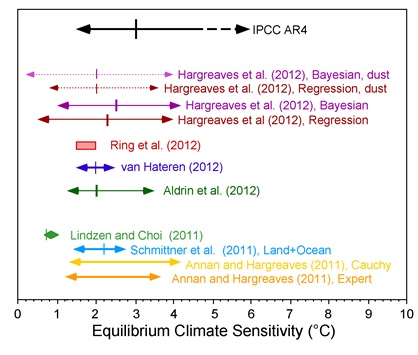