Denying the Climate Catastrophe: 4a. Actual Temperature Data
This is the fourth chapter of an ongoing series. Other parts of the series are here:
- Introduction
- Greenhouse Gas Theory
- Feedbacks
- A) Actual Temperature Data (this article); B) Problems with the Surface Temperature Record
- Attribution of Past Warming: A) Arguments for it being Man-Made; B) Natural Attribution
- Climate Models vs. Actual Temperatures
- Are We Already Seeing Climate Change
- The Lukewarmer Middle Ground
- A Low-Cost Insurance Policy
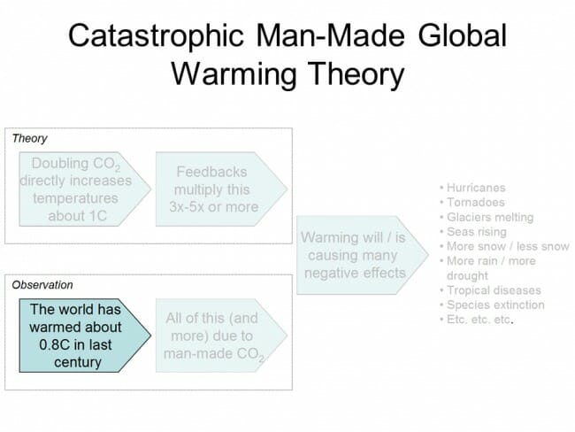
In our last chapter, we ended a discussion on theoretical future warming rates by saying that no amount of computer modelling was going to help us choose between various temperature sensitivities and thus warming rates. Only observational data was going to help us determine how the Earth actually responds to increasing CO2 in the atmosphere. So in this chapter we turn to the next part of our framework, which is our observations of Earth's temperatures, which is among the data we might use to support or falsify the theory of catastrophic man-made global warming.
The IPCC position is that the world (since the late 19th century) has warmed about 0.8C. This is a point on which many skeptics will disagree, though perhaps not as substantially as one might expect from the media. Most skeptics, myself included, would agree that the world has certainly warmed over the last 100-150 years. The disagreement tends to be in the exact amount of warming, with many skeptics contending that the amount of warming has been overstated due to problems with temperature measurement and aggregation methodology.
For now, we will leave those issues aside until part B of this section, where we will discuss some of these issues. One reason to do so is to focus, at least at first, on the basic point of agreement that the Earth has indeed warmed somewhat. But another reason to put these differences over magnitude aside is that we will find, a few chapters hence, that they essentially don't matter. Even the IPCC's 0.8C estimate of past warming does not support its own estimates of temperature sensitivity to CO2.
Surface Temperature Record
The most obvious way to measure temperatures on the Earth is with thermometers near the ground. We have been measuring the temperature at a few select locations for hundreds of years, but it really is only in the last century that we have fairly good coverage of the land surface. And even then our coverage of places like the Antarctic, central Africa, parts of South America, and all of the oceans (which cover 75% of the Earth) is even today still spotty. So coming up with some sort of average temperature for the Earth is not a straight averaging exercise -- data must be infilled and estimated, making the process complicated and subject to a variety of errors.
But the problem is more difficult than just data gaps. How does one actually average a temperature from Denver with a temperature from San Diego? While a few folks attempt such a straight average, scientists have developed a theory that one can more easily average what are known as temperature anomalies than one can average the temperature itself. What is an anomaly? Essentially, for a given thermometer, researchers will establish an average for that thermometer for a particular day of the year. The exact time period or even the accuracy of this average is not that important, as long as the same time period is used consistently. Then, the anomaly for any given measurement is the deviation of the measured temperature from its average. So if the average historical temperature for this day of the year is 25C and the actual measured for the day is 26C, the anomaly for today at this temperature station is +1.0C.
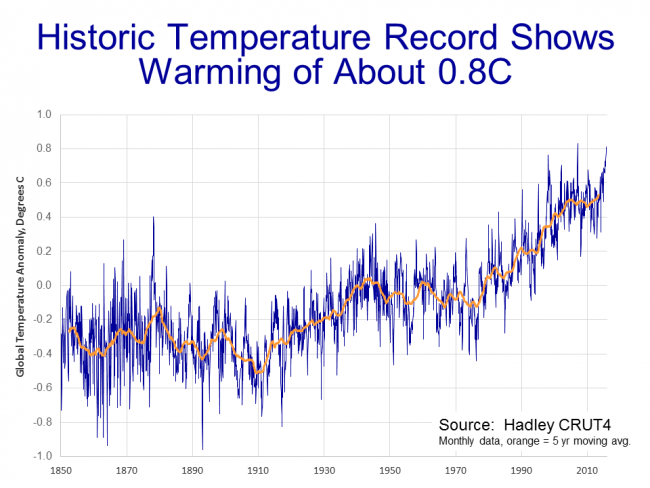
Scientists then develop programs that spatially average these temperature anomalies for the whole Earth, while also adjusting for a myriad of factors, from time-of-day changes in measurement to technology changes over time of the temperature stations to actual changes in the physical location of the measurement. This is a complicated enough a task, with enough explicit choices that must be made about techniques and adjustments, that there are many different temperature metrics floating around out there, many of which get different results from essentially the same data. The Hadley Center in England's CRUT4 global temperature metric is generally considered the gold standard, and is the one used preferentially by the IPCC. Its metric is shown below, with the monthly temperature anomaly in dark blue and the 5 year moving average (centered on its mid-point):
Again, the zero point of the chart is arbitrary and merely depends on the period of time chosen as the base or average. Looking at the moving average, one can see the temperature anomaly bounces around -0.3C in the late 19th century and has been around +0.5C over the last several years, which is how we get to about 0.8C warming.
Satellite Temperature Record
There are other ways to take temperature measurements, however. Another approach is to use satellites to measure surface temperatures (or at least near-surface temperatures). Satellites measure temperature by measuring the thermal microwave emissions of oxygen atoms in the lower troposphere (perhaps 0-3 miles above the Earth). Satellites have the advantage of being able to look at the entire Earth without gaps, and are not subject to siting biases for surface temperatures stations (which will be discussed in our part B of this chapter).
The satellite record does, however, rely on a shifting array of satellites all of which have changing orbits for which adjustments must be made. Of necessity, the satellite record cannot reach as far back into the past. And the satellites are not actually measuring the temperature of the Earth, but rather a temperature a mile or two up. Whether that matters is subject to debate, but the clincher for me is that the IPCC and most climate models have always shown that the first and most anthropogenic warming should show up in exactly this spot -- the lower troposphere -- which makes observation of this zone a particularly good way to look for a global warming signal.
Roy Spencer and John Christy have what is probably the leading satellite temperature metric, called "UAH" as a shorthand for University of Alabama, Huntsville's space science center. The UAH record looks like this:
Note that the absolute magnitude of the anomaly isn't comparable between the surface and satellite record, as they use different base periods, but changes and growth rates in the anomalies should be comparable between the two indices.
The first thing to note is that, though they are different, both the satellite and surface temperature records show warming since 1980. For all that some skeptics may want to criticize the authors of the surface temperature databases, and there indeed some grounds for criticism, these issues should not distract us from the basic fact that in every temperature record we have (including other technologies like radiosonde balloons), we see recent warming.
In terms of magnitude, the two indices do not show the same amount of warming -- since 1980 the satellite temperature record shows about 30% less warming than does the surface temperature record for the same period. So which is right? We will discuss this in more depth in part B, but the question is not made any easier by the fact that the surface records are compiled by prominent alarmist scientists while the satellite records are maintained by prominent skeptic scientists. Which causes each side to accuse the other of having its thumb on the scale, so to speak. I personally like the satellite record because of its larger coverage areas and the fact that its manual adjustments (which are required of both technologies) are for a handful of instruments rather than thousands, and are thus easier to manage and get right. But I am also increasingly of the opinion that the differences are minor, and that neither are consistent with catastrophic forecasts.
So instead of getting ourselves involved in the dueling temperature data set food fight (we will dip our toe into this in part B), let's instead apply both these data sets to several propositions we see frequently in the media. We will quickly see the answers we reach do not depend on the data set chosen.
Test #1: Is Global Warming Accelerating
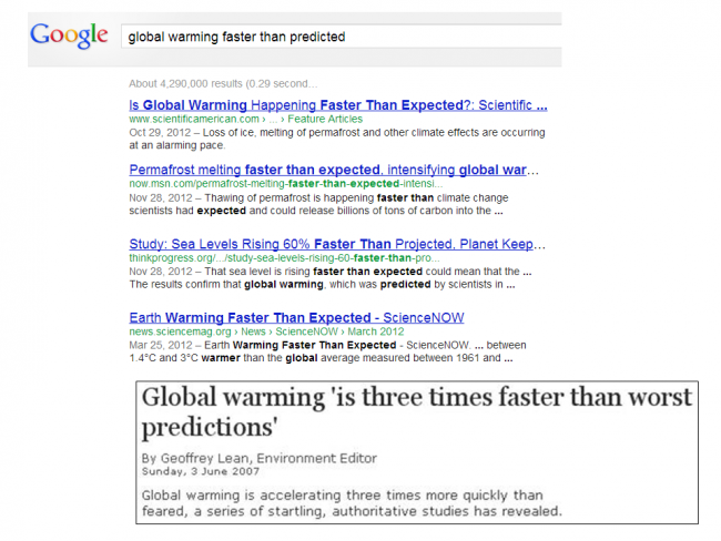
One frequent meme you will hear all the time is that "global warming is accelerating." As of today it had 550,000 results on Google. For example:
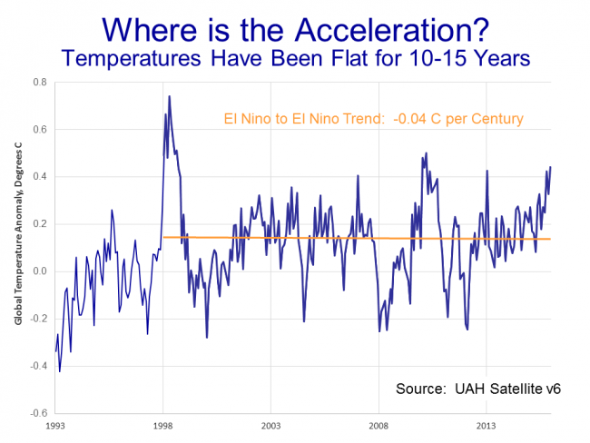
So. Is that true? They can't print it if its not true, right (lol)? Let's look first at the satellite record through the end of 2015 when this presentation was put together (there is an El Nino driven spike in 2 months after this chart was made, which does not affect the conclusions that follow in the least, but I will update to include ASAP).
If you want a name for this chart, I could call it the "bowl of cherries" because it has become a cherry-picker's delight. Everyone in the debate can find a starting point and an end point in this jagged data to find any trend they want to find. So how do we find an objective basis to define end points for this analysis? Well, my background is more in economic analysis. Economists have the same problem in looking at trends for things like employment or productivity because there is a business cycle that adds volatility to these numbers above and beyond any long term trend. One way they manage this is to measure variables from peak to peak of the economic cycle.
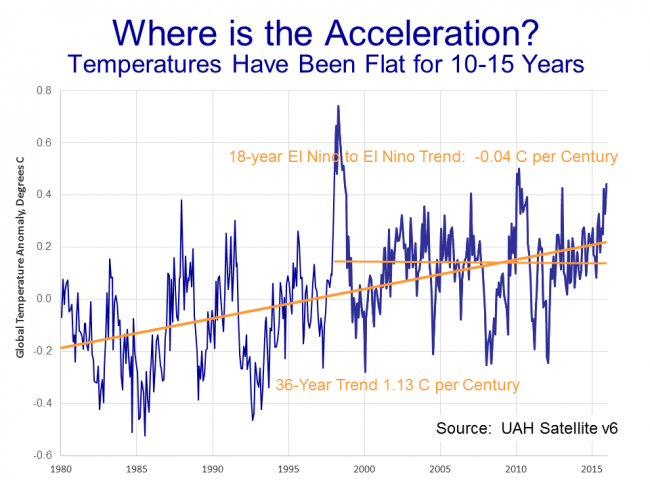
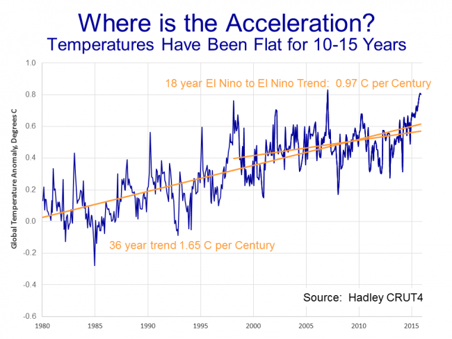
I have done something similar. The equivalent cyclical peaks in the temperature world are probably the very high Pacific Decadal Oscillation, or El Nino, events. There was one in 1998 and there is one occurring right now in late 2015/early 2016. So I defined my period as 18 years from peak to peak. By this timing, the satellite record shows temperatures to be virtually dead flat for those 18 years. This is "the pause" that you may have heard of in climate debates. Such an extended pause is not predicted by global warming theory, particularly when the theory (as in the IPCC main case) assumes high temperature sensitivities to CO2 and low natural variation in temperatures.
So if global warming were indeed accelerating, we would expect the warming rate over the last 18 years to be higher than the rate over the previous 18 years. But just the opposite is true:
While "the pause" does not in and of itself disprove the theory of catastrophic manmade global warming, it does easily falsify the myriad statements you see that global warming is accelerating. At least for the last 20 years, it has been decelerating.
By the way, this is not somehow an artifact of just the satellite record. This is what the surface record looks like for the same periods:
Though it shows (as we discussed earlier) higher overall warming rates, the surface temperature record also shows a deceleration rather than acceleration over the last 20 years.
Test #2: Are Temperatures Rising Faster than Expected
OK, let's consider another common meme, that the "earth is warming faster than predicted."
Again, there over 500,000 Google matches for this meme. So how do we test it? Well, certainly not against the last IPCC forecasts -- they are only a few years old. The first real high-sensitivity or catastrophic forecast we have is from James Hansen, often called the father of global warming.
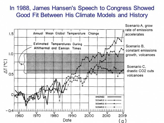
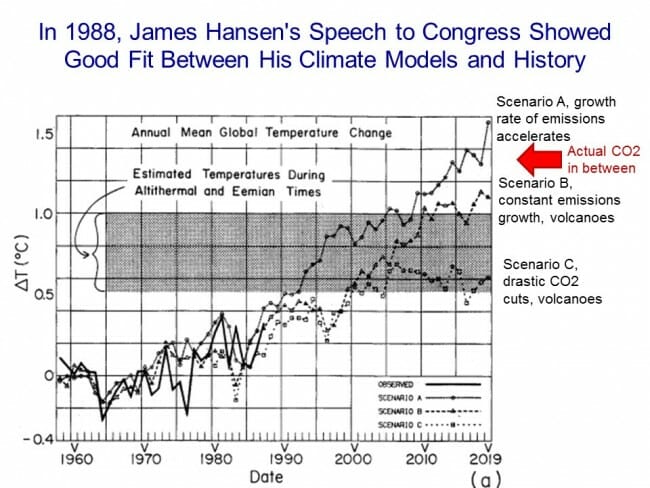
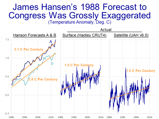
In June of 1988, Hanson made a seminal presentation to Congress on global warming, including this very chart (sorry for the sucky 1980's graphics). In his testimony, he presented his models for the Earth's temperature, which showed a good fit with history**. Using his model, he then created three forecasts: Scenario A, with high rates of CO2 emissions; Scenario B, with more modest emissions; and scenario C, with drastic worldwide emissions cuts (plus volcanoes, that tend to belch dust and chemicals that have a cooling effect). Surprisingly, we can't even get agreement today about which forecast for CO2 production was closer to the mark (throwing in the volcanoes makes things hard to parse) but it is pretty clear that over the 30 years after this forecast, the Earth's CO2 output has been somewhere between A and B.
As it turns out, it doesn't matter whether we actually followed the CO2 emissions from A or B. The warming forecasts for scenario A and B turn out to be remarkably similar. In the past, I used to just overlay temperature actuals onto Hansen's chart, but it is a little hard to get the zero point right and it led to too many food fights. So let's pull the scenario A and B forecasts off the chart and compare them a different way.
The left of chart shows Hanson's scenario A and B, scanned right from his chart. Scenario A implies a warming rate from 1986 to 2016 of 3.1C per century. Scenario B is almost as high, at 2.8C per century. But as you can see on the right, the actual warming rates we have seen over the same period are well below these forecasts. The surface temperature record shows only about half the warming, and the satellite record shows only about a third the warming, that Hansen predicted. There is no justification for saying that recent warming rates have been higher than expected or forecast -- in fact, the exact opposite has been true.
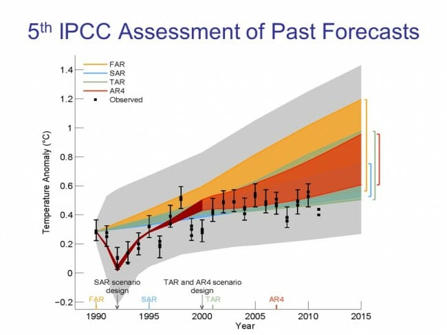
We see the same thing when looking at past IPCC forecasts. At each of its every-five-year assessments, the IPCC has included a forecast range for future temperatures. In this case, though, we don't have to create a comparison with actuals because the most recent (5th) IPCC Assessment did it for us:
The colored bands are their past forecasts. The grey areas are the error bands on the forecast. The black dots are global temperatures (which actually are shown with error bars, which is good practice but seldom done except perhaps when they are trying to stretch to get into the forecast range). As you can see, temperatures have been so far below forecasts that they are dropping out of the low end of even the most generous forecast bands. If temperatures were rising faster than expected, the black dots would be above the orange and yellow bands. We therefore have to come to the conclusion that, at least for the last 20-30 years, temperatures have not been rising faster than expected, they have been rising slower than expected.
Day vs. Night
There is one other phenomenon we can see in the temperature data that we will come back to in later chapters: that much of the warming over the last century has been at night, rather than in the daytime. There are two possible explanations for this. The first is that most anthropogenic warming models predict more night time warming than they do day time warming. The other possibility is that a portion of the warming in the 20th century temperature record is actually spurious bias from the urban heat island effect due to siting of temperature stations near cities, since urban heat island warming shows up mainly at night. We will discuss the latter effect in part B of this chapter.
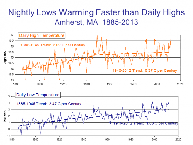
Whatever the cause, much of the warming we have seen has occurred at night, rather than during the day. Here is a great example from the Amherst, MA temperature station (Amherst was the first location where I gave this presentation, if that seems an odd choice).
As you can see, the warming rate since 1945 is 5 times higher at night than during the day. This directly affects average temperatures since daily average temperature for a location in the historic record is the simple average of the daily high and daily low. Yes, I know that this is not exactly accurate, but given technology in the past, this is the best that could be done.
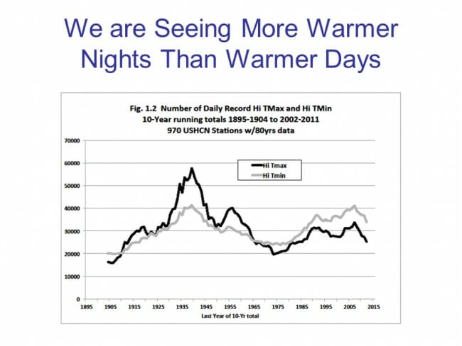
The news media likes to cite examples of heat waves and high temperature records as a "proof" of global warming. We will discuss this later, but this is obviously a logical fallacy -- one can't prove a trend in noisy data simply by citing isolated data points in one tail of the distribution. But it is also fallacious for another reason -- we are not actually seeing any upwards trends in high temperature records, at least for daytime highs:
To get this chart, we obviously have to eliminate newer temperature stations from the data set -- any temperature station that is only 20 years old will have all of its all time records in the last 20 years (you would be surprised at how many otherwise reputable scientists miss simple things like this). Looking at just the temperature stations in the US we have a long record for, we see with the black line that there is really no upwards trend in the number of high temperature records (Tmax) being set. The 1930s were brutally hot, and if not for some manual adjustments we will discuss in part B of this section, they would likely still show as the hottest recent era for the US. It turns out, with the grey line (Tmin), that while there is still no upward trend, we are actually seeing more high temperature records being set with daily lows (the highest low, as it were) than we are with daily highs. The media is, essentially, looking in the wrong place, but I sympathize because a) broiling hot daytime highs are sexier and b) it is brutally hard to talk about highest low temperatures without being confusing as hell.
In our next chapter, or really part B of this chapter, we will discuss some of the issues that may be leading the surface temperature record to be exaggerated, or at least inaccurate.
Chapter 4, Part B on problems with the surface temperature record continues here.
If you want to skip Part B, and get right on with the main line of the argument, you can go straight to Chapter 5, part A, which starts in on the question of how much of past warming can be attributed to man.
** Footnote: The history of Wall Street is full of bankrupt people whose models exactly matched history. I have done financial and economic modeling for decades, and it is surprisingly easy to force multi-variable models to match history. The real test is how well the model works going forward. Both Hanson's 1988 models and the IPCC's many models do an awesome job matching history, but quickly go off the rails in future years. I am reminded of a simple but famous example of the perfect past correlation between certain NFL outcomes and Presidential election outcomes. This NFL model of presidential elections perfectly matches history, but one would be utterly mad to bet future elections based on it.


Of course the world has warmed we came out of the little ice age in 1850. It had to warm just to return to normal. But typically the data is fudged to support the AGW meme. The temperature was warmer in the 30's than any time since then. How could that be possible if CO2 was so powerful. The rtemperature has not gone up in the last 20 years. Again how could that happen as CO2 kept climbing. But no worries, the NASA and NOAA can fix that. They have changed the historical record to make it seem cooler in the first part of the 20th century and completely erased the very warm temperatures of the mid 30's. They had to because when all is said and done the earth only warmed 0.5 degrees between 1900 and 1998 and hasn't changed since 1998.
I had been trying to find that 5th IPCC Assessment of Past Forecasts graphic for a while, and thought it was my own fault for not being able to find it in the IPCC report. After all, though you don't cite your sources, surely there's no reason to just make stuff up.
Lo and behold, it turns out that's from a draft copy[1] of the report and was criticized for using 1990 as the 0 point[2]. The actual chart included in the final report[3] makes it clear that observations have essentially been down the middle of model projections.
Whether you consider the criticism of the original graphic valid or not, it's disingenuous to ascribe a draft graphic to the IPCC report without explaining the criticisms behind it. Now I have to wonder how much of other IPCC work you've misquoted. See - this is why we cite our sources.
[1] https://wattsupwiththat.com/2012/12/18/dr-david-whitehouse-on-the-ar5-figure-1-4/
[2] https://tamino.wordpress.com/2012/12/20/fake-skeptic-draws-fake-picture-of-global-temperature/
[3] http://www.climatechange2013.org/images/figures/WGI_AR5_Fig1-4.jpg
I'm not sure I understand the side-by-side comparison of the chart entitled "James Hansen's 1988 forecast to congress was wildly exaggerated."
There are different start points for each graph. Is this because the different graphs use a different nominal temperature set at 0.0 deg?
"The actual chart included in the final report[3] makes it clear that observations have essentially been down the middle of model projections."
Forgive me, I'm having some difficulty reconciling this statement with the chart. Considering the projections in order:
- FAR [First Assessment Report (1990)]: Observed temperatures would appear to have fallen out of the bottom of the predicted range, though the chart (perhaps intentionally) makes it difficult to tell for sure.
- SAR [Second Assessment Report (1995)]: Here your assessment seems fair, the relatively conservative SAR projection looks pretty reasonable at this stage
- TAR [Third Assessment Report (2001)]: Again, observed temperatures are squarely in the range, though trending toward the low end.
- AR4 [Fourth Assessment Report (2007)]: This one is interesting. We are given a stack of individual projections instead of a range. To my eye, it would appear that the observed temperatures are at the low end of the implied range, though, again, the chart (perhaps intentionally) makes it difficult to tell for sure.
Basically, I'd suggest that IPCC's best estimate was their most conservative one (SAR). There is little to suggest that subsequent projections have gotten more accurate. And, to the extent that observed temperatures are within the projected ranges, it is mainly a result of them hugging the bottom end of very wide ranges.
Overall, you assessment that "observations have essentially been down the middle of model projections." is, to my mind, extraordinarily generous.