This is one of those issues that really should surprise no one, but encroaching urbanization on surface temperature measurement stations can impose an upward bias to recorded temperatures, creating a false trend. The increase in measured temperatures due to urbanization is easy to demonstrate -- my son and I did it as a junior high science project.
In short, what happens is this. Urban environments are hotter than the surrounding countryside, so temperatures in the city will be biased upwards from those in the country around it (you will often see this on the local weather when they contrast the city vs outlying areas). This in and of itself does not necessarily corrupt the temperature trend. However, if the city is growing -- say in the case of the UofA photo in the article which 100 years ago was in an huge open field -- then encroaching urbanization can bias the trend.
Even with these biases removed, it is important to note that there is still an upward trend in the surface temperature record, at least over the last 30 years (as there is in satellite temperature measurement which is not subject to this bias). However, the total US surface trend may be overstated by a third to a half. Climate scientists of the alarmist sort have one of two reactions to this: 1) There are urban heat island deniers, who deny it is an issue or has any effect on the temperature record; and 2) There are those who accept that it exists but claim it is accounted for by various statistical methods that look at multiple sites in one area. The problem with this latter is that rather than actually remove the bias, it tends to smooth the bias like peanut butter across multiple stations.
In this chapter we are going to try to sum up where we are and return to our very first chapter, when I said that we would find something odd once we returned to the supposed global warming "consensus".
First, let's return to our framework one last time and try to summarize what has been said:
I believe that this is a pretty fair representation of the median luke-warmer position. Summarized, it would be:
Manmade CO2 warms the Earth, though by much less than most climate models claim because these models are assuming unrealistic levels of positive feedback that over-state future warming. One degree C of warming, rather than four or five, is a more realistic projection of man-made warming over the next century
The world has certainly warmed over the last century, though by perhaps a bit less than the 0.8C in the surface temperature record due to uncorrected flaws in that record
Perhaps half of this past warming is due to man, the rest due to natural variability
There is little evidence that weather patterns are "already changing" in any measurable way from man-made warming
The statements I just wrote above, no matter how reasonable, are enough to get me and many others vilified as "deniers". You might think that I am exaggerating -- that the denier tag is saved for folks who absolutely deny any warming effect of CO2. But that is not the case, I can assure you from long personal experience.
The Climate Bait and Switch
Of course, the very act of attempting to shut people up who disagree with one's position on a scientific issue is, I would have thought, obviously anti-science. The history of science is strewn with examples of the majority being totally wrong. Even into the 1960's, for example, the 97% consensus in geology was that the continents don't move and that the few scientists who advocated for plate tectonics theory were crackpots.
But that is not how things work today. Climate action advocates routinely look for ways to silence climate skeptics, up to and including seeking to prosecute these climate heretics and try to throw them in jail.
The reason that alarmists say they feel confident in vilifying and attempting to silence folks like myself is because they claim that the science is settled, that 97% of climate scientists believe in the consensus, and so everyone who is not on board with the consensus needs to shut up. But what exactly is this consensus?
The 97% number first appeared in a "study" by several academics who sent out a survey to scientists with some climate change questions. They recieved over 3146 responses, but they decided that only 77 of these respondents "counted" as climate scientists, and of these 75 of the 77 (97%) answered two questions about climate change in the affirmative.
We will get to the two questions in a second, but note already the odd study methodology. If the other 10,000 plus people sent the survey were not the targets of the survey, why were they sent a survey in the first place? It makes one suspicious that the study methodology was changed mid-stream to get the answer they wanted.
Anyway, what is even more fascinating is the two questions asked in the survey. Here they are:
When compared with pre-1800s levels, do you think that mean global temperatures have generally risen, fallen, or remained relatively constant?
Do you think human activity is a significant contributing factor in changing mean global temperatures?
The 97% in this survey answered the questions "risen" and "yes".
Do you see the irony here? If you have been following along with this series, you should be able to say how I would have answered the two questions. I would certainly have said "risen" to 1. The answer to question 2 is a bit hard because "significant" is not defined, but in a complex system with literally thousands of variables, I would have said one of those variables was a significant contributor at anything over about 10%. Since I estimated man's effect on past warming around 40-50%, I would have answered "yes" to #2! In fact, most every prominent science-based skeptic I can think of would likely have answered the same.
So you heard it right -- I and many prominent skeptics are part of the 97% consensus. Effectively, I am being told to shut up and not continue to say what I think, in the name of a 97% consensus that represents exactly what I am saying. This is so weird as to be almost Kafka-esque.
This is what I call the climate bait and switch. Shaky assumptions about things like high positive feedback assumptions are defended with the near-certainty that surrounds unrelated proposition such as the operation of the greenhouse gas effect.
In fact, merely arguing about whether man-made warming exists or is "significant" falls well short of what we really need in the public policy arena. What we really should be discussing is a proposition like this:
Is manmade CO2 causing catastrophic increases in warming and warming-driven weather effects whose costs exceed those of reducing CO2 production enough to avoid these effects?
It is about at this point when I usually have people bring up the precautionary principle. So that I am not unfair to proponents of that principle, I will use the Wikipedia definition:
if an action or policy has a suspected risk of causing harm to the public, or to the environment, in the absence of scientific consensus (that the action or policy is not harmful), the burden of proof that it is not harmful falls on those taking an action that may or may not be a risk.
The principle is used by policy makers to justify discretionary decisions in situations where there is the possibility of harm from making a certain decision (e.g. taking a particular course of action) when extensive scientific knowledge on the matter is lacking. The principle implies that there is a social responsibility to protect the public from exposure to harm, when scientific investigation has found a plausible risk. These protections can be relaxed only if further scientific findings emerge that provide sound evidence that no harm will result.
I believe that, as stated, this is utter madness. I will give you an example. Consider a vaccine that saves thousands of lives a year. Let's say, as is typical of almost every vaccine, that it also hurts a few people, such that it may kill 1 person for every thousand it saves. By the precautionary principle as stated, we would never have approved any vaccine, because the precautionary principle does not put any weight on avoided costs of the action.
So take fossil fuel burning. Proponents of taking drastic action to curb fossil fuel use in the name of global warming prevention will argue that until there is an absolute consensus that burning fossil fuels is not harmful to the climate, such burning should be banned. But it ignores the substantial, staggering, unbelievably-positive effects we have gained from fossil fuels and the technology and economy they support.
Just remember back to that corn yield chart.
Bill McKibbon wants us to stop using fossil fuels because they may cause warmer temperatures that might reduce corn yields. But there is a near absolute certainty that dismantling the fossil fuel economy will take us back to the horrendous yields in the yellow years on this chart. Proponents of climate action point to the possibility of warming-based problems, but miss the near certainty of problems from elimination of fossil fuels.
Over the last 30 years, something unprecedented in the history of human civilization has occurred -- an astounding number of people have exited absolute poverty.
Folks like McKibbon act like there is no downside to drastically cutting back on fossil fuel use and switching to substantially more expensive and less convenient fuels, as if protecting Exxon's profits are the only reason anyone would possibly oppose such a measure. But the billion or so people who have exited poverty of late have done so by burning every bit of fossil fuels than can obtain, and never would have been able to do so in such numbers had such an inexpensive fuel option not been available. We in the West could likely afford having to pay $50 a month more for fuel, but what of the poor of the world?
Perhaps this will give one an idea of how central inexpensive fossil fuels are to well-being. This is a chart from World Bank data plotting each country based on their per capital CO2 production and their lifespan.
As you can see, there is a real, meaningful relationship between CO2 production and life expectancy. In fact, each 10x increase in CO2 production is correlated with 10 years of additional life expectancy. Of course, this relationship is not direct -- CO2 itself does not have health benefits (if one is not a plant). But burning more CO2 is a byproduct of a growing technological economy, which leads to greater wealth and life expectancy.
The problem, then, is not that we shouldn't consider the future potential costs and risks of climate change, but that we shouldn't consider them in a vaccuum without also considering the costs of placing severe artificial limits on inexpensive fossil fuels.
People often say to me that climate action is an insurance policy -- and they ask me, "you buy insurance, don't you?" My answer invariably is, "yes, I buy insurance, but not when the cost of the policy is greater than the risk being insured against."
As it turns out, there is an approach we can take in this country to creating a low-cost insurance policy against the risks that temperature sensitivity to CO2 is higher than I have estimated in this series. I will outline that plan in my final chapter.
Note: This is by far the longest chapter, and could have been 10x longer without a lot of aggressive editing. I have chosen not to break it into two pieces. Sorry for the length. TL;DR: The vast majority of claims of current climate impacts from CO2 are grossly exaggerated or even wholly unsupported by the actual data. The average quality of published studies in this area is very low compared to other parts of climate science.
Having discussed the theory and reality of man-made warming, we move in this chapter to what is often called "climate change" -- is manmade warming already causing adverse changes in the climate?
This is a peculiarly frustrating topic for a number of reasons.
First, everyone who discusses climate change automatically assumes the changes will be for the worse. But are they? The Medieval Warm Period, likely warmer than today, was a period of agricultural plenty and demographic expansion (at least in Europe) -- it was only the end of the warm period that brought catastrophe, in the form of famine and disease. As the world warms, are longer growing seasons in the colder parts of the northern hemisphere really so bad, and why is it no one ever mentions such positive offsets?
The second frustrating issues is that folks increasingly talk about climate change as if it were a direct result of CO2, e.g. CO2 is somehow directly worsening hurricanes. This is in part just media sloppiness, but it has also been an explicit strategy, re-branding global warming as climate change during the last 20 years when global temperatures were mostly flat. So it is important to make this point: There is absolutely no mechanism that has been suggested by anyone wherein CO2 can cause climate change except through the intermediate step of warming. CO2 causes warming, which then potentially leads to changes in weather. If CO2 is only causing incremental warming, then it likely is only causing incremental changes to other aspects of the climate. (I will note as an aside that man certainly has changed the climate through mechanisms other than CO2, but we will not discuss these. A great example is land use. Al Gore claimed the snows of Kilimanjaro are melting because of global warming, but in fact it is far more likely they are receding due to precipitation changes as a result of deforestation of Kilimanjaro's slopes.)
Finally, and perhaps the most frustrating issue, is that handling claims of various purported man-made changes to the climate has become an endless game of "wack-a-mole". It is almost impossible to keep up with the myriad claims of things that are changing (always for the worse) due to CO2. One reason that has been suggested for this endless proliferation of dire predictions is that if one wants to study the mating habits of the ocelot, one may have trouble getting funding, but funding is available in large quantities if you re-brand your study as the effect of climate change on the mating habits of the ocelot. It is the unusual weather event or natural phenomenon (Zika virus!) that is not blamed by someone somewhere on man-made climate change.
As a result, this section could be near-infinitely long. To avoid that, and to avoid a quickly tedious series of charts labelled "hurricanes not up", "tornadoes not up", etc., I want to focus more on the systematic errors that lead to the false impression that we are seeing man-made climate changes all around us.
We will start with publication bias, which I would define as having a trend in the reporting of a type of an event mistaken for a trend in the underlying events itself. Let's start with a classic example from outside climate, the "summer of the shark".
The media hysteria began in early July, 2001, when a young boy was bitten by a shark on a beach in Florida. Subsequent attacks received breathless media coverage, up to and including near-nightly footage from TV helicopters of swimming sharks. Until the 9/11 attacks, sharks were the third biggest story of the year as measured by the time dedicated to it on the three major broadcast networks’ news shows.
Through this coverage, Americans were left with a strong impression that something unusual was happening — that an unprecedented number of shark attacks were occurring in that year, and the media dedicated endless coverage to speculation by various “experts” as to the cause of this sharp increase in attacks.
Except there was one problem — there was no sharp increase in attacks. In the year 2001, five people died in 76 shark attacks. However, just a year earlier, 12 people had died in 85 attacks. The data showed that 2001 actually was a down year for shark attacks. The increased media coverage of shark attacks was mistaken for an increase in shark attacks themselves.
Hopefully the parallel with climate reporting is obvious. Whereas a heat wave in Moscow was likely local news only 30 years ago, now it is an international story that is tied, in every broadcast, to climate change. Every single tail-of-the-distribution weather event from around the world is breathlessly reported, leaving the impression among viewers that more such events are occurring, even when there is in fact no such trend. Further, since weather events can drive media ratings, there is an incentive to make them seem scarier:
When I grew up, winter storms were never named. It was just more snow in Buffalo, or wherever. Now, though, we get "Winter Storm Saturn: East Coast Beast." Is the weather really getting scarier, or just the reporting?
The second systematic error is not limited to climate, and is so common I actually have a category on my blog called "trend that is not a trend". There is a certain chutzpah involved in claiming a trend when it actually does not exist in the data, but such claims occur all the time. In climate, a frequent variation on this failure is the claiming of a trend from a single data point -- specifically, a tail-of-the-distribution weather event will be put forward as "proof" that climate is changing, ie that there is a trend to the worse somehow in the Earth's climate.
The classic example was probably just after Hurricane Katrina. In a speech in September of 2005 in San Francisco, Al Gore told his Sierra Club audience that not only was Katrina undoubtedly caused by man-made global warming, but that it was the harbinger of a catastrophic onslaught of future such hurricanes. In fact, though, there is no upward trend in Hurricane activity. 2005 was a high but not unprecedented year for hurricanes. An Katrina was soon followed by a long and historic lull in North American hurricane activity.
Counting hurricane landfalls is a poor way to look at hurricanes. A better way is to look at the total energy of hurricanes and cyclones globally. And as you can see, the numbers are cyclical (as every long-time hurricane observer could have told Mr. Gore) but without any trend:
In fact, the death rates from severe weather have been dropping throughout the last century at the same time CO2 levels have been rising
Of course, it is likely that increasing wealth and better technology are responsible for much of this mitigation, rather than changes in underlying weather patterns, but this is still relevant to the debate -- many proposed CO2 abatement plans would have the effect of slowing growth in the developing world, leaving them more vulnerable to weather events. I have argued for years that the best way to fight weather deaths is to make the world rich, not to worry about 1 hurricane more or less.
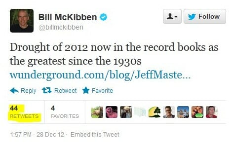
Droughts are another event where the media quickly finds someone to blame the event on man-made climate change and declare that this one event is proof of a trend. Bill McKibben tweeted about drought and corn yields many times in 2012, for example:
It turns out that based on US government data, the 2012 drought was certainly severe but no worse than several other droughts of the last 50 years (negative numbers represent drought).
There is no upward trend at all (in fact a slightly downward trend that likely is not statistically significant) in dry weather in the US
McKibben blamed bad corn yields in 2012 on man-made global warming, and again implied that one year's data point was indicative of a trend
US corn yields indeed were down in 2012, but still higher than at any time they had been since 1995.
It is worth noting the strong upward trend in corn yields from 1940 to today, at the same time the world has supposedly experienced unprecedented man-made warming. I might also point out the years in yellow, which were grown prior to the strong automation of farming via the fossil fuel economy. Bill McKibben hates fossil fuels, and believes they should be entirely eliminated. If so, he also must "own" the corn yields in yellow. CO2-driven warming has not inhibited corn yields, but having McKibben return us to a pre-modern economy certainly would.
Anyway, as you might expect, corn yields after 2012 return right back to trend and continue to hit new records. 2012 did not represent a new trend, it was simply one bad year.
I think most folks would absolutely swear, from media coverage, that the US is seeing more new high temperatures set and an upward trend in heat waves. But it turns out neither is the case.
Obviously, one has to be careful with this analysis. Many temperature stations in the US Historical Climate Network have only been there for 20 or 30 years, so their all time high at that station for any given day is, by definition, going to be in the last 20 or 30 years. But if one looks at temperature stations with many years of data, as done above, we can see there has been no particular uptick in high temperature records and in fact a disproportionate number of our all-time local records were set in the 1930's.
While there has been a small uptick in heat waves over the last 10-20 years, it is trivial compared to the heat of the 1930's
Looking at it a different way, there is no upward trend in 100 degree (Fahrenheit) days...
Or even 110 degree days. Again, the 1930's were hot, long before man-made CO2 could possibly have made them so
Why, one might ask, don't higher average global temperatures translate into more day-time high temperature records? Well, we actually gave the answer back in Chapter 4A, but as a reminder, much of the warming we have seen has occurred at night, raising the nighttime lows without as much affect on daytime highs, so we are seeing more record nighttime high Tmin's than we have in much of the last century without seeing more record daytime Tmax temperatures:
We could go on all day with examples of claiming a trend from a single data point. Watch for it yourself. But for now let's turn to a third category
We can measure things much more carefully and accurately than we could in the past. This is a good thing, except when we are trying to compare the past to the present. In a previous chapter, we showed a count of sunspots, and databases of sunspot counts go all the way back into the early 18th century. Were telescopes in 1716 able to see all the sunspots we can see in 2016? Or might an upward trend in sunspot counts be biased by our better ability today to detect small ones?
A great example of this comes, again, from Al Gore's movie in which Gore claimed that tornadoes were increasing and man-made global warming was the cause. He was working with this data:
This certainly looks scary. Tornadoes have increased by a factor of 5 or 6! But if you look at the NOAA web site, right under this chart, there is a big warning that ways to beware of this data. With doppler radar and storm chasers and all kinds of other new measurement technologies, we can detect smaller tornadoes that were not counted in the 1950's. The NOAA is careful to explain that this chart is biased by changes in measurement technology. If one looks only at larger tornadoes we were unlikely to miss in the 1950's, there is no upward trend, and in fact there may be a slightly declining trend.
That, of course, does not stop nearly every person in the media from blaming global warming whenever there is an above-average tornado year
Behind nearly every media story about "abnormal" weather or that the climate is somehow "broken" is an explicit assumption that we know what "normal" is. Do we?
We have been keeping systematic weather records for perhaps 150 years, and have really been observing the climate in detail for perhaps 30 years. Many of our best tools are space-based and obviously only have 20-30 years of data at most. Almost no one thinks we have been able to observe climate in depth through many of its natural cycles, so how do we know exactly what is normal? Which year do we point to and say, "that was the normal year, that was the benchmark"?
One good example of this is glaciers. Over the last 30 years, most (but not all) major glaciers around the world have retreated, leading to numerous stories blaming this retreat on man-made warming. But one reason that glaciers have retreated over the last 50 years is that they were also retreating the 50 years before that and the 50 years before that:
In fact, glaciers have been retreating around the world since the end of the Little Ice Age (I like to date it to 1812, with visions of Napoleon's army freezing in Russia, but that is of course arbitrary).
A while ago President Obama stood in front of an Alaskan glacier and blamed its retreat on man. But at least one Alaskan glacier in the area has been mapped for centuries, and has been retreating for centuries:
As you can see, from a distance perspective, most of the retreat actually occurred before 1900. If one wants to blame the modern retreat of these glaciers on man, one is left with the uncomfortable argument that natural forces drove the retreat until about 1950, at which point the natural forces stopped just in time for man-made effects to take over.
Melting ice is often linked to sea level rise, though interestingly net ice melting contributes little to IPCC forecasts of sea level rises due to expected offsets with ice building in Antarctica -- most forecast sea level rise comes from the thermal expansion of water in the oceans. And of course, the melting arctic sea ice that makes the news so often contributes nothing to sea level rise (which is why your water does not overflow your glass when the ice melts).
But the story for rising sea levels is the same as with glacier retreats -- the seas have been rising for much longer than man has been burning fossil fuels in earnest, going back to about the same 1812 start point:
There is some debate about manual corrections added to more recent data (that should sound familiar to those reading this whole series) but recent sea level rise seems to be no more than 3 mm per year. At most, recent warming has added perhaps 1 mm a year to the natural trend, or about 4 inches a century.
Our last failure mode is again one I see much more widely than just in climate. Whether the realm is economics or climate or human behavior, the media loves to claim that incredibly complex, multi-variable systems are in fact driven by a single variable, and -- who'd have thunk it -- that single variable happens to fit with their personal pet theory.
With all the vast complexity of the climate, are we really to believe that every unusual weather event is caused by a 0.013 percentage point change (270 ppm to 400 ppm) in the concentration of one atmospheric gas?
Let me illustrate this in another way. The NOAA not only publishes a temperature anomaly (which we have mostly been using in all of our charts) but they take a shot at coming up with an average temperature for the US. The following chart uses their data for the monthly average of Tmax (the daily high at all locations), Tmin (the daily low for all locations) and Tavg (generally the average of Tmin and Tmax).
Note that even the average temperatures vary across a range of 40F through the seasons and years. If one includes the daily high and low, the temperatures vary over a range of nearly 70F. And note that this is the average for all the US over a month. If we were to look at the range of daily temperatures across the breath of locations, we would see numbers that varied from well into the negative numbers to over 110.
The point of all this is that temperatures vary naturally a lot. Now look at the dotted black line. That is the long-term trend in the average, trending slightly up (since we know that average temperatures have risen over the last century). The slope of that line, around 1F per century for the US, is virtually indistinguishable. It is tiny, tiny, tiny compared to the natural variation of the averages.
The point of this is not that small increases in the average don't matter, but that it is irrational to blame every tail-of-the-distribution temperature event on man-made warming, since no matter how large we decide that number has been, its trivial compared to the natural variation we see in temperatures.
OK, I know that was long, but this section was actually pretty aggressively edited even to get it this short. For God sakes, we didn't even mention polar bears (the animals that have already survived through several ice-free inter-glacial periods but will supposedly die if we melt too much ice today). But its time to start driving towards a conclusion, which we will do in our next chapter.
In some sense, this is perhaps the most important chapter, the climax of all the discussion to this point. It is where we return to climate forecasts and attempt to conclude whether forecasts of catastrophic levels of man-made warming are reasonable. So let's take a step back and see where we are.
Here is the framework we have been working with -- we have walked through in earlier chapters both the "theory" and "observation" sections, ending most recently in chapter 5 with a discussion of how much past warming can be attributed to man.
It is important to remember why we embarked on the observation section. We ended the theory section with a range of future temperature forecasts, from the modest to the catastrophic, based on differing sensitivities of temperature to CO2 which were in turn largely based on varying assumptions about positive feedback effects in the climate.
We concluded at the time that there was not much more we could go with pure theory in differentiating between these forecasts, that we had to consult actual observations to validate or invalidate these forecasts.
We've already done one such analysis when we made two comparisons back in Chapter 4. We showed that temperatures had risen over the last 30 years by only a third to a half the rate projected by James Hanson to Congress...
And that even the IPCC admitted in its last report that temperatures were running below or at best at the very low end of past forecast bands
But in the grand scheme of things, even 30 years is a pretty short time frame to discuss climate changes. Remember that in my own attribution attempt in Chapter 5, I posited an important 66 year decadal cycle, and past temperature reconstructions imply other cycles that are centuries and millennia long.
But there is a way we can seek confirmation of climate forecasts using over 100 years of past temperature data. Let's take our forecast chart we showed above and give ourselves a bit more space on the graph by expanding the timescale:
Here is the key insight that is going to help us evaluate the forecasts: each forecast represents an actual, physical relationship between changes in CO2 concentrations and changes in temperature. If such a relationship is to hold in the future, it also has to be valid in the past. So we can take each of these different forecasts for the relation between temperature and CO2 and run them backwards to pre-industrial times in the 19th century, when atmospheric CO2 concentrations were thought to be around 270 ppm.
The temperature value of each line at 270ppm point represents the amount of warming we should already have seen from man-made CO2
What we see is that most of the mainstream IPCC and alarmist forecasts greatly over-predict past warming. For example, this simple analysis shows that for the IPCC mean forecast to be correct, we should have seen 1.6C of manmade warming over the last century and a half. But we know that we have not seen more than about 0.8C total in warming. Even if all of that is attributed to man (which we showed in the last chapter is unlikely), warming has still been well-short of what this forecast would predict. If we define a range for historic man-made warming from 0.33C (the number I came up with in the last chapter) to 0.8C (basically all of past warming due to man), we get numbers that are consistent with the non-catastrophic, zero-feedback cases
Of course we are leaving out the time dimension -- many of the hypothesized feedbacks take time to operate, so the initial transient response of the world's temperatures is not the same as the longer-term equilibrium response. But transient response likely is at least 2/3 of the full equilibrium value, meaning that my hypothesized value for man-made past warming of 0.33C would still be less than the no feedback case on an equilibrium basis.
It is from this analysis that I first convinced myself that man-made warming was unlikely to be catastrophic.
I want to add two notes here.
First, we mentioned back in the attribution section that some scientists argue that man has caused not all of but more than the total observed historical warming. This chapter's analysis explains why. The fact that climate models tend to overpredict history is not a secret among climate modelers (though it is something they seldom discuss publicly). To justify their high feedback and sensitivity assumptions in their forecasts, they need more warming in the past. One way to do this is to argue that the world would have cooled without man-made CO2, so that man-made CO2 contributed 0.8C of warming in addition to whatever the cooling would have been. It allows attribution of more than 100% of past warming to man.
There are various ways this is attempted, but the most popular centers around man-made sulfate aerosols. These aerosols are byproducts of burning sulfur-heavy fossil fuels, particularly coal, and they tend to have a cooling effect on the atmosphere (this is one reason why, in the 1970's, the consensus climate prediction was that man was causing the world to cool, not warm). Some scientists argue that these aerosols have tended to cool the Earth over the past decades, but as we clean up our fuels their effect will go away and we will get catch-up warming.
There are a couple of problems with this line of thought. The first is that we understand even less about the magnitude of aerosol cooling than we do of CO2 warming. Any value we choose is almost a blind guess (though as we shall see in a moment, this can be a boon to modelers on a mission). The second issue is that these aerosols tend to be very short-lived and local. They don't remain in the atmosphere long enough to thoroughly mix and have a global effect. Given their localization and observed concentrations, it is almost impossible to imagine them having more than a tenth or two effect on world temperatures. And I will add that if we need to take into account cooling from sulfate aerosols, we also need to take into account the warming and ice melting effect of black carbon soot from dirty Asian coal combustion. But we will return to that later in our section on Arctic ice.
My second, related note is that scientists will frequently claim that their computer models models do claim correctly match historic temperatures when run backwards. As a long-time modeler of complex systems, my advice is this: don't believe it until you have inspected the model in detail. At least 9 times out of 10, one will find that this sort of tight fit with history is the result of manual tweaking, usually from the affect of a few "plug" variables.
Here is one example -- there was a study a while back that tried to understand how a number of different climate models could all arrive at very different temperature sensitivities to CO2, but all still claim to model the same history accurately. What was found was that there was a second variable -- past cooling from man-made aerosols, discussed above -- that also varied greatly between models. And it turned out that the value chosen in the models for this second variable was exactly the value necessary to make that model's output match history -- that is why I said that our very lack of knowledge of the actual cooling from such aerosols could be a boon to modelers on a mission. In essence, there is a strong suspicion that this variable's value was not based on any observational evidence, but was simply chosen as a plug figure to make the model match history.
Having gone about as far as we can with the forecasts without diving into a whole new order of detail, let's move on to the final alarmist contention, that man-made CO2 is already changing the climate for the worse. We will discuss this in Chapter 7.
In part A, we discussed the main line of argument for attributing past warming to man-made CO2. In essence, scientists have built computer models to simulate the climate (and global temperatures). When these models were unable to simulate the amount of warming that occurred in the two decades between 1978 and 1998 using only what they thought were the major natural climate drivers, scientists concluded that this warming could not have been natural and could only have happened if the climate has a high sensitivity to man-made CO2.
This argument only works, of course, if the climate models are actually a correct representation of the climate. And that can only be proven over time, by comparing climate model output to actual weather. Back in chapter 4A, we briefly discussed how actual temperatures are in fact not tracking very well with climate model predictions, which should throw a substantial amount of doubt on the current quality of climate models (though the media still tends to treat model predictions as authoritative).
In this section, we will focus on some of the natural factors that are missing from most climate models. Obviously, if important natural drivers have been left out of the models, then one cannot conclude from the inability of the models to match historical warming that the historical warming couldn't have been natural. After discussing some of these factors, I will take my owns swing at the attribution problem.
Long-term Climate Shifts
We will begin with long-term climate variations. These are most certainly left out of the models, because no one really understands why they occur (though theories abound, of course). Mann's hockey stick not-withstanding, the consensus picture of past climate continues to include a strong warming period in the Middle Ages and a cool period, called the Little Ice Age, in the 16th and 17th centuries.
Imagine you were a climate modeler in 1600. Your model would probably have under-predicted temperatures over the next 200 years, because you were trying to model starting at the bottom of a long-term cyclical trend. So clearly leaving this trend out in 1600 would get the wrong answer. Wouldn't leaving it out in the year 2000 also get the wrong answer? All too often scientists tend to assume (though not always explicitly) that this long-term natural recovery of temperatures ended around 1950, at the same time they believe man-made warming started. A metaphorical hand-off occurred from natural to man-made factors. But there is no evidence for this whatsoever. We don't know what caused the Little Ice Age, so we don't know how long it can last or when it ends.
Changes in the Sun
Since we have mentioned it, let's discuss the sun. The sun is the dynamo that, along with a few smaller effects like the rotation of the Earth, drives the climate. We have known for some time that the Sun experiences cycles of variation, and one of the ways one can observe this variation is by looking at sunspots. We have more sophisticated ways of measuring the sun today, but we still count the spots.
Sunspots are cyclical in nature, and follow an eleven or so year cycle (you can see this in the spikes in the monthly light blue data above). But when one take this cycle out of the picture, as was done with the 10.8 year moving average above, there also appears to be longer cyclical trends. Since it is generally thought that more sunspots correlate with higher solar activity and output, one might expect that there could be some correlation between this solar trend and temperatures. As we can see above, by the sunspot metric the sun was more active in the second half of the last century than in the first half.
Today, we don't have to relay on just the spots, we can look at the actual energy output of the sun. And it turns out that the types of variations we have seen over recent decades in sunspots do not translate to very large changes in solar output on a percentage basis. Yes, there is more solar output but the extra amount is small, too small to explain much temperature variation. There is, though, an emerging new theory that a complex interaction of the sun with cosmic rays may affect cloud formation, acting as a multiplier effect on changes in solar output. A lot of skeptics, eager to support the natural causation argument, jumped on this theory. However, though the theory is intriguing and could turn out to be correct, I think folks are getting well ahead of the evidence in giving it too much credence at this point.
Ocean Cycles
At the end of the day, while solar variation may explain very long-cycle climate variations, it does not do much to explain our 1978-1998 warming period, so we will move on to another natural factor that does appear to have some explanatory power and which is also not in most climate models -- ocean cycles.
This is a complicated topic and I am far from an expert. In short: As mentioned in an earlier chapter, the oceans have far more heat carrying capacity than the atmosphere. It turns out that oceans have cycles, that are decades long, where they can exchange more or less heat with the atmosphere. In their "warm" periods, these cycles tend to leave more heat in the atmosphere, and in their "cold" periods they bury more heat in their depths. Once such cycle is called the Pacific Decadal Oscillation (PDO), which will be familiar to most Americans because "El Nino"and "La Nina" climate patterns are part of this PDO cycle. If one plots global temperatures against the PDO cycles, there is a good deal of correlation:
When the PDO has been in its warm phases (the red periods in the chart above), global temperatures rise. When it is in its cool phases (the blue zones), temperatures are flat to down. As you can see, the PDO was in a warm phase in our 1978-1998 period. Surely some of that steep rise in temperature may have come from the effect of this ocean cycle, yet this cycle was not included in the climate models that supposedly ruled out the possibility of natural causes for warming in this period.
A number of scientific studies have tried to remove these (and other) cyclical and event-based drivers from the historical temperature record. Here is one such attempt (ENSO and AMO are ocean cycles, large volcanoes tend to have a global cooling effect for a few years after their eruption)
With these natural effects removed, much of the cyclical variation from the Hadley CRUT4 data are gone, and we are left with a pretty constant linear trend. Aha! There is the warming signal, right? Well, yes, but there is a problem here for the effort to attribute most or all of this warming to man -- specifically, this is not at all the trend one would expect if the long-term trend were primarily from man-made CO2. Note the very linear trend starts around 1900, long before we began burning fossil fuels in earnest, and the trend is really quite flat, while man-made CO2 production has been growing exponentially. Supporters of man-made attribution are left in the uncomfortable position of arguing that there must have been natural warming until about 1950 which stopped just in time for man-made warming to take over.
My Attribution Solution
A number of years ago I decided to take a shot at the attribution problem, largely just for fun, but it turned out so well I still keep it up to date. I decided to assume just three factors: 1. A long term linear trend starting even before the 20th century, presumably natural; 2. A new added linear trend, presumably from man-made effects; and 3. A decadal cyclical factor, from things like ocean cycles. I let the optimization program control everything -- the slope of the linear trends, the amplitude and period of the cyclical factor, the start date of the second modern trend, etc, to get the best fit with historic temperatures. As before, I used monthly Hadley CRUT4 data.
This is what we ended up with. A 66-year sine wave:
Plus a long-term linear trend of 0.36C per century and a new linear trend beginning around 1950 that adds another 0.5C per century (for a total linear trend after 1950 of 0.86C per century).
The result was a pretty good fit 8 years ago and more importantly, still continues to be a good fit up to today (unlike much more complicated climate models)
Though the optimization was based on monthly data, you can see the fit even better if we add on a 5-year moving average to the chart:
That is, then, my solution to the attribution problem. Take the 0.5C per century since 1950 that this model has as a modern linear trend, and we will for argument sake attribute it all to man. From 1950-2016 (66 years, coincidentally my sin wave period) that is 0.33C of historic warming due to man-made CO2.
In the next chapter, we return to the climate forecasts we discussed in chapters 2 and 3 and ask ourselves whether these make sense in the context of past warming.
Having established that the Earth has warmed over the past century or so (though with some dispute over how much), we turn to the more interesting -- and certainly more difficult -- question of finding causes for past warming. Specifically, for the global warming debate, we would like to know how much of the warming was due to natural variations and how much was man-made. Obviously this is hard to do, because no one has two thermometers that show the temperature with and without man's influence.
I like to begin each chapter with the IPCC's official position, but this is a bit hard in this case because they use a lot of soft words rather than exact numbers. They don't say 0.5 of the 0.8C is due to man, or anything so specific. They use phrases like "much of the warming" to describe man's affect. However, it is safe to say that most advocates of catastrophic man-made global warming theory will claim that most or all of the last century's warming is due to man, and that is how we have put it in our framework below:
By the way, the "and more" is not a typo -- there are a number of folks who will argue that the world would have actually cooled without manmade CO2 and thus manmade CO2 has contributed more than the total measured warming. This actually turns out to be an important argument, since the totality of past warming is not enough to be consistent with high sensitivity, high feedback warming forecasts. But we will return to this in part C of this chapter.
Past, Mostly Abandoned Arguments for Attribution to Man
There have been and still are many different approaches to the attributions problem. In a moment, we will discuss the current preferred approach. However, it is worth reviewing two other approaches that have mostly been abandoned but which had a lot of currency in the media for some time, in part because both were in Al Gore's film An Inconvenient Truth.
Before we get into them, I want to take a step back and briefly discuss what is called paleo-climatology, which is essentially the study of past climate before the time when we had measurement instruments and systematic record-keeping for weather. Because we don't have direct measurements, say, of the temperature in the year 1352, scientists must look for some alternate measure, called a "proxy," that might be correlated with a certain climate variable and thus useful in estimating past climate metrics. For example, one might look at the width of tree rings, and hypothesize that varying widths in different years might correlate to temperature or precipitation in those years. Most proxies take advantage of such annual layering, as we have in tree rings.
One such methodology uses ice cores. Ice in certain places like Antarctica and Greenland is laid down in annual layers. By taking a core sample, characteristics of the ice can be measured at different layers and matched to approximate years. CO2 concentrations can actually be measured in air bubbles in the ice, and atmospheric temperatures at the time the ice was laid down can be estimated from certain oxygen isotope ratios in the ice. The result is that one can plot a chart going back hundreds of thousands of years that estimates atmospheric CO2 and temperature. Al Gore showed this chart in his movie, in a really cool presentation where the chart wrapped around three screens:
As Gore points out, this looks to be a smoking gun for attribution of temperature changes to CO2. From this chart, temperature and CO2 concentrations appear to be moving in lockstep. From this, CO2 doesn't seem to be a driver of temperatures, it seems to be THE driver, which is why Gore often called it the global thermostat.
But there turned out to be a problem, which is why this analysis no longer is treated as a smoking gun, at least for the attribution issue. Over time, scientists got better at taking finer and finer cuts of the ice cores, and what they found is that when they looked on a tighter scale, the temperature was rising (in the black spikes of the chart) on average 800 years before the CO2 levels (in red) rose.
This obviously throws a monkey wrench in the causality argument. Rising CO2 can hardly be the cause of rising temperatures if the CO2 levels are rising after temperatures.
It is now mostly thought that what this chart represents is the liberation of dissolved CO2 from oceans as temperatures rise. Oceans have a lot of dissolved CO2, and as the oceans get hotter, they will give up some of this CO2 to the atmosphere.
The second outdated attribution analysis we will discuss is perhaps the most famous: The Hockey Stick. Based on a research paper by Michael Mann when he was still a grad student, it was made famous in Al Gore's movie as well as numerous other press articles. It became the poster child, for a few years, of the global warming movement.
So what is it? Like the ice core chart, it is a proxy analysis attempting to reconstruct temperature history, in this case over the last 1000 years or so. Mann originally used tree rings, though in later versions he has added other proxies, such as from organic matter laid down in sediment layers.
Before the Mann hockey stick, scientists (and the IPCC) believed the temperature history of the last 1000 years looked something like this:
Generally accepted history had a warm period from about 1100-1300 called the Medieval Warm Period which was warmer than it is today, with a cold period in the 17th and 18th centuries called the "Little Ice Age". Temperature increases since the little ice age could in part be thought of as a recovery from this colder period. Strong anecdotal evidence existed from European sources supporting the existence of both the Medieval Warm Period and the Little Ice Age. For example, I have taken several history courses on the high Middle Ages and every single professor has described the warm period from 1100-1300 as creating a demographic boom which defined the era (yes, warmth was a good thing back then). In fact, many will point to the famines in the early 14th century that resulted from the end of this warm period as having weakened the population and set the stage for the Black Death.
However, this sort of natural variation before the age where man burned substantial amounts of fossil fuels created something of a problem for catastrophic man-made global warming theory. How does one convince the population of catastrophe if current warming is within the limits of natural variation? Doesn't this push the default attribution of warming towards natural factors and away from man?
The answer came from Michael Mann (now Dr. Mann but actually produced originally before he finished grad school). It has been dubbed the hockey stick for its shape:
The reconstructed temperatures are shown in blue, and gone are the Medieval Warm Period and the Little Ice Age, which Mann argued were local to Europe and not global phenomena. The story that emerged from this chart is that before industrialization, global temperatures were virtually flat, oscillating within a very narrow band of a few tenths of a degree. However, since 1900, something entirely new seems to be happening, breaking the historical pattern. From this chart, it looks like modern man has perhaps changed the climate. This shape, with the long flat historical trend and the sharp uptick at the end, is why it gets the name "hockey stick."
Oceans of ink and electrons have been spilled over the last 10+ years around the hockey stick, including a myriad of published books. In general, except for a few hard core paleoclimatologists and perhaps Dr. Mann himself, most folks have moved on from the hockey stick as a useful argument in the attribution debate. After all, even if the chart is correct, it provides only indirect evidence of the effect of man-made CO2.
Here are a few of the critiques:
Note that the real visual impact of the hockey stick comes from the orange data on the far right -- the blue data alone doesn't form much of a hockey stick. But the orange data is from an entirely different source, in fact an entirely different measurement technology -- the blue data is from tree rings, and the orange is form thermometers. Dr. Mann bristles at the accusation that he "grafted" one data set onto the other, but by drawing the chart this way, that is exactly what he did, at least visually. Why does this matter? Well, we have to be very careful with inflections in data that occur exactly at the point that where we change measurement technologies -- we are left with the suspicion that the change in slope is due to differences in the measurement technology, rather than in the underlying phenomenon being measured.
In fact, well after this chart was published, we discovered that Mann and other like Keith Briffa actually truncated the tree ring temperature reconstructions (the blue line) early. Note that the blue data ends around 1950. Why? Well, it turns out that many tree ring reconstructions showed temperatures declining after 1950. Does this mean that thermometers were wrong? No, but it does provide good evidence that the trees are not accurately following current temperature increases, and so probably did not accurately portray temperatures in the past.
If one looks at the graphs of all of Mann's individual proxy series that are averaged into this chart, astonishingly few actually look like hockey sticks. So how do they average into one? McIntyre and McKitrick in 2005 showed that Mann used some highly unusual and unprecedented-to-all-but-himself statistical methods that could create hockey sticks out of thin air. The duo fed random data into Mann's algorithm and got hockey sticks.
At the end of the day, most of the hockey stick (again due to Mann's averaging methods) was due to samples from just a handful of bristle-cone pine trees in one spot in California, trees whose growth is likely driven by a number of non-temperature factors like precipitation levels and atmospheric CO2 fertilization. Without these few trees, most of the hockey stick disappears. In later years he added in non-tree-ring series, but the results still often relied on just a few series, including the Tiljander sediments where Mann essentially flipped the data upside down to get the results he wanted. Taking out the bristlecone pines and the abused Tiljander series made the hockey stick go away again.
There have been plenty of other efforts at proxy series that continue to show the Medieval Warm Period and Little Ice Age as we know them from the historical record
As an aside, Mann's hockey stick was always problematic for supporters of catastrophic man-made global warming theory for another reason. The hockey stick implies that the world's temperatures are, in absence of man, almost dead-flat stable. But this is hardly consistent with the basic hypothesis, discussed earlier, that the climate is dominated by strong positive feedbacks that take small temperature variations and multiply them many times. If Mann's hockey stick is correct, it could also be taken as evidence against high climate sensitivities that are demanded by the catastrophe theory.
The Current Lead Argument for Attribution of Past Warming to Man
So we are still left wondering, how do climate scientists attribute past warming to man? Well, to begin, in doing so they tend to focus on the period after 1940, when large-scale fossil fuel combustion really began in earnest. Temperatures have risen since 1940, but in fact nearly all of this rise occurred in the 20 year period from 1978 to 1998:
To be fair, and better understand the thinking at the time, let's put ourselves in the shoes of scientists around the turn of the century and throw out what we know happened after that date. Scientists then would have been looking at this picture:
Sitting in the year 2000, the recent warming rate might have looked dire .. nearly 2C per century...
Or possibly worse if we were on an accelerating course...
Scientists began to develop a hypothesis that this temperature rise was occurring too rapidly to be natural, that it had to be at least partially man-made. I have always thought this a slightly odd conclusion, since the slope from this 20-year period looks almost identical to the slope centered around the 1930's, which was very unlikely to have much human influence.
But never-the-less, the hypothesis that the 1978-1998 temperature rise was too fast to be natural gained great currency. But how does one prove it?
What scientists did was to build computer models to simulate the climate. They then ran the computer models twice. The first time they ran them with only natural factors, or at least only the natural factors they knew about or were able to model (they left a lot out, but we will get to that in time). These models were not able to produce the 1978-1998 warming rates. Then, they re-ran the models with manmade CO2, and particularly with a high climate sensitivity to CO2 based on the high feedback assumptions we discussed in an earlier chapter. With these models, they were able to recreate the 1978-1998 temperature rise. As Dr. Richard Lindzen of MIT described the process:
What was done, was to take a large number of models that could not reasonably simulate known patterns of natural behavior (such as ENSO, the Pacific Decadal Oscillation, the Atlantic Multidecadal Oscillation), claim that such models nonetheless accurately depicted natural internal climate variability, and use the fact that these models could not replicate the warming episode from the mid seventies through the mid nineties, to argue that forcing was necessary and that the forcing must have been due to man.
Another way to put this argument is "we can't think of anything natural that could be causing this warming, so by default it must be man-made. With various increases in sophistication, this remains the lead argument in favor of attribution of past warming to man.
In part B of this chapter, we will discuss what natural factors were left out of these models, and I will take my own shot at a simple attribution analysis.
In part A of this chapter, we showed that the world had indeed warmed over the past 30-100 years, whether you looked at the surface temperature record or the satellite record. Using either of these metrics, though, we did not see global warming accelerating, nor did we see warming rates that were faster than predicted. In fact, we saw the opposite.
One story I left out of part A, because it did not affect the basic conclusions we drew, is the criticisms of the surface temperature record. In this part B, we will discuss some of these criticisms, and see why many skeptics believe the 0.8C warming number for the past century is exaggerated. We will also gain some insights as to why the satellite measured warming rates may be closer to the mark than rates determined by surface temperature stations.
Uncorrected Urban Biases
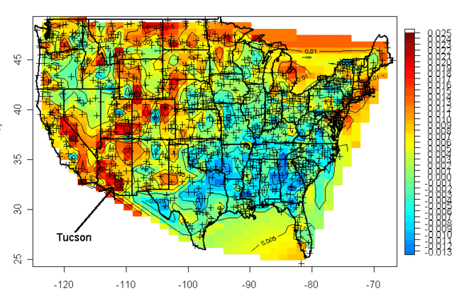
Years ago a guy named Steve McIntyre published a graphical portrayal of warming rates across the US. This is a common chart nowadays. Anyway, this chart (almost 10 years old) drew from temperature measurement stations whose locations are shows with the crosses on the map:
I was living in Arizona at the time and I was interested to learn that the highest warming rate was being recorded at the USHCN station in Tucson (remember, just because Arizona is hot is no reason to necessarily expect it to have high warming rates, they are two different things). At the time, Anthony Watt was just kicking off an initiative to develop quality control data for USHCN stations by having amateurs photograph the sites and upload them to a central data base. I decided I would go down to the Tucson site to experience the highest warming rate myself. This is what I found when I tracked down the station, and took this picture (which has been reproduced all over the place at this point):
That is the temperature station, around that fenced in white box (the uproar over this picture eventually caused this location to be closed). It was in the middle of a parking lot in the middle of a major university in the middle of a growing city. 100 years ago this temperature station was in the countryside, in essentially the open desert - no paving, no buildings, no cars. So we are getting the highest warming rates in the country by comparing a temperature today in an asphalt parking lot in the middle of a city to a temperature a hundred years ago in the open desert.
The problem with this is what's called the urban heat island effect. Buildings and concrete absorb heat from the sun during the day, more than would typically be absorbed by raw land in its natural state. This heat is reradiated at night, causing nights to be warmer in cities than in the areas surrounding them. If you live in a city, you will likely hear weather reports that predict colder temperatures in outlying areas, or warn of freezes in the countryside but not in the city itself.
It turns out that this urban heat island effect is easily measured -- it even makes a great science fair project!
My son and I did this project years ago, attaching a small GPS and temperature probe to a car. We then drove out of the city center into the country and back in the early evening, when the urban heat island effect should be largest. We drove out and then back to average out any effects of overall cooling during our testing. One of the trips is shown above, with around 6 degrees F of temperature change. We, and most others who have done this in other cities, found between 5 and 10 degrees of warming as one drives into a city at night.
If this effect were constant over time, it would not pose too many problems for our purposes here, because we are looking at changes in average temperatures over time, not absolute values. But the urban heat island warming of a city (and particular temperature stations) increases as the urban area grows larger. Because this urban warming is many times the global warming signal we are trying to measure, and since most temperature stations are located near growing urban locations, it introduces an important potential bias into measurement.
A number of studies have found that, in fact, we do indeed see more warming historically in thermometers located in urban areas than in those located in rural areas. Two studies in California have shown much lower warming rates at rural thermometers than at urban ones:
Anthony Watt has been working for years to do this same analysis for the entire US. In fact, the pictures taken above of the temperature station in Tucson were part of the first phase of his project to document each USHCN site used in the global warming statistics with pictures. Once he had pictures, he compared the details of the siting with a classification system scientists use to measure the quality of a temperature sites, from the best (class 1) to the worst with the most biases (class 5). He found that perhaps a third of the warming in the official NOAA numbers may come from the introduction of siting biases from bad sites. Or put another way, the warming at well-sited temperature stations was only about 2/3 in the official metric.
By the way, this is one other reason why I tend to favor the satellite measurements. Going back to the numbers we showed in part A, the satellite temperature metric had about 2/3 the trend of the surface temperature reading, or almost exactly what the surface readings would be if this siting bias were eliminated (the absolute values of the trends don't match, because they are for different time periods and different geographies).
There is one other aspect of this chart that might have caught your eye -- if some temperature stations are showing 2 degrees of warming and some 3.2 degrees of warming, why is the total 3.2 degrees of warming. Shouldn't it be somewhere in the middle?
One explanation is that the NOAA and other bodies take the data from these stations and perform a number of data manipulation steps in addition to a straight spatial averaging. One such step is that they will use a computer process to try to correct temperature stations based on the values from neighboring stations. The folks that run these indices argue that this computational process overcomes the site bias problem. Skeptics will argue that this approach is utter madness -- why work to correct a known bad temperature point, why not just eliminate it? If you have a good compass and a bad compass, you don't somehow mathematically average the results to find north, you throw out the bad one and use the good one. In short, skeptics argue that this approach does not eliminate the error, it just spreads the error around to all the good stations, smearing the error like peanut butter. Here is an example from the GISS, using station data that has only been adjusted for Time of Observation changes (TOBS).
This is exactly what we might expect - little warming out in undeveloped nature in Grand Canyon National Park, lots of warming in a large and rapidly growing modern city (yes, the Tucson data is from our favorite temperature station we featured above). Now, here is the same data after the GISS has adjusted it:
You can see that Tucson has been adjusted down a degree or two, but Grand Canyon has been adjusted up a degree or two (with the earlier mid-century spike adjusted down). OK, so it makes sense that Tucson has been adjusted down, though there is a very good argument to be made that it should be been adjusted down more, say by at least 3 degrees. But why does the Grand Canyon need to be adjusted up by about a degree and a half? What is currently biasing it colder by 1.5 degrees, which is a lot? One suspects the GISS is doing some sort of averaging, which is bringing the Grand Canyon and Tucson from each end closer to a mean -- they are not eliminating the urban bias from Tucson, they are just spreading it around to other stations in the region.
Temperature Adjustments and Signal-To-Noise Ratio
Nothing is less productive, to my mind, than when skeptics yell the word "fraud!" on the issue of temperature adjustments. All temperature databases include manual adjustments, even the satellite indices that many skeptics favor. As mentioned above, satellite measurements have to be adjusted for orbital decay of the satellites just as surface temperature measurements have to be adjusted for changes in the daily time of observation. We may argue that adjustment methodologies are wrong (as we did above with urban biases). We may argue that there are serious confirmation biases (nearly every single adjustment to every temperature and sea level and ocean heat database tends to cool the past and warm the present, perhaps reinforced by preconceived notions that we should be seeing a warming signal.) But I find that charges of fraud just cheapen the debate.
Even if the adjustments are all made the the best of intentions, we are still left with an enormous problem of signal to noise ratio. It turns out that the signal we are trying to measure -- warming over time -- is roughly equal to the magnitude of the manual adjustments. In other words, the raw temperature data does not show warming, only the manually adjusted data show warming. This does not mean the adjusted data is wrong, but it should make us substantially less confident that we are truly measuring the signal in all this noise of adjustment. Here are two examples, for an individual temperature station and for the entire database as a whole:
In this first example, we show the raw data (with Time of Observation adjustments only) in orange, and the final official adjusted version in blue. The adjustments triple the warming rate for the last century.
We can see something similar for the whole US, as raw temperature measurements (this time before time of observation adjustments) actually shows a declining temperature trend in the US. In this case, the entirety of the global warming signal, and more, comes from the manual adjustments. Do these adjustments (literally thousands and thousands of them) make sense when taken in whole? Does it make sense that there was some sort of warming bias in the 1920's that does not exist today? This is certainly an odd conclusion given that it implies a bias exactly opposite of the urban heat island effect.
We could go into much more detail, but this gives one an idea of why skeptics prefer the satellite measurements to the surface temperature record. Rather than endlessly working to try to get these public agencies to release their adjustment details and methodology for third party validation to the public that pays them (an ongoing task that still has not been entirely successful), skeptics have simply moved on to a better approach where the adjustments (to a few satellites) are much easier to manage.
Ultimately, both approaches for seeking a global warming signal are a bit daft. Why? Because, according to the IPCC, of all the extra warming absorbed by the surface of the Earth from the greenhouse effect, only about 1% goes into the atmosphere:
Basically, water has a MUCH higher heat carrying capacity than air, and over 90% of any warming should be going into oceans. We are just starting to get some new tools for measuring the changes to ocean heat content, though the task is hard because we are talking about changes in the thousandths of a degree in the deep oceans.
After this brief digression into the surface temperature records, it is now time to get back to our main line of discussion. In the next chapter, we will begin to address the all-important attribution question: Of the warming we have seen in the past, how much is man-made?