Even an Influential Chart Can Be A Graphics Fail
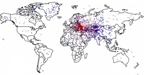
Presumably most of you have seen this chart frm a study that says that not only do Americans not know where the Ukraine is, but that desire for US intervention there is correlated with such knowledge or lack thereof (the less people understand where it is, the more they support intervention).

I find the study results both depressing and unsurprising, so I won't comment on them per se. Though I suppose if you confuse the Ukraine with the Yukon (as a number of respondents seem to), interventionism might make more sense. My only question is: where were such studies of domain knowledge vs. policy recommendations in the health care or minimum wage debate?
However much impact this chart has had, though, it is still a graphics fail in my mind. Why? Because the author attempts to portray a second variable by the dot color. But the variable he or she chooses to portray is the distance of the point from the correct location (red being more correct, blue less). But that is easy to see without the variation in color. It is redundant information.
A much better chart would have been to color code each dot with that respondent's Ukraine prescription, from blue = intervention to red = non-intervention. This way the chart would have supported the full findings of the study (link between geographical knowledge and policy prescription) rather than just one aspect (quality of geographic knowledge).
Update: If so many people got the Ukraine and the Yukon confused, God help us if the next Russian crisis is in Georgia.