Posts tagged ‘MA’

Why Global Warming Does Not Necessarily Translate to Daily High Temperature Records

Most folks assume that global warming results in record high daily temperatures, but this is not necessarily the case.  When your local news station blames a high temperature record on global warming, they may be wrong for two reasons.

  1.  Most of the temperature stations used by your local news channels for weather are full of urban heat island biases.  This is particularly true of the airport temperature that many local news stations use as their official reading (though to be fair UHI has much more effect on evening temperatures than temperatures at the daily high).
  2.  Most global warming, at least in the US where we have some of the best records, does not occur during the day -- it occurs at night

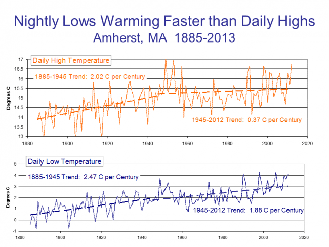
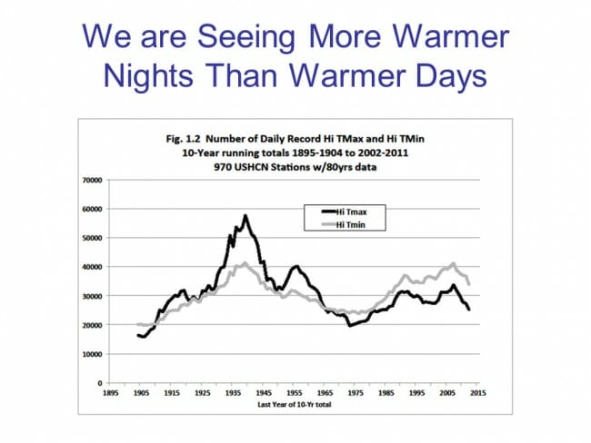
The latter point is surprising to most folks, but as a result we are not seeing an unusual number of daily high temperature records set (many were set in the 1930s and still stand).  What we are seeing instead is a large number of record high low temperature readings.  This is confusing, but basically it means that the lowest temperature that is reached at nighttime is higher than it has been in the past.  The chart below is a bit dated but still holds:

When I give presentations I try to use examples from local data.  Here is the comparison of night time warming vs. day time warming in Amherst, MA.

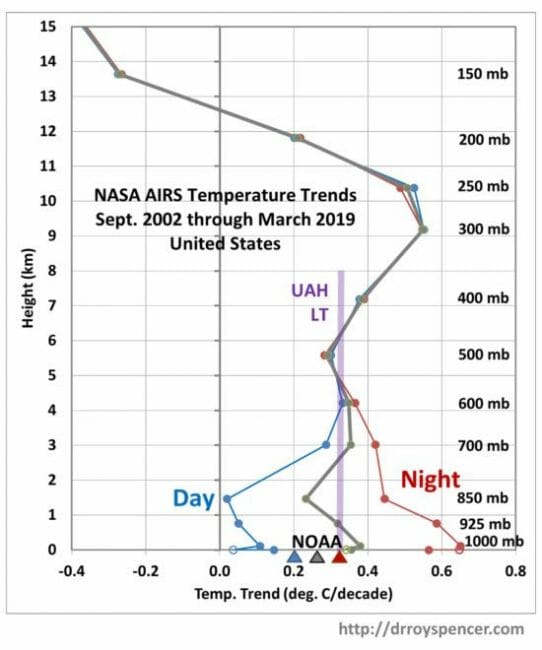
I bring this all up again because Dr. Roy Spencer has done a similar analysis for the US from the relatively new AIRS database (a satellite-based data set that avoids some of the problems of land thermometer data sets like urban heat island biases and geographic coverage gaps).  He shows this same finding, that over 80% of the warming we have seen recently in the US is at night.

This is a bit over-complicated because it is looking at temperatures through different heights of the atmosphere when most of you only care about the surface.  But you can just look at the 0 height line to see the surface warming trend.  Note that in general the data is pretty consistent with the UAH lower-troposphere temperature (satellite) and the NOAA metric (ground thermometers).

No particular point except to highlight something that is poorly understood by most folks because the media never talks about it.


LMAO -- My Kid Learns About the Cold

My Arizona-raised, thin-blooded son was convinced that he had no problem with cold weather when he departed for Amherst College several years ago.  That, of course, was based on exposure to cold via a couple of ski trips.  What he likely underestimated was the impact of cold that lasts for like 6 freaking months.

So it was with good-natured parental fondness for my child that I was LMAO when I read this:

Amherst, MA has coldest February in recorded history.  or here if you hit a paywall.

The average temperature in Amherst in the past month was 11.2 degrees, the lowest average monthly temperature since records were first kept in town in 1835. It broke the previous record of 11.6 degrees set in 1934, according to Michael A. Rawlins, an assistant professor in the department of geosciences and manager of the Climate System Research Center at the University of Massachusetts.

As it turns out, I have made a climate presentation in Amherst so I actually have historic temperature charts.  It is a good example of two things:

  1. While Amherst has been warming, it was warming as much or more before 1940 (or before the era of substantial CO2 emissions) as much as after
  2. Much of the recent warming has manifested as increases in daily minimum temperatures, rather in an increase in daily maximum temperatures.  This is as predicted by warming models, but poorly communicated and understood.  Possibly because fewer people would be bent out of shape if they knew that warming translated into warmer nights rather than higher highs in the daytime.

click to enlarge

Reconciling Seemingly Contradictory Climate Claims

At Real Science, Steven Goddard claims this is the coolest summer on record in the US.

The NOAA reports that both May and June were the hottest on record.

It used to be the the media would reconcile such claims and one might learn something interesting from that reconciliation, but now all we have are mostly-crappy fact checks with Pinocchio counts.  Both these claims have truth on their side, though the NOAA report is more comprehensively correct.  Still, we can learn something by putting these analyses in context and by reconciling them.

The NOAA temperature data for the globe does indeed show May and June as the hottest on record.  However, one should note a couple of things

  • The two monthly records do not change the trend over the last 10-15 years, which has basically been flat.  We are hitting records because we are sitting on a plateau that is higher than the rest of the last century (at least in the NOAA data).  It only takes small positive excursions to reach all-time highs
  • There are a number of different temperature data bases that measure the temperature in different ways (e.g. satellite vs. ground stations) and then adjust those raw readings using different methodologies.  While the NOAA data base is showing all time highs, other data bases, such as satellite-based ones, are not.
  • The NOAA database has been criticized for manual adjustments to temperatures in the past which increase the warming trend.  Without these adjustments, temperatures during certain parts of the 1930's (think: Dust Bowl) would be higher than today.  This was discussed here in more depth.  As is usual when looking at such things, some of these adjustments are absolutely appropriate and some can be questioned.  However, blaming the whole of the warming signal on such adjustments is just wrong -- satellite data bases which have no similar adjustment issues have shown warming, at least between 1979 and 1999.

The Time article linked above illustrated the story of these record months with a video partially on wildfires.  This is a great example of how temperatures are indeed rising but media stories about knock-on effects, such as hurricanes and fires, can be full of it.  2014 has actually been a low fire year so far in the US.

So the world is undeniably on the warm side of average (I won't way warmer than normal because what is "normal"?)  So how does Goddard get this as the coolest summer on record for the US?

Well, the first answer, and it is an important one to remember, is that US temperatures do not have to follow global temperatures, at least not tightly.  While the world warmed 0.5-0.7 degrees C from 1979-1999, the US temperatures moved much less.  Other times, the US has warmed or cooled more than the world has.  The US is well under 5% of the world's surface area.  It is certainly possible to have isolated effects in such an area.  Remember the same holds true the other way -- heat waves in one part of the world don't necessarily mean the world is warming.

But we can also learn something that is seldom discussed in the media by looking at Goddard's chart:

click to enlarge

First, I will say that I am skeptical of any chart that uses "all USHCN" stations because the number of stations and their locations change so much.  At some level this is an apples to oranges comparison -- I would be much more comfortable to see a chart that looks at only USHCN stations with, say, at least 80 years of continuous data.  In other words, this chart may be an artifact of the mess that is the USHCN database.

However, it is possible that this is correct even with a better data set and against a backdrop of warming temperatures.  Why?  Because this is a metric of high temperatures.  It looks at the number of times a data station reads a high temperature over 90F.  At some level this is a clever chart, because it takes advantage of a misconception most people, including most people in the media have -- that global warming plays out in higher daytime high temperatures.

But in fact this does not appear to be the case.  Most of the warming we have seen over the last 50 years has manifested itself as higher nighttime lows and higher winter temperatures.  Both of these raise the average, but neither will change Goddard's metric of days above 90F.  So it is perfectly possible Goddard's chart is right even if the US is seeing a warming trend over the same period.  Which is why we have not seen any more local all-time daily high temperature records set recently than in past decades.  But we have seen a lot of new records for high low temperature, if that term makes sense.  Also, this explains why the ratio of daily high records to daily low records has risen -- not necessarily because there are a lot of new high records, but because we are setting fewer low records.  We can argue about daytime temperatures but nighttime temperatures are certainly warmer.

This chart shows an example with low and high temperatures over time at Amherst, MA  (chosen at random because I was speaking there).  Note that recently, most warming has been at night, rather than in daily highs.

On The Steven Goddard Claim of "Fabricated" Temperature Data

Steven Goddard of the Real Science blog has a study that claims that US real temperature data is being replaced by fabricated data.  Christopher Booker has a sympathetic overview of the claims.

I believe that there is both wheat and chaff in this claim, and I would like to try to separate the two as best I can.  I don't have time to write a well-organized article, so here is just a list of thoughts

  1. At some level it is surprising that this is suddenly news.  Skeptics have criticized the adjustments in the surface temperature database for years
  2. There is certainly a signal to noise ratio issue here that mainstream climate scientists have always seemed insufficiently concerned about.  Specifically, the raw data for US temperatures is mostly flat, such that the manual adjustments to the temperature data set are about equal in magnitude to the total warming signal.  When the entire signal one is trying to measure is equal to the manual adjustments one is making to measurements, it probably makes sense to put a LOT of scrutiny on the adjustments.  (This is a post from 7 years ago discussing these adjustments.  Note that these adjustments are less than current ones in the data base as they have been increased, though I cannot find a similar chart any more from the NOAA discussing the adjustments)
  3. The NOAA HAS made adjustments to US temperature data over the last few years that has increased the apparent warming trend.  These changes in adjustments have not been well-explained.  In fact, they have not really be explained at all, and have only been detected by skeptics who happened to archive old NOAA charts and created comparisons like the one below.  Here is the before and after animation (pre-2000 NOAA US temperature history vs. post-2000).  History has been cooled and modern temperatures have been warmed from where they were being shown previously by the NOAA.  This does not mean the current version  is wrong, but since the entire US warming signal was effectively created by these changes, it is not unreasonable to act for a detailed reconciliation (particularly when those folks preparing the chart all believe that temperatures are going up, so would be predisposed to treating a flat temperature chart like the earlier version as wrong and in need of correction.
    1998changesannotated
  4. However, manual adjustments are not, as some skeptics seem to argue, wrong or biased in all cases.  There are real reasons for manual adjustments to data -- for example, if GPS signal data was not adjusted for relativistic effects, the position data would quickly get out of whack.  In the case of temperature data:
    • Data is adjusted for shifts in the start/end time for a day of measurement away from local midnight (ie if you average 24 hours starting and stopping at noon).  This is called Time of Observation or TOBS.  When I first encountered this, I was just sure it had to be BS.  For a month of data, you are only shifting the data set by 12 hours or about 1/60 of the month.  Fortunately for my self-respect, before I embarrassed myself I created a spreadsheet to monte carlo some temperature data and play around with this issue.  I convinced myself the Time of Observation adjustment is valid in theory, though I have no way to validate its magnitude  (one of the problems with all of these adjustments is that NOAA and other data authorities do not release the source code or raw data to show how they come up with these adjustments).   I do think it is valid in science to question a finding, even without proof that it is wrong, when the authors of the finding refuse to share replication data.  Steven Goddard, by the way, believes time of observation adjustments are exaggerated and do not follow NOAA's own specification.
    • Stations move over time.  A simple example is if it is on the roof of a building and that building is demolished, it has to move somewhere else.  In an extreme example the station might move to a new altitude or a slightly different micro-climate.  There are adjustments in the data base for these sort of changes.  Skeptics have occasionally challenged these, but I have no reason to believe that the authors are not using best efforts to correct for these effects (though again the authors of these adjustments bring criticism on themselves for not sharing replication data).
    • The technology the station uses for measurement changes (e.g. thermometers to electronic devices, one type of electronic device to another, etc.)   These measurement technologies sometimes have known biases.  Correcting for such biases is perfectly reasonable  (though a frustrated skeptic could argue that the government is diligent in correcting for new cooling biases but seldom corrects for warming biases, such as in the switch from bucket to water intake measurement of sea surface temperatures).
    • Even if the temperature station does not move, the location can degrade.  The clearest example is a measurement point that once was in the country but has been engulfed by development  (here is one example -- this at one time was the USHCN measurement point with the most warming since 1900, but it was located in an open field in 1900 and ended up in an asphalt parking lot in the middle of Tucson.)   Since urban heat islands can add as much as 10 degrees F to nighttime temperatures, this can create a warming signal over time that is related to a particular location, and not the climate as a whole.  The effect is undeniable -- my son easily measured it in a science fair project.  The effect it has on temperature measurement is hotly debated between warmists and skeptics.  Al Gore originally argued that there was no bias because all measurement points were in parks, which led Anthony Watts to pursue the surface station project where every USHCN station was photographed and documented.  The net results was that most of the sites were pretty poor.  Whatever the case, there is almost no correction in the official measurement numbers for urban heat island effects, and in fact last time I looked at it the adjustment went the other way, implying urban heat islands have become less of an issue since 1930.  The folks who put together the indexes argue that they have smoothing algorithms that find and remove these biases.  Skeptics argue that they just smear the bias around over multiple stations.  The debate continues.
  5. Overall, many mainstream skeptics believe that actual surface warming in the US and the world has been about half what is shown in traditional indices, an amount that is then exaggerated by poorly crafted adjustments and uncorrected heat island effects.  But note that almost no skeptic I know believes that the Earth has not actually warmed over the last 100 years.  Further, warming since about 1980 is hard to deny because we have a second, independent way to measure global temperatures in satellites.  These devices may have their own issues, but they are not subject to urban heat biases or location biases and further actually measure most of the Earth's surface, rather than just individual points that are sometimes scores or hundreds of miles apart.  This independent method of measurement has shown undoubted warming since 1979, though not since the late 1990's.
  6. As is usual in such debates, I find words like "fabrication", "lies",  and "myth" to be less than helpful.  People can be totally wrong, and refuse to confront their biases, without being evil or nefarious.

Postscript:  Not exactly on topic, but one thing that is never, ever mentioned in the press but is generally true about temperature trends -- almost all of the warming we have seen is in nighttime temperatures, rather than day time.  Here is an example from Amherst, MA (because I just presented up there).  This is one reason why, despite claims in the media, we are not hitting any more all time daytime highs than we would expect from a normal distribution.  If you look at temperature stations for which we have 80+ years of data, fewer than 10% of the 100-year highs were set in the last 10 years.  We are setting an unusual number of records for high low temperature, if that makes sense.

click to enlarge


Understanding "Mix": Is Flattening in Income Growth Due in Part to Geographic Cost of Living Differences and Migration Within the US?

For 20 years, before I liberated myself from corporate America, I spent a hell of a lot of time doing business and market analysis (e.g. why are profits declining in Division X).  I was pretty good at it.  If I had to boil down everything I learned in those years to one lesson, it would be this:  Pay attention to changes in the mix.

What do I mean by "changes in the mix"?  Here is an example.  A company has two products.  One has a 20% margin, and the other has a 30% margin, and both margins have been improving over time because of a series of cost reduction investments.  But overall, company margins are falling.  The likely reason:  the mix is shifting.  The company is selling a higher proportion of the lower margin product.

Here is a real world example:  When I was at AlliedSignal (now Honeywell) aviation, they had exactly this problem.  They were operating in a razor and blades business -- ie they practically gave the new parts away to Boeing and Airbus to put on their planes, because they made all their money selling aftermarket replacements at a premium (at the time, government rules made it almost impossible to buy anything but the original manufacturer's part, so they could charge almost anything for a replacement, especially given that an airline likely had a $50 million plane sitting dormant until the part was replaced).  I routinely would tell managers in the company that essentially our business made money from unreliability -- the less reliable our parts, the more money we made.  Because newer technology, competition, and pressure form airlines was forcing us to greatly improve our reliability (at the same time we were giving stuff to Boeing at ever greater losses), all our newer products on newer planes were less profitable than the old stuff.  As planes aged and dropped out of the fleet, our product mix was getting less and less profitable.

This same effect can be seen in many economic and political issues.  Take for example an argument my mother-in-law and I had years and years ago.  She said that Texas (where I was living at the time) had crap schools that were much worse that those in Massachusetts, her argument for the blue political model.  She observed that average educational outcomes were much better in MA than TX (which was and still is true).  I observed on the other hand that this was in part a result of mix.  Texas had better outcomes than MA when one looked at Hispanics alone, and better outcomes for non-Hispanics alone, but got killed on the mix given that Hispanics typically have lower educational outcomes than non-Hispanics everywhere in the US, and Texas had far more Hispanics than MA.

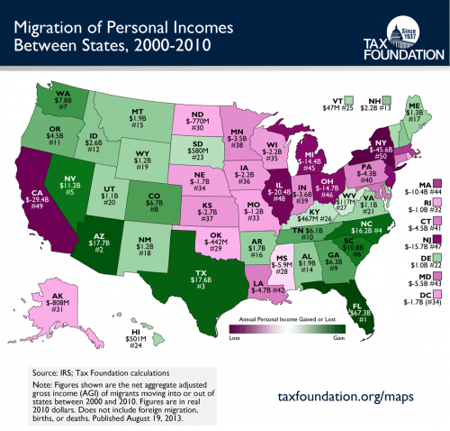
All of this is a long introduction to some thinking I have been doing on all the "Average is Over" discussion talking about the flattening of growth in median wages.  I begin with this chart:

click to enlarge


There is a lot of interstate migration going on.  And much of it seems to be out of what I think of as higher cost states like CA, IL, and NY and into lower cost states like AZ, TX, FL, and NC.  One of the facts of life about the CPI and other inflation adjustments of income numbers is that the US essentially maintains one average CPI.  Further, median income numbers and poverty numbers tend to assume one single average cost of living number.  But everyone understands that the income required to maintain lifestyle X on the east side of Manhattan is very different than the income required to maintain lifestyle X in Dallas or Knoxville or Jackson, MS.

Could it be that even with a flat average median wage, that demographic shifts to lower cost-of-living states actually result in individuals being better off and living better?

For some items one buys, of course, there is no improvement by moving.  For example, my guess is that an iPhone with a monthly service plan costs about the same anywhere you go in the US.  But if you take something like housing, the differences can be enormous.

Let's compare San Francisco and Houston.  At first glance, San Francisco seems far wealthier.  The median income in San Francisco is $78,840 while the median income in Houston in $55,910.  Moving from a median wage job in San Francisco to a media wage job in Houston seems to represent a huge step down.  If you and a bunch of your friends made this move, the US median income number would drop.  It would look like people were worse off.

But something else happens when you take this nominal pay cut to move to Houston.  You also can suddenly afford a much nicer, larger house, even at the lower nominal pay.  In San Francisco, your admittedly higher nominal pay would only afford you the ability to buy only 14% of the homes on the market.  And the median home, which you could not afford, has only about 1000 square feet of space.  In Houston, on the other hand, your lower nominal pay would allow you to buy 56% of the homes.  And that median home, which you can now afford, will have on average 1858 square feet of space.

So while the national median income numbers dropped when you moved to Houston, you actually can afford a much nicer home with perhaps twice as much space.  Thus, it strikes me that there are important things happening in the mix that are not being taken into account when we say that the "average is over".

Of course, while this effect is certainly real, I have no idea how much it affects the overall numbers, ie is it a small effect or a large effect.  Fortunately my son is studying economics in college.  If he ever goes to grad school, I will add this to my list of research suggestions for him.

Postscript:  This exact same discussion could apply to US poverty statistics.  We have one poverty line income number whether you live in Manhattan or Tuscaloosa.  I have always wondered how much poverty statistics would change if you created some kind of purchasing power parity test rather than a fixed income test.

Claiming to Find One Variable That Explains Absolutely Everything in a Complex System

Of late I have been seeing a lot of examples of people trying to claim that complex, even chaotic multi-variable systems are in fact driven by a single variable.  Whether it be CO2 in climate or government spending in Keynesian views of the economy, this over-simplification seems to be a hubris that is increasingly popular.

The worst example I believe I have ever seen of this was in the editorial page today in the Arizona Republic.  Titled Arizona vs. Massachusetts,  this article purports to blame everything from Arizona's higher number of drunk driving accidents to its higher number of rapes on ... the fact that Arizona has lower taxes.  I kid you not:

In the absence of discernible benefits, higher taxes are indeed a negative. We would all like to keep more of what we earn. That is, if there are not other negative consequences. So, it is reasonable to ask: What do Massachusetts citizens get for these increased public expenditures? A wide range of measures from widely disparate sources provide insight into the hidden costs of a single-minded obsession with lower taxes at all costs.

The results of such an investigation are revealing: Overall, Massachusetts residents earn significantly higher salaries and are less likely to be unemployed than those who live in Arizona. Their homes are less likely to be foreclosed on. Their residents are healthier and are better educated, have a lower risk of being murdered, getting killed in a car accident or getting shot by a firearm than are Arizonans. Perhaps these factors explain the lower suicide rate in Massachusetts than in Arizona as well as the longer life spans.

None of this supposed causation is based on the smallest scrap of evidence, other than the spurious correlation that Arizona has lower taxes at the same time it has more of the bad things the authors don't like.  The authors do not even attempt to explain why, out of the thousands of variables that might have an impact on these disparities, that taxation levels are the key driver, or are even relevant.

Perhaps most importantly, the authors somehow fail to even mention the word demographics.  Now, readers know that I am not very happy with Arizona Conservatives that lament the loss here of the Anglo-Saxon mono-culture.   I think immigration is healthy, and find some of the unique cultures in the state, such as on the large tribal reservations, to make the state more interesting.

However, it is undeniable that these demographic differences create wildly different cultures between Arizona and Massachusetts, and that these differences have an enormous impact on the outcomes the authors describe.  For example, given the large number of new immigrants in this state, many of whom come here poor and unable to speak English, one would expect our state to lag in economic averages and education outcomes when compared to a state populated by daughters of the revolution and the kids of college professors (see immigration data at end of post).  This is made worse by the fact that idiotic US immigration law forces many of these immigrants underground, as it is far harder to earn a good income, get an education, or have access to health care when one does not have legal status.  (This is indeed one area AZ is demonstrably worse than MA, with our Joe-Arpaio-type fixation on harassing illegal immigrants).

By the way, it turns out Arizona actually does pretty well with Hispanic students vs. Massachusetts  -- our high school graduation rate for Hispanics is actually 10 points higher than in MA (our graduation rate for blacks is higher too).  But since both numbers are so far below white students, the heavy mix of Hispanic students brings down Arizona's total average vs. MA.   If you don't understand this issue of how one state can do better than another on many demographic categories but still do worse on average because of a more difficult demographic mix, then you shouldn't be writing on this topic.

Further, the large swaths of this state that are part of various Indian nations complicate the picture.  AZ has by far the largest area under the management of tribal nations in the country -- in fact, almost half the tribal land in the country is in this one state.  These tribal areas typically add a lot of poverty, poor education outcomes, and health issues to the Arizona numbers.  Further, they are plagued with a number of tragic social problems, including alcoholism (with resulting high levels of traffic fatalities) and suicide.  But its unclear how much these are a result of Arizona state policy.   These tribal governments are their own nations with their own laws and social welfare systems, and in general fall under the purview of Federal rather than state authority.  The very real issues faced by their populations have a lot of historical causes that have exactly nothing to do with current AZ state tax policy.

The article engages in a popular sort of pseudo-science.  It drops in a lot of numbers, leaving the impression that the authors have done careful research.  In fact, I count over 50 numbers in the short piece.  The point is to dazzle the typical cognitively-challenged reader into thinking the piece is very scientific, so that its conclusions must be accepted.  But when one shakes off the awe over the statistical density, one realizes that not one of the numbers are relevant to their hypothesis: that the way Arizona runs its government is the driver of these outcome differences.

It's really not even worth going through the rest of this article in detail.  You know the authors are not even trying to be fair when they introduce things like foreclosure rates, which have about zero correlation with taxes or red/blue state models.  I lament all the negative statistics the authors cite, but it is simply insane to somehow equate these differences with the size and intrusiveness of the state.  Certainly I aspire to more intelligent government out of my state, which at times is plagued by yahoos focusing on silly social conservative bugaboos.  I am open to learning from the laboratory of 50 states we have, and hope, for example, that Arizona will start addressing its incarceration problem by decriminalizing drugs as has begun in other states.

The authors did convince me of one thing -- our state university system cannot be very good if it hires professors with this sort of analytical sloppiness.  Which is why I am glad I sent my son to college in Massachusetts.

PS- If the authors really wanted an apples to apples comparison that at least tried to find states somewhat more demographically similar to Arizona, they could have tried comparing AZ to California and Texas.  I would love for them to explain how well the blue state tax heavy model is working in CA.  After all, they tax even more than MA, so things must be even better there, right?  I do think that other states like Texas are better at implementing aspects of the red-state model and do better with education for example.  You won't get any argument from me that the public schools here are not great (though I work with several Charter schools which are fabulous).  For some reason, people in AZ, including upper middle class white families, are less passionate on average about education than folks in other states I have lived.  I am not sure why, but this cultural element is not necessarily fixable by higher taxes.

Update- MA supporters will argue, correctly, that they get a lot of immigration as well.  In fact, numerically, they get about the same number of immigrants as AZ.  But the nature of this immigration is totally different.  MA gets legal immigrants who are highly educated and who come over on corporate or university-sponsored visa programs.  Arizona gets a large number of illegal immigrants who get across the border with a suitcase and no English skills.  The per-person median household income for MA immigrants in 2010 was $16,682 (source).  The per-person median household income for AZ immigrants was $9,716.  35.3% of AZ immigrants did not finish high school, while only 15.4% of MA immigrants have less than a high school degree.  48% of AZ immigrants are estimated to be illegal, while only 19% of those in MA are illegal.  11% of Arizonans self-report that they speak English not at all, vs. just 6.7% for MA (source).
Solar False Advertising

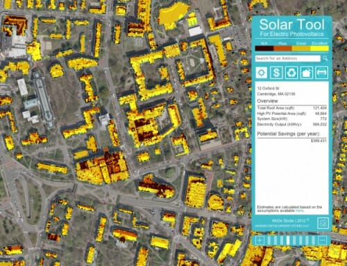
I saw this at Flowing Data -- this is apparently a chart prepared by some sustainability group at MIT to map solar potential of different sites in Cambridge, MA

Look at all the sites marked "excellent".  I have news for the brilliant folks at MIT.  Even the best, flattest roof facing south in Cambridge, MA still rates a "sucks" for solar potential. (source)

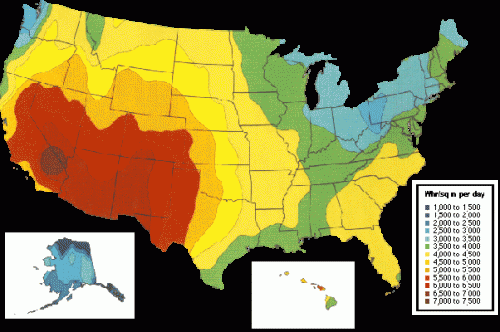
Even with massive state and Federal subsidies, those of us who live in the bright red areas find that roof-top solar PV is still an - at best - marginal investment with very long payback times.  We all hope to change this in the future, but there is no way a city like Cambridge with approximately half the solar insolation we get in AZ is going to have "excellent" roof top solar PV sites.

Get Bob Cratchitt to Do It

The Town of South Attleboro, MA sent out wildly threatening past due letters for folks with balances as low as 1-cent  (thereby investing at least 42 cents to get one back).  In response to charges that this was stupid, City Collector Debora Marcoccio responded:

A computer automatically printed the letters for any account with a balance remaining, and they were not reviewed by staff before being sent out, Marcoccio said.

"It would be fiscally irresponsible for me to have staff weed through the bills and pull out any below a certain amount," Marcoccio said. " And what would that amount be?"

What, are we living in the 19th century with clerks in a musty room preparing bills by hand?  This fix probably requires one whole entire line of program code in the billing system to fix.  I could probably teach myself to code whatever language the payroll system is written in (my guess is COBOL, which, god help me, I already know) in less time than this woman has spent fielding complaints and media inquiries.  Compare this to what TJIC has to do just to get the mail out.

And don't you love people who don't even have enough spine to make a simple decision about the cutoff for minimum bill size.  I have found this is one of those things the government is really, really bad at -- making decisions under uncertainty  (which covers about all decisions, except routine ones embodied in SOP).  Government has no incentives, in general, for productivity, or production, or customer satisfaction.  The only time government employees get feedback at all is when they get negative feedback from having someone yell at them for making a decision that some higher-up didn't like..  So if a decision is not justifiable either by past precedent/SOP or explicitly by the rules, it is not made.

By the way, I had a personal programming milestone last night.  I finally built a website without using a WYSIWIG editor that formatted the way I wanted it to all in CSS without a single table.  I predict that now that I have finally gotten a decent handle on CSS, which mainly consists of learning all the workarounds for when it doesn't work as you would expect, that someone is about to introduce a whole new system for formatting web pages.

Is There a Zero-Cost Regulatory Solution to Energy Efficiency?

A while back, I criticized a story in the NY Times, as quoted by Kevin Drum, that said that California had among the lowest per capita electricity usage of any state (true) and that this was because of the intelligent regulation regime in the state (yes, but not the way they meant).  The implication of Drum's argument was that there was some sort of efficiency ideal that a smart group of technocrats could reach at limited cost to the state (false). Specifically, Drum argued:

Anyway, it's a good article, and goes to show the kinds of things we
could be doing nationwide if conservative politicians could put their
Chicken Little campaign contributors on hold for a few minutes and take
a look at how it's possible to cut energy use dramatically "” and reduce
our dependence on foreign suppliers "” without ruining the economy. The
energy industry might not like the idea, but the rest of us would.

My response, in part, was this:

Well, here are the eight states in the data set above that the
California CEC shows as having the lowest per capita electricity use:
CA, RI, NY, HI, NH, AK, VT, MA.  All right, now here are the eight
states from the same data set that have the highest electricity prices:  CA, RI, NY, HI, NH, AK, VT, MA.  Woah!  It's the exact same eight states!  The 8 states with the highest prices are the eight states with the lowest per capita consumption.
Unbelievable.  No way that could have an effect, huh?  It must be all
those green building codes in CA.  I suspect Drum is sort of right,
just not in the way he means.  Stupid regulation in each state drives
up prices, which in turn provides incentives for lower demand.  It
achieves the goal, I guess, but very inefficiently.  A straight tax
would be much more efficient.

As part of a presentation I am working on about global warming and proposed California CO2 abatement bill AB52, I had the occasion to do a bit more research.  All of my data is from the Energy Information Administration, whose page URLs keep changing and thus breaking my links but this index page to data seems to stay the same.

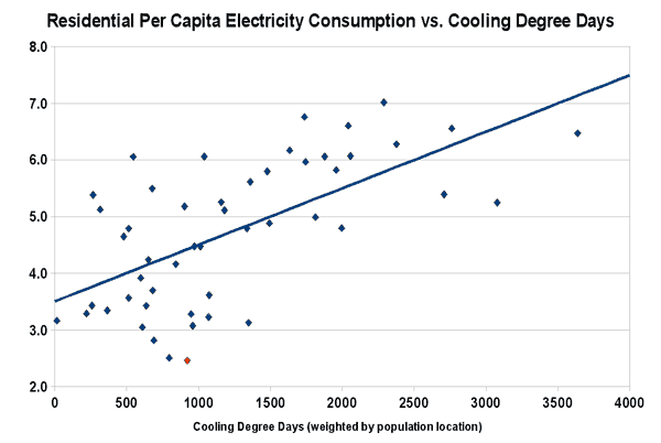
I found three factors that seem to be the main drivers of state electricity demand (which is measured in all of the charts below in thousands of kw-h per capita).  The first factor is climate, and certainly California has one of the milder climates.  The chart below looks at residential electricity demand vs. cooling degree days (weighted for population location).  Each data point is a state, with California is shown as the red data point:
Electricitybystatecdd

We get something similar for heating degree days, with electrical use going down as the climate gets milder, though not as good of a fit, which is not surprising since electricity is less important to heating than cooling.  Since California is well below the line, mild climate can be said to explain some of its lead on other states, but not all.

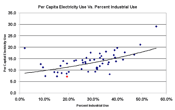
So I looked next at the percentage of electricity demand that goes to industry.  More heavily industrialized states will have a higher total per capita demand, because heavy industry chews up electricity that other types of businesses do not.  It turns out that California has a relatively low industrial use, which is not surprising given the regulatory environment there and the degree to which industry has been chased out of the state (one would have to be a madman to, all things considered, set up a new factory in California).  So here is the same type of chart of total electrical per capita use by state vs. the % industrial demand, again with each data point a state and California in red:
Electricitybystateindust

Again there is a pretty strong relationship, and again we see some but not all of California's low per capita consumption explained.  In effect, states on the left have exported their high-electricity-use industries to the states on the right (or to other countries).

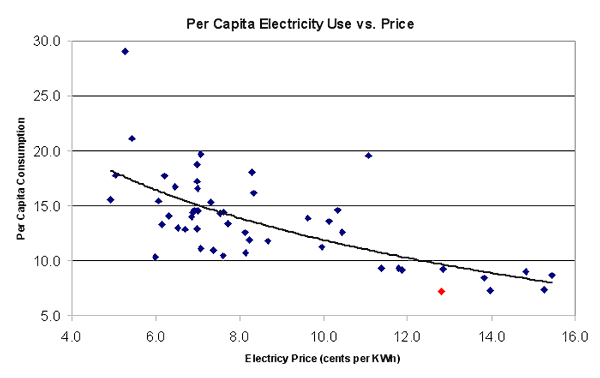
I have saved the most obvious relationship for last:  price.  It turns out unsurprisingly that the states with the highest electricity prices have the lowest per capital consumption:

Electricitybystateprice

Rolling climate, industrial intensity, and price together, these factors seem to explain at least 80% of California's efficiency lead over other states.  California government regulatory policy does indeed drive lower electrical consumption, just not exactly the way they would like you to think.  By chasing industries out of the state and raising electricity costs above those of almost every other state, California has reached a lower per capita consumption level.

California Energy Leadership: Leading the Race to the Bottom

California is apparently trumpeting its "leadership in energy."  The centerpiece of its claims is its low per capita electricity use.  Arnold is making the claim now, but Kevin Drum was pushing this a while back when he said:

Anyway, it's a good article, and goes to show the kinds of things we
could be doing nationwide if conservative politicians could put their
Chicken Little campaign contributors on hold for a few minutes and take
a look at how it's possible to cut energy use dramatically "” and reduce
our dependence on foreign suppliers "” without ruining the economy. The
energy industry might not like the idea, but the rest of us would.

Max Schulz of the Manhattan Institute is not impressed:

California's proud claim to have kept per-capita energy consumption
flat while growing its economy is less impressive than it seems. The
state has some of the highest energy prices in the country "“ nearly
twice the national average "“ largely because of regulations and
government mandates to use expensive renewable sources of power. As a
result, heavy manufacturing and other energy-intensive industries have
been fleeing the Golden State in droves.

Neither am I.  I addressed this issue a while back in response to Drum's post, but since the meme is going around again, I will excerpt from that old post.

The consumption data is from here.
You can see that there are three components that matter - residential,
commercial, and industrial.  Residential and commercial electricity
consumption may or may not be fairly apples to apples comparable
between states (more in a minute).  Industrial consumption, however, will not be comparable, since the mix of industries will change radically state by state.....

Take two of the higher states on the list.  Wyoming, at the top of
the per capita consumption list, has industrial electricity consumption
as a whopping 58% of total state consumption.  KY, also near the top,
has industrial consumption at 50% of total demand.  The US average is
industrial consumption at 29% of total demand.  CA, NY, and NJ, all
near the bottom of the list in terms of per capital demand, have
industrial use as 20.6%, 15.1%, and 16% respectively.  So rather than
try to correlate electricity consumption to local energy regulations,
it is clear that the per capita consumption numbers by state are a much
better indicator of the presence of heavy industry. In other
words, the graph Drum shows is actually a better illustration of the
success of CA not in necessarily becoming more efficient, but in
exporting its pollution to other states.
  No one in their
right mind would even attempt to build a heavy industrial plant in CA
in the last 30 years.  The graph is driven much more by the growth of
industrial electricity use outside CA relative to CA.

Now take the residential numbers.  Lets look again at the states at
the top of the per capita list:  Alabama, South Carolina, Louisiana,
Tennessee, Arkansas, Mississippi, Texas.  Can anyone tell me what these
states have in common?  They are hot and humid.  Yes, California has
its hot spots, but it has its mild spots too  (also, California hot
spots are dry, so they can use more energy efficient evaporative
cooling, something that does not work in the deep south).  These
southern states are hot all over in the summer.  So its
reasonable to assume that maybe, just maybe, some of these hot states
have higher residential per capita consumption because of air
conditioning load?
  In fact, if one recast this list as
residential use per capita, you would see a direct correlation to
summer air conditioning loads.   This table of cooling degree days weighted for population location is a really good proxy for how much air conditioning is needed by state.  (Explanation of cooling degree days).
You can see that states like Alabama and Texas have two to four times
the number of cooling degree days than California, which should
directly correlate to about that much more per capita air conditioning
(and thus electricity) use....

OK, now I have saved the most obvious fisking for last.  Because
even when you correct for these numbers, California is pretty efficient
vs. the average on electricity consumption.  Drum attributes this,
without evidence, to government action.  The NY Times basically does
the same, positing in effect that CA has more energy laws than any
other state and it has the lowest consumption so therefore they must be
correlated.  But of course, correlation is not equal to causation.
Could there be another effect out there?

Well, here are the eight states in the data set above that the
California CEC shows as having the lowest per capita electricity use:
CA, RI, NY, HI, NH, AK, VT, MA.  All right, now here are the eight
states from the same data set that have the highest electricity prices:  CA, RI, NY, HI, NH, AK, VT, MA.  Woah!  It's the exact same eight states!  The 8 states with the highest prices are the eight states with the lowest per capita consumption.
Unbelievable.  No way that could have an effect, huh?  It must be all
those green building codes in CA.  I suspect Drum is sort of right,
just not in the way he means.  Stupid regulation in each state drives
up prices, which in turn provides incentives for lower demand.  It
achieves the goal, I guess, but very inefficiently.  A straight tax
would be much more efficient.

Prepare to Waste Some Time

Via Hit and Run, this is an incredible site for stat-geeks to fool around.  Top 101 city lists.

#1 Average Sunshine!  I have also lived in the 4th least sunny city.  Sunnier is better.   Seattle is not among the rainiest in terms of total inches, because it never rains very hard.  If you could measure rainy as "number of hours per month that rain is falling", Seattle would be right up there.  In places like Houston, you get a lot more volume of rain, but you get a whole years worth in just a couple of hours.

Other interesting ones:

I just wish they had a better explanation of the metric and the data source for each