Archive for April 2016

Denying the Climate Catastrophe: 5b. Natural Attribution
This is part B of Chapter 5 of an ongoing series. Other parts of the series are here:
- Introduction
- Greenhouse Gas Theory
- Feedbacks
- A) Actual Temperature Data; B) Problems with the Surface Temperature Record
- Attribution of Past Warming: A) Arguments for it being Man-Made; B) Natural Attribution (this article)
- Climate Models vs. Actual Temperatures
- Are We Already Seeing Climate Change
- The Lukewarmer Middle Ground
- A Low-Cost Insurance Policy
In part A, we discussed the main line of argument for attributing past warming to man-made CO2. In essence, scientists have built computer models to simulate the climate (and global temperatures). When these models were unable to simulate the amount of warming that occurred in the two decades between 1978 and 1998 using only what they thought were the major natural climate drivers, scientists concluded that this warming could not have been natural and could only have happened if the climate has a high sensitivity to man-made CO2.
This argument only works, of course, if the climate models are actually a correct representation of the climate. And that can only be proven over time, by comparing climate model output to actual weather. Back in chapter 4A, we briefly discussed how actual temperatures are in fact not tracking very well with climate model predictions, which should throw a substantial amount of doubt on the current quality of climate models (though the media still tends to treat model predictions as authoritative).
In this section, we will focus on some of the natural factors that are missing from most climate models. Obviously, if important natural drivers have been left out of the models, then one cannot conclude from the inability of the models to match historical warming that the historical warming couldn't have been natural. After discussing some of these factors, I will take my owns swing at the attribution problem.
Long-term Climate Shifts
We will begin with long-term climate variations. These are most certainly left out of the models, because no one really understands why they occur (though theories abound, of course). Mann's hockey stick not-withstanding, the consensus picture of past climate continues to include a strong warming period in the Middle Ages and a cool period, called the Little Ice Age, in the 16th and 17th centuries.

Imagine you were a climate modeler in 1600. Your model would probably have under-predicted temperatures over the next 200 years, because you were trying to model starting at the bottom of a long-term cyclical trend. So clearly leaving this trend out in 1600 would get the wrong answer. Wouldn't leaving it out in the year 2000 also get the wrong answer? All too often scientists tend to assume (though not always explicitly) that this long-term natural recovery of temperatures ended around 1950, at the same time they believe man-made warming started. A metaphorical hand-off occurred from natural to man-made factors. But there is no evidence for this whatsoever. We don't know what caused the Little Ice Age, so we don't know how long it can last or when it ends.
Changes in the Sun
Since we have mentioned it, let's discuss the sun. The sun is the dynamo that, along with a few smaller effects like the rotation of the Earth, drives the climate. We have known for some time that the Sun experiences cycles of variation, and one of the ways one can observe this variation is by looking at sunspots. We have more sophisticated ways of measuring the sun today, but we still count the spots.

Sunspots are cyclical in nature, and follow an eleven or so year cycle (you can see this in the spikes in the monthly light blue data above). But when one take this cycle out of the picture, as was done with the 10.8 year moving average above, there also appears to be longer cyclical trends. Since it is generally thought that more sunspots correlate with higher solar activity and output, one might expect that there could be some correlation between this solar trend and temperatures. As we can see above, by the sunspot metric the sun was more active in the second half of the last century than in the first half.
Today, we don't have to relay on just the spots, we can look at the actual energy output of the sun. And it turns out that the types of variations we have seen over recent decades in sunspots do not translate to very large changes in solar output on a percentage basis. Yes, there is more solar output but the extra amount is small, too small to explain much temperature variation. There is, though, an emerging new theory that a complex interaction of the sun with cosmic rays may affect cloud formation, acting as a multiplier effect on changes in solar output. A lot of skeptics, eager to support the natural causation argument, jumped on this theory. However, though the theory is intriguing and could turn out to be correct, I think folks are getting well ahead of the evidence in giving it too much credence at this point.
Ocean Cycles
At the end of the day, while solar variation may explain very long-cycle climate variations, it does not do much to explain our 1978-1998 warming period, so we will move on to another natural factor that does appear to have some explanatory power and which is also not in most climate models -- ocean cycles.
This is a complicated topic and I am far from an expert. In short: As mentioned in an earlier chapter, the oceans have far more heat carrying capacity than the atmosphere. It turns out that oceans have cycles, that are decades long, where they can exchange more or less heat with the atmosphere. In their "warm" periods, these cycles tend to leave more heat in the atmosphere, and in their "cold" periods they bury more heat in their depths. Once such cycle is called the Pacific Decadal Oscillation (PDO), which will be familiar to most Americans because "El Nino"and "La Nina" climate patterns are part of this PDO cycle. If one plots global temperatures against the PDO cycles, there is a good deal of correlation:

When the PDO has been in its warm phases (the red periods in the chart above), global temperatures rise. When it is in its cool phases (the blue zones), temperatures are flat to down. As you can see, the PDO was in a warm phase in our 1978-1998 period. Surely some of that steep rise in temperature may have come from the effect of this ocean cycle, yet this cycle was not included in the climate models that supposedly ruled out the possibility of natural causes for warming in this period.
A number of scientific studies have tried to remove these (and other) cyclical and event-based drivers from the historical temperature record. Here is one such attempt (ENSO and AMO are ocean cycles, large volcanoes tend to have a global cooling effect for a few years after their eruption)

With these natural effects removed, much of the cyclical variation from the Hadley CRUT4 data are gone, and we are left with a pretty constant linear trend. Aha! There is the warming signal, right? Well, yes, but there is a problem here for the effort to attribute most or all of this warming to man -- specifically, this is not at all the trend one would expect if the long-term trend were primarily from man-made CO2. Note the very linear trend starts around 1900, long before we began burning fossil fuels in earnest, and the trend is really quite flat, while man-made CO2 production has been growing exponentially. Supporters of man-made attribution are left in the uncomfortable position of arguing that there must have been natural warming until about 1950 which stopped just in time for man-made warming to take over.
My Attribution Solution
A number of years ago I decided to take a shot at the attribution problem, largely just for fun, but it turned out so well I still keep it up to date. I decided to assume just three factors: 1. A long term linear trend starting even before the 20th century, presumably natural; 2. A new added linear trend, presumably from man-made effects; and 3. A decadal cyclical factor, from things like ocean cycles. I let the optimization program control everything -- the slope of the linear trends, the amplitude and period of the cyclical factor, the start date of the second modern trend, etc, to get the best fit with historic temperatures. As before, I used monthly Hadley CRUT4 data.
This is what we ended up with. A 66-year sine wave:

Plus a long-term linear trend of 0.36C per century and a new linear trend beginning around 1950 that adds another 0.5C per century (for a total linear trend after 1950 of 0.86C per century).

The result was a pretty good fit 8 years ago and more importantly, still continues to be a good fit up to today (unlike much more complicated climate models)

Though the optimization was based on monthly data, you can see the fit even better if we add on a 5-year moving average to the chart:

That is, then, my solution to the attribution problem. Take the 0.5C per century since 1950 that this model has as a modern linear trend, and we will for argument sake attribute it all to man. From 1950-2016 (66 years, coincidentally my sin wave period) that is 0.33C of historic warming due to man-made CO2.
In the next chapter, we return to the climate forecasts we discussed in chapters 2 and 3 and ask ourselves whether these make sense in the context of past warming.
Chapter 6 on climate forecasts vs. actual temperatures is here.
Scared Away from Good Ideas by Their Anti-Rational Supporters
I look back on my original support for the war in Iraq and wonder how I made such a mistake. Part of it, I think, was getting sucked into a general nationalist enthusiasm that strikes me as similar in retrospect to the August madness at the start of WWI. But I also think I was scared away from the non-intervention position by the pathetic arguments and tactics adopted by some of the more prominent folks on the "peace" side of that debate. Ironically in college I experienced the flip side of this problem, often lamenting that the worst thing that could happen in any argument was to have someone incompetent try to jump in on my side.
I recall all of this because I was reading this post from Ken White where he is responding and giving advice to a student who was the subject of an earlier column. I really liked this bit:
We're in the middle of a modest conservative backlash and a resurgence of bigotry, both actual and arrested-adolescent-poseur. I believe a large part of this backlash results from the low quality of advocacy for progressive ideas. Much of that advocacy has become characterized by petulant whining and empty dogmatism. The message conveyed by too many of your generation is not that people should adopt progressive ideas because they are right or just, but that they should adopt them because that is what they are supposed to adopt because that is what right-thinking people adopt. That is irritating and ineffectual. Faced with an idea, I don't expect your generation to confront it. I don't expect you to explain how it's wrong, and win hearts and minds that your ideas are better. Rather, I expect you to assert that you should be protected from being exposed to the idea in the first place. That's disappointing and doesn't bode well for the success of progressive ideas (many of which I admire) in society. In short: if this is how you're going to fight for what you think is right, you're going to lose. Do better.
I find this election particularly depressing -- not just because the candidates are so disappointing (that has happened many times before) -- but because it has highlighted how large the anti-rational voter pool is, with both Sanders and Trump acting as attractors for them.
How True

from Mark Perry
Dear Bank of America: Stop Protecting Merchants Who Lose My Credit Card Data
Twice in the last week I have had Bank of American credit or debit cards that have had to be replaced due to (accord to BofA) data breaches at merchants. I (and I assume most others) find these episodes annoying, not the least because I can expect a month or so of warnings and notices from merchants, hosting companies, cable companies, etc that my automatic payment did not go through and I need to immediately tell them my new card number.
So in each case I asked Bank of America to tell me which merchant lost my credit card data. I don't think this is an unreasonable request -- if a merchant through some sort of data carelessness causes me a bunch of hassle, and endangers my financial privacy, I would like to know who it was so I can consider shifting my business to someone else. But Bank of America will not tell me. I think Target initiated a lot of reforms when they suffered through the public backlash from their data breach a while back -- while many merchants have their chip card readers turned off, you can bet they are not turned off at Target.
Wrapped Around the Axle
This is home repair day, so I am working from home while a variety of repair people show up (none of whom has yet shown up in their promised arrival time window).
Anyway, the A/C guy was here first and was diagnosing why my condenser didn't seem to be running. He found this on the cooling fan motor (dead):

Life in Arizona.
Fracking and Foreign Policy
I am happy to see prominent members of Congress from both parties starting to question our support of the deeply flawed government in Saudi Arabia. I don't want to make war on them (repeating the Lybia mistake) but I also have been leery for quite a while about supporting a country that funds so much terrorism and is frankly as socially backwards as any place in the world.
So here is my question: Had it not been for the shale oil and gas revolution in this country, would the US Congress be willing to question this relationship today?
Denying the Climate Catastrophe: 5a. Arguments For Attributing Past Warming to Man
This is part A of Chapter 5 of an ongoing series. Other parts of the series are here:
- Introduction
- Greenhouse Gas Theory
- Feedbacks
- A) Actual Temperature Data; B) Problems with the Surface Temperature Record
- Attribution of Past Warming: A) Arguments for it being Man-Made (this article); B) Natural Attribution
- Climate Models vs. Actual Temperatures
- Are We Already Seeing Climate Change
- The Lukewarmer Middle Ground
- A Low-Cost Insurance Policy
Having established that the Earth has warmed over the past century or so (though with some dispute over how much), we turn to the more interesting -- and certainly more difficult -- question of finding causes for past warming. Specifically, for the global warming debate, we would like to know how much of the warming was due to natural variations and how much was man-made. Obviously this is hard to do, because no one has two thermometers that show the temperature with and without man's influence.
I like to begin each chapter with the IPCC's official position, but this is a bit hard in this case because they use a lot of soft words rather than exact numbers. They don't say 0.5 of the 0.8C is due to man, or anything so specific. They use phrases like "much of the warming" to describe man's affect. However, it is safe to say that most advocates of catastrophic man-made global warming theory will claim that most or all of the last century's warming is due to man, and that is how we have put it in our framework below:

By the way, the "and more" is not a typo -- there are a number of folks who will argue that the world would have actually cooled without manmade CO2 and thus manmade CO2 has contributed more than the total measured warming. This actually turns out to be an important argument, since the totality of past warming is not enough to be consistent with high sensitivity, high feedback warming forecasts. But we will return to this in part C of this chapter.
Past, Mostly Abandoned Arguments for Attribution to Man
There have been and still are many different approaches to the attributions problem. In a moment, we will discuss the current preferred approach. However, it is worth reviewing two other approaches that have mostly been abandoned but which had a lot of currency in the media for some time, in part because both were in Al Gore's film An Inconvenient Truth.
Before we get into them, I want to take a step back and briefly discuss what is called paleo-climatology, which is essentially the study of past climate before the time when we had measurement instruments and systematic record-keeping for weather. Because we don't have direct measurements, say, of the temperature in the year 1352, scientists must look for some alternate measure, called a "proxy," that might be correlated with a certain climate variable and thus useful in estimating past climate metrics. For example, one might look at the width of tree rings, and hypothesize that varying widths in different years might correlate to temperature or precipitation in those years. Most proxies take advantage of such annual layering, as we have in tree rings.
One such methodology uses ice cores. Ice in certain places like Antarctica and Greenland is laid down in annual layers. By taking a core sample, characteristics of the ice can be measured at different layers and matched to approximate years. CO2 concentrations can actually be measured in air bubbles in the ice, and atmospheric temperatures at the time the ice was laid down can be estimated from certain oxygen isotope ratios in the ice. The result is that one can plot a chart going back hundreds of thousands of years that estimates atmospheric CO2 and temperature. Al Gore showed this chart in his movie, in a really cool presentation where the chart wrapped around three screens:

As Gore points out, this looks to be a smoking gun for attribution of temperature changes to CO2. From this chart, temperature and CO2 concentrations appear to be moving in lockstep. From this, CO2 doesn't seem to be a driver of temperatures, it seems to be THE driver, which is why Gore often called it the global thermostat.
But there turned out to be a problem, which is why this analysis no longer is treated as a smoking gun, at least for the attribution issue. Over time, scientists got better at taking finer and finer cuts of the ice cores, and what they found is that when they looked on a tighter scale, the temperature was rising (in the black spikes of the chart) on average 800 years before the CO2 levels (in red) rose.
This obviously throws a monkey wrench in the causality argument. Rising CO2 can hardly be the cause of rising temperatures if the CO2 levels are rising after temperatures.
It is now mostly thought that what this chart represents is the liberation of dissolved CO2 from oceans as temperatures rise. Oceans have a lot of dissolved CO2, and as the oceans get hotter, they will give up some of this CO2 to the atmosphere.
The second outdated attribution analysis we will discuss is perhaps the most famous: The Hockey Stick. Based on a research paper by Michael Mann when he was still a grad student, it was made famous in Al Gore's movie as well as numerous other press articles. It became the poster child, for a few years, of the global warming movement.
So what is it? Like the ice core chart, it is a proxy analysis attempting to reconstruct temperature history, in this case over the last 1000 years or so. Mann originally used tree rings, though in later versions he has added other proxies, such as from organic matter laid down in sediment layers.
Before the Mann hockey stick, scientists (and the IPCC) believed the temperature history of the last 1000 years looked something like this:

Generally accepted history had a warm period from about 1100-1300 called the Medieval Warm Period which was warmer than it is today, with a cold period in the 17th and 18th centuries called the "Little Ice Age". Temperature increases since the little ice age could in part be thought of as a recovery from this colder period. Strong anecdotal evidence existed from European sources supporting the existence of both the Medieval Warm Period and the Little Ice Age. For example, I have taken several history courses on the high Middle Ages and every single professor has described the warm period from 1100-1300 as creating a demographic boom which defined the era (yes, warmth was a good thing back then). In fact, many will point to the famines in the early 14th century that resulted from the end of this warm period as having weakened the population and set the stage for the Black Death.
However, this sort of natural variation before the age where man burned substantial amounts of fossil fuels created something of a problem for catastrophic man-made global warming theory. How does one convince the population of catastrophe if current warming is within the limits of natural variation? Doesn't this push the default attribution of warming towards natural factors and away from man?
The answer came from Michael Mann (now Dr. Mann but actually produced originally before he finished grad school). It has been dubbed the hockey stick for its shape:

The reconstructed temperatures are shown in blue, and gone are the Medieval Warm Period and the Little Ice Age, which Mann argued were local to Europe and not global phenomena. The story that emerged from this chart is that before industrialization, global temperatures were virtually flat, oscillating within a very narrow band of a few tenths of a degree. However, since 1900, something entirely new seems to be happening, breaking the historical pattern. From this chart, it looks like modern man has perhaps changed the climate. This shape, with the long flat historical trend and the sharp uptick at the end, is why it gets the name "hockey stick."
Oceans of ink and electrons have been spilled over the last 10+ years around the hockey stick, including a myriad of published books. In general, except for a few hard core paleoclimatologists and perhaps Dr. Mann himself, most folks have moved on from the hockey stick as a useful argument in the attribution debate. After all, even if the chart is correct, it provides only indirect evidence of the effect of man-made CO2.
Here are a few of the critiques:
- Note that the real visual impact of the hockey stick comes from the orange data on the far right -- the blue data alone doesn't form much of a hockey stick. But the orange data is from an entirely different source, in fact an entirely different measurement technology -- the blue data is from tree rings, and the orange is form thermometers. Dr. Mann bristles at the accusation that he "grafted" one data set onto the other, but by drawing the chart this way, that is exactly what he did, at least visually. Why does this matter? Well, we have to be very careful with inflections in data that occur exactly at the point that where we change measurement technologies -- we are left with the suspicion that the change in slope is due to differences in the measurement technology, rather than in the underlying phenomenon being measured.
- In fact, well after this chart was published, we discovered that Mann and other like Keith Briffa actually truncated the tree ring temperature reconstructions (the blue line) early. Note that the blue data ends around 1950. Why? Well, it turns out that many tree ring reconstructions showed temperatures declining after 1950. Does this mean that thermometers were wrong? No, but it does provide good evidence that the trees are not accurately following current temperature increases, and so probably did not accurately portray temperatures in the past.
- If one looks at the graphs of all of Mann's individual proxy series that are averaged into this chart, astonishingly few actually look like hockey sticks. So how do they average into one? McIntyre and McKitrick in 2005 showed that Mann used some highly unusual and unprecedented-to-all-but-himself statistical methods that could create hockey sticks out of thin air. The duo fed random data into Mann's algorithm and got hockey sticks.
- At the end of the day, most of the hockey stick (again due to Mann's averaging methods) was due to samples from just a handful of bristle-cone pine trees in one spot in California, trees whose growth is likely driven by a number of non-temperature factors like precipitation levels and atmospheric CO2 fertilization. Without these few trees, most of the hockey stick disappears. In later years he added in non-tree-ring series, but the results still often relied on just a few series, including the Tiljander sediments where Mann essentially flipped the data upside down to get the results he wanted. Taking out the bristlecone pines and the abused Tiljander series made the hockey stick go away again.
There have been plenty of other efforts at proxy series that continue to show the Medieval Warm Period and Little Ice Age as we know them from the historical record

As an aside, Mann's hockey stick was always problematic for supporters of catastrophic man-made global warming theory for another reason. The hockey stick implies that the world's temperatures are, in absence of man, almost dead-flat stable. But this is hardly consistent with the basic hypothesis, discussed earlier, that the climate is dominated by strong positive feedbacks that take small temperature variations and multiply them many times. If Mann's hockey stick is correct, it could also be taken as evidence against high climate sensitivities that are demanded by the catastrophe theory.
The Current Lead Argument for Attribution of Past Warming to Man
So we are still left wondering, how do climate scientists attribute past warming to man? Well, to begin, in doing so they tend to focus on the period after 1940, when large-scale fossil fuel combustion really began in earnest. Temperatures have risen since 1940, but in fact nearly all of this rise occurred in the 20 year period from 1978 to 1998:

To be fair, and better understand the thinking at the time, let's put ourselves in the shoes of scientists around the turn of the century and throw out what we know happened after that date. Scientists then would have been looking at this picture:

Sitting in the year 2000, the recent warming rate might have looked dire .. nearly 2C per century...

Or possibly worse if we were on an accelerating course...

Scientists began to develop a hypothesis that this temperature rise was occurring too rapidly to be natural, that it had to be at least partially man-made. I have always thought this a slightly odd conclusion, since the slope from this 20-year period looks almost identical to the slope centered around the 1930's, which was very unlikely to have much human influence.

But never-the-less, the hypothesis that the 1978-1998 temperature rise was too fast to be natural gained great currency. But how does one prove it?
What scientists did was to build computer models to simulate the climate. They then ran the computer models twice. The first time they ran them with only natural factors, or at least only the natural factors they knew about or were able to model (they left a lot out, but we will get to that in time). These models were not able to produce the 1978-1998 warming rates. Then, they re-ran the models with manmade CO2, and particularly with a high climate sensitivity to CO2 based on the high feedback assumptions we discussed in an earlier chapter. With these models, they were able to recreate the 1978-1998 temperature rise. As Dr. Richard Lindzen of MIT described the process:
What was done, was to take a large number of models that could not reasonably simulate known patterns of natural behavior (such as ENSO, the Pacific Decadal Oscillation, the Atlantic Multidecadal Oscillation), claim that such models nonetheless accurately depicted natural internal climate variability, and use the fact that these models could not replicate the warming episode from the mid seventies through the mid nineties, to argue that forcing was necessary and that the forcing must have been due to man.
Another way to put this argument is "we can't think of anything natural that could be causing this warming, so by default it must be man-made. With various increases in sophistication, this remains the lead argument in favor of attribution of past warming to man.
In part B of this chapter, we will discuss what natural factors were left out of these models, and I will take my own shot at a simple attribution analysis.
The next section, Chapter 6 Part B, on natural attribution is here
Why Wind and Solar Are Not Currently the Answer on Emissions Reductions
I have made this point forever, but it always bears repeating -- the variability of wind and solar require hot fossil fuel backups that leads to little reduction in total fossil fuel generation capacity (so that wind and solar investments are entirely duplicative) and less-than-expected reductions in actual emissions.
I don't think wind will ever be viable, except perhaps in a few unique offshore locations. Solar is potentially viable with a 10x or so reduction in panel costs and a 10-100x reduction in battery/energy storage costs. I honestly think that day will come, but we are not there.
From the Unbroken Window comes this slide from an interesting presentation at the Ontario Society of Professional Engineers, essentially making the same points I and others have been trying to make for years.

I made the point about nuclear in my climate legislative proposal here.
Sometimes, It Pays to be A Total Geek. And Some Advice for Android Owners
So a while back, I was playing around with mirroring my android phone screen on my PC, really for no good reason. But to do so, and really to do a lot of PC control tasks on an android, USB debugging mode needs to be turned on. So I did that. And then after playing around with it, forgot about it for months.
Then, last night I dropped my phone and lost the screen functions. The phone functions and digitizer are just fine, but the screen is black. Thanks to the cloud, I have backups of all photos, email, calendar, contacts and such. (Android has a better cloud approach than Apple on photos, mail, and calendar but an inferior approach on apps, messages, and general settings).
I wanted to get into the phone to wipe the memory. How if the screen is black? Aha! I could mirror the phone screen onto my PC. Which I did and I got everything accomplished. It would have been impossible to do this, though, if I had not previously set USB debugging mode on, as that requires a bunch of screen taps. I did have to hit one OK to get the mirroring started (after that the mouse worked on the computer to make selections) but I took a similar phone and mirrored it, found out where the confirmation message was popping up on the screen, and was able to hit the right spot on the broken phone when I needed to.
So here is my advice for android owners. Broken or blacked out screen is probably the #1 smart phone failure mode. Go into your phone right now and turn on usb debugging mode while you still can. There is an odd process involving tapping a certain button 7 times to turn on developer mode, but it is explained here. The screen mirroring is a chrome app called vysor, which also requires some downloads of special drives but that is explained by the app.
A Blast From My Childhood
Apparently, the sea monkey and x-ray glasses business empire is being fought over by several people. I would have bet that the business did not exist any more, but apparently it still sells several million dollars a year of the little engineered brine shrimp. This is a fascinating article throughout, both on the history of sea monkeys, the marketing genius that made it work, and the current legal fight. Link via Tyler Cowen.
Yes the Middle Class is Shrinking. And the Ranks of the Poor Are Shrinking. Because Americans are Getting Wealthier
Mark Perry has a number of good graphs that show that the shrinking of the middle class is real, but only because they are moving to "rich" -- hardly the implication of those on the Left who are trying to demagogue the issue. Check them out if you have not seen them but this animated graph was new to me:

Note the general movement to the right.
Interestingly, the only block on the low side getting larger is the percent of people at "zero". In my mind, this just reinforces my point that the poverty issue is primarily one of having a job, not the rate paid at the job. For that growing cohort at zero, raising the minimum wage only makes it more likely they stay at zero.
Contact Lenses and Cronyism
Hooray for Veronica de Rugy, who is .
What makes the contact lens market unique — and also leaves it extra vulnerable to crony intervention — is the fact that customers are required by federal law to obtain a prescription from a licensed optometrist in order to purchase lenses.
It is a rare instance where prescribers are also sellers, which leads to a cozy relationship between manufacturers and the doctors who can steer patients toward their brand.
Prescriptions are brand-specific, which makes it difficult for consumers to shop around. Choosing a different brand would require paying for another exam in order to obtain a new prescription.
The simplest solution would be to do away with the gatekeepers altogether and allow the purchase of contact lenses without a prescription.
It works just fine that way in Europe and Japan
I feel like I have been the lone voice in the wilderness on this one, :
I drive into my local Shell station to fill up, and stick my card in the pump, but the pump refuses to dispense. I walk into the office and ask the store manager why I can't get gasoline. She checks my account, and says "Mr. Meyer, your Volvo fuel prescription has expired." I say, "Oh, well its OK, I am sure I am using the right gas." She replies, "I'm sorry, but the law requires that you have to have a valid prescription from your dealership to refill your gas. You can't make that determination yourself, and most car dealerships have their prescriptions expire each year to make sure you bring the car in for a checkup. Regular checkups are important to the health of your car. You will need to pay for a service visit to your dealership before we can sell you gas." I reply, "RRRRRRR."
OK, so if this really happened we would all scream SCAM! While we all recognize that it may be important to get our car checked out every once in a while, most of us would see this for what it was: A government regulation intended mainly to increase the business of my Volvo dealership's service department by forcing me to pay for regular visits.
So why don't we cry foul when the exact same situation occurs every day with glasses and contact lenses?
Denying the Climate Catastrophe: 4b. Problems With The Surface Temperature Record
This is the part B of the fourth chapter of an ongoing series. Other parts of the series are here:
- Introduction
- Greenhouse Gas Theory
- Feedbacks
- A) Actual Temperature Data; B) Problems with the Surface Temperature Record (this article)
- Attribution of Past Warming; A) Arguments for it being Man-Made; B) Natural Attribution
- Climate Models vs. Actual Temperatures
- Are We Already Seeing Climate Change
- The Lukewarmer Middle Ground
- A Low-Cost Insurance Policy
In part A of this chapter, we showed that the world had indeed warmed over the past 30-100 years, whether you looked at the surface temperature record or the satellite record. Using either of these metrics, though, we did not see global warming accelerating, nor did we see warming rates that were faster than predicted. In fact, we saw the opposite.
One story I left out of part A, because it did not affect the basic conclusions we drew, is the criticisms of the surface temperature record. In this part B, we will discuss some of these criticisms, and see why many skeptics believe the 0.8C warming number for the past century is exaggerated. We will also gain some insights as to why the satellite measured warming rates may be closer to the mark than rates determined by surface temperature stations.
Uncorrected Urban Biases
Years ago a guy named Steve McIntyre published a graphical portrayal of warming rates across the US. This is a common chart nowadays. Anyway, this chart (almost 10 years old) drew from temperature measurement stations whose locations are shows with the crosses on the map:
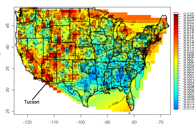
I was living in Arizona at the time and I was interested to learn that the highest warming rate was being recorded at the USHCN station in Tucson (remember, just because Arizona is hot is no reason to necessarily expect it to have high warming rates, they are two different things). At the time, Anthony Watt was just kicking off an initiative to develop quality control data for USHCN stations by having amateurs photograph the sites and upload them to a central data base. I decided I would go down to the Tucson site to experience the highest warming rate myself. This is what I found when I tracked down the station, and took this picture (which has been reproduced all over the place at this point):

That is the temperature station, around that fenced in white box (the uproar over this picture eventually caused this location to be closed). It was in the middle of a parking lot in the middle of a major university in the middle of a growing city. 100 years ago this temperature station was in the countryside, in essentially the open desert - no paving, no buildings, no cars. So we are getting the highest warming rates in the country by comparing a temperature today in an asphalt parking lot in the middle of a city to a temperature a hundred years ago in the open desert.
The problem with this is what's called the urban heat island effect. Buildings and concrete absorb heat from the sun during the day, more than would typically be absorbed by raw land in its natural state. This heat is reradiated at night, causing nights to be warmer in cities than in the areas surrounding them. If you live in a city, you will likely hear weather reports that predict colder temperatures in outlying areas, or warn of freezes in the countryside but not in the city itself.
It turns out that this urban heat island effect is easily measured -- it even makes a great science fair project!

My son and I did this project years ago, attaching a small GPS and temperature probe to a car. We then drove out of the city center into the country and back in the early evening, when the urban heat island effect should be largest. We drove out and then back to average out any effects of overall cooling during our testing. One of the trips is shown above, with around 6 degrees F of temperature change. We, and most others who have done this in other cities, found between 5 and 10 degrees of warming as one drives into a city at night.
If this effect were constant over time, it would not pose too many problems for our purposes here, because we are looking at changes in average temperatures over time, not absolute values. But the urban heat island warming of a city (and particular temperature stations) increases as the urban area grows larger. Because this urban warming is many times the global warming signal we are trying to measure, and since most temperature stations are located near growing urban locations, it introduces an important potential bias into measurement.
A number of studies have found that, in fact, we do indeed see more warming historically in thermometers located in urban areas than in those located in rural areas. Two studies in California have shown much lower warming rates at rural thermometers than at urban ones:


Anthony Watt has been working for years to do this same analysis for the entire US. In fact, the pictures taken above of the temperature station in Tucson were part of the first phase of his project to document each USHCN site used in the global warming statistics with pictures. Once he had pictures, he compared the details of the siting with a classification system scientists use to measure the quality of a temperature sites, from the best (class 1) to the worst with the most biases (class 5). He found that perhaps a third of the warming in the official NOAA numbers may come from the introduction of siting biases from bad sites. Or put another way, the warming at well-sited temperature stations was only about 2/3 in the official metric.

By the way, this is one other reason why I tend to favor the satellite measurements. Going back to the numbers we showed in part A, the satellite temperature metric had about 2/3 the trend of the surface temperature reading, or almost exactly what the surface readings would be if this siting bias were eliminated (the absolute values of the trends don't match, because they are for different time periods and different geographies).

There is one other aspect of this chart that might have caught your eye -- if some temperature stations are showing 2 degrees of warming and some 3.2 degrees of warming, why is the total 3.2 degrees of warming. Shouldn't it be somewhere in the middle?
One explanation is that the NOAA and other bodies take the data from these stations and perform a number of data manipulation steps in addition to a straight spatial averaging. One such step is that they will use a computer process to try to correct temperature stations based on the values from neighboring stations. The folks that run these indices argue that this computational process overcomes the site bias problem. Skeptics will argue that this approach is utter madness -- why work to correct a known bad temperature point, why not just eliminate it? If you have a good compass and a bad compass, you don't somehow mathematically average the results to find north, you throw out the bad one and use the good one. In short, skeptics argue that this approach does not eliminate the error, it just spreads the error around to all the good stations, smearing the error like peanut butter. Here is an example from the GISS, using station data that has only been adjusted for Time of Observation changes (TOBS).

This is exactly what we might expect - little warming out in undeveloped nature in Grand Canyon National Park, lots of warming in a large and rapidly growing modern city (yes, the Tucson data is from our favorite temperature station we featured above). Now, here is the same data after the GISS has adjusted it:

You can see that Tucson has been adjusted down a degree or two, but Grand Canyon has been adjusted up a degree or two (with the earlier mid-century spike adjusted down). OK, so it makes sense that Tucson has been adjusted down, though there is a very good argument to be made that it should be been adjusted down more, say by at least 3 degrees. But why does the Grand Canyon need to be adjusted up by about a degree and a half? What is currently biasing it colder by 1.5 degrees, which is a lot? One suspects the GISS is doing some sort of averaging, which is bringing the Grand Canyon and Tucson from each end closer to a mean -- they are not eliminating the urban bias from Tucson, they are just spreading it around to other stations in the region.
Temperature Adjustments and Signal-To-Noise Ratio
Nothing is less productive, to my mind, than when skeptics yell the word "fraud!" on the issue of temperature adjustments. All temperature databases include manual adjustments, even the satellite indices that many skeptics favor. As mentioned above, satellite measurements have to be adjusted for orbital decay of the satellites just as surface temperature measurements have to be adjusted for changes in the daily time of observation. We may argue that adjustment methodologies are wrong (as we did above with urban biases). We may argue that there are serious confirmation biases (nearly every single adjustment to every temperature and sea level and ocean heat database tends to cool the past and warm the present, perhaps reinforced by preconceived notions that we should be seeing a warming signal.) But I find that charges of fraud just cheapen the debate.
Even if the adjustments are all made the the best of intentions, we are still left with an enormous problem of signal to noise ratio. It turns out that the signal we are trying to measure -- warming over time -- is roughly equal to the magnitude of the manual adjustments. In other words, the raw temperature data does not show warming, only the manually adjusted data show warming. This does not mean the adjusted data is wrong, but it should make us substantially less confident that we are truly measuring the signal in all this noise of adjustment. Here are two examples, for an individual temperature station and for the entire database as a whole:

In this first example, we show the raw data (with Time of Observation adjustments only) in orange, and the final official adjusted version in blue. The adjustments triple the warming rate for the last century.

We can see something similar for the whole US, as raw temperature measurements (this time before time of observation adjustments) actually shows a declining temperature trend in the US. In this case, the entirety of the global warming signal, and more, comes from the manual adjustments. Do these adjustments (literally thousands and thousands of them) make sense when taken in whole? Does it make sense that there was some sort of warming bias in the 1920's that does not exist today? This is certainly an odd conclusion given that it implies a bias exactly opposite of the urban heat island effect.
We could go into much more detail, but this gives one an idea of why skeptics prefer the satellite measurements to the surface temperature record. Rather than endlessly working to try to get these public agencies to release their adjustment details and methodology for third party validation to the public that pays them (an ongoing task that still has not been entirely successful), skeptics have simply moved on to a better approach where the adjustments (to a few satellites) are much easier to manage.
Ultimately, both approaches for seeking a global warming signal are a bit daft. Why? Because, according to the IPCC, of all the extra warming absorbed by the surface of the Earth from the greenhouse effect, only about 1% goes into the atmosphere:

Basically, water has a MUCH higher heat carrying capacity than air, and over 90% of any warming should be going into oceans. We are just starting to get some new tools for measuring the changes to ocean heat content, though the task is hard because we are talking about changes in the thousandths of a degree in the deep oceans.
After this brief digression into the surface temperature records, it is now time to get back to our main line of discussion. In the next chapter, we will begin to address the all-important attribution question: Of the warming we have seen in the past, how much is man-made?
Chapter 5, Part A on the question of attributing past warming to man is here.
So @tylercowen, You Want to Understand the Great Stagnation? Here It Is
Certainly the government's current permission-based approach to business regulation combined with an overt hostility of government (or at least those parties that influence it) to radically new business models (see: Uber) is a big part of the great stagnation story.
But insanity like this is also a big part:
Weighing in on two California laws that require employers to provide suitable seating to workers when “the nature of the work” permits it, the California Supreme Court said the phrase refers to an employee's tasks performed at a given location for which the right to a suitable seat is asserted.
In response to questions certified by the U.S. Court of Appeals for the Ninth Circuit, the state high court said April 4 that the phrase “nature of the work” doesn't require a holistic evaluation of the full range of an employee's tasks completed during a shift.
An employer's business judgment and the layout of the workplace are relevant in determining whether sitting is permitted, but courts should apply an objective analysis based on the totality of the circumstances, the California Supreme Court said.
It held that “if an employer argues there is no suitable seat available, the burden is on the employer to prove unavailability.”
As a business owner in California, I am going to have to do a ton of research to figure out just how we can comply with all this, and even then I will likely be wrong because whether one is in compliance or not is never actually clear until it is tested in court. I had to do the same thing with California meal break law (multiple times), California heat stress law, new California harassment rules, California sick leave rules, the California minimum wage, Obamacare rules, Obamacare reporting, the new upcoming DOL rules on salaried employees, etc.
Five or ten years ago, I spent most of my free time thinking about improving and growing the business. Now, all my mental bandwidth is consumed by regulatory compliance. I have not added a new business operation for years, but instead have spent most of my time exiting businesses in California. Perhaps more important is what I am doing with my managers. My managers are not Harvard MBAs, they are front-line blue collar folks who have been promoted to manager because they have proven themselves adept at our service process. There are only a finite number of things I can teach them and new initiatives I can give them in a year. And instead of using this limited bandwidth to teach some of the vital productivity enhancement tools we should be adopting, I spend all my training time on compliance management issues.
Speech Restriction Stories I Have Read in Just the Last 24 Hours
NY state attorney general (and others) pursuing potential criminal and civil charges against ExxonMobil for its climate change advocacy
US Virgin Islands AG (really) going after non-profit CEI for its climate change advocacy
Elizabeth Warren wants the SEC to ban companies from "saying whatever they want about Washington policy debates," a demand inspired by her frustration that financial firms are publicly disagreeing with her on the impact of her desired regulations
California AG Kamala Harris demanding non-profit donor lists, presumably so she can harass and intimidate the ones she does not like
California AG Kamala Harris has raided the home and seized video footage of an independent advocated/journalist who did secret sting videos of Planned Parenthood, the exact same sort of advocacy journalism pursued legally (without legal harassment) by any number of Leftish groups in California and elsewhere (I doubt Ms Harris plans to raid the home of PETA activists who trespass on farms to secretly film chicken and pig breeding).
It turns out there are strong speech protections in this country, except when you are a professional, and then there are none.
And of course, I still am fighting against a libel lawsuit meant to force me to remove this product review.
Update, add this one: Tenured Marquette professor faces termination based on blog post with which University disagrees
When the student replied that he has a right to argue his opinion, Ms. Abbate responded that “you can have whatever opinions you want but I can tell you right now, in this class homophobic comments, racist comments and sexist comments will not be tolerated. If you don’t like that you are more than free to drop this class.” The student reported the exchange to Marquette professor John McAdams, who teaches political science. Mr. McAdams also writes a blog called the Marquette Warrior, which often criticizes the Milwaukee school for failing to act in accordance with its Catholic mission.
Mr. McAdams wrote on his blog that Ms. Abbate was “using a tactic typical among liberals now. Opinions with which they disagree are not merely wrong, and are not to be argued against on their merits, but are deemed ‘offensive’ and need to be shut up.” His blog went viral, and Ms. Abbate received vicious emails. She has since left Marquette.
But now Marquette is going after Mr. McAdams. In December 2014, the school sent him a letter suspending his teaching duties and banning him from campus while it reviewed his “conduct” related to the blog post. “You are to remain off campus during this time, and should you need to come to campus, you are to contact me in writing beforehand to explain the purpose of your visit, to obtain my consent and to make appropriate arrangements for that visit,” Dean Richard Holz wrote.
Lol, the university is going to prove he was wrong to write that universities avoid dialog in favor of saying "shut up" by telling him to ... shut up or be fired.
By the way, since nowadays it seems that supporting someone's free speech rights is treated the same as agreeing with that person, I will remind folks that having led a pro gay marriage ballot initiative briefly in Arizona, I am unlikely to agree with someone who thinks it should be banned. But so what? I would have absolutely no problem arguing with such a person in a rational way, something that faculty member Ms. Abbate seemed incapable of doing. While I might disagree with him on any number of issues, Professor McAdams was totally right to call her out. Besides, is the Left's goal really to take all opinion with which they disagree and drive it underground? Force folks underground and you never know what will emerge some day. Things like.... Trump supporters.
It is amazing to me that universities have become the least viable place in the US to raise and discuss controversial issues in the light of day.
Bernie Sanders and The Panama Papers
As much as Bernie would like to blame the money laundering and money-hiding in the Panama papers on capitalism, in fact the vast majority of clients in those papers appear to be from socialist and strongly interventionist, populist governments.
Socialist countries tend still have winners and losers just like capitalist countries. However, those winners and losers are not determined by success in making products and services in the marketplace, but in success in reaching a leadership position in the government or cozying up to those in government. Soviet government elite had special privileges and special stores not accessible by ordinary Russians. The Castro brothers and Hugo Chavez's daughter are among the richest people in the western hemisphere.
However, these wealthy leaders now have two problems. First, they likely spend most of their time spouting egalitarian claptrap, so that they would like to hide their wealth in order to mask the obvious consistency problem. Perhaps more importantly, their socialist policies have likely destroyed the country's economy -- there is, for example, no place any sane person would want to invest a billion dollars in Venezuela. They need to get their money out of the country but because everyone else in a socialist country is also trying to get their money out, the self-same leader has likely instituted capital controls. So the leader needs to put his or her money in a different country where it can actually be invested productively, and in doing so must evade their own capital controls.
Greatest Video on Management Ever
Perhaps it is just because of the day I have had, but I am increasingly convinced that this video portrays the true experience of running a company better than any other video I have seen
New Star Wars Trailer
This looks encouraging.
AT-ATs are back!
The Virtues of Short-Selling
Is there anything that rankles populists who are "anti-speculator" more than the ability to short stocks? From time to time countries that are upset about falling markets will ban short-selling. But I have defended stock (and other asset shorting) as a critical market mechanism that helps to limit damaging bubbles. I wrote waaaaaay back in 2008, after the US temporarily banned short selling of certain assets:
At the start of the bubble, a particular asset (be it an equity or a commodity like oil) is owned by a mix of people who have different expectations about future price movements. For whatever reasons, in a bubble, a subset of the market develops rapidly rising expectations about the value of the asset. They start buying the asset, and the price starts rising. As the price rises, and these bulls buy in, folks who owned the asset previously and are less bullish about the future will sell to the new buyers. The very fact of the rising price of the asset from this buying reinforces the bulls' feeling that the sky is the limit for prices, and bulls buy in even more.
Let's fast forward to a point where the price has risen to some stratospheric levels vs. the previous pricing as well as historical norms or ratios. The ownership base for the asset is now disproportionately
made up of those sky-is-the-limit bulls, while everyone who thought these guys were overly optimistic and a bit wonky have sold out. 99.9% of the world now thinks the asset is grossly overvalued. But how does it come to earth? After all, the only way the price can drop is if some owners sell, and all the owners are super-bulls who are unlikely to do so. As a result, the bubble might continue and grow long after most of the world has seen the insanity of it.Thus, we have short-selling. Short-selling allows the other 99.9% who are not owners to sell part of the asset anyway, casting their financial vote [on] the value of the company. Short-selling shortens bubbles, hastens the reckoning, and in the process generally reduces the wreckage on the back end.
I am remembering this old post because Arnold Kling links an interesting bit on economists discussing the Big Short, who among a number of interesting things say this:
Shorting the market in the way they did is very risky, and one has to be very confident, perhaps overconfident, in one’s forecast to take such risks. As a consequence, many people who were pessimistic about the housing market simply stayed on the sidelines—which in turn meant that for a while, valuations in the market primarily reflected the beliefs of optimists.
The timing issue is key. I have been right probably in 4 of out the 5 major market shorting opportunities I have identified in the last 10 years, but have been on average 2 years early with all of them, meaning I lost money on most of them, or made money after enduring some really big paper losses for a while.
The Downside of Web/Cloud Enabled Devices (Including My Oddest Analogy of the Week)
Google's parent Alphabet is abandoning support for Revlov's Smart Home Hub (which they bought a while back). In and of itself this part of an irritating strategy (pursued enthusiastically both by Alphabet and Apple) of identifying edgy new devices with enthusiastic user bases, buying them, and then shutting them down. I was a SageTV fan and user back in the day until Google bought it and shut it down (as a potential competitor to GoogleTV and its other streaming products). The bright side is that this pushed me to XBMC/KODI, which is better. The dark side is that I am sure Google could easily write those guys a check and then they will be gone too.
Anyway, after SageTV was shut down by Google, I could still use the hardware and software, it just did not get improved or updated or supported any more. But increasingly new electronic products are requiring some sort of cloud integration or online account activation. To work, the product actually has to check in with the manufacturer's servers. So what happens when those servers are shut down?
Alphabet-owned company Nest is going to pull the plug on the Revolv smart home hub and app on May 15, rendering the hardware unusable next month.
Just to be clear on how much of a big deal this is, the company isn't only out to stop support but to really disable the device and turn the hub into a $300 teardrop-shaped brick. How much does a pitchfork go for nowadays?
...Needless to say, existing users are outraged by the development, and they have very good reason to be so."When software and hardware are intertwined, does a warranty mean you stop supporting the hardware or does it mean that the manufacturer can intentionally disable it without consequence? Tony Fadell seems to believe the latter. Tony believes he has the right to reach into your home and pull the plug on your Nest products," Arlo Gilbert, CEO of Televero and formerly proud owner of a Revolv hub, says, emphasizing that "Google is intentionally bricking hardware that he owns."
Video game enthusiasts have worried about this for years, and have started to encounter this problem, as the new most-favored copyright protection scheme is to require an online account and an account-check each time the game is run. They try to say the online component is adding value, and they do a few things like leader boards and achievements, but the primary rational is copy protection. Personally I find this generally easier to work with than other types of copy protection that have been tried (I really like Steam, for example) but what happens when the login servers are shut down?
This sort of reminds me, oddly enough, of cemeteries. There used to be a problem where private cemetery owners would sell out the cemetery, fill it up, and move on. But then the cemetery itself would fall apart. It's not like the owners are still around to pay association dues like condo owners do. Once people figured out that problem, they quickly began demanding that cemeteries have a plan for long-term maintenance, with assets in trust or some such thing. Perhaps the hardware and software industry will do the same thing. I could see a non-profit trust getting set up by the major players to which manufacturers pay dues in exchange for having the trust take over their servers after a product is abandoned.
Raising the Cost of Hiring Unskilled Workers by 50% is A Bad Way to Fight Poverty
After my prior post, I have summarized the chart I included from Mark Perry to the key data that I think really makes the point. Household income is obviously a product of hours worked and hourly wages. Looking at the chart below, poverty seems to be much more a function of not working than it is of low wages. Which makes California's decision to raise the price of hiring unskilled workers by 50% (by raising their minimum wage from $10 to $15) all the more misguided.

Note the calculations in the last two lines, which look at two approaches to fighting poverty. If we took the poorest 20% and kept their current number of hours worked the same, but magically raised their hourly earnings to that of the second quintile (ie from $14.21 to $17.33), it would increase their annual household income by $2,558, a 22% increase (I say magically because clearly if wages are raised via a minimum wage mandate, employment in this groups would drop even further, likely offsetting most of the gains). However, if instead we did nothing to their wages but encouraged more employment such that their number of workers rose to that of the second quintile, this would increase household income by a whopping $13,357, a 115% percent increase.
From this, would you logically try to fight poverty by forcing wages higher (which will almost surely reduce employment) or by trying to increase employment?
Why The Minimum Wage Does Not Make Moral Sense: Unemployment, Not Low Wage Rate, Causes Most Poverty
In response to his new $15 minimum wage in California, Governor Jerry Brown said:
Economically, minimum wages may not make sense. But morally, socially, and politically they make every sense because it binds the community together to make sure parents can take care of their kids.
Let me explain as briefly as I can why this minimum wage increase is immoral. We will use data from the chart below which was cribbed from Mark Perry in this post.

The average wage of people who work in the poorest 20% in the US is already near $15 ($28,417 divided by 2000 full time hours - $14.20 per hour). This is not that much lower than the hourly earnings of those in the second poorest or even the middle quintiles. So why are they poor? The biggest different is that while only 16% of the middle quintile households had no one who worked, and 31.5% of the second poorest quintile had no one who worked, of the poorest 20% of households a whopping 63% had no one who worked. Only 16.1% of poor adults had a full time job.
The reason for poverty, then, is not primarily one of rate, it is one of achieving full time employment. Many of these folks have limited education, few job skills, little or no work experience, and can have poor language skills. And California has just increased the cost of giving these folks a job by 50%. The poor will be worse off, as not only will more of them miss out on the monetary benefits of employment, but also the non-monetary ones (building a work history, learning basic skills, etc.)
Past studies have shown that most of the benefit of the minimum wage goes to non-poor households (ie second and third earners in middle class homes). The targets Jerry Brown speaks of, parents earning the minimum wage to take care of families, are perhaps only 1/8 of minimum wage earners.
MaCurdy found that less than 40% of wage increases [from a minimum wage hike] went to people earning less than twice the poverty line, and among that group, about third of them are trying to raise a family on the minimum wage.
Of course, the price of a lot of stuff poor people have to buy in California is about to go up. We are going to have to raise our campground rates by 20-25% to offset the labor cost increase. But that is another story.
Incredibly, Not A Single University Has Challenged This On Their Own
FIRE is looking for a client (University or aggrieved student) whom it can help sue the Department of Education over their sexual misconduct guidance
Five years ago today, the Department of Education’s Office for Civil Rights (OCR) announced sweeping new requirements for colleges and universities adjudicating allegations of sexual misconduct. By unilaterally issuing these binding mandates via a controversial “Dear Colleague” letter (DCL), OCR ignored its obligation under federal law to notify the public of the proposed changes and solicit feedback.
To correct this error, and to begin to fix a broken system of campus sexual assault adjudication that regularly fails all involved, the Foundation for Individual Rights in Education (FIRE) seeks a student or institution to challenge OCR’s abuse of power. FIRE has made arrangements to secure legal counsel for a student or institution harmed by OCR’s mandates and in a position to challenge the agency’s violation of the Administrative Procedure Act(APA). In keeping with FIRE’s charitable mission to advance the public interest, representation will be provided at no cost to the harmed party.
“In the five years since its issuance, OCR has acted as though the 2011 Dear Colleague letter is binding law—but it isn’t,” said FIRE Executive Director Robert Shibley. “By circumventing federal law, OCR ignored all stakeholders: victims, the accused, civil liberties advocates, administrators, colleges, law enforcement, and the general public. Real people’s lives are being irreparably harmed as a result. It’s time that OCR be held accountable.”
The DCL requires that schools use the low “preponderance of the evidence” standard of proof (i.e., that they find an accused student guilty with just 50.01 percent certainty) when adjudicating claims of sexual assault and sexual harassment. The DCL’s requirement that colleges use this standard—found nowhere in Title IX or its implementing regulations, and specified before 2011 only in letters between OCR and individual schools—effectively creates a new substantive rule for institutions to follow.
Here is what is amazing to me: Not a single university has challenged this rule, even though trashes the due process rights of is male students. These same universities had no problem defying the law on things like ROTC and army recruiting (which represent mostly voluntary enticements of their students) but have rolled over and played dead over this much more direct threat to their students' well-being.
Thank God We Don't Have Cable Neutrality
Time Warner Cable, the owners of the Dodgers local broadcast rights is continuing to battle with local cable channels to be added to their cable package. Like last year, it appears that no deal will be forthcoming and the Dodgers (and perhaps more disheartening, Vin Scully in his last year) won't be on many TV sets this summer in LA. Kevin Drum essentially says bravo to the cable companies for opposing the Dodgers bid to jack up basic cable rates in the area.
Boo hoo. They tried everything—everything, I tell you. Except, of course, for the one thing that would have worked: the right to make the Dodgers an extra-cost option, not part of basic cable. Most cable operators see no reason that every television viewer in the LA basin should have to pay 60 bucks a year more in cable fees regardless of whether or not they care about baseball.
And that's the one thing TWC won't do. Why? Because then it will become crystal clear just how few households actually care enough about the Dodgers to pay for them. And that would truly be a disaster beyond reckoning. There's a limit to the amount of sports programming that people are willing to have crammed down their throats!
I actually agree with him, and will add that it is always great to see a progressive acknowledge consumers do actually exercise accountability on businesses.
But I will observe that had we adopted cable neutrality rules** as we have for net neutrality, the cable companies would have found it impossible, or at least much more difficult, to oppose carriage by a pushy and expensive content provider. It is this sort of intra-supply-chain tug of war that generally benefits consumers in the long run (as it has in LA, at least for Drum) that is essentially outlawed by net neutrality rules which basically declare content providers the victors by default. As I wrote before:
Net Neutrality is one of those Orwellian words that mean exactly the opposite of what they sound like. There is a battle that goes on in the marketplace in virtually every communication medium between content creators and content deliverers. We can certainly see this in cable TV, as media companies and the cable companies that deliver their product occasionally have battles that break out in public. But one could argue similar things go on even in, say, shipping, where magazine publishers push for special postal rates and Amazon negotiates special bulk UPS rates.
In fact, this fight for rents across a vertical supply chain exists in virtually every industry. Consumers will pay so much for a finished product. Any vertical supply chain is constantly battling over how much each step in the chain gets of the final consumer price.
What "net neutrality" actually means is that certain people, including apparently the President, want to tip the balance in this negotiation towards the content creators (no surprise given Hollywood's support for Democrats). Netflix, for example, takes a huge amount of bandwidth that costs ISP's a lot of money to provide. But Netflix doesn't want the ISP's to be be able to charge for this extra bandwidth Netflix uses - Netflix wants to get all the benefit of taking up the lion's share of ISP bandwidth investments without having to pay for it. Net Neutrality is corporate welfare for content creators....
I am still pretty sure the net effect of these regulations, whether they really affect net neutrality or not, will be to disarm ISP's in favor of content providers in the typical supply chain vertical wars that occur in a free market. At the end of the day, an ISP's last resort in negotiating with a content provider is to shut them out for a time, just as the content provider can do the same in reverse to the ISP's customers. Banning an ISP from doing so is like banning a union from striking.
** Footnote: OK, we sortof did have cable neutrality in one respect -- over the air broadcasters were able to obtain crony legislation that cable companies had to carry every locally broadcast channel. So that channel 59 that you never bothered to watch now get's equal treatment with the NBC affiliate. This was a huge boon for these stations, and the value of these often tiny stations exploded with this must-carry rule. Essentially they were given an asset for free, ie position in a cable lineup, that other competitors had to fight for.
Al Gore, as an aside, actually became rich with exactly this game. It is hard to fight your way into a cable lineup nowadays. Al Gore did it with this Current TV startup based on his name and a promise of a sort of MTV for politics. The channel went nowhere and lost a lot of money, but it now had one valuable asset -- placement in cable TV lineups. So it sold this asset to Al Jazzera, which had struggled to get placement.