Posts tagged ‘Anthony Watt’

Denying the Climate Catastrophe: 4b. Problems With The Surface Temperature Record

This is the part B of the fourth chapter of an ongoing series.  Other parts of the series are here:

  1. Introduction
  2. Greenhouse Gas Theory
  3. Feedbacks
  4.  A)  Actual Temperature Data;  B) Problems with the Surface Temperature Record (this article)
  5. Attribution of Past Warming;  A) Arguments for it being Man-Made; B) Natural Attribution
  6. Climate Models vs. Actual Temperatures
  7. Are We Already Seeing Climate Change
  8. The Lukewarmer Middle Ground
  9. A Low-Cost Insurance Policy

In part A of this chapter, we showed that the world had indeed warmed over the past 30-100 years, whether you looked at the surface temperature record or the satellite record.  Using either of these metrics, though, we did not see global warming accelerating, nor did we see warming rates that were faster than predicted.  In fact, we saw the opposite.

One story I left out of part A, because it did not affect the basic conclusions we drew, is the criticisms of the surface temperature record.  In this part B, we will discuss some of these criticisms, and see why many skeptics believe the 0.8C warming number for the past century is exaggerated.  We will also gain some insights as to why the satellite measured warming rates may be closer to the mark than rates determined by surface temperature stations.

Uncorrected Urban Biases

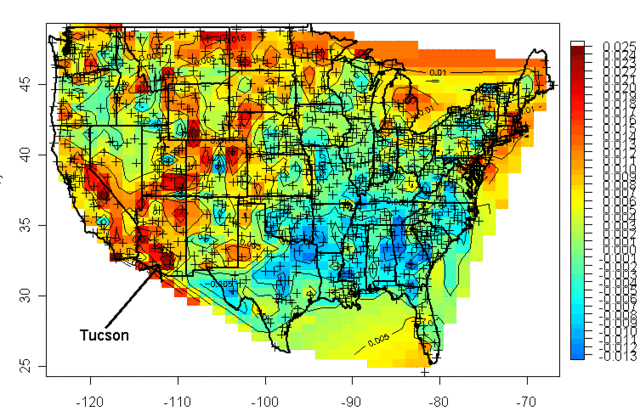
Years ago a guy named Steve McIntyre published a graphical portrayal of warming rates across the US.  This is a common chart nowadays. Anyway, this chart (almost 10 years old) drew from temperature measurement stations whose locations are shows with the crosses on the map:

usgrid80

I was living in Arizona at the time and I was interested to learn that the highest warming rate was being recorded at the USHCN station in Tucson (remember, just because Arizona is hot is no reason to necessarily expect it to have high warming rates, they are two different things).  At the time, Anthony Watt was just kicking off an initiative to develop quality control data for USHCN stations by having amateurs photograph the sites and upload them to a central data base.  I decided I would go down to the Tucson site to experience the highest warming rate myself.  This is what I found when I tracked down the station, and took this picture (which has been reproduced all over the place at this point):

click to enlarge

That is the temperature station, around that fenced in white box (the uproar over this picture eventually caused this location to be closed).  It was in the middle of a parking lot in the middle of a major university in the middle of a growing city.  100 years ago this temperature station was in the countryside, in essentially the open desert - no paving, no buildings, no cars.  So we are getting the highest warming rates in the country by comparing a temperature today in an asphalt parking lot in the middle of a city to a temperature a hundred years ago in the open desert.

The problem with this is what's called the urban heat island effect.   Buildings and concrete absorb heat from the sun during the day, more than would typically be absorbed by raw land in its natural state.  This heat is reradiated at night, causing nights to be warmer in cities than in the areas surrounding them.  If you live in a city, you will likely hear weather reports that predict colder temperatures in outlying areas, or warn of freezes in the countryside but not in the city itself.

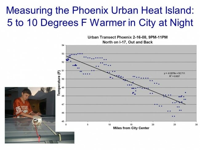
It turns out that this urban heat island effect is easily measured -- it even makes a great science fair project!

Click to enlarge

My son and I did this project years ago, attaching a small GPS and temperature probe to a car.  We then drove out of the city center into the country and back in the early evening, when the urban heat island effect should be largest.  We drove out and then back to average out any effects of overall cooling during our testing.  One of the trips is shown above, with around 6 degrees F of temperature change.  We, and most others who have done this in other cities, found between 5 and 10 degrees of warming as one drives into a city at night.

If this effect were constant over time, it would not pose too many problems for our purposes here, because we are looking at changes in average temperatures over time, not absolute values.  But the urban heat island warming of a city (and particular temperature stations) increases as the urban area grows larger.   Because this urban warming is many times the global warming signal we are trying to measure, and since most temperature stations are located near growing urban locations, it introduces an important potential bias into measurement.

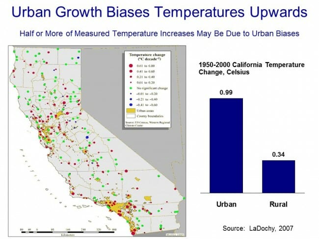
A number of studies have found that, in fact, we do indeed see more warming historically in thermometers located in urban areas than in those located in rural areas.  Two studies in California have shown much lower warming rates at rural thermometers than at urban ones:

click to enlarge

Click to enlarge

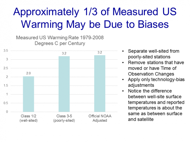
Anthony Watt has been working for years to do this same analysis for the entire US.  In fact, the pictures taken above of the temperature station in Tucson were part of the first phase of his project to document each USHCN site used in the global warming statistics with pictures.  Once he had pictures, he compared the details of the siting with a classification system scientists use to measure the quality of a temperature sites, from the best (class 1) to the worst with the most biases (class 5).  He found that perhaps a third of the warming in the official NOAA numbers may come from the introduction of siting biases from bad sites.  Or put another way, the warming at well-sited temperature stations was only about 2/3 in the official metric.

Click to enlarge

By the way, this is one other reason why I tend to favor the satellite measurements.  Going back to the numbers we showed in part A, the satellite temperature metric had about 2/3 the trend of the surface temperature reading, or almost exactly what the surface readings would be if this siting bias were eliminated (the absolute values of the trends don't match, because they are for different time periods and different geographies).

Click to enlarge

There is one other aspect of this chart that might have caught your eye -- if some temperature stations are showing 2 degrees of warming and some 3.2 degrees of warming, why is the total 3.2 degrees of warming.  Shouldn't it be somewhere in the middle?

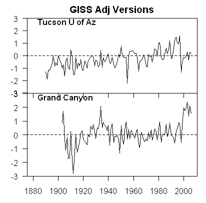
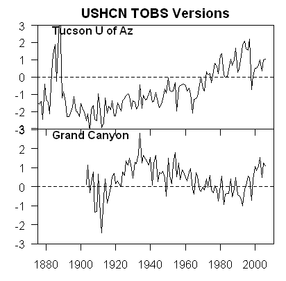
One explanation is that the NOAA and other bodies take the data from these stations and perform a number of data manipulation steps in addition to a straight spatial averaging.   One such step is that they will use a computer process to try to correct temperature stations based on the values from neighboring stations.  The folks that run these indices argue that this computational process overcomes the site bias problem.  Skeptics will argue that this approach is utter madness -- why work to correct a known bad temperature point, why not just eliminate it?  If you have a good compass and a bad compass, you don't somehow mathematically average the results to find north, you throw out the bad one and use the good one.  In short, skeptics argue that this approach does not eliminate the error, it just spreads the error around to all the good stations, smearing the error like peanut butter.  Here is an example from the GISS, using station data that has only been adjusted for Time of Observation changes (TOBS).
Grand_12

This is exactly what we might expect - little warming out in undeveloped nature in Grand Canyon National Park, lots of warming in a large and rapidly growing modern city (yes, the Tucson data is from our favorite temperature station we featured above).  Now, here is the same data after the GISS has adjusted it:

Grand_15

You can see that Tucson has been adjusted down a degree or two, but Grand Canyon has been adjusted up a degree or two (with the earlier mid-century spike adjusted down).  OK, so it makes sense that Tucson has been adjusted down, though there is a very good argument to be made that it should be been adjusted down more, say by at least 3 degrees.  But why does the Grand Canyon need to be adjusted up by about a degree and a half?  What is currently biasing it colder by 1.5 degrees, which is a lot?  One suspects the GISS is doing some sort of averaging, which is bringing the Grand Canyon and Tucson from each end closer to a mean -- they are not eliminating the urban bias from Tucson, they are just spreading it around to other stations in the region.

Temperature Adjustments and Signal-To-Noise Ratio

Nothing is less productive, to my mind, than when skeptics yell the word "fraud!" on the issue of temperature adjustments.  All temperature databases include manual adjustments, even the satellite indices that many skeptics favor.    As mentioned above, satellite measurements have to be adjusted for orbital decay of the satellites just as surface temperature measurements have to be adjusted for changes in the daily time of observation.  We may argue that adjustment methodologies are wrong (as we did above with urban biases).  We may argue that there are serious confirmation biases (nearly every single adjustment to every temperature and sea level and ocean heat database tends to cool the past and warm the present, perhaps reinforced by preconceived notions that we should be seeing a warming signal.)  But I find that charges of fraud just cheapen the debate.

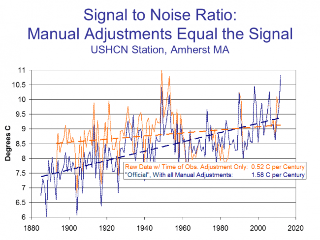
Even if the adjustments are all made the the best of intentions, we are still left with an enormous problem of signal to noise ratio.  It turns out that the signal we are trying to measure -- warming over time -- is roughly equal to the magnitude of the manual adjustments.  In other words, the raw temperature data does not show warming, only the manually adjusted data show warming.  This does not mean the adjusted data is wrong, but it should make us substantially less confident that we are truly measuring the signal in all this noise of adjustment.  Here are two examples, for an individual temperature station and for the entire database as a whole:

Click to enlarge

In this first example, we show the raw data (with Time of Observation adjustments only) in orange, and the final official adjusted version in blue.  The adjustments triple the warming rate for the last century.

Click to enlarge

We can see something similar for the whole US, as raw temperature measurements (this time before time of observation adjustments) actually shows a declining temperature trend in the US.  In this case, the entirety of the global warming signal, and more, comes from the manual adjustments.  Do these adjustments (literally thousands and thousands of them) make sense when taken in whole?  Does it make sense that there was some sort of warming bias in the 1920's that does not exist today? This  is certainly an odd conclusion given that it implies a bias exactly opposite of the urban heat island effect.

We could go into much more detail, but this gives one an idea of why skeptics prefer the satellite measurements to the surface temperature record.  Rather than endlessly working to try to get these public agencies to release their adjustment details and methodology for third party validation to the public that pays them (an ongoing task that still has not been entirely successful), skeptics have simply moved on to a better approach where the adjustments (to a few satellites) are much easier to manage.

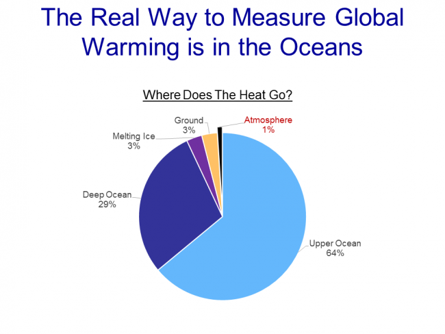
Ultimately, both approaches for seeking a global warming signal are a bit daft.  Why?  Because, according to the IPCC, of all the extra warming absorbed by the surface of the Earth from the greenhouse effect, only about 1% goes into the atmosphere:


click to enlarge

Basically, water has a MUCH higher heat carrying capacity than air, and over 90% of any warming should be going into oceans.  We are just starting to get some new tools for measuring the changes to ocean heat content, though the task is hard because we are talking about changes in the thousandths of a degree in the deep oceans.

After this brief digression into the surface temperature records, it is now time to get back to our main line of discussion.  In the next chapter, we will begin to address the all-important attribution question:  Of the warming we have seen in the past, how much is man-made?

Chapter 5, Part A on the question of attributing past warming to man is here.
Alarmism Fail

Anthony Watt has a nice catalog of past predictions of doom (e.g. running out of oil, food, climate issues, etc).  It really would be funny if not such a serious and structural issue with the media.   I would love to see someone like the NY Times have a sort of equivalent of their reader advocate whose job was to go through past predictions published in the paper and see how they matched up to reality.  If I had more time, it is the blog I would like to start.

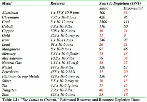
Update:  One of his readers Dennis Wingo took the resource depletion table from Ehrlich's Limits to Growth and annotated it -- the numbers in red show the resources Ehrlich predicted we should already run out of.

However, rather than ever, ever going back and visiting these forecasting failures and trying to understand the structural problem with them, the media still runs back to Ehrlich as an "expert".

Phil Jones Hoping for Warming

I feel the need to reproduce this email in its entirety.  Here is Phil Jones actively hoping the world will warm (an outcome he has publicly stated would be catastrophic).  The tribalism has gotten so intense that it is more important for his alarmist tribe to count coup on the skeptics than to hope for a good outcome for the Earth.

>From: Phil Jones [mailto:p.jones@uea.ac.uk]
>Sent: 05 January 2009 16:18
>To: Johns, Tim; Folland, Chris
>Cc: Smith, Doug; Johns, Tim
>Subject: Re: FW: Temperatures in 2009
>
>
>   Tim, Chris,
>     I hope you're not right about the lack of warming lasting
>   till about 2020. I'd rather hoped to see the earlier Met Office
>   press release with Doug's paper that said something like -
>   half the years to 2014 would exceed the warmest year currently on
> record, 1998!
>     Still a way to go before 2014.
>
>     I seem to be getting an email a week from skeptics saying
>   where's the warming gone. I know the warming is on the decadal
>   scale, but it would be nice to wear their smug grins away.
>
>     Chris - I presume the Met Office
> continually monitor the weather forecasts.
>    Maybe because I'm in my 50s, but the language used in the forecasts seems
>    a bit over the top re the cold. Where I've been for the last 20
> days (in Norfolk)
>    it doesn't seem to have been as cold as the forecasts.
>
>     I've just submitted a paper on the UHI for London - it is 1.6 deg
> C for the LWC.
>   It comes out to 2.6 deg C for night-time minimums. The BBC forecasts has
>   the countryside 5-6 deg C cooler than city centres on recent nights.
> The paper
>   shows the UHI hasn't got any worse since 1901 (based on St James Park
>   and Rothamsted).
>
>   Cheers
>   Phil

Is this better or worse than rooting for a bad economy to get your favorite politicians elected?  Anthony Watt has more in this same tone, showing how climate scientists were working to shift messages and invent new science to protect the warming hypothesis.

The last part about the UHI (urban heat island) study is interesting.  I don't remember this study.  But it is interesting that he accepts a UHI of as high as 1.6C (my son and I found evening UHI in Phoenix around 4-6C, about in line with his London results).    It looks like he is trying to say that UHI should not matter to temperature measurement, since it has not changed in London since 1900  (a bias in temperature measurement that does not change does not affect the temperature anomaly, which is what tends to be important).  But the point is that many other temperature stations in the Hadley CRUT data base are in cities that are now large today but were much smaller than London in 1900 (Tucson is a great example).  In these cases, there is a changing measurement bias that can affect the anomaly, so I am not sure what Jones was trying to get at.

Pretty Good Climategate Summary

From Christopher Booker at the Telegraph via Anthony Watts

There are three threads in particular in the leaked documents which have sent a shock wave through informed observers across the world. Perhaps the most obvious, as lucidly put together by Willis Eschenbach (see McIntyre's blog Climate Audit and Anthony Watt's blog Watts Up With That), is the highly disturbing series of emails which show how Dr Jones and his colleagues have for years been discussing the devious tactics whereby they could avoid releasing their data to outsiders under freedom of information laws.

They have come up with every possible excuse for concealing the background data on which their findings and temperature records were based.

This in itself has become a major scandal, not least Dr Jones's refusal to release the basic data from which the CRU derives its hugely influential temperature record, which culminated last summer in his startling claim that much of the data from all over the world had simply got "lost". Most incriminating of all are the emails in which scientists are advised to delete large chunks of data, which, when this is done after receipt of a freedom of information request, is a criminal offence.

But the question which inevitably arises from this systematic refusal to release their data is "“ what is it that these scientists seem so anxious to hide? The second and most shocking revelation of the leaked documents is how they show the scientists trying to manipulate data through their tortuous computer programmes, always to point in only the one desired direction "“ to lower past temperatures and to "adjust" recent temperatures upwards, in order to convey the impression of an accelerated warming. This comes up so often (not least in the documents relating to computer data in the Harry Read Me file) that it becomes the most disturbing single element of the entire story. This is what Mr McIntyre caught Dr Hansen doing with his GISS temperature record last year (after which Hansen was forced to revise his record), and two further shocking examples have now come to light from Australia and New Zealand.

In each of these countries it has been possible for local scientists to compare the official temperature record with the original data on which it was supposedly based. In each case it is clear that the same trick has been played "“ to turn an essentially flat temperature chart into a graph which shows temperatures steadily rising. And in each case this manipulation was carried out under the influence of the CRU.

What is tragically evident from the Harry Read Me file is the picture it gives of the CRU scientists hopelessly at sea with the complex computer programmes they had devised to contort their data in the approved direction, more than once expressing their own desperation at how difficult it was to get the desired results.

The third shocking revelation of these documents is the ruthless way in which these academics have been determined to silence any expert questioning of the findings they have arrived at by such dubious methods "“ not just by refusing to disclose their basic data but by discrediting and freezing out any scientific journal which dares to publish their critics' work. It seems they are prepared to stop at nothing to stifle scientific debate in this way, not least by ensuring that no dissenting research should find its way into the pages of IPCC reports.

It's Official: Global Warming Alarmism is a Religion (at Least in the UK)

Via Anthony Watt, from the UK Telegraph:

An executive has won the right to sue his employer on the basis that he was unfairly dismissed for his green views after a judge ruled that environmentalism had the same weight in law as religious and philosophical beliefs.

In a landmark ruling, Mr Justice Michael Burton said that "a belief in man-made climate change "¦ is capable, if genuinely held, of being a philosophical belief for the purpose of the 2003 Religion and Belief Regulations".

The ruling could open the door for employees to sue their companies for failing to account for their green lifestyles, such as providing recycling facilities or offering low-carbon travel.

John Bowers QC, representing Grainger, had argued that adherence to climate change theory was "a scientific view rather than a philosophical one", because "philosophy deals with matters that are not capable of scientific proof."

That argument has now been dismissed by Mr Justice Burton, who last year ruled that the environmental documentary An Inconvenient Truth by Al Gore was political and partisan.

The decision allows the tribunal to go ahead, but more importantly sets a precedent for how environmental beliefs are regarded in English law.

Wow!  Its a  religion, not a scientific position.  I probably should be laughing, but I'm not.

Green Fraud

Via Anthony Watt, from the Oregonian

State officials deliberately underestimated the cost of Gov. Ted Kulongoski's plan to lure green energy companies to Oregon with big taxpayer subsidies, resulting in a program that cost 40 times more than unsuspecting lawmakers were told, an investigation by The Oregonian shows.

Records also show that the program, a favorite of Kulongoski's known as the Business Energy Tax Credit, has given millions of dollars to failed companies while voters are being asked to raise income taxes because the state budget doesn't have enough to pay for schools and other programs....

According to documents obtained under Oregon's public records law, agency officials estimated in a Nov. 16, 2006, spreadsheet that expanding the tax credits would cost taxpayers an additional $13 million in 2007-09. But after a series of scratch-outs and scribbled notes, a new spreadsheet pared the cost to $1.8 million. And when energy officials handed their final estimate to the Legislature in February 2007, they pegged the added cost at just $1.2 million for the first two years and $4.1 million for 2009-11.

The higher estimates were never shown to lawmakers. Current and former energy staffers acknowledged a clear attempt to minimize the cost of the subsidies.

"I remember that discussion. Everyone was saying, yes, this is going to be a huge (budget) hit," recalled Charles Stephens, a former analyst for the Energy Department who left in 2006. "The governor's office was saying, 'No, we need a smaller number.'"

Hmm, sounds eerily like what is going on with the health care bill in Congress.

Update: It turns out that all of the "green" companies so far have sold their tax credits for cash to companies like Wal-Mart and US Bank.  This is no enormous problem (though the optics are terrible for the state) but it is yet another reason why the Oregon budget gets busted by this program -- a startup solar company won't use tax credits for years as it will take some time to be profitable (if they ever are) but Wal-Mart can use them right now.

From The Copenhagen Climate Change Treaty

The treaty draft is really hard to read, as it has all kinds of alternate language in brackets.  However, a few folks have already started reviewing the treaty, and what they are finding is less of a climate treaty and more of a blueprint for world socialism.  One example, via Anthony Watt, from page 122 of the draft:

17. [[Developed [and developing] countries] [Developed and developing country Parties] [All Parties] [shall] [should]:]
(a) Compensate for damage to the LDCs' economy and also compensate for lost opportunities, resources, lives, land and dignity, as many will become environmental refugees;

(b) Africa, in the context of environmental justice, should be equitably compensated for environmental, social and economic losses arising from the implementation of response measures.

Compensating for "lost opportunities?" Isn't that number just whatever they want it to be? And don't get me started on lost "dignity."

Geothermal

I don't know much about geothermal power, but I do know I don't hear much talk about it of late.  Anthony Watt thinks this is a mistake, and discusses the potential.  To some extent, the problem with geothermal's acceptance is that it breaks our current centralized power model in favor of distributed power.  There are few spots where geothermal potential is large enough to run a big power plant, but apparently many where there is the ability to heat a single building.

Senior Government Official Using His Position to Presure Textbook Publishers

Anthony Watt has an interesting story of a senior NASA official using his government position to pressure textbook manufacturers to change their books to reflect his view of the world.

It Really is a Smaller World

Anthony Watt has a pointer to a nice presentation in four parts on YouTube by Bob Carter made at a public forum in Australia.  He walks through some of the skeptics' issues with catastrophic man-made global warming theory.

What caught my attention, though, were the pictures Mr. Carter shows in his presentation about about 1:30 into part 4.  Because I took the pictures he shows, down at the University of Arizona, as part of Mr. Watts project to document temperature measurement stations.  Kind of cool to see someone I don't know in a country I have (sadly) never visited using a small bit of my work.  Part 4 is below, but you can find links to all four parts here.

Signal to Noise Ratio in Measurement

Over at Climate Skeptic, I discuss Anthony Watt's preliminary findings as to the quality of measurement in the surface temperature installations that are used to measure global warming.  If we call global warming "the signal", then the signal is currently thought to have been about 0.6C over the last century.  However, Watt has good reason to estimate that 85% of the US Historical Climate Network has installation biases that create errors from 1-5C,or about 2-8 times the signal.  And these are not random biases that cancel out, but tend to all bias the numbers higher, leading to systematic over-estimation of temperature increases.