Denying the Climate Catastrophe: 5a. Arguments For Attributing Past Warming to Man
This is part A of Chapter 5 of an ongoing series. Other parts of the series are here:
- Introduction
- Greenhouse Gas Theory
- Feedbacks
- A) Actual Temperature Data; B) Problems with the Surface Temperature Record
- Attribution of Past Warming: A) Arguments for it being Man-Made (this article); B) Natural Attribution
- Climate Models vs. Actual Temperatures
- Are We Already Seeing Climate Change
- The Lukewarmer Middle Ground
- A Low-Cost Insurance Policy
Having established that the Earth has warmed over the past century or so (though with some dispute over how much), we turn to the more interesting -- and certainly more difficult -- question of finding causes for past warming. Specifically, for the global warming debate, we would like to know how much of the warming was due to natural variations and how much was man-made. Obviously this is hard to do, because no one has two thermometers that show the temperature with and without man's influence.
I like to begin each chapter with the IPCC's official position, but this is a bit hard in this case because they use a lot of soft words rather than exact numbers. They don't say 0.5 of the 0.8C is due to man, or anything so specific. They use phrases like "much of the warming" to describe man's affect. However, it is safe to say that most advocates of catastrophic man-made global warming theory will claim that most or all of the last century's warming is due to man, and that is how we have put it in our framework below:
By the way, the "and more" is not a typo -- there are a number of folks who will argue that the world would have actually cooled without manmade CO2 and thus manmade CO2 has contributed more than the total measured warming. This actually turns out to be an important argument, since the totality of past warming is not enough to be consistent with high sensitivity, high feedback warming forecasts. But we will return to this in part C of this chapter.
Past, Mostly Abandoned Arguments for Attribution to Man
There have been and still are many different approaches to the attributions problem. In a moment, we will discuss the current preferred approach. However, it is worth reviewing two other approaches that have mostly been abandoned but which had a lot of currency in the media for some time, in part because both were in Al Gore's film An Inconvenient Truth.
Before we get into them, I want to take a step back and briefly discuss what is called paleo-climatology, which is essentially the study of past climate before the time when we had measurement instruments and systematic record-keeping for weather. Because we don't have direct measurements, say, of the temperature in the year 1352, scientists must look for some alternate measure, called a "proxy," that might be correlated with a certain climate variable and thus useful in estimating past climate metrics. For example, one might look at the width of tree rings, and hypothesize that varying widths in different years might correlate to temperature or precipitation in those years. Most proxies take advantage of such annual layering, as we have in tree rings.
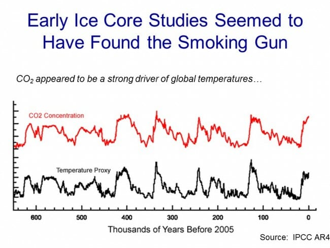
One such methodology uses ice cores. Ice in certain places like Antarctica and Greenland is laid down in annual layers. By taking a core sample, characteristics of the ice can be measured at different layers and matched to approximate years. CO2 concentrations can actually be measured in air bubbles in the ice, and atmospheric temperatures at the time the ice was laid down can be estimated from certain oxygen isotope ratios in the ice. The result is that one can plot a chart going back hundreds of thousands of years that estimates atmospheric CO2 and temperature. Al Gore showed this chart in his movie, in a really cool presentation where the chart wrapped around three screens:
As Gore points out, this looks to be a smoking gun for attribution of temperature changes to CO2. From this chart, temperature and CO2 concentrations appear to be moving in lockstep. From this, CO2 doesn't seem to be a driver of temperatures, it seems to be THE driver, which is why Gore often called it the global thermostat.
But there turned out to be a problem, which is why this analysis no longer is treated as a smoking gun, at least for the attribution issue. Over time, scientists got better at taking finer and finer cuts of the ice cores, and what they found is that when they looked on a tighter scale, the temperature was rising (in the black spikes of the chart) on average 800 years before the CO2 levels (in red) rose.
This obviously throws a monkey wrench in the causality argument. Rising CO2 can hardly be the cause of rising temperatures if the CO2 levels are rising after temperatures.
It is now mostly thought that what this chart represents is the liberation of dissolved CO2 from oceans as temperatures rise. Oceans have a lot of dissolved CO2, and as the oceans get hotter, they will give up some of this CO2 to the atmosphere.
The second outdated attribution analysis we will discuss is perhaps the most famous: The Hockey Stick. Based on a research paper by Michael Mann when he was still a grad student, it was made famous in Al Gore's movie as well as numerous other press articles. It became the poster child, for a few years, of the global warming movement.
So what is it? Like the ice core chart, it is a proxy analysis attempting to reconstruct temperature history, in this case over the last 1000 years or so. Mann originally used tree rings, though in later versions he has added other proxies, such as from organic matter laid down in sediment layers.
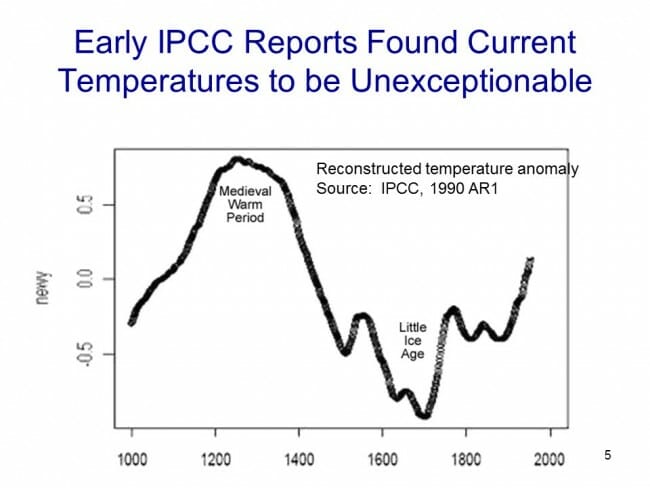
Before the Mann hockey stick, scientists (and the IPCC) believed the temperature history of the last 1000 years looked something like this:
Generally accepted history had a warm period from about 1100-1300 called the Medieval Warm Period which was warmer than it is today, with a cold period in the 17th and 18th centuries called the "Little Ice Age". Temperature increases since the little ice age could in part be thought of as a recovery from this colder period. Strong anecdotal evidence existed from European sources supporting the existence of both the Medieval Warm Period and the Little Ice Age. For example, I have taken several history courses on the high Middle Ages and every single professor has described the warm period from 1100-1300 as creating a demographic boom which defined the era (yes, warmth was a good thing back then). In fact, many will point to the famines in the early 14th century that resulted from the end of this warm period as having weakened the population and set the stage for the Black Death.
However, this sort of natural variation before the age where man burned substantial amounts of fossil fuels created something of a problem for catastrophic man-made global warming theory. How does one convince the population of catastrophe if current warming is within the limits of natural variation? Doesn't this push the default attribution of warming towards natural factors and away from man?
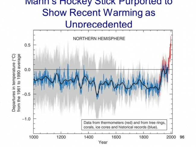
The answer came from Michael Mann (now Dr. Mann but actually produced originally before he finished grad school). It has been dubbed the hockey stick for its shape:
The reconstructed temperatures are shown in blue, and gone are the Medieval Warm Period and the Little Ice Age, which Mann argued were local to Europe and not global phenomena. The story that emerged from this chart is that before industrialization, global temperatures were virtually flat, oscillating within a very narrow band of a few tenths of a degree. However, since 1900, something entirely new seems to be happening, breaking the historical pattern. From this chart, it looks like modern man has perhaps changed the climate. This shape, with the long flat historical trend and the sharp uptick at the end, is why it gets the name "hockey stick."
Oceans of ink and electrons have been spilled over the last 10+ years around the hockey stick, including a myriad of published books. In general, except for a few hard core paleoclimatologists and perhaps Dr. Mann himself, most folks have moved on from the hockey stick as a useful argument in the attribution debate. After all, even if the chart is correct, it provides only indirect evidence of the effect of man-made CO2.
Here are a few of the critiques:
- Note that the real visual impact of the hockey stick comes from the orange data on the far right -- the blue data alone doesn't form much of a hockey stick. But the orange data is from an entirely different source, in fact an entirely different measurement technology -- the blue data is from tree rings, and the orange is form thermometers. Dr. Mann bristles at the accusation that he "grafted" one data set onto the other, but by drawing the chart this way, that is exactly what he did, at least visually. Why does this matter? Well, we have to be very careful with inflections in data that occur exactly at the point that where we change measurement technologies -- we are left with the suspicion that the change in slope is due to differences in the measurement technology, rather than in the underlying phenomenon being measured.
- In fact, well after this chart was published, we discovered that Mann and other like Keith Briffa actually truncated the tree ring temperature reconstructions (the blue line) early. Note that the blue data ends around 1950. Why? Well, it turns out that many tree ring reconstructions showed temperatures declining after 1950. Does this mean that thermometers were wrong? No, but it does provide good evidence that the trees are not accurately following current temperature increases, and so probably did not accurately portray temperatures in the past.
- If one looks at the graphs of all of Mann's individual proxy series that are averaged into this chart, astonishingly few actually look like hockey sticks. So how do they average into one? McIntyre and McKitrick in 2005 showed that Mann used some highly unusual and unprecedented-to-all-but-himself statistical methods that could create hockey sticks out of thin air. The duo fed random data into Mann's algorithm and got hockey sticks.
- At the end of the day, most of the hockey stick (again due to Mann's averaging methods) was due to samples from just a handful of bristle-cone pine trees in one spot in California, trees whose growth is likely driven by a number of non-temperature factors like precipitation levels and atmospheric CO2 fertilization. Without these few trees, most of the hockey stick disappears. In later years he added in non-tree-ring series, but the results still often relied on just a few series, including the Tiljander sediments where Mann essentially flipped the data upside down to get the results he wanted. Taking out the bristlecone pines and the abused Tiljander series made the hockey stick go away again.
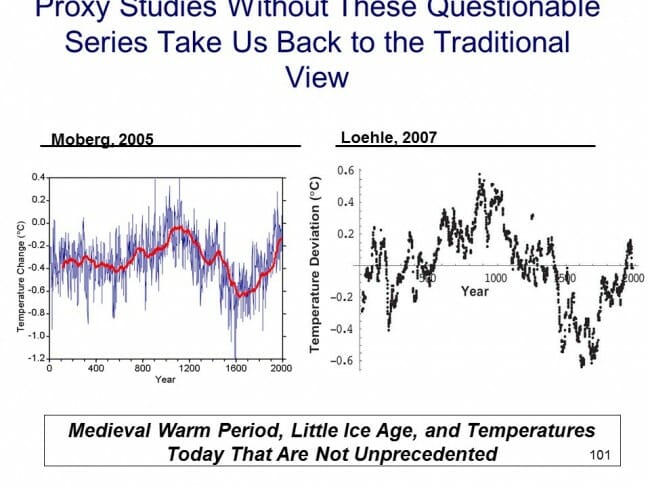
There have been plenty of other efforts at proxy series that continue to show the Medieval Warm Period and Little Ice Age as we know them from the historical record
As an aside, Mann's hockey stick was always problematic for supporters of catastrophic man-made global warming theory for another reason. The hockey stick implies that the world's temperatures are, in absence of man, almost dead-flat stable. But this is hardly consistent with the basic hypothesis, discussed earlier, that the climate is dominated by strong positive feedbacks that take small temperature variations and multiply them many times. If Mann's hockey stick is correct, it could also be taken as evidence against high climate sensitivities that are demanded by the catastrophe theory.
The Current Lead Argument for Attribution of Past Warming to Man
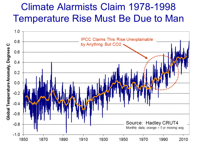
So we are still left wondering, how do climate scientists attribute past warming to man? Well, to begin, in doing so they tend to focus on the period after 1940, when large-scale fossil fuel combustion really began in earnest. Temperatures have risen since 1940, but in fact nearly all of this rise occurred in the 20 year period from 1978 to 1998:
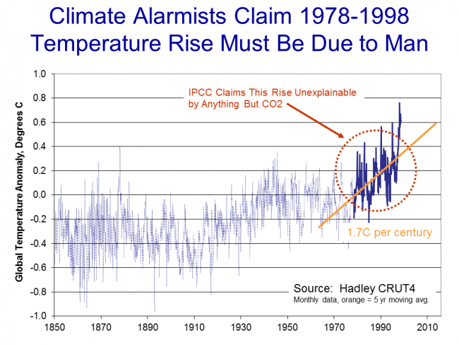
To be fair, and better understand the thinking at the time, let's put ourselves in the shoes of scientists around the turn of the century and throw out what we know happened after that date. Scientists then would have been looking at this picture:
Sitting in the year 2000, the recent warming rate might have looked dire .. nearly 2C per century...
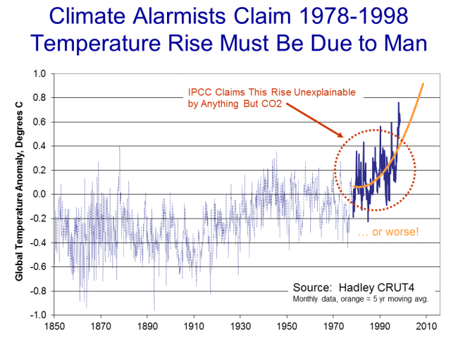
Or possibly worse if we were on an accelerating course...
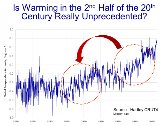
Scientists began to develop a hypothesis that this temperature rise was occurring too rapidly to be natural, that it had to be at least partially man-made. I have always thought this a slightly odd conclusion, since the slope from this 20-year period looks almost identical to the slope centered around the 1930's, which was very unlikely to have much human influence.
But never-the-less, the hypothesis that the 1978-1998 temperature rise was too fast to be natural gained great currency. But how does one prove it?
What scientists did was to build computer models to simulate the climate. They then ran the computer models twice. The first time they ran them with only natural factors, or at least only the natural factors they knew about or were able to model (they left a lot out, but we will get to that in time). These models were not able to produce the 1978-1998 warming rates. Then, they re-ran the models with manmade CO2, and particularly with a high climate sensitivity to CO2 based on the high feedback assumptions we discussed in an earlier chapter. With these models, they were able to recreate the 1978-1998 temperature rise. As Dr. Richard Lindzen of MIT described the process:
What was done, was to take a large number of models that could not reasonably simulate known patterns of natural behavior (such as ENSO, the Pacific Decadal Oscillation, the Atlantic Multidecadal Oscillation), claim that such models nonetheless accurately depicted natural internal climate variability, and use the fact that these models could not replicate the warming episode from the mid seventies through the mid nineties, to argue that forcing was necessary and that the forcing must have been due to man.
Another way to put this argument is "we can't think of anything natural that could be causing this warming, so by default it must be man-made. With various increases in sophistication, this remains the lead argument in favor of attribution of past warming to man.
In part B of this chapter, we will discuss what natural factors were left out of these models, and I will take my own shot at a simple attribution analysis.
The next section, Chapter 6 Part B, on natural attribution is here


Nice breakdown of Mann's obfuscations in the hockey stick graph. "Hide the decline" (swapping data sets) was truly scientific fraud, no matter how much they claim it was innocuous.
As mentioned in a prior thread on this subject, the shift from the cooling trend the current warming trend circa 1750-1850 was a far greater increase in warming than the amo/pdo enhanced warming of the 1980-1990's. But that shift which was of much greater magnitude was natural.
Nicely done Warren. A very technical subject made accessible to the lay-person.
I found your blog almost 10 years ago while looking for info on climate change, I didn't find this page, but your climate sceptic page instead. On it you had an incredible 80 page thesis on why global warming was garbage, very well and reasonably thought out, without name calling. This is more of the same. Thanks.
You're being very warming-generous by using Hadley CRUtemp4 charts as examples of warming having precedence. CRUT4 has already increased 21st century warming by .1C over CRUT3, and cooled pre-1960 temperatures by half a degree. Take those "adjustments" away, and the 1930's were warmer than the current decade. Which makes perfect sense when one looks at the extreme heat temperature records set in the 30's that still stand today. And what of the thousands of Americans that died of heat stroke during that decade? Did that never happen? CRUtemp is laughable in it's almost complete removal of the cooling period from the 1950's through 1970's when glaciers were growing and scientists were warning us of an impending ice age. Previous temperature records corroborated these historical events. But each successive version of CRUtemp smoothes them away more than the last. That they've thoroughly revised history with very few complaints is a testament to the state of modern science and journalism.
Those ice core studies are missing the y axis labels, which means they're burying the lede: the prehistoric correlation between CO2 and carbon is around 1 Kelvin per 10ppm CO2, an order of magnitude above what we've observed and vastly higher than our most paranoid predictions. Anyone who really believes that this is primarily because of a forcing effect from CO2 to temperature rather than the other way around would be preparing to move to Alaska. Not southern Alaska, either. North slope.
Somebody's ALWAYS trying to put something over on us.
Coyote: This obviously throws a monkey wrench in the causality argument. Rising CO2 can hardly be the cause of rising temperatures if the CO2 levels are rising after temperatures.
That is incorrect in the case of feedback mechanisms. CO2 causes warming, which causes the oceans to release more CO2 which causes more warming ... The trigger is believed to be orbital variations.
Coyote: Note that the real visual impact of the hockey stick comes from the orange data on the far right -- the blue data alone doesn't form much of a hockey stick. But the orange data is from an entirely different source, in fact an entirely different measurement technology -- the blue data is from tree rings, and the orange is form thermometers.
Um, that's why they are in different colors.
Coyote: In fact, well after this chart was published, we discovered that Mann and other like Keith Briffa actually truncated the tree ring temperature reconstructions (the blue line) early. Note that the blue data ends around 1950.
Tree growth patterns closely track the instrumental temperature record and other proxies measures until about 1960, when they begin to diverge. This is believed to be due to anthropogenic factors.
Coyote: McIntyre and McKitrick in 2005 showed that Mann used some highly unusual and unprecedented-to-all-but-himself statistical methods that could create hockey sticks out of thin air.
While Mann's seat-of-the-pants methods were subject to valid criticism, Independent analysis of the data supports Mann's original findings, and newer proxy studies also support the finding of anomalous warming.
Coyote: Another way to put this argument is "we can't think of anything natural that could be causing this warming, so by default it must be man-made.
That's only part of the argument. Energy is conserved, and there are only a few parameters to the overall global energy budget; radiation and albedo. If the Earth's surface absorbs more energy than it emits, it warms until it reaches a higher temperature equilibrium.
However, the primary argument for global warming is based on the physics of the greenhouse effect, and the history of natural climate change.
Re: your CO2 feedback point, would that not cause temperature and CO2 to rise in unison? You state "CO2 causes warming" however that does not seem to be shown in the ice core chart.
And on an unrelated point, what is the "correct" temperature? Personally I don't want to go back to glaciers in Ohio, but I'm just one person.
Coyote: McIntyre and McKitrick in 2005 showed that Mann used some highly unusual and unprecedented-to-all-but-himself statistical methods that could create hockey sticks out of thin air.
While Mann's seat-of-the-pants methods were subject to valid criticism, Independent analysis of the data supports Mann's original findings, and newer proxy studies also support the finding of anomalous warming.
Truly independent analysis does not support Mann's finding. Replication using the same flawed proxies and similar flawed statistical methods will result in verification of Mann' s HS,
However See Loehle and molberg
Mann' HS -
Have your followed in the critiques of D’Arrigo et al 2016 and her cherrypicking of individual cores - deleted 97% of the cores that did not have the hockey stick - puts a whole new meaning to the 97% consensus.
Your might want to keep up with the scientific studies at credible web sites which dont include skepitcal science and real climate science
Please provide a specific citation, rather than just waving in the general direction of "critiques".
Joe: See Loehle and molberg
Any chance of providing an actual citation?
Peabody: your CO2 feedback point, would that not cause temperature and CO2 to rise in unison?
There's typically a delay in any feedback system. In this case, it takes a long some time for the hydrosphere and cryosphere to reach equilibrium in response to CO2 forcing.
Peabody: And on an unrelated point, what is the "correct" temperature?
For the Earth? For life? For humans? For human civilization, relative stability is the most healthy. Some change is natural, but fouling their own nest is something humans are smart enough to avoid.
Perhaps you mean Moberg et al., Highly variable Northern Hemisphere temperatures reconstructed from low- and high-resolution proxy data, Nature 2005. If so, take a look at the second graph.
http://www.nature.com/nature/journal/v433/n7026/images/nature03265-f2.2.jpg
Note the anomalous warming in the last few decades.
The “solution” regarding concern about carbon dioxide lies in understanding entropy and thermodynamics and recognizing that force fields create temperature gradients, not back radiation. You need to study what happens in real experiments and real studies, such as mine which shows real world data confirming water vapor cools rather than warms. You need to realize that rain forests with 4% water vapor are not 50 degrees hotter than drier regions, that the Sun’s radiation cannot make the surface hotter than it makes the middle of the troposphere and that mankind can do nothing about climate change which is 100% natural.
A location on the Moon’s surface can cool by over 200 degrees in about two weeks, getting down to around -150°C on the dark side. Now, Antarctica is on the dark side of Earth for over three months in winter, but its temperature remains fairly steady in the vicinity of -50°C to -60°C. But there must be at least some loss of energy via radiation through the atmospheric window to Space. So what replenishes that energy? Clearly the difference between the Moon and the Earth has something to do with the atmosphere. Hence the energy must come from the atmosphere, but wherever the atmosphere is colder than the Antarctic surface, there can be no heat transfer by radiation. There can however be a process which increases entropy in accord with the Second Law of Thermodynamics, and you can read about that process at https://itsnotco2.wordpress.com because that is where this mystery energy does in fact come from. When you understand this process and note the overwhelming evidence supporting its existence then, and only then, will you have a correct understanding as to why the radiative greenhouse is nothing but fiction.
* Second law of thermodynamics: In a natural thermodynamic process, the sum of the entropies of the interacting thermodynamic systems increases.
"describe man's affect" --> effect not affect. :-)
feel free to delete this comment after making the fix :-)
Without x,y, and z axis, ALL data are based on Junk Science.
Completely off topic, thank you :) (Thread was closed.)