My family often jokes about my obsessive behavior vis a vis Tesla and Elon Musk (on the off chance you are unaware of my thoughts, the most recent are here). My daughter texted me last night that "Wealthy millennials seem to love Elon." And that is true. My answer to her is the title of this post, "People who express opinions outside of their domain seldom have really looked into it much."
Of course, I am not in any way arguing for some sort of strong credentialism wherein people should not express opinions outside of their domain. God forbid, I would have to shut down this blog. But I am saying that just because someone is really smart and successful at A does not necessarily mean their opinion on B is worth squat. As always, as a consumer of opinions, caveat emptor should always be the watchwords.
The first time I really encountered this phenomenon (outside of obvious examples such as the political and economic opinions of Hollywood celebrities) was related to climate change. I don't see them as often today, but for a while it used to be very common for letters to circulate in support of climate change science signed by hundreds or thousands of scientists.
The list of signatures was always impressive, but when you looked into it, there was a problem: few if any of the folks who signed had spent any time really looking at the details of climate science -- they were busy happily studying subatomic particles or looking for dark energy in space. It turned out most of them had fallen for the climate alarmist marketing ploy that opposition to catastrophic man-made global warming theory was by people who were anti-science. And thus by signing the letter they weren't saying they had looked into it all and confirmed the science looked good to them, they were merely saying they supported science.
When some of them looked into the details of climate science later, they were appalled. Many have reached the same general conclusions that I have, that CO2 is certainly causing some warming but the magnitude of that warming or in particular the magnitude and direction of its knock on effects like floods or droughts or tornadoes, is far from settled science.
So it is often the case that people who show strong support for ideas or people outside of their domain do so for reasons other than having made use of their expertise and experience to take a deep dive into the issues. Theranos is a great example from the business world. Elizabeth Holmes convinced a bunch of men (and they were mostly all men -- women seemed to have more immunity to her BS) who were extraordinarily successful in their own domains (George Schultz, the Murdochs, Henry Kissinger, Larry Ellison) to become passionate believers in her vision. Which is fine, it was a lovely vision. But they spent zero time testing whether she could really do it, and worse, refused to countenance any reality checks about problems Theranos was facing because Holmes convinced them that critics were just bad-intentioned people representing nefarious interests who wanted her vision to fail.
Which now brings us to Tesla and Elon Musk. I used to love Elon like everyone else. I still think that having four or five billionaires in a space race against each other is finally the world I thought I was going to get growing up reading Heinlein. The Tesla Model S was probably one of the most revolutionary cars of the last 50 years. But he lost me when he committed outright fraud in the Solar City - Tesla deal and since then have only become more skeptical about he and Tesla.
I sort of laugh when folks tell me that really smart successful rich people believe in Tesla. You mean like James Murdoch, on the board of Tesla and who also was lost his entire investment in Theranos? Or like Larry Ellison, an adviser and fan of Elizabeth Holmes who invested $1 billion in Tesla just 6 months ago and has already lost 40% of it? The window on this is probably closing, but over the last 10 years if you wanted to get Silicon Valley investors to throw a lot of money at you, find a traditional bricks and mortar business and devise a story in which you take that industry and convert its economics to that of the networked software world (see: Uber, WeWork, Tesla, and even Theranos is some of its strategic pivots).
Or how about true millennials and Elon Musk? Name a wealthy millennial supporter of Elon Musk and Tesla and I can bet you any amount of money they have not looked at Tesla's balance sheet or cash flow or the details of its global demand trends. They have not thought about its dealership strategy or manufacturing strategy and the cash flow implications of these. They just like what Elon says. It sounds big and visionary. They buy into Elon's formulation that he is saving the environment and everyone opposed to him is in a cabal with big oil (ignoring the fact that Elon routinely uses his Gulfstream VI to commute distances less than 60 miles). So saying that rich millenials adore Elon is effectively saying that they want to be associated with the same things Elon says he is for -- the environment and space travel et al.
Elon Musk is Ferdinand DeLesseps. He is PT Barnum. He is Elizabeth Holmes. He is the pied piper. He is fabulous at spinning visions and making them sound science-y. But he is not Tony Stark. There is a phenomenon with Elon Musk that everyone thinks he is brilliant until they hear him speak about something about which they have domain knowledge, and then they realize he is full of sh*t. For example, no one who knows anything about transportation or physics or basic engineering has thought his Boring Company and Hyperloop make any sense at all. His ideas would have been great cover stories for Popular Mechanics in the 1970's, wowing 13-year-old boys like me with pictures of mile-long cargo blimps and flying RV's. He is like a Marvel movie that spouts science that is just believable-enough sounding that it moves the plot along but does not stand up to any scrutiny.
All of this would be harmless if he was not running a public company. I don't really care about the rich folks who were duped by Elizabeth Holmes, but hundreds of thousands of small millenial investors who have totally bought into the Elon hype are literally putting their last dollar into Tesla, and sometimes borrowing more. Tesla shorts often laugh at these folks on Twitter, calling them "bagholders," but it is a tragedy. Unless Tesla finds a sugar daddy sucker, and the odds of that are getting longer, I think it is going to end badly for many of these investors
As a disclosure, I have been short Tesla via puts for a while now. It you really want to understand Elon, the best book I can recommend is The Path Between The Seas about the building of the Panama Canal. First, it is a great book you should read no matter what. And second, Ferdinand DeLesseps is the best analog I can find for Musk.
Most folks assume that global warming results in record high daily temperatures, but this is not necessarily the case. When your local news station blames a high temperature record on global warming, they may be wrong for two reasons.
Most of the temperature stations used by your local news channels for weather are full of urban heat island biases. This is particularly true of the airport temperature that many local news stations use as their official reading (though to be fair UHI has much more effect on evening temperatures than temperatures at the daily high).
Most global warming, at least in the US where we have some of the best records, does not occur during the day -- it occurs at night
The latter point is surprising to most folks, but as a result we are not seeing an unusual number of daily high temperature records set (many were set in the 1930s and still stand). What we are seeing instead is a large number of record high low temperature readings. This is confusing, but basically it means that the lowest temperature that is reached at nighttime is higher than it has been in the past. The chart below is a bit dated but still holds:
When I give presentations I try to use examples from local data. Here is the comparison of night time warming vs. day time warming in Amherst, MA.
I bring this all up again because Dr. Roy Spencer has done a similar analysis for the US from the relatively new AIRS database (a satellite-based data set that avoids some of the problems of land thermometer data sets like urban heat island biases and geographic coverage gaps). He shows this same finding, that over 80% of the warming we have seen recently in the US is at night.
This is a bit over-complicated because it is looking at temperatures through different heights of the atmosphere when most of you only care about the surface. But you can just look at the 0 height line to see the surface warming trend. Note that in general the data is pretty consistent with the UAH lower-troposphere temperature (satellite) and the NOAA metric (ground thermometers).
No particular point except to highlight something that is poorly understood by most folks because the media never talks about it.
Imagine that for some reason you desperately needed to be under a certain weight. I am old enough to think of the relatively obscure movie Vision Quest where a high school wrestler is trying to drop two weight classes. If you were in that situation, what is the first investment you would make? Exercise equipment? Nutrition guides? A personal trainer? No! You would invest in a good, accurate scale. Because without being able to measure the variable (in this case weight) you care about, everything else is worthless.
As trivial an observation as this may seem, the fact is that the world's governments have spent tens, perhaps hundreds of billions of dollars on global warming research and mitigation and have done almost zero to build out and improve a reliable temperature measurement system and historical temperature database. We have absolutely failed over the last 30 years to substantially improve our actual measurement of the warming we are so concerned about.
There are at least two problems with our temperature data, the first of which I have written about many times before -- our surface temperature measurement infrastructure is full of bad installations whose design and location bear no resemblance to best-practice standards. The most common problem is that temperature measurement stations are located in places that are subject to a lot of local biases, particularly urban development and heat islands. I wrote about a classic example I discovered right here in Arizona. And while the US has taken a few steps to eliminate the most egregious locations, many bad ones still exist. And problems with the US infrastructure are nothing compared to issues with the infrastructure in other countries. There still are only a handful of measurement locations in huge continents such as Africa and Antarctica, with quality problems equal to or greater than those in the US.
Parallel to the land surface data, we have a second temperature data set taken from satellites that has nearly as many issues. Satellite data eliminates some of the problems of the surface data set: it does not have large gaps in coverage and it is not subject to local biases, such as urban heat islands. It does have the problem of not actually measuring the surface temperature, but rather the lower troposphere, but this is exactly where computer models predict the largest global warming signal to occur, so it is still useful. But there have been many under-investment problems here, too. The history of temperature versions of the UAH satellite temperature data base has many ups and downs that must be corrected -- this satellite fell out of the sky and then this one has sensor drift and then this other one went off course. Despite the large and vocal role of the Goddard Institute for Space Studies (GISS) in climate research, the database they maintain is a surface temperature database and they seem to do little to support space measurement, leaving it to a few small groups to learn something from the satellites. It's as big mess, made worse by the political factor of the space temperature database getting lower warming rates and being maintained by a skeptic while the surface temperature databases show more warming and are maintained by folks more pessimistic about warming rates.
To this picture we can add substantial problems with the historical temperature record. The Hadley CRUT database is generally considered the gold standard in surface temperature records and is used by most researchers. There are some problems with the database that are hard to fix -- for example, for 1850 there is apparently only 1 temperature station in the database for the entire southern hemisphere, which means half the world's temperature is being extrapolated from one site in Indonesia. We can't get in a time machine and sprinkle the world in 1850 with more thermometers. But we can try to take some sort of estimate of the potential error induced by such spotty measurement, something I have never seen done in the CRUT database. The data in 1850 is always presented as just as solid as that in 1950 (see my last global temperature update).
Apparently, a PHD student in Australia recently audited the CRUT database as his thesis project. Before you get into his results, here is one thing to consider: Literally trillion-dollar decisions are being made based on this database and based on research which uses this database, and no one has bothered to do this previously until some random grad student in Australia gives it a shot? By the way, it should be noted that once he completed what should have been warmly welcomed by the climate community with a "Dang, can't believe we didn't do that already," he has instead gotten nothing but grief and criticism.
The thesis is paywalled, (just $8, I have bought a copy and am slogging through it now) but Anthony Watt summarizes:
HadCRUT4 is the primary global temperature dataset used by the Intergovernmental Panel on Climate Change (IPCC) to make its dramatic claims about “man-made global warming”. It’s also the dataset at the center of “ClimateGate” from 2009, managed by the Climate Research Unit (CRU) at East Anglia University.
The audit finds more than 70 areas of concern about data quality and accuracy.
But according to an analysis by Australian researcher John McLean it’s far too sloppy to be taken seriously even by climate scientists, let alone a body as influential as the IPCC or by the governments of the world.
…
Main points:
The Hadley data is one of the most cited, most important databases for climate modeling, and thus for policies involving billions of dollars.
McLean found freakishly improbable data, and systematic adjustment errors , large gaps where there is no data, location errors, Fahrenheit temperatures reported as Celsius, and spelling errors.
Almost no quality control checks have been done: outliers that are obvious mistakes have not been corrected – one town in Columbia spent three months in 1978 at an average daily temperature of over 80 degrees C. One town in Romania stepped out from summer in 1953 straight into a month of Spring at minus 46°C. These are supposedly “average” temperatures for a full month at a time. St Kitts, a Caribbean island, was recorded at 0°C for a whole month, and twice!
Temperatures for the entire Southern Hemisphere in 1850 and for the next three years are calculated from just one site in Indonesia and some random ships.
Sea surface temperatures represent 70% of the Earth’s surface, but some measurements come from ships which are logged at locations 100km inland. Others are in harbors which are hardly representative of the open ocean.
When a thermometer is relocated to a new site, the adjustment assumes that the old site was always built up and “heated” by concrete and buildings. In reality, the artificial warming probably crept in slowly. By correcting for buildings that likely didn’t exist in 1880, old records are artificially cooled. Adjustments for a few site changes can create a whole century of artificial warming trends.
Details of the worst outliers
For April, June and July of 1978 Apto Uto (Colombia, ID:800890) had an average monthly temperature of 81.5°C, 83.4°C and 83.4°C respectively.
The monthly mean temperature in September 1953 at Paltinis, Romania is reported as -46.4 °C (in other years the September average was about 11.5°C).
At Golden Rock Airport, on the island of St Kitts in the Caribbean, mean monthly temperatures for December in 1981 and 1984 are reported as 0.0°C. But from 1971 to 1990 the average in all the other years was 26.0°C.
The last point about past thermometer adjustments is one I have run into before when I was looking at urban heat islands and their effect on temperature measurement (by the way this is a really great science fair project if you are looking for one). Past urban heat adjustments seem to imply (by cooling the past more than the present) that urban heat biases on measured temperatures have gone down over time, which defies all logic and experience.
There is a lot more of interest at the link, but it strikes me as shear madness, bordering on fraud, that there seems to have been so little effort put into data integrity of perhaps the single most important non-economic dataset in the world. I would presume that warmists, who constantly accuse skeptics of being "anti-science" would be the first to line up in favor of investing whatever is necessary in better, cleaner data. So far, there has only been criticism of the effort.
Postscript: The temperature adjustment issue is an important one. In short, as seen below, the magnitude of the temperature adjustments in the US temperature database equal the magnitude of the warming. In other words, the warming signal comes entirely from the adjustments. This does not mean the signal is being read incorrectly, but it does mean that getting the adjustments (and their error bars, which no one ever includes) correct is perhaps the single most important issue to a good historical database.
This is the, uh, whateverth installment in a series on using your common sense to fact check data, even when the data is tantalizingly useful for the point one is trying to make.
For the last decade or so, global warming activists have used major fires as further "proof" that there is a global warming trend. Often these analyses are flawed, for a variety of reasons that will be familiar to readers, e.g.
A single bad fire is just one data point and does not prove a trend, you need a series of data to prove a trend
There is no upward trend in US acreage in fires over the last 10 years, but there is in the last 20 years, which gives lots of nice opportunities for cherry-picking on both sides
Acres burned is a TERRIBLE measure of global warming, because it is trying to draw global trends from a tiny fraction of the world land mass (western US); and because it is dependent on many non-climate variables such as forest management policies and firefighting policy.
The better more direct metric of possible warming harm is drought, such as the Palmer drought severity index, which shows no trend (click to enlarge below)
An even better metric, of course, is that there IS an actual upward trend in temperatures. There is not, however, much of an upward trend in bad weather like drought, hurricanes, or tornadoes. In this context fire is a third order variable (temp--->drought---> fire) which makes it a bad proxy, particularly when the first order variable is telling the tale.
AAAAaaaand then, there is this chart, much loved by skeptics, for long-term US fire history:
I am pretty sure that I have avoided ever using this piece of skeptic catnip (though I could be wrong, I can have moments of weakness). The reason is that nothing about this chart passes the smell test. While it is true that the 1930's were super hot and dry, likely hotter in the US than it has been this decade, there is absolutely no reason to believe the entire period of 1926-1952 were so much higher than today. Was there a different fire management policy (e.g. did they just let all fires burn themselves out)? Was there a change in how the data was recorded?
Here is my rule of thumb -- when you see a discontinuity like this (e.g. before and after 1955) you better have a good explanation and understanding of the discontinuity. This is not just to be a good person and be true to good scientific process (though we all should) but also from the practical and selfish desire to avoid having someone come along who DOES know why the discontinuity exists and embarrass you for your naivete.
I have never trusted this chart, because I have not really understood it. This week, the Antiplanner (who before he focused on transit focused most of his writing on the Forest Service and forest policy) has an explanation.
The story begins in 1908, when Congress passed the Forest Fires Emergency Funds Act, authorizing the Forest Service to use whatever funds were available from any part of its budget to put out wildfires, with the promise that Congress would reimburse those funds. As far as I know, this is the only time any democratically elected government has given a blank check to any government agency; even in wartime, the Defense Department has to live within a budget set by Congress.
This law was tested just two years later with the Big Burn of 1910, which killed 87 people as it burned 3 million acres in the northern Rocky Mountains. Congress reimbursed the funds the Forest Service spent trying (with little success) to put out the fires, but — more important — a whole generation of Forest Service leaders learned from this fire that all forest fires were bad....
This led to a conflict over the science of fire that is well documented in a 1962 book titled Fire and Water: Scientific Heresy in the Forest Service. Owners of southern pine forests believed that they needed to burn the underbrush in their forests every few years or the brush would build up, creating the fuels for uncontrollable wildfires. But the mulish Forest Service insisted that all fires were bad, so it refused to fund fire protection districts in any state that allowed prescribed burning.
The Forest Service’s stubborn attitude may have come about because most national forests were in the West, where fuel build-up was slower and in many forests didn’t lead to serious wildfire problems. But it was also a public relations problem: after convincing Congress that fire was so threatening that it deserved a blank check, the Forest Service didn’t want to dilute the message by setting fires itself.
When a state refused to ban prescribed fire, the Forest Service responded by counting all fires in that state, prescribed or wild, as wildfires. Many southern landowners believed they needed to burn their forests every four or five years, so perhaps 20 percent of forests would be burned each year, compared with less than 1 percent of forests burned through actual wildfires. Thus, counting the prescribed fires greatly inflated the total number of acres burned.
The Forest Service reluctantly and with little publicity began to reverse its anti-prescribed-fire policy in the late 1930s. After the war, the agency publicly agreed to provide fire funding to states that allowed prescribed burning. As southern states joined the cooperative program one by one, the Forest Service stopped counting prescribed burns in those states as wildfires. This explains the steady decline in acres burned from about 1946 to 1956.
There were some big fires in the West in the 1930s that were not prescribed fires. I’m pretty sure that if someone made a chart like the one shown above for just the eleven contiguous western states, it would still show a lot more acres burned in real wildfires in the 1930s than any decade since — though not by as big a margin as when southern prescribed fires are counted. The above chart should not be used to show that fires were worse in the 1930s than today, however, because it is based on a lie derived from the Forest Service’s long refusal to accept the science behind prescribed burning.
There you go, the discontinuity seems to be from a change in the way the measurement is calculated.
By the way, I work closely with the Forest Service every day and mostly this partnership is rewarding. But I can tell you that the blank check still exists for fire suppression costs and results in exactly the sort of inefficient spending that you would imagine. Every summer, much Forest Service work comes to a halt as nearly every manager and professional gets temporarily assigned to fire -- something FS employees love because they get out of the grind of their day job and essentially get to go camping.
Most of you know I agree there is man-made global warming but am skeptical the extent will be anywhere near most forecasts you see in the media. For some reason, this earns me the title of "denier." However, I find that the climate discussion has become boring in the extreme, and I have mostly moved on from it. But I am still interested in analytical abuses in the media, and long-time readers will know that my favorite is the positing of a trend using but a single data point. My example today happens to be from climate.
It starts with this tweet:
As extreme weather events become more common, we're living through "once in lifetime storms" every year. Our most immediate understanding of their severity is loss of life and damages.
Obviously he is reacting to the recent hurricane in North Carolina, which turns out to be pretty run of the mill but the media has portrayed as some sort of armageddon. I could have pulled roughly similar quotes from all kinds of sources. Several networks did long pieces over the weekend claiming an upward trend in hurricanes without any trend data, but merely from the fact that one made landfall recently. But anyone who claims be defending science should be held, I think, to a higher standard in making scientific claims.
As I asked the March for Science tweeter: If, say, there is a trend towards more or stronger hurricanes, why does no one ever show a trend chart? They just declare the trend from one data point, like a single hurricane landfall. Every long-term hurricane & cyclonic energy trend chart I have seen is flat to down. (This is not primarily a climate post but I will post some hurricane trend charts at the end).
There is certainly an upwards trend in the media labelling storms as "once in a lifetime" but it is doubtful that there is actually an underlying trend in storm severity. Even the slightly more meaningful term "100-year _____" is abused.
Consider a 100-year flood in North Carolina, almost certainly a once in a lifetime event for someone in that state unless they live really long. Since North Carolina is .027% of the world's landmass, there will be, on average, 37 hundred-year floods over land areas the size of North Carolina every single year. That's 37 once-in-a-lifetime North-Carolina-sized floods somewhere in the world every single year. Heck, there should be 3-4 thousand-year floods of North Carolina size somewhere in the world every year -- that's three or four once in a millenium floods! And this same math applies to 100-year heat waves, droughts, snow storms -- you name it.
We can learn a couple of things from this. First, living through "once in a lifetime" storms every year, somewhere in the world, is not abnormal -- it is expected. Second, one can see how choices in media coverage could drive an apparent trend. If the media covered maybe 3 or 4 of these 37 floods when I was young, but covers every one today, it will appear that there is a trend since I hear so much more about them. But in fact, nothing will have changed except the media. I will remind you what I wrote on this topic waaaay back in 2012.
Let's take a step back to 2001 and the "Summer of the Shark." The media hysteria began in early July, when a young boy was bitten by a shark on a beach in Florida. Subsequent attacks received breathless media coverage, up to and including near-nightly footage from TV helicopters of swimming sharks. Until the 9/11 attacks, sharks were the third biggest story of the year as measured by the time dedicated to it on the three major broadcast networks' news shows.
Through this coverage, Americans were left with a strong impression that something unusual was happening -- that an unprecedented number of shark attacks were occurring in that year, and the media dedicated endless coverage to speculation by various "experts" as to the cause of this sharp increase in attacks.
Except there was one problem -- there was no sharp increase in attacks. In the year 2001, five people died in 76 shark attacks. However, just a year earlier, 12 people had died in 85 attacks. The data showed that 2001 actually was a down year for shark attacks.
Once you start looking for this type of thing, the extrapolation of a trend from at most one data point, you will see it everywhere.
For those still hanging around to the end, here are a couple of actual trend charts on hurricanes (the adjusted line attempts to correct for the fact that earlier eras with no satellites or radar tended to miss some hurricanes) (source at NOAA):
Below are two charts that look beyond just the Atlantic at global cyclones, both from this source. The first is frequency:
The second looks at accumulated cyclonic energy, which is a sort of time integral of the energy in all active cyclonic storms around the world
Later in the tweetstorm, the same tweeter mentioned as a fact, again without data, "Climate change is increasing drought frequency, impacting everything from agriculture to health. Some studies suggest the consequences of droughts include increased violence and war." There has been no upward trend in US droughts (negative is more drought-y.
Finally, in the spirit of full disclosure, of all the zillions of things (not directly related to temperature) in weather effects that are blamed on global warming, this is the only one I have found that shows an upward trend recently and could logically be attributed to warming. Whether this is related to warming or independent or a data measurement issue is (if folks were honest) not well understood
This article in something called Inside Climate News seems to be typical of many I have seen this year: Because we have had much attention in the media on heat waves this year, there must be an upward trend in heat waves and that is a warning signal that man-made global warming is destroying the planet. Typical of these articles are a couple of features
Declaration of a trend without any actual trend data, but just a single data point of events this year
Unstated implication that there must be a trend because the author can't remember another year when heat wave stories were so prevalent in the media
Unproven link to man-made global warming, because I guess both involve warmth.
I have no idea if well-publicized heat waves this year are a harbinger of an accelerating global warming trend. But since we are discussing "trends" it struck me as useful to actually liven up the discussion with some actual trend data, ie data for more than one summer. There is a real danger to extrapolating trends from volume of media coverage, as I discussed here. If you don't want to click through, I have a funny story in the postscript.
First, our most reliable temperature trend data does not really show a spike in temperatures this summer. Remember, a heat wave that covered the entire US would only affect 6% of the world's landmass and <2% of the world's total area (source). You can easily see the trend upwards several tenths of a degree over the last 40 years, but it is impossible to see much unique about the last 3 months of summer.
Second, there really is no substantial upward trend in US heat wave index (from right off the EPA's web site, as are all of the following charts. Look at the source for yourself to make sure I am not playing games). Note that all of the following charts are through 2016 and do NOT include the recent summer but are pretty meaningful none-the-less.
Third, in most of the country, there is actually a downward trend rather than upward trend in extreme heat days.
Pretty much everyone agrees, skeptics included, that the world and the US has warmed. So why are extreme heat days down in many locations, and certain down from the 1930's? This defies our intuition. The explanation is in part due to a feature of global warming that is seldom explained well by the media, that much of the warming we see and as predicted in climate models is in the night. We are seeing some increase in hot daytime highs, but really not at an unprecedented level over the last century. BUT, we see MUCH more of a trend in hot daily lows, which basically means warming evenings.
I spoke at Amherst College a while back and here was their temperature trends, broken up between daily highs and nighttime lows. All of Amherst's temperature trend since 1950 has not been in increased daytime highs but higher nighttime lows. This is a pattern you see repeated over and over at nearly every temperature station.
This is why I consider media reports of heat waves, at least of the scope we have seen to date, absolutely irrelevant to "proving" the world is warming.
let's take a step back to 2001 and the "Summer of the Shark." The media hysteria began in early July, when a young boy was bitten by a shark on a beach in Florida. Subsequent attacks received breathless media coverage, up to and including near-nightly footage from TV helicopters of swimming sharks. Until the 9/11 attacks, sharks were the third biggest story of the year as measured by the time dedicated to it on the three major broadcast networks' news shows.
Through this coverage, Americans were left with a strong impression that something unusual was happening -- that an unprecedented number of shark attacks were occurring in that year, and the media dedicated endless coverage to speculation by various "experts" as to the cause of this sharp increase in attacks.
Except there was one problem -- there was no sharp increase in attacks. In the year 2001, five people died in 76 shark attacks. However, just a year earlier, 12 people had died in 85 attacks. The data showed that 2001 actually was a down year for shark attacks.
Update: I am not really an active participant in the climate scene any more, particularly when positions hardened and it was impossible to really have an interesting discussion any more. The implicit plea in this post goes beyond climate -- if you are claiming a trend, show me the trend data. I can be convinced. There is clear trend data that temperatures are increasing so I believe there is an upward trend in temperatures. Show me the same for droughts or heat waves or hurricanes and I will believe the trend about those as well, but so often the actual data never matches the arm-waving in these media sources.
This article about a skeptic of the dominant Alvarez meteor-extinction debate is quite interesting and worth a read. Gerta Keller has had quite an interesting life. But I will say I found it particularly fascinating comparing details here to the climate debate. Here are a few example quotes that will seem very familiar to those who have watched the back and forth over global warming, particularly from the skeptic side:
Keller’s resistance has put her at the core of one of the most rancorous and longest-running controversies in science. “It’s like the Thirty Years’ War,” says Kirk Johnson, the director of the Smithsonian’s National Museum of Natural History. Impacters’ case-closed confidence belies decades of vicious infighting, with the two sides trading accusations of slander, sabotage, threats, discrimination, spurious data, and attempts to torpedo careers. “I’ve never come across anything that’s been so acrimonious,” Kerr says. “I’m almost speechless because of it.” Keller keeps a running list of insults that other scientists have hurled at her, either behind her back or to her face. She says she’s been called a “bitch” and “the most dangerous woman in the world,” who “should be stoned and burned at the stake.”
Nobel prize winner Alvarez sounds a bit like Michael Mann:
Ad hominem attacks had by then long characterized the mass-extinction controversy, which came to be known as the “dinosaur wars.” Alvarez had set the tone. His numerous scientific exploits—winning the Nobel Prize in Physics, flying alongside the crew that bombed Hiroshima, “X-raying” Egypt’s pyramids in search of secret chambers—had earned him renown far beyond academia, and he had wielded his star power to mock, malign, and discredit opponents who dared to contradict him. In The New York Times, Alvarez branded one skeptic “not a very good scientist,” chided dissenters for “publishing scientific nonsense,” suggested ignoring another scientist’s work because of his “general incompetence,” and wrote off the entire discipline of paleontology when specialists protested that the fossil record contradicted his theory. “I don’t like to say bad things about paleontologists, but they’re really not very good scientists,” Alvarez told TheTimes. “They’re more like stamp collectors.”
This sounds familiar, dueling battles between models and observations:
That the dinosaur wars drew in scientists from multiple disciplines only added to the bad blood. Paleontologists resented arriviste physicists, like Alvarez, for ignoring their data; physicists figured the stamp collectors were just bitter because they hadn’t cracked the mystery themselves. Differing methods and standards of proof failed to translate across fields. Where the physicists trusted models, for example, geologists demanded observations from fieldwork.
There is pal review
he said impacters had warned some of her collaborators not to work with her, even contacting their supervisors in order to pressure them to sever ties. (Thierry Adatte and Wolfgang Stinnesbeck, who have worked with Keller for years, confirmed this.) Keller listed numerous research papers whose early drafts had been rejected, she felt, because pro-impact peer reviewers “just come out and regurgitate their hatred.”
And charges that key data is not being shared to avoid it falling in the hands of skeptics
She suspected repeated attempts to deny her access to valuable samples extracted from the Chicxulub crater, such as in 2002, when the journal Naturereported on accusations that Jan Smit had seized control of a crucial piece of rock—drilled at great expense—and purposefully delayed its distribution to other scientists, a claim Smit called “ridiculous.” (Keller told me the sample went missing and was eventually found in Smit’s duffel bag; Smit says this is “pure fantasy.”)
Leading to a familiar discussion of scientific consensus
Keller and others accuse the impacters of trying to squash deliberation before alternate ideas can get a fair hearing. Though geologists had bickered for 60 years before reaching a consensus on continental drift, Alvarez declared the extinction debate over and done within two years. “That the asteroid hit, and that the impact triggered the extinction of much of the life of the sea … are no longer debatable points,” he said in a 1982 lecture.....
All the squabbling raises a question: How will the public know when scientists have determined which scenario is right? It is tempting, but unreliable, to trust what appears to be the majority opinion. Forty-one co-authors signed on to a 2010 Science paper asserting that Chicxulub was, after all the evidence had been evaluated, conclusively to blame for the dinosaurs’ death. Case closed, again. Although some might consider this proof of consensus, dozens of geologists, paleontologists, and biologists wrote in to the journal contesting the paper’s methods and conclusions. Science is not done by vote.
I was randomly browsing my blog history when I encountered a post from over 11 years ago when it was necessary to spend 1800+ words explaining why steel could still fail in the Twin Towers even when it did not actually melt.
Of late, Rosie [O'Donnell] has joined the "truthers," using her show to flog the notion that the WTC was brought down in a government-planned controlled demolition....
Rosie, as others have, made a point of observing that jet fuel does not burn hot enough to melt steel, and therefore the fire in the main towers could not have caused the structure to yield and collapse. This is absurd. It is a kindergartener's level of science. It is ignorant of a reality that anyone who has had even one course in structural engineering or metallurgy will understand. The argument made that "other buildings have burned and not collapsed" is only marginally more sophisticated, sort of equivalent to saying that seeing an iceberg melts proves global warming. ...
Here is the reality that most 19-year-old engineering students understand: Steel loses its strength rapidly with temperature, losing nearly all of its structural strength by 1000 degrees F, well below its melting point but also well below the temperature of burning jet fuel.
And on and on from there. Seriously, I know its hard to believe this was even necessary, but it was a serious charge by some of our intellectual betters in the entertainment industry. Actually, it brings me a certain comfort in encountering this again -- maybe our public discourse is not really getting substantially stupider. Maybe it has always been that way.
Look, I am not mocking you if you don't know the material properties of steel and how they change with temperature. Odds are, in your jobs, you do not need to know anything about it. What bothers me are the people who know nothing about these topics who speak with such certainty. In some ways it seems to go past Dunning-Krueger, People making these absolute pronouncements not only don't know anything about the topic, but many have actively avoided ever finding themselves in a classroom where the topic (or more accurately the mathematical and scientific foundations of the topic) might have been discussed.
It's not like I am totally immune to this. Here are a few topics that I may have blogged about a few times years and years ago but now I won't touch because I know I don't understand them:
Central banking and monetary policy
Almost anything having to do with chemistry, including ocean acidification (or more accurately, reduced ocean alkalinity). I even had an A in Organic Chemistry but it did not stick at all.
Literary criticism, except to say what I liked and I didn't like
Anything about certain performance-based crafts, like singing and acting, except to say which performances I did and did not enjoy
Ice hockey, horse racing, and soccer (which doesn't mean I don't enjoy watching them)
80% of what Tyler Cowen writes about
Anything about music post-1985
Anything on cooking or food
Absolutely anything on wine
To the last point, I got invited to a wine tasting the other day. Everyone was saying they tasted chicory or boysenberry or a hint of diatomaceous earth or whatever and I tasted .. wine. Honestly I felt like a blind person sitting in on a discussion of the color wheel. But I resist the temptation to scream that it is all just the emperor's new clothes -- I am sure the people around me can honestly taste differences that I can't. I know I can taste differences in bourbon they cannot taste. Good vodkas on the other hand, are a different matter. Some day I am going to do a blind vodka tasting for my vodka-snob friends and see if they really can taste the difference.
Postscript: I used to love the show Connections by James Burke. He would start with something like the Defenestration of Prague and show a series of connections between it and, say, the invention of the telephone. Perhaps you can see why I found it entertaining since I began a post about the structural strength of steel at different temperatures and ended it with whether good vodkas really taste different.
There are a lot of James Burke TV episodes on Youtube and I recommend them all. Connections is recommended of course but I actually think his best series was season 1 of the Day the Universe Changed. I believe this is episode 1.
Meanwhile, French trains carry less than 11 percent of freight, as more than 86 percent of freight is transported on highways. Those numbers are in sharp contrast to the U.S., where at least a third of freight goes by rail and less than 40 percent goes by truck (and I suspect a bad model has erroneously exaggerated the role of trucks).
American railroads are a model of capitalism, one of the least-subsidized forms of transportation in the world. They are profitable and do far more for the national economy than Europe’s socialized railroads, which mainly serve narrow elites.
Most of the intellectual elites and nearly all the global warming alarmists deride the US for not having the supposedly superior rail system that France and Germany have. They are blinded by the vision of admittedly beautiful high speed trains, and have frittered away billions of dollars trying to pursue various high speed rail visions in the US.
I know that the supposedly pro-science global warming alarmists sometimes are not actually very focused on science, but this is pretty simple to think about.
First, consider the last time you were on a passenger train. Add up the weight of all the folks in your car. Do you think they weighed more or less than the car itself? Unless you were packed into a subway train with Japanese sumo wrestlers, the answer is that the weight of the car dwarfs that of the passengers it is carrying. The average Amtrak passenger car apparently weighs about 65 tons (my guess is a high speed rail car weighs more). The capacity of a coach is 70-80 passengers, which at an average adult weight of 140 pounds yields a maximum passenger weight per car of 5.6 tons. This means that just 8% of the fuel in a passenger train is being used to move people -- the rest goes into moving the train itself.
Now consider a freight train. The typical car weight 25-30 tons empty and can carry between 70 and 120 tons of cargo. This means that 70-80% of the fuel in a freight train is being used to move the cargo.
Now you have to take me on faith on one statement -- it is really hard, in fact close to impossible, to optimize a rail system for both passengers and freight. In the extreme of high speed rail, passenger trains required separate dedicated tracks. Most rail systems, even when they serve both sorts of traffic, generally prioritize one or the other. So, if you wanted to save energy and had to pick, which would you choose -- focusing on freight or focusing on passengers? Oh and by the way, if you want to make it more personal, throw in a consideration of which you would rather have next to you on crowded roads, another car or another freight truck?
This is why the supposedly-green folks' denigrating of US rail is so crazy to me. The US rails system makes at least as much sense as the European system, even before you consider that it was mostly privately funded and runs without the subsidies that are necessary to keep European rail running. Yes, as an American tourist travelling in Europe, the European rails system is great. Agreed. I use it every time I go there. I have to assume that this elite tourist experience must be part of why folks ignore the basic science here.
Postscript #1: One could argue that what matters is not the weight ratios of freight vs. passenger rail but how those compare to the road alternatives. I would have to think this through, but it gets way more complicated because you have to start worrying about average occupancy and such since that also differs. At full capacity say of 4 people, the typical 4000 pound car (US, rest of the world is less) would passenger weight around 12% of the total, higher than for the passenger train. But average occupies could change the comparison and I don't have the time to work it through. But for a full analysis we would have to take a lot of other things into account. For example, trains are a poor fit with customer travel time preferences for longer US distances, even for higher speed options. In the same way freight pencils out worse for rail in Europe because the last mile transport problems become a bigger percentage in a shorter haul. I am confident though that for the US, the freight-dominant system is the right solution and it amazes me how hard it is to get anyone to recognize this.
Postscript #2: Thinking about the SNCF, I actually did a consulting project there 20+ years ago. I remember two things. First they had 25% more freight car repair people than they had freight cars. Which led me to making the tongue-in-cheek suggestion that they could give every one of these folks their own tool bag, assign them their own car to ride around on, and still cut a fifth of their staff. I have never, ever, ever seen bloated staffing like I did at SNCF. My other memory was lunches with executives that took place in palatial dining rooms with waiters in white gloves. We ate for like 3 hours and drank a case of wine and all I could think about doing after lunch was going to take a nap.
Postscript #3: This is really going to be a random aside, but if you want to bring science to the table, monorails are the dumbest things ever. The whole advantage of rail is the friction reduction of a metal flanged wheel rolling on a metal rail. Most monorails (and people movers) are just tires on a concrete beam (e.g this is how the Disney monorails work). This is no more efficient than a bus and actually less because the train jacks up the vehicle to passenger weight ratio over a bus. Because of certain geometry issues, monorails also have limited capacity. Disney has been struggling with this for years at the Magic Kingdom in Florida and their ferry boats seem to move a lot more passengers than the adjacent monorails. Monorails do look awesome, though, and their tracks are airier and more attractive than traditional elevated rail tracks.
I have over several months been answering questions about my climate positions -- I think for a woman's school project but I honestly can't remember any more. Anyway, I answered a question for her today and though I did not spend a ton of time on it, I thought I would share.
She asked:
Why do you find it unproductive to argue for something based on how many experts are agreeing to it? Wouldn't it be hubris to dismiss the fact that a number of experts are contradicting you on a subject that is pretty complex and is something that isn't nesessarily understood intuitively?
Why do you believe it is unproductive to take such a point into serious consideration?
The way I see it. there is this kind of logic:
A math student works on a very complicated math problem from his homework and has all his justifications for his answer. However, it turns out that his math professor has a different answer-- which is saying something important. It would be a slippery slope for the student to posit that his answer is right and the professor's answer is wrong just because the justification he came up with on his own always leads him back to the same answer. (That is, unless he found out an explanation for why his professor got that answer, like say-- maybe the professor never worked out the problem by himself and looked at an answer key which was wrong.)
My off the cuff responses to the student:
This is not a simple math problem. It is a super complex multi-variable chaotic system in which we are trying to attribute changes in one output variable (temperature) to a single input variable out of thousands or millions (CO2). I think the majority of the hubris (given the state of our knowledge) is on the certainty side, not the doubting side. I would observe, by the way, that many of the exact same people who use this "you must respect the experts" argument against climate skeptics themselves challenge many expert assertions, e.g. that minimum wages reduce employment or that GMO's are safe, that are supported by at least as many experts in those other fields. You would be unusual if you personally do not disagree with some proposition that most of the "experts" support.
The way folks often describe science when trying to criticize climate skeptics sounds to me a lot more like religion than science. Saying that there are fundamental assertions that one cannot challenge is a feature of religion, not true science. Science is about having a theory, making predictions from that theory, and if those predictions consistently turn out to be true, then gaining confidence in the theory. Many of global warming predictions have been wrong -- they have overestimated temperature increases to date, hurricanes and tornadoes are not getting more frequent, droughts are not getting more frequent, etc (do not confuse the frequency of these events in the news with their actual underlying frequency -- go live with the data at the NOAA to see that all these severe weather trends are dead flat). But no one goes back and relooks at the model or theories and those that do point out these shortcomings, eg. skeptics, are threatened with censure. Does not sound like science to me.
I am not without relevant expertise. Though I don't have as deep of climate knowledge as some, I know a lot about modeling chaotic multivariable systems (in finance and economics) and know exactly what the shortcomings of models are and can recognize the patterns of many mistakes in climate that I have seen in other fields of modeling. Further, the key difference skeptics have with alarmists is the expectation of strong positive feedbacks in the climate accelerating temperatures greatly. My major and research work in college were in dynamic systems and feedbacks. Climate scientists are positing that there is more positive feedback in the climate system than exists in any other stable natural system we know about. That is worth some skepticism if one understands feedbacks.
The experts in climate would be a lot more credible if they were more transparent and open to discourse. Instead, they frequently refuse to release their data (even on government-funded projects) for replication and carefully engineer peer review panels so no one who actually disagrees with them are on it. It has been years since any climate "expert" has agreed to participate in a public debate.
The most important answer is that what the "experts" are saying and what the media and the general public are saying the experts are saying is completely different. There is a bait and switch going on, where the majority (though maybe not the most vocal) of the experts are very careful and conservative (little c) in their claims, but they are portrayed as being all-in en masse on the most outrageous and spectacular of the claims by activists. I would refer you to this article, but I will reprint below the key part to your question:
So let's come back to our original question -- what is it exactly that skeptics "deny." As we have seen, most don't deny the greenhouse gas theory, or that the Earth has warmed some amount over the last several year. They don't even deny that some of that warming has likely been via man-made CO2. What they deny is the catastrophe -- they argue that the theory of strong climate positive feedback is flawed, and is greatly exaggerating the amount of warming we will see from man-made CO2. And, they are simultaneously denying that most or all of past warming is man-made, and arguing instead that the amount that is natural and cyclic is being under-estimated.
So how about the "97% of scientists" who purportedly support global warming? What proposition do they support? Let's forget for a minute a variety of concerns about cherry-picking respondents in studies like this (I am always reminded by such studies of the quote attributed, perhaps apocryphally, to Pauline Kael that she couldn't understand how Nixon had won because no one she knew voted for him). Let's look at the actual propositions the 97% agreed to in one such study conducted at the University of Illinois. Here they are: 1. When compared with pre-1800s levels, do you think that mean global temperatures have generally risen, fallen, or remained relatively constant? 2. Do you think human activity is a significant contributing factor in changing mean global temperatures? The 97% answered "risen" and "yes" to these two questions. But depending on how one defines "significant" (is 20% a significant factor?) I could get 97% of a group of science-based skeptics to agree to the same answers. So this is the real problem at the heart of the climate debate -- the two sides are debating different propositions! In our chart, proponents of global warming action are vigorously defending the propositions on the left side [see chart in the original], propositions with which serious skeptics generally already agree. When skeptics raise issues about climate models, natural sources of warming, and climate feedbacks, advocates of global warming action run back to the left side of the chart and respond that the world is warming and greenhouse gas theory is correct. At best, this is a function of the laziness and scientific illiteracy of the media that allows folks to talk past one another; at worst, it is a purposeful bait-and-switch to avoid debate on the tough issues.
I could have also said that there were several times in class when I challenged the teacher on a math problem answer and I was right and they were wrong. My wife-to-be was actually in one of these classes and can testify to the fact.
By the way, I find the last point I made about bait and switch to be surprisingly similar to problems I have arguing net neutrality. The problem is that the FCC's actions under Obama were NOT net neutrality, they were applying early 1900's telephone regulation which pretty much killed innovation in that industry to the Internet. Unfortunately, everyone calls those regulations "net neutrality" so if you oppose these dumb counter-productive regulations one is somehow against net neutrality when in fact it is nothing of the sort.
Most folks, even those who say they are data-driven, are not data-driven. They react to their perception. If some sort of activity suddenly makes the news more, we assume that activity is increasing, even if all that is happening is that the activity is simply making the news more.
A lot of the folks who want to blame this year's landfalling hurricanes on global warming are making this mistake. If you are 20, the last major hurricane landfalls were in 2005 when you were 8. The last decade has seen a nearly unprecedented drought in US major hurricane landfalls, so against the backdrop of this drought, several major Atlantic storms seems highly unusual. But I grew up in the 1960's to the 1980's on the Gulf Coast and hurricanes were a regular part of our life then. When I lived in Clear Lake City, Texas, we had so many in a few years in the 1980's that I had a special spot picked out to park my car to keep it above flood waters. In the 1990's, we had a memorable vacation where we rented a house on the North Carolina coast for a month and got hit by three hurricanes -- we spent the whole trip hiding in the laundry room from tornado warnings and evacuating back and forth to the interior of the state.
For those who like simple charts, the WSJ had a good one the other day:
Making this a chart of hurricane landfalls deals with the public perception issue, as landfalls tend to be the only ones we really remember. But this is actually a terrible metric (even though it makes my point about Irma and Harvey not representing any sort of upward trend) because landfalls are random and may not really represent actual hurricane activity. A better metric is accumulated cyclonic energy of tropical storms, which looks at a sort of integral of storm strength over time. This does not show a trend either, but since I cannot find a chart of ACE updated with recent activity I am not going to put it up here. Here it was as of June of this year, and this chart only goes back to 1970 -- if we had good data early in the 20th century it would have been much higher.
You are likely aware that the US, and many other countries, are spending billions and billions of dollars on climate research. After drug development, it probably has become the single most lucrative academic sector.
Let me ask a question. If you were concerned (as you should be) about lead in soil and drinking water and how it might or might not be getting into the bloodstream of children, what would you spend money on? Sure, better treatments and new technologies for filtering and cleaning up lead. But wouldn't the number one investment be in more and better measurement of environmental and human lead concentrations, and how they might be changing over time?
So I suppose if one were worried about the global rise in temperatures, one would look at better and more complete measurement of these temperatures. Hah! You would be wrong.
There are three main global temperature histories: the combined CRU-Hadley record (HADCRU), the NASA-GISS (GISTEMP) record, and the NOAA record. All three global averages depend on the same underlying land data archive, the Global Historical Climatology Network (GHCN). Because of this reliance on GHCN, its quality deficiencies will constrain the quality of all derived products.
The number of weather stations providing data to GHCN plunged in 1990 and again in 2005. The sample size has fallen by over 75% from its peak in the early 1970s, and is now smaller than at any time since 1919.
Well, perhaps they have focused on culling a large poor quality network into fewer, higher quality locations? If they have been doing this, there is little or no record of that being the case. To outsiders, it looks like stations just keep turning off. And in fact, by certain metrics, the quality of the network is falling:
The collapse in sample size has increased the relative fraction of data coming from airports to about 50 percent (up from about 30 percent in the 1970s). It has also reduced the average latitude of source data and removed relatively more high-altitude monitoring sites.
Airports, located in the middle of urban centers by and large, are terrible temperature measurement points, subject to a variety of biases such as the urban heat island effect. My son and I measured over 10 degrees Fahrenheit different between the Phoenix airport and the outlying countryside in an old school project. Folks who compile the measurements claim that they have corrected for these biases, but many of us have reasons to doubt that (consider this example, where an obviously biased station was still showing in the corrected data as the #1 warming site in the country). I understand why we have spent 30 years correcting screwed up biased stations because we need some stations with long histories and these are what we have (though many long lived stations have been allowed to expire), but why haven't we been building a new, better-sited network?
Ironically, there has been one major investment effort to improve temperature measurement, and that is through satellite measurements. We now use satellites for official measures of cloud cover, sea ice extent, and sea level, but the global warming establishment has largely ignored satellite measurement of temperatures. For example, James Hansen (Al Gore's mentor and often called the father of global warming) strongly defended 100+ year old surface temperature measurement technology over satellites. Ironically, Hansen was head, for years, of NASA's Goddard Institute of Space Studies (GISS), so one wonders why he resisted space technology in this one particular area. Cynics among us would argue that it is because satellites give the "wrong" answer, showing a slower warming rate than the heavily manually adjusted surface records.
Bret Stephens has initiated a huge storm on the Left as journalists and other Leftwing luminaries have fallen over themselves to make sure everyone understands how evil and absolutely unacceptable Stephens' article is. A good example is probably "This New York Times Article on Climate Change Is So F***ing Bad". I don't know where and how these things are announced, but apparently virtue-signaling on the Left offcially requires that everyone denounce the article as the most evil thing ever written (actually reading it is apparently optional).
But you will almost never see much of Stephens article quoted. Here is the entirety of the article that discusses climate. This is all there is (there are other discussions that are meant to be a parable somewhat relevant to the climate debate, but below is the entirety of what Stephens writes directly about climate:
Let’s turn to climate change.
Last October, the Pew Research Center published a survey on the politics of climate change. Among its findings: Just 36 percent of Americans care “a great deal” about the subject. Despite 30 years of efforts by scientists, politicians and activists to raise the alarm, nearly two-thirds of Americans are either indifferent to or only somewhat bothered by the prospect of planetary calamity.
Why? The science is settled. The threat is clear. Isn’t this one instance, at least, where 100 percent of the truth resides on one side of the argument?
Well, not entirely. As Andrew Revkin wrote last year about his storied career as an environmental reporter at The Times, “I saw a widening gap between what scientists had been learning about global warming and what advocates were claiming as they pushed ever harder to pass climate legislation.” The science was generally scrupulous. The boosters who claimed its authority weren’t.
Anyone who has read the 2014 report of the Intergovernmental Panel on Climate Change knows that, while the modest (0.85 degrees Celsius, or about 1.5 degrees Fahrenheit) warming of the Northern Hemisphere since 1880 is indisputable, as is the human influence on that warming, much else that passes as accepted fact is really a matter of probabilities. That’s especially true of the sophisticated but fallible models and simulations by which scientists attempt to peer into the climate future. To say this isn’t to deny science. It’s to acknowledge it honestly.
By now I can almost hear the heads exploding. They shouldn’t, because there’s another lesson here — this one for anyone who wants to advance the cause of good climate policy. As Revkin wisely noted, hyperbole about climate “not only didn’t fit the science at the time but could even be counterproductive if the hope was to engage a distracted public.”
Let me put it another way. Claiming total certainty about the science traduces the spirit of science and creates openings for doubt whenever a climate claim proves wrong. Demanding abrupt and expensive changes in public policy raises fair questions about ideological intentions. Censoriously asserting one’s moral superiority and treating skeptics as imbeciles and deplorables wins few converts.
None of this is to deny climate change or the possible severity of its consequences. But ordinary citizens also have a right to be skeptical of an overweening scientism. They know — as all environmentalists should — that history is littered with the human wreckage of scientific errors married to political power.
Ten years ago I would have thought this so milquetoast as to be uncontroversial to anyone -- almost unpublishable as an editorial due its shear lack of controversy. He acknowledges warming, acknowledges some is man-made, states that some activists have gone beyond the science in their claims, and that climate action folks tend to be hostile to anything but ardent agreement (an attitude not really consistent with "science"). In response, ironically, virtually the entire Left has responded to this mildest of mild criticisms by treating Stephens as the next incarnation of Joseph Goebbels. Apparently he was spot-on about the lack of tolerance for any debate or disagreement.
This reminds me when my speech on global warming was banned from a conference by representatives of the City of Los Angeles. I remember writing to them:
Apparently, several folks on this board were calling me a climate denier and a flat Earther. Now, it seems kind of amazing that a presentation that calls for a carbon tax and acknowledges 1-1.5 degrees C of man-made warming per century could be called an extremist denier presentation. But here is the key to understand -- my bet is that not one of you in opposition has ever bothered to see it. This despite the fact that I sent your organization both a copy of the CMC video linked above as well as this very short 4-page summary from Forbes. But everyone involved seems more willing to spend hours and hours arguing that I am a child of Satan than they were willing to spend 5-minutes acquainting themselves with what I actually say. (By the way, at this point you probably should not look at this material, as all it will do is embarrass you because I am positive that it is nothing like what you expected)
In fact, I would be willing to bet that the folks who were most vociferous in their opposition to this talk have never actually read anything from a lukewarmer or a skeptic. It is a hallmark of modern public discourse that people frequently don't know the other side's argument from the other side itself, but rather from its own side. This is roughly equivalent to knowing about Hillary Clinton's policy positions solely from listening to Rush Limbaugh. It is a terrible way to be an informed adult participating in public discourse, but unfortunately it seems to be a practice that is increasingly common, and in fact encouraged by most universities, which have become echo chambers of conventional thought rather than real institutions of learning.
I am at an impasse. Here is my dilemma: I don't know if the media is purposely obfuscating the climate debate or whether they are just ignorant and scientifically illiterate. For now, because I am a happy soul that does not like making dark assumptions about other people's motivations, so I am going to give the media the benefit of the doubt and just assume they are ignorant. But it is getting harder to reach this conclusion, because for it to be ignorance, it has to be serial ignorance lasting many years and crossing thousands of people.
The other day, in response to an article at Skeptical Science, I wrote about the typical media myths in the climate debate that make actual conversation about the theory so difficult. The first one I listed was this:
"Climate deniers are anti-science morons and liars because they deny the obvious truth of warming from greenhouse gasses like CO2"
In fact, if you read the article, most of the prominent climate skeptics (plus me, as a non-prominent one) totally accept greenhouse gas theory and that CO2, acting alone, would warm the Earth by 1-1.2C. What we are skeptical of is the very net high positive feedbacks (and believe me, for those of you not familiar with dynamic systems analysis, these numbers are very large for stable natural systems) assumed to multiply this initial warming many-fold.
This is just tremendously frustrating, in part because climate alarmists (at least in the media) don't seem to understand their own theory. I constantly have to patiently explain that the theory of catastrophic man-made global warming (or climate change if you prefer) is a two part theory, and that warming forecasts are based on two independent chained theories: First, CO2 acting as a green house gas incrementally warms the earth and second, large net positive feedbacks in the Earth's climate multiply this initial warming many times. The majority of the warming actually comes from the second theory, not greenhouse gas theory, but every time I am in a debate or interview situation one of the early questions is "how can you deny greenhouse gas theory, it is settled science?" This is what I call the climate bait and switch -- skeptics have issues with the second theory but the media and climate alarmists only want to argue about the first.
In a CNBC interview, the host asked, “Do you believe that it’s been proven that CO2 is the primary control knob for climate?” Pruitt answered: “No, I think that measuring with precision human activity on the climate is something very challenging to do, and there’s tremendous disagreement about the degree of impact. So no, I would not agree that it’s a primary contributor to the global warming that we see. But we don’t know that yet. We need to continue the debate and continue the review and the analysis.”
This is a pretty reasonable answer. It is simply absurd to argue that CO2 (at a current atmospheric concentration of 0.04%) is the "primary control knob for climate". CO2 is obviously part of a large and complex equation with many, many variables, but calling it the primary control knob is like saying that the sugar industry is the primary control knob for the US economy.
But back to the issue of the climate bait and switch. Here is NPR responding to Pruitt's comments. Can you guess what they say?
Those statements are at odds with an overwhelming body of scientific evidence showing that humans are causing the climate to warm by releasing CO2 into the atmosphere. The view that CO2 is a major heat-trapping gas is supported by reams of data, included data collected by government agencies such as NASA and the National Oceanic and Atmospheric Administration.
Greenhouse gas theory is settled science! But Pruitt has never, in anything I have read, disagreed with greenhouse gas theory. He just thinks the effects have been exaggerated. But here is the media, yet again, ignoring the actual arguments of skeptics and trying to recast their position as denying greenhouse gas theory. The media sets up this false dichotomy that either you accept that CO2 is "the primary control knob of climate" or you deny CO2 is a greenhouse gas at all. They allow no intermediate position, despite the fact that both of these choices are scientifically absurd.
Mr. Tracinski goes on to make the same point I often make, so I will let him do it in his own words since I don't seem to have any success explaining it:
The question is not whether carbon dioxide is a greenhouse gas. The question is whether it is the “primary control knob for the climate.” The question is whether it is the greenhouse gas, the one factor that dominates all other factors.
There is good reason for skepticism. For one thing, just on the “basic science,” Pruitt is absolutely correct. Carbon dioxide is a greenhouse gas, but it is not the most powerful greenhouse gas, by a long shot. Water vapor is far more effective at trapping heat and releasing it back to the atmosphere, primarily because it absorbs a lot more radiation in the infrared spectrum, which is released as heat.
That’s why all of the climate theories that project runaway global warming use water vapor to juice up the relatively small impact of carbon dioxide itself. They posit a “feedback loop” in which carbon dioxide increases temperatures, which increases the amount of water vapor in the atmosphere, which increases temperatures even more. These models need a more powerful greenhouse gas to magnify the effect of carbon dioxide.
But does it really work that way? By how much does water vapor magnify the impact of carbon dioxide? And is that effect dampened by other factors? Consider cloud formation: more water in the atmosphere means more clouds, which reflect sunlight back into space and have a cooling effect that counteracts the warming effect. But by how much?
The answer is that nobody really knows. There are varying estimates for “climate sensitivity,” that is, how sensitive global temperatures are to increases in carbon dioxide. They range from a relatively trivial impact—less than one degree Celsius warming from a doubling of atmospheric carbon dioxide—to more than five degrees.
I really wasn't going to do much with this Skeptical Science post by Rob Honeycutt called "Correcting Warren Meyer on Forbes," but several readers have asked me about it and it's Friday and I am sort of bored in the office so here goes. I may skip parts of his critique. That does not necessarily mean I agree with it, but several sections of this article are just so trivial (let's defend Al Gore!) that it is hard to work up any energy about it. As reference, my original article published back in 2012 is here.
Dammit Meyer, You Changed The Words to the Doxology!
The author begins his critique this way:
Mr. Meyer opens with a misleading attempt to frame the issue as a debate on "catastrophic man-man global warming theory." This approach conflates two very distinct elements of the science on anthropogenicclimate change. Nowhere in the published scientific literature can you find the phrase he uses. When I did a search on this term in Google Scholar, what did I find? Mr. Meyer's Forbes article. Also searching "catastrophic man-made climate change" I get a smattering of non-research related materials coming from people who rejecting human influence on climate. Meyer has formed a completely irrelevant and fabricated framing of the issue for the basis of his discussion.
In Mr. Meyer's article he claims this is the "core theory" and states that he will use the IPCC as the primary source for this, even though there is no place where the IPCC frames climate change in this manner.
Hey, thanks for making my point! I always start climate discussions by saying that supporters of climate action are frequently sloppy with the way they frame the debate. They use phrases like "climate denier" for folks like me which make no sense, since I don't deny there is a climate. Clearly "climate denier" is a shortcut term for my denying some other more complex proposition, but what proposition exactly? Merely saying "global warming" as a proposition is sloppy because it could include both natural and manmade effects. Climate change is even sloppier (I would argue purposely so) because it obscures the fact that deleterious effects from anthropogenic CO2 must be via the intermediate stage of warming (i.e. there is no theory that CO2 causes hurricanes directly).
With this in mind, I begin nearly every discussion of climate change by doing what many proponents of climate action fail to do -- I am very precise about the proposition I am going to discuss. It's not just global warming, it's man-made global warming. And since the climate alarmists are urging immediate action, it is not just man-made global warming but it is catastrophic man-made global warming, ie man-made global warming with negative effects so severe it requires urgent and extensive actions to circumvent. I think that is a very fair reading of what folks like James Hansen have in mind (if he does not think it will be catastrophic, why is he getting arrested in front of power plants?) The fact that Google searches do not yield these precise terms but rather yield millions of hits for meaningless phrases like "climate denier" just go to support one of the themes of my original piece, that the climate debate is made much muddier by the sloppy framing of the issues in the media.
However, while Mr. Honeycutt criticizes my framing as non-canon, he offers no specific critiques of how the phrase "catastrophic man-made global warming" might be wrong and offers no alternative framing. I really do try to pass Bryan Caplan's ideological Turing test on this stuff, so I am interested -- if advocates for climate action do not think "Catastrophic Man-Made Global Warming" is a fair statement of their theory, what would they use instead?
So Is Feedback a Critical Assumption or Not?
I really don't want to repeat my article, but it is useful to understand my thesis: Catastrophic Man-Made Global Warming Theory is actually a two-part theory, with two chained steps. In the first, CO2 (and methane and other stuff) act as greenhouse gasses and incrementally warm the planet (about 1-1.2C per doubling of CO2 levels). In the second step, via a second theory unrelated to greenhouse gas theory, the initial warming from greenhouse gasses is multiplied several times by positive feedbacks that dominate the Earth's climate system, up to the IPCC's estimate of 3-5 C per doubling. Most of the projected warming in forecasts, such as those from the IPCC, are actually from this second step. My position is that I largely agree with the first step, which is well understood, but believe there is little real understanding of the second, that feedbacks could be net positive or negative, and that scientists either over-estimate their certainty on feedbacks or, more commonly, bury the feedback assumptions and don't even talk about them in public.
As an aside, I have presented this in front of many climate scientists and no one has really disputed that my summary of the logic is correct (they have of course disputed my skepticism with the feedback number). In fact Wikipedia, no climate denier, has this in their article about climate sensitivity:
CO2 climate sensitivity has a component directly due to radiative forcing by CO2, and a further contribution arising from climate feedbacks, both positive and negative. "Without any feedbacks, a doubling of CO2 (which amounts to a forcing of 3.7 W/m2) would result in 1 °C global warming, which is easy to calculate and is undisputed. The remaining uncertainty is due entirely to feedbacks in the system, namely, the water vapor feedback, the ice-albedo feedback, the cloud feedback, and the lapse rate feedback";[12] addition of these feedbacks leads to a value of the sensitivity to CO2 doubling of approximately 3 °C ± 1.5 °C, which corresponds to a value of λ of 0.8 K/(W/m2).
In a critique, I would expect someone to say, "your description of the theories is wrong because of X" or "I agree with your basic description of the theories but think there are good reasons why we expect feedbacks to be strongly positive". But this is what we get instead from Mr. Honeycutt
New errors pop up when trying to describe this "theory" where he attempts to describe water vapor feedbacks. He states that the IPCC "assumed" a strong positive feedbackfrom water vapor. The IPCC doesn't assume anything. The IPCC is a collection of leading experts in their fields who ware painstakingly cataloguing the scientific research. Meyer also makes an error suggesting the IPCC "just add" 2-4°C onto the 1°C for CO2 warming. Such figures, again, are completely manufactured by Meyer. They don't jibe with climate sensitivity figures and he provides no reference to what he means with figures like these.
The IPCC actually produces graphs such as the following to quantify forcings on the climate system, which also very clearly indicate levels of scientific understanding and uncertainty ranges.
He follows with a IPCC chart that showing forcing number estimates for different atmospheric components and the range of IPCC climate sensitivity forecasts, then says
By comparison, the IPCC and research scientists take the uncertainties involved with climateforcings and feedbacks very seriously. They clearly quantify and document them. The net result of the research suggests that our climate's sensitivity to forcing centers around 3°C for doubling CO2 concentrations. The low end probability is ~1.5°C, and the IPCC clearly state that anything lower than this is highly improbable.
My first thought is a snarky one, that it is interesting to see someone from a site with the word "skeptical" in the title go in for such a full-bore appeal to authority. But to the substance, I am certainly familiar with all the IPCC forcing charts, and what is more, that these charts include a self-assessment by the IPCC about how confident they are in their estimates. Since that self-assessment never is supported by any methodology or analysis in the reports, or any neutral third-party review, I take it with a grain of salt.
But to the rest, if one wants to discuss climate change with a lay audience, it is not wildly useful to start spewing out forcing numbers that have little meaning to the reader, and which the reader has no ability to connect to what they really care about, ie how much temperatures may rise.
More tellingly, though, after I spend most of my article discussing how the media frequently merges the effects of greenhouse gasses acting alone with the effects of feedbacks in the system that multiply or reduce these direct effects, Mr. Honeycutt does just that, offering forcing numbers that, if I read them correctly, include both direct effects and feedback multipliers.
The reason why it is useful to separate the direct warming effect from CO2 from the follow-on effects of feedback multipliers is the level of certainty we have in assessing their values. We can figure out pretty precisely the absorption and reradiation characteristics of CO2 in a laboratory. We can't do anything similar with feedbacks -- they must be inferred using various (all to-date imperfect) approaches to isolating feedback effects from everything else in the climate. An example from another field might be useful. Let's say we want to know the economic effect of hosting the Superbowl in Phoenix. It is pretty easy to measure the direct effects, like the money spent on tickets for the event. But when we look at the total system, things get really hard. Sure we had people come in spending money on the Superbowl, but maybe we had fewer tourists doing other things, or maybe increased spending at the Superbowl was offset by less spending at movies or amusement parks. We might compare that day's revenues to other years, but other years might have had different weather, different population, and a million other small differences that affect the outcome. Sorting through all these literally millions of changing variables to get the net effect of hosting the Superbowl is hard (and in fact for the last Superbowl hosted in Arizona, academic groups have come up with a huge array of numbers that range all the way from highly positive to negative for the net economic effect). The one difference between this example and what scientists have to do to isolate effects of individual inputs to the climate system is that the climate problem is much harder.
In responding to Mr. Honeycutt, I cannot honestly tell if Mr. Honeycutt is refuting this formulation of the problem (ie incremental warming from greenhouse gas effects of CO2 is increased to much higher, catastrophic levels by a second theory that the earth is dominated by strong positive feedbacks) or merely disputing my assertion that the second half of this proposition is not well-proven.
Missing the Point on Past Temperatures
Mr. Honeycutt has a number of problems with my discussion of past temperatures. First, he doesn't like my saying that warming from pre-industrial times was 0.7C. Mea culpa, it was probably 0.8C when I wrote the article. He also does not like the satellite temperature measurement, because it measures temperatures in the lower troposphere (a couple miles up in the atmosphere) rather than at the surface. He is absolutely correct, but you know what? I am skeptical of both land and space data sets. They both have their flaws. Land surface temperatures, especially near the poles and in places like Africa, are widely spaced requiring a lot of interpolation. They are also subject to a number of biases, such as from changing land use and urbanization. Satellite data tends to cover larger swaths of the Earth, but have to be corrected for orbital decay and other satellite aging factors. And as the author mentioned, they measure temperatures in the lower troposphere rather than the surface. However, since the IPCC says that the most warming from greenhouse gasses should be in the lower troposphere, even greater than the warming on the surface, satellites strike me as a useful tool to look for a global warming signal. That is why I always use both. (As an aside, Mr. Honeycutt departs from his appeals to IPCC authority by advocating two land surface data sets NOT chosen by the IPCC as their lead data set -- I use the Hadley CRUT4 because this is what the IPCC uses as their gold standard).
But all this misses the point of why I introduced past temperatures in the first place. My thesis was that past warming was not consistent with high CO2 temperature sensitivity numbers. I used charts in the article but I can repeat the logic simply here. Sensitivity numbers in the IPCC are the warming expected per doubling of CO2 levels. Since pre-industrial times we have increased global CO2 concentrations from about 270ppm (or 0.0270%) to about 405 ppm. This increase of 135pp from 270ppm is conveniently (for the math) about 50% of a doubling. Because the ratio between concentration and temperature is logarithmic, at 50% of a doubling we should see 57% of the doubling effect. So for an IPCC sensitivity of 3C per doubling, since pre-industrial times we should have seen a warming of .57 x 3 = 1.7C. We are nowhere close to this, even if every tenth of degree of warming over the last 100 years was man-made (a proposition with which I would disagree). At the high end of the IPCC range, around 5C, we would have had to see 2.85C of warming to date. At the low end of 1.5C, which the author calls unlikely, we would have seen about 0.86C of historical warming. If one argues that manmade warming is only about half the past warming, then the sensitivity would have to be less than 1C (by the way, this disconnect only gets larger if one considers greenhouse gasses other than CO2).
There are plenty of potential arguments one could counter with. One could argue that time delays are really long or that man-made aerosols are masking past warming -- and we could have a nice back and forth on the topic. Instead we just get printouts from models. Seriously, is that how skeptical folks approach science, accepting black box model output that embodies hundreds or even thousands of potential GIGO assumptions and inputs? I would love someone to show me in a sort of waterfall chart how one gets from 1.7C of expected warming from 270-405ppm to Hadley CRUT4 actual warming around 0.8C. Doesn't anyone feel the need to reconcile their forecasts to actual observations?
There are really good reasons to distrust models. If Donald Trump wanted to invest $100 million in building new military bases, and said that he had a computer model from experts with graphs that show the plan will grow GNP by a trillion dollars, would you automatically accept the model? If GNP only grew by $200 million instead of by a trillion, would you want a reconciliation and explanation?
There are also good reasons to distrust climate models and forecasts. James Hansen's models he used in his famous testimony in front of Congress in 1988 over-predicted warming rates by quite a bit (full explanation here). Since people argue endlessly over this chart about how to center and zero the graphs, it is much easier just to look at implied warming rates:
Even the IPCC finds itself questioning its past warming forecasts:
These forecast failures are not meant as proof the theory is wrong, merely that there is good reason to be skeptical of computer model output as somehow the last word in a debate.
Actually, Missing the Whole Point of the Article
I had naively thought that the title of the article "Understanding the Global Warming Debate" (rather than, say, "Climate Alarmists Are Big Fat Liars") might be a clue I was trying outline the terms of the debate and the skeptic position in it rather than put a detailed dagger through the heart of, say, climate models.
I wrote this article based on my extreme frustration in the climate debate. I have no problem with folks disagreeing with me - in enjoy it. But I was frustrated that the skeptic argument was being mis-portrayed and folks were arguing about the wrong things. Specifically, I was frustrated with both of these two arguments that were frequently thrown in my face:
"Climate deniers are anti-science morons and liars because they deny the obvious truth of warming from greenhouse gasses like CO2"
In fact, if you read the article, most of the prominent climate skeptics (plus me, as a non-prominent one) totally accept greenhouse gas theory and that CO2, acting alone, would warm the Earth by 1-1.2C. What we are skeptical of is the very net high positive feedbacks (and believe me, for those of you not familiar with dynamic systems analysis, these numbers are very large for stable natural systems) assumed to multiply this initial warming many-fold. Of all the folks I have talked to in the past, perhaps less than 1% were familiar with the fact that warming forecasts were a chain of not one but two theories, both greenhouse gas theory and the theory that the Earth's atmosphere is dominated by strong net positive feedbacks. Even if the audience does not choose to agree with my skepticism over feedback levels, isn't this education of the public about the basic theory useful? The author accuses me of purposeful obfuscation, but for those of us who are skeptical, it is odd that alarmists seem to resist discussing the second part of the theory. Could it be that the evidence for strong positive feedbacks dominating the Earth's long-term-stable greenhouse gas theory is not as strong as that for greenhouse gas theory? Evidence for high atmospheric positive feedbacks simply HAS to be weaker than that for greenhouse gas theory, not only because they have been studied less time but more importantly because it is orders of magnitude harder to parse out values of feedbacks in a complex system than it is to measure the absorption and emission spectrum of a gas in a laboratory.
"Climate deniers are anti-science morons and liars because there is a 97% consensus behind global warming theory.
Well, studies have shown a 97% agreement on .. something. This comes back to the first part of this post. If one is sloppy about the proposition being tested, then it is easier to get widespread agreement. The original study that arrived at the 97% number asked two questions -- "do you think the world has warmed in the last century" and "do you think a significant part of this warming has been due to man". 97% of scientists said yes. But I, called a climate denier, would have said yes to both as well. Alarmists attempt to shut off debate with skeptics by siting 97% agreement with propositions that have little or nothing to do with skeptics' arguments. Try asking a large group of scientists if they think that the world will warm 3C per doubling of CO2 levels, the proposition with which I disagree, and I guarantee you are not going to get anywhere near 97%. This is simply a bait and switch.
I will conclude with his conclusion:
Meyer ends with an unjustifiable conclusion, stating:
So this is the real problem at the heart of the climate debate — the two sides are debating different propositions! In our chart, proponents of global warming action are vigorously defending the propositions on the left side, propositions with which serious skeptics generally already agree. When skeptics raise issues about climate models, natural sources of warming, and climate feedbacks, advocates of global warming action run back to the left side of the chart and respond that the world is warming and greenhouse gastheory is correct. At best, this is a function of the laziness and scientific illiteracy of the media that allows folks to talk past one another; at worst, it is a purposeful bait-and-switch to avoid debate on the tough issues.
The positions he's put forth in this article are the epitome of lazy analysis and scientific illiteracy. He's bizarrely framed his entire discussion attempting to attack the positions of the IPCC, a body composed of the world's leading researchers, as being scientifically illiterate. One has to ask, from where does his own "literacy" if not from leading climateresearchers? It's certainly not based in the available published research which the IPCC reports are based on.
In this, perhaps he's inadvertently answering his own questions in a manner that he would prefer to reject. What are "skeptics" denying? Answer: The scientific research.
Well, first, I would advise him to work on his reading comprehension scores. I called the media scientifically illiterate, not the IPCC and researchers. The basic framework of greenhouse gas incremental warming multiplied many times by assumed positive net feedbacks is in the scientific literature and the IPCC -- my frustration is that the feedback theory seldom enters the public debate and media articles, despite the fact that the feedback theory is the source of the majority of projected warming and is the heart of many climate skeptic's criticisms of the theory.
And with that, the "skeptical science" article ends with an appeal to authority.
Postscript: Thinking about it more, at some level I find this article weirdly totalitarian, particularly the last paragraph where I am described as doing nothing but polluting the climate discussion. Here he writes:
Forbes is a very high profile publication and thus someone there, at Forbes, decided that it was fine and well to give this person an internet soapbox to promote a position rejecting the climate science which he has absolutely no expertise. He is not genuinely adding to the discussion on climate change but is being placed into a position as someone to listen to. Meyer is polluting the discussion with misinformation and poor analysis which has no bearing on the actual issue of climate change. And thanks to Google, these types of discussions, lacking in any substance, are given equal weight to actual science due to the traffic they generate.
This seems an oddly extreme response to someone who:
agrees in the linked article that the world has warmed over the last century
agrees in the linked article that a good chunk of that warming is due to manmade CO2
agrees in the linked article that CO2 acting as a greenhouse gas will increase temperatures, acting alone, by about 1-1.2C per doubling
but disagrees on the magnitude of added warming from net feedback effects.
It seems that we have moved beyond "you are either with us or against us" and entered the realm of "you are either entirely with us on every single detail or you are against us".
Postscript #2: Something else has been bothering me about this critique and I think I can finally put it into words -- the critique is sort of science without thought, a regurgitation of the canon whenever I diverge from orthodoxy without actually considering the arguments presented.
Look, there are tens of thousands of people talking past each other on climate issues. One of the things I try to do, if nothing else to bring something new to the discussion, is try to reframe the discussion in more useful and accesible terms, often with different sorts of graphs. Sometimes these are useful reframings, and sometimes not, but I do know that in general I am a heck of a lot better at creating charts to communicate with a lay audience than is the IPCC or most of the prominent folks on either side of the climate debate. This is why getting feedback (as in this critique) that I use different words to summarize the issue or that I do not use the standard charts everyone else xeroxes out of the IPCC reports (as did Mr. Honeycutt) is not very helpful.
I have written many times that someday we will look back on the early 21st century and decide that the obsessive focus on Co2 and global warming gutted the environmental movements effectiveness for a generation. While we focus on overblown fears of global warming, warming that may be more expensive to stop than it actually hurts us, real environmental problems we know how to solve go neglected.
The World Health Organization (WHO) released its first report on children's health and the environment, showing that the effects of pollution are felt most strongly by the very young. Of the deaths of children under five, a quarter are caused by smog, second-hand smoke, inadequate hygiene, unsafe water and other environmental risks. "[Young children's] developing organs and immune systems, and smaller bodies and airways, make them especially vulnerable to dirty air and water," said WHO Director-General Margaret Chan.
Much of this is sadly preventable. WHO said that 570,000 children were killed by respiratory infections like pneumonia that are attributable to second-hand smoke and indoor and outdoor air pollution, for instance. 361,000 were killed by diarrhea caused by a lack of access to clean water, sanitation and hygiene. 270,000 infants died in their first month from conditions like prematurity, caused by unclear water and air.
WHO said many deaths are caused by environmental hazards like electronic waste that exposes kids to mercury, lead and other toxins. Air pollution is another obvious problem, especially in large cities like Beijing and Paris
These are all things we know how to fix. We are not sure how to run a growing modern economy with current technology without producing CO2, but we sure as heck know how to fix this stuff. The global warming obsession diverts resources and attention from things we really could improve. What is more, many of these things - like access to clean water - can only be hurt by the current environmental obsession to eliminate fossil fuel use and (among the extreme) upend market capitalism. Economic growth and development is what tends to fix many of these problems, which certainly is not going to happen as rapidly if energy costs skyrocket.
But it is even worse. The linked article begins with a view of polluted Paris. How can Paris be such a mess? I thought all we Americans were environmental Neanderthals compared to Europeans, but none of our cities look like this any more. And France actually has the largest commitment to clean nuclear power in the world, so what is up? One likely cause is the EU's fixation on pushing consumers into diesel cars in the name of fighting global warming. Diesel cars produce a smidgen less Co2 per mile (because they are efficient) but also produce all sorts of pollutants that are hard to eliminate. That picture of Paris might be labelled "Paris after obsession with global warming".
The article and report does of course mention global warming. One of the first rules of modern environmentalism is that no negative environmental report or study can be published without blaming global warming in some way, even if there is no evidence for it. From the same article:
Climate change is also a leading issue, since it causes pollen growth that is "associated with increased rates of asthma in children," the organization says. Between 11 and 14 percent of children under five currently report asthma issues, and around 44 percent are related to environmental exposure.
Seriously, this is what they have? Pollen? While 44 percent of asthma is from environmental sources, they present no evidence (because none exists) of how much asthma is from incremental pollen from global warming. This is so weak compared to the other problems they outline that I am amazed they can't see themselves how weak the contrast looks. (If you were tasked to reduce asthma from manmade sources in China, would you look at particulates in the air that create the brown clouds over Beijin or would you go after pollen from global warming?)
By the way, the Engadget article (Engadget is apparently abandoning blogging about gadgets in favor of becoming the next online MSNBC) concludes:
Unfortunately, the Republican-controlled congress and Donald Trump have rolled back environmental protections, and the White House plans to cut the EPA's budget up to 40 percent. That's a major setback for environmentalists and other activists, but the WHO report is a timely reminder of exactly for whom we need to clean things up.
Twenty years ago, the clean air and water acts enjoyed tremendous public support, even grudgingly among Republicans. No one, even in the Left-hated Reagan Administration, ever made a serious effort to impinge on them. However, over the last 20 years, environmentalists have overreached themselves. Their obsession on climate and other crazy overreaches (like the Waters of the United States rules) have caused a lot of people to starting thinking all environmentalism is bullsh*t. Yet another way the global warming obsession is undermining the environmental movement.
Postscript: This is also the reason for my climate plan with a revenue-neutral carbon tax. Give global warming folks what they are asking for in a very low cost way and then lets move on to fixing stuff that matters.
I just updated my climate presentation with data through December of 2016, so given "hottest year evah" claims, I thought I would give a brief update with the data that the media seldom ever provides. This is only a small part of my presentation, which I will reproduce for Youtube soon (though you can see it here at Claremont-McKenna). In this post I will address four questions:
Is the world still warming?
Is global warming accelerating?
Is global warming "worse than expected"?
Coyote, How Is Your Temperature Prediction Model Doing?
Is the world still warming: Yes
We will use two data sets. The first is the land surface data set from the Hadley Center in England, the primary data set used by the IPCC. Rather than average world absolute temperature, all these charts show the variation or "anomaly" of that absolute temperature from some historical average (the zero point of which is arbitrary). The theory is that it is easier and more accurate to aggregate anomalies across the globe than it is to average the absolute temperature. In all my temperature charts, unless otherwise noted, the dark blue is the monthly data and the orange is a centered 5-year moving average.
You can see the El Nino / PDO-driven spike last year. Ocean cycles like El Nino are complicated, but in short, oceans hold an order of magnitude or two more heat than the atmosphere. There are decadal cycles where oceans will liberate heat from their depths into the atmosphere, creating surface warming, and cycles where oceans bury more heat, cooling the surface.
The other major method for aggregating global temperatures is using satellites. I use the data from University of Alabama, Huntsville.
On this scale, the el nino peaks in 1999 and 2017 are quite obvious. Which method, surface or satellites, gets a better result is a matter of debate. Satellites are able to measure a larger area, but are not actually measuring the surface, they are measuring temperatures in the lower tropospehere (the troposphere's depth varies but ranges from the surface to 5-12 miles above the surface). However, since most climate models and the IPCC show man-made warming being greatest in the lower troposphere, it seems a good place to measure. Surface temperature records, on the other hand, are measuring exactly where we live, but can be widely spaced and are subject to a variety of biases, such as the urban heat island effect. The station below in Tucson, located in a parking lot and surrounded by buildings, was an official part of the global warming record until my picture became widely circulated and embarrassed them in to closing it.
This argument about dueling data sets goes on constantly, and I have not even mentioned the issues of manual adjustments in the surface data set that are nearly the size of the entire global warming signal. But we will leave these all aside with the observation that all data sources show a global warming trend.
Is Global Warming Accelerating? No
Go into google and search "global warming accelerating". Or just click that link. There are a half-million results about global warming accelerating. Heck, Google even has one of those "fact" boxes at the top that say it is:
It is interesting by the way that Google is using political advocacy groups for its "facts" nowadays.
Anyway, if global warming is so obviously accelerating that Google can list it as a fact at the top of its search page, it should be obvious from the data, right? Well let's look. First, here is the satellite data since I honestly believe it to be of higher quality than the surface records:
This is what I call the cherry-picking chart. Everyone can find a peak for one end of their time scale and a valley for the other and create whatever story they want. In economic analysis, to deal with the noise and cyclicality, one will sometimes see economic growth measured peak-to-peak, meaning from cyclical peak to the next cyclical peak, as a simple way to filter out some of the cyclicality. I have done the same here, taking my time period as about 18 years from the peak of the 1999 El Nino to 2017 and the peak of the recent El Nino. The exact data used for the trend is show in darker blue. You can decide if I have been fair.
The result for this time period is a Nino to Nino warming trend of 0.11C. Now let's look at the years before this
So the trend for 36 years is 1.2C per century but the trend for the last half of this is just 0.11C. That does not look like acceleration to me. One might argue that it may again accelerate in the future, but I cannot see how so many people blithely treat it as a fact that global warming has been accelerating when it clearly has not. But maybe its just because I picked those darn satellites. Maybe the surface temperatures show acceleration?
Nope. Though the slow down is less dramatic, the surface temperature data never-the-less shows the same total lack of acceleration.
Is Global Warming "Worse Than Expected"? No
The other meme one hears a lot is that global warming is "worse than expected". Again, try the google search I linked. Even more results, over a million this time.
To tackle this one, we have to figure out what was "expected". Al Gore had his crazy forecasts in his movie. One sees all kinds of apocalyptic forecasts in the media. The IPCC has forecasts, but it tends to change them every five years and seldom goes back and revisits them, so those are hard to use. But we have one from James Hansen, often called the father of global warming and Al Gore's mentor, from way back in 1988. His seminal testimony in that year in front of Congress really put man-made global warming on the political map. Here is the forecast he presented:
Unfortunately, in his scenarios, he was moving two different variables (CO2 levels and volcanoes) so it is hard to tell which one applies best to the actual history since then, but we are almost certainly between his A and B forecasts. A lot of folks have spent time trying to compare actual temperatures to these lines, but it is very hard. The historical temperature record Hansen was using has been manually adjusted several times since, so the historical data does not match, and it is hard to get the right zero point. But we can eliminate the centering issues altogether if we just look at slopes -- that is all we really care about anyway. So I have reproduced Hanson's data in the chart on the left and calculated the warming slopes in his forecast:
As it turns out, it really does not matter whether we choose the A or B scenario from Hansen, because both have about the same slope -- between 2.8C and 3.1C per century of warming from 1986 (which appears to be the actual zero date of Hansen's forecast) and today. Compare this to 1.8C of actual warming in the surface temperature record for this same period, and 1.2C in the satellite record. While we have seen warming, it is well under the rates predicted by Hansen.
This is a consistent result to what the IPCC found in their last assessment when they evaluated past forecasts. The colored areas are the IPCC forecast ranges from past forecasts, the grey area was the error bar (the IPCC is a bit inconsistent when it shows error bars, including error bands seemingly only when it helps their case). The IPCC came to the same result as I did above: that warming had continued but was well under the pace that was "expected" form past forecasts.
By the way, the reason that many people may think that global warming is accelerating is because media mentions of global warming and severe weather events has been accelerating, leaving the impression that things are changing faster than they truly are. I wrote an article about this effect here at Forbes. In that I began:
The media has two bad habits that make it virtually impossible for consumers of, say, television news to get a good understanding of trends
They highlight events in the tail ends of the normal distribution and authoritatively declare that these data points represent some sort of trend or shift in the mean
They mistake increases in their own coverage of certain phenomenon for an increase in the frequency of the phenomenon itself.
Coyote, How Is Your Temperature Prediction Model Doing? Great, thanks for asking
Ten years ago, purely for fun, I attempted to model past temperatures using only three inputs: A decadal cyclical sin wave, a long-term natural warming trend out of the little ice age (of 0.36 C per century), and a man-made warming trend really kicking in around 1950 (of 0.5C per century). I used this regression as an attribution model, to see how much of past warming might be due to man (I concluded about half of 20th century warming may be due to manmade effects). But I keep running it to test its accuracy, again just for fun, as a predictive tool. Here is where we are as of December of 2016 (in this case the orange line is my forecast line):
Still hanging in there: Despite the "hottest year evah" news, temperatures in December were exactly on my prediction line. Here is the same forecast with the 5-year centered moving average added in light blue:
President Trump is a strong economic nationalist. He believes that this country should source everything domestically - its products and its labor - and any labor or resources that are coming from other countries should either be stopped by a wall or heavily taxed.
Economists and I will spend a lot of time over the next four years trying to explain to our economically-ignorant administration why global trade and the global division of labor increase domestic incomes and production rather than decreasing them. But I do not want to lose sight of another important benefit of open trade in the global economy - peace.
We often miss the fact because our news is dominated by stories of violence and terror, but we live in times of unprecedented peace around the world. It is no coincidence that this is occurring at the same time that global trade is at a historic peak. People and governments can obtain just about anything they want, inexpensively, through voluntary trade. This has seldom been the case through history -- and when people could not get what they wanted through free trade, they tried to take it by force.
Think about the corollary of Trump's economic nationalism, particularly if everyone followed this same approach. If one skews all the rules and taxes and prohibitions so everything must be sourced domestically, then if a country does not have some particular resource or skill domestically, it is out of luck. No domestic rare earth metals? Sorry.
But governments and powerful people seldom calmly accept that something they critically need is not available. They will be tempted to go and take it. The worst, most violent empire building of the last 100-150 years has occurred when countries have pursued economic nationalism. Think of the colonialism of the late 19th century. Today we happily trade with South Africa and other countries for valuable resources, but in that time of economic nationalism, if a country wanted access to these resources, it felt it had to control the land and the people. Hitler in the 1930's wanted to make Germany self-sufficient in agricultural goods and certain other resources, and the only way to do that was to go and grab other people's land and resources.
The best example of all of this phenomenon is, I think, Japan in the 1930's. Japan felt that it was resource poor and under Trump's theory of economic nationalism, it felt it had to control oil and other resources it did not have domestically. So it plotted to go take it. When the US instituted a trade embargo in these very goods to punish Japan's aggressiveness in China, it just accelerated Japan's thinking in this area, convincing it for good it had to control these resources, and it was soon invading the oil-rich islands of what is now Indonesia. This example is all the more telling because Japan actually found true prosperity after the war when it traded peacefully for these resources. Unfortunately, it adopted economic nationalism, via MITI, of another form and helped manage themselves into a 20-year recession, but that is another trade-related story for another day.
Postscript: I have more to say on this when I get my thoughts better organized. Right now I am hurrying to a plane, for Regina, Canada, where I am speaking on global warming tomorrow. There is a related issue of what happens when strong protectionism on our part pushes China over into the crash they have been putting off for years -- suddenly a crash largely of their making becomes the fault of the US, with implications for a formation of a new cold war, but that again is another topic for another day.
If you are worried about greenhouse gasses and global warming, then I have some Christmas advice for you. When you are done with your Christmas tree, do NOT take it to one of those "recycling" locations most towns have. The recycling process is typically chipping and mulching the trees, which just accelerates their decomposition into greenhouse gasses. If you are really concerned about catastrophic warming, you want to use your tree as a carbon sink. Have it shrink-wrapped in some sort of plastic what won't biodegrade and then landfill it -- the deeper it is buried, the better. Those folks trying to get you to "recycle" your tree are secretly in the pay of the Koch brothers and trying to trick you into ruining the environment.
I have observed in the past that the media will run negative pieces about legislation they favor, but only after the legislation is passed and the information is not longer useful to the debate. I suppose they do this to retroactively create a paper trail for being even-handed. So I hypothesized that we might see a December surprise once Hillary won, raising issues about her more forthrightly than they were willing to before the election.
Well, I was sortof right. We are seeing a December surprise -- the silly Russian hacking story being pushed by the Clinton campaign and the White House -- but for completely different reasons. These stories are clearly to try to de-legitimize Trump's election, either just as general battle-space preparation or more specifically ahead of the Electoral College vote.
By the way, speaking of fake news, it strikes me there is an interesting bait and switch in how this story is presented. The story itself is about the appropriation and publication of the emails of Democratic insiders. To my knowledge, no one has claimed the emails have been altered or faked, so one could argue that most of the damage is self-inflicted on Democrats -- if they had not been writing about inciting violence at Trump rallies, there would be nothing salacious to leak.
But the media shorthands all this as just "hacking" which I suspect many low information voters think refers to actually altering vote tabulations. Certainly this is the assumption that Jill Stein and all the suckers who donated to her money-hole recount effort ran with. But of course there is zero evidence of this and it is almost impossible to imagine happening in any kind of wholesale manner. But I think that some in the media and many in the Democrat camp are purposely throwing around the "hacking" term in the hopes that people will get this false impression.
Postscript: I have a new standard we should apply to any government regulatory effort aimed at a private company selling a product or service thought to be fraudulent: No private individual can be prosecuted for selling any product or service that is less of a scam than Jill Stein's recount eff0rt (which, oh wait, may get spent on something else, anything else they want). Ordinary people are being suckered into giving money to this on completely false, really absurd, principles. It infuriates me when politicians get all pious about, say, Exxon misleading the public about global warming when they sell crap like this. At least when I pay my $3 to Exxon, I get a gallon of gas that actually runs my car as promised. What will any of these donors get from Stein's effort?
Having established that the Earth has warmed over the past century or so (though with some dispute over how much), we turn to the more interesting -- and certainly more difficult -- question of finding causes for past warming. Specifically, for the global warming debate, we would like to know how much of the warming was due to natural variations and how much was man-made. Obviously this is hard to do, because no one has two thermometers that show the temperature with and without man's influence.
I like to begin each chapter with the IPCC's official position, but this is a bit hard in this case because they use a lot of soft words rather than exact numbers. They don't say 0.5 of the 0.8C is due to man, or anything so specific. They use phrases like "much of the warming" to describe man's affect. However, it is safe to say that most advocates of catastrophic man-made global warming theory will claim that most or all of the last century's warming is due to man, and that is how we have put it in our framework below:
By the way, the "and more" is not a typo -- there are a number of folks who will argue that the world would have actually cooled without manmade CO2 and thus manmade CO2 has contributed more than the total measured warming. This actually turns out to be an important argument, since the totality of past warming is not enough to be consistent with high sensitivity, high feedback warming forecasts. But we will return to this in part C of this chapter.
Past, Mostly Abandoned Arguments for Attribution to Man
There have been and still are many different approaches to the attributions problem. In a moment, we will discuss the current preferred approach. However, it is worth reviewing two other approaches that have mostly been abandoned but which had a lot of currency in the media for some time, in part because both were in Al Gore's film An Inconvenient Truth.
Before we get into them, I want to take a step back and briefly discuss what is called paleo-climatology, which is essentially the study of past climate before the time when we had measurement instruments and systematic record-keeping for weather. Because we don't have direct measurements, say, of the temperature in the year 1352, scientists must look for some alternate measure, called a "proxy," that might be correlated with a certain climate variable and thus useful in estimating past climate metrics. For example, one might look at the width of tree rings, and hypothesize that varying widths in different years might correlate to temperature or precipitation in those years. Most proxies take advantage of such annual layering, as we have in tree rings.
One such methodology uses ice cores. Ice in certain places like Antarctica and Greenland is laid down in annual layers. By taking a core sample, characteristics of the ice can be measured at different layers and matched to approximate years. CO2 concentrations can actually be measured in air bubbles in the ice, and atmospheric temperatures at the time the ice was laid down can be estimated from certain oxygen isotope ratios in the ice. The result is that one can plot a chart going back hundreds of thousands of years that estimates atmospheric CO2 and temperature. Al Gore showed this chart in his movie, in a really cool presentation where the chart wrapped around three screens:
As Gore points out, this looks to be a smoking gun for attribution of temperature changes to CO2. From this chart, temperature and CO2 concentrations appear to be moving in lockstep. From this, CO2 doesn't seem to be a driver of temperatures, it seems to be THE driver, which is why Gore often called it the global thermostat.
But there turned out to be a problem, which is why this analysis no longer is treated as a smoking gun, at least for the attribution issue. Over time, scientists got better at taking finer and finer cuts of the ice cores, and what they found is that when they looked on a tighter scale, the temperature was rising (in the black spikes of the chart) on average 800 years before the CO2 levels (in red) rose.
This obviously throws a monkey wrench in the causality argument. Rising CO2 can hardly be the cause of rising temperatures if the CO2 levels are rising after temperatures.
It is now mostly thought that what this chart represents is the liberation of dissolved CO2 from oceans as temperatures rise. Oceans have a lot of dissolved CO2, and as the oceans get hotter, they will give up some of this CO2 to the atmosphere.
The second outdated attribution analysis we will discuss is perhaps the most famous: The Hockey Stick. Based on a research paper by Michael Mann when he was still a grad student, it was made famous in Al Gore's movie as well as numerous other press articles. It became the poster child, for a few years, of the global warming movement.
So what is it? Like the ice core chart, it is a proxy analysis attempting to reconstruct temperature history, in this case over the last 1000 years or so. Mann originally used tree rings, though in later versions he has added other proxies, such as from organic matter laid down in sediment layers.
Before the Mann hockey stick, scientists (and the IPCC) believed the temperature history of the last 1000 years looked something like this:
Generally accepted history had a warm period from about 1100-1300 called the Medieval Warm Period which was warmer than it is today, with a cold period in the 17th and 18th centuries called the "Little Ice Age". Temperature increases since the little ice age could in part be thought of as a recovery from this colder period. Strong anecdotal evidence existed from European sources supporting the existence of both the Medieval Warm Period and the Little Ice Age. For example, I have taken several history courses on the high Middle Ages and every single professor has described the warm period from 1100-1300 as creating a demographic boom which defined the era (yes, warmth was a good thing back then). In fact, many will point to the famines in the early 14th century that resulted from the end of this warm period as having weakened the population and set the stage for the Black Death.
However, this sort of natural variation before the age where man burned substantial amounts of fossil fuels created something of a problem for catastrophic man-made global warming theory. How does one convince the population of catastrophe if current warming is within the limits of natural variation? Doesn't this push the default attribution of warming towards natural factors and away from man?
The answer came from Michael Mann (now Dr. Mann but actually produced originally before he finished grad school). It has been dubbed the hockey stick for its shape:
The reconstructed temperatures are shown in blue, and gone are the Medieval Warm Period and the Little Ice Age, which Mann argued were local to Europe and not global phenomena. The story that emerged from this chart is that before industrialization, global temperatures were virtually flat, oscillating within a very narrow band of a few tenths of a degree. However, since 1900, something entirely new seems to be happening, breaking the historical pattern. From this chart, it looks like modern man has perhaps changed the climate. This shape, with the long flat historical trend and the sharp uptick at the end, is why it gets the name "hockey stick."
Oceans of ink and electrons have been spilled over the last 10+ years around the hockey stick, including a myriad of published books. In general, except for a few hard core paleoclimatologists and perhaps Dr. Mann himself, most folks have moved on from the hockey stick as a useful argument in the attribution debate. After all, even if the chart is correct, it provides only indirect evidence of the effect of man-made CO2.
Here are a few of the critiques:
Note that the real visual impact of the hockey stick comes from the orange data on the far right -- the blue data alone doesn't form much of a hockey stick. But the orange data is from an entirely different source, in fact an entirely different measurement technology -- the blue data is from tree rings, and the orange is form thermometers. Dr. Mann bristles at the accusation that he "grafted" one data set onto the other, but by drawing the chart this way, that is exactly what he did, at least visually. Why does this matter? Well, we have to be very careful with inflections in data that occur exactly at the point that where we change measurement technologies -- we are left with the suspicion that the change in slope is due to differences in the measurement technology, rather than in the underlying phenomenon being measured.
In fact, well after this chart was published, we discovered that Mann and other like Keith Briffa actually truncated the tree ring temperature reconstructions (the blue line) early. Note that the blue data ends around 1950. Why? Well, it turns out that many tree ring reconstructions showed temperatures declining after 1950. Does this mean that thermometers were wrong? No, but it does provide good evidence that the trees are not accurately following current temperature increases, and so probably did not accurately portray temperatures in the past.
If one looks at the graphs of all of Mann's individual proxy series that are averaged into this chart, astonishingly few actually look like hockey sticks. So how do they average into one? McIntyre and McKitrick in 2005 showed that Mann used some highly unusual and unprecedented-to-all-but-himself statistical methods that could create hockey sticks out of thin air. The duo fed random data into Mann's algorithm and got hockey sticks.
At the end of the day, most of the hockey stick (again due to Mann's averaging methods) was due to samples from just a handful of bristle-cone pine trees in one spot in California, trees whose growth is likely driven by a number of non-temperature factors like precipitation levels and atmospheric CO2 fertilization. Without these few trees, most of the hockey stick disappears. In later years he added in non-tree-ring series, but the results still often relied on just a few series, including the Tiljander sediments where Mann essentially flipped the data upside down to get the results he wanted. Taking out the bristlecone pines and the abused Tiljander series made the hockey stick go away again.
There have been plenty of other efforts at proxy series that continue to show the Medieval Warm Period and Little Ice Age as we know them from the historical record
As an aside, Mann's hockey stick was always problematic for supporters of catastrophic man-made global warming theory for another reason. The hockey stick implies that the world's temperatures are, in absence of man, almost dead-flat stable. But this is hardly consistent with the basic hypothesis, discussed earlier, that the climate is dominated by strong positive feedbacks that take small temperature variations and multiply them many times. If Mann's hockey stick is correct, it could also be taken as evidence against high climate sensitivities that are demanded by the catastrophe theory.
The Current Lead Argument for Attribution of Past Warming to Man
So we are still left wondering, how do climate scientists attribute past warming to man? Well, to begin, in doing so they tend to focus on the period after 1940, when large-scale fossil fuel combustion really began in earnest. Temperatures have risen since 1940, but in fact nearly all of this rise occurred in the 20 year period from 1978 to 1998:
To be fair, and better understand the thinking at the time, let's put ourselves in the shoes of scientists around the turn of the century and throw out what we know happened after that date. Scientists then would have been looking at this picture:
Sitting in the year 2000, the recent warming rate might have looked dire .. nearly 2C per century...
Or possibly worse if we were on an accelerating course...
Scientists began to develop a hypothesis that this temperature rise was occurring too rapidly to be natural, that it had to be at least partially man-made. I have always thought this a slightly odd conclusion, since the slope from this 20-year period looks almost identical to the slope centered around the 1930's, which was very unlikely to have much human influence.
But never-the-less, the hypothesis that the 1978-1998 temperature rise was too fast to be natural gained great currency. But how does one prove it?
What scientists did was to build computer models to simulate the climate. They then ran the computer models twice. The first time they ran them with only natural factors, or at least only the natural factors they knew about or were able to model (they left a lot out, but we will get to that in time). These models were not able to produce the 1978-1998 warming rates. Then, they re-ran the models with manmade CO2, and particularly with a high climate sensitivity to CO2 based on the high feedback assumptions we discussed in an earlier chapter. With these models, they were able to recreate the 1978-1998 temperature rise. As Dr. Richard Lindzen of MIT described the process:
What was done, was to take a large number of models that could not reasonably simulate known patterns of natural behavior (such as ENSO, the Pacific Decadal Oscillation, the Atlantic Multidecadal Oscillation), claim that such models nonetheless accurately depicted natural internal climate variability, and use the fact that these models could not replicate the warming episode from the mid seventies through the mid nineties, to argue that forcing was necessary and that the forcing must have been due to man.
Another way to put this argument is "we can't think of anything natural that could be causing this warming, so by default it must be man-made. With various increases in sophistication, this remains the lead argument in favor of attribution of past warming to man.
In part B of this chapter, we will discuss what natural factors were left out of these models, and I will take my own shot at a simple attribution analysis.
In part A of this chapter, we showed that the world had indeed warmed over the past 30-100 years, whether you looked at the surface temperature record or the satellite record. Using either of these metrics, though, we did not see global warming accelerating, nor did we see warming rates that were faster than predicted. In fact, we saw the opposite.
One story I left out of part A, because it did not affect the basic conclusions we drew, is the criticisms of the surface temperature record. In this part B, we will discuss some of these criticisms, and see why many skeptics believe the 0.8C warming number for the past century is exaggerated. We will also gain some insights as to why the satellite measured warming rates may be closer to the mark than rates determined by surface temperature stations.
Uncorrected Urban Biases
Years ago a guy named Steve McIntyre published a graphical portrayal of warming rates across the US. This is a common chart nowadays. Anyway, this chart (almost 10 years old) drew from temperature measurement stations whose locations are shows with the crosses on the map:
I was living in Arizona at the time and I was interested to learn that the highest warming rate was being recorded at the USHCN station in Tucson (remember, just because Arizona is hot is no reason to necessarily expect it to have high warming rates, they are two different things). At the time, Anthony Watt was just kicking off an initiative to develop quality control data for USHCN stations by having amateurs photograph the sites and upload them to a central data base. I decided I would go down to the Tucson site to experience the highest warming rate myself. This is what I found when I tracked down the station, and took this picture (which has been reproduced all over the place at this point):
That is the temperature station, around that fenced in white box (the uproar over this picture eventually caused this location to be closed). It was in the middle of a parking lot in the middle of a major university in the middle of a growing city. 100 years ago this temperature station was in the countryside, in essentially the open desert - no paving, no buildings, no cars. So we are getting the highest warming rates in the country by comparing a temperature today in an asphalt parking lot in the middle of a city to a temperature a hundred years ago in the open desert.
The problem with this is what's called the urban heat island effect. Buildings and concrete absorb heat from the sun during the day, more than would typically be absorbed by raw land in its natural state. This heat is reradiated at night, causing nights to be warmer in cities than in the areas surrounding them. If you live in a city, you will likely hear weather reports that predict colder temperatures in outlying areas, or warn of freezes in the countryside but not in the city itself.
It turns out that this urban heat island effect is easily measured -- it even makes a great science fair project!
My son and I did this project years ago, attaching a small GPS and temperature probe to a car. We then drove out of the city center into the country and back in the early evening, when the urban heat island effect should be largest. We drove out and then back to average out any effects of overall cooling during our testing. One of the trips is shown above, with around 6 degrees F of temperature change. We, and most others who have done this in other cities, found between 5 and 10 degrees of warming as one drives into a city at night.
If this effect were constant over time, it would not pose too many problems for our purposes here, because we are looking at changes in average temperatures over time, not absolute values. But the urban heat island warming of a city (and particular temperature stations) increases as the urban area grows larger. Because this urban warming is many times the global warming signal we are trying to measure, and since most temperature stations are located near growing urban locations, it introduces an important potential bias into measurement.
A number of studies have found that, in fact, we do indeed see more warming historically in thermometers located in urban areas than in those located in rural areas. Two studies in California have shown much lower warming rates at rural thermometers than at urban ones:
Anthony Watt has been working for years to do this same analysis for the entire US. In fact, the pictures taken above of the temperature station in Tucson were part of the first phase of his project to document each USHCN site used in the global warming statistics with pictures. Once he had pictures, he compared the details of the siting with a classification system scientists use to measure the quality of a temperature sites, from the best (class 1) to the worst with the most biases (class 5). He found that perhaps a third of the warming in the official NOAA numbers may come from the introduction of siting biases from bad sites. Or put another way, the warming at well-sited temperature stations was only about 2/3 in the official metric.
By the way, this is one other reason why I tend to favor the satellite measurements. Going back to the numbers we showed in part A, the satellite temperature metric had about 2/3 the trend of the surface temperature reading, or almost exactly what the surface readings would be if this siting bias were eliminated (the absolute values of the trends don't match, because they are for different time periods and different geographies).
There is one other aspect of this chart that might have caught your eye -- if some temperature stations are showing 2 degrees of warming and some 3.2 degrees of warming, why is the total 3.2 degrees of warming. Shouldn't it be somewhere in the middle?
One explanation is that the NOAA and other bodies take the data from these stations and perform a number of data manipulation steps in addition to a straight spatial averaging. One such step is that they will use a computer process to try to correct temperature stations based on the values from neighboring stations. The folks that run these indices argue that this computational process overcomes the site bias problem. Skeptics will argue that this approach is utter madness -- why work to correct a known bad temperature point, why not just eliminate it? If you have a good compass and a bad compass, you don't somehow mathematically average the results to find north, you throw out the bad one and use the good one. In short, skeptics argue that this approach does not eliminate the error, it just spreads the error around to all the good stations, smearing the error like peanut butter. Here is an example from the GISS, using station data that has only been adjusted for Time of Observation changes (TOBS).
This is exactly what we might expect - little warming out in undeveloped nature in Grand Canyon National Park, lots of warming in a large and rapidly growing modern city (yes, the Tucson data is from our favorite temperature station we featured above). Now, here is the same data after the GISS has adjusted it:
You can see that Tucson has been adjusted down a degree or two, but Grand Canyon has been adjusted up a degree or two (with the earlier mid-century spike adjusted down). OK, so it makes sense that Tucson has been adjusted down, though there is a very good argument to be made that it should be been adjusted down more, say by at least 3 degrees. But why does the Grand Canyon need to be adjusted up by about a degree and a half? What is currently biasing it colder by 1.5 degrees, which is a lot? One suspects the GISS is doing some sort of averaging, which is bringing the Grand Canyon and Tucson from each end closer to a mean -- they are not eliminating the urban bias from Tucson, they are just spreading it around to other stations in the region.
Temperature Adjustments and Signal-To-Noise Ratio
Nothing is less productive, to my mind, than when skeptics yell the word "fraud!" on the issue of temperature adjustments. All temperature databases include manual adjustments, even the satellite indices that many skeptics favor. As mentioned above, satellite measurements have to be adjusted for orbital decay of the satellites just as surface temperature measurements have to be adjusted for changes in the daily time of observation. We may argue that adjustment methodologies are wrong (as we did above with urban biases). We may argue that there are serious confirmation biases (nearly every single adjustment to every temperature and sea level and ocean heat database tends to cool the past and warm the present, perhaps reinforced by preconceived notions that we should be seeing a warming signal.) But I find that charges of fraud just cheapen the debate.
Even if the adjustments are all made the the best of intentions, we are still left with an enormous problem of signal to noise ratio. It turns out that the signal we are trying to measure -- warming over time -- is roughly equal to the magnitude of the manual adjustments. In other words, the raw temperature data does not show warming, only the manually adjusted data show warming. This does not mean the adjusted data is wrong, but it should make us substantially less confident that we are truly measuring the signal in all this noise of adjustment. Here are two examples, for an individual temperature station and for the entire database as a whole:
In this first example, we show the raw data (with Time of Observation adjustments only) in orange, and the final official adjusted version in blue. The adjustments triple the warming rate for the last century.
We can see something similar for the whole US, as raw temperature measurements (this time before time of observation adjustments) actually shows a declining temperature trend in the US. In this case, the entirety of the global warming signal, and more, comes from the manual adjustments. Do these adjustments (literally thousands and thousands of them) make sense when taken in whole? Does it make sense that there was some sort of warming bias in the 1920's that does not exist today? This is certainly an odd conclusion given that it implies a bias exactly opposite of the urban heat island effect.
We could go into much more detail, but this gives one an idea of why skeptics prefer the satellite measurements to the surface temperature record. Rather than endlessly working to try to get these public agencies to release their adjustment details and methodology for third party validation to the public that pays them (an ongoing task that still has not been entirely successful), skeptics have simply moved on to a better approach where the adjustments (to a few satellites) are much easier to manage.
Ultimately, both approaches for seeking a global warming signal are a bit daft. Why? Because, according to the IPCC, of all the extra warming absorbed by the surface of the Earth from the greenhouse effect, only about 1% goes into the atmosphere:
Basically, water has a MUCH higher heat carrying capacity than air, and over 90% of any warming should be going into oceans. We are just starting to get some new tools for measuring the changes to ocean heat content, though the task is hard because we are talking about changes in the thousandths of a degree in the deep oceans.
After this brief digression into the surface temperature records, it is now time to get back to our main line of discussion. In the next chapter, we will begin to address the all-important attribution question: Of the warming we have seen in the past, how much is man-made?
Last month I outlined my position on global warming to a fabulous audience at the Athenaeum at Claremont-McKenna College. In doing so, I had a chance to substantially update my presentation materials. I realized that it had been years since I had posted this presentation as anything but a video, and so I embark over the next several weeks to lay my position out in a multi-part written series.
Table of Contents (updated as new chapters are added)
I suppose the first question I need to answer is: why should you bother reading this? We are told the the science is "settled" and that there is a 97% consensus among scientists on .... something. Aren't you the reader just giving excess credence to someone who is "anti-science" just by reading this?
Well, this notion that the "debate is over" is one of those statements that is both true and not true. There is something approaching scientific consensus for certain parts of anthropogenic global warming theory -- for example, the fact that CO2 is a greenhouse gas and that concentrations of it in the atmosphere have a warming effect on the Earth is pretty much undisputed in all but the furthest reaches of the scientific community.
But it turns out that other propositions that are important to the debate on man-made global warming are far less understood scientifically, and the near certainty on a few issues (like the existence of the greenhouse gas effect) is often used to mask real questions about these other propositions. So before we go any further , it is critical for us to get very clear what exact proposition we are discussing.
At this point I have to tell a story from over thirty years ago when I saw Ayn Rand speak at Northeastern University (it's hard to imagine any university today actually allowing Rand on campus, but that is another story). In the Q&A period at the end, a woman asked Rand, "Why don't you believe in housewives?" and Rand answered, in a very snarky fashion, "I did not know housewives were a matter of belief." What the woman likely meant to ask was "Why don't you believe that being a housewife is a valid occupation for a woman?" But Rand was a bear for precision in language and was not going to agree or disagree with a poorly worded proposition.
I am always reminded of this story when someone calls me a climate denier. I want to respond, in Rand's Russian accent, "I did not know that climate was a matter of belief?"
But rather than being snarky here, let's try to reword the "climate denier" label and see if we can get to a proposition with which I can agree or disagree.
Am I, perhaps, a "climate change denier?" Well, no. I don't know anyone who is. The world has had warm periods and ice ages. The climate changes.
OK, am I a "man-made climate change denier?" No again. I know very few people, except perhaps for a few skeptics of the talkshow host variety, that totally deny any impact of man's actions on climate. Every prominent skeptic I can think of acknowledges multiple vectors of impact by man on climate, from greenhouse gas emissions to land use.
If you have to slap a label on me, I am a "catastrophic man-made climate change denier." I deny the catastrophe. Really, I would prefer "catastrophic man-made global warming denier" because there is no mechanism by which man's CO2 emissions can affect climate except through the intermediate step of warming. The name change from "global warming" to "climate change" was, to my mind, less about science and more about a marketing effort to deal with the fact the temperatures had plateaued over the last 10-20 years and to allow activists to point to tail of the distribution weather events and call them man-made. But we get ahead of ourselves. We will discuss all of this in later sections.
In this series I will therefore be discussing what I will call the "Catastrophic Man-Made Global Warming Theory." There are a lot of moving parts to this theory, so I will use the following framework as a structure for my discussion.
This framework follows the work of the UN IPCC, an international panel that meets every 5 years or so to summarize the state of climate science in general and catastrophic man-made global warming in particular. While I will obviously disagree with the IPCC canon from time to time, I will try to always point out when I do so. However, I don't think any climate scientists would argue with the framework I am using here to describe their theory.
The first thing you will see, and perhaps the most important single point you should take away from this discussion, is that the core theory of catastrophic man-made global warming is actually a two part theory. In part one, which is essentially greenhouse gas theory, a doubling of CO2 warms the Earth by a bit over 1 degree Celsius. But there is a second part of the theory, a theory that is entirely unrelated to greenhouse gas theory. That theory states that the Earth's climate systems are dominated by positive feedbacks which multiply the initial warming from CO2 by 3- 5 times or more.
It is this two-part theory that causes me, and many other skeptics, the most frustration in the climate debate. For when advocates say the science is "settled," they really mean that greenhouse gas theory is pretty well accepted. But this is only one part of a two-part theory, and in fact the catastrophe actually comes from the second theory, the theory that the climate is dominated by positive feedbacks, and this second theory is far from settled. But again, I get ahead of myself, we will cover this all in great depth in later sections.
No theory in science has any meaning until it is confirmed by observations, so the bottom half of our framework deals with observational evidence for the theory. The IPCC claims that the Earth has warmed about 0.8C over the last century, and that [much/substantial/most/all/more than 100%] of this warming is due to man. The IPCC and many scientists have played with the wording of the amount of warming attributable to man over the years, and rather than deal with that complexity here, we will wait until we get to that section. But it is fair to say that IPCC canon is that man's contribution to the warming is probably not less than half and could be more than 100%.
Finally, on the right of our framework, this man-made warming has the potential to cause all sorts of changes -- to weather patterns, to animal species, to disease vectors -- you name it. Pick any possible negative effect -- more hurricanes, more tornadoes, more heat waves, more snow, less snow, lower crop yields, more malaria, more rain, less rain, more terrorism, rising sea levels, displaced persons, more acne, etc. etc. -- and someone has been quoted in the media claiming the link to warming. When something bad happened in Medieval Europe, it was typically blamed on Jews or marginalized women (via witchcraft accusations). Today, global warming is the new all-purpose target of blame.
Over many installments and several weeks, I hope to walk through this framework and discuss the state of the science (for those who can't wait, I wrote a much shorter overview here several years ago). We will discuss parts of the science that are well-grounded -- such as man-made warming from greenhouse gas theory and the fact that the Earth has warmed over the last century. We will discuss parts of the science I consider exaggerated -- such as the claim of large positive feedback multipliers of future warming and attribution of all past warming to man. And we will discuss parts of the theory which, despite constant repetition in the press, have absolutely no evidence behind them whatsoever -- such as the claim that we are already seeing negative effects from warming such as more hurricanes and tornadoes.
There was some debate a while back around about a temperature chart some Conservative groups were passing around.
Obviously, on this scale, global warming does not look too scary. The question is, is this scale at all relevant? I could re-scale the 1929 stock market drop to a chart that goes from Dow 0 to, say, Dow 100,000 and the drop would hardly be noticeable. That re-scaling wouldn't change the fact that the 1929 stock market crash was incredibly meaningful and had large impacts on the economy. Kevin Drum wrote about the temperature chart above,
This is so phenomenally stupid that I figured it had to be a joke of some kind.
Mother Jones has banned me from commenting on Drum's site, so I could not participate in the conversation over this chart. But I thought about it for a while, and I think the chart's author perhaps has a point but pulled it off poorly. I am going to take another shot at it.
First, I always show the historic temperature anomaly on the zoomed in scale that you are used to seeing, e.g. (as usual, click to enlarge)
The problem with this chart is that it is utterly without context just as much as the previous chart. Is 0.8C a lot or a little? Going back to our stock market analogy, it's a bit like showing the recent daily fluctuations of the Dow on a scale from 16,300 to 16,350. The variations will look huge, much larger than either their percentage variation or their meaningfulness to all but the most panicky investors.
So I have started including the chart below as well. Note that it is in Fahrenheit (vs. the anomaly chart above in Celsius) because US audiences have a better intuition for Fahrenheit, and is only for the US vs. the global chart above. It shows the range of variation in US monthly averages, with the orange being the monthly average daily maximum temperature across the US, the dark blue showing the monthly average daily minimum temperature, and the green the monthly mean. The dotted line is the long-term linear trend
Note that these are the US averages -- the full range of daily maximums and minimums for the US as a whole would be wider and the full range of individual location temperatures would be wider still. A couple of observations:
It is always dangerous to eyeball charts, but you should be able to see what is well known to climate scientists (and not just some skeptic fever dream) -- that much of the increase over the last 30 years (and even 100 years) of average temperatures has come not from higher daytime highs but from higher nighttime minimum temperatures. This is one reason skeptics often roll their eyes as attribution of 15 degree summer daytime record heat waves to global warming, since the majority of the global warming signal can actually be found with winter and nighttime temperatures.
The other reason skeptics roll their eyes at attribution of 15 degree heat waves to 1 degree long term trends is that this one degree trend is trivial compared to the natural variation found in intra-day temperatures, between seasons, or even across years. It is for this context that I think this view of temperature trends is useful as a supplement to traditional anomaly charts (in my standard presentation, I show this chart scale once and the standard anomaly chart scale further up about 30 times, so that utility has limits).


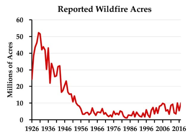


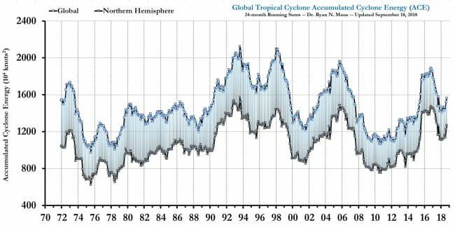
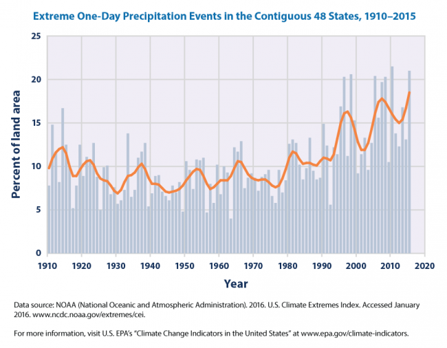


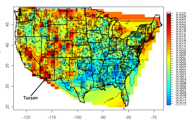


