Posts tagged ‘James Hansen’

So Skeptical Science Is "Correcting" Me

I really wasn't going to do much with this Skeptical Science post by Rob Honeycutt called "Correcting Warren Meyer on Forbes," but several readers have asked me about it and it's Friday and I am sort of bored in the office so here goes.  I may skip parts of his critique.  That does not necessarily mean I agree with it, but several sections of this article are just so trivial (let's defend Al Gore!) that it is hard to work up any energy about it.  As reference, my original article published back in 2012 is here.

Dammit Meyer, You Changed The Words to the Doxology!

The author begins his critique this way:

Mr. Meyer opens with a misleading attempt to frame the issue as a debate on "catastrophic man-man global warming theory." This approach conflates two very distinct elements of the science on anthropogenic climate change. Nowhere in the published scientific literature can you find the phrase he uses. When I did a search on this term in Google Scholar, what did I find? Mr. Meyer's Forbes article. Also searching "catastrophic man-made climate change" I get a smattering of non-research related materials coming from people who rejecting human influence on climate. Meyer has formed a completely irrelevant and fabricated framing of the issue for the basis of his discussion.

In Mr. Meyer's article he claims this is the "core theory" and states that he will use the IPCC as the primary source for this, even though there is no place where the IPCC frames climate change in this manner.

Hey, thanks for making my point!  I always start climate discussions by saying that supporters of climate action are frequently sloppy with the way they frame the debate.   They use phrases like "climate denier" for folks like me which make no sense, since I don't deny there is a climate.  Clearly "climate denier" is a shortcut term for my denying some other more complex proposition, but what proposition exactly?  Merely saying "global warming" as a proposition is sloppy because it could include both natural and manmade effects.  Climate change is even sloppier (I would argue purposely so) because it obscures the fact that deleterious effects from anthropogenic CO2 must be via the intermediate stage of warming (i.e. there is no theory that CO2 causes hurricanes directly).

With this in mind, I begin nearly every discussion of climate change by doing what many proponents of climate action fail to do  -- I am very precise about the proposition I am going to discuss.  It's not just global warming, it's man-made global warming.  And since the climate alarmists are urging immediate action, it is not just man-made global warming but it is catastrophic man-made global warming, ie man-made global warming with negative effects so severe it requires urgent and extensive actions to circumvent.  I think that is a very fair reading of what folks like James Hansen have in mind (if he does not think it will be catastrophic, why is he getting arrested in front of power plants?)  The fact that Google searches do not yield these precise terms but rather yield millions of hits for meaningless phrases like "climate denier" just go to support one of the themes of my original piece, that the climate debate is made much muddier by the sloppy framing of the issues in the media.

However, while Mr. Honeycutt criticizes my framing as non-canon, he offers no specific critiques of how the phrase "catastrophic man-made global warming" might be wrong and offers no alternative framing.  I really do try to pass Bryan Caplan's ideological Turing test on this stuff, so I am interested -- if advocates for climate action do not think "Catastrophic Man-Made Global Warming" is a fair statement of their theory, what would they use instead?

So Is Feedback a Critical Assumption or Not?

I really don't want to repeat my article, but it is useful to understand my thesis:  Catastrophic Man-Made Global Warming Theory is actually a two-part theory, with two chained steps.  In the first, CO2 (and methane and other stuff) act as greenhouse gasses and incrementally warm the planet (about 1-1.2C per doubling of CO2 levels).  In the second step, via a second theory unrelated to greenhouse gas theory, the initial warming from greenhouse gasses is multiplied several times by positive feedbacks that dominate the Earth's climate system, up to the IPCC's estimate of 3-5 C per doubling.  Most of the projected warming in forecasts, such as those from the IPCC, are actually from this second step.  My position is that I largely agree with the first step, which is well understood, but believe there is little real understanding of the second, that feedbacks could be net positive or negative, and that scientists either over-estimate their certainty on feedbacks or, more commonly, bury the feedback assumptions and don't even talk about them in public.

As an aside, I have presented this in front of many climate scientists and no one has really disputed that my summary of the logic is correct (they have of course disputed my skepticism with the feedback number).  In fact Wikipedia, no climate denier, has this in their article about climate sensitivity:

CO2 climate sensitivity has a component directly due to radiative forcing by CO2, and a further contribution arising from climate feedbacks, both positive and negative. "Without any feedbacks, a doubling of CO2 (which amounts to a forcing of 3.7 W/m2) would result in 1 °C global warming, which is easy to calculate and is undisputed. The remaining uncertainty is due entirely to feedbacks in the system, namely, the water vapor feedback, the ice-albedo feedback, the cloud feedback, and the lapse rate feedback";[12] addition of these feedbacks leads to a value of the sensitivity to CO2 doubling of approximately 3 °C ± 1.5 °C, which corresponds to a value of λ of 0.8 K/(W/m2).

In a critique, I would expect someone to say, "your description of the theories is wrong because of X" or "I agree with your basic description of the theories but think there are good reasons why we expect feedbacks to be strongly positive".  But this is what we get instead from Mr. Honeycutt

New errors pop up when trying to describe this "theory" where he attempts to describe water vapor feedbacks. He states that the IPCC "assumed" a strong positive feedbackfrom water vapor. The IPCC doesn't assume anything. The IPCC is a collection of leading experts in their fields who ware painstakingly cataloguing the scientific research. Meyer also makes an error suggesting the IPCC "just add" 2-4°C onto the 1°C for CO2 warming. Such figures, again, are completely manufactured by Meyer. They don't jibe with climate sensitivity figures and he provides no reference to what he means with figures like these.

The IPCC actually produces graphs such as the following to quantify forcings on the climate system, which also very clearly indicate levels of scientific understanding and uncertainty ranges.

He follows with a IPCC chart that showing forcing number estimates for different atmospheric components and the range of IPCC climate sensitivity forecasts, then says

By comparison, the IPCC and research scientists take the uncertainties involved with climateforcings and feedbacks very seriously. They clearly quantify and document them. The net result of the research suggests that our climate's sensitivity to forcing centers around 3°C for doubling CO2 concentrations. The low end probability is ~1.5°C, and the IPCC clearly state that anything lower than this is highly improbable.

My first thought is a snarky one, that it is interesting to see someone from a site with the word "skeptical" in the title go in for such a full-bore appeal to authority.  But to the substance, I am certainly familiar with all the IPCC forcing charts, and what is more, that these charts include a self-assessment by the IPCC about how confident they are in their estimates.  Since that self-assessment never is supported by any methodology or analysis in the reports, or any neutral third-party review, I take it with a grain of salt.

But to the rest, if one wants to discuss climate change with a lay audience, it is not wildly useful to start spewing out forcing numbers that have little meaning to the reader, and which the reader has no ability to connect to what they really care about, ie how much temperatures may rise.

More tellingly, though, after I spend most of my article discussing how the media frequently merges the effects of greenhouse gasses acting alone with the effects of feedbacks in the system that multiply or reduce these direct effects, Mr. Honeycutt does just that, offering forcing numbers that, if I read them correctly, include both direct effects and feedback multipliers.

The reason why it is useful to separate the direct warming effect from CO2 from the follow-on effects of feedback multipliers is the level of certainty we have in assessing their values.  We can figure out pretty precisely the absorption and reradiation characteristics of CO2 in a laboratory.  We can't do anything similar with feedbacks -- they must be inferred using various (all to-date imperfect) approaches to isolating feedback effects from everything else in the climate.  An example from another field might be useful.  Let's say we want to know the economic effect of hosting the Superbowl in Phoenix.  It is pretty easy to measure the direct effects, like the money spent on tickets for the event.  But when we look at the total system, things get really hard.  Sure we had people come in spending money on the Superbowl, but maybe we had fewer tourists doing other things, or maybe increased spending at the Superbowl was offset by less spending at movies or amusement parks.  We might compare that day's revenues to other years, but other years might have had different weather, different population, and a million other small differences that affect the outcome.  Sorting through all these literally millions of changing variables to get the net effect of hosting the Superbowl is hard (and in fact for the last Superbowl hosted in Arizona, academic groups have come up with a huge array of numbers that range all the way from highly positive to negative for the net economic effect).  The one difference between this example and what scientists have to do to isolate effects of individual inputs to the climate system is that the climate problem is much harder.

In responding to Mr. Honeycutt, I cannot honestly tell if Mr. Honeycutt is refuting this formulation of the problem (ie incremental warming from greenhouse gas effects of CO2 is increased to much higher, catastrophic levels by a second theory that the earth is dominated by strong positive feedbacks) or merely disputing my assertion that the second half of this proposition is not well-proven.

Missing the Point on Past Temperatures

Mr. Honeycutt has a number of problems with my discussion of past temperatures.  First, he doesn't like my saying that warming from pre-industrial times was 0.7C.  Mea culpa, it was probably 0.8C when I wrote the article.  He also does not like the satellite temperature measurement, because it measures temperatures in the lower troposphere (a couple miles up in the atmosphere) rather than at the surface.  He is absolutely correct, but you know what?  I am skeptical of both land and space data sets.  They both have their flaws.  Land surface temperatures, especially near the poles and in places like Africa, are widely spaced requiring a lot of interpolation.  They are also subject to a number of biases, such as from changing land use and urbanization.  Satellite data tends to cover larger swaths of the Earth, but have to be corrected for orbital decay and other satellite aging factors.  And as the author mentioned, they measure temperatures in the lower troposphere rather than the surface.  However, since the IPCC says that the most warming from greenhouse gasses should be in the lower troposphere, even greater than the warming on the surface, satellites strike me as a useful tool to look for a global warming signal.   That is why I always use both.  (As an aside, Mr. Honeycutt departs from his appeals to IPCC authority by advocating two land surface data sets NOT chosen by the IPCC as their lead data set -- I use the Hadley CRUT4 because this is what the IPCC uses as their gold standard).

But all this misses the point of why I introduced past temperatures in the first place.  My thesis was that past warming was not consistent with high CO2 temperature sensitivity numbers.  I used charts in the article but I can repeat the logic simply here.  Sensitivity numbers in the IPCC are the warming expected per doubling of CO2 levels.  Since pre-industrial times we have increased global CO2 concentrations from about 270ppm  (or 0.0270%) to about 405 ppm.  This increase of 135pp from 270ppm is conveniently (for the math) about 50% of a doubling.  Because the ratio between concentration and temperature is logarithmic, at 50% of a doubling we should see 57% of the doubling effect.  So for an IPCC sensitivity of 3C per doubling, since pre-industrial times we should have seen a warming of .57 x 3 =  1.7C.  We are nowhere close to this, even if every tenth of degree of warming over the last 100 years was man-made (a proposition with which I would disagree).  At the high end of the IPCC range, around 5C, we would have had to see 2.85C of warming to date.  At the low end of 1.5C, which the author calls unlikely, we would have seen about 0.86C of historical warming.  If one argues that manmade warming is only about half the past warming, then the sensitivity would have to be less than 1C  (by the way, this disconnect only gets larger if one considers greenhouse gasses other than CO2).

There are plenty of potential arguments one could counter with.  One could argue that time delays are really long or that man-made aerosols are masking past warming -- and we could have a nice back and forth on the topic.  Instead we just get printouts from models.  Seriously, is that how skeptical folks approach science, accepting black box model output that embodies hundreds or even thousands of potential GIGO assumptions and inputs?  I would love someone to show me in a sort of waterfall chart how one gets from 1.7C of expected warming from 270-405ppm to Hadley CRUT4 actual warming around 0.8C.  Doesn't anyone feel the need to reconcile their forecasts to actual observations?

There are really good reasons to distrust models.  If Donald Trump wanted to invest $100 million in building new military bases, and said that he had a computer model from experts with graphs that show the plan will grow GNP by a trillion dollars, would you automatically accept the model?  If GNP only grew by $200 million instead of by a trillion, would you want a reconciliation and explanation?

There are also good reasons to distrust climate models and forecasts.  James Hansen's models he used in his famous testimony in front of Congress in 1988 over-predicted warming rates by quite a bit (full explanation here).  Since people argue endlessly over this chart about how to center and zero the graphs, it is much easier just to look at implied warming rates:

Even the IPCC finds itself questioning its past warming forecasts:

These forecast failures are not meant as proof the theory is wrong, merely that there is good reason to be skeptical of computer model output as somehow the last word in a debate.

Actually, Missing the Whole Point of the Article

I had naively thought that the title of the article "Understanding the Global Warming Debate" (rather than, say, "Climate Alarmists Are Big Fat Liars") might be a clue I was trying outline the terms of the debate and the skeptic position in it rather than put a detailed dagger through the heart of, say, climate models.

I wrote this article based on my extreme frustration in the climate debate.  I have no problem with folks disagreeing with me  - in enjoy it.  But I was frustrated that the skeptic argument was being mis-portrayed and folks were arguing about the wrong things.  Specifically, I was frustrated with both of these two arguments that were frequently thrown in my face:

  • "Climate deniers are anti-science morons and liars because they deny the obvious truth of warming from greenhouse gasses like CO2"

In fact, if you read the article, most of the prominent climate skeptics (plus me, as a non-prominent one) totally accept greenhouse gas theory and that CO2, acting alone, would warm the Earth by 1-1.2C.  What we are skeptical of is the very net high positive feedbacks (and believe me, for those of you not familiar with dynamic systems analysis, these numbers are very large for stable natural systems) assumed to multiply this initial warming many-fold.  Of all the folks I have talked to in the past, perhaps less than 1% were familiar with the fact that warming forecasts were a chain of not one but two theories, both greenhouse gas theory and the theory that the Earth's atmosphere is dominated by strong net positive feedbacks.  Even if the audience does not choose to agree with my skepticism over feedback levels, isn't this education of the public about the basic theory useful?  The author accuses me of purposeful obfuscation, but for those of us who are skeptical, it is odd that alarmists seem to resist discussing the second part of the theory.  Could it be that the evidence for strong positive feedbacks dominating the Earth's long-term-stable greenhouse gas theory is not as strong as that for greenhouse gas theory?  Evidence for high atmospheric positive feedbacks simply HAS to be weaker than that for greenhouse gas theory, not only because they have been studied less time but more importantly because it is orders of magnitude harder to parse out values of feedbacks in a complex system than it is to measure the absorption and emission spectrum of a gas in a laboratory.

  • "Climate deniers are anti-science morons and liars because there is a 97% consensus behind global warming theory.

Well, studies have shown a 97% agreement on .. something.  This comes back to the first part of this post.  If one is sloppy about the proposition being tested, then it is easier to get widespread agreement.  The original study that arrived at the 97% number asked two questions -- "do you think the world has warmed in the last century" and "do you think a significant part of this warming has been due to man".  97% of scientists said yes.  But I, called a climate denier, would have said yes to both as well.  Alarmists attempt to shut off debate with skeptics by siting 97% agreement with propositions that have little or nothing to do with skeptics' arguments.  Try asking a large group of scientists if they think that the world will warm 3C per doubling of CO2 levels, the proposition with which I disagree, and I guarantee you are not going to get anywhere near 97%.  This is simply a bait and switch.

I will conclude with his conclusion:

Meyer ends with an unjustifiable conclusion, stating:

So this is the real problem at the heart of the climate debate — the two sides are debating different propositions!  In our chart, proponents of global warming action are vigorously defending the propositions on the left side, propositions with which serious skeptics generally already agree.   When skeptics raise issues about climate models, natural sources of warming, and climate feedbacks, advocates of global warming action run back to the left side of the chart and respond that the world is warming and greenhouse gastheory is correct.    At best, this is a function of the laziness and scientific illiteracy of the media that allows folks to talk past one another;  at worst, it is a purposeful bait-and-switch to avoid debate on the tough issues.

The positions he's put forth in this article are the epitome of lazy analysis and scientific illiteracy. He's bizarrely framed his entire discussion attempting to attack the positions of the IPCC, a body composed of the world's leading researchers, as being scientifically illiterate. One has to ask, from where does his own "literacy" if not from leading climateresearchers? It's certainly not based in the available published research which the IPCC reports are based on.

In this, perhaps he's inadvertently answering his own questions in a manner that he would prefer to reject. What are "skeptics" denying? Answer: The scientific research.

Well, first, I would advise him to work on his reading comprehension scores.  I called the media scientifically illiterate, not the IPCC and researchers.  The basic framework of greenhouse gas incremental warming multiplied many times by assumed positive net feedbacks is in the scientific literature and the IPCC -- my frustration is that the feedback theory seldom enters the public debate and media articles, despite the fact that the feedback theory is the source of the majority of projected warming and is the heart of many climate skeptic's criticisms of the theory.

And with that, the "skeptical science" article ends with an appeal to authority.

Postscript:  Thinking about it more, at some level I find this article weirdly totalitarian, particularly the last paragraph where I am described as doing nothing but polluting the climate discussion.  Here he writes:

Forbes is a very high profile publication and thus someone there, at Forbes, decided that it was fine and well to give this person an internet soapbox to promote a position rejecting the climate science which he has absolutely no expertise. He is not genuinely adding to the discussion on climate change but is being placed into a position as someone to listen to. Meyer is polluting the discussion with misinformation and poor analysis which has no bearing on the actual issue of climate change. And thanks to Google, these types of discussions, lacking in any substance, are given equal weight to actual science due to the traffic they generate.

This seems an oddly extreme response to someone who:

  • agrees in the linked article that the world has warmed over the last century
  • agrees in the linked article that a good chunk of that warming is due to manmade CO2
  • agrees in the linked article that CO2 acting as a greenhouse gas will increase temperatures, acting alone, by about 1-1.2C per doubling
  • argues for a form of carbon tax (in a different article)
  • but disagrees on the magnitude of added warming from net feedback effects.

It seems that we have moved beyond "you are either with us or against us" and entered the realm of "you are either entirely with us on every single detail or you are against us".

Postscript #2:  Something else has been bothering me about this critique and I think I can finally put it into words  -- the critique is sort of science without thought, a regurgitation of the canon whenever I diverge from orthodoxy without actually considering the arguments presented.

Look, there are tens of thousands of people talking past each other on climate issues.  One of the things I try to do, if nothing else to bring something new to the discussion, is try to reframe the discussion in more useful and accesible terms, often with different sorts of graphs.  Sometimes these are useful reframings, and sometimes not, but I do know that in general I am a heck of a lot better at creating charts to communicate with a lay audience than is the IPCC or most of the prominent folks on either side of the climate debate.  This is why getting feedback (as in this critique) that I use different words to summarize the issue or that I do not use the standard charts everyone else xeroxes out of the IPCC reports (as did Mr. Honeycutt) is not very helpful.
Global Temperature Update

I just updated my climate presentation with data through December of 2016, so given "hottest year evah" claims, I thought I would give a brief update with the data that the media seldom ever provides.  This is only a small part of my presentation, which I will reproduce for Youtube soon (though you can see it here at Claremont-McKenna).  In this post I will address four questions:

  • Is the world still warming?
  • Is global warming accelerating?
  • Is global warming "worse than expected"?
  • Coyote, How Is Your Temperature Prediction Model Doing?

Is the world still warming:  Yes

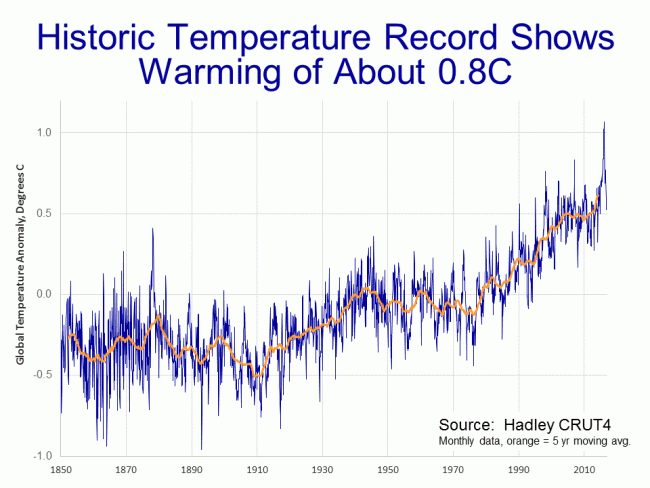
We will use two data sets.  The first is the land surface data set from the Hadley Center in England, the primary data set used by the IPCC.  Rather than average world absolute temperature, all these charts show the variation or "anomaly" of that absolute temperature from some historical average (the zero point of which is arbitrary).  The theory is that it is easier and more accurate to aggregate anomalies across the globe than it is to average the absolute temperature.  In all my temperature charts, unless otherwise noted, the dark blue is the monthly data and the orange is a centered 5-year moving average.

You can see the El Nino / PDO-driven spike last year.  Ocean cycles like El Nino are complicated, but in short, oceans hold an order of magnitude or two more heat than the atmosphere.  There are decadal cycles where oceans will liberate heat from their depths into the atmosphere, creating surface warming, and cycles where oceans bury more heat, cooling the surface.

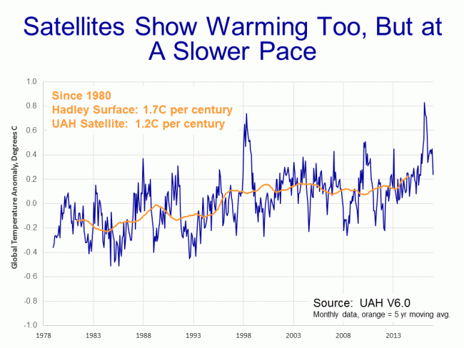
The other major method for aggregating global temperatures is using satellites.  I use the data from University of Alabama, Huntsville.

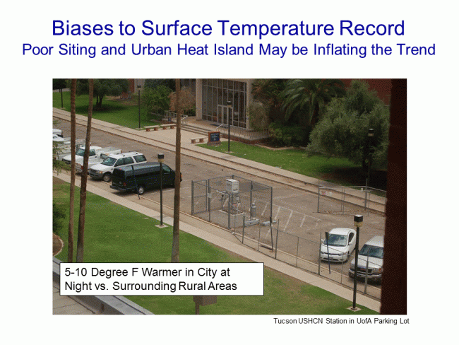
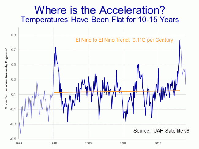
On this scale, the el nino peaks in 1999 and 2017 are quite obvious.  Which method, surface or satellites, gets a better result is a matter of debate.  Satellites are able to measure a larger area, but are not actually measuring the surface, they are measuring temperatures in the lower tropospehere (the troposphere's depth varies but ranges from the surface to 5-12 miles above the surface).  However, since most climate models and the IPCC show man-made warming being greatest in the lower troposphere, it seems a good place to measure.  Surface temperature records, on the other hand, are measuring exactly where we live, but can be widely spaced and are subject to a variety of biases, such as the urban heat island effect.  The station below in Tucson, located in a parking lot and surrounded by buildings, was an official part of the global warming record until my picture became widely circulated and embarrassed them in to closing it.

This argument about dueling data sets goes on constantly, and I have not even mentioned the issues of manual adjustments in the surface data set that are nearly the size of the entire global warming signal.  But we will leave these all aside with the observation that all data sources show a global warming trend.

Is Global Warming Accelerating?  No

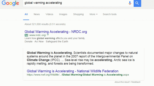
Go into google and search "global warming accelerating".  Or just click that link.  There are a half-million results about global warming accelerating.  Heck, Google even has one of those "fact" boxes at the top that say it is:

It is interesting by the way that Google is using political advocacy groups for its "facts" nowadays.

Anyway, if global warming is so obviously accelerating that Google can list it as a fact at the top of its search page, it should be obvious from the data, right?  Well let's look.  First, here is the satellite data since I honestly believe it to be of higher quality than the surface records:

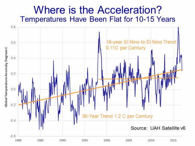
This is what I call the cherry-picking chart.  Everyone can find a peak for one end of their time scale and a valley for the other and create whatever story they want.  In economic analysis, to deal with the noise and cyclicality, one will sometimes see economic growth measured peak-to-peak, meaning from cyclical peak to the next cyclical peak, as a simple way to filter out some of the cyclicality.  I have done the same here, taking my time period as about 18 years from the peak of the 1999 El Nino to 2017 and the peak of the recent El Nino.  The exact data used for the trend is show in darker blue.  You can decide if I have been fair.

The result for this time period is a Nino to Nino warming trend of 0.11C.  Now let's look at the years before this

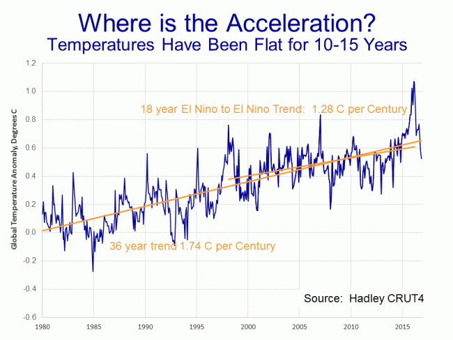
So the trend for 36 years is 1.2C per century but the trend for the last half of this is just 0.11C.  That does not look like acceleration to me.  One might argue that it may again accelerate in the future, but I cannot see how so many people blithely treat it as a fact that global warming has been accelerating when it clearly has not.  But maybe its just because I picked those darn satellites.  Maybe the surface temperatures show acceleration?

Nope.  Though the slow down is less dramatic, the surface temperature data never-the-less shows the same total lack of acceleration.

Is Global Warming "Worse Than Expected"?  No

The other meme one hears a lot is that global warming is "worse than expected".  Again, try the google search I linked.  Even more results, over a million this time.

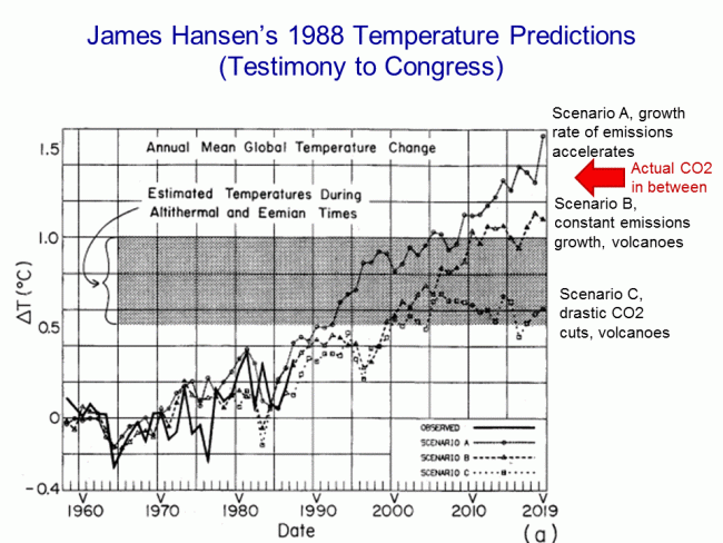
To tackle this one, we have to figure out what was "expected".  Al Gore had his crazy forecasts in his movie.  One sees all kinds of apocalyptic forecasts in the media.  The IPCC has forecasts, but it tends to change them every five years and seldom goes back and revisits them, so those are hard to use.  But we have one from James Hansen, often called the father of global warming and Al Gore's mentor, from way back in 1988.  His seminal testimony in that year in front of Congress really put man-made global warming on the political map.  Here is the forecast he presented:

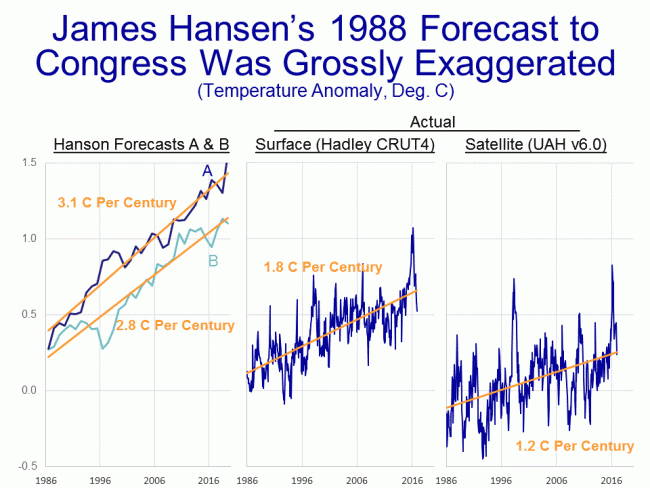
Unfortunately, in his scenarios, he was moving two different variables (CO2 levels and volcanoes) so it is hard to tell which one applies best to the actual history since then, but we are almost certainly between his A and B forecasts.  A lot of folks have spent time trying to compare actual temperatures to these lines, but it is very hard.  The historical temperature record Hansen was using has been manually adjusted several times since, so the historical data does not match, and it is hard to get the right zero point.  But we can eliminate the centering issues altogether if we just look at slopes -- that is all we really care about anyway.  So I have reproduced Hanson's data in the chart on the left and calculated the warming slopes in his forecast:

As it turns out, it really does not matter whether we choose the A or B scenario from Hansen, because both have about the same slope -- between 2.8C and 3.1C per century of warming from 1986 (which appears to be the actual zero date of Hansen's forecast) and today.  Compare this to 1.8C of actual warming in the surface temperature record for this same period, and 1.2C in the satellite record.  While we have seen warming, it is well under the rates predicted by Hansen.

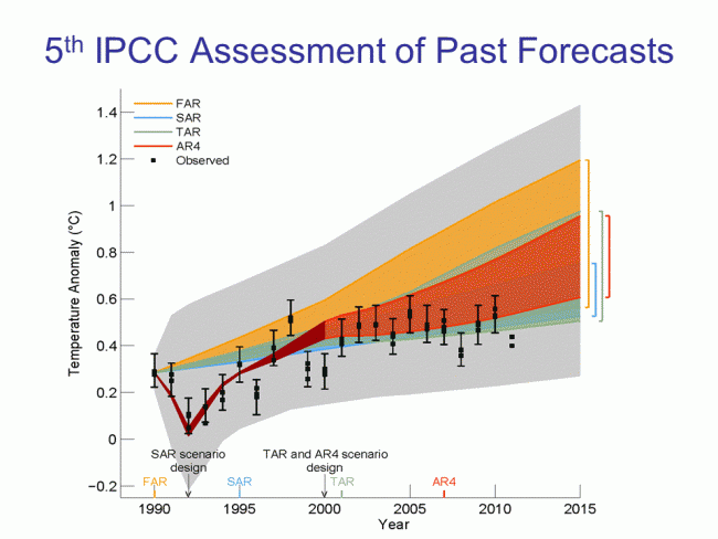
This is a consistent result to what the IPCC found in their last assessment when they evaluated past forecasts.  The colored areas are the IPCC forecast ranges from past forecasts, the grey area was the error bar (the IPCC is a bit inconsistent when it shows error bars, including error bands seemingly only when it helps their case).  The IPCC came to the same result as I did above:   that warming had continued but was well under the pace that was "expected" form past forecasts.

By the way, the reason that many people may think that global warming is accelerating is because media mentions of global warming and severe weather events has been accelerating, leaving the impression that things are changing faster than they truly are.  I wrote an article about this effect here at Forbes.  In that I began:

The media has two bad habits that make it virtually impossible for consumers of, say, television news to get a good understanding of trends

  1. They highlight events in the tail ends of the normal distribution and authoritatively declare that these data points represent some sort of trend or shift in the mean
  2. They mistake increases in their own coverage of certain phenomenon for an increase in the frequency of the phenomenon itself.

Coyote, How Is Your Temperature Prediction Model Doing?  Great, thanks for asking

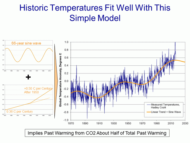
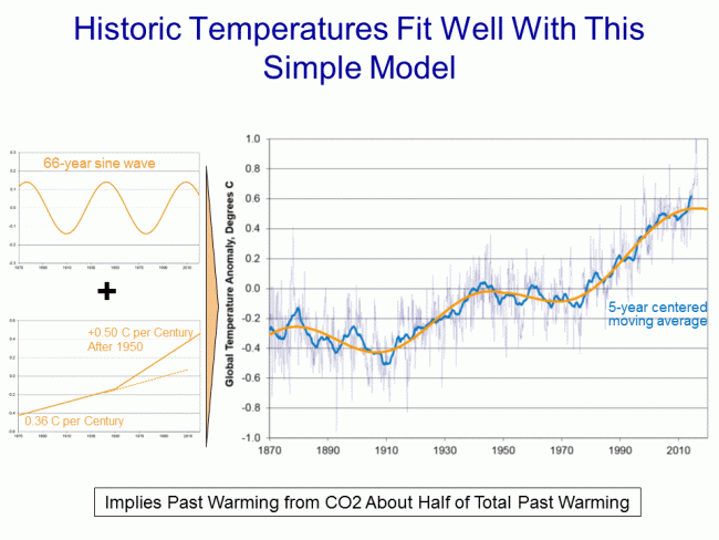
Ten years ago, purely for fun, I attempted to model past temperatures using only three inputs:  A decadal cyclical sin wave, a long-term natural warming trend out of the little ice age (of 0.36 C per century), and a man-made warming trend really kicking in around 1950 (of 0.5C per century).  I used this regression as an attribution model, to see how much of past warming might be due to man (I concluded about half of 20th century warming may be due to manmade effects).  But I keep running it to test its accuracy, again just for fun, as a predictive tool.  Here is where we are as of December of 2016 (in this case the orange line is my forecast line):

Still hanging in there:  Despite the "hottest year evah" news, temperatures in December were exactly on my prediction line.  Here is the same forecast with the 5-year centered moving average added in light blue:

Warning: Crimes Against Humanity May Be Found Here

According not to some random weird dude found on a campus in California, but to the head of NASA Goddard Institute for Space Studies, I am guilty of crimes against humanity for questioning whether the world's climate system is really dominated by strong positive feedback

One of the world’s most widely respected climatologists, James Hansen, director of NASA-GISS, which focuses on the study of earth’s climate for the space agency, testified to Congress in 2008 that the CEOs of fossil fuel companies (who, according to various professional reporting have been promoting this and other misleading messages about global warming in conjunction with ideological groups trying to prevent government regulation) “knew what they were doing” and, as stated in his written testimony to Congress in 2008, were guilty of “high crimes against humanity and nature.”

Hansen tells ABC News — in a phone call from the U.K. where he’s been traveling — that he used that highly charged phrase, crime against humanity, “not only for dramatic effect, but also because it is accurate, given the enormous scale of the consequences to humanity” if manmade global warming is not somehow stopped and reversed.

“It wasn’t only aimed at the fossil fuel CEOs,” Hansen added on the phone. “This also applies to politicians who pretend the global warming is not manmade.”....

“Crimes Against Humanity” is a category of culpability that found currency in the last century as a label for such atrocities as genocide, including the Nazi Holocaust.

This is a grave accusation, laden with great emotion, but it has not been made lightly — rather with extensive study and forethought.

You have been warned.

Stupid Math Tricks

James Hansen, head of NASA's GISS and technical adviser on An Inconvenient Truth, wrote recently

Thus there is no need to equivocate about the summer heat waves in Texas in 2011 and Moscow in 2010, which exceeded 3σ – it is nearly certain that they would not have occurred in the absence of global warming. If global warming is not slowed from its current pace, by mid-century 3σ events will be the new norm and 5σ events will be common.

This statement alone should be enough for any thoughtful person who here-to-fore has bought in to global warming hysteria out of vague respect for "science" to question their beliefs.

First, he is basically arguing that a 3σ event proves (makes it "nearly certain") that some shift has occurred in the underlying process.  In particular, he is arguing that one single sample's value is due to a mean shift in the system.  I don't have a ton of experience in process control and quality, but my gut feel is that a 3σ event can be just that, a 3σ event.  One should expect a 3σ event to occur, on average, once in every 300 samples of a system with a normal distribution of outcomes.

Second, and a much bigger problem, is that Hansen is gaming the sampling process.  First, he is picking an isolated period.  Let's say, to be generous, that this 3σ event stretched over 3 months and was unprecedented in the last century.  But there are 400 3-month periods in the last hundred years.  So he is saying in these two locations there was a 3σ temperature excursion once out of 400 samples.  Uh, ok.  Pretty much what one would expect.

Or, if you don't like the historic approach, lets focus on just this year.  He treats Moscow and Texas like they are the only places being sampled, but in fact they are two of hundreds or even thousands of places on Earth.  Since he does not focus on any of the others, we can assume these are the only two that have so-called 3σ temperature events this summer.

It's hard to know how large to define "Texas"  (since the high temperatures did not cover the whole state) or "Moscow" (since clearly the high temperatures likely reached beyond the suburbs of just that city).

Let's say that the 3σ event occurred in a circular area 500km in diameter.  That is an area of 196,250 sq km each.  But the land surface area of the Earth (we will leave out the oceans for now since heat waves there don't tend to make the headlines) is about 150 million sq km.   This means that each of these areas represent about 1/764th of the land surface area of the Earth.  Or said another way, this summer there were 764 500km diameter land areas we could sample, and 2 had 3σ events.  Again, exactly as expected.

In other words, Hansen's that something unusual is going on in the system is that he found two 3σ events that happened once every 300 or 400 samples.  You feeling better about the science yet?

Luboš Motl has a more sophisticated discussion of the same statement, and gets into other issues with Hansen's statement.

Postscript:  One other issue -- the mean shift in temperatures over the last 30 years has been, at most, about 0.5C  (a small number compared to the Moscow temperature excursion from the norm).  Applying that new mean and the historic standard deviation, my guess is that the Moscow event would have still been a 2.5σ event.  So its not clear how an event that would have been unlikely even with global warming but slightly more unlikely without global warming tells us much of anything about changes in the underlying system, or how Hansen could possible assign blame for the even with near certainty to anthropogenic CO2.

The Anti-Industrial Revolution

I stole this post title from Ayn Rand, but it seems appropriate to this story by James Delingpole.  Apparently James Hansen, leader of NASA's GISS, which does most of its climate research, wants to turn back the clock on industrialized civilization.    A new book by Keith Farnish writes:

The only way to prevent global ecological collapse and thus ensure the survival of humanity is to rid the world of Industrial Civilization.

And continues:

I'm rarely afraid of stating the truth, but some truths are far harder to give than others; one of them is that people will die in huge numbers when civilization collapses. Step outside of civilization and you stand a pretty good chance of surviving the inevitable; stay inside and when the crash happens there may be nothing at all you can do to save yourself. The speed and intensity of the crash will depend an awful lot on the number of people who are caught up in it: greater numbers of people have more structural needs "“ such as food production, power generation and healthcare "“ which need to be provided by the collapsing civilization; greater numbers of people create more social tension and more opportunity for extremism and violence; greater numbers of people create more sewage, more waste, more bodies "“ all of which cause further illness and death.

I wonder what Mr. Farnish thinks the average life expectancy was before the industrial revolution, or even "civilization?"  But my intention here is not to shoot fish in Mr. Farnish's barrel.  What is interesting is who approached Farnish and offered, unsolicited, to blurb his book:  James Hansen.  Here is Hansen's endorsement:

Keith Farnish has it right: time has practically run out, and the 'system' is the problem. Governments are under the thumb of fossil fuel special interests "“ they will not look after our and the planet's well-being until we force them to do so, and that is going to require enormous effort.

Does anyone believe that a person who believes this wouldn't misrepresent the science or fudge his temperature metrics to support his cause.  If he expects civilization to crash, why do we expect him to operate by the rules of civilized society?

Wherein, To My Great Surprise, I actually Agree with James Hansen

James Hansen wrote an editorial supporting a revenue-neutral carbon tax, and while I don't really agree with all of his justifications or economics, I do agree with his ultimate conclusion --that such a tax would be fairer, more efficient, less growth-killing, and ultimately more effective than the Frankenstein mess of parts that makes up the current cap-and-trade bill.

To be fair, I have been on this point for a while, having advocated a carbon tax offset by a payroll tax reduction to make it revenue neutral for some time, including in my most recent film.  I don't think I have to tell my readers that I am not big on taxes nor am I of the belief that any strong action on CO2 emissions is necessary.

However, I am largely indifferent between a sales tax on fuel and an equal sized sales tax on labor (which is effectively what payroll taxes are).  There is no doubt that a reduction in payroll taxes would be a helpful step in this recession, and if folks would sleep better at night with less carbon emissions, I can tolerate trading one for another.

Jonathon Adler has more, including Paul Krugman's negative reaction to the plan  (did this guy really once win the Nobel Price in economics?)

Bush is a Total Failure

James Hansen is a climate scientist at NASA.  He has accused the Bush administration of exerting too much political control of government scientists and of censoring him.  If so, the Bush administration is doing a really horrible job, as demonstrated by this chart:

Hansen_in_the_news_2

As a libertarian, I am the first to believe that government funding of science is corrupting.  Mr. Hansen should consider leaving the government immediately for one of the many universities who would eagerly have him on their faculty.

Unfortunately, I suspect it is not free inquiry that Mr. Hansen wants.  I suspect he treasures his position of government power.  He does not want a position of equality in a free exchange of ideas, he wants a position of power from which he can dictate without accountability.  He wants government power without the check of accountability and criticism.  He wants someone paying his bills but he doesn't want a boss.  Well grow up.  If you don't like working for the Bush administration or the scrutiny that comes with accepting public funding, and I certainly would not, then leave.

Is NASA The Largest Source of Global Warming?

Cars made by GM and fuel produce by Exxon may be responsible for a lot of CO2, but no one is creating as much global warming as James Hansen and NASA do just sitting at their computers.  An example, showing a cooling trend in New Zealand before their adjustments, but a strong warming trend after NASA is through with the data, is posted at Climate Skeptic.

Does the US Matter?

After NASA was forced to restate its US temperature data downward, James Hansen argued that the US doesn't matter.  After it was observed that long-term temperature measurement is flawed in South America and Africa, James Hansen agreed and argued that South America and Africa don't matter.  Since oceans cover 75% of the globe and we have no long-term temperature record for these oceans or for Antarctica, I ask the question at Climate Skeptic:  What does matter?

Good News: Hansen Releases the Temperature Code

Good news this week:  James Hansen and NASA have now deigned to release for scrutiny their taxpayer-funded temperature aggregation and adjustment code.  I go in more detail and explain why this matters over at Climate Skeptic.

By the way, if you are wondering why I have calmed down a bit on climate of late here at Coyote Blog, it is because I have decided that my climate work really was diluting what I want to do here at Coyote Blog, and it really deserved its own home and audience.  I have begun archiving old posts over at Climate Skeptic, and I will do most of my new posting on climate there.  Those interested in the climate issues are encouraged to bookmark the new site and/or subscribe to its feed.

For a little while, I will still mirror the headlines over here at Coyote Blog (after all, the paint is still so wet over at Climate Skeptic that I don't think Google has found me yet -- a few blogrolls wouldn't hurt, hint, hint.)

Also, in the next few weeks I plan release my own video on issues with catastrophic anthropogenic (man-made) global warming theory.  The core of this video will be based on this skeptics summary post and my 60-second climate overview as well as my free 80-page skeptics primer, of course.

Um, Whatever

James Hansen, NASA climate scientist and lead singer in the climate apocalypse choir, responded to his  temperature data revisions a week ago:

What we have here is a case of dogged contrarians who
present results in ways intended to deceive the public into believing
that the changes have greater significance than reality. They aim to
make a mountain out of a mole hill. I believe that these people are not
stupid, instead they seek to create a brouhaha and muddy the waters in
the climate change story. They seem to know exactly what they are doing
and believe they can get away with it, because the public does not have
the time, inclination, and training to discern what is a significant
change with regard to the global warming issue.

The proclamations of the contrarians are a deceit

Um, whatever.  Remember, this is the man who had large errors in his data set, used by nearly every climate scientist in the world, for years, and which were only recently discovered by Steven McIntyre (whom Hansen refuses to even name in his letter).  These errors persisted for years because Mr. Hansen refuses to allow the software and algorithms he uses to "correct" and adjust the data to be scrutinized by anyone else.  He keeps critical methodologies that are paid for by we taxpayers a secret.  But it is his critics who are deceitful? 

In particular, he is bent out of shape that critics' first presented the new data as a revised ranking of the hottest years rather than as a revised line graph.  But it was Hansen and his folks who made a big deal in the press that 1998 was the hottest year in history.  It was he that originally went for this sound byte rather than the more meaningful and data-rich graph when communicating with the press.  But then he calls foul when his critics mimic his actions?  (Oh, and by the way, I showed it both ways).

Hansen has completely ignored the important lessons from this experience, while focusing like a laser on the trivial.  I explained in detail why this event mattered, and it was not mainly because of the new numbers.  In short, finding this mistake was pure accident -- it was a bit like inferring that the furniture in a house is uncomfortable solely by watching the posture of visitors leaving the house.  That's quite an deductive achievement, but how much more would you learn if the homeowners would actually let you in the house to inspect the furniture.  Maybe its ugly too.

So why does Hansen feel he should be able to shield himself from scrutiny and keep the details of his database adjustments and aggregation methodology a secret?  Because he thinks he is the king.    Just read his letter:

The contrarians will be remembered as court jesters. There is no point
to joust with court jesters. "¦ Court jesters serve as a distraction, a
distraction from usufruct. Usufruct is the matter that the captains
wish to deny, the matter that they do not want their children to know
about.

Why do we allow this kind of secrecy and spurning of scrutiny in science?  Is it tolerated in any other discipline?

Steve McIntyre has his response here.  McIntyre still has my favorite comment ever about Hansen and his gang:

While acolytes may call these guys "professionals", the process of
data adjustment is really a matter of statistics and even accounting.
In these fields, Hansen and Mann are not "professionals" - Mann
admitted this to the NAS panel explaining that he was "not a
statistician". As someone who has read their works closely, I do not
regard any of these people as "professional". Much of their reluctance
to provide source code for their methodology arises, in my opinion,
because the methods are essentially trivial and they derive a certain
satisfaction out of making things appear more complicated than they
are, a little like the Wizard of Oz. And like the Wizard of Oz, they
are not necessarily bad men, just not very good wizards.

Update:  If you have a minute, read Hansen's letter, and then ask yourself:  Does this sound like what I would expect of scientific discourse?  Does he sound more like a politician or a scientist?

A Temperature Adjustment Example

I won't go back into all the details, but I have posted before about just how large the manual adjustments to temperature numbers are (the "noise") as compared to the magnitude of measured warming (the "signal").  This issue of manual temperature corrections is the real reason the NASA temperature restatements are important (not the absolute value of the restatement).

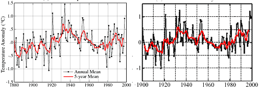
Here is a quick visual example.  Both charts below are from James Hansen and the GISS and are for the US only.  Both use basically the same temperature measurement network (the USHCN).  The one on the left was Hansen's version of US temperatures in 1999.  The one on the right he published in 2001.
Hansen_1999_v_2001

The picture at the right is substantially different  than the one on the left.  Just look at 1932 and 1998.  Between the first and second chart, none of the underlying temperature measurements changed.  What changed  were the adjustments to the underlying measurements applied by the NOAA and by the GISS.  For some reason, temperatures after 1980 have been raised and temperatures in the middle of the century were lowered.

For scientists to apply a negative temperature adjustment to measurements, as they did for the early 1930's, it means they think there was some warming bias in 1932 that does not exist today.  When scientists raise current temperatures, they are saying there is some kind of cooling bias that exists today that did not exist in the 1930's.  Both of these adjustments are basically implying the same thing:  That temperature measurement was more biased upwards, say by asphalt and urbanization and poor sitings, in 1932 than they are today.  Does this make any freaking sense at all?

Of course, there may be some other bias at work here that I don't know about.  But I and everyone else in the world are forced to guess because the NOAA and the GISS insist on keeping their adjustment software and details a secret, and continue to resist outside review.

Read much more about this from Steve McIntyre.

Letter to Newsweek

Editors-

Oh, the delicious irony.

As a skeptic of catastrophic man-made global warming, I was disturbed to see that Newsweek in its August 13, 2007 issue (The Truth About Denial)
had equated me with a Holocaust denier.  There are so many interesting
scientific issues involved in climate change that it was flabbergasting
to me that Newsweek would waste time on an extended ad hominem
attack against one side in a scientific debate.  I was particularly
amazed that Newsweek would accuse the side of the debate that is
outspent 1000:1 with being tainted by money.  This is roughly
equivalent to arguing that Mike Gravel's spending is corrupting the
2008 presidential election.

However, fate does indeed have a sense of humor.  Skeptics' efforts of the sort Newsweek derided just this week
forced NASA-Goddard (GISS) to revise downward recent US temperature
numbers due to a programming mistake that went unidentified for
years, in part because NASA's taxpayer-paid researchers refuse to
release their temperature adjustment and aggregation methodology to the
public for scrutiny.  The problem was found by a chain of events that
began with amateur volunteers and led ultimately to Steven McIntyre (he
of the Michael Mann hockey stick debunking) calling foul.

The particular irony is that the person who is in charge of this
database, and is responsible for the decision not to allow scientific
scrutiny of his methodologies, is none other than James Hansen, who
Newsweek held up as the shining example of scientific objectivity in
its article.  Newsweek should have been demanding that taxpayer-funded
institutions like NASA should be opening their research to full review,
but instead Newsweek chose to argue that Mr. Hansen should be shielded
from scrutiny.

Warren Meyer