Most folks assume that global warming results in record high daily temperatures, but this is not necessarily the case. When your local news station blames a high temperature record on global warming, they may be wrong for two reasons.
Most of the temperature stations used by your local news channels for weather are full of urban heat island biases. This is particularly true of the airport temperature that many local news stations use as their official reading (though to be fair UHI has much more effect on evening temperatures than temperatures at the daily high).
Most global warming, at least in the US where we have some of the best records, does not occur during the day -- it occurs at night
The latter point is surprising to most folks, but as a result we are not seeing an unusual number of daily high temperature records set (many were set in the 1930s and still stand). What we are seeing instead is a large number of record high low temperature readings. This is confusing, but basically it means that the lowest temperature that is reached at nighttime is higher than it has been in the past. The chart below is a bit dated but still holds:
When I give presentations I try to use examples from local data. Here is the comparison of night time warming vs. day time warming in Amherst, MA.
I bring this all up again because Dr. Roy Spencer has done a similar analysis for the US from the relatively new AIRS database (a satellite-based data set that avoids some of the problems of land thermometer data sets like urban heat island biases and geographic coverage gaps). He shows this same finding, that over 80% of the warming we have seen recently in the US is at night.
This is a bit over-complicated because it is looking at temperatures through different heights of the atmosphere when most of you only care about the surface. But you can just look at the 0 height line to see the surface warming trend. Note that in general the data is pretty consistent with the UAH lower-troposphere temperature (satellite) and the NOAA metric (ground thermometers).
No particular point except to highlight something that is poorly understood by most folks because the media never talks about it.
So it turns out that the solar roads I was sure would not work have actually now been built and... they don't work.
One of the first solar roads to be installed is in Tourouvre-au-Perche, France. This has a maximum power output of 420 kW, covers 2,800 metres squared and cost €5 million to install. This implies a cost of €11,905 per installed kW.
The road's capacity factor – which measures the efficiency of the technology by dividing its average power output by its potential maximum power output – is just 4 percent.
In contrast, the Cestas solar plant near Bordeaux, which features rows of solar panels carefully angled towards the sun, has a maximum power output of 300,000 kW and a capacity factor of 14 percent. And at a cost of €360 million, or €1,200 per installed kW, one-tenth the cost of our solar roadway, it generates three times more power.
There is much more. I am embarrassed to say that when I slammed solar roads all those years, I actually was missing an important problem with them:
Unable to benefit from air circulation, its inevitable these panels will heat up more than a rooftop solar panel too.
As a result a significant drop in performance for a solar road, compared to rooftop solar panels, has to be expected. The question is by how much and what is the economic cost?
I will add this to the list, thanks.
When I write stuff like this, I get the same kind of mindless feedback that I get when I point out operational issues at Tesla, ie "you are in the pay of the Koch brothers" or "you have no vision." Well, I am actually putting solar on my roof and will get (hopefully) 45,000 KwH per year, which is about a third of the energy they get from this road but installed for a bit over 1% of the cost of the road. And the panels are all ideally angled and placed, they are up in the air with absolutely no shade on them at any time of the day, and they don't have any trucks driving over them.
Tags: feedback, solar, temperature, UK Category: Energy, Science |
Comments Off on In the Absolutely Most Predictable Scientific Finding Ever, Solar Roads Are Found to Suck
Most of you know I agree there is man-made global warming but am skeptical the extent will be anywhere near most forecasts you see in the media. For some reason, this earns me the title of "denier." However, I find that the climate discussion has become boring in the extreme, and I have mostly moved on from it. But I am still interested in analytical abuses in the media, and long-time readers will know that my favorite is the positing of a trend using but a single data point. My example today happens to be from climate.
It starts with this tweet:
As extreme weather events become more common, we're living through "once in lifetime storms" every year. Our most immediate understanding of their severity is loss of life and damages.
Obviously he is reacting to the recent hurricane in North Carolina, which turns out to be pretty run of the mill but the media has portrayed as some sort of armageddon. I could have pulled roughly similar quotes from all kinds of sources. Several networks did long pieces over the weekend claiming an upward trend in hurricanes without any trend data, but merely from the fact that one made landfall recently. But anyone who claims be defending science should be held, I think, to a higher standard in making scientific claims.
As I asked the March for Science tweeter: If, say, there is a trend towards more or stronger hurricanes, why does no one ever show a trend chart? They just declare the trend from one data point, like a single hurricane landfall. Every long-term hurricane & cyclonic energy trend chart I have seen is flat to down. (This is not primarily a climate post but I will post some hurricane trend charts at the end).
There is certainly an upwards trend in the media labelling storms as "once in a lifetime" but it is doubtful that there is actually an underlying trend in storm severity. Even the slightly more meaningful term "100-year _____" is abused.
Consider a 100-year flood in North Carolina, almost certainly a once in a lifetime event for someone in that state unless they live really long. Since North Carolina is .027% of the world's landmass, there will be, on average, 37 hundred-year floods over land areas the size of North Carolina every single year. That's 37 once-in-a-lifetime North-Carolina-sized floods somewhere in the world every single year. Heck, there should be 3-4 thousand-year floods of North Carolina size somewhere in the world every year -- that's three or four once in a millenium floods! And this same math applies to 100-year heat waves, droughts, snow storms -- you name it.
We can learn a couple of things from this. First, living through "once in a lifetime" storms every year, somewhere in the world, is not abnormal -- it is expected. Second, one can see how choices in media coverage could drive an apparent trend. If the media covered maybe 3 or 4 of these 37 floods when I was young, but covers every one today, it will appear that there is a trend since I hear so much more about them. But in fact, nothing will have changed except the media. I will remind you what I wrote on this topic waaaay back in 2012.
Let's take a step back to 2001 and the "Summer of the Shark." The media hysteria began in early July, when a young boy was bitten by a shark on a beach in Florida. Subsequent attacks received breathless media coverage, up to and including near-nightly footage from TV helicopters of swimming sharks. Until the 9/11 attacks, sharks were the third biggest story of the year as measured by the time dedicated to it on the three major broadcast networks' news shows.
Through this coverage, Americans were left with a strong impression that something unusual was happening -- that an unprecedented number of shark attacks were occurring in that year, and the media dedicated endless coverage to speculation by various "experts" as to the cause of this sharp increase in attacks.
Except there was one problem -- there was no sharp increase in attacks. In the year 2001, five people died in 76 shark attacks. However, just a year earlier, 12 people had died in 85 attacks. The data showed that 2001 actually was a down year for shark attacks.
Once you start looking for this type of thing, the extrapolation of a trend from at most one data point, you will see it everywhere.
For those still hanging around to the end, here are a couple of actual trend charts on hurricanes (the adjusted line attempts to correct for the fact that earlier eras with no satellites or radar tended to miss some hurricanes) (source at NOAA):
Below are two charts that look beyond just the Atlantic at global cyclones, both from this source. The first is frequency:
The second looks at accumulated cyclonic energy, which is a sort of time integral of the energy in all active cyclonic storms around the world
Later in the tweetstorm, the same tweeter mentioned as a fact, again without data, "Climate change is increasing drought frequency, impacting everything from agriculture to health. Some studies suggest the consequences of droughts include increased violence and war." There has been no upward trend in US droughts (negative is more drought-y.
Finally, in the spirit of full disclosure, of all the zillions of things (not directly related to temperature) in weather effects that are blamed on global warming, this is the only one I have found that shows an upward trend recently and could logically be attributed to warming. Whether this is related to warming or independent or a data measurement issue is (if folks were honest) not well understood
This article in something called Inside Climate News seems to be typical of many I have seen this year: Because we have had much attention in the media on heat waves this year, there must be an upward trend in heat waves and that is a warning signal that man-made global warming is destroying the planet. Typical of these articles are a couple of features
Declaration of a trend without any actual trend data, but just a single data point of events this year
Unstated implication that there must be a trend because the author can't remember another year when heat wave stories were so prevalent in the media
Unproven link to man-made global warming, because I guess both involve warmth.
I have no idea if well-publicized heat waves this year are a harbinger of an accelerating global warming trend. But since we are discussing "trends" it struck me as useful to actually liven up the discussion with some actual trend data, ie data for more than one summer. There is a real danger to extrapolating trends from volume of media coverage, as I discussed here. If you don't want to click through, I have a funny story in the postscript.
First, our most reliable temperature trend data does not really show a spike in temperatures this summer. Remember, a heat wave that covered the entire US would only affect 6% of the world's landmass and <2% of the world's total area (source). You can easily see the trend upwards several tenths of a degree over the last 40 years, but it is impossible to see much unique about the last 3 months of summer.
Second, there really is no substantial upward trend in US heat wave index (from right off the EPA's web site, as are all of the following charts. Look at the source for yourself to make sure I am not playing games). Note that all of the following charts are through 2016 and do NOT include the recent summer but are pretty meaningful none-the-less.
Third, in most of the country, there is actually a downward trend rather than upward trend in extreme heat days.
Pretty much everyone agrees, skeptics included, that the world and the US has warmed. So why are extreme heat days down in many locations, and certain down from the 1930's? This defies our intuition. The explanation is in part due to a feature of global warming that is seldom explained well by the media, that much of the warming we see and as predicted in climate models is in the night. We are seeing some increase in hot daytime highs, but really not at an unprecedented level over the last century. BUT, we see MUCH more of a trend in hot daily lows, which basically means warming evenings.
I spoke at Amherst College a while back and here was their temperature trends, broken up between daily highs and nighttime lows. All of Amherst's temperature trend since 1950 has not been in increased daytime highs but higher nighttime lows. This is a pattern you see repeated over and over at nearly every temperature station.
This is why I consider media reports of heat waves, at least of the scope we have seen to date, absolutely irrelevant to "proving" the world is warming.
let's take a step back to 2001 and the "Summer of the Shark." The media hysteria began in early July, when a young boy was bitten by a shark on a beach in Florida. Subsequent attacks received breathless media coverage, up to and including near-nightly footage from TV helicopters of swimming sharks. Until the 9/11 attacks, sharks were the third biggest story of the year as measured by the time dedicated to it on the three major broadcast networks' news shows.
Through this coverage, Americans were left with a strong impression that something unusual was happening -- that an unprecedented number of shark attacks were occurring in that year, and the media dedicated endless coverage to speculation by various "experts" as to the cause of this sharp increase in attacks.
Except there was one problem -- there was no sharp increase in attacks. In the year 2001, five people died in 76 shark attacks. However, just a year earlier, 12 people had died in 85 attacks. The data showed that 2001 actually was a down year for shark attacks.
Update: I am not really an active participant in the climate scene any more, particularly when positions hardened and it was impossible to really have an interesting discussion any more. The implicit plea in this post goes beyond climate -- if you are claiming a trend, show me the trend data. I can be convinced. There is clear trend data that temperatures are increasing so I believe there is an upward trend in temperatures. Show me the same for droughts or heat waves or hurricanes and I will believe the trend about those as well, but so often the actual data never matches the arm-waving in these media sources.
I was randomly browsing my blog history when I encountered a post from over 11 years ago when it was necessary to spend 1800+ words explaining why steel could still fail in the Twin Towers even when it did not actually melt.
Of late, Rosie [O'Donnell] has joined the "truthers," using her show to flog the notion that the WTC was brought down in a government-planned controlled demolition....
Rosie, as others have, made a point of observing that jet fuel does not burn hot enough to melt steel, and therefore the fire in the main towers could not have caused the structure to yield and collapse. This is absurd. It is a kindergartener's level of science. It is ignorant of a reality that anyone who has had even one course in structural engineering or metallurgy will understand. The argument made that "other buildings have burned and not collapsed" is only marginally more sophisticated, sort of equivalent to saying that seeing an iceberg melts proves global warming. ...
Here is the reality that most 19-year-old engineering students understand: Steel loses its strength rapidly with temperature, losing nearly all of its structural strength by 1000 degrees F, well below its melting point but also well below the temperature of burning jet fuel.
And on and on from there. Seriously, I know its hard to believe this was even necessary, but it was a serious charge by some of our intellectual betters in the entertainment industry. Actually, it brings me a certain comfort in encountering this again -- maybe our public discourse is not really getting substantially stupider. Maybe it has always been that way.
Look, I am not mocking you if you don't know the material properties of steel and how they change with temperature. Odds are, in your jobs, you do not need to know anything about it. What bothers me are the people who know nothing about these topics who speak with such certainty. In some ways it seems to go past Dunning-Krueger, People making these absolute pronouncements not only don't know anything about the topic, but many have actively avoided ever finding themselves in a classroom where the topic (or more accurately the mathematical and scientific foundations of the topic) might have been discussed.
It's not like I am totally immune to this. Here are a few topics that I may have blogged about a few times years and years ago but now I won't touch because I know I don't understand them:
Central banking and monetary policy
Almost anything having to do with chemistry, including ocean acidification (or more accurately, reduced ocean alkalinity). I even had an A in Organic Chemistry but it did not stick at all.
Literary criticism, except to say what I liked and I didn't like
Anything about certain performance-based crafts, like singing and acting, except to say which performances I did and did not enjoy
Ice hockey, horse racing, and soccer (which doesn't mean I don't enjoy watching them)
80% of what Tyler Cowen writes about
Anything about music post-1985
Anything on cooking or food
Absolutely anything on wine
To the last point, I got invited to a wine tasting the other day. Everyone was saying they tasted chicory or boysenberry or a hint of diatomaceous earth or whatever and I tasted .. wine. Honestly I felt like a blind person sitting in on a discussion of the color wheel. But I resist the temptation to scream that it is all just the emperor's new clothes -- I am sure the people around me can honestly taste differences that I can't. I know I can taste differences in bourbon they cannot taste. Good vodkas on the other hand, are a different matter. Some day I am going to do a blind vodka tasting for my vodka-snob friends and see if they really can taste the difference.
Postscript: I used to love the show Connections by James Burke. He would start with something like the Defenestration of Prague and show a series of connections between it and, say, the invention of the telephone. Perhaps you can see why I found it entertaining since I began a post about the structural strength of steel at different temperatures and ended it with whether good vodkas really taste different.
There are a lot of James Burke TV episodes on Youtube and I recommend them all. Connections is recommended of course but I actually think his best series was season 1 of the Day the Universe Changed. I believe this is episode 1.
My wife's cousin is in management of a beautiful resort (Mauna Kea / Hapuna) on the Kohala coast of the Big Island of Hawaii. I was asking him if it was OK to visit and you can feel the frustration of a resort executive in his reply:
Absolutely ZERO impact from Volcano….
Volcano is 120 miles away and has zero impact on MK. Since it has been rumbling we have had nothing but beautiful sky, perfect air and perfect water temperature.
Web site with air quality… http://www.hiso2index.info/ MK is about the same as Kihei in Maui… Kona occasionally gets not great with some Vog… So Kihei and MK are both at 14 right now. Kona is the worst at 46 on the west side (Still good) Phoenix is at 71; St. Louis right now seems the worst in the nation at 119. Worst are on the Big Island right now is Ocean View a little south west of the lava flows at 82.
Unfortunately, CNN makes it seem like everyone is wearing a gas mask and there is acid rain falling all over the place. The volcano is limited to a tiny area on the south-east coast and all Island in Hawaii and 90% of the big island and all of the Kohala Coast are not impacted. The impact from the Volcano for me is the same as you in Phoenix… ZERO….. Also no matter what it does it will not impact us… It is a shield volcano, not Mt. St. Helene so it can’t blow up and there is not enough lava in the chamber to cause any big issues other than right at its base…
The only time to “pay attention” is if Mauna Loa or Hualalai started to rumble. Both of those could have an impact on the west side of the island.
I have been a home theater hobbyist for years, though with projection TV's rather than LCD panel TV's. However, from what I know, this appears to be a good list of things to do and not do in setting up your TV. TV's have historically been set up to look good in very bright showrooms under fluorescent lighting, but this is not how you likely watch the TV at home. In fact, the best thing you can do to improve the look of your picture for cinematic content actually has nothing to do with the TV -- darken your viewing room. They key to a really good picture is in the dark areas of the picture, not the bright areas. Tricks to up the contrast and brightness of the TV can kill the detail in the dark areas. The only way to really see what is there is to watch in a dark room.
The hardest thing to do at first is to get the color temperature correct. Thankfully, most TV's today generally have a color temperature setting that is correct (20 years ago one had to have a technician do a manual re-calibration). The right color temperature is around 6500K but TV's and computer monitors often ship with color temperatures boosted way up above 9000K, well up into the blue range because this makes the TV appear brighter in a TV showroom (at higher temperatures a neutral grey will look bluer, at lower temperatures it will look redder). Unfortunately, your eyes are used to looking at high temperature monitors and TVs and so when you first change to the correct setting things may look to red. Live with it a while.
I have over several months been answering questions about my climate positions -- I think for a woman's school project but I honestly can't remember any more. Anyway, I answered a question for her today and though I did not spend a ton of time on it, I thought I would share.
She asked:
Why do you find it unproductive to argue for something based on how many experts are agreeing to it? Wouldn't it be hubris to dismiss the fact that a number of experts are contradicting you on a subject that is pretty complex and is something that isn't nesessarily understood intuitively?
Why do you believe it is unproductive to take such a point into serious consideration?
The way I see it. there is this kind of logic:
A math student works on a very complicated math problem from his homework and has all his justifications for his answer. However, it turns out that his math professor has a different answer-- which is saying something important. It would be a slippery slope for the student to posit that his answer is right and the professor's answer is wrong just because the justification he came up with on his own always leads him back to the same answer. (That is, unless he found out an explanation for why his professor got that answer, like say-- maybe the professor never worked out the problem by himself and looked at an answer key which was wrong.)
My off the cuff responses to the student:
This is not a simple math problem. It is a super complex multi-variable chaotic system in which we are trying to attribute changes in one output variable (temperature) to a single input variable out of thousands or millions (CO2). I think the majority of the hubris (given the state of our knowledge) is on the certainty side, not the doubting side. I would observe, by the way, that many of the exact same people who use this "you must respect the experts" argument against climate skeptics themselves challenge many expert assertions, e.g. that minimum wages reduce employment or that GMO's are safe, that are supported by at least as many experts in those other fields. You would be unusual if you personally do not disagree with some proposition that most of the "experts" support.
The way folks often describe science when trying to criticize climate skeptics sounds to me a lot more like religion than science. Saying that there are fundamental assertions that one cannot challenge is a feature of religion, not true science. Science is about having a theory, making predictions from that theory, and if those predictions consistently turn out to be true, then gaining confidence in the theory. Many of global warming predictions have been wrong -- they have overestimated temperature increases to date, hurricanes and tornadoes are not getting more frequent, droughts are not getting more frequent, etc (do not confuse the frequency of these events in the news with their actual underlying frequency -- go live with the data at the NOAA to see that all these severe weather trends are dead flat). But no one goes back and relooks at the model or theories and those that do point out these shortcomings, eg. skeptics, are threatened with censure. Does not sound like science to me.
I am not without relevant expertise. Though I don't have as deep of climate knowledge as some, I know a lot about modeling chaotic multivariable systems (in finance and economics) and know exactly what the shortcomings of models are and can recognize the patterns of many mistakes in climate that I have seen in other fields of modeling. Further, the key difference skeptics have with alarmists is the expectation of strong positive feedbacks in the climate accelerating temperatures greatly. My major and research work in college were in dynamic systems and feedbacks. Climate scientists are positing that there is more positive feedback in the climate system than exists in any other stable natural system we know about. That is worth some skepticism if one understands feedbacks.
The experts in climate would be a lot more credible if they were more transparent and open to discourse. Instead, they frequently refuse to release their data (even on government-funded projects) for replication and carefully engineer peer review panels so no one who actually disagrees with them are on it. It has been years since any climate "expert" has agreed to participate in a public debate.
The most important answer is that what the "experts" are saying and what the media and the general public are saying the experts are saying is completely different. There is a bait and switch going on, where the majority (though maybe not the most vocal) of the experts are very careful and conservative (little c) in their claims, but they are portrayed as being all-in en masse on the most outrageous and spectacular of the claims by activists. I would refer you to this article, but I will reprint below the key part to your question:
So let's come back to our original question -- what is it exactly that skeptics "deny." As we have seen, most don't deny the greenhouse gas theory, or that the Earth has warmed some amount over the last several year. They don't even deny that some of that warming has likely been via man-made CO2. What they deny is the catastrophe -- they argue that the theory of strong climate positive feedback is flawed, and is greatly exaggerating the amount of warming we will see from man-made CO2. And, they are simultaneously denying that most or all of past warming is man-made, and arguing instead that the amount that is natural and cyclic is being under-estimated.
So how about the "97% of scientists" who purportedly support global warming? What proposition do they support? Let's forget for a minute a variety of concerns about cherry-picking respondents in studies like this (I am always reminded by such studies of the quote attributed, perhaps apocryphally, to Pauline Kael that she couldn't understand how Nixon had won because no one she knew voted for him). Let's look at the actual propositions the 97% agreed to in one such study conducted at the University of Illinois. Here they are: 1. When compared with pre-1800s levels, do you think that mean global temperatures have generally risen, fallen, or remained relatively constant? 2. Do you think human activity is a significant contributing factor in changing mean global temperatures? The 97% answered "risen" and "yes" to these two questions. But depending on how one defines "significant" (is 20% a significant factor?) I could get 97% of a group of science-based skeptics to agree to the same answers. So this is the real problem at the heart of the climate debate -- the two sides are debating different propositions! In our chart, proponents of global warming action are vigorously defending the propositions on the left side [see chart in the original], propositions with which serious skeptics generally already agree. When skeptics raise issues about climate models, natural sources of warming, and climate feedbacks, advocates of global warming action run back to the left side of the chart and respond that the world is warming and greenhouse gas theory is correct. At best, this is a function of the laziness and scientific illiteracy of the media that allows folks to talk past one another; at worst, it is a purposeful bait-and-switch to avoid debate on the tough issues.
I could have also said that there were several times in class when I challenged the teacher on a math problem answer and I was right and they were wrong. My wife-to-be was actually in one of these classes and can testify to the fact.
By the way, I find the last point I made about bait and switch to be surprisingly similar to problems I have arguing net neutrality. The problem is that the FCC's actions under Obama were NOT net neutrality, they were applying early 1900's telephone regulation which pretty much killed innovation in that industry to the Internet. Unfortunately, everyone calls those regulations "net neutrality" so if you oppose these dumb counter-productive regulations one is somehow against net neutrality when in fact it is nothing of the sort.
My last phone was a Droid Turbo (or some variant of that). It was a tank (and btw the battery was so large it would last a week). It was also butt-ugly, but you could drop that thing from an airplane and it would probably keep working. I never bothered with a case.
My new phone is a Galaxy S8. It is probably, looks-wise, the acme of phone design right now and the polar opposite in attractiveness from the Droid Turbo. But it is literally almost all glass. The front is glass. The back is glass. The sides, dues to the curved bezel, are mostly glass. If you drop this thing you are going to hit -- wait for it -- glass. I was changing cases on it and dropped it from a height of no more than three feet and both the front and back glass shattered. So you MUST put this expensive phone in a relatively bulky case. You can have a slim case that may or may not protect the screen and sort of retains some of the feel of the curved bezel or a bulky case that probably will protect the phone but makes the entire phone design moot.
My point is that companies seem to be designing phones for how good they look and feel in the Verizon store**, rather than how they will actually look bundled up in a large case in real life. Once you provide reasonable life-protection for the S8, all its expensive design features are covered up.
One thing I have learned during this experience is that the vast majority of the millennials who rate cell phones on review sites like Engadget are wildly over-influenced by aesthetics. For example they all seem to downgrade phones that have larger bezels and metal rather than glass packaging, irregardless of reliability. I am still looking for a site that publishes a good list of drop test results and ratings. I don't think I will buy another phone without seeing these results (I was considering a pixel 2 until I saw is horrible drop results). I would also like to see someone who grades phone aesthetics in the sort of cases we are all going to put on them. Honestly if I had time I would probably start my own review site focused on real-world use, emphasizing characteristics like reliability, repair costs, drop test results, and battery life.
** For a long, long, long time, TV manufacturers ruined TV pictures so they would look better in a store. Every TV you could buy, at least in the pre-LCD era, had super-high color temperatures shifted way up into the blues. The colors looked like crap in a dark room watching a movie, but the picture appeared brighter in the TV showroom. Back in the day, one of the first things one would do with a good TV if one was a movie snob was to get the TV color calibrated or look for a TV that had a color temperature setting.
For many of you, this will be a blinding glimpse of the obvious, but I see so many dumb approaches to cooling cocktails being pushed that I had to try to clear a few things up.
First, a bit of physics. Ice cubes cool your drink in two ways. First and perhaps most obviously, the ice is colder than your drink. Put any object that is 32 degrees in a liquid that is 72 degrees and the warmer liquid will transfer heat to the cooler object. The object you dropped in will warm and the liquid will cool and their temperatures will tend to equilibrate. The exact amount that the liquid will cool depends on their relative masses, the heat carrying capacity of each material, and the difference in their temperatures.
However, for all but the most unusual substances, this cooling effect will be minor in comparison with the second effect, the phase change of the ice. Phase changes in water consume and liberate a lot of heat. I probably could look up the exact amounts, but the heat absorbed by water going from 32 degree ice to 33 degree water is way more than the heat absorbed going from that now 33 degree water to room temperature.
Your drink needs to be constantly chilled, even if it starts cold, because most glasses are not very good insulators. Pick up the glass -- is the glass cold from the drink? If so, this means the glass is a bad insulator. If it were a good insulator, the glass would be room temperature on the outside even if the drink were cold. The glass will absorb some heat from the air, but air is not really a great conductor of heat unless it is moving. But when you hold the glass in your hand, you are making a really good contact between your drink and an organic body that is essentially circulating near-100 degree fluid around it. Your body is pumping heat into your cocktail.
Given this, let's analyze two common approaches to supposedly cooling cocktails without excessive dilution:
Cold rocks. You put these things in the freezer and put them in your drink to keep it cold. Well, this certainly will not dilute the drink, but it also will not keep it very cold for long. Remember, the equilibration of temperatures between the drink and the object in it is not the main source of heat absorption, it is the phase change and the rocks are not going to change phase in your drink. Perhaps if you cooled the rocks in liquid nitrogen? I don't know.
Large round ice balls. There is nothing that is more attractive in my cocktail than a perfect round ice ball. A restaurant here in town called the Gladly has a way of making these beautiful round flaw-free ice balls that look like they are Steuben glass. The theory is that with a smaller surface to volume ratio, the ice ball will melt slower. Which is probably true, but all this means is that the heat transfer is slower and the cooling is less. But again, the physics should be roughly the same -- it is going to cool mostly in proportion to how much it melts. If it melts less, it cools less. I have a sneaking suspicion that bars have bought into this ice ball thing to mask tiny cocktails -- I have been to several bars which have come up with ice balls or cylinders that are maybe 1 mm smaller in diameter than the glass so that a large glass holds about an ounce of cocktail.
I will not claim to be an expert but I like my bourbon drinks cold and have adopted this strategy -- perhaps you have others.
Keep the bottles chilled. I keep Vodka in the freezer and bourbon and a few key mixers in the refrigerator. It is much easier to keep something cool than to cool it the first time, and this is a good dilution-free approach to the initial cooling. I don't know if this sort of storage is problematic for the liquor -- I have never found any issues.
Keep your drinking glass in the freezer. Again, it will warm in your hand but an initially warm glass is going to pump heat into whatever you pour into it.
Use a special glass. I have gone through two generations on this. My first generation was to use a double wall glass with an air gap. This works well and you can find many choices on Amazon. Then my wife found some small glasses at Tuesday Morning that were double wall but have water in the gap. You put them in the freezer and not only does the glass get cold but the water in the middle freezes. Now I can get some phase change cooling in my cocktail without dilution. You have to get used to holding a really cold glass but in Phoenix we have no complaints about such things.
Things I don't know but might work: I can imagine you could design encapsulated ice cubes, such as water in a glass sphere. Don't know if anyone makes these. There are similar products with gel in them that freezes, and double wall glasses with gel. I do not know if the phase change in the gel is better or worse for heat absorption than phase change of water. I have never found those cold packs made of gel as satisfactory as an ice pack, but that may be just a function of size. Anyone know?
Update: I believe this is what I have, though since we bought them at Tuesday Morning their provenance is hard to trace. They are small, but if you are sipping straight bourbon or scotch this is way more than enough.
Postscript: I was drinking old Fashions for a while but switched to a straight mix of Bourbon and Cointreau. Apparently there is no name for this cocktail that I can find, though its a bit like a Bourbon Sidecar without the lemon juice. For all your cocktails, I would seriously consider getting a jar of these, they are amazing. The Luxardo cherries are nothing like the crappy bright red maraschino cherries you see sold in grocery stores.
You are likely aware that the US, and many other countries, are spending billions and billions of dollars on climate research. After drug development, it probably has become the single most lucrative academic sector.
Let me ask a question. If you were concerned (as you should be) about lead in soil and drinking water and how it might or might not be getting into the bloodstream of children, what would you spend money on? Sure, better treatments and new technologies for filtering and cleaning up lead. But wouldn't the number one investment be in more and better measurement of environmental and human lead concentrations, and how they might be changing over time?
So I suppose if one were worried about the global rise in temperatures, one would look at better and more complete measurement of these temperatures. Hah! You would be wrong.
There are three main global temperature histories: the combined CRU-Hadley record (HADCRU), the NASA-GISS (GISTEMP) record, and the NOAA record. All three global averages depend on the same underlying land data archive, the Global Historical Climatology Network (GHCN). Because of this reliance on GHCN, its quality deficiencies will constrain the quality of all derived products.
The number of weather stations providing data to GHCN plunged in 1990 and again in 2005. The sample size has fallen by over 75% from its peak in the early 1970s, and is now smaller than at any time since 1919.
Well, perhaps they have focused on culling a large poor quality network into fewer, higher quality locations? If they have been doing this, there is little or no record of that being the case. To outsiders, it looks like stations just keep turning off. And in fact, by certain metrics, the quality of the network is falling:
The collapse in sample size has increased the relative fraction of data coming from airports to about 50 percent (up from about 30 percent in the 1970s). It has also reduced the average latitude of source data and removed relatively more high-altitude monitoring sites.
Airports, located in the middle of urban centers by and large, are terrible temperature measurement points, subject to a variety of biases such as the urban heat island effect. My son and I measured over 10 degrees Fahrenheit different between the Phoenix airport and the outlying countryside in an old school project. Folks who compile the measurements claim that they have corrected for these biases, but many of us have reasons to doubt that (consider this example, where an obviously biased station was still showing in the corrected data as the #1 warming site in the country). I understand why we have spent 30 years correcting screwed up biased stations because we need some stations with long histories and these are what we have (though many long lived stations have been allowed to expire), but why haven't we been building a new, better-sited network?
Ironically, there has been one major investment effort to improve temperature measurement, and that is through satellite measurements. We now use satellites for official measures of cloud cover, sea ice extent, and sea level, but the global warming establishment has largely ignored satellite measurement of temperatures. For example, James Hansen (Al Gore's mentor and often called the father of global warming) strongly defended 100+ year old surface temperature measurement technology over satellites. Ironically, Hansen was head, for years, of NASA's Goddard Institute of Space Studies (GISS), so one wonders why he resisted space technology in this one particular area. Cynics among us would argue that it is because satellites give the "wrong" answer, showing a slower warming rate than the heavily manually adjusted surface records.
I just updated my climate presentation with data through December of 2016, so given "hottest year evah" claims, I thought I would give a brief update with the data that the media seldom ever provides. This is only a small part of my presentation, which I will reproduce for Youtube soon (though you can see it here at Claremont-McKenna). In this post I will address four questions:
Is the world still warming?
Is global warming accelerating?
Is global warming "worse than expected"?
Coyote, How Is Your Temperature Prediction Model Doing?
Is the world still warming: Yes
We will use two data sets. The first is the land surface data set from the Hadley Center in England, the primary data set used by the IPCC. Rather than average world absolute temperature, all these charts show the variation or "anomaly" of that absolute temperature from some historical average (the zero point of which is arbitrary). The theory is that it is easier and more accurate to aggregate anomalies across the globe than it is to average the absolute temperature. In all my temperature charts, unless otherwise noted, the dark blue is the monthly data and the orange is a centered 5-year moving average.
You can see the El Nino / PDO-driven spike last year. Ocean cycles like El Nino are complicated, but in short, oceans hold an order of magnitude or two more heat than the atmosphere. There are decadal cycles where oceans will liberate heat from their depths into the atmosphere, creating surface warming, and cycles where oceans bury more heat, cooling the surface.
The other major method for aggregating global temperatures is using satellites. I use the data from University of Alabama, Huntsville.
On this scale, the el nino peaks in 1999 and 2017 are quite obvious. Which method, surface or satellites, gets a better result is a matter of debate. Satellites are able to measure a larger area, but are not actually measuring the surface, they are measuring temperatures in the lower tropospehere (the troposphere's depth varies but ranges from the surface to 5-12 miles above the surface). However, since most climate models and the IPCC show man-made warming being greatest in the lower troposphere, it seems a good place to measure. Surface temperature records, on the other hand, are measuring exactly where we live, but can be widely spaced and are subject to a variety of biases, such as the urban heat island effect. The station below in Tucson, located in a parking lot and surrounded by buildings, was an official part of the global warming record until my picture became widely circulated and embarrassed them in to closing it.
This argument about dueling data sets goes on constantly, and I have not even mentioned the issues of manual adjustments in the surface data set that are nearly the size of the entire global warming signal. But we will leave these all aside with the observation that all data sources show a global warming trend.
Is Global Warming Accelerating? No
Go into google and search "global warming accelerating". Or just click that link. There are a half-million results about global warming accelerating. Heck, Google even has one of those "fact" boxes at the top that say it is:
It is interesting by the way that Google is using political advocacy groups for its "facts" nowadays.
Anyway, if global warming is so obviously accelerating that Google can list it as a fact at the top of its search page, it should be obvious from the data, right? Well let's look. First, here is the satellite data since I honestly believe it to be of higher quality than the surface records:
This is what I call the cherry-picking chart. Everyone can find a peak for one end of their time scale and a valley for the other and create whatever story they want. In economic analysis, to deal with the noise and cyclicality, one will sometimes see economic growth measured peak-to-peak, meaning from cyclical peak to the next cyclical peak, as a simple way to filter out some of the cyclicality. I have done the same here, taking my time period as about 18 years from the peak of the 1999 El Nino to 2017 and the peak of the recent El Nino. The exact data used for the trend is show in darker blue. You can decide if I have been fair.
The result for this time period is a Nino to Nino warming trend of 0.11C. Now let's look at the years before this
So the trend for 36 years is 1.2C per century but the trend for the last half of this is just 0.11C. That does not look like acceleration to me. One might argue that it may again accelerate in the future, but I cannot see how so many people blithely treat it as a fact that global warming has been accelerating when it clearly has not. But maybe its just because I picked those darn satellites. Maybe the surface temperatures show acceleration?
Nope. Though the slow down is less dramatic, the surface temperature data never-the-less shows the same total lack of acceleration.
Is Global Warming "Worse Than Expected"? No
The other meme one hears a lot is that global warming is "worse than expected". Again, try the google search I linked. Even more results, over a million this time.
To tackle this one, we have to figure out what was "expected". Al Gore had his crazy forecasts in his movie. One sees all kinds of apocalyptic forecasts in the media. The IPCC has forecasts, but it tends to change them every five years and seldom goes back and revisits them, so those are hard to use. But we have one from James Hansen, often called the father of global warming and Al Gore's mentor, from way back in 1988. His seminal testimony in that year in front of Congress really put man-made global warming on the political map. Here is the forecast he presented:
Unfortunately, in his scenarios, he was moving two different variables (CO2 levels and volcanoes) so it is hard to tell which one applies best to the actual history since then, but we are almost certainly between his A and B forecasts. A lot of folks have spent time trying to compare actual temperatures to these lines, but it is very hard. The historical temperature record Hansen was using has been manually adjusted several times since, so the historical data does not match, and it is hard to get the right zero point. But we can eliminate the centering issues altogether if we just look at slopes -- that is all we really care about anyway. So I have reproduced Hanson's data in the chart on the left and calculated the warming slopes in his forecast:
As it turns out, it really does not matter whether we choose the A or B scenario from Hansen, because both have about the same slope -- between 2.8C and 3.1C per century of warming from 1986 (which appears to be the actual zero date of Hansen's forecast) and today. Compare this to 1.8C of actual warming in the surface temperature record for this same period, and 1.2C in the satellite record. While we have seen warming, it is well under the rates predicted by Hansen.
This is a consistent result to what the IPCC found in their last assessment when they evaluated past forecasts. The colored areas are the IPCC forecast ranges from past forecasts, the grey area was the error bar (the IPCC is a bit inconsistent when it shows error bars, including error bands seemingly only when it helps their case). The IPCC came to the same result as I did above: that warming had continued but was well under the pace that was "expected" form past forecasts.
By the way, the reason that many people may think that global warming is accelerating is because media mentions of global warming and severe weather events has been accelerating, leaving the impression that things are changing faster than they truly are. I wrote an article about this effect here at Forbes. In that I began:
The media has two bad habits that make it virtually impossible for consumers of, say, television news to get a good understanding of trends
They highlight events in the tail ends of the normal distribution and authoritatively declare that these data points represent some sort of trend or shift in the mean
They mistake increases in their own coverage of certain phenomenon for an increase in the frequency of the phenomenon itself.
Coyote, How Is Your Temperature Prediction Model Doing? Great, thanks for asking
Ten years ago, purely for fun, I attempted to model past temperatures using only three inputs: A decadal cyclical sin wave, a long-term natural warming trend out of the little ice age (of 0.36 C per century), and a man-made warming trend really kicking in around 1950 (of 0.5C per century). I used this regression as an attribution model, to see how much of past warming might be due to man (I concluded about half of 20th century warming may be due to manmade effects). But I keep running it to test its accuracy, again just for fun, as a predictive tool. Here is where we are as of December of 2016 (in this case the orange line is my forecast line):
Still hanging in there: Despite the "hottest year evah" news, temperatures in December were exactly on my prediction line. Here is the same forecast with the 5-year centered moving average added in light blue:
There's no point trying to fight climate change - we'll all be dead in the next decade and there's nothing we can do to stop it, a visiting scientist claims.
Guy McPherson, a biology professor at the University of Arizona, says the human destruction of our own habitat is leading towards the world's sixth mass extinction.
Instead of fighting, he says we should just embrace it and live life while we can.
"It's locked down, it's been locked in for a long time - we're in the midst of our sixth mass extinction," he told Paul Henry on Thursday.
....
"I can't imagine there will be a human on the planet in 10 years," he says.
"We don't have 10 years. The problem is when I give a number like that, people think it's going to be business as usual until nine years [and] 364 days."
He says part of the reason he's given up while other scientists fight on is because they're looking at individual parts, such as methane emissions and the melting ice in the Arctic, instead of the entire picture.
"We're heading for a temperature within that span that is at or near the highest temperature experienced on Earth in the last 2 billion years."
Instead of trying to fix the climate, Prof McPherson says we should focus on living while we can.
"I think hope is a horrible idea. Hope is wishful thinking. Hope is a bad idea - let's abandon that and get on with reality instead. Let's get on with living instead of wishing for the future that never comes.
If I had to pick one topic or way of thinking that engineers and scientists have developed but other folks are often entirely unfamiliar with, I might pick the related ideas of error, uncertainty, and significance. A good science or engineering education will spend a lot of time on assessing the error bars for any measurement, understanding how those errors propagate through a calculation, and determining which digits of an answer are significant and which ones are, as the British might say, just wanking.
It is quite usual to see examples of the media getting notions of error and significance wrong. But yesterday I saw a story where someone actually dusted these tools off and explained why the Olympics don't time events to the millionths of a second, despite clocks that are supposedly that accurate:
Modern timing systems are capable of measuring down to the millionth of a second—so why doesn’t FINA, the world swimming governing body, increase its timing precision by adding thousandths-of-seconds?
As it turns out, FINA used to. In 1972, Sweden’s Gunnar Larsson beat American Tim McKee in the 400m individual medley by 0.002 seconds. That finish led the governing body to eliminate timing by a significant digit. But why?
In a 50 meter Olympic pool, at the current men’s world record 50m pace, a thousandth-of-a-second constitutes 2.39 millimeters of travel. FINA pool dimension regulations allow a tolerance of 3 centimeters in each lane, more than ten times that amount. Could you time swimmers to a thousandth-of-a-second? Sure, but you couldn’t guarantee the winning swimmer didn’t have a thousandth-of-a-second-shorter course to swim. (Attempting to construct a concrete pool to any tighter a tolerance is nearly impossible; the effective length of a pool can change depending on the ambient temperature, the water temperature, and even whether or not there are people in the pool itself.)
There was some debate a while back around about a temperature chart some Conservative groups were passing around.
Obviously, on this scale, global warming does not look too scary. The question is, is this scale at all relevant? I could re-scale the 1929 stock market drop to a chart that goes from Dow 0 to, say, Dow 100,000 and the drop would hardly be noticeable. That re-scaling wouldn't change the fact that the 1929 stock market crash was incredibly meaningful and had large impacts on the economy. Kevin Drum wrote about the temperature chart above,
This is so phenomenally stupid that I figured it had to be a joke of some kind.
Mother Jones has banned me from commenting on Drum's site, so I could not participate in the conversation over this chart. But I thought about it for a while, and I think the chart's author perhaps has a point but pulled it off poorly. I am going to take another shot at it.
First, I always show the historic temperature anomaly on the zoomed in scale that you are used to seeing, e.g. (as usual, click to enlarge)
The problem with this chart is that it is utterly without context just as much as the previous chart. Is 0.8C a lot or a little? Going back to our stock market analogy, it's a bit like showing the recent daily fluctuations of the Dow on a scale from 16,300 to 16,350. The variations will look huge, much larger than either their percentage variation or their meaningfulness to all but the most panicky investors.
So I have started including the chart below as well. Note that it is in Fahrenheit (vs. the anomaly chart above in Celsius) because US audiences have a better intuition for Fahrenheit, and is only for the US vs. the global chart above. It shows the range of variation in US monthly averages, with the orange being the monthly average daily maximum temperature across the US, the dark blue showing the monthly average daily minimum temperature, and the green the monthly mean. The dotted line is the long-term linear trend
Note that these are the US averages -- the full range of daily maximums and minimums for the US as a whole would be wider and the full range of individual location temperatures would be wider still. A couple of observations:
It is always dangerous to eyeball charts, but you should be able to see what is well known to climate scientists (and not just some skeptic fever dream) -- that much of the increase over the last 30 years (and even 100 years) of average temperatures has come not from higher daytime highs but from higher nighttime minimum temperatures. This is one reason skeptics often roll their eyes as attribution of 15 degree summer daytime record heat waves to global warming, since the majority of the global warming signal can actually be found with winter and nighttime temperatures.
The other reason skeptics roll their eyes at attribution of 15 degree heat waves to 1 degree long term trends is that this one degree trend is trivial compared to the natural variation found in intra-day temperatures, between seasons, or even across years. It is for this context that I think this view of temperature trends is useful as a supplement to traditional anomaly charts (in my standard presentation, I show this chart scale once and the standard anomaly chart scale further up about 30 times, so that utility has limits).
I want to briefly revisit Hansen's 1998 Congressional forecast. Yes, I and many others have churned over this ground many times, but I think I now have a better approach. The typical approach has been to overlay some actual temperature data set on top of Hansen's forecast (e.g. here). The problem is that with revisions to all of these data sets, particularly the GISS reset in 1999, none of these data sets match what Hansen was using at the time. So we often get into arguments on where the forecast and actuals should be centered, etc.
This might be a better approach. First, let's start with Hansen's forecast chart (click to enlarge).
Folks have argued for years over which CO2 scenario best matches history. I would argue it is somewhere between A and B, but you will see in a moment that it almost does not matter. It turns out that both A and B have nearly the same regressed slope.
The approach I took this time was not to worry about matching exact starting points or reconciling difference anomaly base periods. I merely took the slope of the A and B forecasts and compared it to the slope over the last 30 years of a couple of different temeprature databases (Hadley CRUT4 and the UAH v6 satellite data).
The only real issue is the start year. The analysis is not very sensitive to the year, but I tried to find a logical start. Hansen's chart is frustrating because his forecasts never converge exactly, even 20 years in the past. However, they are nearly identical in 1986, a logical base year if Hansen was giving the speech in 1988, so I started there. I didn't do anything fancy on the trend lines, just let Excel calculate the least squares regression. This is what we get (as usual, click to enlarge).
I think that tells the tale pretty clearly. Versus the gold standard surface temperature measurement (vs. Hansen's thumb-on-the-scale GISS) his forecast was 2x too high. Versus the satellite measurements it was 3x too high.
The least squares regression approach probably under-estimates that A scenario growth rate, but that is OK, that just makes the conclusion more robust.
By the way, I owe someone a thanks for the digitized numbers behind Hansen's chart but it has been so many years since I downloaded them I honestly forgot who they came from.
Virtually every study done points to the fact the immigrants, even illegal immigrants, are less prone to crime than American citizens. That is why immigration opponents must rely on repetition of lurid single examples to try to make their case, a bit like global warming advocates point to individual heat waves as a substitute for having any warming show up in the recent global temperature metrics.
There are two broad types of studies that investigate immigrant criminality. The first type uses Census and American Community Survey (ACS) data from the institutionalized population and broadly concludes that immigrants are less crime prone than the native-born population. It is important to note that immigrants convicted of crimes serve their sentences before being deported with few exceptions.
However, there are some potential problems with Census-based studies that could lead to inaccurate results. That’s where the second type of study comes in. The second type is a macro level analysis to judge the impact of immigration on crime rates, generally finding that increased immigration does not increase crime and sometimes even causes crime rates to fall.
Butcher and Piehl examine the incarceration rates for men aged 18-40 in the 1980, 1990, and 2000 Censuses. In each year, immigrants are less likely to be incarcerated than natives with the gap widening each decade. By 2000, immigrants have incarceration rates that are one-fifth those of the native-born
Man has almost certainly warmed the world by some tenths of a degree C with his CO2, though much of this warming has hit night-time lows rather than daily highs. Anyway, while future temperature rise forecasts are often grossly exaggerated by absurdly high assumptions of positive feedback, there is at least a kernel of fact in there that CO2 is likely warming the world somewhat.
However, the popular "science" on climate change is often awful, positing, for example, that hurricanes are being increased by man right in the midst of the longest hurricane drought we have seen in the US for a hundred years.
Inevitably, the recent severe California droughts have been blamed on manmade CO2. As a hopefully useful adjunct to this debate, I have annotated a recent chart from the San Jose Mercury News on the history of California droughts to reflect the popular global warming / climate change narrative. You be the judge of the reasonableness:
My Arizona-raised, thin-blooded son was convinced that he had no problem with cold weather when he departed for Amherst College several years ago. That, of course, was based on exposure to cold via a couple of ski trips. What he likely underestimated was the impact of cold that lasts for like 6 freaking months.
So it was with good-natured parental fondness for my child that I was LMAO when I read this:
The average temperature in Amherst in the past month was 11.2 degrees, the lowest average monthly temperature since records were first kept in town in 1835. It broke the previous record of 11.6 degrees set in 1934, according to Michael A. Rawlins, an assistant professor in the department of geosciences and manager of the Climate System Research Center at the University of Massachusetts.
As it turns out, I have made a climate presentation in Amherst so I actually have historic temperature charts. It is a good example of two things:
While Amherst has been warming, it was warming as much or more before 1940 (or before the era of substantial CO2 emissions) as much as after
Much of the recent warming has manifested as increases in daily minimum temperatures, rather in an increase in daily maximum temperatures. This is as predicted by warming models, but poorly communicated and understood. Possibly because fewer people would be bent out of shape if they knew that warming translated into warmer nights rather than higher highs in the daytime.
Climate skeptics are at risk of falling into the same exaggeration-trap as do alarmists.
I have written about the exaggeration of past warming by questionable manual adjustments to temperature records for almost a decade. So I don't need to be convinced that these adjustments 1) need to be cleaned up and 2) likely exaggerate past warming.
These recent articles are making it sound like alarmist scientists are simply adding adjustments to past temperatures for no reason. But there are many perfectly valid reasons surface temperature measurements have to be manually adjusted. It is a required part of the process. Just as the satellite data must be adjusted as well, though for different things.
So we should not be suspicious of adjustments per se. We should be concerned about them, though, for a number of reasons:
In many parts of the world, like in the US, the manual adjustments equal or exceed the measured warming trend. That means the"signal" we are measuring comes entirely from the adjustments. That is, to put it lightly, not ideal.
The adjustments are extremely poorly documented and impossible for any third party to replicate (one reason the satellite record may be more trustworthy is all the adjustment code for the satellites is open source).
The adjustments may have a bias. After all, most of the people doing the adjustments expect to see a warming trend historically, and so consider lack of such a trend to be an indicator the data is wrong and in need of adjustment. This is not a conspiracy, but a normal human failing and the reason why the ability to replicate such work is important.
The adjustments do seem to be very aggressive in identifying any effects that might have artificially created a cooling trend but lax in finding and correcting effects that might have artificially created a warming trend. First and foremost, the changing urban heat island effect in growing cities seems to be under-corrected (Again there is debate on this -- the proprietors of the model believe they have fixed this with a geographic normalizing, correcting biases from nearby thermometers. I and others believe all they are doing is mathematically smearing the error over a larger geography).
Again, I discussed all the pros and cons here. If pushed to the wall, I would say perhaps half of the past warming in the surface temperature record is due to undercorrection of warming biases or overcorrection of cooling biases.
I believe that there is both wheat and chaff in this claim [that manual temperature adjustments are exaggerating past warming], and I would like to try to separate the two as best I can. I don't have time to write a well-organized article, so here is just a list of thoughts
At some level it is surprising that this is suddenly news. Skeptics have criticized the adjustments in the surface temperature database for years.
There is certainly a signal to noise ratio issue here that mainstream climate scientists have always seemed insufficiently concerned about. For example, the raw data for US temperatures is mostly flat, such that the manual adjustments to the temperature data set are about equal in magnitude to the total warming signal. When the entire signal one is trying to measure is equal to the manual adjustments one is making to measurements, it probably makes sense to put a LOT of scrutiny on the adjustments. (This is a post from 7 years ago discussing these adjustments. Note that these adjustments are less than current ones in the data base as they have been increased, though I cannot find a similar chart any more from the NOAA discussing the adjustments)
The NOAA HAS made adjustments to US temperature data over the last few years that has increased the apparent warming trend. These changes in adjustments have not been well-explained. In fact, they have not really be explained at all, and have only been detected by skeptics who happened to archive old NOAA charts and created comparisons like the one below. Here is the before and after animation (pre-2000 NOAA US temperature history vs. post-2000). History has been cooled and modern temperatures have been warmed from where they were being shown previously by the NOAA. This does not mean the current version is wrong, but since the entire US warming signal was effectively created by these changes, it is not unreasonable to act for a detailed reconciliation (particularly when those folks preparing the chart all believe that temperatures are going up, so would be predisposed to treating a flat temperature chart like the earlier version as wrong and in need of correction.
However, manual adjustments are not, as some skeptics seem to argue, wrong or biased in all cases. There are real reasons for manual adjustments to data -- for example, if GPS signal data was not adjusted for relativistic effects, the position data would quickly get out of whack. In the case of temperature data:
Data is adjusted for shifts in the start/end time for a day of measurement away from local midnight (ie if you average 24 hours starting and stopping at noon). This is called Time of Observation or TOBS. When I first encountered this, I was just sure it had to be BS. For a month of data, you are only shifting the data set by 12 hours or about 1/60 of the month. Fortunately for my self-respect, before I embarrassed myself I created a spreadsheet to monte carlo some temperature data and play around with this issue. I convinced myself the Time of Observation adjustment is valid in theory, though I have no way to validate its magnitude (one of the problems with all of these adjustments is that NOAA and other data authorities do not release the source code or raw data to show how they come up with these adjustments). I do think it is valid in science to question a finding, even without proof that it is wrong, when the authors of the finding refuse to share replication data. Steven Goddard, by the way, believes time of observation adjustments are exaggerated and do not follow NOAA's own specification.
Stations move over time. A simple example is if it is on the roof of a building and that building is demolished, it has to move somewhere else. In an extreme example the station might move to a new altitude or a slightly different micro-climate. There are adjustments in the data base for these sort of changes. Skeptics have occasionally challenged these, but I have no reason to believe that the authors are not using best efforts to correct for these effects (though again the authors of these adjustments bring criticism on themselves for not sharing replication data).
The technology the station uses for measurement changes (e.g. thermometers to electronic devices, one type of electronic device to another, etc.) These measurement technologies sometimes have known biases. Correcting for such biases is perfectly reasonable (though a frustrated skeptic could argue that the government is diligent in correcting for new cooling biases but seldom corrects for warming biases, such as in the switch from bucket to water intake measurement of sea surface temperatures).
Even if the temperature station does not move, the location can degrade. The clearest example is a measurement point that once was in the country but has been engulfed by development (here is one example -- this at one time was the USHCN measurement point with the most warming since 1900, but it was located in an open field in 1900 and ended up in an asphalt parking lot in the middle of Tucson.) Since urban heat islands can add as much as 10 degrees F to nighttime temperatures, this can create a warming signal over time that is related to a particular location, and not the climate as a whole. The effect is undeniable -- my son easily measured it in a science fair project. The effect it has on temperature measurement is hotly debated between warmists and skeptics. Al Gore originally argued that there was no bias because all measurement points were in parks, which led Anthony Watts to pursue the surface station project where every USHCN station was photographed and documented. The net result was that most of the sites were pretty poor. Whatever the case, there is almost no correction in the official measurement numbers for urban heat island effects, and in fact last time I looked at it the adjustment went the other way, implying urban heat islands have become less of an issue since 1930. The folks who put together the indexes argue that they have smoothing algorithms that find and remove these biases. Skeptics argue that they just smear the bias around over multiple stations. The debate continues.
Overall, many mainstream skeptics believe that actual surface warming in the US and the world has been about half what is shown in traditional indices, an amount that is then exaggerated by poorly crafted adjustments and uncorrected heat island effects. But note that almost no skeptic I know believes that the Earth has not actually warmed over the last 100 years. Further, warming since about 1980 is hard to deny because we have a second, independent way to measure global temperatures in satellites. These devices may have their own issues, but they are not subject to urban heat biases or location biases and further actually measure most of the Earth's surface, rather than just individual points that are sometimes scores or hundreds of miles apart. This independent method of measurement has shown undoubted warming since 1979, though not since the late 1990's.
As is usual in such debates, I find words like "fabrication", "lies", and "myth" to be less than helpful. People can be totally wrong, and refuse to confront their biases, without being evil or nefarious.
To these I will add a #7: The notion that satellite results are somehow pure and unadjusted is just plain wrong. The satellite data set takes a lot of mathematical effort to get right, something that Roy Spencer who does this work (and is considered in the skeptic camp) will be the first to tell you. Satellites have to be adjusted for different things. They have advantages over ground measurement because they cover most all the Earth, they are not subject to urban heat biases, and bring some technological consistency to the measurement. However, the satellites used are constantly dieing off and being replaced, orbits decay and change, and thus times of observation of different parts of the globe change [to their credit, the satellite folks release all their source code for correcting these things]. I have become convinced the satellites, net of all the issues with both technologies, provide a better estimate but neither are perfect.
Depending on what temperature data set you look at **, or on your trust in various manual adjustments in these data sets ***, 2014 may have beaten the previous world temperature record by 0.02C. Interestingly, the 0.02C rise over the prior record set four years ago would imply (using only these two data points which warmists seem to want to focus on) a temperature increase of 0.5C per century, a few tenths below my prediction but an order of magnitude below the alarmists' predictions for future trends.
Anyway, whether there was an absolute record or not, there was almost certainly a different temperature record set -- the highest divergence to date in the modern measured temperatures from what the computer models predicted. The temperature increase for the past 5 years was a full 0.17C less than predicted, the largest gap yet for the models in forward-prediction mode (as opposed to when they are used to backcast history).
** There are four or five or more data sets, depending on how you count them. There are 2 major satellite data sets and 2-3 ground based data sets. The GISS ground data set generally gives the largest warming trends, while the satellite data sets give the least, but all show some warming over the last 30 or so years (though most of this warming was before 1999).
*** The data sets are all full of manual adjustments of various sorts. All of these are necessary. For surface stations, the measurement points move and change technology. For the satellites, orbits and instruments shift over time. The worrisome feature of all these adjustments is that they are large as compared to the underlying warming signal being measured, so small changes in the adjustments can lead to large changes in the apparent trend. Skeptics often charge that the proprietors of land data sets are aggressive about including adjustments that increase the apparent trend but reluctant to add similar adjustments (eg for urban heat islands) that might reduce the trend. As a result, most of the manual adjustments increase the trend. There is actually little warming trend in the raw data, and it only shows up after the adjustments. It may be total coincidence, but the database run by the most ardent warmist is the GISS and it has the highest trend. The database run by the most skeptical is the UAH satellite database and it shows the smallest trend. Hmm.
There is little trend evidence anywhere that climate is getting -- pick the world -- weirder, more extreme, out of whack, whatever. In particular, name any severe weather category you can imagine, and actual data in trend charts likely will not show any recent trend.
The reasons the average person on the street will swear you are a crazy denier for pointing such a thing out to them is that the media bombards them with news of nearly every 2+ sigma weather event, calling most of these relatively normal episodes as "the worst ever".
A great example is the California drought. Here is the rolling average 5-year precipitation chart for California. Find the worst drought "ever".
I know no one trusts anyone else's data in public debates, but you can make these charts yourself at the NOAA site, just go here: http://www.ncdc.noaa.gov/cag/. The one record set was that 2013 had the lowest measured CA precipitation in the last century plus, so that was indeed a record bad year, but droughts are typically made up of multiple years of below average precipitation and by that measure the recent CA drought is the fourth or fifth worst.
By the way, Paul Homewood points out something that even surprised me and I try not to be susceptible to the mindless media bad news stampeded: California rainfall this year was close to normal. And, as you can see, there is pretty much no trend over the last century plus in California rainfall:
As discussed previously, let's add the proviso that rainfall is not necessarily the best metric of drought. The Palmer drought index looks at moisture in soil and takes into account other factors like temperature and evaporation, and by that metric this CA drought is closer to the worst of the century, though certainly not what one would call unprecedented. Also, there is a worsening trend in the Palmer data.
Update: By the way, the fact that two measures of drought give us two different answers on the relative severity of the drought and on the trend in droughts is typical. It makes a mockery of the pretense to certainty on these topics in the media. Fortunately, I am not so invested in the whole thing that I can't include data that doesn't support my thesis.
When I was an undergrad, my interest was in interfacing microcomputers with mechanical devices. Most of what we did would be labelled "robotics" today, or at least proto-robotics (e.g. ripping the ultrasonic rangefinder out of a Polaroid camera, putting it on a stepper motor, and trying to paint a radar image of the room on a computer screen).
In doing this, we were playing around with S-100 bus computers (PC's were a bit in the future at that point) and I got interested in brute force approaches to solving the traveling salesman problem. The way this is done is to establish some random points in x,y space and then connect them with a random path and measure the length of that path. The initial random path is obviously going to be a terrible solution. So you have the computer randomly flip flop two segments, and then you see if the resulting total distance is reduced. If it is, then you keep the change and try another.
This will lead to a much shorter path, but often will not lead to the optimally shortest path. The reason is that the result can get stuck in a local minimum that is not the optimum. Essentially, to break out of this, you have to allow the solution to get worse first before it can get better.
The approach I was playing with was called simulated annealing. Everything I said above is the same in this approach, but sometimes you let the program accept flip-flopped segments that yield a worse (ie longer) rather than better path. The allowed amount worse is governed by a "temperature" that is slowly lowered. Initially, at high temperatures, the solution can jump into most any solution, better or worse. But as the "temperature" is lowered, the allowed amount of jumping into worse solutions is reduced. Essentially, the system is much, much more likely than the previous approach to settle closer to the actual optimum. This is roughly an analog of how annealing works in metals. The code is ridiculously simple. I don't remember it being much more than 100 lines in Pascal.
Anyway, if you lived through the above without falling asleep, the payoff is this site. After 30 years of pretty much never thinking about simulated annealing again, I found Todd Schneider's blog which has a great visual overview of solving the travelling salesman problem with simulated annealing. If you really want to visually see it work, go to the customizable examples at the bottom and set the iterations per map draw for about 100. Then watch. It really does look a bit like a large excited molecule slowly cooling. Here is an example below but check out his site.


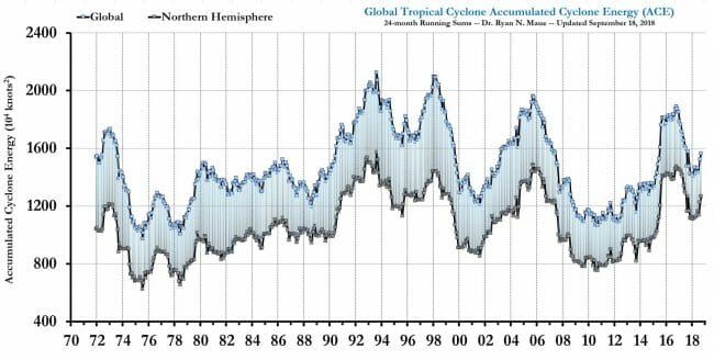

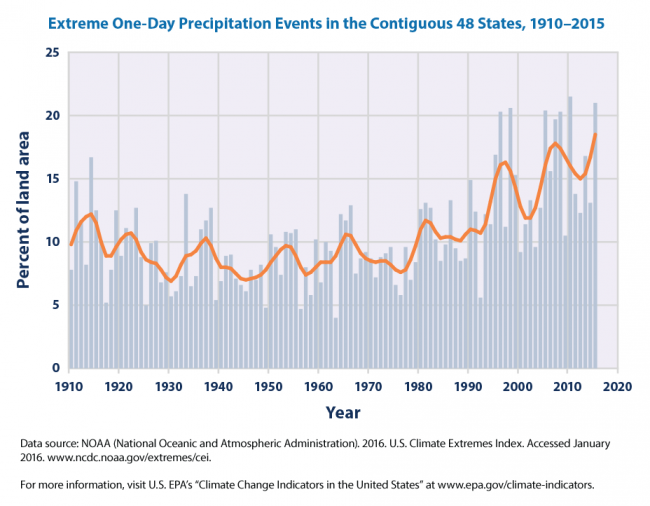


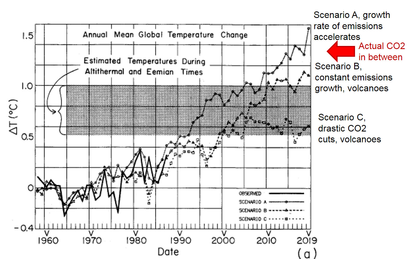
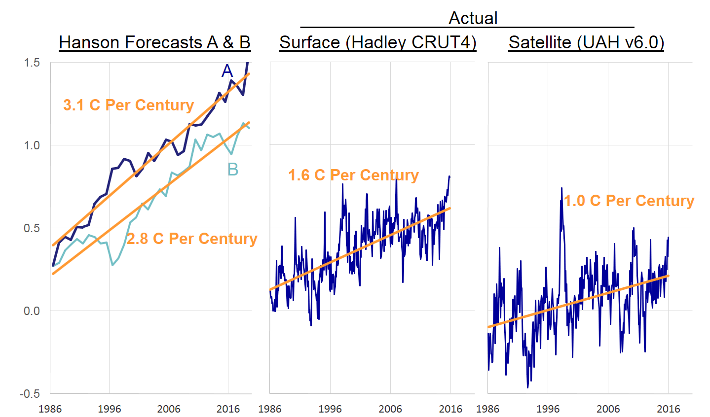


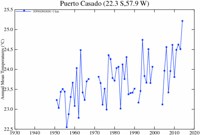

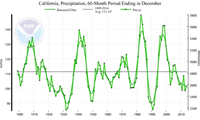

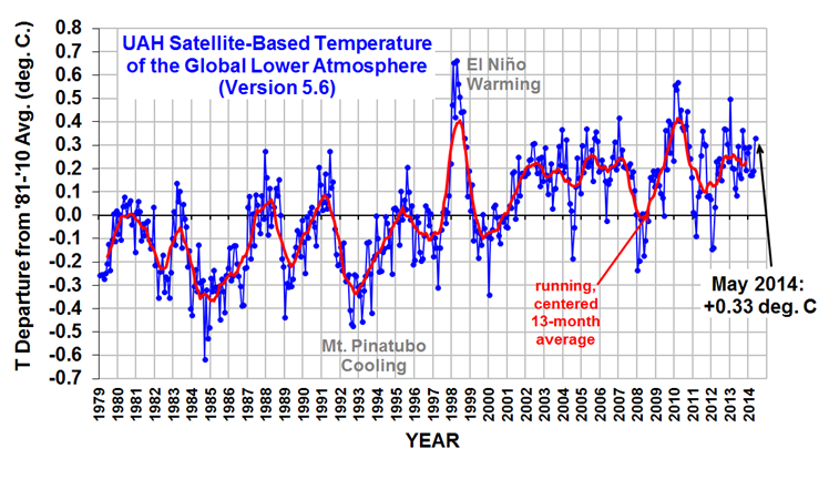