Posts tagged ‘UAH’

Why Global Warming Does Not Necessarily Translate to Daily High Temperature Records

Most folks assume that global warming results in record high daily temperatures, but this is not necessarily the case.  When your local news station blames a high temperature record on global warming, they may be wrong for two reasons.

  1.  Most of the temperature stations used by your local news channels for weather are full of urban heat island biases.  This is particularly true of the airport temperature that many local news stations use as their official reading (though to be fair UHI has much more effect on evening temperatures than temperatures at the daily high).
  2.  Most global warming, at least in the US where we have some of the best records, does not occur during the day -- it occurs at night

The latter point is surprising to most folks, but as a result we are not seeing an unusual number of daily high temperature records set (many were set in the 1930s and still stand).  What we are seeing instead is a large number of record high low temperature readings.  This is confusing, but basically it means that the lowest temperature that is reached at nighttime is higher than it has been in the past.  The chart below is a bit dated but still holds:

When I give presentations I try to use examples from local data.  Here is the comparison of night time warming vs. day time warming in Amherst, MA.

I bring this all up again because Dr. Roy Spencer has done a similar analysis for the US from the relatively new AIRS database (a satellite-based data set that avoids some of the problems of land thermometer data sets like urban heat island biases and geographic coverage gaps).  He shows this same finding, that over 80% of the warming we have seen recently in the US is at night.

This is a bit over-complicated because it is looking at temperatures through different heights of the atmosphere when most of you only care about the surface.  But you can just look at the 0 height line to see the surface warming trend.  Note that in general the data is pretty consistent with the UAH lower-troposphere temperature (satellite) and the NOAA metric (ground thermometers).

No particular point except to highlight something that is poorly understood by most folks because the media never talks about it.


Revisiting James Hanson's 1988 Global Warming Forecast to Congress

(Cross-posted from Climate Skeptic)

I want to briefly revisit Hansen's 1998 Congressional forecast.  Yes, I and many others have churned over this ground many times, but I think I now have a better approach.   The typical approach has been to overlay some actual temperature data set on top of Hansen's forecast (e.g. here).  The problem is that with revisions to all of these data sets, particularly the GISS reset in 1999, none of these data sets match what Hansen was using at the time.  So we often get into arguments on where the forecast and actuals should be centered, etc.

This might be a better approach.  First, let's start with Hansen's forecast chart (click to enlarge).

hansen forecast

Folks have argued for years over which CO2 scenario best matches history.  I would argue it is somewhere between A and B, but you will see in a moment that it almost does not matter.    It turns out that both A and B have nearly the same regressed slope.

The approach I took this time was not to worry about matching exact starting points or reconciling difference anomaly base periods.  I merely took the slope of the A and B forecasts and compared it to the slope over the last 30 years of a couple of different temeprature databases (Hadley CRUT4 and the UAH v6 satellite data).

The only real issue is the start year.  The analysis is not very sensitive to the year, but I tried to find a logical start.  Hansen's chart is frustrating because his forecasts never converge exactly, even 20 years in the past.  However, they are nearly identical in 1986, a logical base year if Hansen was giving the speech in 1988, so I started there.  I didn't do anything fancy on the trend lines, just let Excel calculate the least squares regression.  This is what we get (as usual, click to enlarge).

click to enlarge

I think that tells the tale  pretty clearly.   Versus the gold standard surface temperature measurement (vs. Hansen's thumb-on-the-scale GISS) his forecast was 2x too high.  Versus the satellite measurements it was 3x too high.

The least squares regression approach probably under-estimates that A scenario growth rate, but that is OK, that just makes the conclusion more robust.

By the way, I owe someone a thanks for the digitized numbers behind Hansen's chart but it has been so many years since I downloaded them I honestly forgot who they came from.

The 2014 Temperature Record No One Is Talking About

Depending on what temperature data set you look at **, or on your trust in various manual adjustments in these data sets ***, 2014 may have beaten the previous world temperature record by 0.02C.  Interestingly, the 0.02C rise over the prior record set four years ago would imply (using only these two data points which warmists seem to want to focus on) a temperature increase of 0.5C per century, a few tenths below my prediction but an order of magnitude below the alarmists' predictions for future trends.

Anyway, whether there was an absolute record or not, there was almost certainly a different temperature record set -- the highest divergence to date in the modern measured temperatures from what the computer models predicted.  The temperature increase for the past 5 years was a full 0.17C less than predicted, the largest gap yet for the models in forward-prediction mode (as opposed to when they are used to backcast history).


** There are four or five or more data sets, depending on how you count them.   There are 2 major satellite data sets and 2-3 ground based data sets.  The GISS ground data set generally gives the largest warming trends, while the satellite data sets give the least, but all show some warming over the last 30 or so years (though most of this warming was before 1999).

*** The data sets are all full of manual adjustments of various sorts.  All of these are necessary.  For surface stations, the measurement points move and change technology.  For the satellites, orbits and instruments shift over time.  The worrisome feature of all these adjustments is that they are large as compared to the underlying warming signal being measured, so small changes in the adjustments can lead to large changes in the apparent trend.  Skeptics often charge that the proprietors of land data sets are aggressive about including adjustments that increase the apparent trend but reluctant to add similar adjustments (eg for urban heat islands) that might reduce the trend.  As a result, most of the manual adjustments increase the trend.  There is actually little warming trend in the raw data, and it only shows up after the adjustments.  It may be total coincidence, but the database run by the most ardent warmist is the GISS and it has the highest trend.   The database run by the most skeptical is the UAH satellite database and it shows the smallest trend.  Hmm.

The Call-Your-Bluff Tax

Ross McKitrick has suggested a variation on a carbon tax that in effect challenges both Anthropogenic Global Warming (AGW) believers and skeptics to put their money where their mouth is.  I, for one, would accept this challenge.  He proposes a carbon tax on a sliding scale:

Suppose each country implements something called the T3 tax, whose U.S.
dollar rate is set equal to 20 times the three-year moving average of
the RSS and UAH estimates of the mean tropical tropospheric temperature
anomaly, assessed per tonne of carbon dioxide, updated annually. Based
on current data, the tax would be US$4.70 per ton, which is about the
median mainstream carbon-dioxide-damage estimate from a major survey
published in 2005 by economist Richard Tol.

He chooses the "tropical tropospheric temperature anomaly" because that is effectively the canary in the underground mine.  According to AGW theory, the troposphere (the lowest 10km of atmosphere) will be warmed more than the earth's surface.  McKitrick also says that AGW models show the tropics will be warmed more than high latitudes. 

This tax rate is low, and would yield very little emissions
abatement. Global-warming skeptics and opponents of
greenhouse-abatement policy will like that. But would global-warming
activists? They should -- because according to them, the tax will climb
rapidly in the years ahead.

The IPCC predicts a warming rate in
the tropical troposphere of about double that at the surface, implying
about 0.2C to 1.2C per decade in the tropical troposphere under
greenhouse-forcing scenarios. That implies the tax will climb by $4 to
$24 per tonne per decade, a much more aggressive schedule of emission
fee increases than most current proposals. At the upper end of warming
forecasts, the tax could reach $200 per tonne of CO2 by 2100, forcing
major carbon-emission reductions and a global shift to non-carbon
energy sources.

Global-warming activists would like this. But so
would skeptics, because they believe the models are exaggerating the
warming forecasts. After all, the averaged UAH/ RSS tropical
troposphere series went up only about 0.08C over the past decade, and
has been going down since 2002. Some solar scientists even expect
pronounced cooling to begin in a decade. If they are right, the T3 tax
will fall below zero within two decades, turning into a subsidy for
carbon emissions.

At this point the global-warming alarmists would leap up to slam the
proposal. But not so fast, Mr. Gore: The tax would only become a carbon
subsidy if all the climate models are wrong, if greenhouse gases are
not warming the atmosphere, and if the sun actually controls the
climate. Alarmists sneeringly denounce such claims as "denialism," so
they can hardly reject the policy on the belief that they are true.

Under
the T3 tax, the regulator gets to call everyone's bluff at once,
without gambling in advance on who is right. If the tax goes up, it
ought to have. If it doesn't go up, it shouldn't have. Either way we
get a sensible outcome.

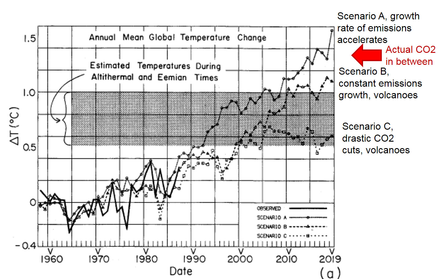
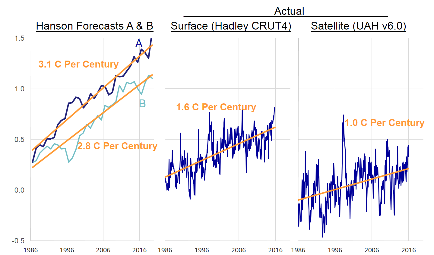
I think many skeptics would jump at such a proposal (as long as there is some control on AGW supporters "restating" and "correcting" the satellite readings -- there is nothing AGW scientists are better at than "correcting" historical numbers that don't fit their story line).  One reason is that we skeptics know one of the AGW dirty little secrets:   In fact, against all predictions of the theory, the troposphere has been warming less than the surface.  Also, while I get conflicting inputs on whether the tropics or the northern latitudes should warm more, but if McKitrick is correct, the fact that the tropics have been warming less than higher norther latitudes (but more than southern latitudes) is also an inconsistency.  In case you don't keep a full set of tropospheric temperature histories sitting on your desk, here are several from Global Warming at a Glance.

Warming for the lower troposphere in the tropics, note the 0.2C anomaly (click any image for larger version):

Uahmsutrop

Here is the lower troposphere for the Northern Hemisphere above the tropics which is warming more than the tropics, with a 0.3 degree anomaly

Uahmsunextm

And here is a comparison of Global lower troposphere temperatures (in blue) vs. one compilation  by the GIS of measured surface temperatures in red.  Note the divergence, which is exactly opposite of what AGW theory says has to happen, given the surface temps have a 0.5 to 0.6 degree anomaly  Note that this may be because of some serious biases to ground based temperature measurement, but then that would mean that global warming is over-stated.

Msuvsgistemp

Look for my upcoming "Skeptical Layman's Primer to Anthropogenic Global Warming" or email me for a pre-release beta copy.