Warmists and Skeptics Should Agree That This is The Real Scandal in Climate Science
Imagine that for some reason you desperately needed to be under a certain weight. I am old enough to think of the relatively obscure movie Vision Quest where a high school wrestler is trying to drop two weight classes. If you were in that situation, what is the first investment you would make? Exercise equipment? Nutrition guides? A personal trainer? No! You would invest in a good, accurate scale. Because without being able to measure the variable (in this case weight) you care about, everything else is worthless.
As trivial an observation as this may seem, the fact is that the world's governments have spent tens, perhaps hundreds of billions of dollars on global warming research and mitigation and have done almost zero to build out and improve a reliable temperature measurement system and historical temperature database. We have absolutely failed over the last 30 years to substantially improve our actual measurement of the warming we are so concerned about.
There are at least two problems with our temperature data, the first of which I have written about many times before -- our surface temperature measurement infrastructure is full of bad installations whose design and location bear no resemblance to best-practice standards. The most common problem is that temperature measurement stations are located in places that are subject to a lot of local biases, particularly urban development and heat islands. I wrote about a classic example I discovered right here in Arizona. And while the US has taken a few steps to eliminate the most egregious locations, many bad ones still exist. And problems with the US infrastructure are nothing compared to issues with the infrastructure in other countries. There still are only a handful of measurement locations in huge continents such as Africa and Antarctica, with quality problems equal to or greater than those in the US.
Parallel to the land surface data, we have a second temperature data set taken from satellites that has nearly as many issues. Satellite data eliminates some of the problems of the surface data set: it does not have large gaps in coverage and it is not subject to local biases, such as urban heat islands. It does have the problem of not actually measuring the surface temperature, but rather the lower troposphere, but this is exactly where computer models predict the largest global warming signal to occur, so it is still useful. But there have been many under-investment problems here, too. The history of temperature versions of the UAH satellite temperature data base has many ups and downs that must be corrected -- this satellite fell out of the sky and then this one has sensor drift and then this other one went off course. Despite the large and vocal role of the Goddard Institute for Space Studies (GISS) in climate research, the database they maintain is a surface temperature database and they seem to do little to support space measurement, leaving it to a few small groups to learn something from the satellites. It's as big mess, made worse by the political factor of the space temperature database getting lower warming rates and being maintained by a skeptic while the surface temperature databases show more warming and are maintained by folks more pessimistic about warming rates.
To this picture we can add substantial problems with the historical temperature record. The Hadley CRUT database is generally considered the gold standard in surface temperature records and is used by most researchers. There are some problems with the database that are hard to fix -- for example, for 1850 there is apparently only 1 temperature station in the database for the entire southern hemisphere, which means half the world's temperature is being extrapolated from one site in Indonesia. We can't get in a time machine and sprinkle the world in 1850 with more thermometers. But we can try to take some sort of estimate of the potential error induced by such spotty measurement, something I have never seen done in the CRUT database. The data in 1850 is always presented as just as solid as that in 1950 (see my last global temperature update).
Apparently, a PHD student in Australia recently audited the CRUT database as his thesis project. Before you get into his results, here is one thing to consider: Literally trillion-dollar decisions are being made based on this database and based on research which uses this database, and no one has bothered to do this previously until some random grad student in Australia gives it a shot? By the way, it should be noted that once he completed what should have been warmly welcomed by the climate community with a "Dang, can't believe we didn't do that already," he has instead gotten nothing but grief and criticism.
The thesis is paywalled, (just $8, I have bought a copy and am slogging through it now) but Anthony Watt summarizes:
HadCRUT4 is the primary global temperature dataset used by the Intergovernmental Panel on Climate Change (IPCC) to make its dramatic claims about “man-made global warming”. It’s also the dataset at the center of “ClimateGate” from 2009, managed by the Climate Research Unit (CRU) at East Anglia University.
The audit finds more than 70 areas of concern about data quality and accuracy.
But according to an analysis by Australian researcher John McLean it’s far too sloppy to be taken seriously even by climate scientists, let alone a body as influential as the IPCC or by the governments of the world.
…
Main points:
- The Hadley data is one of the most cited, most important databases for climate modeling, and thus for policies involving billions of dollars.
- McLean found freakishly improbable data, and systematic adjustment errors , large gaps where there is no data, location errors, Fahrenheit temperatures reported as Celsius, and spelling errors.
- Almost no quality control checks have been done: outliers that are obvious mistakes have not been corrected – one town in Columbia spent three months in 1978 at an average daily temperature of over 80 degrees C. One town in Romania stepped out from summer in 1953 straight into a month of Spring at minus 46°C. These are supposedly “average” temperatures for a full month at a time. St Kitts, a Caribbean island, was recorded at 0°C for a whole month, and twice!
- Temperatures for the entire Southern Hemisphere in 1850 and for the next three years are calculated from just one site in Indonesia and some random ships.
- Sea surface temperatures represent 70% of the Earth’s surface, but some measurements come from ships which are logged at locations 100km inland. Others are in harbors which are hardly representative of the open ocean.
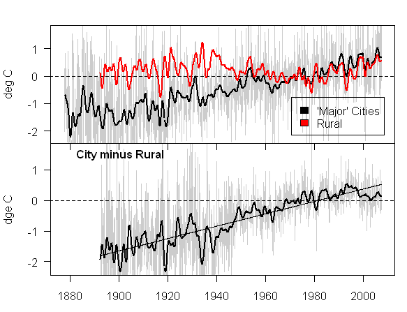
- When a thermometer is relocated to a new site, the adjustment assumes that the old site was always built up and “heated” by concrete and buildings. In reality, the artificial warming probably crept in slowly. By correcting for buildings that likely didn’t exist in 1880, old records are artificially cooled. Adjustments for a few site changes can create a whole century of artificial warming trends.
Details of the worst outliers
- For April, June and July of 1978 Apto Uto (Colombia, ID:800890) had an average monthly temperature of 81.5°C, 83.4°C and 83.4°C respectively.
- The monthly mean temperature in September 1953 at Paltinis, Romania is reported as -46.4 °C (in other years the September average was about 11.5°C).
- At Golden Rock Airport, on the island of St Kitts in the Caribbean, mean monthly temperatures for December in 1981 and 1984 are reported as 0.0°C. But from 1971 to 1990 the average in all the other years was 26.0°C.
The last point about past thermometer adjustments is one I have run into before when I was looking at urban heat islands and their effect on temperature measurement (by the way this is a really great science fair project if you are looking for one). Past urban heat adjustments seem to imply (by cooling the past more than the present) that urban heat biases on measured temperatures have gone down over time, which defies all logic and experience.
There is a lot more of interest at the link, but it strikes me as shear madness, bordering on fraud, that there seems to have been so little effort put into data integrity of perhaps the single most important non-economic dataset in the world. I would presume that warmists, who constantly accuse skeptics of being "anti-science" would be the first to line up in favor of investing whatever is necessary in better, cleaner data. So far, there has only been criticism of the effort.
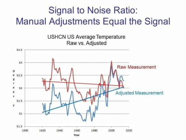
Postscript: The temperature adjustment issue is an important one. In short, as seen below, the magnitude of the temperature adjustments in the US temperature database equal the magnitude of the warming. In other words, the warming signal comes entirely from the adjustments. This does not mean the signal is being read incorrectly, but it does mean that getting the adjustments (and their error bars, which no one ever includes) correct is perhaps the single most important issue to a good historical database.

