I will preface this post by saying I know exactly zero about AI companies and what they are working on. But I wonder if they are working on the right thing.
First, a digression. Anyone who is more than a casual user of Microsoft Word understands that there are fundamental bugs in the core of the program that have existed since almost the very first version and have never been fixed in almost 30 years. Two that come immediately to mind are the difficulty in getting images to stay where you put them and the absolutely terrible structured outlining (eg section II-B-iv-2-a). The former is so bad you can find a zillion memes on it. The latter is so bad that Word Perfect still survives focused on lawyers who write a lot of documents with hierarchical bulleting.
Everyone knows these problems exist. Presumably they are fixable with some amount of effort. But they are not fixed. Instead, release after new release in Word trumpets new niche functionality without ever focusing on the core functionality. I can't remember ever using a feature of Word that was added since 2005, and maybe earlier, but yet adding those new features is what consumes all the development time.
My fear is that AI companies are doing the same thing. New features and capabilities of the major AI models are impressive. But at their core, at least for researching and writing, they still have the critical, fatal flaw of hallucinations. Almost every day we can watch some law firm get reprimanded by a judge for submitting briefs that include fake, made-up, hallucinated cases.
I don't care how capable and human sounding these ai models are, if they are inserting reputation-destroying hallucinations in a firm's output, or writing in an identifiable AI style, they are worse than useless. And companies that say "Oh, we don't use AI" are fooling themselves because even the best and brightest kids that they are hiring have become habituated to using AI to finish research and writing assignments. A young woman I know who manages case teams for one of the big strategic consultants (I won't give the name but think McKinsey, BCG, Baine, etc) says that a huge part of her job as engagement manager is to stop AI-generated slop with obvious errors and recognizable AI writing style from getting to the client. Her case team keeps handing her things that at best are obviously AI prose and at worst contain errors. Interestingly, she checks all this stuff not because she was assigned to do it, but because she grew up on the AI/non-AI temporal border and sees the risks. I have a bet online where I believe one of these firms is going to be caught up in a public scandal and lawsuit in 2026 for turning in ai-generated client presentations while billing that client 7 figures a month (imagine the explosion when a CEO finds out they were paying $1 million a month for the output of a few ChatGPT prompts).
The problem is actually bad enough that I briefly considered starting a new firm whose sole job was to independently review, fact-check, and edit all of a firm's output to help them identify hallucinations and AI tells. You could probably go hire 100 of the older generation of Washington Post layoffs right now who have actual reporting, editing, and fact checking experience (avoid the younger ones who grew up in the journalism as advocacy era). Go out and sell your services to law firms and consultants and such. Gotta be a business there. Right now I am too newly retired to pursue it but I will leave the idea to you guys. You're welcome.
Obviously, nothing about what I describe above sounds like the employment apocalypse everyone is expecting. You are simply not going to see the promised productivity gains until AI cleans up its house and in my mind that would include transparency about hallucinations -- what are the rates, what have they done to fix them in this version, are the rates going down, etc.
Imagine that for some reason you desperately needed to be under a certain weight. I am old enough to think of the relatively obscure movie Vision Quest where a high school wrestler is trying to drop two weight classes. If you were in that situation, what is the first investment you would make? Exercise equipment? Nutrition guides? A personal trainer? No! You would invest in a good, accurate scale. Because without being able to measure the variable (in this case weight) you care about, everything else is worthless.
As trivial an observation as this may seem, the fact is that the world's governments have spent tens, perhaps hundreds of billions of dollars on global warming research and mitigation and have done almost zero to build out and improve a reliable temperature measurement system and historical temperature database. We have absolutely failed over the last 30 years to substantially improve our actual measurement of the warming we are so concerned about.
There are at least two problems with our temperature data, the first of which I have written about many times before -- our surface temperature measurement infrastructure is full of bad installations whose design and location bear no resemblance to best-practice standards. The most common problem is that temperature measurement stations are located in places that are subject to a lot of local biases, particularly urban development and heat islands. I wrote about a classic example I discovered right here in Arizona. And while the US has taken a few steps to eliminate the most egregious locations, many bad ones still exist. And problems with the US infrastructure are nothing compared to issues with the infrastructure in other countries. There still are only a handful of measurement locations in huge continents such as Africa and Antarctica, with quality problems equal to or greater than those in the US.
Parallel to the land surface data, we have a second temperature data set taken from satellites that has nearly as many issues. Satellite data eliminates some of the problems of the surface data set: it does not have large gaps in coverage and it is not subject to local biases, such as urban heat islands. It does have the problem of not actually measuring the surface temperature, but rather the lower troposphere, but this is exactly where computer models predict the largest global warming signal to occur, so it is still useful. But there have been many under-investment problems here, too. The history of temperature versions of the UAH satellite temperature data base has many ups and downs that must be corrected -- this satellite fell out of the sky and then this one has sensor drift and then this other one went off course. Despite the large and vocal role of the Goddard Institute for Space Studies (GISS) in climate research, the database they maintain is a surface temperature database and they seem to do little to support space measurement, leaving it to a few small groups to learn something from the satellites. It's as big mess, made worse by the political factor of the space temperature database getting lower warming rates and being maintained by a skeptic while the surface temperature databases show more warming and are maintained by folks more pessimistic about warming rates.
To this picture we can add substantial problems with the historical temperature record. The Hadley CRUT database is generally considered the gold standard in surface temperature records and is used by most researchers. There are some problems with the database that are hard to fix -- for example, for 1850 there is apparently only 1 temperature station in the database for the entire southern hemisphere, which means half the world's temperature is being extrapolated from one site in Indonesia. We can't get in a time machine and sprinkle the world in 1850 with more thermometers. But we can try to take some sort of estimate of the potential error induced by such spotty measurement, something I have never seen done in the CRUT database. The data in 1850 is always presented as just as solid as that in 1950 (see my last global temperature update).
Apparently, a PHD student in Australia recently audited the CRUT database as his thesis project. Before you get into his results, here is one thing to consider: Literally trillion-dollar decisions are being made based on this database and based on research which uses this database, and no one has bothered to do this previously until some random grad student in Australia gives it a shot? By the way, it should be noted that once he completed what should have been warmly welcomed by the climate community with a "Dang, can't believe we didn't do that already," he has instead gotten nothing but grief and criticism.
The thesis is paywalled, (just $8, I have bought a copy and am slogging through it now) but Anthony Watt summarizes:
HadCRUT4 is the primary global temperature dataset used by the Intergovernmental Panel on Climate Change (IPCC) to make its dramatic claims about “man-made global warming”. It’s also the dataset at the center of “ClimateGate” from 2009, managed by the Climate Research Unit (CRU) at East Anglia University.
The audit finds more than 70 areas of concern about data quality and accuracy.
But according to an analysis by Australian researcher John McLean it’s far too sloppy to be taken seriously even by climate scientists, let alone a body as influential as the IPCC or by the governments of the world.
…
Main points:
The Hadley data is one of the most cited, most important databases for climate modeling, and thus for policies involving billions of dollars.
McLean found freakishly improbable data, and systematic adjustment errors , large gaps where there is no data, location errors, Fahrenheit temperatures reported as Celsius, and spelling errors.
Almost no quality control checks have been done: outliers that are obvious mistakes have not been corrected – one town in Columbia spent three months in 1978 at an average daily temperature of over 80 degrees C. One town in Romania stepped out from summer in 1953 straight into a month of Spring at minus 46°C. These are supposedly “average” temperatures for a full month at a time. St Kitts, a Caribbean island, was recorded at 0°C for a whole month, and twice!
Temperatures for the entire Southern Hemisphere in 1850 and for the next three years are calculated from just one site in Indonesia and some random ships.
Sea surface temperatures represent 70% of the Earth’s surface, but some measurements come from ships which are logged at locations 100km inland. Others are in harbors which are hardly representative of the open ocean.
When a thermometer is relocated to a new site, the adjustment assumes that the old site was always built up and “heated” by concrete and buildings. In reality, the artificial warming probably crept in slowly. By correcting for buildings that likely didn’t exist in 1880, old records are artificially cooled. Adjustments for a few site changes can create a whole century of artificial warming trends.
Details of the worst outliers
For April, June and July of 1978 Apto Uto (Colombia, ID:800890) had an average monthly temperature of 81.5°C, 83.4°C and 83.4°C respectively.
The monthly mean temperature in September 1953 at Paltinis, Romania is reported as -46.4 °C (in other years the September average was about 11.5°C).
At Golden Rock Airport, on the island of St Kitts in the Caribbean, mean monthly temperatures for December in 1981 and 1984 are reported as 0.0°C. But from 1971 to 1990 the average in all the other years was 26.0°C.
The last point about past thermometer adjustments is one I have run into before when I was looking at urban heat islands and their effect on temperature measurement (by the way this is a really great science fair project if you are looking for one). Past urban heat adjustments seem to imply (by cooling the past more than the present) that urban heat biases on measured temperatures have gone down over time, which defies all logic and experience.
There is a lot more of interest at the link, but it strikes me as shear madness, bordering on fraud, that there seems to have been so little effort put into data integrity of perhaps the single most important non-economic dataset in the world. I would presume that warmists, who constantly accuse skeptics of being "anti-science" would be the first to line up in favor of investing whatever is necessary in better, cleaner data. So far, there has only been criticism of the effort.
Postscript: The temperature adjustment issue is an important one. In short, as seen below, the magnitude of the temperature adjustments in the US temperature database equal the magnitude of the warming. In other words, the warming signal comes entirely from the adjustments. This does not mean the signal is being read incorrectly, but it does mean that getting the adjustments (and their error bars, which no one ever includes) correct is perhaps the single most important issue to a good historical database.
In part A of this chapter, we showed that the world had indeed warmed over the past 30-100 years, whether you looked at the surface temperature record or the satellite record. Using either of these metrics, though, we did not see global warming accelerating, nor did we see warming rates that were faster than predicted. In fact, we saw the opposite.
One story I left out of part A, because it did not affect the basic conclusions we drew, is the criticisms of the surface temperature record. In this part B, we will discuss some of these criticisms, and see why many skeptics believe the 0.8C warming number for the past century is exaggerated. We will also gain some insights as to why the satellite measured warming rates may be closer to the mark than rates determined by surface temperature stations.
Uncorrected Urban Biases
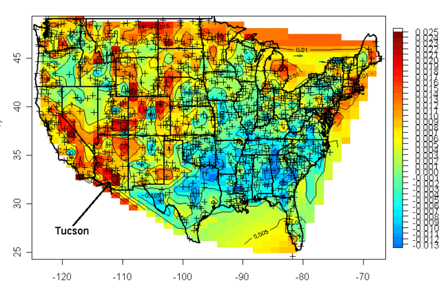
Years ago a guy named Steve McIntyre published a graphical portrayal of warming rates across the US. This is a common chart nowadays. Anyway, this chart (almost 10 years old) drew from temperature measurement stations whose locations are shows with the crosses on the map:
I was living in Arizona at the time and I was interested to learn that the highest warming rate was being recorded at the USHCN station in Tucson (remember, just because Arizona is hot is no reason to necessarily expect it to have high warming rates, they are two different things). At the time, Anthony Watt was just kicking off an initiative to develop quality control data for USHCN stations by having amateurs photograph the sites and upload them to a central data base. I decided I would go down to the Tucson site to experience the highest warming rate myself. This is what I found when I tracked down the station, and took this picture (which has been reproduced all over the place at this point):
That is the temperature station, around that fenced in white box (the uproar over this picture eventually caused this location to be closed). It was in the middle of a parking lot in the middle of a major university in the middle of a growing city. 100 years ago this temperature station was in the countryside, in essentially the open desert - no paving, no buildings, no cars. So we are getting the highest warming rates in the country by comparing a temperature today in an asphalt parking lot in the middle of a city to a temperature a hundred years ago in the open desert.
The problem with this is what's called the urban heat island effect. Buildings and concrete absorb heat from the sun during the day, more than would typically be absorbed by raw land in its natural state. This heat is reradiated at night, causing nights to be warmer in cities than in the areas surrounding them. If you live in a city, you will likely hear weather reports that predict colder temperatures in outlying areas, or warn of freezes in the countryside but not in the city itself.
It turns out that this urban heat island effect is easily measured -- it even makes a great science fair project!
My son and I did this project years ago, attaching a small GPS and temperature probe to a car. We then drove out of the city center into the country and back in the early evening, when the urban heat island effect should be largest. We drove out and then back to average out any effects of overall cooling during our testing. One of the trips is shown above, with around 6 degrees F of temperature change. We, and most others who have done this in other cities, found between 5 and 10 degrees of warming as one drives into a city at night.
If this effect were constant over time, it would not pose too many problems for our purposes here, because we are looking at changes in average temperatures over time, not absolute values. But the urban heat island warming of a city (and particular temperature stations) increases as the urban area grows larger. Because this urban warming is many times the global warming signal we are trying to measure, and since most temperature stations are located near growing urban locations, it introduces an important potential bias into measurement.
A number of studies have found that, in fact, we do indeed see more warming historically in thermometers located in urban areas than in those located in rural areas. Two studies in California have shown much lower warming rates at rural thermometers than at urban ones:
Anthony Watt has been working for years to do this same analysis for the entire US. In fact, the pictures taken above of the temperature station in Tucson were part of the first phase of his project to document each USHCN site used in the global warming statistics with pictures. Once he had pictures, he compared the details of the siting with a classification system scientists use to measure the quality of a temperature sites, from the best (class 1) to the worst with the most biases (class 5). He found that perhaps a third of the warming in the official NOAA numbers may come from the introduction of siting biases from bad sites. Or put another way, the warming at well-sited temperature stations was only about 2/3 in the official metric.
By the way, this is one other reason why I tend to favor the satellite measurements. Going back to the numbers we showed in part A, the satellite temperature metric had about 2/3 the trend of the surface temperature reading, or almost exactly what the surface readings would be if this siting bias were eliminated (the absolute values of the trends don't match, because they are for different time periods and different geographies).
There is one other aspect of this chart that might have caught your eye -- if some temperature stations are showing 2 degrees of warming and some 3.2 degrees of warming, why is the total 3.2 degrees of warming. Shouldn't it be somewhere in the middle?
One explanation is that the NOAA and other bodies take the data from these stations and perform a number of data manipulation steps in addition to a straight spatial averaging. One such step is that they will use a computer process to try to correct temperature stations based on the values from neighboring stations. The folks that run these indices argue that this computational process overcomes the site bias problem. Skeptics will argue that this approach is utter madness -- why work to correct a known bad temperature point, why not just eliminate it? If you have a good compass and a bad compass, you don't somehow mathematically average the results to find north, you throw out the bad one and use the good one. In short, skeptics argue that this approach does not eliminate the error, it just spreads the error around to all the good stations, smearing the error like peanut butter. Here is an example from the GISS, using station data that has only been adjusted for Time of Observation changes (TOBS).
This is exactly what we might expect - little warming out in undeveloped nature in Grand Canyon National Park, lots of warming in a large and rapidly growing modern city (yes, the Tucson data is from our favorite temperature station we featured above). Now, here is the same data after the GISS has adjusted it:
You can see that Tucson has been adjusted down a degree or two, but Grand Canyon has been adjusted up a degree or two (with the earlier mid-century spike adjusted down). OK, so it makes sense that Tucson has been adjusted down, though there is a very good argument to be made that it should be been adjusted down more, say by at least 3 degrees. But why does the Grand Canyon need to be adjusted up by about a degree and a half? What is currently biasing it colder by 1.5 degrees, which is a lot? One suspects the GISS is doing some sort of averaging, which is bringing the Grand Canyon and Tucson from each end closer to a mean -- they are not eliminating the urban bias from Tucson, they are just spreading it around to other stations in the region.
Temperature Adjustments and Signal-To-Noise Ratio
Nothing is less productive, to my mind, than when skeptics yell the word "fraud!" on the issue of temperature adjustments. All temperature databases include manual adjustments, even the satellite indices that many skeptics favor. As mentioned above, satellite measurements have to be adjusted for orbital decay of the satellites just as surface temperature measurements have to be adjusted for changes in the daily time of observation. We may argue that adjustment methodologies are wrong (as we did above with urban biases). We may argue that there are serious confirmation biases (nearly every single adjustment to every temperature and sea level and ocean heat database tends to cool the past and warm the present, perhaps reinforced by preconceived notions that we should be seeing a warming signal.) But I find that charges of fraud just cheapen the debate.
Even if the adjustments are all made the the best of intentions, we are still left with an enormous problem of signal to noise ratio. It turns out that the signal we are trying to measure -- warming over time -- is roughly equal to the magnitude of the manual adjustments. In other words, the raw temperature data does not show warming, only the manually adjusted data show warming. This does not mean the adjusted data is wrong, but it should make us substantially less confident that we are truly measuring the signal in all this noise of adjustment. Here are two examples, for an individual temperature station and for the entire database as a whole:
In this first example, we show the raw data (with Time of Observation adjustments only) in orange, and the final official adjusted version in blue. The adjustments triple the warming rate for the last century.
We can see something similar for the whole US, as raw temperature measurements (this time before time of observation adjustments) actually shows a declining temperature trend in the US. In this case, the entirety of the global warming signal, and more, comes from the manual adjustments. Do these adjustments (literally thousands and thousands of them) make sense when taken in whole? Does it make sense that there was some sort of warming bias in the 1920's that does not exist today? This is certainly an odd conclusion given that it implies a bias exactly opposite of the urban heat island effect.
We could go into much more detail, but this gives one an idea of why skeptics prefer the satellite measurements to the surface temperature record. Rather than endlessly working to try to get these public agencies to release their adjustment details and methodology for third party validation to the public that pays them (an ongoing task that still has not been entirely successful), skeptics have simply moved on to a better approach where the adjustments (to a few satellites) are much easier to manage.
Ultimately, both approaches for seeking a global warming signal are a bit daft. Why? Because, according to the IPCC, of all the extra warming absorbed by the surface of the Earth from the greenhouse effect, only about 1% goes into the atmosphere:
Basically, water has a MUCH higher heat carrying capacity than air, and over 90% of any warming should be going into oceans. We are just starting to get some new tools for measuring the changes to ocean heat content, though the task is hard because we are talking about changes in the thousandths of a degree in the deep oceans.
After this brief digression into the surface temperature records, it is now time to get back to our main line of discussion. In the next chapter, we will begin to address the all-important attribution question: Of the warming we have seen in the past, how much is man-made?
Update:This post may be unfair, as discussed here. I am not fully convinced, though.
I won't repeat what I wrote before, but several months ago I wrote a long article about my suspicions that Yelp was using its review recommendation system to disappear reviews its corporate sponsors and their attorneys did not like. My evidence was based on my actual experience writing a detailed, fact-based negative review of an insurer, only to have it disappear from the site and be left out of the insurer's overall score.
It took me a long time to find the review, along with dozens of others, in a purgatory of "not recommended" reviews reachable from a near invisible link that doesn't even look like a link. I won't retype the whole post but my evidence was in part:
Yelp says it is sending reviews to not-recommended purgatory because they are of lower quality or have reviewers with less reviewing history on Yelp. But a scan of the reviews in my case showed no such pattern. Not-recommended reviews were at least as (and arguably more) detailed than recommended reviews, and there was no discernible difference in reviewer experience. The not recommended reviews were also no less moderate, as there was immoderate language (and horrible grammar) in accepted reviews while there were calm and reasoned reviews that were rejected.
What the not-recommended reviews had in common was that they tended to be more negative on average than the recommended ones (which is hard to do because the recommended reviews average to about 1.5 stars)
Looking at several local independent restaurants, I saw no or few not-recommended reviews and pages and pages of recommended reviews, a ratio that was reversed for the major insurer which presumably has far more resources to intimidate or buy off Yelp. For the insurer, there were two not-recommended reviews for every one recommended one.
I knew this insurer to be willing to litigate against bad reviews, since they have sued me for libel to remove my review. Presumably, they would not hesitate to threaten Yelp as well.
Yelp already has a review quality system driven by upvoting by customers based on the usefulness of the review. So why the need for an entirely parallel review-rating system unless that rating system was for an entirely different purpose than quality control.
Yelp got a lot of grief a while back accusing it of deleting reviews, so its CEO has pledged on multiple occasions that it doesn't do so. I believe them. Instead, it looks like Yelp disappears reviews in a way that the CEO can truthfully say they were not deleted, but they are for all intents and purposes invisible to the public.
Anyway, all this was spurred by the following trailer sent to me with this article from a reader. Apparently a film called Billion Dollar Bully is being made about Yelp, and from the hints in the trailer it appears that they will be taking on many of the issues I listed above and frankly have only been able to guess at rather than prove. Brava!
I can't think of any justification for the FDA's shutdown of 23andme's genetic testing service except one of pure control. It is yet another case where you and I are not smart enough or sophisticated enough to be trusted with information about our own bodies. Because we might use the information in some way with which Maya Shankar might not agree.
Let me be clear, I am not offended by all regulation of genetic tests. Indeed, genetic tests are already regulated. To be precise, the labs that perform genetic tests are regulated by the Clinical Laboratory Improvement Amendments (CLIA) as overseen by the CMS (here is an excellent primer). The CLIA requires all labs, including the labs used by 23andMe, to be inspected for quality control, record keeping and the qualifications of their personnel. The goal is to ensure that the tests are accurate, reliable, timely, confidential and not risky to patients. I am not offended when the goal of regulation is to help consumers buy the product that they have contracted to buy.
What the FDA wants to do is categorically different. The FDA wants to regulate genetic tests as a high-riskmedical device that cannot be sold until and unless the FDA permits it be sold.
Moreover, the FDA wants to judge not the analytic validity of the tests, whether the tests accurately read the genetic code as the firms promise (already regulated under the CLIA) but the clinical validity, whether particular identified alleles are causal for conditions or disease. The latter requirement is the death-knell for the products because of the expense and time it takes to prove specific genes are causal for diseases. Moreover, it means that firms like 23andMe will not be able to tell consumers about their own DNA but instead will only be allowed to offer a peek at the sections of code that the FDA has deemed it ok for consumers to see.
Alternatively, firms may be allowed to sequence a consumer’s genetic code and even report it to them but they will not be allowed to tell consumers what the letters mean. Here is why I think the FDA’s actions are unconstitutional. Reading an individual’s code is safe and effective. Interpreting the code and communicating opinions about it may or may not be safe–just like all communication–but it falls squarely under the First Amendment.
I know that libertarians want to kill the FDA altogether. That is never going to happen. But what might be more realistic is to shift their governing law from validating that medical treatments are safe and effective to just safe.
Brad Warbiany has more, including real life examples of how 23andme's service has been useful to his family.
For years Progressives, led by President Obama during the legislative process for the PPACA, have attacked health insurance companies for their profits and overhead. I never understood the former -- at generally 5% of revenues or less, even wiping health insurance profits out altogether would offset less than a year's worth of health care inflation. The Progressive hatred for health insurance overhead was actually built into the PPACA, with limits on non-care expenses as a percent of premiums.
Progressive's justification for this was to compare health insurer's overhead against Medicare, which appears to have lower overhead as a percentage of revenues. This is problematic, because lots of things that private insurers have to pay for actually still are paid for by the Federal government, but just don't hit Medicare's books due to funky government accounting. Other private costs, particularly claims management, are areas that likely have a real return in fraud reduction. In this case, Medicare's decision not to invest in claims management overhead shows up as costs elsewhere, specifically in fraudulent billings.
None of these areas of costs make for particularly fertile ground for demagoguing, so the Progressive argument against health insurance overhead usually boils down to marketing. This argument makes a nice fit with progressive orthodoxy, which has always hated advertising as manipulative. But health insurance marketing expenses mainly consist of
Funding commissions to brokers, who actually sell the product, and
Funding people to go to company open enrollments and explain health care options to participants
Suddenly, now that Progressives have taken over health care via the PPACA and federal exchanges, their tune has changed. They seem to have a near infinite appetite for marketing money to support construction of the exchanges (which serve the role of the broker, though less well because there is no support) and information about options to potential participants. That these are exactly the kinds of expenses they have railed against for years in the private world seems to elicit no irony. Via Cato
Now we learn, from the Washington Post’s Sara Kliff, “Sebelius has, over the past three months, made multiple phone calls to health industry executives, community organizations and church groups and directly asked that they contribute to non-profits that are working to enroll uninsured Americans and increase awareness of the law.”
[California] will also spend $250 million on a two-year marketing campaign [for its health insurance exchange]. By comparison California Senator Barbara Boxer spent $28 million on her 2010 statewide reelection campaign while her challenger spent another $22 million.
The most recent installment of the $910 million in federal money was a $674 million grant. The exchange's executive director noted that was less than the $706 million he had asked for. "The feds reduced the 2014 potential payment for outreach and enrollment by about $30 million," he said. "But we think we have enough resources on hand to do the biggest outreach that I have ever seen." ...
The California Exchange officials also say they need 20,000 part time enrollers to get everybody signed up––paying them $58 for each application. Having that many people out in the market creates quality control issues particularly when these people will be handling personal information like address, birth date, and social security number. California Blue Shield, by comparison has 5,000 employees serving 3.5 million members.
New York is off to a similar start. New York has received two grants totaling $340 million again just to set up an enrollment and eligibility process.
These are EXACTLY the same sorts of marketing costs progressives have railed on for years in the private world.
Proponents of Obamacare and other aggressive government health care interventions often argue that government health insurance will be less expensive than private health insurance. Ignoring the whole history of government provided services (which you have to do to accept this argument), it is entertaining to press them on what costs will go away.
First, they will argue "profits." Health insurers "obviously" make a lot of profit, so doing away with that will amount to a lot of savings. Several years ago, when Obama was actively demagoguing** the health insurance business, the profit margins of health insurers were all around 3-4% or less. Which means in exchange for eliminating all private profit incentives towards efficiency and productivity, we get a 3% one time cost reduction. Not very promising.
After profits, Obamacare supporters will point to administrative costs. Their philosophy that private insurance administrative costs drive health inflation is built into Obamacare, which places a cap on non-care related costs as a percentage of premiums. I would argue a lot of this cost is claims management and fraud detection that government programs like Medicare don't have, to their detriment, but let's leave that aside. I think most Obamacare opponents are convinced that there are billions in marketing costs that could be eliminated. This has always been their bete noir in pharmaceuticals, that drug companies spend too much marketing.
I have said for years that to a large extent, what outsiders call "marketing" in health insurance is actually customer service and information, in particular agents who go out to companies and help people understand and make their insurance choices.
[California] will also spend $250 million on a two-year marketing campaign [for its health insurance exchange]. By comparison California Senator Barbara Boxer spent $28 million on her 2010 statewide reelection campaign while her challenger spent another $22 million.
The most recent installment of the $910 million in federal money was a $674 million grant. The exchange's executive director noted that was less than the $706 million he had asked for. "The feds reduced the 2014 potential payment for outreach and enrollment by about $30 million," he said. "But we think we have enough resources on hand to do the biggest outreach that I have ever seen." ...
The California Exchange officials also say they need 20,000 part time enrollers to get everybody signed up––paying them $58 for each application. Having that many people out in the market creates quality control issues particularly when these people will be handling personal information like address, birth date, and social security number. California Blue Shield, by comparison has 5,000 employees serving 3.5 million members.
New York is off to a similar start. New York has received two grants totaling $340 million again just to set up an enrollment and eligibility process.
** Don't be fooled by the demagoguery. This is standard Obama practice. In exchange for eating sh*t from Obama in public, private companies get all kinds of crony favors in private. Remember, health insurers got the US government to mandate that everyone in the country buy their products, and got the Feds to establish trillions in subsidies to help people do so. This may be the greatest crony giveaway of all time, and to cover for it, like a magician distracting your eye from the sleight of hand, Obama made it appear in public as if he were health insurers' greatest enemy, rather than their sugar daddy.
That got me to thinking about a wonderful story of how one of rock's legendary bands ensured that their shows were set up properly - and safely. Van Halen's contracts would spell out any and everything that had to occur before they would go on stage. Not surprisingly, since these contracts covered everything but the kitchen sink, it would be nearly impossible to make sure all the i's and lower-case j's were dotted. So they came up with a smart way to make sure everything was followed to a tee.
In their contracts, they buried a rider in that said that the band would be provided with a jar of M&M's with all the brown ones removed. The thinking was that if the contract were read thoroughly, the M&M's would be provided sans the brown ones. If that was done properly, so, likely, would everything else. So rather than checking to see if everything was taken care of, they simply looked for the jar of M&M's. If there were brown ones inside, they'd have everything checked top-to-bottom
When you think about it, that's a nearly costless way to check for quality control. So much for the dumb musician stereotype.