Posts tagged ‘warming’

The Bad Economics of ... Pretty Much ALL Advocacy Groups Looking For Government Handouts

John Hinderaker at Powerline writes about the House committee hearing on reparations the other day.  Just as a review, there is a proposal on the table by many Democrats that a large group of Americans who have never owned slaves or even condoned slavery pay reparations for slavery to a large group of Americans who have never been slaves (nor likely have their parents or their grand parents).

Forgetting the moral bankruptcy of the underlying arguments for reparations, I would have thought that if modern American blacks were somehow owed reparations for past damages, the very fact of being held in bondage was damage enough.  That crime is so bad it's hard to imagine anything else really adding more than incrementally to the damage calculation.  But apparently Ta-Nehisi Coates tetified, using a recent academic paper, that cotton grown and harvested by black labor amounted to nearly half the US economic activity at the time, and thus was somehow worse.  I am not really sure I understand this argument, but if we focus narrowly on the statement at hand it is obviously absurd, if for no other reason than the fact that the South was economically overwhelmed in the war by the North.

Apparently the "trick" in the study was to essentially double count economic activity and claim any activity that only marginally touched on cotton to be part of the tally for the size of the cotton economy.

Coates’s numbers come from Cornell University historian Ed Baptist’s 2014 book The Half Has Never Been Told. In a key passage in the book, Baptist purports to add up the total value of economic activity that derived from cotton production, which at $77 million made up about 5 percent of the estimated gross domestic product (GDP) of the United States in 1836. Baptist then committed a fundamental accounting error. He proceeded to double and even triple count intermediate transactions involved in cotton production — things like land purchases for plantations, tools used for cotton production, transportation, insurance, and credit instruments used in each. Eventually that $77 million became $600 million in Baptist’s accounting, or almost half of the entire antebellum economy of the United States.

My point is not to quibble with Coates's numbers per se -- as I said up top, a) I don't think reparations are owed for our great great grandparents actions b) I think the economic contribution of cotton is a rounding error on any damages that would be owed and c) I feel like the United States government and its people already paid this bill in blood and treasure during the Civil War.

The point I want to make is that this same error is made ALL THE TIME.  Every study you see quoted about economic impacts of .. whatever ... likely makes this same mistake, either accidentally or on purpose.  When sports teams try to get tax subsidies so their billionaire owners can build new stadiums, the economic impact "studies" they produce do this same triple counting.  When the sugar industry tries to justify the absurd tariffs that protect it, their studies use this same trick.  When climate alarmists cite economic impacts of a degree of warming, they use this technique.

By the way, I have made my own proposal on slavery reparations that targets the cost of reparations at the wealthy institution in the antebellum south, an institution that still exists today, which did the most to extend and preserve and defend slavery.

Denying the Climate Catastrophe: 4a. Actual Temperature Data

This is the fourth chapter of an ongoing series.  Other parts of the series are here:

  1. Introduction
  2. Greenhouse Gas Theory
  3. Feedbacks
  4.  A)  Actual Temperature Data (this article);   B) Problems with the Surface Temperature Record
  5. Attribution of Past Warming:  A) Arguments for it being Man-Made; B) Natural Attribution
  6. Climate Models vs. Actual Temperatures
  7. Are We Already Seeing Climate Change
  8. The Lukewarmer Middle Ground
  9. A Low-Cost Insurance Policy

In our last chapter, we ended a discussion on theoretical future warming rates by saying that no amount of computer modelling was going to help us choose between various temperature sensitivities and thus warming rates.  Only observational data was going to help us determine how the Earth actually responds to increasing CO2 in the atmosphere.  So in this chapter we turn to the next part of our framework, which is our observations of Earth's temperatures, which is among the data we might use to support or falsify the theory of catastrophic man-made global warming.

click to enlarge

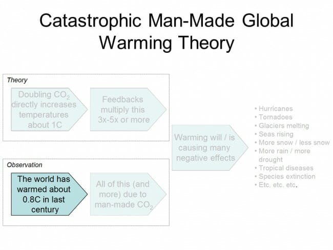
The IPCC position is that the world (since the late 19th century) has warmed about 0.8C.  This is a point on which many skeptics will disagree, though perhaps not as substantially as one might expect from the media.   Most skeptics, myself included, would agree that the world has certainly warmed over the last 100-150 years.  The disagreement tends to be in the exact amount of warming, with many skeptics contending that the amount of warming has been overstated due to problems with temperature measurement and aggregation methodology.

For now, we will leave those issues aside until part B of this section, where we will discuss some of these issues.  One reason to do so is to focus, at least at first, on the basic point of agreement that the Earth has indeed warmed somewhat.  But another reason to put these differences over magnitude aside is that we will find, a few chapters hence, that they essentially don't matter.  Even the IPCC's 0.8C estimate of past warming does not support its own estimates of temperature sensitivity to CO2.

Surface Temperature Record

The most obvious way to measure temperatures on the Earth is with thermometers near the ground.   We have been measuring the temperature at a few select locations for hundreds of years, but it really is only in the last century that we have fairly good coverage of the land surface.  And even then our coverage of places like the Antarctic, central Africa, parts of South America, and all of the oceans (which cover 75% of the Earth) is even today still spotty.  So coming up with some sort of average temperature for the Earth is not a straight averaging exercise -- data must be infilled and estimated, making the process complicated and subject to a variety of errors.

But the problem is more difficult than just data gaps.  How does one actually average a temperature from Denver with a temperature from San Diego?  While a few folks attempt such a straight average, scientists have developed a theory that one can more easily average what are known as temperature anomalies than one can average the temperature itself.  What is an anomaly?  Essentially, for a given thermometer, researchers will establish an average for that thermometer for a particular day of the year.  The exact time period or even the accuracy of this average is not that important, as long as the same time period is used consistently.  Then, the anomaly for any given measurement is the deviation of the measured temperature from its average.   So if the average historical temperature for this day of the year is 25C and the actual measured for the day is 26C, the anomaly for today at this temperature station is +1.0C.

Scientists then develop programs that spatially average these temperature anomalies for the whole Earth, while also adjusting for a myriad of factors, from time-of-day changes in measurement to technology changes over time of the temperature stations to actual changes in the physical location of the measurement.  This is a complicated enough a task, with enough explicit choices that must be made about techniques and adjustments, that there are many different temperature metrics floating around out there, many of which get different results from essentially the same data.  The Hadley Center in England's CRUT4 global temperature metric is generally considered the gold standard, and is the one used preferentially by the IPCC.  Its metric is shown below, with the monthly temperature anomaly in dark blue and the 5 year moving average (centered on its mid-point):

click to enlarge

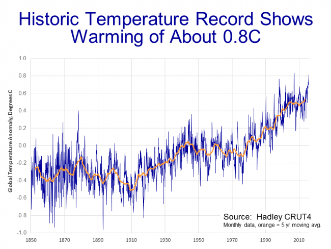
Again, the zero point of the chart is arbitrary and merely depends on the period of time chosen as the base or average.  Looking at the moving average, one can see the temperature anomaly bounces around -0.3C in the late 19th century and has been around +0.5C over the last several years, which is how we get to about 0.8C warming.

Satellite Temperature Record

There are other ways to take temperature measurements, however.  Another approach is to use satellites to measure surface temperatures (or at least near-surface temperatures).   Satellites measure temperature by measuring the thermal microwave emissions of oxygen atoms in the lower troposphere (perhaps 0-3 miles above the Earth).  Satellites have the advantage of being able to look at the entire Earth without gaps, and are not subject to siting biases for surface temperatures stations (which will be discussed in our part B of this chapter).

The satellite record does, however, rely on a shifting array of satellites all of which have changing orbits for which adjustments must be made.  Of necessity, the satellite record cannot reach as far back into the past.  And the satellites are not actually measuring the temperature of the Earth, but rather a temperature a mile or two up.  Whether that matters is subject to debate, but the clincher for me is that the IPCC and most climate models have always shown that the first and most anthropogenic warming should show up in exactly this spot -- the lower troposphere -- which makes observation of this zone a particularly good way to look for a global warming signal.

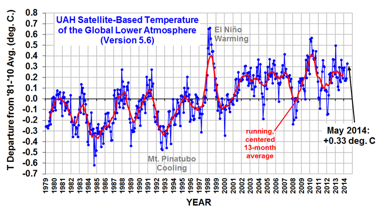
Roy Spencer and John Christy have what is probably the leading satellite temperature metric, called "UAH" as a shorthand for University of Alabama, Huntsville's space science center.  The UAH record looks like this:

click to enlarge

Note that the absolute magnitude of the anomaly isn't comparable between the surface and satellite record, as they use different base periods, but changes and growth rates in the anomalies should be comparable between the two indices.

The first thing to note is that, though they are different, both the satellite and surface temperature records show warming since 1980.  For all that some skeptics may want to criticize the authors of the surface temperature databases, and there indeed some grounds for criticism, these issues should not distract us from the basic fact that in every temperature record we have (including other technologies like radiosonde balloons), we see recent warming.

In terms of magnitude, the two indices do not show the same amount of warming -- since 1980 the satellite temperature record shows about 30% less warming than does  the surface temperature record for the same period.   So which is right?  We will discuss this in more depth in part B, but the question is not made any easier by the fact that the surface records are compiled by prominent alarmist scientists while the satellite records are maintained by prominent skeptic scientists.  Which causes each side to accuse the other of having its thumb on the scale, so to speak.  I personally like the satellite record because of its larger coverage areas and the fact that its manual adjustments (which are required of both technologies) are for a handful of instruments rather than thousands, and are thus easier to manage and get right.  But I am also increasingly of the opinion that the differences are minor, and that neither are consistent with catastrophic forecasts.

So instead of getting ourselves involved in the dueling temperature data set food fight (we will dip our toe into this in part B), let's instead apply both these data sets to several propositions we see frequently in the media.  We will quickly see the answers we reach do not depend on the data set chosen.

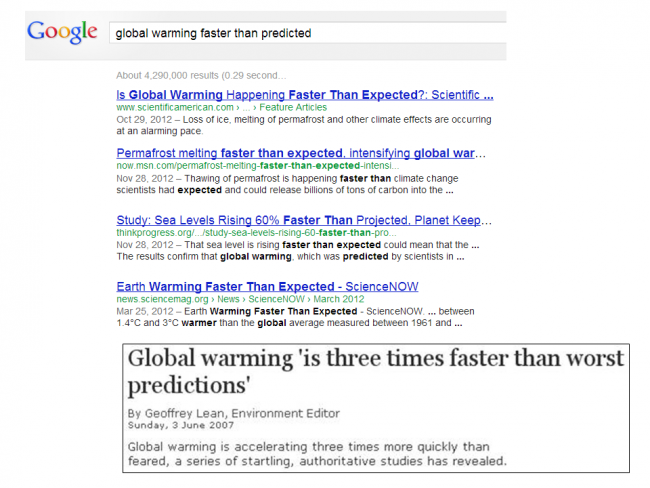
Test #1:  Is Global Warming Accelerating

One frequent meme you will hear all the time is that "global warming is accelerating."  As of today it had 550,000 results on Google.  For example:

click to enlarge

So.  Is that true?  They can't print it if its not true, right (lol)?  Let's look first at the satellite record through the end of 2015 when this presentation was put together (there is an El Nino driven spike in 2 months after this chart was made, which does not affect the conclusions that follow in the least, but I will update to include ASAP).

click to enlarge

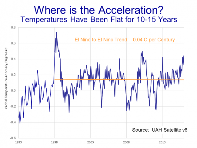
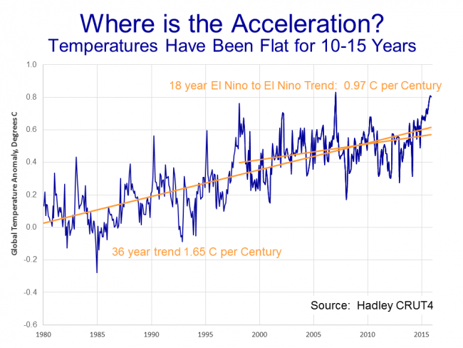
If you want a name for this chart, I could call it the "bowl of cherries" because it has become a cherry-picker's delight.   Everyone in the debate can find a starting point and an end point in this jagged data to find any trend they want to find.  So how do we find an objective basis to define end points for this analysis?  Well, my background is more in economic analysis.  Economists have the same problem in looking at trends for things like employment or productivity because there is a business cycle that adds volatility to these numbers above and beyond any long term trend.  One way they manage this is to measure variables from peak to peak of the economic cycle.

I have done something similar.  The equivalent cyclical peaks in the temperature world are probably the very high Pacific Decadal Oscillation, or El Nino, events.  There was one in 1998 and there is one occurring right now in late 2015/early 2016.  So I defined my period as 18 years from peak to peak.  By this timing, the satellite record shows temperatures to be virtually dead flat for those 18 years.  This is "the pause" that you may have heard of in climate debates.   Such an extended pause is not predicted by global warming theory, particularly when the theory (as in the IPCC main case) assumes high temperature sensitivities to CO2 and low natural variation in temperatures.

So if global warming were indeed accelerating, we would expect the warming rate over the last 18 years to be higher than the rate over the previous 18 years.  But just the opposite is true:

click to enlarge

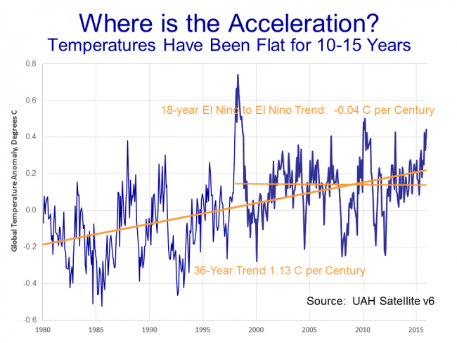
While "the pause" does not in and of itself disprove the theory of catastrophic manmade global warming, it does easily falsify the myriad statements you see that global warming is accelerating.  At least for the last 20 years, it has been decelerating.

By the way, this is not somehow an artifact of just the satellite record.  This is what the surface record looks like for the same periods:

click to enlarge

Though it shows (as we discussed earlier) higher overall warming rates, the surface temperature record also shows a deceleration rather than acceleration over the last 20 years.


Test #2:  Are Temperatures Rising Faster than Expected

OK, let's consider another common meme, that the "earth is warming faster than predicted."

click to enlarge

Again, there over 500,000 Google matches for this meme.  So how do we test it?  Well, certainly not against the last IPCC forecasts -- they are only a few years old.  The first real high-sensitivity or catastrophic forecast we have is from James Hansen, often called the father of global warming.

click to enlarge

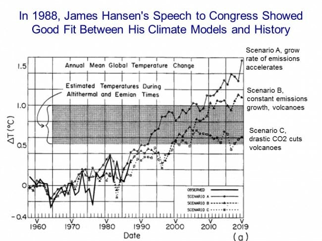
In June of 1988, Hanson made a seminal presentation to Congress on global warming, including this very chart (sorry for the sucky 1980's graphics).  In his testimony, he presented his models for the Earth's temperature, which showed a good fit with history**.  Using his model, he then created three forecasts:  Scenario A, with high rates of CO2 emissions;  Scenario B, with more modest emissions; and scenario C, with drastic worldwide emissions cuts (plus volcanoes, that tend to belch dust and chemicals that have a cooling effect).  Surprisingly, we can't even get agreement today about which forecast for CO2 production was closer to the mark (throwing in the volcanoes makes things hard to parse) but it is pretty clear that over the 30 years after this forecast, the Earth's CO2 output has been somewhere between A and B.

click to enlarge

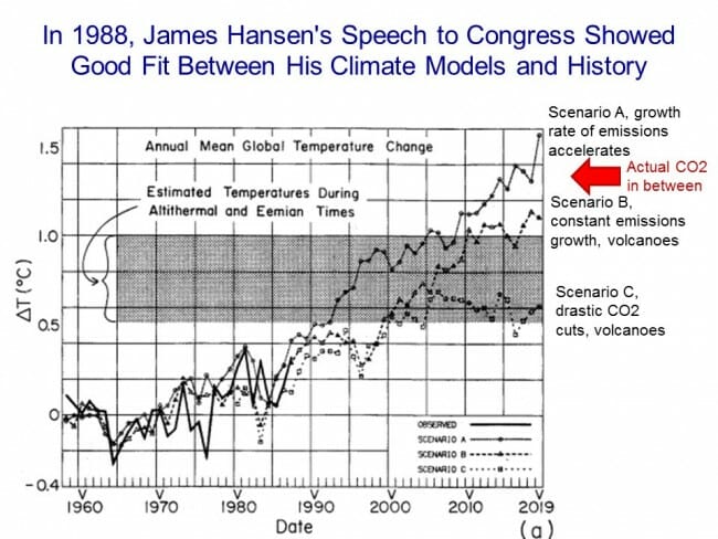
As it turns out, it doesn't matter whether we actually followed the CO2 emissions from A or B.  The warming forecasts for scenario A and B turn out to be remarkably similar.  In the past, I used to just overlay temperature actuals onto Hansen's chart, but it is a little hard to get the zero point right and it led to too many food fights.  So let's pull the scenario A and B forecasts off the chart and compare them a different way.

click to enlarge

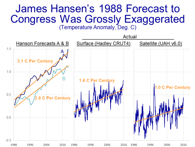
The left of chart shows Hanson's scenario A and B, scanned right from his chart.  Scenario A implies a warming rate from 1986 to 2016 of 3.1C per century.  Scenario B is almost as high, at 2.8C per century.  But as you can see on the right, the actual warming rates we have seen over the same period are well below these forecasts.  The surface temperature record shows only about half the warming, and the satellite record shows only about a third the warming, that Hansen predicted.   There is no justification for saying that recent warming rates have been higher than expected or forecast -- in fact, the exact opposite has been true.

We see the same thing when looking at past IPCC forecasts.  At each of its every-five-year assessments, the IPCC has included a forecast range for future temperatures.  In this case, though, we don't have to create a comparison with actuals because the most recent (5th) IPCC Assessment did it for us:

click to enlarge

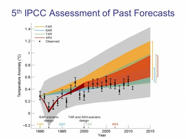
The colored bands are their past forecasts.  The grey areas are the error bands on the forecast.  The black dots are global temperatures (which actually are shown with error bars, which is good practice but seldom done except perhaps when they are trying to stretch to get into the forecast range).  As you can see, temperatures have been so far below forecasts that they are dropping out of the low end of even the most generous forecast bands.  If temperatures were rising faster than expected, the black dots would be above the orange and yellow bands.  We therefore have to come to the conclusion that, at least for the last 20-30 years, temperatures have not been rising faster than expected, they have been rising slower than expected.

Day vs. Night

There is one other phenomenon we can see in the temperature data that we will come back to in later chapters:  that much of the warming over the last century has been at night, rather than in the daytime.   There are two possible explanations for this.  The first is that most anthropogenic warming models predict more night time warming than they do day time warming.  The other possibility is that a portion of the warming in the 20th century temperature record is actually spurious bias from the urban heat island effect due to siting of temperature stations near cities, since urban heat island warming shows up mainly at night.  We will discuss the latter effect in part B of this chapter.

Whatever the cause, much of the warming we have seen has occurred at night, rather than during the day.  Here is a great example from the Amherst, MA temperature station (Amherst was the first location where I gave this presentation, if that seems an odd choice).

Click to enlarge

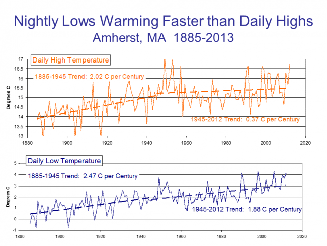
As you can see, the warming rate since 1945 is 5 times higher at night than during the day.  This directly affects average temperatures since daily average temperature for a location in the historic record is the simple average of the daily high and daily low.  Yes, I know that this is not exactly accurate, but given technology in the past, this is the best that could be done.

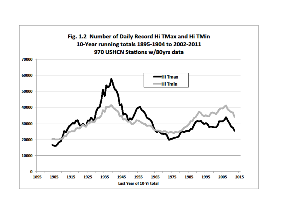
The news media likes to cite examples of heat waves and high temperature records as a "proof" of global warming.   We will discuss this later, but this is obviously a logical fallacy -- one can't prove a trend in noisy data simply by citing isolated data points in one tail of the distribution.  But it is also fallacious for another reason -- we are not actually seeing any upwards trends in high temperature records, at least for daytime highs:

Click to enlarge

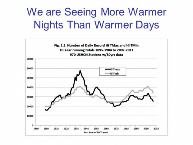
To get this chart, we obviously have to eliminate newer temperature stations from the data set -- any temperature station that is only 20 years old will have all of its all time records in the last 20 years (you would be surprised at how many otherwise reputable scientists miss simple things like this).  Looking at just the temperature stations in the US we have a long record for, we see with the black line that there is really no upwards trend in the number of high temperature records (Tmax) being set.   The 1930s were brutally hot, and if not for some manual adjustments we will discuss in part B of this section, they would likely still show as the hottest recent era for the US.   It turns out, with the grey line (Tmin), that while there is still no upward trend, we are actually seeing more high temperature records being set with daily lows (the highest low, as it were) than we are with daily highs.  The media is, essentially, looking in the wrong place, but I sympathize because a) broiling hot daytime highs are sexier and b) it is brutally hard to talk about highest low temperatures without being confusing as hell.

In our next chapter, or really part B of this chapter, we will discuss some of the issues that may be leading the surface temperature record to be exaggerated, or at least inaccurate.

Chapter 4, Part B on problems with the surface temperature record continues here.

If you want to skip Part B, and get right on with the main line of the argument, you can go straight to Chapter 5, part A, which starts in on the question of how much of past warming can be attributed to man.


** Footnote:  The history of Wall Street is full of bankrupt people whose models exactly matched history.  I have done financial and economic modeling for decades, and it is surprisingly easy to force multi-variable models to match history.  The real test is how well the model works going forward.  Both Hanson's 1988 models and the IPCC's many models do an awesome job matching history, but quickly go off the rails in future years.  I am reminded of a simple but famous example of the perfect past correlation between certain NFL outcomes and Presidential election outcomes.   This NFL model of presidential elections perfectly matches history, but one would be utterly mad to bet future elections based on it.

Denying the Climate Catastrophe: 3. Feedbacks

This is the third chapter of an ongoing series.  Other parts of the series are here:

  1. Introduction
  2. Greenhouse Gas Theory
  3. Feedbacks (this article)
  4.  A)  Actual Temperature Data;   B) Problems with the Surface Temperature Record
  5. Attribution of Past Warming:  A) Arguments for it being Man-Made; B) Natural Attribution
  6. Climate Models vs. Actual Temperatures
  7. Are We Already Seeing Climate Change
  8. The Lukewarmer Middle Ground
  9. A Low-Cost Insurance Policy

We ended the last chapter on the greenhouse gas theory with this:

So whence comes the catastrophe?  As mentioned in the introduction, the catastrophe comes from a second, independent theory that the Earth's climate system is dominated by strong positive feedbacks that multiply greenhouse warming many times into a catastrophe.

Slide15

In this chapter, we will discuss this second, independent theory:  that the Earth's climate system is dominated by positive feedbacks.  I suppose the first question is, "What do we mean by feedback?"

Slide16

In a strict sense, feedback is the connection of the output of a system to its input, creating a process that is circular:  A system creates an output based on some initial input, that output changes the system's input, which then changes its output, which then in turn changes its input, etc.

Typically, there are two types of feedback:  negative and positive.  Negative feedback is a bit like the ball in the trough in the illustration above.  If we tap the ball, it moves, but that movement creates new forces (e.g. gravity and the walls of the trough) that tend to send the ball back where it started.  Negative feedback tends to attenuate any input to a system -- meaning that for any given push on the system, the output will end up being less than one might have expected from the push.

Positive feedback is more like the ball sitting on top of the hill.   Even a small tap will send it rolling very far away, because the shape of the hill and gravity tend to push the ball even further in the direction of the tap.  Positive feedback amplifies or multiplies any input to a system, meaning that even small pushes can lead to very large results.

The climate temperature system has a mix of positive and negative feedbacks.

For example, consider cumulus clouds.  If the Earth warms, more water tends to evaporate from the oceans, and some of that water will form big fluffy white clouds.  These clouds act as an umbrella for the Earth, reflecting heat back into space.  So as more clouds form due to warming, there is a net new cooling effect that offsets some of the original warming.  The amount of warming we might have expected is smaller due to the negative feedback of cloud formation.

On the other side, consider ice and snow.  Ice and snow reflect sunlight back into space and keep the Earth cooler than it would be without the ice and snow cover.  As the world warms, ice and snow will melt and thus reflect less sunlight back into space, having the effect of warming the Earth even more.  So an initial warming leads to more warming, amplifying the effect of the initial warming.

Since we know both types of feedback exist, what we care about is the net effect -- does negative or positive feedback dominate?  In every catastrophic forecast you have seen for global warming, in nearly every climate model the IPCC uses, the authors have assumed that the climate is dominated by strong positive feedbacks that multiply incremental warming from greenhouse gasses many times.

This is the result:

Slide17

As a reminder, the green line is the warming from increases in atmospheric CO2 concentration solely from the greenhouse gas effect, without any feedbacks taken into account.  It is generally agreed to be a warming rate of about 1.2C per doubling of CO2 concentrations, with which I and many (or most) science-based skeptics agree.  The other lines, then, are a variety of forecasts for warming after feedbacks are taken into account.  You can see that all these forecasts assume positive feedback, as the effect is multiplicative of the initial greenhouse gas warming (the pink, purple, and orange lines are approximately 3x, 5x, and 10x the green line, implying very high levels of positive feedback).

The pink line is the mean forecast from the 4th IPCC, implying a temperature sensitivity to CO2 of about 3C.  The purple line is the high end of the IPCC forecast band, implying a temperature sensitivity of 5C.  And the highest is not from a mathematical model per se, but from the mouth of Bill McKibben (sorry for the misspelling in the chart) who has on several occasions threatened that we could see as much as 10C of warming from CO2 by the end of the century.

Skeptics have pointed out a myriad of issues with the climate computer models that develop these forecasts, but I will leave those aside for now.  Suffice it to say that the models exclude many important aspects of the climate and are subject to hand tuning that allows modellers to produce pretty much any output they like.

But I do want to say a few words about computer models and scientific proof.  Despite what you will hear from the media, and even from the mouths of prominent alarmist scientists, computer models do not and cannot constitute "proof" of any sort.  Computer models are merely tools we use to derive the predicted values of physical parameters from complex hypotheses.  They are no different than the pen and paper computations an 18th century researcher might have made for the position of Saturn from Newton's celestial mechanics equations.  The "proof" comes when we take these predicted values and compare them against actual measurements over time and find that they are or are not accurate predictions.  Newton's laws were proved as his equations'  outputs for Saturn's position were compared to Saturn's actual measured position  (and in fact they were disproved, to a small extent, when Mercury's position did not accurately match and Einstein has to fix things a bit).  Similarly, hypotheses about global warming will be proved or disproved when the predictions of various models are compared to actual temperatures.

So we can't really get much further until we get to actual observations of the climate, which we will address in the next several chapters.  But I want to make sure that the two-part theory that leads to catastrophic global warming is clear.

This is the portion of the warming due to greenhouse gas theory:

Slide18

As you can see, the portion due to greenhouse gas theory is relatively small and likely not catastrophic.  The catastrophe comes from the second independent theory that the Earth's climate system is dominated by strong  (very strong!) positive feedbacks.


Slide19

It is the positive feedback that causes the catastrophe, not greenhouse gas theory.  So in debating catastrophic man-made global warming theory, we should be spending most of our time debating the theory that the climate is dominated by strong positive feedbacks, rather than debating the greenhouse gas theory.

But in fact, this does not happen in the mainstream media.  If you are an average consumer of climate news, I will be you have never heard a discussion in the media about this second theory.

And this second theory is far from settled.  If on the "settled" scale from 1-10, greenhouse gas theory is an 8 or 9, this theory of strong positive feedbacks dominating the climate is about a 2.   In fact, there is plenty of evidence that not only are scientists estimating feedbacks incorrectly, but that they don't even have the sign right and that net feedbacks may be negative.

This is a bit hard to communicate to a layman, but the positive feedbacks assumed by the most alarmist and catastrophic climate forecasts are very, very high.  Way higher than one might expect in advance upon encountering a new system.  This assumption of strong positive feedbacks is one that might even offend the sensibilities of the natural scientist.  Natural systems that are long-term stable (and certainly for all its variation the climate system has remained in a pretty narrow range for millions and millions of years) are typically not dominated by positive feedbacks, they are dominated by negative feedbacks.

If in fact our climate temperature system is dominated by negative feedbacks, the future warming forecast would actually be below the green line:


Slide20

OK, without getting in and criticizing the details of these models (which would by the way be a pointless wack-a-mole game because there are dozens of them) the best way to assess the validity of these various forecasts is to now consult actual observations.  Which we will begin to do in our next chapter, part 4a on actual temperature measurements.

Denying the Climate Catastrophe: 2. Greenhouse Gas Theory

Other parts of the series are here:

  1. Introduction
  2. Greenhouse Gas Theory (this article)
  3. Feedbacks
  4.  A)  Actual Temperature Data; B) Problems with the Surface Temperature Record
  5. Attribution of Past Warming;  A) Arguments for it being Man-Made;  B) Natural Attribution
  6. Climate Models vs. Actual Temperatures
  7. Are We Already Seeing Climate Change
  8. The Lukewarmer Middle Ground
  9. A Low-Cost Insurance Policy

We continue our multi-part series on the theory of catastrophic man-made global warming by returning to our framework we introduced in the last chapter.

Click to Enlarge

In the introduction, we discussed how catastrophic man-made global warming theory was actually made up of two independent parts.  In this section, we will discuss the first of these two parts, the greenhouse gas effect, which is the box in the upper left of our framework.

For those unfamiliar with exactly what the greenhouse effect is, I encourage you to check out this very short primer.  Essentially, certain gasses in the atmosphere can absorb some of the heat the Earth is radiating into space, and re-radiate some of this heat back to Earth.  These are called greenhouse gasses.  Water vapor is a relatively strong greenhouse gas, while CO2 is actually a relatively weak greenhouse gas.

It may come as a surprise to those who only know of skeptics' arguments from reading their opponents (rather than the skeptics themselves), but most prominent skeptics accept the theory of greenhouse gas warming.  Of course there are exceptions, including a couple of trolls who like to get attention in the comments section of this and other blogs, and including a few prominent politicians and talk-show hosts.  But there are also environmental alarmists on the other side who have signed petitions to ban dihydrogen monoxide.  It is always tempting, but seldom intellectually rewarding, to judge a particular position by its least capable defenders.

There is simply too much evidence both from our and other planets (as well as simple experiments in a laboratory) to deny that greenhouse gasses in the atmosphere have a warming effect on planets, and that CO2 is such a greenhouse gas.   What follows in the rest of this section represents something of a consensus of people on both sides of the debate.

To investigate the effect of CO2 on Earth's temperature, we are going to use this chart:

Click to Enlarge

On the X axis is the atmospheric concentration of CO2 in parts-per-million (ppm).  Frequently, forecasts of CO2 warming are shown as a relationship over time.  I prefer this view, because it separates the assumption of CO2 emissions rates from assumptions about the sensitivity of temperatures to CO2.

Note that the concentrations we are talking about are remarkably small.  Currently the Earth is just over 400 ppm, which is 0.04%.  Only one in 2500 molecules in air is CO2.

Click to Enlarge

On the Y-axis we then have the incremental warming we might see, on average, across the surface of the Earth from increased concentrations of CO2.  Unless I point it out explicitly, we will use Celsius throughout this and later chapters.

What we now want to do is graph the relationship between the concentrations of CO2 in the atmosphere and the temperature increase of the Earth.  We will use 400 ppm and 0C increase as our starting points.  For now (and we will come back to this assumption) we will look at just the direct effect of warming from the greenhouse gas effect of CO2 and leave out any other complicated, 2nd order interactions with the Earth and its climate.

The estimate I will use comes from Dr. Michael Mann and was first cited in the early IPCC reports.  A quick note on the IPCC -- the IPCC is a body that meets every 5 years or so under the auspices of the United Nations to try to summarize the current state of climate science.  Many skeptics, including myself, would argue that the IPCC process is flawed and overly politicized, but as much as possible in this series I will try to use the IPCC position, making it explicit when I differ.  But what follows is very much IPCC canon.  In fact, I like using Michael Mann's work here because, as author of the hockey stick, he is a vocal and prominent advocate on the alarmist end of the debate and certain not in the tank for the skeptic side.

Click to Enlarge

The relationship is shown in the equation at the top (where delta T is the temperature increase and c is the atmospheric concentration in ppm).  I have graphed the equation in green because most of us do not have a good intuition for what this equation might look like.

The first thing you might note is that the line is curved, and represents a diminishing return relationship, which means that each incremental molecule of CO2 in the atmosphere has less warming effect than the last (see my short presentation on the greenhouse gas effect here).  Thus a constant rate of growth in CO2 concentrations would yield a slowing growth rate in temperatures.  This is a well-understood relationship, so much so that the sensitivity of temperature to CO2 is generally written not as degrees per ppm but as degrees per doubling of CO2 levels.  This means that the increase from 400-800 ppm would be expected to have about the same impact on temperature as the increase from 800 to 1600 ppm.

Of course, without any sense of CO2 growth rates, it's hard to relate this line to our lives.  So as a next step, we will overly some CO2 forecasts for the atmospheric levels of CO2 by 2100. [As an aside, there is a group of skeptics that think that most CO2 increases are coming from warming itself, flipping the arrow of causality, rather than from man.  There is some evidence for this proposition in ice core analysis, but I will leave it aside and for our purposes assume most CO2 increases in this century are coming from hydrocarbon combustion].

Though I think that their forecasts are exaggerated, I have taken the UN IPCC's 4 most likely CO2 cases for the year 2100 and overlayed them on the chart below:


Click to Enlarge

Taking the midpoint of these forecasts, we arrive at about 1C of warming between now and the end of the century.

So now, if you are paying attention, you may be ready to call bullsh*t on me.  Coyote, you say, every catastrophic forecast I have ever seen in the media is for WAY more than 1C of warming!  Bill McKibbon says its going to be 10 degrees of warming (and if you can't trust Harvard journalism majors on scientific issues, who can you trust?)  You are obviously lying, you evil denier.

Actually, not.  Everything in this chapter has been pretty much canon in the global warming world.  The direct, first order contribution of CO2 via the greenhouse effect is expected to be around a degree over the next century.  So whence comes the catastrophe?  As mentioned in the introduction, the catastrophe comes from a second, independent theory that the Earth's climate system is dominated by strong positive feedbacks that multiply greenhouse warming many times into a catastrophe.

If you have never heard of this second theory, don't be surprised.  In many years of reading press articles on global warming, I can't remember one that adequately explained the two-part nature of the theory that is embedded in most global warming forecasts and climate models.  But, perhaps not coincidentally, it is this second theory with which we skeptics have the most issues.  We will take this up in our next installment.

Part 3 on feedbacks can be found here.

"Man-Made" Climate Change

Man has almost certainly warmed the world by some tenths of a degree C with his CO2, though much of this warming has hit night-time lows rather than daily highs.  Anyway, while future temperature rise forecasts are often grossly exaggerated by absurdly high assumptions of positive feedback, there is at least a kernel of fact in there that CO2 is likely warming the world somewhat.

However, the popular "science" on climate change is often awful, positing, for example, that hurricanes are being increased by man right in the midst of the longest hurricane drought we have seen in the US for a hundred years.

Inevitably, the recent severe California droughts have been blamed on manmade CO2.  As a hopefully useful adjunct to this debate, I have annotated a recent chart from the San Jose Mercury News on the history of California droughts to reflect the popular global warming / climate change narrative.  You be the judge of the reasonableness:

click to enlarge

Inability to Evaluate Risk in A Mature and Reasoned Fashion

A while back I wrote a long post on topics like climate change, vaccinations, and GMO foods where I discussed the systematic problems many in the political-media complex have in evaluating risks in a reasoned manner.

I didn't have any idea who the "Food Babe" was but from this article she sure seems to be yet another example.  If you want to see an absolute classic of food babe "thinking", check out this article on flying.   Seriously, I seldom insist you go read something but it is relatively short and you will find yourself laughing, I guarantee it.

Postscript:  I had someone tell me the other day that I was inconsistent.  I was on the side of science (being pro-vaccination) but against science (being pro-fossil fuel use).   I have heard this or something like it come up in the vaccination debate a number of times, so a few thoughts:

  1. The commenter is assuming their conclusion.  Most people don't actually look at the science, so saying you are for or against science is their way of saying you are right or wrong.
  2. The Luddites are indeed taking a consistent position here, and both "Food babe" and RFK Jr. represent that position -- they ascribe large, unproveable risks to mundane manmade items and totally discount the benefits of these items.  This includes vaccines, fossil fuels, GMO foods, cell phones, etc.
  3. I am actually with the science on global warming, it is just what the science says is not well-portrayed in the media.  The famous 97% of scientists actually agreed with two propositions:  That the world has warmed over the last century and that man has contributed to that warming.  The science is pretty clear on these propositions and I agree with them.  What I disagree with is that temperature sensitivity to a doubling of CO2 concentrations is catastrophic, on the order of 4 or 5C or higher, as many alarmist believe, driven by absurdly high assumptions of positive feedback in the climate system.   But the science is very much in dispute about these feedback assumptions and thus on the amount of warming we should expect in the future -- in fact the estimates in scientific papers and the IPCC keep declining each year heading steadily for my position of 1.5C.  Also, I dispute that things like recent hurricanes and the California drought can be tied to manmade CO2, and in fact the NOAA and many others have denied that these can be linked.  In being skeptical of all these crazy links to global warming (e.g. Obama claims global warming caused his daughter's asthma attack), I am totally with science.  Scientists are not linking these things, talking heads in the media are.

OK, I Relent: I Will Support A Carbon Tax If Y'all Will Stop the Torrent of Stupid

President Obama is preparing to unleash a Colorado-River-sized torrent of stupid.  He wants to spend tens of billions of dollars on goofy green energy projects that will have an indiscernible affect on world temperatures but will have a very robust effect on some crony bottom lines.   Here is one example:

As part of President Obama’s plans to combat climate change, the White House announced a program on Friday for the U.S. Department of Energy to train 75,000 people to work in the solar power industry by 2020, many of whom will be part of a military veterans jobs initiative called Solar Ready Vets.

Seriously, is the training costs of workers really a substantial portion of a solar installation?

Andrea Luecke, president and executive director of the Solar Foundation, which publishes the annual National Solar Jobs Census, said that Obama’s announcement will not likely increase the size of the solar industry’s workforce but will instead ensure that the industry will be able to find highly skilled workers to fill jobs.

“We’re experiencing difficulty finding more skilled and qualified workers to install and do design work required,” she said, adding that the industry’s workforce has a “skills gap” as well-trained electricians and other workers go back to other construction jobs as the economy gains momentum.

I will translate that trade-group speak for you:  We like to pay our workers less than similarly-skilled construction workers so we lose a lot of skilled workers to higher paying construction companies. This program will not add any net employment to the economy but will help us keep wages lower by increasing the supply of qualified workers.

I can't help but think of Henry Ford, who famously raised the wages of his employees substantially.  The fake story is that he did this so all his workers could buy his product.   The real reason he did this was that he had horrendous labor turnover problems.  Like the solar industry, he was training folks who then left for higher paying jobs.  So he had to raise his wages to retain trained people.  How history would have changed if Ford had instead been able to call Obama and ask him to have the taxpayer pay to feed him with new, trained workers so he wouldn't have to raise his wage rates!

Seriously, did a bunch of technocrats get together and study the whole solar industry and come to the conclusion that solar installation skills were the keystone problem that was holding back the whole industry?  Of course not.  The solar industry will sink or swim based on panel costs and efficiencies.   What happened is someone said, "well the public always seems to like job training programs.  Those poll well."  And then they called the solar crony association or whatever it is called and they said, "sure, we would love to have taxpayers pay some of our training costs.  Thanks, we will be very supportive." And then someone said, "well, won't the Republicans pitch a fit over this?" And then someone had the brilliant idea of making it a veterans program -- "Republicans love soldiers, that will help defuze their opposition."  And an expensive crony giveaway was born.

About 5 years ago I said I would be willing to accept a carbon tax whose proceeds were used to reduce various labor tax rates (e.g. social security).  Substituting an energy consumption tax for a labor consumption tax was probably at least neutral and maybe even a net positive.

Now, I want to come back to that idea.  I don't believe any more than I did then that CO2-driven global warming will be catastrophic.  In fact, I am more confident than ever that while CO2-induced warming is a reality, the sensitivity of temperatures to CO2 levels is relatively low.  But please, I am willing to fully support a carbon tax that offsets some other existing tax if only we will stop all this stupid crony useless green energy stuff.  At least with a carbon tax, the markets will reduce fossil fuel use in the most efficient ways possible.  As opposed to programs like this one that will reduce fossil fuel use not at all but will cost a lot of money.

LMAO -- My Kid Learns About the Cold

My Arizona-raised, thin-blooded son was convinced that he had no problem with cold weather when he departed for Amherst College several years ago.  That, of course, was based on exposure to cold via a couple of ski trips.  What he likely underestimated was the impact of cold that lasts for like 6 freaking months.

So it was with good-natured parental fondness for my child that I was LMAO when I read this:

Amherst, MA has coldest February in recorded history.  or here if you hit a paywall.

The average temperature in Amherst in the past month was 11.2 degrees, the lowest average monthly temperature since records were first kept in town in 1835. It broke the previous record of 11.6 degrees set in 1934, according to Michael A. Rawlins, an assistant professor in the department of geosciences and manager of the Climate System Research Center at the University of Massachusetts.

As it turns out, I have made a climate presentation in Amherst so I actually have historic temperature charts.  It is a good example of two things:

  1. While Amherst has been warming, it was warming as much or more before 1940 (or before the era of substantial CO2 emissions) as much as after
  2. Much of the recent warming has manifested as increases in daily minimum temperatures, rather in an increase in daily maximum temperatures.  This is as predicted by warming models, but poorly communicated and understood.  Possibly because fewer people would be bent out of shape if they knew that warming translated into warmer nights rather than higher highs in the daytime.

click to enlarge

On Funding and Bias in Climate

I really, really did not want to have to write yet another post on this.  99+% of all climate funding goes to alarmists rather than skeptics.   Greenpeace laments donations of funds to skeptics by Exxon of a million dollars or so and wants to drive out all such funding when Greenpeace and Tides and the US Government are giving literally billions to alarmists.  Despite this staggering imbalance, the only stories you ever see are about the dangers and bias introduced by that measly 1% skeptics get.  I guess that 1% is spent pretty well because it sure seems to have people running in circles declaring the sky is falling.

One would think that at some point the world would wake up and realize that criticizing the funding sources behind an individual does not actually rebut that individual's arguments.

Potential bias introduced by funding sources (or some other influence) are a pointer -- they are an indication there might be a problem warranting deeper examination of the evidence introduced and the methodology of collecting that evidence.  Such potential biases are not themselves evidence, and do nothing to rebut an argument.  A reasonable way to use such biases in an argument would be something like:

I want to begin by noting that Joe may have had a predisposition to his stated conclusion even before he started because of [funding source, political view, whatever].  This means we need to very carefully look at how he got to his conclusion.  And I intend to show you that he made several important errors that should undermine our acceptance of his conclusions.  They are....

Unfortunately, nowadays people like the New York Times and our own Arizona Representative Raul Grijalva seem to feel like the job is done after the first sentence.  They have decided that the best way to refute recent scientific work by a number of climate scientists is to try to show that some of their funding comes from fossil fuel companies.

Beyond the strange implicit assumption that fossil fuel funding would automatically "disprove" a research paper, there is also an assumption that oil company funding is "unclean" while government or non-profit environmental group funding is "clean".  Remember the last time you saw a news story about a climate alarmist's funding?  Yeah, neither do I.

There is no justifiable reason for this asymmetry.  Funding does not potentially introduce bias because it is sourced from for-profit or non-profit entities.  In fact, the motivation of the funding source is virtually irrelevant.  The only relevant questions related to bias are:

  1. Did the funding source demand a certain conclusion at the outset of the study as the price of the funding -- or --
  2. Is there a reasonable expectation that the source would deny future funding if the conclusions of the study don't go their way

My sense is that #1 is rare and that the real issue is #2.

But #2 is ubiquitous.  Sure, if a group of skeptical scientists suddenly started writing papers about 8 degree warming predictions, Chevron is going to be less likely to fund their future research.  But on the flip side if Michael Mann suddenly started saying that future warming will only be a modest 1-2 degrees, do you think that he would continue to get funding from Greenpeace, the Tides Foundation, the WWF, or even from an Obama-run Federal agency?  No way.   There is absolutely no less bias introduced by Chevron funding than from Greenpeace funding, because in each case there can be a reasonable fear by the researcher that future funding would be denied by that source if the "right" answer was not reached.

Postscript & Disclosure of Biases:  I have never received any outside funding for this blog or my climate work.  However, if Chevron were to send me a check for a million dollars, I would probably cash it.  I do own individual shares of ExxonMobil stock as well as shares of the Vanguard S&P500 index fund, which includes equities of a number of energy companies.  I also am a frequent purchaser of gasoline and electricity, as well as a number of other products and services whose prices are tied to energy prices (e.g. air transportation).  As a consumer, I would rather not see the prices of these products rise.  I buy a lot of food, whose price might be improved by longer growing seasons.  My camping company tends to benefit from rising gasoline prices, because rising prices causes people to stay closer to home and camp at the type of places we operate.  It is hard to predict how regional climates will change if overall global temperatures rise, but since many of my campgrounds are summer escapes at high altitude, they would probably benefit somewhat from rising temperatures.  I own a home in Arizona whose value would probably be lessened if the world warmed 2-3 degrees, because it would make winters in the northeast and midwest more bearable and thus hurt Arizona as a location for a winter second home.  Global warming may reduce the life of my dog as we are less likely to walk her when it is over 100 degrees out which makes her less healthy.  I own land in Hawaii that might be more valuable if sea level rises puts it 6-8 inches close to the ocean.  I am planning a vacation to see the tulips bloom in Holland and changes in climate could shift the blooming date and thus cause me to miss the best colors.  Fifteen years from now my daughter would like a June wedding and changes to climate might cause it to rain that day.  My daughter also owns 5 shares of Walt Disney and their earnings might be helped by global warming as nostalgia for cooler weather could greatly increase DVD sales of "Frozen".

Skeptics: Please Relax on the Whole "Greatest Scientific Fraud of All Time" Thing

Climate skeptics are at risk of falling into the same exaggeration-trap as do alarmists.

I have written about the exaggeration of past warming by questionable manual adjustments to temperature records for almost a decade.  So I don't need to be convinced that these adjustments 1) need to be cleaned up and 2) likely exaggerate past warming.

However, this talk of the "Greatest Scientific Fraud of All Time" is just crazy.  If you are interested, I urge you read my piece from the other day for a more balanced view.  Don't stop reading without checking out #4.

These recent articles are making it sound like alarmist scientists are simply adding adjustments to past temperatures for no reason.  But there are many perfectly valid reasons surface temperature measurements have to be manually adjusted.  It is a required part of the process.  Just as the satellite data must be adjusted as well, though for different things.

So we should not be suspicious of adjustments per se.  We should be concerned about them, though, for a number of reasons:

  • In many parts of the world, like in the US, the manual adjustments equal or exceed the measured warming trend.  That means the"signal" we are measuring comes entirely from the adjustments.  That is, to put it lightly, not ideal.
  • The adjustments are extremely poorly documented and impossible for any third party to replicate (one reason the satellite record may be more trustworthy is all the adjustment code for the satellites is open source).
  • The adjustments may have a bias.  After all, most of the people doing the adjustments expect to see a warming trend historically, and so consider lack of such a trend to be an indicator the data is wrong and in need of adjustment.  This is not a conspiracy, but a normal human failing and the reason why the ability to replicate such work is important.
  • The adjustments do seem to be very aggressive in identifying any effects that might have artificially created a cooling trend but lax in finding and correcting effects that might have artificially created a warming trend.  First and foremost, the changing urban heat island effect in growing cities seems to be under-corrected  (Again there is debate on this -- the proprietors of the model believe they have fixed this with a geographic normalizing, correcting biases from nearby thermometers.  I and others believe all they are doing is mathematically smearing the error over a larger geography).

Again, I discussed all the pros and cons here.  If pushed to the wall, I would say perhaps half of the past warming in the surface temperature record is due to undercorrection of warming biases or overcorrection of cooling biases.

Adjusting the Temperature Records

I have been getting inquiries from folks asking me what I think about stories like this one, where Paul Homewood has been looking at the manual adjustments to raw temperature data and finding that the adjustments actually reverse the trends from cooling to warming.  Here is an example of the comparisons he did:

Raw, before adjustments;

puertoraw


After manual adjustments

puertoadj2


I actually wrote about this topic a few months back, and rather than rewrite the post I will excerpt it below:

I believe that there is both wheat and chaff in this claim [that manual temperature adjustments are exaggerating past warming], and I would like to try to separate the two as best I can.  I don't have time to write a well-organized article, so here is just a list of thoughts

  1. At some level it is surprising that this is suddenly news.  Skeptics have criticized the adjustments in the surface temperature database for years.
  2. There is certainly a signal to noise ratio issue here that mainstream climate scientists have always seemed insufficiently concerned about.  For example, the raw data for US temperatures is mostly flat, such that the manual adjustments to the temperature data set are about equal in magnitude to the total warming signal.  When the entire signal one is trying to measure is equal to the manual adjustments one is making to measurements, it probably makes sense to put a LOT of scrutiny on the adjustments.  (This is a post from 7 years ago discussing these adjustments.  Note that these adjustments are less than current ones in the data base as they have been increased, though I cannot find a similar chart any more from the NOAA discussing the adjustments)
  3. The NOAA HAS made adjustments to US temperature data over the last few years that has increased the apparent warming trend.  These changes in adjustments have not been well-explained.  In fact, they have not really be explained at all, and have only been detected by skeptics who happened to archive old NOAA charts and created comparisons like the one below.  Here is the before and after animation (pre-2000 NOAA US temperature history vs. post-2000).  History has been cooled and modern temperatures have been warmed from where they were being shown previously by the NOAA.  This does not mean the current version  is wrong, but since the entire US warming signal was effectively created by these changes, it is not unreasonable to act for a detailed reconciliation (particularly when those folks preparing the chart all believe that temperatures are going up, so would be predisposed to treating a flat temperature chart like the earlier version as wrong and in need of correction. 1998changesannotated
  4. However, manual adjustments are not, as some skeptics seem to argue, wrong or biased in all cases.  There are real reasons for manual adjustments to data -- for example, if GPS signal data was not adjusted for relativistic effects, the position data would quickly get out of whack.  In the case of temperature data:
    • Data is adjusted for shifts in the start/end time for a day of measurement away from local midnight (ie if you average 24 hours starting and stopping at noon).  This is called Time of Observation or TOBS.  When I first encountered this, I was just sure it had to be BS.  For a month of data, you are only shifting the data set by 12 hours or about 1/60 of the month.  Fortunately for my self-respect, before I embarrassed myself I created a spreadsheet to monte carlo some temperature data and play around with this issue.  I convinced myself the Time of Observation adjustment is valid in theory, though I have no way to validate its magnitude  (one of the problems with all of these adjustments is that NOAA and other data authorities do not release the source code or raw data to show how they come up with these adjustments).   I do think it is valid in science to question a finding, even without proof that it is wrong, when the authors of the finding refuse to share replication data.  Steven Goddard, by the way, believes time of observation adjustments are exaggerated and do not follow NOAA's own specification.
    • Stations move over time.  A simple example is if it is on the roof of a building and that building is demolished, it has to move somewhere else.  In an extreme example the station might move to a new altitude or a slightly different micro-climate.  There are adjustments in the data base for these sort of changes.  Skeptics have occasionally challenged these, but I have no reason to believe that the authors are not using best efforts to correct for these effects (though again the authors of these adjustments bring criticism on themselves for not sharing replication data).
    • The technology the station uses for measurement changes (e.g. thermometers to electronic devices, one type of electronic device to another, etc.)   These measurement technologies sometimes have known biases.  Correcting for such biases is perfectly reasonable  (though a frustrated skeptic could argue that the government is diligent in correcting for new cooling biases but seldom corrects for warming biases, such as in the switch from bucket to water intake measurement of sea surface temperatures).
    • Even if the temperature station does not move, the location can degrade.  The clearest example is a measurement point that once was in the country but has been engulfed by development  (here is one example -- this at one time was the USHCN measurement point with the most warming since 1900, but it was located in an open field in 1900 and ended up in an asphalt parking lot in the middle of Tucson.)   Since urban heat islands can add as much as 10 degrees F to nighttime temperatures, this can create a warming signal over time that is related to a particular location, and not the climate as a whole.  The effect is undeniable -- my son easily measured it in a science fair project.  The effect it has on temperature measurement is hotly debated between warmists and skeptics.  Al Gore originally argued that there was no bias because all measurement points were in parks, which led Anthony Watts to pursue the surface station project where every USHCN station was photographed and documented.  The net result was that most of the sites were pretty poor.  Whatever the case, there is almost no correction in the official measurement numbers for urban heat island effects, and in fact last time I looked at it the adjustment went the other way, implying urban heat islands have become less of an issue since 1930.  The folks who put together the indexes argue that they have smoothing algorithms that find and remove these biases.  Skeptics argue that they just smear the bias around over multiple stations.  The debate continues.
  5. Overall, many mainstream skeptics believe that actual surface warming in the US and the world has been about half what is shown in traditional indices, an amount that is then exaggerated by poorly crafted adjustments and uncorrected heat island effects.  But note that almost no skeptic I know believes that the Earth has not actually warmed over the last 100 years.  Further, warming since about 1980 is hard to deny because we have a second, independent way to measure global temperatures in satellites.  These devices may have their own issues, but they are not subject to urban heat biases or location biases and further actually measure most of the Earth's surface, rather than just individual points that are sometimes scores or hundreds of miles apart.  This independent method of measurement has shown undoubted warming since 1979, though not since the late 1990's.
  6. As is usual in such debates, I find words like "fabrication", "lies",  and "myth" to be less than helpful.  People can be totally wrong, and refuse to confront their biases, without being evil or nefarious.

To these I will add a #7:  The notion that satellite results are somehow pure and unadjusted is just plain wrong.  The satellite data set takes a lot of mathematical effort to get right, something that Roy Spencer who does this work (and is considered in the skeptic camp) will be the first to tell you.  Satellites have to be adjusted for different things.  They have advantages over ground measurement because they cover most all the Earth, they are not subject to urban heat biases, and bring some technological consistency to the measurement.  However, the satellites used are constantly dieing off and being replaced, orbits decay and change, and thus times of observation of different parts of the globe change [to their credit, the satellite folks release all their source code for correcting these things].   I have become convinced the satellites, net of all the issues with both technologies, provide a better estimate but neither are perfect.

The 2014 Temperature Record No One Is Talking About

Depending on what temperature data set you look at **, or on your trust in various manual adjustments in these data sets ***, 2014 may have beaten the previous world temperature record by 0.02C.  Interestingly, the 0.02C rise over the prior record set four years ago would imply (using only these two data points which warmists seem to want to focus on) a temperature increase of 0.5C per century, a few tenths below my prediction but an order of magnitude below the alarmists' predictions for future trends.

Anyway, whether there was an absolute record or not, there was almost certainly a different temperature record set -- the highest divergence to date in the modern measured temperatures from what the computer models predicted.  The temperature increase for the past 5 years was a full 0.17C less than predicted, the largest gap yet for the models in forward-prediction mode (as opposed to when they are used to backcast history).


** There are four or five or more data sets, depending on how you count them.   There are 2 major satellite data sets and 2-3 ground based data sets.  The GISS ground data set generally gives the largest warming trends, while the satellite data sets give the least, but all show some warming over the last 30 or so years (though most of this warming was before 1999).

*** The data sets are all full of manual adjustments of various sorts.  All of these are necessary.  For surface stations, the measurement points move and change technology.  For the satellites, orbits and instruments shift over time.  The worrisome feature of all these adjustments is that they are large as compared to the underlying warming signal being measured, so small changes in the adjustments can lead to large changes in the apparent trend.  Skeptics often charge that the proprietors of land data sets are aggressive about including adjustments that increase the apparent trend but reluctant to add similar adjustments (eg for urban heat islands) that might reduce the trend.  As a result, most of the manual adjustments increase the trend.  There is actually little warming trend in the raw data, and it only shows up after the adjustments.  It may be total coincidence, but the database run by the most ardent warmist is the GISS and it has the highest trend.   The database run by the most skeptical is the UAH satellite database and it shows the smallest trend.  Hmm.

Why Do Climate Change Claims Consistently Get a Fact-Checker Pass?

It is almost impossible to read a media story any more about severe weather events without seeing some blurb about such and such event being the result of manmade climate change.  I hear writers all the time saying that it is exhausting to run the gauntlet of major media fact checkers, so why do they all get a pass on these weather statements?  Even the IPCC, which we skeptics think is exaggerating manmade climate change effects, refused to link current severe weather events with manmade CO2.

The California drought brings yet another tired example of this.  I think pretty much everyone in the media has operated from the assumption that the current CA drought is 1. unprecedented and 2. man-made. The problem is that neither are true.  Skeptics have been saying this for months, pointing to 100-year California drought data and pointing to at 2-3 other events in the pre-manmade-CO2 era that were at least as severed.  But now the NOAA has come forward and said roughly the same thing:

Natural weather patterns, not man-made global warming, are causing the historic drought parching California, says a study out Monday from federal scientists.

"It's important to note that California's drought, while extreme, is not an uncommon occurrence for the state," said Richard Seager, the report's lead author and professor with Columbia University's Lamont Doherty Earth Observatory. The report was sponsored by the National Oceanic and Atmospheric Administration. The report did not appear in a peer-reviewed journal but was reviewed by other NOAA scientists.

"In fact, multiyear droughts appear regularly in the state's climate record, and it's a safe bet that a similar event will happen again," he said.

The persistent weather pattern over the past several years has featured a warm, dry ridge of high pressure over the eastern north Pacific Ocean and western North America. Such high-pressure ridges prevent clouds from forming and precipitation from falling.

The study notes that this ridge — which has resulted in decreased rain and snowfall since 2011 — is almost opposite to what computer models predict would result from human-caused climate change.

There is an argument to be made that this drought was made worse by the fact that the low precipitation was mated with higher-than average temperatures that might be partially attributable to man-made climate change.  One can see this in the Palmer drought severity index, which looks at more factors than just precipitation.  While the last 3 years was not the lowest for rainfall in CA over the last 100, I believe the Palmer index was the lowest for the last 3 years of any period in the last 100+ years.  The report did not address this warming or attempt to attribute some portion of it to man, but it is worth noting that temperatures this year in CA were, like the drought, not unprecedented, particularly in rural areas (urban areas are going to be warmer than 50 years ago due to increasing urban heat island effect, which is certainly manmade but has nothing to do with CO2.)

Update:  By the way, note the article is careful to give several paragraphs after this bit to opponents who disagree with the findings.  Perfectly fine.  But note that this is the courtesy that is increasingly denied to skeptics when the roles are reversed.  Maybe I should emulate climate alarmists and be shouting "false balance!  the science is settled!"

Trend That is Not A Trend: Increase in Typhoons and Hurricanes

The science that CO2 is a greenhouse gas and causes some warming is hard to dispute.  The science that Earth is dominated by net positive feedbacks that increase modest greenhouse gas warming to catastrophic levels is very debatable.  The science that man's CO2 is already causing an increase in violent and severe weather is virtually non-existent.

Seriously, of all the different pieces of the climate debate, the one that is almost always based on pure crap are the frequent media statements linking manmade CO2 to some severe weather event.

For example, Coral Davenport in the New York Times wrote the other day:

As the torrential rains of Typhoon Hagupit flood thePhilippines, driving millions of people from their homes, the Philippine government arrived at a United Nationsclimate change summit meeting on Monday to push hard for a new international deal requiring all nations, including developing countries, to cut their use of fossil fuels.

It is a conscious pivot for the Philippines, one of Asia’s fastest-growing economies. But scientists say the nation is also among the most vulnerable to the impacts of climate change, and the Philippine government says it is suffering too many human and economic losses from the burning of fossil fuels....

A series of scientific reports have linked the burning of fossil fuels with rising sea levels and more powerful typhoons, like those that have battered the island nation.

It is telling that Ms. Davenport did not bother to link or name any of these scientific reports.  Even the IPCC, which many skeptics believe to be exaggerating manmade climate change dangers, refused in its last report to link any current severe weather events with manmade CO2.

Roger Pielke responded today with charts from two different recent studies on typhoon activity in the Phillipines.  Spot the supposed upward manmade trend.  Or not:

kubotachan2009

c2789-wpac-50-10-weinkleetal


I am not a huge fan of landfalling cyclonic storm counts because whether they make landfall or not can be totally random and potentially disguise trends.  A better metric is the total energy of cyclonic storms, land-falling or not, where again there is no trend.

Via the Weather Underground, here is Accumulated Cyclonic Energy for the Western Pacific (lower numbers represent fewer cyclonic storms with less total strength):

ace-west-pacific


And here, by the way, is the ACE for the whole globe:


ace-global

Remember this when you see the next storm inevitably blamed on manmade global warming.  If anything, we are actually in a fairly unprecedented (in the last century and a half) hurricane drought.

Listening to California Parks People Discuss Climate Change

Some random highlights:

  • I watched a 20 minute presentation in which a woman from LA parks talked repeatedly about the urban heat island being a result of global warming
  • I just saw that California State Parks, which is constantly short of money and has perhaps a billion dollars in unfunded maintenance needs, just spent millions of dollars to remove a road from a beachfront park based solely (they claimed) based on projections that 55 inches of sea level rise would cause the road to be a problem.  Sea level has been rising 3-4mm a year for over 150 years and even the IPCC, based on old much higher temperature increase forecasts, predicted about a foot of rise.
  • One presenter said that a 3-5C temperature rise over the next century represent the low end of reasonable forecasts.  Most studies of later are showing a climate sensitivity of 1.5-2.0 C (I still predict 1C) with warming over the rest of the century of about 1C, or about what we saw last century
  • I watched them brag for half an hour about spending tons of extra money on make LEED certified buildings.  As written here any number of times, most LEED savings come through BS gaming of the rules, like putting in dedicated electric vehicle parking sites (that do not even need a charger to get credit).  In a brief moment of honesty, the architect presenting admitted that most of the LEED score for one building came from using used rather than new furniture in the building.
  • They said that LEED buildings were not any more efficient than most other commercial buildings getting built, just a matter of whether you wanted to pay for LEED certification -- it was stated that the certification was mostly for the plaque.  Which I suppose is fine for private businesses looking for PR, but why are cash-strapped public agencies doing it?

Trend That Is Not A Trend: Rape Culture

From Mark Perry:

click to enlarge

I suppose one could argue that there is some change in reporting rates, since rape is well-know to be an under-reported crime.  However, I would struggle to argue that under-reporting rates are going up (which is what it would take to be the prime driver of the trend above).  If anything, my guess is that reporting rates are rising such that the chart above actually understates the improvement.

PS-  Folks commenting on this post saying that by reporting a declining trend I demonstrate that I don't care about rape or don't treat it seriously are idiots.  I have lived through dozens of data-free media scares and witch hunts  -- global cooling, global warming, the great pre-school sexual abuse witch hunt, about 20 different narcotics related scares (vodka tampons, anyone?).    Data is useful.    In this case, knowing there is improvement means we can look for what is driving the improvement and do more of it (though Kevin Drum would likely attribute it to unleaded gasoline).

"Trend that is not a trend" is an occasional feature on this blog.  I could probably write three stories a day on this topic if I wished.  The media is filled with stories of supposed trends based on single data points or anecdotes rather than, you know, actual trend data.  More stories of this type are here.  It is not unusual to find that the trend data often support a trend in the opposite direction as claimed by media articles.  I have a related category I have started of trends extrapolated from single data points.

Thank God For Scientists: "Unexpected Link Between Solar Activity and Climate Change"

Without scientists, we would never be apprised of the fact that the behavior of the sun affects how warm or cold it is on Earth (emphasis added)

For the first time, a research team has been able to reconstruct the solar activity at the end of the last ice age, around 20 000–10 000 years ago, by analysing trace elements in ice cores in Greenland and cave formations from China. During the last glacial maximum, Sweden was covered in a thick ice sheet that stretched all the way down to northern Germany and sea levels were more than 100 metres lower than they are today, because the water was frozen in the extensive ice caps. The new study shows that the sun’s variation influences the climate in a similar way regardless of whether the climate is extreme, as during the Ice Age, or as it is today.

“The study shows an unexpected link between solar activity and climate change. It shows both that changes in solar activity are nothing new and that solar activity influences the climate, especially on a regional level. Understanding these processes helps us to better forecast the climate in certain regions”, said Raimund Muscheler, Lecturer in Quaternary Geology at Lund University and co-author of the study.

My snarky tone is a bit unfair here.  While the sun seems an obvious candidate as a major climate driver, changes in its actual energy hitting the Earth have always appeared small compared to what would be needed to explain observed temperature changes.  This team hypothesizes that the changes in the sun's output have effects on atmospheric circulation that have a larger than expected impact on temperatures.  Henrik Svensmark explains it a different way, hypothesizing that cloud formation is heavily influenced by cosmic rays, and higher solar activity tends to shield the Earth from cosmic rays, thus reducing cloud formation and increasing temperatures.

Skeptics find this sudden realization that the sun affects climate to be kind of funny, since they have argued for years that higher temperatures in the late 20th century have coincided with a very active sun, probably more active than it has been in hundreds of years.   Climate alarmists have denied any influence to the sun.  Sun deniers!  This absolutist stance may seem odd, given that most skeptics (despite what is said of us) actually accept some amount of warming from CO2, but here are these folks who wrap themselves in the mantle of science that deny any effect from the sun?  The problem that warmists have is that higher climate sensitivities, on the order of 3 degrees C per doubling of CO2, greatly over-predict past warming (as I demonstrate in my videos, see around the 59 minute mark).  If anything else whatsoever other than CO2 caused one iota of the warming over the last 50 years, then this over-prediction just gets worse.  In fact, warmists have to assume crazy high levels of aerosol cooling -- that go beyond what most of the science supports -- to make their forecasts work looking backwards.

Scott Sumner Explains a Lot of Climate Alarmism, Without Discussing Climate

Scott Sumner is actually discussing discrimination, and how discrimination is often "proven" in social studies

The economy operates in very subtle ways, and often when I read academic studies of issues like discrimination, the techniques seem incredibly naive to me. They might put in all the attributes of male and female labor productivity they can think of, and then simply assume than any unexplained residual must be due to "discrimination." And they do this in cases where there is no obvious reason to assume discrimination. It would be like a scientist assuming that magicians created a white rabbit out of thin air, at the snap of their fingers, because they can't think of any other explanation of how it got into the black hat!

Most alarming climate forecasts are based on the period from 1978 to 1998.  During this 20 year period world temperatures rose about a half degree C.  People may say they are talking about temperature increases since 1950, but most if not all of those increases occurred from 1978-1998.  Temperatures were mostly flat or down before and since.

A key, if not the key, argument for CO2-driven catastrophic warming that is based on actual historic data (rather than on theory or models) is that temperatures rose in this 20 year period farther and faster than would be possible by any natural causes, and thus must have been driven by man-made CO2.  Essentially what scientists said was, "we have considered every possible natural cause of warming that we can think of, and these are not enough to cause this warming, so the warming must be unnatural."  I was struck just how similar this process was to what Mr. Sumner describes.  Most skeptics, by the way, agree that some of this warming may have been driven by manmade CO2 but at the same time argue that there were many potential natural effects (e.g. ocean cycles) that were not considered in this original analysis.

Reconciling Seemingly Contradictory Climate Claims

At Real Science, Steven Goddard claims this is the coolest summer on record in the US.

The NOAA reports that both May and June were the hottest on record.

It used to be the the media would reconcile such claims and one might learn something interesting from that reconciliation, but now all we have are mostly-crappy fact checks with Pinocchio counts.  Both these claims have truth on their side, though the NOAA report is more comprehensively correct.  Still, we can learn something by putting these analyses in context and by reconciling them.

The NOAA temperature data for the globe does indeed show May and June as the hottest on record.  However, one should note a couple of things

  • The two monthly records do not change the trend over the last 10-15 years, which has basically been flat.  We are hitting records because we are sitting on a plateau that is higher than the rest of the last century (at least in the NOAA data).  It only takes small positive excursions to reach all-time highs
  • There are a number of different temperature data bases that measure the temperature in different ways (e.g. satellite vs. ground stations) and then adjust those raw readings using different methodologies.  While the NOAA data base is showing all time highs, other data bases, such as satellite-based ones, are not.
  • The NOAA database has been criticized for manual adjustments to temperatures in the past which increase the warming trend.  Without these adjustments, temperatures during certain parts of the 1930's (think: Dust Bowl) would be higher than today.  This was discussed here in more depth.  As is usual when looking at such things, some of these adjustments are absolutely appropriate and some can be questioned.  However, blaming the whole of the warming signal on such adjustments is just wrong -- satellite data bases which have no similar adjustment issues have shown warming, at least between 1979 and 1999.

The Time article linked above illustrated the story of these record months with a video partially on wildfires.  This is a great example of how temperatures are indeed rising but media stories about knock-on effects, such as hurricanes and fires, can be full of it.  2014 has actually been a low fire year so far in the US.

So the world is undeniably on the warm side of average (I won't way warmer than normal because what is "normal"?)  So how does Goddard get this as the coolest summer on record for the US?

Well, the first answer, and it is an important one to remember, is that US temperatures do not have to follow global temperatures, at least not tightly.  While the world warmed 0.5-0.7 degrees C from 1979-1999, the US temperatures moved much less.  Other times, the US has warmed or cooled more than the world has.  The US is well under 5% of the world's surface area.  It is certainly possible to have isolated effects in such an area.  Remember the same holds true the other way -- heat waves in one part of the world don't necessarily mean the world is warming.

But we can also learn something that is seldom discussed in the media by looking at Goddard's chart:

click to enlarge

First, I will say that I am skeptical of any chart that uses "all USHCN" stations because the number of stations and their locations change so much.  At some level this is an apples to oranges comparison -- I would be much more comfortable to see a chart that looks at only USHCN stations with, say, at least 80 years of continuous data.  In other words, this chart may be an artifact of the mess that is the USHCN database.

However, it is possible that this is correct even with a better data set and against a backdrop of warming temperatures.  Why?  Because this is a metric of high temperatures.  It looks at the number of times a data station reads a high temperature over 90F.  At some level this is a clever chart, because it takes advantage of a misconception most people, including most people in the media have -- that global warming plays out in higher daytime high temperatures.

But in fact this does not appear to be the case.  Most of the warming we have seen over the last 50 years has manifested itself as higher nighttime lows and higher winter temperatures.  Both of these raise the average, but neither will change Goddard's metric of days above 90F.  So it is perfectly possible Goddard's chart is right even if the US is seeing a warming trend over the same period.  Which is why we have not seen any more local all-time daily high temperature records set recently than in past decades.  But we have seen a lot of new records for high low temperature, if that term makes sense.  Also, this explains why the ratio of daily high records to daily low records has risen -- not necessarily because there are a lot of new high records, but because we are setting fewer low records.  We can argue about daytime temperatures but nighttime temperatures are certainly warmer.

This chart shows an example with low and high temperatures over time at Amherst, MA  (chosen at random because I was speaking there).  Note that recently, most warming has been at night, rather than in daily highs.

Another Plea to Global Warming Alarmists on the Phrase "Climate Denier"

Stop calling me and other skeptics "climate deniers".  No one denies that there is a climate.  It is a stupid phrase.

I am willing, even at the risk of the obvious parallel that is being drawn to the Holocaust deniers, to accept the "denier" label, but it has to be attached to a proposition I actually deny, or that can even be denied.

As help in doing so, here are a few reminders (these would also apply to many mainstream skeptics -- I am not an outlier)

  • I don't deny that climate changes over time -- who could?  So I am not a climate change denier
  • I don't deny that the Earth has warmed over the last century (something like 0.7C).  So I am not a global warming denier
  • I don't deny that man's CO2 has some incremental effect on warming, and perhaps climate change (in fact, man effects climate with many more of his activities other than just CO2 -- land use, with cities on the one hand and irrigated agriculture on the other, has measurable effects on the climate).  So I am not a man-made climate change or man-made global warming denier.

What I deny is the catastrophe -- the proposition that man-made global warming** will cause catastrophic climate changes whose adverse affects will outweigh both the benefits of warming as well as the costs of mitigation.  I believe that warming forecasts have been substantially exaggerated (in part due to positive feedback assumptions) and that tales of current climate change trends are greatly exaggerated and based more on noting individual outlier events and not through real data on trends (see hurricanes, for example).

Though it loses some of this nuance, I would probably accept "man-made climate catastrophe denier" as a title.

** Postscript -- as a reminder, there is absolutely no science that CO2 can change the climate except through the intermediate step of warming.   If you believe it is possible for CO2 to change the climate without there being warming (in the air, in the oceans, somewhere), then you have no right to call anyone else anti-science and you should go review your subject before you continue to embarrass yourself and your allies.

On The Steven Goddard Claim of "Fabricated" Temperature Data

Steven Goddard of the Real Science blog has a study that claims that US real temperature data is being replaced by fabricated data.  Christopher Booker has a sympathetic overview of the claims.

I believe that there is both wheat and chaff in this claim, and I would like to try to separate the two as best I can.  I don't have time to write a well-organized article, so here is just a list of thoughts

  1. At some level it is surprising that this is suddenly news.  Skeptics have criticized the adjustments in the surface temperature database for years
  2. There is certainly a signal to noise ratio issue here that mainstream climate scientists have always seemed insufficiently concerned about.  Specifically, the raw data for US temperatures is mostly flat, such that the manual adjustments to the temperature data set are about equal in magnitude to the total warming signal.  When the entire signal one is trying to measure is equal to the manual adjustments one is making to measurements, it probably makes sense to put a LOT of scrutiny on the adjustments.  (This is a post from 7 years ago discussing these adjustments.  Note that these adjustments are less than current ones in the data base as they have been increased, though I cannot find a similar chart any more from the NOAA discussing the adjustments)
  3. The NOAA HAS made adjustments to US temperature data over the last few years that has increased the apparent warming trend.  These changes in adjustments have not been well-explained.  In fact, they have not really be explained at all, and have only been detected by skeptics who happened to archive old NOAA charts and created comparisons like the one below.  Here is the before and after animation (pre-2000 NOAA US temperature history vs. post-2000).  History has been cooled and modern temperatures have been warmed from where they were being shown previously by the NOAA.  This does not mean the current version  is wrong, but since the entire US warming signal was effectively created by these changes, it is not unreasonable to act for a detailed reconciliation (particularly when those folks preparing the chart all believe that temperatures are going up, so would be predisposed to treating a flat temperature chart like the earlier version as wrong and in need of correction.
    1998changesannotated
  4. However, manual adjustments are not, as some skeptics seem to argue, wrong or biased in all cases.  There are real reasons for manual adjustments to data -- for example, if GPS signal data was not adjusted for relativistic effects, the position data would quickly get out of whack.  In the case of temperature data:
    • Data is adjusted for shifts in the start/end time for a day of measurement away from local midnight (ie if you average 24 hours starting and stopping at noon).  This is called Time of Observation or TOBS.  When I first encountered this, I was just sure it had to be BS.  For a month of data, you are only shifting the data set by 12 hours or about 1/60 of the month.  Fortunately for my self-respect, before I embarrassed myself I created a spreadsheet to monte carlo some temperature data and play around with this issue.  I convinced myself the Time of Observation adjustment is valid in theory, though I have no way to validate its magnitude  (one of the problems with all of these adjustments is that NOAA and other data authorities do not release the source code or raw data to show how they come up with these adjustments).   I do think it is valid in science to question a finding, even without proof that it is wrong, when the authors of the finding refuse to share replication data.  Steven Goddard, by the way, believes time of observation adjustments are exaggerated and do not follow NOAA's own specification.
    • Stations move over time.  A simple example is if it is on the roof of a building and that building is demolished, it has to move somewhere else.  In an extreme example the station might move to a new altitude or a slightly different micro-climate.  There are adjustments in the data base for these sort of changes.  Skeptics have occasionally challenged these, but I have no reason to believe that the authors are not using best efforts to correct for these effects (though again the authors of these adjustments bring criticism on themselves for not sharing replication data).
    • The technology the station uses for measurement changes (e.g. thermometers to electronic devices, one type of electronic device to another, etc.)   These measurement technologies sometimes have known biases.  Correcting for such biases is perfectly reasonable  (though a frustrated skeptic could argue that the government is diligent in correcting for new cooling biases but seldom corrects for warming biases, such as in the switch from bucket to water intake measurement of sea surface temperatures).
    • Even if the temperature station does not move, the location can degrade.  The clearest example is a measurement point that once was in the country but has been engulfed by development  (here is one example -- this at one time was the USHCN measurement point with the most warming since 1900, but it was located in an open field in 1900 and ended up in an asphalt parking lot in the middle of Tucson.)   Since urban heat islands can add as much as 10 degrees F to nighttime temperatures, this can create a warming signal over time that is related to a particular location, and not the climate as a whole.  The effect is undeniable -- my son easily measured it in a science fair project.  The effect it has on temperature measurement is hotly debated between warmists and skeptics.  Al Gore originally argued that there was no bias because all measurement points were in parks, which led Anthony Watts to pursue the surface station project where every USHCN station was photographed and documented.  The net results was that most of the sites were pretty poor.  Whatever the case, there is almost no correction in the official measurement numbers for urban heat island effects, and in fact last time I looked at it the adjustment went the other way, implying urban heat islands have become less of an issue since 1930.  The folks who put together the indexes argue that they have smoothing algorithms that find and remove these biases.  Skeptics argue that they just smear the bias around over multiple stations.  The debate continues.
  5. Overall, many mainstream skeptics believe that actual surface warming in the US and the world has been about half what is shown in traditional indices, an amount that is then exaggerated by poorly crafted adjustments and uncorrected heat island effects.  But note that almost no skeptic I know believes that the Earth has not actually warmed over the last 100 years.  Further, warming since about 1980 is hard to deny because we have a second, independent way to measure global temperatures in satellites.  These devices may have their own issues, but they are not subject to urban heat biases or location biases and further actually measure most of the Earth's surface, rather than just individual points that are sometimes scores or hundreds of miles apart.  This independent method of measurement has shown undoubted warming since 1979, though not since the late 1990's.
  6. As is usual in such debates, I find words like "fabrication", "lies",  and "myth" to be less than helpful.  People can be totally wrong, and refuse to confront their biases, without being evil or nefarious.

Postscript:  Not exactly on topic, but one thing that is never, ever mentioned in the press but is generally true about temperature trends -- almost all of the warming we have seen is in nighttime temperatures, rather than day time.  Here is an example from Amherst, MA (because I just presented up there).  This is one reason why, despite claims in the media, we are not hitting any more all time daytime highs than we would expect from a normal distribution.  If you look at temperature stations for which we have 80+ years of data, fewer than 10% of the 100-year highs were set in the last 10 years.  We are setting an unusual number of records for high low temperature, if that makes sense.

click to enlarge


Great Moments in "Science"

You know that relative of yours, who last Thanksgiving called you anti-science because you had not fully bought into global warming alarm?

Well, it appears that the reason we keep getting called "anti-science" is because climate scientists have a really funny idea of what exactly "science" is.

Apparently, a number of folks have been trying for years to get articles published in peer reviewed journals comparing the IPCC temperature models to actual measurements, and in the process highlighting the divergence of the two.  And they keep getting rejected.

Now, the publisher of Environmental Research Letters has explained why.  Apparently, in climate science it is "an error" to attempt to compare computer temperature forecasts with the temperatures that actually occurred.  In fact, he says that trying to do so "is harmful as it opens the door for oversimplified claims of 'errors' and worse from the climate sceptics media side".  Apparently, the purpose of scientific inquiry is to win media wars, and not necessarily to discover truth.

Here is something everyone in climate should remember:  The output of models merely represents a hypothesis.  When we have complicated hypotheses in complicated systems, and where such hypotheses may encompass many interrelated assumptions, computer models are an important tool for playing out, computationally, what results those hypotheses might translate to in the physical world.  It is no different than if Newton had had a computer and took his equation Gmm/R^2 and used the computer to project future orbits for the Earth and other planets (which he and others did, but by hand).   But these projections would have no value until they were checked against actual observations.  That is how we knew we liked Newton's models better than Ptolemy's -- because they checked out better against actual measurements.

But climate scientists are trying to create some kind of weird world where model results have some sort of independent reality, where in fact the model results should be trusted over measurements when the two diverge.  If this is science -- which it is not -- but if it were, then I would be anti-science.

Skeptics -- Don't Be That Guy Who Gets Us All Tarred as Anti-Science

Alarmists have adopted the seemingly farcical but oddly effective technique of finding the most absurd skeptic argument they can, then beating the carp out of this straw man, and then claiming that this proves that all skeptics are anti-science.

Don't believe me?  Kevin Drum did it yesterday, bravely taking on a claim -- that atmospheric CO2 concentrations have not increased in the last century -- that I have never seen a skeptic make and I am pretty active in the community.  Having beaten up on this odd, outlier position, he then claims this tars everyone who does not agree with him

Nonetheless, there you have it. In the tea party precincts of the conservative movement, even the simplest version of reality doesn't matter. If cheese denial is how you demonstrate you're part of the tribe, then anyone who denies cheese is a hero. The fact that you happen to be happily munching away on a slice of pizza at the time doesn't faze you at all.

Awesome.  So by this logic, everything Kevin Drum says about the environment is wrong because some moron environmental activists signed a petition against dihydrogen monoxide in a Penn and Teller Bullshit! episode

So, as a public service, I wanted to link to Roy Spencer's list of 10 skeptic arguments that don't hold water.  There are quality scientific arguments against catastrophic man-made warming theory.  You don't need to rely on ones that are wrong.

I agree with all of these.  I will say that I used to believe a version of #5, but I have been convinced as to why it is wrong.  However, it is still true that CO2 has a diminishing return effect on warming such that each additional molecule has less effect on warming than the last.  That is why climate sensitivity is most often shown as degrees of warming per doubling of concentration of CO2, meaning 400-800 ppm has the same effect as 800-1600ppm.

Postscript:  Drum choose to lampoon a position that is such an outlier it did not even make Spencer's list.  Spencer assumes even the craziest skeptics accept that CO2 is increasing, such that the bad science he is refuting in #7 relates to the causes of that increase.

Climate Alarmists Coming Around to At Least One Skeptic Position

As early as 2009 (and many other more prominent skeptics were discussing it much earlier) I reported on why measuring ocean heat content was a potentially much better measure of greenhouse gas changes to the Earth rather than measuring surface air temperatures.  Roger Pielke, in particular, has been arguing this for as long as I can remember.

The simplest explanation for why this is true is that greenhouse gasses increase the energy added to the surface of the Earth, so that is what we would really like to measure, that extra energy.  But in fact the vast, vast majority of the heat retention capacity of the Earth's surface is in the oceans, not in the air.  Air temperatures may be more immediately sensitive to changes in heat flux, but they are also sensitive to a lot of other noise that tends to mask long-term signals.    The best analog I can think of is to imagine that you have two assets, a checking account and your investment portfolio.  Looking at surface air temperatures to measure long-term changes in surface heat content is a bit like trying to infer long-term changes in your net worth by looking only at your checking account, whose balance is very volatile, vs. looking at the changing size of your investment portfolio.

Apparently, the alarmists are coming around to this point

Has global warming come to a halt? For the last decade or so the average global surface temperature has been stabilising at around 0.5°C above the long-term average. Can we all relax and assume global warming isn't going to be so bad after all?

Unfortunately not. Instead we appear to be measuring the wrong thing. Doug McNeall and Matthew Palmer, both from the Met Office Hadley Centre in Exeter, have analysed climate simulations and shown that both ocean heat content and net radiation (at the top of the atmosphere) continue to rise, while surface temperature goes in fits and starts. "In my view net radiation is the most fundamental measure of global warming since it directly represents the accumulation of excess solar energy in the Earth system," says Palmer, whose findings are published in the journal Environmental Research Letters.

First, of course, we welcome past ocean heat content deniers to the club.  But second, those betting on ocean heat content to save their bacon and keep alarmism alive should consider why skeptics latched onto the metric with such passion.   In fact, ocean heat content may be rising more than surface air temperatures, but it has been rising MUCH less than would be predicted from high-sensitivity climate models.

Climate Alarmism In One Statement: "Limited Evidence, High Agreement"

From James Delingpole:

The draft version of the report's Summary For Policymakers made the startling admission that the economic damage caused by "climate change" would be between 0.2 and 2 percent of global GDP - significantly less than the doomsday predictions made in the 2006 Stern report (which estimated the damage at between 5 and 20 percent of global GDP).

But this reduced estimate did not suit the alarmist narrative of several of the government delegations at the recent IPCC talks in Yokahama, Japan. Among them was the British one, comprising several members of the deep green Department of Energy and Climate Change (DECC), which insisted on doctoring this section of the Summary For Policymakers in order to exaggerate the potential for more serious economic damage.

"Losses are more likely than not to be greater, rather than smaller, than this range (limited evidence, high agreement)"

There was no evidence whatsoever in the body of the report to justify this statement.

I find it fascinating that there can be "high agreement" to a statement for which there is limited or no evidence.  Fortunately these are all self-proclaimed defenders of science or I might think this was purely a political statement.

Note that the most recent IPCC reports and new published studies on climate sensitivity tend to say that 1) warming in the next century will be 1-2C, not the much higher numbers previously forecast; 2)  That warming will not be particularly expensive to manage and mitigate and 3) we are increasingly less sure that warming is causing all sorts of negative knock-on effects like more hurricanes.  In other words, opinion is shifting to where science-based skeptics have been all along (since 2007 in my case).  No surprise or shame here.  What is shameful though is that as evidence points more and more to the lukewarmer skeptic position, we are still called evil heretical deniers that should be locked in jail.  Like telling Galileo, "you were right about that whole heliocentric thing but we still think you are evil for suggesting it."