Posts tagged ‘GDP’

The Bad Economics of ... Pretty Much ALL Advocacy Groups Looking For Government Handouts

John Hinderaker at Powerline writes about the House committee hearing on reparations the other day.  Just as a review, there is a proposal on the table by many Democrats that a large group of Americans who have never owned slaves or even condoned slavery pay reparations for slavery to a large group of Americans who have never been slaves (nor likely have their parents or their grand parents).

Forgetting the moral bankruptcy of the underlying arguments for reparations, I would have thought that if modern American blacks were somehow owed reparations for past damages, the very fact of being held in bondage was damage enough.  That crime is so bad it's hard to imagine anything else really adding more than incrementally to the damage calculation.  But apparently Ta-Nehisi Coates tetified, using a recent academic paper, that cotton grown and harvested by black labor amounted to nearly half the US economic activity at the time, and thus was somehow worse.  I am not really sure I understand this argument, but if we focus narrowly on the statement at hand it is obviously absurd, if for no other reason than the fact that the South was economically overwhelmed in the war by the North.

Apparently the "trick" in the study was to essentially double count economic activity and claim any activity that only marginally touched on cotton to be part of the tally for the size of the cotton economy.

Coates’s numbers come from Cornell University historian Ed Baptist’s 2014 book The Half Has Never Been Told. In a key passage in the book, Baptist purports to add up the total value of economic activity that derived from cotton production, which at $77 million made up about 5 percent of the estimated gross domestic product (GDP) of the United States in 1836. Baptist then committed a fundamental accounting error. He proceeded to double and even triple count intermediate transactions involved in cotton production — things like land purchases for plantations, tools used for cotton production, transportation, insurance, and credit instruments used in each. Eventually that $77 million became $600 million in Baptist’s accounting, or almost half of the entire antebellum economy of the United States.

My point is not to quibble with Coates's numbers per se -- as I said up top, a) I don't think reparations are owed for our great great grandparents actions b) I think the economic contribution of cotton is a rounding error on any damages that would be owed and c) I feel like the United States government and its people already paid this bill in blood and treasure during the Civil War.

The point I want to make is that this same error is made ALL THE TIME.  Every study you see quoted about economic impacts of .. whatever ... likely makes this same mistake, either accidentally or on purpose.  When sports teams try to get tax subsidies so their billionaire owners can build new stadiums, the economic impact "studies" they produce do this same triple counting.  When the sugar industry tries to justify the absurd tariffs that protect it, their studies use this same trick.  When climate alarmists cite economic impacts of a degree of warming, they use this technique.

By the way, I have made my own proposal on slavery reparations that targets the cost of reparations at the wealthy institution in the antebellum south, an institution that still exists today, which did the most to extend and preserve and defend slavery.
My View on the Source of Wealth in the Modern World

About 15 years ago, I wrote something I wanted to repeat here just because I keep looking for it and a lot of my old Typepad blog era stuff is hard to find.  The original post is gone but I quoted from it in 2005.

Since 1700, the GDP per capita in places like the US has risen, in real terms, over 40 fold.  This is a real increase in total wealth, created by the human mind.  And it was unleashed because the world began to change in some fundamental ways around 1700 that allowed the human mind to truly flourish.  Among these changes, I will focus on two:

  1. There was a philosophical and intellectual change where questioning established beliefs and social patterns went from being heresy and unthinkable to being acceptable, and even in vogue.  In other words, men, at first just the elite but soon everyone, were urged to use their mind rather than just relying on established beliefs
  2. There were social and political changes that greatly increased the number of people capable of entrepreneurship.  Before this time, the vast vast majority of people were locked into social positions that allowed them no flexibility to act on a good idea, even if they had one.  By starting to create a large and free middle class, first in the Netherlands and England and then in the US, more people had the ability to use their mind to create new wealth.  Whereas before, perhaps 1% or less of any population really had the freedom to truly act on their ideas, after 1700 many more people began to have this freedom. 

So today's wealth, and everything that goes with it (from shorter work hours to longer life spans) is the result of more people using their minds more freely.

At the time, perhaps to my shame, I had never even heard of Deirdre McCloskey nor her work that has been published in three volumes called the Bourgeois Era explaining what she calls the "great enrichening" (which I am slowly plowing through).  My thinking when I wrote this seems reasonably consistent with her conclusions, though she has obviously been a lot more systematic in thinking about it.  This exchange with Gregory Waymire is a short but quite readable window on her thinking.  She writes in part:

You're adopting a conventional and somewhat silly view that the bourgeoisie were especially diligent, when it is not true as fact and is anyway not the character of the bourgeoisie that
mattered to the Great Enrichment (which by the way was a factor of 30 per capita in countries that fully adopted economic liberalism, not the factor of 10 you quote: look at the passage again, and read slower and longer). Weber sometimes got this right, sometimes wrong. But people tend to read him as saying that higher savings and more diligence, Ben Franklin style (and even Ben did not actually do it), is what made us rich.

One trouble which such a conventional argument is an economic one that Solow-type models (and Smith- and Marx- and Weber- type models) that reduce growth to savings and labor effort are radically mistaken. What matters is human creativity released from ancient trammels....

What made us rich, I argue at no doubt tedious and unreadable length in the Bourgeois Era trilogy, is imagination, ingenuity, radical ideas released. They were released in turn by liberalism, Smith's "liberal plan of [social] equality, [economic] liberty, and legal [justice]."

Trade and The World's Most Misunderstood Accounting Identity: Y=C+I+G+X-M (Update)

(Note:  This is an update of this post based on a new set of economically illiterate people in the White House).

Repeat after me:  Y=C+I+G+X-M is an accounting rule.  It does not explain anything about the economy.  It is as useful to telling us anything interesting about the economy as the equation biomass=plants+animals+bacteria tells us anything about the ecosystem.

Apparently our new commerce secretary is totally ignorant of this fact:

[New Commerce Secretary Wilbur Ross] has a simple but misguided view of global trade. He believes that good trade policy yields a national trade surplus, while bad deals produce trade deficits—as if every country in the world could run a trade surplus. In an August letter to this newspaper, Mr. Ross wrote, “It’s Econ 101 that GDP equals the sum of domestic economic activity plus ‘net exports,’ i.e., exports minus imports. Therefore, when we run massive and chronic trade deficits, it weakens our economy.”

Who taught him that? Imports are subtracted in GDP calculations to avoid overstating domestic production, not because they make us poorer. Many domestic products wouldn’t exist without foreign components.

Here is his faulty logic.  The GDP (Y) is calculated by adding Consumer spending + Investment by Business + Government spending + eXports and then subtracting iMports.  Because imports are subtracted in the GDP equation, they look to the layman like they shrink the economy.  How do we grow the economy?  Why, let's reduce that number that is subtracted!  But this is wrong.  Totally wrong.   Anything that reduces imports (e.g. a tariff) will likely reduce C+I+G by the same amount.   The M term is there simply to avoid double counting.  It has no economic meaning in this context whatsoever.  I have tried many times to explain this, but let me see if I can work by analogy.

Let's say we wanted an equation to count the amount of clothing we owned.  To make things simple, let's say we are only concerned with the total of Shirts, Pants, and Underwear.   Most of our clothes are in the closet, so we say our clothes are equal to the S+P+U we count in our closet.  But wait, we may have Loaned clothes to other people.  Those are not in our closet but should count in our total of our owned clothing.  So now clothes = S+P+U+L.  But we may also have Borrowed clothes.  Some of those clothes we counted in the closet may be Borrowed and thus not actually ours, so we need to back these out.  Our final equation is clothes owned = S+P+U+L-B.  Look familiar?

Let's go further.  Let's say that we want to increase our number of clothes owned.  We want wardrobe growth!  Well, it looks like those borrowed clothes are a "drag" on our wardrobe size.  If we get rid of the borrowed clothes, that negative B term will get smaller and our wardrobe has to get larger, right?

Wrong.  Remember, like the GDP equation, our wardrobe size equation is just an accounting identity.  The negative B term was put in to account for the fact that some of the clothes we counted in S+P+U in the closet were not actually ours.  If we decrease B, say by returning our friend's shirt, the S term will go down by the exact same amount.  Sure, B goes down, but so do the number of shirts we count in the closet.  So focusing on the B term gets us nowhere.

But it is actually worse than that, because focusing on reducing B makes us worse off.  If negative term B rises, our wardrobe is no larger, but we get the use of all of those other pieces of clothing.  Our owned wardrobe may not be any larger but we get access to more choices and clothing possibilities.  When we drive the negative term B down to zero, our wardrobe is no larger and we are worse off with fewer choices.  Similarly, in the the economy, focusing on reducing imports does not grow the economy, it just serves to make us poorer by reducing our buying choices and increasing the cost of consumer goods as well as manufacturing inputs.

I don't want to say that it's impossible for increases in imports to drag the economy.  For example, if oil prices rise, the imports number measured in dollars will likely rise, and the economy could be worse off as we have to give up buying other things to continue to buy the oil we need.  But, absent major price changes, drops in exports more likely just mirror drops in C+I+G.  If consumers are hurting, they spend less on everything, including imported goods.   At the end of the day, none of these numbers (Mr. Keynes, are you listening?) are independent variables.

Postscript:  Here is another example.  Imagine a company with three divisions, D1, D2, and D3.  How do we compute the company's total revenue?  Well, typically we would add the revenue from the three divisions, so Total Corporate Revenue R = RD1 + RD2 + RD3.  Oh, but there is a problem.  Some of the sales from each of our divisions are to each other.  We only want to measure our true revenue from external sales, so we need to subtract intra-company sales from the total (this is a very typical step in conglomerate accounting).  So total company revenue R = RD1+RD2+RD3-IC, where IC are the total of intra-company sales within the company between divisions.  If you had a new CEO who looked at this accounting, and the CEO's first thought was "if we got rid of all these intra-company sales, surely we would have more revenue, because they are subtracting from total revenue in the revenue equation."  What would you do with this CEO?  If you knew the first thing about corporate accounting, you would fire him or her immediately for being a moron.  Just because the IC term is negative in the accounting equation does not mean that intra-company sales are a drag on revenues.  Eliminating intra-comapny sales would likely reduce revenues and profits as company insiders are forced to find new, less trusted, and more expensive sources for their purchases than buying internally.

China Doesn't Kill American Jobs, Politicians Do

I am simply exhausted with the notion that seems to have taken over both political parties that trade with China is somehow the source of US economic woes.

Remember that voluntary trade can't happen unless both parties are benefiting from each trade.  Remember the masses of academic evidence that the (largely hard to see) benefits of trade in terms of lower costs and more choice tend to be greater than the (easier to see) job losses in a few trade-affected industries.  But even if none of that is compelling to you, consider that our trade deficit with China is just 2% of GDP.  It's almost a rounding error.

If politicians want to know why lower-skilled laborers struggle to find employment, they need to look past imports from China and Mexican immigration and look at their own policies that are making it more and more expensive for businesses to hire people in this country.   I have written about this many times before, but some of the most prominent include:

  • minimum wage laws, rising to $15 an hour in many parts of the country, and increasingly draconian overtime rules, both of which substantially raise the cost of hiring someone.
  • minimum benefit laws, including expensive health care requirements in Obamacare and a myriad of other state-level requirements such as mandatory paid sick leave or family leave
  • payroll taxes that act as sales taxes on labor  -- we understand that cigarette taxes are supposed to reduce cigarette purchases but don't understand that payroll taxes reduce purchases of labor?
  • employment regulations, such as chair laws and break laws in California, that make employing people more expensive and risky
  • employer liability laws, that make employers financially responsible for any knuckleheaded thing their employees do, even when these actions violate company policy (e.g. making racist or sexist statements)**
  • laws that make hiring far more risk, including those that limit the ability to do due diligence on potential employees (e.g. ban the box) and those that limit the ability of employers to fire poor performing employees.

And this is just employment law -- we could go on all day with regulations that make life difficult for lower income workers, such as the numerous laws that restrict the housing stock and drive up housing prices and rents for these same folks who are struggling to find a job.

Let's say you live in California.  Who has killed more jobs in your state -- China or the California legislature?  The answer is no contest.   The California legislature wins the job destruction race in a landslide.   While California's high-tech community enjoys a symbiotic relationship with China that has created immense wealth, the California legislature works overtime to make sure low-skilled workers in the state don't benefit.


**Postscript:  Of all the factors here, I won't say that this is the largest but I think it is the most underrated and least discussed.  But think about it.  If you are going to be personally financially libel for ignorant, insensitive, or uncouth remarks made by your employees, even when you have explicitly banned such behavior in company rules and don't personally tolerate it, how likely are you going to be to hire a high school dropout without a good work history to interact with customers?

Keynesians Have Shot Their Only Bolt -- How Will They Spend Their Way Through The Next Crisis?

Governments have spent so much, to so little effect, to try to stimulate the current economy, I wonder where they will find the resources to spend more the next time?  Because you can be sure that despite the fact that we are likely near the top of a weak cycle, no one is paying back what was spent in the last recession or proposing to reduce central bank balance sheets.

This is a couple of years old, but tells the story pretty well:

The financial crisis that began in late 2007, with its mix of liquidity crunch, decreased tax revenues, huge economic stimulus programs, recapitalizations of banks and so on and so forth, led to a dramatic increase in the public debt for most advanced economies. Public debt as a percent of GDP in OECD countries as a whole went from hovering around 70% throughout the 1990s to almost 110% in 2012. It is now projected to grow to 112.5% of GDP by 2014, possibly rising even higher in the following years. This trend is visible not only in countries with a history of debt problems - such as Japan, Italy, Belgium and Greece - but also in countries where it was relatively low before the crisis - such as the US, UK, France, Portugal and Ireland.

So over a third of the debt that has been built up in all of history by Western nations was added in just a few years from 2007-2012.  At the same time, the central banks of these countries were adding to their balance sheets like crazy, essentially printing money in addition to this deficit spending.  In the US, the Fed's balance sheet as a percent of GDP hovered around 6% until the second half of 2008.   That had tripled to over 18% in 2012 (source).  At the same time, European central bank assets grew from about 7% to over 16% of GDP.

James Taranto has a regular feature named after a reporter named Fox Butterfield.  The feature takes statements such as "Despite Mary getting a PhD in Peruvian gender studies from Harvard, she has struggled to find a job" and argues that the "despite" should be replaced by "because".

This is certainly true of the statement that "despite record stimulus and Fed balance sheet expansion, the economy has remained sluggish".  That "despite" should be "because of".  The government continues to distort the allocation of capital and wonders why investment is sluggish and tends towards bubbles in certain assets.  Japan has stimulated for 25 years to absurd levels of debt and has gotten 25 years of sluggishness in return.

All this reminds me of a story in one of my favorite business books, "Barbarians at the Gate."  Back in the day, tobacco companies had a practice of jamming inventory into the channel just ahead of the semi-annual price increase.   They called this "loading."  The channel liked it because they got cheap product to sell at the new higher prices.  The tobacco companies liked it because it boosted quarterly revenues at the end of the quarter.  But that boost only happens once.  To show growth the next quarter, one must load even more.  Over time, they were jamming huge amounts of inventory into the channel.  I have never been a smoker, but apparently freshness is an issue with cigarettes and they can go stale.  Eventually, the company was loading so much their sales started to drop because everyone was buying stale cigarettes.

In find this a powerful metaphor for government interventions in the economy today.

Postscript:  I will give another example.  In Arizona, we are on a July-June fiscal year.  Years ago, some government yahoo had the bright idea to close a budget hole by passing a law that all businesses had to pre-pay their estimate of sales taxes due in July a month earlier in June.  For that one glorious year, politicians had 13 months of revenue to spend rather than 12.

But to set things aright the next year, they would have to live with just 11 months of revenue.  No way they were going to do that!  So they did the pull-forward thing again to get a full 12 months.  And they have done it every year since.  It has become an institution.  All this costs a ton of money to process, as the state must essentially process a 13th return each year, presumably paying overtime and temp costs to do it.  All for the benefit of one year where they got the use of one month of revenue early, we have been stuck with higher state operating costs forever.

The Saudis Tried to Kill The Shale Oil Business. It May Turn Out The Other Way Around

This article on Saudi Arabia, shale oil, and oil prices was interesting throughout

Saudi Arabia is effectively beached. It relies on oil for 90pc of its budget revenues. There is no other industry to speak of, a full fifty years after the oil bonanza began.

Citizens pay no tax on income, interest, or stock dividends. Subsidized petrol costs twelve cents a litre at the pump. Electricity is given away for 1.3 cents a kilowatt-hour. Spending on patronage exploded after the Arab Spring as the kingdom sought to smother dissent.

The International Monetary Fund estimates that the budget deficit will reach 20pc of GDP this year, or roughly $140bn. The 'fiscal break-even price' is $106.

Far from retrenching, King Salman is spraying money around, giving away $32bn in a coronation bonus for all workers and pensioners.

He has launched a costly war against the Houthis in Yemen and is engaged in a massive military build-up - entirely reliant on imported weapons - that will propel Saudi Arabia to fifth place in the world defence ranking.

The Saudi royal family is leading the Sunni cause against a resurgent Iran, battling for dominance in a bitter struggle between Sunni and Shia across the Middle East. "Right now, the Saudis have only one thing on their mind and that is the Iranians. They have a very serious problem. Iranian proxies are running Yemen, Syria, Iraq, and Lebanon," said Jim Woolsey, the former head of the US Central Intelligence Agency.

Money began to leak out of Saudi Arabia after the Arab Spring, with net capital outflows reaching 8pc of GDP annually even before the oil price crash. The country has since been burning through its foreign reserves at a vertiginous pace.

Globalization and Start-Ups

In a comment on this article about declining startup activity and the growing average size of businesses, a commenter wrote:

The high foreign trade deficit is also a barrier to the formation of small new companies. The annual trade deficit of the US is greater than the rate of GDP growth, which explains a lot of things. Probably more companies are being destroyed than created in the US. Legislate and reverse the foreign trade deficit and there will be a massive surge in small companies.

I wrote in return

As for wolf-dogs comment on the trade deficit, I think this is totally wrong. Most of the trade imbalance is with stuff like cars and steel which are unlikely startup businesses. The easy availability of Asian manufacturing sources for nearly anything you want to make or can dream up facilitates startups and entrepreneurship. My gut feel, just seeing what entrepreneurs around me are doing but not from any hard data, is that globalization and easy international sourcing is a net positive for small business formation.

I have never seen any data on this though.  Thoughts?

Overwrought Language of the Day

Our Overwrought language award this week comes from Kevin Drum of Mother Jones, writing about Paul Ryan's budget plan.  Drum calls Ryan's budget a "Vision of a Dickensian Hellhole".  He quotes Jonathon Chait as saying, "Its enactment would amount to the most dramatic rollback of government since the New Deal."

All this for a budget that proposes to reduce government spending to about 19% of GDP, a level that we have not seen since the Dickensian Hellhole of ... the Bill Clinton Presidency.  During the New Deal, spending hovered around 10% of GDP.

This is the ratchet effect that big government lovers are so adept at employing.  Under President Obama (with a lot of help from George Bush and a Democratic Congress) spending has skyrocketed to an unprecedented-except-in-WWII level of over 25% of GDP.  But suddenly Drum and Chait and company want to define that level as the new baseline, below which any drop is now "Dickensian."  Which is another reason that we should never, ever create a new government spending program because once established they are impossible to eliminate, no matter how stupid and wasteful.


Trade and The World's Most Misunderstood Accounting Identity: Y=C+I+G+X-M

Repeat after me:  Y=C+I+G+X-M is an accounting rule.  It does not explain anything about the economy.  It is as useful to telling us anything interesting about the economy as the equation biomass=plants+animals+bacteria tells us anything about the ecosystem.

Which is why this kind of article in the press makes me crazy (emphasis added)

The U.S. trade gap narrowed in April as the effects of a West Coast port slowdown faded, easing one of the biggest drags on economic growth during the opening months of the year....

This year’s volatile import and export figures worked out to an overall drag on the economy in the opening months of 2015....

A surge in imports and falling exports subtracted 1.9 percentage points from the headline figure. As measured by GDP, exports are a positive for economic growth, while imports are a negative...

“The huge drag on GDP from trade in Q1 will almost certainly not be repeated in Q2,” said Jim O’Sullivan, chief U.S. economist at High Frequency Economics.

Here is the logic.  The GDP is calculated by adding Consumer spending + Industrial spending + Government spending + eXports and then subtracting iMports.  Because imports are subtracted in the GDP equation, they look to the layman like they shrink the economy.  How do we grow the economy?  Why, let's reduce that number that is subtracted!  But this is wrong.  Totally wrong.   I have tried many times to explain this, but let me see if I can work by analogy.

Let's say we wanted an equation to count the amount of clothing we owned.  To make things simple, let's say we are only concerned with the total of Shirts, Pants, and Underwear.   Most of our clothes are in the closet, so we say our clothes are equal to the S+P+U we count in our closet.  But wait, we may have Loaned clothes to other people.  Those are not in our closet but should count.  So now clothes = S+P+U+L.  But we may also have borrowed clothes.  Some of those clothes we counted in the closet may be Borrowed and thus not actually ours, so we need to back these out.  Our final equation is clothes = S+P+U+L-B.  Look familiar?

Let's go further.  Let's say that we want to increase our number of clothes.  We want wardrobe growth!  Well, it looks like those borrowed clothes are a "drag" on our wardrobe size.  If we get rid of the borrowed clothes, that negative B term will get smaller and our wardrobe has to get larger, right?

Wrong.  Remember, like the GDP equation, our wardrobe size equation is just an accounting identity.  The negative B term was put in to account for the fact that some of the clothes we counted in S+P+U in the closet were not actually ours.  But if we decrease B, say by returning our friend's shirt, the S term will go down by the exact same amount.  Sure, B goes down, but so do the number of shirts we count in the closet.  So focusing on the B term gets us nowhere.

But it is actually worse than that, because focusing on reducing B makes us worse off.  If B rises, our wardrobe is no larger, but we get the use of all of those other pieces of clothing.  Our owned wardrobe may not be any larger but we get access to more choices and clothing possibilities.  When we drive B down to zero, our wardrobe is no larger and we are worse off with fewer choices.

Returning to the economy, I don't want to say that it's impossible for increases in imports to drag the economy.  For example, if oil prices rise, the imports number measured in dollars will likely rise, and the economy will likely be worse off as we have to give up buying other things to continue to buy the oil we need.  But, absent major price changes, drops in exports more likely just mirror drops in C+I+G.  If consumers are hurting, they spend less on everything, including imported goods.   At the end of the day, none of these numbers (Mr. Keynes, are you listening?) are independent variables.

Postscript:  By the way, the trade deficit is a mirage in another way - it looks at only a subset of trans-national financial transactions.   The flow of dollars is (mostly) always in balance.  So if we are net sending dollars overseas when trading hard goods, the dollars come back in foreign purchases of investments and financial goods (which aren't included in the trade numbers).  Saying we have a trade deficit is the same as saying we have a net investment surplus.  For you physical scientists out there, measuring the trade deficit is like drawing your box around the process wrong such that you miss some of the forces.

If you really want to know our trade problem, it's not the trade deficit per se, but the fact that the funds coming back via investments are largely invested in value-destroying government debt rather than productive investments.

We Still Haven't Figured Out How to Measure Prosperity

The previous chart on beer availability reminds me of an issue I have been thinking about for a while -- that we do no know how to measure prosperity.

GDP growth and unemployment reduction are terrible measures.  Just to give one example, these measures looked fabulous in WWII.  But the average person living in the US had access to almost nothing -- they couldn't buy anything under rationing, they couldn't travel for leisure, etc.   GDP looked great because we were building stuff and then blowing it up, the economic equivilent of digging a hole and filling it in (but worse, because people were dying).  And unemployment looked great because we had drafted everyone and sent them off to get shot.

But median income and net worth numbers fail to measure prosperity as well.  The reason was described in this post here way back in 2007.

The home on the left was owned by Mark Hopkins, railroad millionaire and one of the most powerful men of his age in California.  Hopkins had a mansion with zillions of rooms and servants to cook and clean for him, but he never saw a movie, never listened to music except when it was live, never crossed the country in less than a week.  And while he could afford numerous servants around the house, Hopkins (like his business associates) tended to work 6 and 7 day weeks of 70 hours or more, in part due to the total lack of business productivity tools (telephone, computer, air travel, etc.) we take for granted.  Hopkins likely never read after dark by any light other than a flame.

If Mark Hopkins or any of his family contracted cancer, TB, polio, heart disease, or even appendicitis, they would probably die.  All the rage today is to moan about people's access to health care, but Hopkins had less access to health care than the poorest resident of East St. Louis.  Hopkins died at 64, an old man in an era where the average life span was in the early forties.  He saw at least one of his children die young, as most others of his age did.  In fact, Stanford University owes its founding to the early death (at 15) of the son of Leland Stanford, Hopkin's business partner and neighbor.  The richest men of his age had more than a ten times greater chance of seeing at least one of their kids die young than the poorest person in the US does today.

How do we take into account that even if a person has the same income as someone in 1952, they are effectively wealthier in many ways due to access to medical procedures, travel, entertainment, electronic devices, etc?

Somehow we need to measure consumer capability -- not just how much raw money one has but what can one do with the money?  What is the horizon of possibilities?  Deirdre McCloskey tends to eschew the term capitalism in favor of "market-tested innovation."  I think that is a pretty powerful description of our system.  But if it is, we really are only measuring the impact of productivity and cost-reduction innovations.  How do we measure the wealth impact of consumer-empowerment innovations like iPhones?  Essentially, we don't.  Which, by the way, may be one reason our current crappy metrics say we have growing income inequality.  With our current metrics, Steve Jobs' increase in wealth is noted in the metrics, but the metrics don't show the rest of us getting any wealthier by the fact that we can now have iPhones (or the myriad of competitors the iPhone spawned).  The consumer surplus from iPhones undoubtedly dwarfs the money Jobs made, but it doesn't show up in any wealth calculations.

A few years ago I told a youth group that there were still many things left to discover in the mundane world -- by this I meant the everyday world we encounter and not just at the limits of the universe or at the scale of quarks.  The example I gave at the time is that there is a lot of room for better techniques to tease out causality in complex systems -- e.g. how much did the stimulus really affect the economy or how much does CO2 really affect temperatures.  I would add this question of measuring prosperity as a second item in this category.

What I Think is Going on With Greece

I want to offer a perspective on the Greek financial mess.

I am not confused about the Greek desire to get out from under their debt load - past governments have built up intolerable levels of debt which is costs a huge portion of Greek GDP to pay off.

At one time in my life I would have been confused by folks, often on the Left, who argue that the answer to Greek debt problems is ... deficit spending.  This might have seen inexplicable to me earlier in life as a wondered how the same behavior of fiscal irresponsibility that led them into debt would get them out.  But I have learned that there is no limit to the optimism Keynesians hold for the effects of government spending.  The last trillion of debt may have not done anything measurable but the next trillion is always going to be the one that turns us around.  Sort of like Cubs fans.

No, what confuses me today is the fact that other institutions and countries are still willing to buy Greek debt and even entertain some sort of debt swap where they end up with even more Greek debt.  I have heard it said by many experts that it is unrealistic to expect that lenders will get even a fraction of their principle back from these loans.  So why loan more?

The key for me in understanding this is the book "Engineering the Financial Crisis".  In that book, the authors presented the theory that the Basel capital accords, which set capital requirements for banks, had a lot to do with the last financial crisis.  Specifically, the rules allowed bank investments in two types of securities to be counted at 100% towards their capital levels.  Any other type of investment was severely discounted, so there were enormous incentives in the regulations to focus bank investments on these two types of securities.  What were they?  Sovereign debt and mortgages (and mortgage-backed securities).

In the authors' view, which I find persuasive, a lot of the last financial crisis was caused by these rules creating a huge artificial demand by banks for mortgage securities.  This created a sort of monoculture that was susceptible to small contagions spreading rapidly.  As this demand for mortgage backed securities inevitably drove down their returns, it also created a demand for higher-yielding, riskier mortgage investments that might still "count" as mortgage securities under the capital requirements.

Anyway, for the Greek crisis, we need to look at the other piece of these capital requirements that give 100% capital credit:  sovereign debt.  Now, I may have this wrong, but for Euro denominated credit, it all counts as 100% whether its German or Greek, which is a bit like saying a mortgage to Bill Gates and a mortgage to Clark Griswold's country cousins count the same, but those are the rules.

So here is the problem as I understand it:  Greek debt, because of its risk, paid higher returns than other sovereign debt but still counted the same against capital requirements.   So European banks loaded up on it.  Now that the debt is clearly bad, I am sure they would love to get paid for it.  But what they want even more is to continue to get credit for it on their balance sheets against capital requirements.  So what the banks need more than getting paid is for the debt to still exist and to (nominally) be current so that they can still count it on their balance sheets.  Otherwise, if the debt gets written off, that means banks need to run out and raise hundreds of billions in new capital to replace it.

Yes, I know this seems insane.  If everyone knows that the debt is virtually worthless, isn't it a sham to keep taking expensive steps (like issuing even more new debt) just to make sure the debt still appears on the books at 100%?  Yes, of course it is.  This is a problem with just about every system ever tried on bank capital requirements.  Such requirements make sense (even to this libertarian) in a world of deposit insurance and too big to fail, but they can and do create expensive unintended consequences.

Question for Keynesians: What Are You Doing To Prepare for the Next Cycle?

When I was in school learning macro 101 from Baumol and Blinder, my memory is that the theory of Keynesian stimulus and managing the economic cycle was that deficits should be run in the bottom part of the economic cycle, paid for with surpluses in the top half.   So we are now almost certainly in the top half of the cycle.  But I don't hear any Keynesians seeking to run a surplus, or even to dial back on government deficits or spending.  In fact, our Keynesian-in-chief says he is done with "mindless austerity" and wants to start spending even harder in 2015.

Its enough to make one suspicious that all the stimulus talk is just a Trojan Horse for a desire to increase the size and power of government.

But for Keynesians who really believe what they are saying, that deficit spending somehow saved us from a depression in 2009 and 2010, then I ask you -- what are you going to do next time?  It appears that when we enter the next recession in this country, that US debt as a percentage of GDP is going to be almost twice what it was entering the last recession.  Don't you worry that this limits your flexibility and ability to ramp up deficit spending in the next recession?

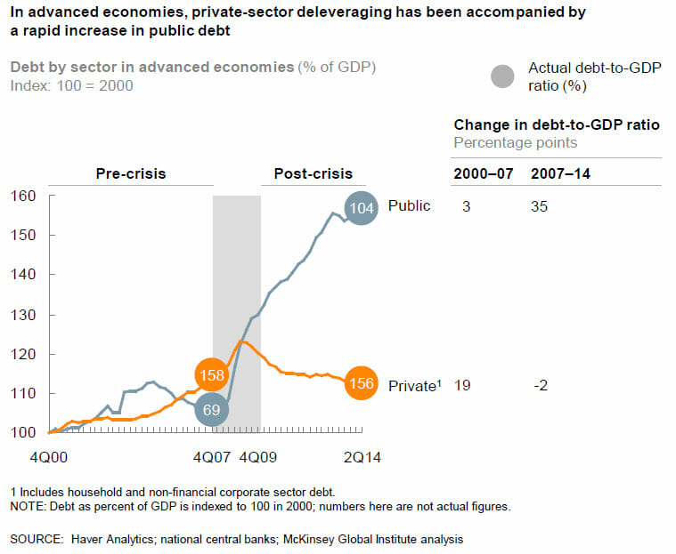
The situation in the US is the same as it is worldwide.  While those evil private short-term-focused private actors have used the improving economy to de-leverage back below 2007 levels, governments have increased their debt as a percentage of GDP by just over 50% since just before the last recession.

20150205_debt1


Since 2007, according to my old friends at McKinsey, global government debt has risen by $25 trillion since 2007.  If you really care about Keynesian stimulus in recessions, and not just "mindlessly" (I can use that term too) increase government spending, wouldn't you want to be building up some reserves for next time?

I am Pretty Sure Bastiat Figured This Out 150 Years Ago: Cash For Clunkers Even Worse Than First Thought

From the WSJ

In a National Bureau of Economic Research working paper this month, economists at Texas A&M return to Cash for Clunkers, the 2009 stimulus fillip that dispensed vouchers worth as much as $4,500 if people turned in their old cars for destruction and bought a new set of wheels. Mark Hoekstra, Steven Puller and Jeremy West report their "striking" finding that the $3 billion program's two-month run subtracted between $2.6 billion and $4 billion from the auto industry.

The irony is that the goals were to help Detroit through the recession by subsidizing sales and to please the green lobby by putting more fuel-efficient cars on the road. By pulling forward purchases that consumers would make later anyway, the Obama Administration also hoped to add to GDP. Christina Romer, then chair of the Council of Economic Advisers, called Cash for Clunkers "very nearly the best possible countercyclical fiscal policy in an economy suffering from temporarily low aggregate demand."

The A&M economists had the elegant idea of comparing the buying behavior of Texas drivers who owned cars that barely qualified for cash (those that got 18 miles per gallon of gas or less) and those that barely did not (19 mph). Using state DMV sales records, this counterfactual allowed them to isolate the effects of the Cash for Clunkers incentives and show what would have happened without the program.

The two groups were equally likely to purchase a new vehicle over the nine month period that started with Cash for Clunkers, so the subsidy did not create any extra auto business. But in order to meet the fuel efficiency mandate, consumers who got the subsidy were induced to purchase smaller vehicle models with less horsepower that cost on average $2,500 to $3,000 less than those bought by their ineligible peers. The clunkers bought more Corollas, and everybody else more Chevys.

Extrapolated nationally, auto revenues may have plunged by more than what the government spent. And any environmental benefits cannot be justified under the federal social cost of carbon estimate of $33 a ton. Prior research from 2009 and 2013 has shown that the program cost between $237 and $288 a carbon ton.

Climate Alarmism In One Statement: "Limited Evidence, High Agreement"

From James Delingpole:

The draft version of the report's Summary For Policymakers made the startling admission that the economic damage caused by "climate change" would be between 0.2 and 2 percent of global GDP - significantly less than the doomsday predictions made in the 2006 Stern report (which estimated the damage at between 5 and 20 percent of global GDP).

But this reduced estimate did not suit the alarmist narrative of several of the government delegations at the recent IPCC talks in Yokahama, Japan. Among them was the British one, comprising several members of the deep green Department of Energy and Climate Change (DECC), which insisted on doctoring this section of the Summary For Policymakers in order to exaggerate the potential for more serious economic damage.

"Losses are more likely than not to be greater, rather than smaller, than this range (limited evidence, high agreement)"

There was no evidence whatsoever in the body of the report to justify this statement.

I find it fascinating that there can be "high agreement" to a statement for which there is limited or no evidence.  Fortunately these are all self-proclaimed defenders of science or I might think this was purely a political statement.

Note that the most recent IPCC reports and new published studies on climate sensitivity tend to say that 1) warming in the next century will be 1-2C, not the much higher numbers previously forecast; 2)  That warming will not be particularly expensive to manage and mitigate and 3) we are increasingly less sure that warming is causing all sorts of negative knock-on effects like more hurricanes.  In other words, opinion is shifting to where science-based skeptics have been all along (since 2007 in my case).  No surprise or shame here.  What is shameful though is that as evidence points more and more to the lukewarmer skeptic position, we are still called evil heretical deniers that should be locked in jail.  Like telling Galileo, "you were right about that whole heliocentric thing but we still think you are evil for suggesting it."

We Are All Lukewarmers Now

Matt Ridley has another very good editorial in the WSJ that again does a great job of outlining what I think of as the core skeptic position.  Read the whole thing, but a few excerpts:

The United Nations' Intergovernmental Panel on Climate Change will shortly publish the second part of its latest report, on the likely impact of climate change. Government representatives are meeting with scientists in Japan to sex up—sorry, rewrite—a summary of the scientists' accounts of storms, droughts and diseases to come. But the actual report, known as AR5-WGII, is less frightening than its predecessor seven years ago.

The 2007 report was riddled with errors about Himalayan glaciers, the Amazon rain forest, African agriculture, water shortages and other matters, all of which erred in the direction of alarm. This led to a critical appraisal of the report-writing process from a council of national science academies, some of whose recommendations were simply ignored.

Others, however, hit home. According to leaks, this time the full report is much more cautious and vague about worsening cyclones, changes in rainfall, climate-change refugees, and the overall cost of global warming.

It puts the overall cost at less than 2% of GDP for a 2.5 degrees Centigrade (or 4.5 degrees Fahrenheit) temperature increase during this century. This is vastly less than the much heralded prediction of Lord Stern, who said climate change would cost 5%-20% of world GDP in his influential 2006 report for the British government.

It is certainly a strange branch of science where major reports omit a conclusion because that conclusion is not what they wanted to see

The IPCC's September 2013 report abandoned any attempt to estimate the most likely "sensitivity" of the climate to a doubling of atmospheric carbon dioxide. The explanation, buried in a technical summary not published until January, is that "estimates derived from observed climate change tend to best fit the observed surface and ocean warming for [sensitivity] values in the lower part of the likely range." Translation: The data suggest we probably face less warming than the models indicate, but we would rather not say so.

Readers of this site will recognize this statement

None of this contradicts basic physics. Doubling carbon dioxide cannot on its own generate more than about 1.1C (2F) of warming, however long it takes. All the putative warming above that level would come from amplifying factors, chiefly related to water vapor and clouds. The net effect of these factors is the subject of contentious debate.

I have reluctantly accepted the lukewarmer title, though I think it is a bit lame.

In climate science, the real debate has never been between "deniers" and the rest, but between "lukewarmers," who think man-made climate change is real but fairly harmless, and those who think the future is alarming. Scientists like Judith Curry of the Georgia Institute of Technology and Richard Lindzen of MIT have moved steadily toward lukewarm views in recent years.

When I make presentations, I like to start with the following (because it gets everyone's attention):  "Yes, I am a denier.  But to say 'denier', implies that one is denying some specific proposition.  What is that proposition?  It can't be 'global warming' because propositions need verbs, otherwise it is like saying one denies weather.  I don't deny that the world has warmed over the last century.  I don't deny that natural factors play a role in this (though many alarmists seem to).  I don't even deny that man has contributed incrementally to this warming.  What I deny is the catastrophe.  Specifically, I deny that man's CO2 will warm the Earth enough to create a catastrophe.  I define "catastrophe" as an outcome where the costs of immediately reducing CO2 output with the associated loss in economic growth would be substantially less than the cost of future adaption and abatement. "

Explaining the Flaw in Kevin Drum's (and Apparently Science Magazine's) Climate Chart

I won't repeat the analysis, you need to see it here.  Here is the chart in question:

la-sci-climate-warming

My argument is that the smoothing and relatively low sampling intervals in the early data very likely mask variations similar to what we are seeing in the last 100 years -- ie they greatly exaggerate the smoothness of history and create a false impression that recent temperature changes are unprecedented (also the grey range bands are self-evidently garbage, but that is another story).

Drum's response was that "it was published in Science."  Apparently, this sort of appeal to authority is what passes for data analysis in the climate world.

Well, maybe I did not explain the issue well.  So I found a political analysis that may help Kevin Drum see the problem.  This is from an actual blog post by Dave Manuel (this seems to be such a common data analysis fallacy that I found an example on the first page of my first Google search).  It is an analysis of average GDP growth by President.  I don't know this Dave Manuel guy and can't comment on the data quality, but let's assume the data is correct for a moment.  Quoting from his post:

Here are the individual performances of each president since 1948:

1948-1952 (Harry S. Truman, Democrat), +4.82%

1953-1960 (Dwight D. Eisenhower, Republican), +3%

1961-1964 (John F. Kennedy / Lyndon B. Johnson, Democrat), +4.65%

1965-1968 (Lyndon B. Johnson, Democrat), +5.05%

1969-1972 (Richard Nixon, Republican), +3%

1973-1976 (Richard Nixon / Gerald Ford, Republican), +2.6%

1977-1980 (Jimmy Carter, Democrat), +3.25%

1981-1988 (Ronald Reagan, Republican), 3.4%

1989-1992 (George H. W. Bush, Republican), 2.17%

1993-2000 (Bill Clinton, Democrat), 3.88%

2001-2008 (George W. Bush, Republican), +2.09%

2009 (Barack Obama, Democrat), -2.6%

Let's put this data in a chart:

click to enlarge


Look, a hockey stick , right?   Obama is the worst, right?

In fact there is a big problem with this analysis, even if the data is correct.  And I bet Kevin Drum can get it right away, even though it is the exact same problem as on his climate chart.

The problem is that a single year of Obama's is compared to four or eight years for other presidents.  These earlier presidents may well have had individual down economic years - in fact, Reagan's first year was almost certainly a down year for GDP.  But that kind of volatility is masked because the data points for the other presidents represent much more time, effectively smoothing variability.

Now, this chart has a difference in sampling frequency of 4-8x between the previous presidents and Obama.  This made a huge difference here, but it is a trivial difference compared to the 1 million times greater sampling frequency of modern temperature data vs. historical data obtained by looking at proxies (such as ice cores and tree rings).  And, unlike this chart, the method of sampling is very different across time with temperature - thermometers today are far more reliable and linear measurement devices than trees or ice.  In our GDP example, this problem roughly equates to trying to compare the GDP under Obama (with all the economic data we collate today) to, say, the economic growth rate under Henry the VIII.  Or perhaps under Ramses II.   If I showed that GDP growth in a single month under Obama was less than the average over 66 years under Ramses II, and tried to draw some conclusion from that, I think someone might challenge my analysis.  Unless of course it appears in Science, then it must be beyond question.

If You Don't Like People Saying That Climate Science is Absurd, Stop Publishing Absurd Un-Scientific Charts

Kevin Drum can't believe the folks at the National Review are still calling global warming science a "myth".  As is usual for global warming supporters, he wraps himself in the mantle of science while implying that those who don't toe the line on the declared consensus are somehow anti-science.

Readers will know that as a lukewarmer, I have as little patience with outright CO2 warming deniers as I do with those declaring a catastrophe  (for my views read this and this).  But if you are going to simply be thunderstruck that some people don't trust climate scientists, then don't post a chart that is a great example of why people think that a lot of global warming science is garbage.  Here is Drum's chart:

la-sci-climate-warming


The problem is that his chart is a splice of multiple data series with very different time resolutions.  The series up to about 1850 has data points taken at best every 50 years and likely at 100-200 year or more intervals.  It is smoothed so that temperature shifts less than 200 years or so in length won't show up and are smoothed out.

In contrast, the data series after 1850 has data sampled every day or even hour.  It has a sampling interval 6 orders of magnitude (over a million times) more frequent.  It by definition is smoothed on a time scale substantially shorter than the rest of the data.

In addition, these two data sets use entirely different measurement techniques.  The modern data comes from thermometers and satellites, measurement approaches that we understand fairly well.  The earlier data comes from some sort of proxy analysis (ice cores, tree rings, sediments, etc.)  While we know these proxies generally change with temperature, there are still a lot of questions as to their accuracy and, perhaps more importantly for us here, whether they vary linearly or have any sort of attenuation of the peaks.  For example, recent warming has not shown up as strongly in tree ring proxies, raising the question of whether they may also be missing rapid temperature changes or peaks in earlier data for which we don't have thermometers to back-check them (this is an oft-discussed problem called proxy divergence).

The problem is not the accuracy of the data for the last 100 years, though we could quibble this it is perhaps exaggerated by a few tenths of a degree.  The problem is with the historic data and using it as a valid comparison to recent data.  Even a 100 year increase of about a degree would, in the data series before 1850, be at most a single data point.  If the sampling is on 200 year intervals, there is a 50-50 chance a 100 year spike would be missed entirely in the historic data.  And even if it were in the data as a single data point, it would be smoothed out at this data scale.

Do you really think that there was never a 100-year period in those last 10,000 years where the temperatures varied by more than 0.1F, as implied by this chart?  This chart has a data set that is smoothed to signals no finer than about 200 years and compares it to recent data with no such filter.  It is like comparing the annualized GDP increase for the last quarter to the average annual GDP increase for the entire 19th century.   It is easy to demonstrate how silly this is.  If you cut the chart off at say 1950, before much anthropogenic effect will have occurred, it would still look like this, with an anomalous spike at the right (just a bit shorter).  If you believe this analysis, you have to believe that there is an unprecedented spike at the end even without anthropogenic effects.

There are several other issues with this chart that makes it laughably bad for someone to use in the context of arguing that he is the true defender of scientific integrity

  • The grey range band is if anything an even bigger scientific absurdity than the main data line.  Are they really trying to argue that there were no years, or decades, or even whole centuries that never deviated from a 0.7F baseline anomaly by more than 0.3F for the entire 4000 year period from 7500 years ago to 3500 years ago?  I will bet just about anything that the error bars on this analysis should be more than 0.3F, much less the range of variability around the mean.  Any natural scientist worth his or her salt would laugh this out of the room.  It is absurd.  But here it is presented as climate science in the exact same article that the author expresses dismay that anyone would distrust climate science.
  • A more minor point, but one that disguises the sampling frequency problem a bit, is that the last dark brown shaded area on the right that is labelled "the last 100 years" is actually at least 300 years wide.  Based on the scale, a hundred years should be about one dot on the x axis.  This means that 100 years is less than the width of the red line, and the last 60 years or the real anthropogenic period is less than half the width of the red line.  We are talking about a temperature change whose duration is half the width of the red line, which hopefully gives you some idea why I say the data sampling and smoothing processes would disguise any past periods similar to the most recent one.

Update:  Kevin Drum posted a defense of this chart on Twitter.  Here it is:  "It was published in Science."   Well folks, there is climate debate in a nutshell.   An 1000-word dissection of what appears to be wrong with a particular analysis retorted by a five-word appeal to authority.

Update #2:  I have explained the issue with a parallel flawed analysis from politics where Drum is more likely to see the flaws.

USA Today: Shutdown Has Trivial, Unmeasurable Impact on Economy

OK, actually, they did not use the words "trivial" and "unmeasurable."  But they could have.  What they actually said in a story splashed across the front page:

The 16-day government shutdown cost the economy jobs, delayed mortgages and lost retail sales — at least $12 billion worth, and maybe as much as $24 billion

$12-24 Billion is between 0.08% and 0.15% of GDP.  This is for a shutdown of the government for 4.4% of the year (16 days divided by 365).   That hardly seems like a substantial impact, and not at all in line with the scare stories in advance of the shutdown.  (And this is coming from someone who was impacted a lot, though due to illegal actions by the administration).

The Difference Between Private and Public Governance, Part Number Whatever

Let's suppose a Fortune 500 company went through a rancorous internal debate about strategic priorities, perhaps even resulting in proxy fights and such (think Blackberry, HP, and many other examples).  The debate and uncertainty makes investors nervous.  So when the debate has been settled, what does the CEO say?  My guess is that he or she will do everything they can to calm investors, explain that the internal debate was a sign of a healthy response to adversity, and reiterate to the markets that the company is set to be stronger than ever.  The CEO is going to do everything they can to rebuild confidence and downplay the effects of the internal debate.

Here is President Obama today, talking about the budget battle

“Probably nothing has done more damage to America’s credibility in the world than the spectacle we’ve seen these past few weeks,” the president said in an impassioned White House appearance.

Good God, its like he's urging a sell order on his own stock.   I was early in observing the Republican strategy was stupid and doomed to failure, but you have to show a little statesmanship as President.

Postscript:  

Standard & Poor’s estimated the shutdown has taken $24 billion out of the economy.

If this is true, this number is trivial.  0.15% of GDP (and this from someone hurt more than most) loss from a government shutdown about 4.4% of the year (16/365)

Trading $1 in Debt for 85 cents of Economic Activity

UPDATE:  Mea culpa.  One point in the original post was dead wrong.  It is possible, contrary to what I wrote below, to get something like a 0.7%  difference in annual growth rates with the assumptions he has in the chart below (Drum still exaggerated when he called it 1%).  I don't know if the model is valid (I have little faith in any macro models) but I was wrong on this claim.  Using the 0.7% and working more carefully by quarter we get a cumulative GDP addition a bit lower than the cumulative debt addition.  There is still obviously a reasonable question even at a multiplier near 1 whether $1 of economic activity today is worth $1 of debt repayment plus interest in the future.  

I am not a believer, obviously, in cyclical tweaking of the economy by the Feds.  To my thinking, the last recession was caused by a massive government-driven mis-allocation of capital so further heavy-handed government allocation of capital seems like a poor solution.  But what really drives me crazy is that most folks on the Left will seductively argue that now is not the time to reduce debt levels, implying sometime in the future when the economy is better will be the appropriate time.  But when, in any expansion, have you heard anyone on the Left say, "hey, its time to reduce spending and cut debt because we need the fiscal flexibility next time the economy goes wrong."

I will leave the stuff in error below in the post because I don't think it is right to disappear mistakes.  For transparency, my spreadsheet reconstruction both confirming the 0.7% and with the updated numbers below is here:   reconstruction.xls.


Kevin Drum is flogging the austerity horse again

I see that Macroecomic Advisors has produced a comprehensive estimate of the total effect of bad fiscal policies. Their conclusion: austerity policies since the start of 2011 have cut GDP growth by about 1 percentage point per year.

Something seemed odd to me -- when I opened up the linked study, it said the "lost" government discretionary spending is about 2% of GDP.  Is Drum really arguing that we should be spending 2% of GDP to increase GDP by 1%?

Of course, the math does not work quite this way given compounding and such, but it did cause me to check things out.  The first thing I learned is that Drum partook of some creative rounding.  The study actually said reductions in discretionary spending as a percent of GDP reduced GDP growth rates since the beginning of 2011 by 0.7% a year, not 1% (the study does mention a 1% number but this includes other effects as well).

But it is weirder than that, because here is the chart in the study that is supposed to support the 0.7% number:

click to enlarge

Note that in the quarterly data, only 2 quarters appear to show a 0.7% difference and all the others are less.  I understand that compounding can do weird things, but how can the string of numbers represented by the green bars net to 0.7%?  What it looks like they did is just read off the last bar, which would be appropriate if they were doing some sort of cumulative model, but that is not how the chart is built.  If we interpolate actual values and are relatively careful about getting the compounding right, the difference is actually about 0.45%.  So now we are down to less than half the number Drum quoted see update above (I sent an email to the study author for clarification but have not heard back.  Update:  he was nice enough to send me a quick email).

So let's accept this 0.45% 0.7% number for a moment.  If GDP started somewhere around 16 trillion in 2010, if we apply a 0.45% the quarterly growth numbers from his chart, we get an incremental economic activity from 2011 through 2013:Q2 of about $333 billion.

So now look at the spending side.  The source says that discretionary spending fell by about 2% of GDP over this period.  From the graph above, it seems to bite pretty early, but we will assume it fell 1/12 of this 2% figure each quarter, so that by the end of 2013 or beginning of 2014 we get a fall in spending by 2% of GDP.  Cumulatively, this would be a reduction in spending over the 2.5 years vs. some "non-austere" benchmark of $388 billion.

Thus, in exchange for running up $677 billion $388 billion in additional debt, we would have had $445 billion $333 billion in incremental economic activity.  A couple of reactions:

  1. Having the government borrow money and spend it definitely increases near-term GDP.  No one disputes that.  It is not even in question.  Those of us who favor reigning in government spending acknowledge this.  The question is, at what cost in terms of future obligations.  In fact, this very study Drum is quoting says

    Economists agree that failure to shrink prospective deficits and debt will bestow significant economic consequences and risks on future generations. Federal deficits drive up interest rates, “crowding out” private investment. If government borrowing supports consumption (e.g., through Social Security and major health programs) rather than public investment, the nation’s overall capital stock declines, undermining our standard of living. The process is slow but the eventual impact is large.2 In addition, accumulating debt raises the risk of a fiscal crisis. No one can say when this might occur but, unlike crowding out, a debt crisis could develop unexpectedly once debt reached high levels.

    High deficits and debt also undermine the efficacy of macroeconomic policies and reduce policymakers’ flexibility to respond to unexpected events. For example, in a recession, it would be harder to provide fiscal stimulus if deficits and debt already were high. Furthermore, fiscal stimulus might be less effective then. Additional deficit spending could be seen as pushing the nation closer to crisis, thereby forcing up interest rates and undercutting the effects of the stimulus. With fiscal policy hamstrung, the burden of counter-cyclical policy is thrust on the Federal Open Market Committee (FOMC) but, particularly in a low interest-rate environment, the FOMC may be unable (or unwilling) to provide additional monetary
    stimulus.

  2. I guess we have pretty much given up on the >1 multiplier, huh?  Beggaring our children for incremental economic growth today is a risky enough strategy, but particularly so with the implied .66 .85 multiplier here.

This is not the first time Drum has taken, uh, creative data approaches to cry "austerity" during a mad spending spree. 

Eeek! Austerity! Oh, Never Mind.

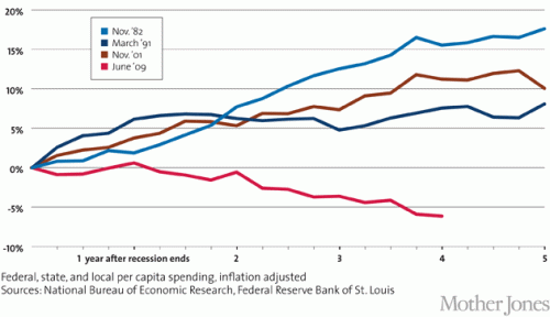
Yesterday I challenged a graph by Kevin Drum in Mother Jones as being a disingenuous attempt to paint US government spending as some sort of crazed austerity program which is making the recovery worse.  He uses this graph to "prove" that our fiscal response to this recession is weak vis a vis past recessions.  The graph is a bit counter-intuitive -- note that it begins at the end of each recession.  His point is that Keynesian spending needs to continue long after (five years ?!) after the recession is over to guarantee a good recovery, and that we have not done that.

Click to enlarge

For anyone not steeped in the special reality of the reality-based community, it is a bit counter intuitive for those of us who have actually lived through the last 5 years to call government spending austere.

The key is in the dates he selects.  He leaves out the actual recession years.  So by his chart, responses that are late and occur after the recession look better than responses that are fast and large but happen during the recession.  This seems odd, but it is the conclusion one has to draw.

I took roughly the same data and started each line two years earlier, so that my first year is two years ahead of his graph and the zero year in my graph is the same as the zero point in Drum's chart.  His data is better in the sense that he has quarterly data and I only have annual.  Mine is better in that it looks at changes in spending as a percentage of GDP, which I would guess would be the more relevant Keynesian metric (it also helps us correct for the chicken and egg problem of increased government spending being due to, rather than causing, economic expansion).

Here are the results (I tried to use roughly the same colors for the same data series, but who in the world with the choice of the entire color pallet uses two almost identical blues?)

recession-redux2

You can see that Drum makes spending look lower in the current recession by carefully dating the data series to the peak of the spending, rather than comparing it to pre-recession levels.  The right hand scale is the difference in government spending as a percentage of GDP from the -2 year.  So, for example, in the current recession government spending was 34.2% in 2007 and 41.4% in 2009 for a reading of 7.2% in year 0.

Even with the flat spending over the last three or four years in the current recession (flat nominal spending leads do a declining percent of GDP) the spending increase from pre-recession levels is still about twice as high as in other recent recessions.

Does this look like austerity to anyone?

Deceptive Chart of the Day from Kevin Drum and Mother Jones to Desperately Sell the "Austerity" Hypothesis

Update:  OK, I pulled together the data and did what Drum should have done, is take the graph back to pre-recession levels.  Shouldn't it be even better if the increase in spending came during the recession rather than after?  See update here.

Kevin Drum complains about US government austerity (I know, I know, only some cocooned progressive could describe recent history as austerity, but let's deal with his argument).  He uses this chart to "prove" that we have been austere vs. other recessions, and thus austerity helps explain why recovery from this recession has been particularly slow.  Here is his chart

Austerity_2_WM_630

This is absurdly disingenuous.  Why?  Simple -- it is impossible to evaluate post recession spending without looking at what spending did during the recession.   All these numbers begin after the recession is over.  But what if, in the current recession, we increased spending much more than in other recessions.  We would still be at a higher level vs. pre-recession spending now, despite a lack of further increases after the recession.

In the time before this chart even starts, total state, local, Federal spending increased from 2007 to 2008 by 10.2%.  It increased another 11.1 % from 2008 to 2009.  So he starts the chart at the peak, only AFTER spending had increased in response to the recession by 22.5%.  Had he started the chart at the correct date and not at a self-serving one, my guess is that it would have shown that in this recession we increased spending more than any other recent recession, not less.  So went digging for some data.

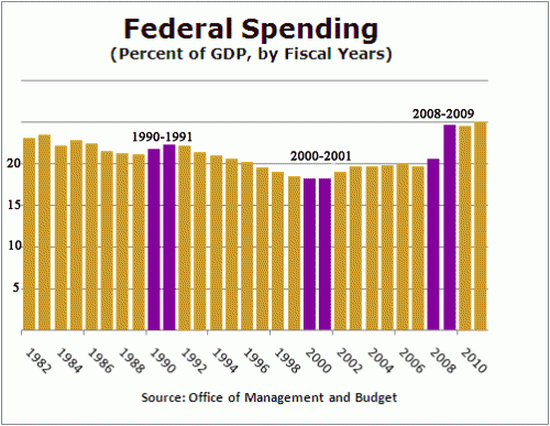
I actually have a day job, so I don't have time to create a chart of total government spending since 1981, so I will look at just Federal spending, but it makes my point.  I scavenged this chart from Factcheck.org.  The purple bars are the year that each of Drum's data series begin plus the year prior (which is excluded from Drum's chart).  Essentially the growth in spending between the two purple lines is the growth left out just ahead of when Drum started each data series in his chart.  The chart did not go back to 1981 so I could not do that year.

click to enlarge

Hopefully, you can see why I say that Drum is disingenuous for not going back to pre-recession numbers.  In this case, you can see the current recession has an unprecedented pop in spending in the year before Drum starts his data series, so it is not surprising that post recession spending might be flatter (remember, the pairs of purple lines are essentially the change in spending the year before each of Drum's data series).  In fact, it is very clear that relative to the pre-recession year of 2008 (really 2007, but I will give him a small break), even after 5 years of "austerity" our federal spending as a percent of GDP will be far higher than in any other recession he considers.  In no previous recession in this era did post recession spending end up more than 2 points higher (as a percent of GDP) than pre-recession levels.    In this recession, we are likely to end up 4-5 points higher.

By the way, isn't it possible that he has cause and effect reversed?  He argues that post-recession recovery was faster in other recessions because government spending kept increasing over five years after the recession is over.  But isn't it just possible that the truth is the reverse -- that government spending increased more rapidly after other recessions because recovery was faster, thus increasing tax revenues. Congress then promptly spent the new revenues on new toys.

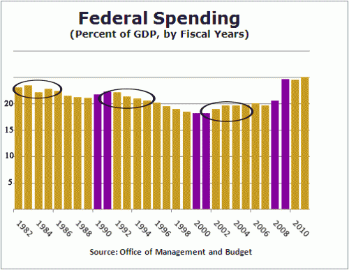
Let's look at the same chart, highlighted in a different way.  I will circle the 4-5 years included in each of Drum's data series:

spending-2

You can see that despite the fact that government spending in these prior recessions was increasing in real terms, it was falling in two our of three of them as a percentage of GDP (the third increased due to war spending in Afghanistan and Iraq, spending which I, and I suspect Drum, would hesitate to call stimulative, particular since he and others at the time called it a jobless recovery).

How can it be that spending was increasing but falling as a percent of GDP?  Because the GDP was growing really fast, faster than government spending.  This does not prove my point, but is a good indicator that recovery is likely leading spending increases, rather than the other way around.

Keynesian Multiplier of 0.05

So much for that Keynesian stimulus notion (emphasis in the original)

With everyone focused on the 5th anniversary of the Lehman failure, we are taking a quick look at how the world's developed (G7) nations have fared since 2008, and just what the cost to restore "stability" has been. In a nutshell: the G7 have added around $18tn of consolidated debt to a record $140 trillion, relative to only $1tn of nominal GDP activity and nearly $5tn of G7 central bank balance sheet expansion (Fed+BoJ+BoE+ECB). In other words, over the past five years in the developed world, it took $18 dollars of debt (of which 28% was provided by central banks) to generate $1 of growth. For all talk of "deleveraging" G7 consolidated debt has been at a record high 440% for the past four years.

The theory of stimulus -- taking money out of the productive economy, where it is spent based on the information of hundreds of millions of people as to the relative value of millions of potential investments, and handing it to the government to spend based on political calculus -- never made a lick of sense to me.  I guess I would have assumed the multiplier in the short term was fractional but at least close to one, indicating in the short run that if we borrow and dump the money into the economy we would get some short-term growth, only to have to pay the piper later.  But we are not even seeing this.

The Problem with Infrastructure

Obama, accompanied by the usual chorus on the Left including Kevin Drum, is yet again trumpeting infrastructure spending as a partial economic solution for what ails us, in part based on a McKinsey Global Institute report.   Infrastructure is like education (the other half of the Obama "plan") -- it's hard to find anyone against it per se, it is easy to find examples of it failing, and it is really hard to craft programs at the Federal level that really improve anything.

Having been inside the McKinsey sausage factor for five years, I was loath to just accept their conclusion without seeing the data, so I read the section of the report on infrastructure.  Having read the report, I still don't see how they got to the under-funding number.  Some of the evidence is laughably biased, such as pronouncements from the American Society of Civil Engineers, who clearly would be thrilled with more government infrastructure spending.  The rest comes from something called the world economic forum, but I simply don't have the energy right now to follow the pea any further.

I had two reactions to this plan:

  1. Presumably what infrastructure projects we choose matters, so how can we have any confidence (given things like our green energy investment program) that these investments will be chosen wisely and not based on political expediency?
  2. From my experience, and also from the McKinsey numbers, most of the infrastructure needs are refurbishment and replacement of existing infrastructure, rather than new infrastructure.  But politicians are typically loath to make these kind of investments, preferring to offer new toys to voters rather than saying all that money was spent just to keep their existing toys.  Just look at the DC metro system, which is still pursuing expensive expansion plans at the same time it refuses to perform capital maintenance and replacement on its current crumbling infrastructure.  Or look at Detroit which is falling apart but still wants to spend $400 million on a new hockey rink.

I was pleasantly surprised that McKinsey actually raised both of these issues as critical.  To the point about project selection:

To effectively deploy additional investment in infrastructure, the United States will have to improve its performance on project election, timely delivery and execution, and maintenance and renewal. This could raise the overall productivity of US infrastructure by as much as 40 percent and generate more economic impact for every dollar spent. And there is added pressure to raise infrastructure productivity today: as commodity prices rise, input costs are going up as well. In extreme circumstances, this can even lead to spot shortages of asphalt and other critical materials, making productive use of such assets even more important.

One of the most effective ways to make infrastructure investment more productive is to choose the right mix of projects from the outset. Too often, the primary approval criteria for project selection in the United States are political support and visibility rather than comprehensive cost-benefit analysis.129 Even when economic analysis is used, it is not always rigorous, or it may be disregarded in actual decision making. When state and local governments choose sub-optimal projects, the cost of financing rises, so focusing on those projects with the clearest returns is a crucial part of taking a more cost-effective approach for the nation as a whole.

In addition, planners at all levels of US government tend to have a bias toward addressing congestion and bottlenecks by building new capacity. But rather than immediately jumping to build new infrastructure projects to solve problems,
planners and project sponsors might first consider refurbishing existing assets or using technology to get more out of them. (See “Better maintenance, optimization, and demand management can extend the life of existing infrastructure assets” later in this chapter.)

The McKinsey study is not arguing for Keynesian digging holes and filling them in again.   They are arguing for infrastructure spending but only if it is better targeted than such programs have been in the past.   Anything about this Administration (or any other Administration, really) that gives you confidence this will happen?

In fact, they argue that a large reason for under-developed infrastructure is not the spending level per se but the insanely inefficient way in which government spends the money

Delays and cost overruns are a familiar refrain in infrastructure projects. Boston’s Big Dig, for example, remains the costliest highway project in US history and was plagued by years of delay and shoddy construction. Originally estimated at $2.6 billion, it now has a final price tag estimated by the Massachusetts Department of Transportation at $24.3 billion, including interest on borrowing. More recently, the San Francisco–Oakland Bay Bridge is being completed almost a decade late, and its original budget of $1.3 billion has grown to more than $6 billion.

Finally, their recommendation focuses more on maintenance and the prosaic, rather than expensive sexy headline grabbing investments (cough California high speed rail cough) that politicians prefer

Another major strategy for increasing infrastructure productivity involves maximizing the life span and capacity of existing assets. In many cases, directing more resources to these areas may be a more cost-effective choice for policy makers than new build-outs.

First, there is a need to focus more attention on maintenance, refurbishment, and renewal. This is an increasingly urgent issue for the nation’s aging water infrastructure, much of which was built in the years immediately after World War II; some of the nation’s oldest pipe systems are now more than a century old. Even more recent water treatment plants will need refurbishment: many built in the
1970s after passage of the Clean Water Act will soon require rehabilitation or replacement. Proactive maintenance to upgrade and extend the life of these aging systems is becoming a more urgent priority.

The study uses a GDP multiplier of 1.77 for infrastructure spending, which explains why their claimed GDP impacts are so high.  Using this kind of chicked-in-every-pot high multiplier will of course make infrastructure spending seem like a no-brainer.  Of course those of us with more sympathy towards Austrian economics, wherein recessions are caused by misallocations of capital, will worry that this kind of government spending program, shifting private resources to public decision makers to spend, will only double down on the same crap that caused the recession in the first place.  I grew up with Japan's MITI being praised as a model by the American Left, watched the lost decades that followed this government-directed investment program, and believe that a similar reckoning is coming in China.

A Couple of Thoughts About Reinhart & Rogoff

As quick background, R&R had a study that found that higher government debt levels correlated to lower, even negative, economic growth.  More recently, others have found computational errors that exaggerated this result, and have criticized their methodology, particularly their approach to weighting data from different countries and years.

A few thoughts:

  1. A major reasons the errors were found is that R&R actually made their data available for replication.  This is apparently rare - certainly it is rare in the climate world.  I am glad they are getting kudos for this and hope the academic world can find a way to incentivize / force more data sharing
  2. I would not have expected a direct relationship between country debt levels and economic growth.  What I would expect is that growth can still be good at higher debt levels, but the risk of hitting a tipping point starts to rise dangerously with debt levels.  Eventually levels get so high that an interest rate shock or liquidity shock is almost inevitable
  3. More than a relation between GDP growth and absolute debt levels, I would have expected a relationship between GDP growth and changes in debt level.  Absolute government debt levels may represent resources removed from the productive economy years and decades earlier.  Increases in government debt represent recent decreases in capital available for productive use.