Quick: From Media Reporting and Obama Speeches, What Is Your Impression of Wildfire Severity This Year
Wildfires are becoming a perennial favorite of our "Trend that is not a trend" series, showing how media creates trends out of single data points and even out of thin air. Often, the evidence behind trends in media stories tends to be ... the increasing volume of media stories on that topic. Thus the "Summer of the Shark" media fiasco.
About 98 out of 100 people I might ask would say that this is a record year for wildfires in the US. In fact, it is, so far, one of the slowest wildfire seasons in recent memory.
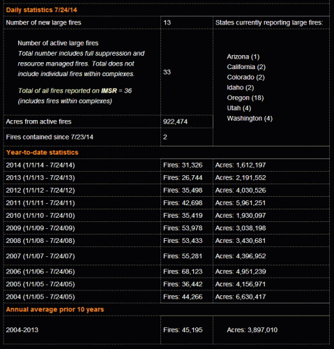
Here is a screencap of the data from the National Inter-agency Fire Center. Here is the link so you can see for yourself (though of course the data will be different over time since it shows year to date data for the day you check).
Note that there is no apples to oranges BS here -- all data for all years are for Jan 1 to July 24 of that year. So far this year, the number of fires is 31% below average and the total acres burned is nearly 60% below average.
Postscript: By the way, I have every reason to hate wildfires. A wildfire in the Sedona area shut down my largest business for the year, pretty much wiping out our company's earnings for the year.
Postscript #2: There is clearly a trend in the data for acres burned (see whole database here). I am not denying the trend, though we can argue how much is climate and how much is forest management and how much is simply more human contact with the wilderness. What I object to is using individual events, particularly individual events in below-average years, as proof of the trend

I am curious as to whether the trend toward more acres burning is meaningful. I note that on average each fire is burning in the range of 100 acres or less, so 1 or 2 very big fires will skew the averages.
Seconded. It's troublesome to pick a trend out of data where the variance is much higher than the trend. 2012 and 2013 were huge, but 2011 was tiny, and 2009-2010 were par.
We had a saying one place I worked: one data point makes a trend. Sorta facetiously, but...
The last trend that wasn't - really turned out to be a trend. - a 26% jump in adult children living at home, with the false excuse that dorm dwellers are counted in the figure and college participation is going up. Turns out college participation has dropped 2% as well. It was only when ancient data from the 80s when we also experienced a recession was added that it looked flat.
Point is with all this data you need to be careful. In have even found respected economist Mark Perry of Carpet Diem fudging the numbers on recent food inflation charts, based on easily verifiable government data. You shouldn't have to misrepresent data to prove your point - even if I consider you to be on the correct side of the issue.
On deck: lightning.
The beauty of one data point is that it fits any trend you could possibly want.