Posts tagged ‘GISS’

Revisiting James Hanson's 1988 Global Warming Forecast to Congress

(Cross-posted from Climate Skeptic)

I want to briefly revisit Hansen's 1998 Congressional forecast.  Yes, I and many others have churned over this ground many times, but I think I now have a better approach.   The typical approach has been to overlay some actual temperature data set on top of Hansen's forecast (e.g. here).  The problem is that with revisions to all of these data sets, particularly the GISS reset in 1999, none of these data sets match what Hansen was using at the time.  So we often get into arguments on where the forecast and actuals should be centered, etc.

This might be a better approach.  First, let's start with Hansen's forecast chart (click to enlarge).

hansen forecast

Folks have argued for years over which CO2 scenario best matches history.  I would argue it is somewhere between A and B, but you will see in a moment that it almost does not matter.    It turns out that both A and B have nearly the same regressed slope.

The approach I took this time was not to worry about matching exact starting points or reconciling difference anomaly base periods.  I merely took the slope of the A and B forecasts and compared it to the slope over the last 30 years of a couple of different temeprature databases (Hadley CRUT4 and the UAH v6 satellite data).

The only real issue is the start year.  The analysis is not very sensitive to the year, but I tried to find a logical start.  Hansen's chart is frustrating because his forecasts never converge exactly, even 20 years in the past.  However, they are nearly identical in 1986, a logical base year if Hansen was giving the speech in 1988, so I started there.  I didn't do anything fancy on the trend lines, just let Excel calculate the least squares regression.  This is what we get (as usual, click to enlarge).

click to enlarge

I think that tells the tale  pretty clearly.   Versus the gold standard surface temperature measurement (vs. Hansen's thumb-on-the-scale GISS) his forecast was 2x too high.  Versus the satellite measurements it was 3x too high.

The least squares regression approach probably under-estimates that A scenario growth rate, but that is OK, that just makes the conclusion more robust.

By the way, I owe someone a thanks for the digitized numbers behind Hansen's chart but it has been so many years since I downloaded them I honestly forgot who they came from.

The 2014 Temperature Record No One Is Talking About

Depending on what temperature data set you look at **, or on your trust in various manual adjustments in these data sets ***, 2014 may have beaten the previous world temperature record by 0.02C.  Interestingly, the 0.02C rise over the prior record set four years ago would imply (using only these two data points which warmists seem to want to focus on) a temperature increase of 0.5C per century, a few tenths below my prediction but an order of magnitude below the alarmists' predictions for future trends.

Anyway, whether there was an absolute record or not, there was almost certainly a different temperature record set -- the highest divergence to date in the modern measured temperatures from what the computer models predicted.  The temperature increase for the past 5 years was a full 0.17C less than predicted, the largest gap yet for the models in forward-prediction mode (as opposed to when they are used to backcast history).


** There are four or five or more data sets, depending on how you count them.   There are 2 major satellite data sets and 2-3 ground based data sets.  The GISS ground data set generally gives the largest warming trends, while the satellite data sets give the least, but all show some warming over the last 30 or so years (though most of this warming was before 1999).

*** The data sets are all full of manual adjustments of various sorts.  All of these are necessary.  For surface stations, the measurement points move and change technology.  For the satellites, orbits and instruments shift over time.  The worrisome feature of all these adjustments is that they are large as compared to the underlying warming signal being measured, so small changes in the adjustments can lead to large changes in the apparent trend.  Skeptics often charge that the proprietors of land data sets are aggressive about including adjustments that increase the apparent trend but reluctant to add similar adjustments (eg for urban heat islands) that might reduce the trend.  As a result, most of the manual adjustments increase the trend.  There is actually little warming trend in the raw data, and it only shows up after the adjustments.  It may be total coincidence, but the database run by the most ardent warmist is the GISS and it has the highest trend.   The database run by the most skeptical is the UAH satellite database and it shows the smallest trend.  Hmm.

The Anti-Industrial Revolution

I stole this post title from Ayn Rand, but it seems appropriate to this story by James Delingpole.  Apparently James Hansen, leader of NASA's GISS, which does most of its climate research, wants to turn back the clock on industrialized civilization.    A new book by Keith Farnish writes:

The only way to prevent global ecological collapse and thus ensure the survival of humanity is to rid the world of Industrial Civilization.

And continues:

I'm rarely afraid of stating the truth, but some truths are far harder to give than others; one of them is that people will die in huge numbers when civilization collapses. Step outside of civilization and you stand a pretty good chance of surviving the inevitable; stay inside and when the crash happens there may be nothing at all you can do to save yourself. The speed and intensity of the crash will depend an awful lot on the number of people who are caught up in it: greater numbers of people have more structural needs "“ such as food production, power generation and healthcare "“ which need to be provided by the collapsing civilization; greater numbers of people create more social tension and more opportunity for extremism and violence; greater numbers of people create more sewage, more waste, more bodies "“ all of which cause further illness and death.

I wonder what Mr. Farnish thinks the average life expectancy was before the industrial revolution, or even "civilization?"  But my intention here is not to shoot fish in Mr. Farnish's barrel.  What is interesting is who approached Farnish and offered, unsolicited, to blurb his book:  James Hansen.  Here is Hansen's endorsement:

Keith Farnish has it right: time has practically run out, and the 'system' is the problem. Governments are under the thumb of fossil fuel special interests "“ they will not look after our and the planet's well-being until we force them to do so, and that is going to require enormous effort.

Does anyone believe that a person who believes this wouldn't misrepresent the science or fudge his temperature metrics to support his cause.  If he expects civilization to crash, why do we expect him to operate by the rules of civilized society?

Example of Climate Work That Needs to be Checked and Replicated

When someone starts to shout "but its in the peer-reviewed literature" as an argument-ender to me, I usually respond that peer review is not the finish line, meaning that the science of some particular point is settled.  It is merely the starting point, where now a proposition is in the public domain and can be checked and verified and replicated and criticized and potentially disproved or modified.

The CRU scandal should, in my mind, be taken exactly the same way.  Unlike what more fire-breathing skeptics have been saying, this is not the final nail in the coffin of catastrophic man-made global warming theory.  It is merely a starting point, a chance to finally move government funded data and computer code into the public domain where it has always belonged, and start tearing it down or confirming it.

To this end, I would like to share a post from year ago, showing the kind of contortions that skeptics have been going through for years to demonstrate that there appear to be problems in  key data models -- contortions and questions that could have been answered in hours rather than years if the climate scientists hadn't been so afraid of scrutiny and kept their inner workings secret.  This post is from July, 2007.  It is not one of my most core complaints with global warming alarmists, as I think the Earth has indeed warmed over the last 150 years, though perhaps by less than the current metrics say.  But I think some folks are confused why simple averages of global temperatures can be subject to hijinx.  The answer is that the averages are not simple:

A few posts back, I showed how nearly 85% of the reported warming in the US over the last century is actually due to adjustments and added fudge-factors by scientists rather than actual measured higher temperatures.  I want to discuss some further analysis Steve McIntyre has done on these adjustments, but first I want to offer a brief analogy.

Let's say you had two compasses to help you find north, but the compasses are reading incorrectly.  After some investigation, you find that one of the compasses is located next to a strong magnet, which you have good reason to believe is strongly biasing that compass's readings.  In response, would you

  1. Average the results of the two compasses and use this mean to guide you, or
  2. Ignore the output of the poorly sited compass and rely solely on the other unbiased compass?

Most of us would quite rationally choose #2.  However, Steve McIntyre shows us a situation involving two temperature stations in the USHCN network in which government researchers apparently have gone with solution #1.  Here is the situation:

He compares the USHCN station at the Grand Canyon (which appears to be a good rural setting) with the Tucson USHCN station I documented here, located in a parking lot in the center of a rapidly growing million person city.   Unsurprisingly, the Tucson data shows lots of warming and the Grand Canyon data shows none.  So how might you correct Tucson and the Grand Canyon data, assuming they should be seeing about the same amount of warming?  Would you

average them, effectively adjusting the two temperature readings

towards each other, or would you assume the Grand Canyon data is cleaner

with fewer biases and adjust Tucson only?   Is there anyone who would not choose the second option, as with the compasses?

The GISS data set, created by the Goddard Center of NASA, takes the USHCN data set and somehow uses nearby stations to correct for anomalous stations.  I say somehow, because, incredibly, these government scientists, whose research is funded by taxpayers and is being used to make major policy decisions, refuse to release their algorithms or methodology details publicly. They keep it all secret!  Their adjustments are a big black box that none of us are allowed to look into  (and remember, these adjustments account for the vast majority of reported warming in the last century).

We can, however, reverse engineer some of these adjustments, and McIntyre does.  What he finds is that the GISS appears to be averaging the good and bad compass, rather than throwing out or adjusting only the biased reading.  You can see this below.  First, here are the USHCN data for these two stations with only the Time of Observation adjustment made (more on what these adjustments are in this article).
Grand_12

As I said above, no real surprise "“ little warming out in undeveloped nature, lots of warming in a large and rapidly growing modern city.  Now, here is the same data after the GISS has adjusted it:

Grand_15

You can see that Tucson has been adjusted down a degree or two, but Grand Canyon has been adjusted up a degree or two (with the earlier mid-century spike adjusted down).  OK, so it makes sense that Tucson has been adjusted down, though there is a very good argument to be made that it should be been adjusted down more, say by at least 3 degrees**.  But why does the Grand Canyon need to be adjusted up by about a degree and a half?  What is biasing it colder by 1.5 degrees, which is a lot?  The answer:  Nothing.  The explanation:  Obviously, the GISS is doing some sort of averaging, which is bringing the Grand Canyon and Tucson from each end closer to a mean.

This is clearly wrong, like averaging the two compasses.  You don't average a measurement known to be of good quality with one known to be biased.  The Grand Canyon should be held about the same, and Tucson adjusted down even more toward it, or else thrown out.  Lets look at two cases.  In one, we will use the GISS approach to combine these two stations"“ this adds 1.5 degrees to GC and subtracts 1.5 degrees from Tucson.  In the second, we will take an approach that applies all the adjustment to just the biases (Tucson station) "” this would add 0 degrees to GC and subtract 3 degrees from Tucson.  The first approach, used by the GISS, results in a mean warming in these two stations that is 1.5 degrees higher than the more logical second approach. No wonder the GISS produces the highest historical global warming estimates of any source!  Steve McIntyre has much more.

** I got to three degrees by applying all of the adjustments for GC and Tucson to Tucson.  Here is another way to get to about this amount.   We know from studies that urban heat islands can add 8-10 degrees to nighttime urban temperatures over surrounding undeveloped land.  Assuming no daytime effect, which is conservative, we might conclude that 8-10 degrees at night adds about 3 degrees to the entire 24-hour average.

Postscript: Steve McIntyre comments (bold added):

These adjustments are supposed to adjust for station moves "“ the procedure is described in Karl and Williams 1988 [check], but, like so many climate recipes, is a complicated statistical procedure that is not based on statistical procedures known off the island. (That's not to say that the procedures are necessarily wrong, just that the properties of the procedure are not known to statistical civilization.) When I see this particular outcome of the Karl methodology, my mpression is that, net of the pea moving under the thimble, the Grand Canyon values are being blended up and the Tucson values are being blended down. So that while the methodology purports to adjust for station moves, I'm not convinced that the methodology can successfully estimate ex post the impact of numerous station moves and my guess is that it ends up constructing a kind of blended average.

LOL.  McIntyre, by the way, is the same gentleman who helped call foul on the Mann hockey stick for bad statistical procedure.

Pretty Good Climategate Summary

From Christopher Booker at the Telegraph via Anthony Watts

There are three threads in particular in the leaked documents which have sent a shock wave through informed observers across the world. Perhaps the most obvious, as lucidly put together by Willis Eschenbach (see McIntyre's blog Climate Audit and Anthony Watt's blog Watts Up With That), is the highly disturbing series of emails which show how Dr Jones and his colleagues have for years been discussing the devious tactics whereby they could avoid releasing their data to outsiders under freedom of information laws.

They have come up with every possible excuse for concealing the background data on which their findings and temperature records were based.

This in itself has become a major scandal, not least Dr Jones's refusal to release the basic data from which the CRU derives its hugely influential temperature record, which culminated last summer in his startling claim that much of the data from all over the world had simply got "lost". Most incriminating of all are the emails in which scientists are advised to delete large chunks of data, which, when this is done after receipt of a freedom of information request, is a criminal offence.

But the question which inevitably arises from this systematic refusal to release their data is "“ what is it that these scientists seem so anxious to hide? The second and most shocking revelation of the leaked documents is how they show the scientists trying to manipulate data through their tortuous computer programmes, always to point in only the one desired direction "“ to lower past temperatures and to "adjust" recent temperatures upwards, in order to convey the impression of an accelerated warming. This comes up so often (not least in the documents relating to computer data in the Harry Read Me file) that it becomes the most disturbing single element of the entire story. This is what Mr McIntyre caught Dr Hansen doing with his GISS temperature record last year (after which Hansen was forced to revise his record), and two further shocking examples have now come to light from Australia and New Zealand.

In each of these countries it has been possible for local scientists to compare the official temperature record with the original data on which it was supposedly based. In each case it is clear that the same trick has been played "“ to turn an essentially flat temperature chart into a graph which shows temperatures steadily rising. And in each case this manipulation was carried out under the influence of the CRU.

What is tragically evident from the Harry Read Me file is the picture it gives of the CRU scientists hopelessly at sea with the complex computer programmes they had devised to contort their data in the approved direction, more than once expressing their own desperation at how difficult it was to get the desired results.

The third shocking revelation of these documents is the ruthless way in which these academics have been determined to silence any expert questioning of the findings they have arrived at by such dubious methods "“ not just by refusing to disclose their basic data but by discrediting and freezing out any scientific journal which dares to publish their critics' work. It seems they are prepared to stop at nothing to stifle scientific debate in this way, not least by ensuring that no dissenting research should find its way into the pages of IPCC reports.

Climate Rorschach Test

Over at Climate Skeptic, I have what could be called a climate Rorschach test.  Look at these two images below.  The left is the temperature plot for Lampasas, Texas, a station in the NASA GISS global warming data base.  On the right is the location of the temperature station since the year 2000 (the instrument is in the while cylinder in the middle of the picture under the dish).  Click either picture to expand

Lampasas_tx_ushcn_plot_2


Lampasas_tx_ushcn

So here is the eye test:  Do you read the warming since 2000 as man-made global warming due to CO2, or do you read it as a move of the temperature instrument to a totally inappropriate urban site to which the instrument was moved in 2000, contaminated with hot asphalt, car radiators, nearby buildings, air conditioning exhaust, etc?

You should know that NASA's GISS reads this as man-made global warming, and reports it as such.  Further, NASA actually takes the raw data above and in their computer model lowers temperatures in 1900 and 1920, actually increasing the apparent warming trend.  For the record, the GISS opposes this kind of photo survey as worthless and argues that their computer algorithms, which correct for urban warming at this site in 1900 but not in 2007, work just fine with no knowledge of the specific site location.

Why the NASA Temperture Adjustments Matter

NASA's GISS was recently forced to restate its historical temperature database for the US when Steve McIntyre (climate gadfly) found discontinuities in the data that seemed to imply a processing error.  Which indeed turned out to be the case (store here).

The importance of this is NOT the actual change to the measurements, though it was substantial.  The importance, which the media reporting on this has entirely missed, is it highlights why NASA and other government-funded climate scientists have got to release their detailed methodologies and software for scrutiny.  The adjustments they are making to historical temperatures are often larger(!) than the measured historical warming (here, here, here) so the adjustment methodology is critical. 

This post from Steve McIntyre really shows how hard government-funded climate scientists like James Hansen are working to avoid scientific scrutiny.  Note the contortions and detective work McIntyre and his readers must go through to try to back into what NASA and Hansen are actually doing.  Read in this context, you should be offended by this article.  Here is an excerpt (don't worry if you can't follow the particular discussion, just get a sense of how hard NASA is making it to replicate their adjustment process):

If I average the data so adjusted, I get the NASA-combined version
up to rounding of 0.05 deg C. Why these particular values are chosen is
a mystery to say the least. Version 1 runs on average a little warmer
than version 0 where they diverge ( and they are identical after 1980).
So why version 0 is adjusted down more than version 1 is hard to figure
out.

Why is version 2 adjusted down prior to 1990 and not after? Again
it's hard to figure out. I'm wondering whether there isn't another
problem in splicing versions as with the USHCN data. One big version of
Hansen's data was put together for Hansen and Lebedeff 1987 and the
next publication was Hansen et al 1999 - maybe different versions got
involved. But that's just a guess. It could be almost anything....It would be interesting to check their source code and see how they get this adjustment, that's for sure.

A basic tenant of science is that you publish enough information such that others can replicate your work.  Hansen and NASA are not doing this, which is all the more insane given that we as taxpayers pay for their work.

Hansen cites the fact that Phil Jones gets somewhat similar results as
evidence of the validity of his calculations. In fairness to Hansen,
while they have not archived code, they have archived enough data
versions to at least get a foothold on what they are doing. In
contrast, Phil Jones at CRU maintains lockdown anti-terrorist security
on his data versions and has even refused FOI requests for his data.
None of these sorts of analyses are possible on CRU data, which may or
may not have problems of its own.

A Temperature Adjustment Example

I won't go back into all the details, but I have posted before about just how large the manual adjustments to temperature numbers are (the "noise") as compared to the magnitude of measured warming (the "signal").  This issue of manual temperature corrections is the real reason the NASA temperature restatements are important (not the absolute value of the restatement).

Here is a quick visual example.  Both charts below are from James Hansen and the GISS and are for the US only.  Both use basically the same temperature measurement network (the USHCN).  The one on the left was Hansen's version of US temperatures in 1999.  The one on the right he published in 2001.
Hansen_1999_v_2001

The picture at the right is substantially different  than the one on the left.  Just look at 1932 and 1998.  Between the first and second chart, none of the underlying temperature measurements changed.  What changed  were the adjustments to the underlying measurements applied by the NOAA and by the GISS.  For some reason, temperatures after 1980 have been raised and temperatures in the middle of the century were lowered.

For scientists to apply a negative temperature adjustment to measurements, as they did for the early 1930's, it means they think there was some warming bias in 1932 that does not exist today.  When scientists raise current temperatures, they are saying there is some kind of cooling bias that exists today that did not exist in the 1930's.  Both of these adjustments are basically implying the same thing:  That temperature measurement was more biased upwards, say by asphalt and urbanization and poor sitings, in 1932 than they are today.  Does this make any freaking sense at all?

Of course, there may be some other bias at work here that I don't know about.  But I and everyone else in the world are forced to guess because the NOAA and the GISS insist on keeping their adjustment software and details a secret, and continue to resist outside review.

Read much more about this from Steve McIntyre.

Some Final Thoughts on The NASA Temperature Restatement

I got a lot of traffic this weekend from folks interested in the US historical temperature restatement at NASA-GISS.  I wanted to share to final thoughts and also respond to a post at RealClimate.org (the #1 web cheerleader for catastrophic man-made global warming theory).

  1. This restatement does not mean that the folks at GISS are necessarily wrong when they say the world has been warming over the last 20 years.  We know from the independent source of satellite measurements that the Northern Hemisphere has been warming (though not so much in the Southern Hemisphere).  However, surface temperature measurements, particularly as "corrected" and aggregated at the GISS, have always been much higher than the satellite readings.  (GISS vs Satellite)  This incident may start to give us an insight into how to bring those two sources into agreement. 
  2. For years, Hansen's group at GISS, as well as other leading climate scientists such as Mann and Briffa (creators of historical temperature reconstructions) have flaunted the rules of science by holding the details of their methodologies and algorithm's secret, making full scrutiny impossible.  The best possible outcome of this incident will be if new pressure is brought to bear on these scientists to stop saying "trust me" and open their work to their peers for review.  This is particularly important for activities such as Hansen's temperature data base at GISS.  While measurement of temperature would seem straight forward, in actual fact the signal to noise ration is really low.  Upward "adjustments" and fudge factors added by Hansen to the actual readings dwarf measured temperature increases, such that, for example, most reported warming in the US is actually from these adjustments, not measured increases.
  3. In a week when Newsweek chose to argue that climate skeptics need to shut up, this incident actually proves why two sides are needed for a quality scientific debate.  Hansen and his folks missed this Y2K bug because, as a man-made global warming cheerleader, he expected to see temperatures going up rapidly so he did not think to question the data.  Mr. Hansen is world-famous, is a friend of luminaries like Al Gore, gets grants in quarter million dollar chunks from various global warming believers.  All his outlook and his incentives made him want the higher temperatures to be true.  It took other people with different hypotheses about climate to see the recent temperature jump for what it was: An error.

The general response at RealClimate.org has been:  Nothing to see here, move along.

Among other incorrect stories going around are that the mistake was due
to a Y2K bug or that this had something to do with photographing
weather stations. Again, simply false.

I really, really don't think it matters exactly how the bug was found, except to the extent that RealClimate.org would like to rewrite history and convince everyone this was just a normal adjustment made by the GISS themselves rather than a mistake found by an outsider.  However, just for the record, the GISS, at least for now until they clean up history a bit, admits the bug was spotted by Steven McIntyre.  Whatever the bug turned out to be, McIntyre initially spotted it as a discontinuity that seemed to exist in GISS data around the year 2000.  He therefore hypothesized it was a Y2K bug, but he didn't know for sure because Hansen and the GISS keep all their code as a state secret.  And McIntyre himself says he became aware of the discontinuity during a series of posts that started from a picture of a weather station at Anthony Watts blog.  I know because I was part of the discussion, talking to these folks online in real time.  Here is McIntyre explaining it himself.

In sum, the post on RealClimate says:

Sum total of this change? A couple of hundredths of degrees in the US
rankings and no change in anything that could be considered
climatically important (specifically long term trends).

A bit of background - surface temperature readings have read higher than satellite readings of the troposphere, when the science of greenhouse gases says the opposite should be true.  Global warming hawks like Hansen and the GISS have pounded on the satellite numbers, investigating them 8 ways to Sunday, and have on a number of occasions trumpeted upward corrections to satellite numbers that are far smaller than these downward corrections to surface numbers. 

But yes, IF this is the the only mistake in the data, then this is a mostly correct statement from RealClimate.org..  However, here is my perspective:

  • If a mistake of this magnitude can be found by outsiders without access to Hansen's algorithm's or computer code just by inspection of the resulting data, then what would we find if we could actually inspect the code?  And this Y2K bug is by no means the only problem.  I have pointed out several myself, including adjustments for urbanization and station siting that make no sense, and averaging in rather than dropping bad measurement locations
  • If we know significant problems exist in the US temperature monitoring network, what would we find looking at China? Or Africa?  Or South America.  In the US and a few parts of Europe, we actually have a few temperature measurement points that were rural in 1900 and rural today.  But not one was measuring rural temps in these other continents 100 years ago.  All we have are temperature measurements in urban locations where we can only guess at how to adjust for the urbanization.  The problem in these locations, and why I say this is a low signal to noise ratio measurement, is that small percentage changes in our guesses for how much the urbanization correction should be make enormous changes (even to changing the sign) of historic temperature change measurements.

Here are my recommendations:

  1. NOAA and GISS both need to release their detailed algorithms and computer software code for adjusting and aggregating USHCN and global temperature data.  Period.  There can be no argument.  Folks at RealClimate.org who believe that all is well should be begging for this to happen to shut up the skeptics.  The only possible reason for not releasing this scientific information that was created by government employees with taxpayer money is if there is something to hide.
  2. The NOAA and GISS need to acknowledge that their assumptions of station quality in the USHCN network are too high, and that they need to incorporate actual documented station condition (as done at SurfaceStations.org) in their temperature aggregations and corrections.  In some cases, stations like Tucson need to just be thrown out of the USHCN.  Once the US is done, a similar effort needs to be undertaken on a global scale, and the effort needs to include people whose incentives and outlook are not driven by making temperatures read as high as possible.
  3. This is the easiest of all.  Someone needs to do empirical work (not simulated, not on the computer, but with real instruments) understanding how various temperature station placements affect measurements.  For example, how do the readings of an instrument in an open rural field compare to an identical instrument surrounded by asphalt a few miles away?  These results can be used for step #2 above.  This is cheap, simple research a couple of graduate students could do, but climatologists all seem focused on building computer models rather than actually doing science.
  4. Similar to #3, someone needs to do a definitive urban heat island study, to find out how much temperature readings are affected by urban heat, again to help correct in #2.  Again, I want real research here, with identical instruments placed in various locations and various radii from an urban center  (not goofy proxys like temperature vs. wind speed -- that's some scientist who wants to get a result without ever leaving his computer terminal).  Most studies have shown the number to be large, but a couple of recent studies show smaller effects, though now these studies are under attack not just for sloppiness but outright fabrication.  This can't be that hard to study, if people were willing to actually go into the field and take measurements.  The problem is everyone is trying to do this study with available data rather than by gathering new data.

Postscript:  The RealClimate post says:

However, there is clearly a latent and deeply felt wish in some sectors for the whole problem of global warming to be reduced to a statistical quirk or a mistake.

If catastrophic man-made global warming theory is correct, then man faces a tremendous lose-lose.  Either shut down growth, send us back to the 19th century, making us all substantially poorer and locking a billion people in Asia into poverty they are on the verge of escaping, or face catastrophic and devastating changes in the planet's weather.

Now take two people.  One in his heart really wants this theory not to be true, and hopes we don't have to face this horrible lose-lose tradeoff.  The other has a deeply felt wish that this theory is true, and hopes man does face this horrible future.  Which person do you like better?  And recognize, RealClimate is holding up the latter as the only moral man. 

Update:  Don't miss Steven McIntyre's take from the whole thing.  And McIntyre responds to Hansen here.

Letter to Newsweek

Editors-

Oh, the delicious irony.

As a skeptic of catastrophic man-made global warming, I was disturbed to see that Newsweek in its August 13, 2007 issue (The Truth About Denial)
had equated me with a Holocaust denier.  There are so many interesting
scientific issues involved in climate change that it was flabbergasting
to me that Newsweek would waste time on an extended ad hominem
attack against one side in a scientific debate.  I was particularly
amazed that Newsweek would accuse the side of the debate that is
outspent 1000:1 with being tainted by money.  This is roughly
equivalent to arguing that Mike Gravel's spending is corrupting the
2008 presidential election.

However, fate does indeed have a sense of humor.  Skeptics' efforts of the sort Newsweek derided just this week
forced NASA-Goddard (GISS) to revise downward recent US temperature
numbers due to a programming mistake that went unidentified for
years, in part because NASA's taxpayer-paid researchers refuse to
release their temperature adjustment and aggregation methodology to the
public for scrutiny.  The problem was found by a chain of events that
began with amateur volunteers and led ultimately to Steven McIntyre (he
of the Michael Mann hockey stick debunking) calling foul.

The particular irony is that the person who is in charge of this
database, and is responsible for the decision not to allow scientific
scrutiny of his methodologies, is none other than James Hansen, who
Newsweek held up as the shining example of scientific objectivity in
its article.  Newsweek should have been demanding that taxpayer-funded
institutions like NASA should be opening their research to full review,
but instead Newsweek chose to argue that Mr. Hansen should be shielded
from scrutiny.

Warren Meyer

Breaking News: Recent US Temperature Numbers Revised Downwards Today

This is really big news, and a fabulous example of why two-way scientific discourse is still valuable, in the same week that both Newsweek and Al Gore tried to make the case that climate skeptics were counter-productive and evil. 

Climate scientist Michael Mann (famous for the hockey stick chart) once made the statement that  the 1990's were the
warmest decade in a millennia and that "there is a 95 to 99% certainty
that 1998 was the hottest year in the last one thousand years." (By
the way, Mann now denies he ever made this claim, though you can watch him say
these exact words in the CBC documentary Global
Warming:  Doomsday Called Off
).

Well, it turns out, according to the NASA GISS database, that 1998 was not even the hottest year of the last century.  This is because many temperatures from recent decades that appeared to show substantial warming have been revised downwards.  Here is how that happened (if you want to skip the story, make sure to look at the numbers at the bottom).

One of the most cited and used historical surface temperature databases is that of NASA/Goddard's GISS.  This is not some weird skeptics site.  It is considered one of the premier world temperature data bases, and it is maintained by anthropogenic global warming true believers.  It has consistently shown more warming than any other data base, and is thus a favorite source for folks like Al Gore.  These GISS readings in the US rely mainly on the US Historical Climate Network (USHCN) which is a network of about 1000 weather stations taking temperatures, a number of which have been in place for over 100 years.

Frequent readers will know that I have been a participant in an effort led by Anthony Watts at SurfaceStations.org to photo-document these temperature stations as an aid to scientists in evaluating the measurement quality of each station.  The effort has been eye-opening, as it has uncovered many very poor instrument sitings that would bias temperature measurements upwards, as I found in Tucson and Watts has documented numerous times on his blog.

One photo on Watt's blog got people talking - a station in MN with a huge jump in temperature about the same time some air conditioning units were installed nearby.   Others disagreed, and argued that such a jump could not be from the air conditioners, since a lot of the jump happened with winter temperatures when the AC was dormant.  Steve McIntyre, the Canadian statistician who helped to expose massive holes in Michael Mann's hockey stick methodology, looked into it.  After some poking around, he began to suspect that the GISS data base had a year 2000 bug in one of their data adjustments.

One of the interesting aspects of these temperature data bases is that they do not just use the raw temperature measurements from each station.  Both the NOAA (which maintains the USHCN stations) and the GISS apply many layers of adjustments, which I discussed here.  One of the purposes of Watt's project is to help educate climate scientists that many of the adjustments they make to the data back in the office does not necessarily represent the true condition of the temperature stations.  In particular, GISS adjustments imply instrument sitings are in more natural settings than they were in say 1905, an outrageous assumption on its face that is totally in conflict to the condition of the stations in Watt's data base.  Basically, surface temperature measurements have a low signal to noise ratio, and climate scientists have been overly casual about how they try to tease out the signal.

Anyway, McIntyre suspected that one of these adjustments had a bug, and had had this bug for years.  Unfortunately, it was hard to prove.  Why?  Well, that highlights one of the great travesties of climate science.  Government scientists using taxpayer money to develop the GISS temperature data base at taxpayer expense refuse to publicly release their temperature adjustment algorithms or software (In much the same way Michael Mann refused to release the details for scrutiny of his methodology behind the hockey stick).  Using the data, though, McIntyre made a compelling case that the GISS data base had systematic discontinuities that bore all the hallmarks of a software bug.

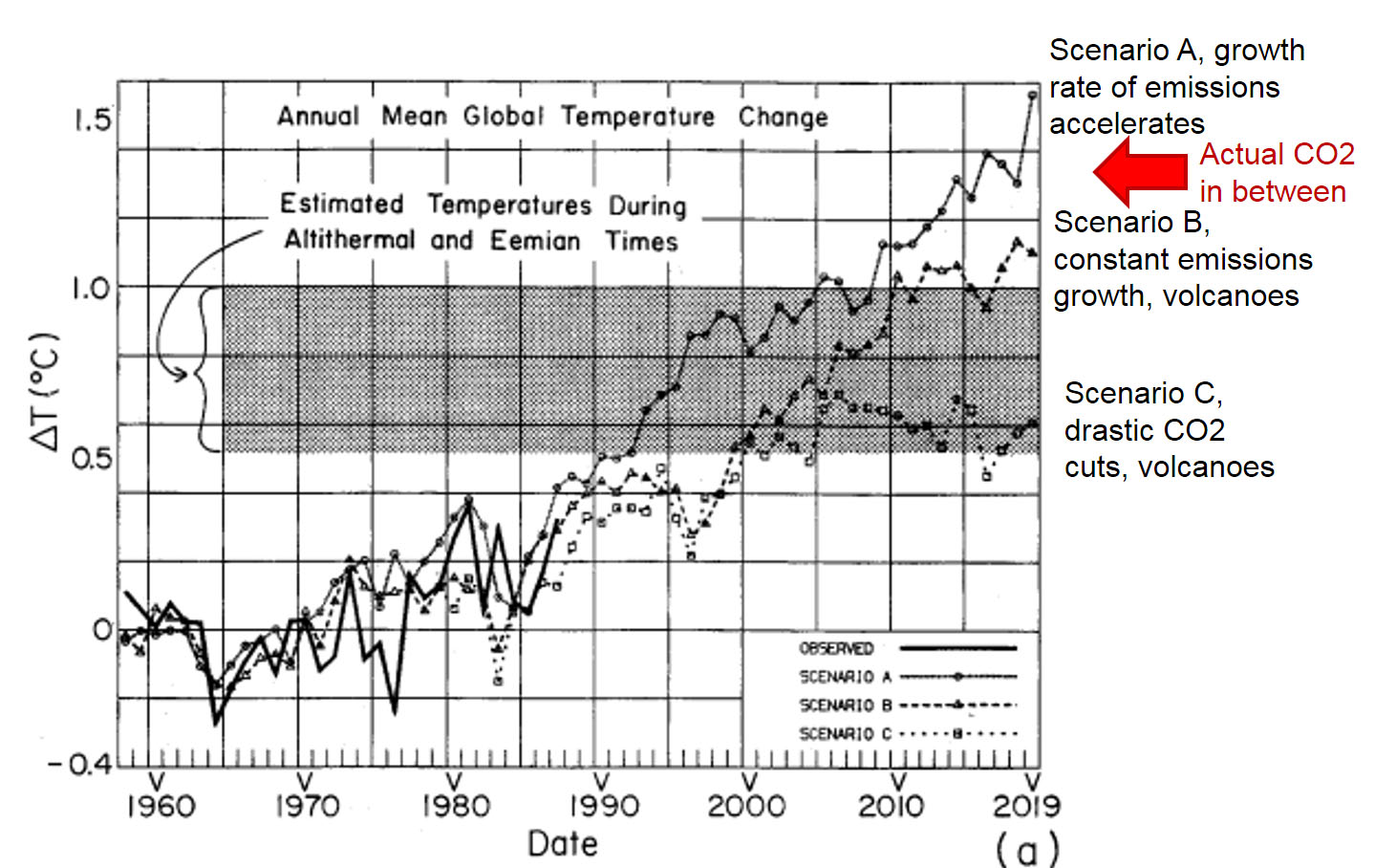
Today, the GISS admitted that McIntyre was correct, and has started to republish its data with the bug fixed.  And the numbers are changing a lot.  Before today, GISS would have said 1998 was the hottest year on record (Mann, remember, said with up to 99% certainty it was the hottest year in 1000 years) and that 2006 was the second hottest.  Well, no more.  Here are the new rankings for the 10 hottest years in the US, starting with #1:

1934, 1998, 1921, 2006, 1931, 1999, 1953, 1990, 1938, 1939

Three of the top 10 are in the last decade.  Four of the top ten are in the 1930's, before either the IPCC or the GISS really think man had any discernible impact on temperatures.  Here is the chart for all the years in the data base:
New_giss

There are a number of things we need to remember:

  • This is not the end but the beginning of the total reexamination that needs to occur of the USHCN and GISS data bases.  The poor correction for site location and urbanization are still huge issues that bias recent numbers upwards.  The GISS also has issues with how it aggregates multiple stations, apparently averaging known good stations with bad stations a process that by no means eliminates biases.  As a first step, we must demand that NOAA and GISS release their methodology and computer algorithms to the general public for detailed scrutiny by other scientists.
  • The GISS today makes it clear that these adjustments only affect US data and do not change any of their conclusions about worldwide data.  But consider this:  For all of its faults, the US has the most robust historical climate network in the world.  If we have these problems, what would we find in the data from, say, China?  And the US and parts of Europe are the only major parts of the world that actually have 100 years of data at rural locations.  No one was measuring temperature reliably in rural China or Paraguay or the Congo in 1900.  That means much of the world is relying on urban temperature measurement points that have substantial biases from urban heat.
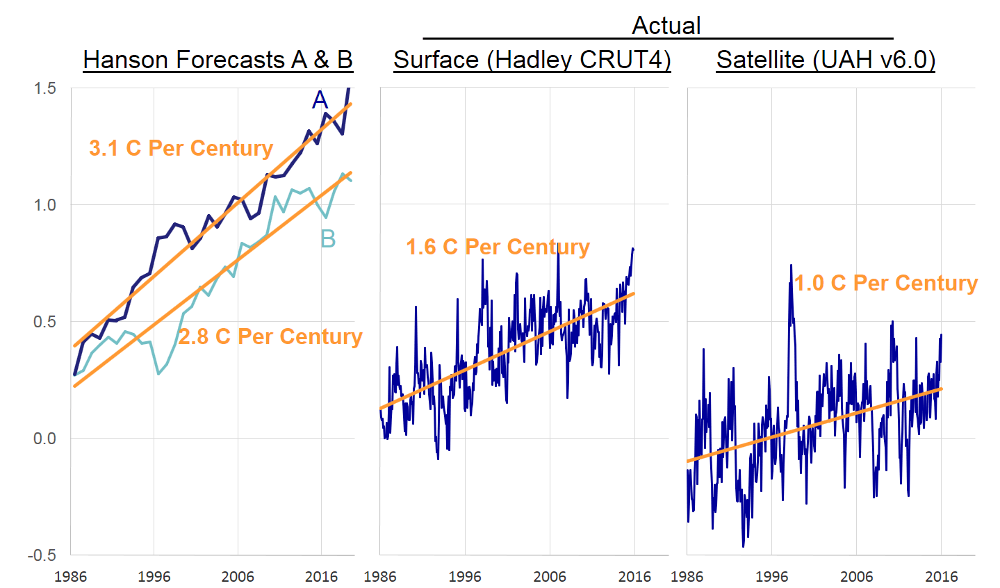
  • All of these necessary revisions to surface temperatures will likely not make warming trends go away completely.  What it may do is bring the warming down to match the much lower satellite measured warming numbers we have, and will make current warming look more like past natural warming trends (e.g. early in this century) rather than a catastrophe created by man.  In my global warming book, I argue that future man-made warming probably will exist, but will be more like a half to one degree over the coming decades than the media-hyped numbers that are ten times higher.

So how is this possible?  How can the global warming numbers used in critical policy decisions and scientific models be so wrong with so basic of an error?  And how can this error have gone undetected for the better part of a decade?  The answer to the latter question is because the global warming  and climate community resist scrutiny.  This weeks Newsweek article and statements by Al Gore are basically aimed at suppressing any scientific criticism or challenge to global warming research.  That is why NASA can keep its temperature algorithms secret, with no outside complaint, something that would cause howls of protest in any other area of scientific inquiry.

As to the first question, I will leave the explanation to Mr. McIntyre:

While acolytes may call these guys "professionals", the process of
data adjustment is really a matter of statistics and even accounting.
In these fields, Hansen and Mann are not "professionals" - Mann
admitted this to the NAS panel explaining that he was "not a
statistician". As someone who has read their works closely, I do not
regard any of these people as "professional". Much of their reluctance
to provide source code for their methodology arises, in my opinion,
because the methods are essentially trivial and they derive a certain
satisfaction out of making things appear more complicated than they
are, a little like the Wizard of Oz. And like the Wizard of Oz, they
are not necessarily bad men, just not very good wizards.

For more, please see my Guide to Anthropogenic Global Warming or, if you have less time, my 60-second argument for why one should be skeptical of catastrophic man-made global warming theory.

Update:
Nothing new, just thinking about this more, I cannot get over the irony that in the same week Newsweek makes the case that climate science is settled and there is no room for skepticism, skeptics discover a gaping hole and error in the global warming numbers.

Update #2:  I know people get upset when we criticize scientists.  I get a lot of "they are not biased, they just made a mistake."  Fine.  But I have zero sympathy for a group of scientists who refuse to let other scientists review their methodology, and then find that they have been making a dumb methodology mistake for years that has corrupted the data of nearly every climate study in the last decade.

Update #3:  I labeled this "breaking news," but don't expect to see it in the NY Times anytime soon.  We all know this is one of those asymmetric story lines, where if the opposite had occurred (ie things found to be even worse/warmer than thought) it would be on the front page immediately, but a lowered threat will never make the news.

Oh, and by he way.  This is GOOD news.  Though many won't treat it that way.  I understand this point fairly well because, in a somewhat parallel situation, I seem to be the last anti-war guy who treats progress in Iraq as good news.

Update #4: I should have mentioned that the hero of the Newsweek story is catastrophic man-made global warming cheerleader James Hansen, who runs the GISS and is most responsible for the database in question as well as the GISS policy not to release its temperature aggregation and adjustment methodologies.  From IBD, via CNN Money:

Newsweek portrays James Hansen, director of NASA's Goddard Institute for Space Studies, as untainted by corporate bribery.

Hansen
was once profiled on CBS' "60 Minutes" as the "world's leading
researcher on global warming." Not mentioned by Newsweek was that
Hansen had acted as a consultant to Al Gore's slide-show presentations
on global warming, that he had endorsed John Kerry for president, and
had received a $250,000 grant from the foundation headed by Teresa
Heinz Kerry.

Update #5: My letter to the editor at Newsweek.  For those worried that this is some weird skeptic's fevered dream, Hansen and company kind of sort of recognize the error in the first paragraph under background here.  Their US temperature chart with what appears is the revised data is here.

Update #6: Several posts are calling this a "scandal."  It is not a scandal.  It is a mistake from which we should draw two lessons:

  1. We always need to have people of opposing opinions looking at a problem.  Man-made global warming hawks expected to see a lot of warming after the year 2000, so they never questioned the numbers.  It took folks with different hypotheses about climate to see the jump in the numbers for what it was - a programming error.
  2. Climate scientists are going to have to get over their need to hold their adjustments, formulas, algorithms and software secret.  It's just not how science is done.  James Hansen saying "trust me, the numbers are right, I don't need to tell you how I got them" reminds me of the mathematician Fermat saying he had a proof of his last theorem, but it wouldn't fit in the margin.  How many man-hours of genius mathematicians was wasted because Fermat refused to show his proof (which was most likely wrong, given how the theorem was eventually proved).

Final Update:  Some parting thoughts, and recommendations, here.

Steve McIntyre Comments on Historical Temperature Adjustments

Steve McIntyre, the statistician than called into question much of the methodology behind the Mann Hockey Stick chart, has some observations on adjustments to US temperature records I discussed here and here.

Eli Rabett and Tamino have both advocated faith-based climate
science in respect to USHCN and GISS adjustments. They say that the
climate "professionals" know what they're doing; yes, there are
problems with siting and many sites do not meet even minimal compliance
standards, but, just as Mann's "professional" software was able to
extract a climate signal from the North American tree ring data, so
Hansen's software is able to "fix" the defects in the surface sites.
"Faith-based" because they do not believe that Hansen has any
obligation to provide anything other than a cursory description of his
software or, for that matter, the software itself. But if they are
working with data that includes known bad data, then critical
examination of the adjustment software becomes integral to the
integrity of the record - as there is obviously little integrity in
much of the raw data.

While acolytes may call these guys "professionals", the process of
data adjustment is really a matter of statistics and even accounting.
In these fields, Hansen and Mann are not "professionals" - Mann
admitted this to the NAS panel explaining that he was "not a
statistician". As someone who has read their works closely, I do not
regard any of these people as "professional". Much of their reluctance
to provide source code for their methodology arises, in my opinion,
because the methods are essentially trivial and they derive a certain
satisfaction out of making things appear more complicated than they
are, a little like the Wizard of Oz. And like the Wizard of Oz, they
are not necessarily bad men, just not very good wizards.

He goes on to investigate a specific example the "professionals" use
as a positive example, demonstrating they appear to have a Y2K error in
their algorithm.   This is difficult to do, because like Mann, government scientists maintaining a government temperature data base taken from government sites paid for with taxpayer funds refuse to release their methodology or algorithms for inspection.

In the case cited, the "professionals" also make adjustments that imply the site has
decreasing urbanization over the last 100 years, something I am not
sure one can say about any site in the US except perhaps for a few
Colorado ghost towns.  The "experts" also fail to take the basic step of actually analyzing the site itself which, if visited, would reveal recently installed air conditioning unites venting hot air on the temperature instrument.   

A rebuttal, arguing that poor siting of temperature instruments is OK and does not affect the results is here.  I find rebuttals of this sort really distressing.  I studied physics for a while, before switching to engineering, and really small procedural mistakes in measurement could easily invalidate one's results.  I find it amazing that climate scientists seek to excuse massive mistakes in measurement.  I'm sorry, but in no other branch of science are results considered "settled" when the experimental noise is greater than the signal.  I would really, really, just for once, love to see a anthropogenic global warming promoter say "well, I don't think the siting will change the results, but you are right, we really need to go back and take another pass at correcting historical temperatures based on more detailed analysis of the individual sites."

More Thoughts on Historic Temperature Adjustments

A few posts back, I showed how nearly 85% of the reported warming in the US over the last century is actually due to adjustments and added fudge-factors by scientists rather than actual measured higher temperatures.  I want to discuss some further analysis Steve McIntyre has done on these adjustments, but first I want to offer a brief analogy.

Let's say you had two compasses to help you find north, but the compasses are reading incorrectly.  After some investigation, you find that one of the compasses is located next to a strong magnet, which you have good reason to believe is strongly biasing that compass's readings.  In response, would you

  1. Average the results of the two compasses and use this mean to guide you, or
  2. Ignore the output of the poorly sited compass and rely solely on the other unbiased compass?

Most of us would quite rationally choose #2.  However, Steve McIntyre shows us a situation involving two temperature stations in the USHCN network in which government researchers apparently have gone with solution #1.  Here is the situation:

He compares the USHCN station at the Grand Canyon (which appears to be a good rural setting) with the Tucson USHCN station I documented here, located in a parking lot in the center of a rapidly growing million person city.   Unsurprisingly, the Tucson data shows lots of warming and the Grand Canyon data shows none.  So how might you correct Tucson and the Grand Canyon data, assuming they should be seeing about the same amount of warming?  Would you
average them, effectively adjusting the two temperature readings
towards each other, or would you assume the Grand Canyon data is cleaner
with fewer biases and adjust Tucson only?   Is there anyone who would not choose the second option, as with the compasses?

The GISS data set, created by the Goddard Center of NASA, takes the USHCN data set and somehow uses nearby stations to correct for anomalous stations.  I say somehow, because, incredibly, these government scientists, whose research is funded by taxpayers and is being used to make major policy decisions, refuse to release their algorithms or methodology details publicly.  They keep it all secret!  Their adjustments are a big black box that none of us are allowed to look into  (and remember, these adjustments account for the vast majority of reported warming in the last century).

We can, however, reverse engineer some of these adjustments, and McIntyre does.  What he finds is that the GISS appears to be averaging the good and bad compass, rather than throwing out or adjusting only the biased reading.  You can see this below.  First, here are the USHCN data for these two stations with only the Time of Observation adjustment made (more on what these adjustments are in this article).
Grand_12

As I said above, no real surprise - little warming out in undeveloped nature, lots of warming in a large and rapidly growing modern city.  Now, here is the same data after the GISS has adjusted it:

Grand_15

You can see that Tucson has been adjusted down a degree or two, but Grand Canyon has been adjusted up a degree or two (with the earlier mid-century spike adjusted down).  OK, so it makes sense that Tucson has been adjusted down, though there is a very good argument to be made that it should be been adjusted down more, say by at least 3 degrees**.  But why does the Grand Canyon need to be adjusted up by about a degree and a half?  What is biasing it colder by 1.5 degrees, which is a lot?  The answer:  Nothing.  The explanation:  Obviously, the GISS is doing some sort of averaging, which is bringing the Grand Canyon and Tucson from each end closer to a mean. 

This is clearly wrong, like averaging the two compasses.  You don't average a measurement known to be of good quality with one known to be biased.  The Grand Canyon should be held about the same, and Tucson adjusted down even more toward it, or else thrown out.  Lets look at two cases.  In one, we will use the GISS approach to combine these two stations-- this adds 1.5 degrees to GC and subtracts 1.5 degrees from Tucson.  In the second, we will take an approach that applies all the adjustment to just the biases (Tucson station) -- this would add 0 degrees to GC and subtract 3 degrees from Tucson.  The first approach, used by the GISS, results in a mean warming in these two stations that is 1.5 degrees higher than the more logical second approach.  No wonder the GISS produces the highest historical global warming estimates of any source!  Steve McIntyre has much more.

** I got to three degrees by applying all of the adjustments for GC and Tucson to Tucson.  Here is another way to get to about this amount.   We know from studies that urban heat islands can add 8-10 degrees to nighttime urban temperatures over surrounding undeveloped land.  Assuming no daytime effect, which is conservative, we might conclude that 8-10 degrees at night adds about 3 degrees to the entire 24-hour average.

Postscript: Steve McIntyre comments (bold added):

These adjustments are supposed to adjust for station moves - the
procedure is described in Karl and Williams 1988 [check], but, like so
many climate recipes, is a complicated statistical procedure that is
not based on statistical procedures known off the island.
(That's not
to say that the procedures are necessarily wrong, just that the
properties of the procedure are not known to statistical civilization.
)
When I see this particular outcome of the Karl methodology, my
impression is that, net of the pea moving under the thimble, the Grand
Canyon values are being blended up and the Tucson values are being
blended down. So that while the methodology purports to adjust for
station moves, I'm not convinced that the methodology can successfully
estimate ex post the impact of numerous station moves and my guess is
that it ends up constructing a kind of blended average.

LOL.  McIntyre, by the way, is the same gentleman who helped call foul on the Mann hockey stick for bad statistical procedure.