Climate Humor from the New York Times
Though this is hilarious, I am pretty sure Thomas Lovejoy is serious when he writes
But the complete candor and transparency of the [IPCC] panel’s findings should be recognized and applauded. This is science sticking with the facts. It does not mean that global warming is not a problem; indeed it is a really big problem.
This is a howler. Two quick examples. First, every past IPCC report summary has had estimates for climate sensitivity, ie the amount of temperature increase they expect for a doubling of CO2 levels. Coming into this IPCC report, emerging evidence from recent studies has been that the climate sensitivity is much lower than previous estimates. So what did the "transparent" IPCC do? They, for the first time, just left out the estimate rather than be forced to publish one that was lower than the last report.
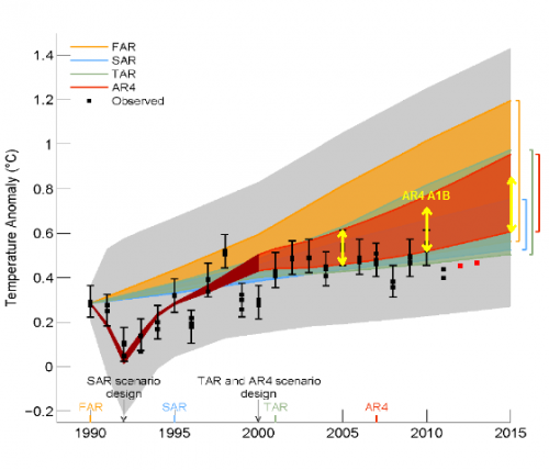
The second example relates to the fact that temperatures have been flat over the last 15-17 years and as a result, every single climate model has overestimated temperatures. By a lot. In a draft version, the IPCC created this chart (the red dots were added by Steve McIntyre after the chart was made as the new data came in).
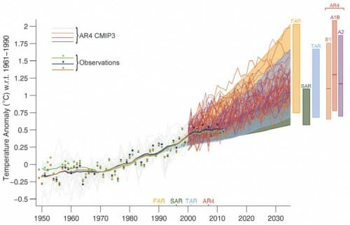
This chart was consistent with a number of peer-reviewed studies that assessed the performance of climate models. Well, this chart was a little too much "candor" for the transparent IPCC, so they replaced it with this chart in the final draft:
What a mess! They have made the area we want to look at between 1990 and the present really tiny, and then they have somehow shifted the forecast envelopes down on several of the past reports so that suddenly current measurements are within the bands. They also hide the bottom of the fourth assessment band (orange FAR) so you can't see that observations are out of the envelope of the last report. No one so far can figure out how they got the numbers in this chart, and it does not match any peer-reviewed work. Steve McIntyre is trying to figure it out.
OK, so now that we are on the subject of climate models, here is the second hilarious thing Lovejoy said:
Does the leveling-off of temperatures mean that the climate models used to track them are seriously flawed? Not really. It is important to remember that models are used so that we can understand where the Earth system is headed.
Does this make any sense at all? Try it in a different context: The Fed said the fact that their economic models failed to predict what actually happened over the last 15 years is irrelevant because the models are only used to see where the economy is headed.
The consistent theme of this report is declining certainty and declining chances of catastrophe, two facts that the IPCC works as hard as possible to obfuscate but which still come out pretty clearly as one reads the report.

