Posts tagged ‘graphs’

Phoenix Transit Ridership Continues to Fall as Light Rail Investment Goes Up

Well, the numbers are in for the 2017 fiscal year (which ends June 30) and after another huge investment in light rail, Phoenix has lost more transit ridership.   From the Valley Metro web site:

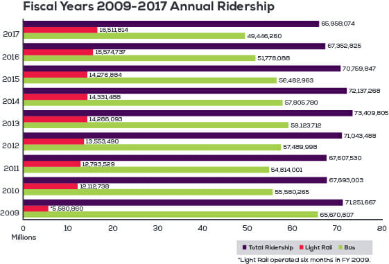
First, credit where it is due.  After years of bizarre chartsmanship where bars on their graphs bore only a passing relationship to the numbers being graphed, Valley Metro seems to have adopted a new (or their first) graphing program.

As you can see, while light rail trips were up by about a million, bus trips were again down by over 2 million, for a net loss in transit ridership of over a million, the fourth year in a row this has been the case.  I had expected rail ridership to rise, since in 2016 the rail system was expanded by 31% in length and 36% in cumulative investment.  This extension resulting in a 15.6% increase in rail ridership between 2015 and 2017.  Early on, I got in a debate with supporters of the line arguing that since they had cherry-picked the densest corridor in town to start, incremental extensions would actually reduce ridership per mile because they would be serving less promising routes.  Supporters argued that I was ignoring network effects and that ridership would rise faster than line length.  I guess we are sorting out that argument now.

In the ten years leading up to the opening of the light rail line, transit ridership grew by an average of 6.7% a year in Phoenix.  In the 8 years since the rail line's opening, total transit ridership has fallen 1% per year.  This is a well known effect (at least well known to all but rail die-hards) that Randal O'Toole, among others, has been pointing out for years.  Since light rail is an order of magnitude more expensive to operate per passenger-mile, and since transit budgets are never infinite, growing light rail tends to strangle bus traffic, because bus routes and service have to be cut to feed money into the light rail money pit.  Since every dollar spent on rail moves fewer passengers than a dollar spent on buses, transferring money from buses to trail reduces total ridership.  It is worth noting that had the line not been built and bus transit had been allowed to grow as it had before the line, there might have been over 40 million more trips last year assuming pre-2009 growth rates.

Yes the Middle Class is Shrinking. And the Ranks of the Poor Are Shrinking. Because Americans are Getting Wealthier

Mark Perry has a number of good graphs that show that the shrinking of the middle class is real, but only because they are moving to "rich" -- hardly the implication of those on the Left who are trying to demagogue the issue.  Check them out if you have not seen them but this animated graph was new to me:

econ

Note the general movement to the right.

Interestingly, the only block on the low side getting larger is the percent of people at "zero".    In my mind, this just reinforces my point that the poverty issue is primarily one of having a job, not the rate paid at the job.  For that growing cohort at zero, raising the minimum wage only makes it more likely they stay at zero.

Never, Ever Trust Media Reporting of Scientific (Or Quasi-Scientific) Studies -- The Github Sexism Study and the Response.

I recommend this article (via Tyler Cowen) on the interesting topic of whether women's open source software contributions on Github are accepted more or less frequently than those of men.   The findings of the study are roughly as follows:

They find that women get more (!) requests accepted than men for all of the top ten programming languages. They check some possible confounders – whether women make smaller changes (easier to get accepted) or whether their changes are more likely to serve an immediate project need (again, easier to get accepted) and in fact find the opposite – women’s changes are larger and less likely to serve project needs. That makes their better performance extra impressive....

Among insiders [essentially past contributors], women do the same as men when gender is hidden, but better than men when gender is revealed. In other words, if you know somebody’s a woman, you’re more likely to approve her request than you would be on the merits alone. We can’t quantify exactly how much this is, because the paper doesn’t provide numbers, just graphs. Eyeballing the graph, it looks like being a woman gives you about a 1% advantage. I don’t see any discussion of this result, even though it’s half the study, and as far as I can tell the more statistically significant half.

Among outsiders, women do the same as/better than men when gender is hidden, and the same as/worse than men when gender is revealed. I can’t be more specific than this because the study doesn’t give numbers and I’m trying to eyeball confidence intervals on graphs. The study itself say that women do worse than men when gender is revealed, so since the researchers presumably have access to their real numbers data, that might mean the confidence intervals don’t overlap. From eyeballing the graph, it looks like the difference is 1% – ie, men get their requests approved 64% of the time, and women 63% of the time. Once again, it’s hard to tell by graph-eyeballing whether these two numbers are within each other’s confidence intervals.

OK, so generally good news for women on all fronts -- they do better than men -- with one small area (63 vs 64 percent) where there might or might not be an issue.

This was an interesting side bit:

Oh, one more thing. A commenter on the paper’s pre-print asked for a breakdown by approver gender, and the authors mentioned that “Our analysis (not in this paper — we’ve cut a lot out to keep it crisp) shows that women are harder on other women than they are on men. Men are harder on other men than they are on women.”

Depending on what this means – since it was cut out of the paper to “keep it crisp”, we can’t be sure – it sounds like the effect is mainly from women rejecting other women’s contributions, and men being pretty accepting of them. Given the way the media predictably spun this paper, it is hard for me to conceive of a level of crispness which justifies not providing this information.

So here is an example press report of this study and data:

Here’s Business Insider: Sexism Is Rampant Among Programmers On GitHub, Research Finds. “A new research report shows just how ridiculously tough it can be to be a woman programmer, especially in the very male-dominated world of open-source software….it also shows that women face a giant hurdle of “gender bias” when others assess their work. This research also helps explain the bigger problem: why so many women who do enter tech don’t stick around in it, and often move on to other industries within 10 years. Why bang your head against the wall for longer than a decade?” [EDIT: the title has since been changed]

This article, and many many like it, bear absolutely no relationship to the actual data in the study.  Since the article of course is all most people even read, now a meme is created forever in social media that is just plain wrong.  Nice job media.

Kevin Drum Inadvertently Undermines His Own Keynesianism

This is a follow-up from a post this morning here.  Kevin Drum is a Keynesian who thinks that the government is committing economic suicide if it does not increase its spending substantially during and after a recession.  Kevin Drum is also a fierce partisan who wants to defend President Obama against his detractors.  Unfortunately, trying to do the two simultaneously has led to what I think may be an embarrassing result for him.

In the chart below, I combine two graphs of his.  The one on the left is a chart from last year in a Mother Jones cover story blasting "austerity" and lamenting how dumb it was to decrease spending in the years after a recession.  The chart on the right is from the other day, when Drum is agreeing with Paul Krugman that the recession recovery under Obama has been much stronger than the one under Bush II.  The result is a juxtaposition that seems to undermine his Keynesian assumptions - specifically, the recession where we had the "austerity" was the one with the better recovery.  The only thing I have done to his charts is removed lines in the left chart for other past recessions and changed the line colors on the two charts to match.   You can click to enlarge:

click to enlarge

The blue line is the Bush II recession, the red line is the Obama recession.  I believe the start dates are consistent in both charts.  All the numbers and choice of start dates and measurement scales are Drum's.  Don't yell at me for something in the chart construction being unfair -- they are his choices.

The conclusion?  Higher government spending seems to inhibit recovery.  Thanks Kevin!

Graphics Fail

One of the classic mistakes in graphics is the height / volume fail.  This is how it works:  the length of an object is used to portray some sort of relative metric.  But in the quest to make the graphic prettier, the object is turned into a 2D, or worse, 3D object.  This means that for a linear dimension where one object is 2x as long as another, its area is actually 4x the other and its volume is 8x.  The eye tends to notice the area or volume, so that the difference is exaggerated.

This NY Times graph is a great example of this fail (via here)

The Tebow character is, by the data, supposed to be about 1.7x the Brady character.  And this may be true of the heights, but visually it looks something like 4x larger because the eye is processing something in between area and volume, distorting one's impression of the data.   The problem is made worse by the fact that the characters are arrayed over a 3D plane.   Is there perspective at work?  Is Rodgers smaller than Peyton Manning because his figure is at the back, or because of the data?  The Vick figure, by the data, should be smaller than the Rodgers figure but due to tricks of perspective, it looks larger to me.

This and much more is explained in this Edward Tufte book, the Visual Display of Quantitative Information.  You will find this book on a surprising number of geek shelves (next to a tattered copy of Goedel-Escher-Bach) but it is virtually unknown in the general populace.  Every USA Today graphics maker should be forced to read it.