I am always amazed that folks, say those in government in places like San Francisco, consistently support restricting the supply of new housing while subsidizing home buyers and then are surprised when prices and rents keeps rising. From the Market Urbanism Report via Walter Olson.
But a look at the numbers shows that, on the contrary, housing construction (or lack thereof) seems to be the driving factor behind whether or not large U.S. metros remain affordable.
This would be the conclusion from 7 years of data from the Census Bureau, which publishes annual lists on the number of new privately-owned housing units authorized in each metro area. Between 2010 and 2016, when overall national housing permits ticked up each year following the recession, most major metros have issued housing permit numbers in the high 4- or low 5-figures annually. But three metros have stood far above the rest.
The Dallas-Fort Worth-Arlington MSA issued 273,853 housing permits over this 7-year period; New York-Newark-Jersey City issued 283,814; and Houston-The Woodlands-Sugar Land topped every metro with 316,639 permits. Combined, the 3 metros accounted for 13.5% of the nation’s approved housing units.
Other metros weren’t even close to these three....
These statistics are glaring, and show that the urban housing affordability crisis, and its solution, is far simpler than many pundits suspect. In their ongoing quest to satisfy their anti-growth biases, they’ve settled on demand-side responses (read: government subsidies) that ignore or worsen the fundamental problem of under-supply; while they continue to blame various third party boogeymen, including developers, landlords, Airbnb hosts, techies, hipsters, Asian families buying second homes, and migrants in general.
But, again, the Census data sheds light on the actual nature of the issue: some metros in America are building a LOT of housing. Other metros may think they are, but actually are not. And housing prices within given metros are either stabilizing or skyrocketing based on this decision.
I have written about this mix effect many times, eg here. Imagine a corporate division that sells tables and chairs. The CEO is reviewing this division's performance, and sees that their revenues are increasing but their profit margin is falling. He asks his analyst to look into it - is it the tables or the chairs or both that are showing falling margins. Our poor harassed analyst comes back and says, uh, neither. The profit margins for both tables and chairs went up last year. Well, the CEO asks, if revenues are up and all their component margins are going up, how is their total margin falling? It turns out that tables make a much higher margin than chairs, and over the last year the company has seen a much higher growth in chair sales than table sales. The mix is shifting towards a lower margin product and is bringing the averages down. By the way, I can say with authority that this conversation is much harder when the analyst is yours truly and the CEO is famed tough (but talented) boss Chuck Knight of Emerson Electric.
One mystery of this economic expansion is that wage growth has remained slow even as the labor market has finally tightened. One widely cited culprit is historically low productivity growth. But a new analysis from the Federal Reserve Bank of San Francisco adds a more optimistic, albeit paradoxical, explanation.
The Bureau of Labor Statistics recently reported that median weekly earnings had risen in July by a healthy 4.2% on an annual basis, the fastest growth in a decade. As labor markets tighten, employers typically increase wages. Until this past year, however, median weekly earnings growth had hovered near 2%, which is significantly less than the 3.25% average from 1983 to 2015.
So why haven’t wages risen faster amid an increase in hiring and unfilled jobs? One answer is that wages have actually been growing at a faster clip—around 4% to 5%—at least for full-time workers with steady jobs. But new full-time workers who are generally paid less than the retirees they replace are dragging down the average wage increase.
Researchers at the San Francisco Fed this week updated their 2016 paper that disaggregated the wages of full-time workers with steady employment from recent entrants—that is, new workers or those returning to full-time work. Their earlier analysis showed that average wage growth had slowed less than expected during the recession while staying relatively flat during the recovery.
That’s because workers who lost jobs during the recession were generally lower skilled and lower paid, so average weekly wages didn’t fall significantly. However, many of those workers have since been rehired at below-average wages, which has depressed the aggregate.
In prior expansions, wage growth has been driven mostly by continuously full-time employed workers, and the researchers find that’s still the case. Wage growth for these workers is now close to the pre-recession 2007 peak. But there are now many more workers who have been on the labor-force sidelines who are moving to full-time employment, thus creating a drag on wages.
This is frequently how mix shifts play out in the news. Notice that there are actually two pieces of good news here: 1. Wages for full-time workers who have been employed for a while are growing well and 2. lower-skilled and less experienced workers who left the labor force are now getting jobs and returning to work. However, when these are combined, the net is portrayed as bad news, ie wage growth in the US is sluggish. Because the mix was ignored.
For some reason, it appears that building hotels next to city convention centers is a honey pot for politicians. I am not sure why, but my guess is that they spend hundreds of millions or billions on a convention center based on some visitation promises. When those promises don't pan out, politicians blame it on the lack of a hotel, and then use public money for a hotel. When that does not pan out, I am not sure what is next. Probably a sports stadium. Then light rail. Then, ? It just keeps going and going....
When Phoenix leaders opened the Sheraton in 2008, they proclaimed it would be a cornerstone of downtown's comeback. They had one goal in mind: lure big conventions and tourism dollars. Officials argued the city needed the extra hotel beds to support its massive taxpayer-funded convention center a block away.
Finally, we may be at an end, though politicians are still hoping for some sort of solution that better hides what a sorry expenditure of tax money this really was
Phoenix has entered into exclusive negotiations to sell the city-owned Sheraton Grand Phoenix downtown hotel —the largest hotel in Arizona — for $255 million.
The city signed a letter of intent with TLG Phoenix LLC, an investment company based in Florida, to accept the offer and negotiate a purchase contract, city officials announced Tuesday evening.
But the deal faces criticism from some council members concerned about the loss to taxpayers. The city also attempted, unsuccessfully, to sell the hotel to the same buyer for a higher price last year.
If Phoenix ultimately takes the offer, the city's total losses on the taxpayer-funded Sheraton could exceed $100 million.
The city still owes $306 million on the hotel and likely would have to pay that off, even after a sale. That would come on top of about $47 million the city has sunk into the hotel, largely when bookings dropped due to the recession.
...
In addition to taking a loss on the building, Phoenix would give the buyer a property-tax break — the city hasn't released a potential value for that incentive — and transfer over a roughly $13 million reserve fund for hotel improvements.
Update: Phoenix is in the top ten US cities in terms of hotel room capacity, so city government of course detects that there is a market failure such that the city ... needs more hotel rooms, so it gets the government in the business of building more. Good plan.
Here is the trick: You want a tax increase for X. The public is never going to approve of raising taxes for X. So you bundle 95% X with 5% Y, Y being something the public is really excited about. As much as possible, you never mention X in any discussion of the tax increase, despite most of the funds being dedicated to X, and instead focus solely on Y. If history is any guide, you will get your tax increase.
What a specific example? You want a tax increase to fund a huge public transit boondoggle. The public is not buying it. So you rebrand the public transit project as a "transportation bill", you throw in a few highway improvements, you talk mainly about the highway improvements, and you get your public transit bill.
Another example is general revenue increases. Most of these tax increases go to increasing the salary and pensions of bureaucrats and senior administrators that aren't really doing anything the public wants done in the first place. So you say the tax increase is to improve the pay of three (and only these three) categories of workers: police, firefighters, and teachers. The public likes what these folks do, and could mostly care less about what anyone else in local government does. So even if the taxes help about just 3 teachers among 3000 other bureaucrats, you sell it as a teacher salary increase.
'Yikes!': Some Arizona teachers see little from Prop. 123
For months leading up to the vote on Proposition 123, supporters of the public education funding measure pleaded for its passage, saying it represented money for teachers.
But as the first installment of cash has gone out, many teachers may find Prop. 123 is a smaller windfall than they hoped. And voters may be surprised to learn where some of the money is going.
In some cases, teachers will collect less than 20 percent of their district's Prop. 123 funds. Some districts will use most of their money for other purposes, ranging from textbooks to computers to school buses, according to an Arizona Republicsurvey of district spending plans.
The measure was sold as a way to direct money — significant money — to teachers and classrooms....
With no rules on how the money can be used, each school district has tried to address its own priorities. While many supporters of the measure invoked teachers as the main reason to vote for Prop. 123, others in the public school systems have staked a claim to the money, especially after many went years without raises beginning in the recession.
Those seeing raises include relatively low-paid secretaries, custodians and bus drivers. But it also includes superintendents, principals and mid-level administrators who don’t work in classrooms.
That may not sit well with voters who opposed the measure or with supporters who thought they were doing something more substantive for teachers.
Alex Tabarrok discusses some academic work that shows a declining inter-regional mobility in the United States which is causing local economic declines to last much longer than they used to last.
In a new paper, also cited by Leubsdorf, Danny Yagan at Berkeley suggests that reduced migration is only part of the problem. What has made the aftermath to the 2008-2009 recession so bad is that migration is low at the same time that it has become more necessary than ever. The 2008-2009 recession was especially localized, it hit some places harder than others and in a way that appears to be permanent. But migration has been too slow to solve the problem.
The usual story is that in-and-out migration equalizes wage, unemployment and employment rates across the nation. Some places may be harder hit than others but movement quickly makes the US into one labor market. In the aftermath of this recession, however, that isn’t happening for employment rates. Using a clever research design that looks at workers with similar education and skills doing the same jobs at the same large firms but in different locations, Yagan finds that location continues to matter years after the recession has ended. Workers who worked in the places hardest hit in the 2007-2009 recession have employment rates today that are 1% lower than similar workers in regions that were less hard hit.
It is probably unfair for me to comment on this because I have been highly mobile in my life, having lived and worked in about 10 places as diverse as Houston, Dallas, Boston, Boulder, Seattle, Phoenix, St. Louis. However, I will take a shot at this. Some of my hypotheses:
Government programs to encourage home ownership have reduced mobility. It is simply harder to move if one has a house to sell, and this was worse in the last recession, which was driven in large part by falling home prices, which made it even harder to move when one has an underwater home to sell.
Political/Cultural redlining reduces mobility. As an example, certain millennials want to be nowhere else but San Francisco, despite how absurdly hard it is to live there. They will starve in poverty there before going to, say, Houston, which is an easy place to live when one is young but which many consider to be a evil redneck backwater.
Use of Communication technology causes people to think they can reduce mobility when they perhaps can't. I think a lot of folks with modern communication technology assume that location is irrelevant and that they should be able to do X work anywhere they want. I think they are overestimating where many industries and companies are right now (though they may be correct in the future). Just from tax compliance and regulatory perspectives, it is pure hell for a company in, say, Texas to have an employee in, say, California. Plus I think there are still real networking and management reasons for employees to be concentrated in facilities.
Let's start by saying that I have an imperfect layman's view of Keynes and Hayek. This is my understanding and over-simplification of how these camps deal with economic downturns.
Keynes: Economic downturns result from some sort of failure of aggregate demand. There are positive feedbacks in the system such that a small downturn can lead to a larger downturn if left unchecked (but on the flip side mean that a small stimulus can have a disproportionately large effect on demand). The proper government response to a downturn is to create demand through government deficit spending. Failure to emerge in a timely manner from a recession likely is the result of the government not being aggressive enough in its spending.
Hayek: Economic downturns result from mis-allocation of savings and investment capital, often due to government policy by not necessarily so (one can argue the housing bubble was driven by government policy, but the first Internet bubble likely was not). The proper government response to a recession is to stop any distorting government policy that drove it and let the economy sort itself out by restructuring. Failure to emerge in a timely manner from a recession is likely due to interventions that slow this necessary restructuring (e.g. bailouts, government-directed investment programs).
I will say that if my Hayek description is not correct for the Austrians, it is correct for me -- this is what I believe happens.
That said, I have long thought the Japanese lost decade(s) were pretty much final proof of the Hayek vs. Keynes explanation, and I am sort of amazed people still argue about it. I remember in the 80's people in the US admired the Japanese MITI system of industrial management that carefully directed investment into government-preferred industries and, by the way, stomped on the Japanese consumer (including laws that kept both the retail and agricultural sectors backwards) in favor of promoting the export market.
In the 20+ years since Japan slid into a downturn, they have been the poster child for Keynesian stimulation. They have deficit spent like crazy and have driven up -- by a longshot -- the largest government debt as a percent of GDP of any of the industrialized nations. Yet still they flounder -- I would argue precisely because they had an Austrian recession, based on years and years of government-enforced mal-investment, but have refused the Austrian solution. Watching it evolve over the years, I have thought it impossible to miss the point, but it appears that Krugman-Keynesians can always argue, not matter how much government debt was run up, that the problem was that they just didn't spend enough.
Well, in my view we have another such test coming, perhaps even more stark -- in China. China, perhaps more than Japan, has filled their economy with investment distortions -- the huge empty cities that get shown on the Internet seem to be one example.
And over the past year or two, China has been deficit spending and stimulating like hell -- both at the central government level as well as with policies that have encouraged the accumulation of debt both locally and in industry.
This is why I think the crash is coming in China, and the longer they manage to delay it by artificial means, the worse and longer the crash will be. There is probably a bet that could be had here, but I am not sure how it would be structured.
When I was in school learning macro 101 from Baumol and Blinder, my memory is that the theory of Keynesian stimulus and managing the economic cycle was that deficits should be run in the bottom part of the economic cycle, paid for with surpluses in the top half. So we are now almost certainly in the top half of the cycle. But I don't hear any Keynesians seeking to run a surplus, or even to dial back on government deficits or spending. In fact, our Keynesian-in-chief says he is done with "mindless austerity" and wants to start spending even harder in 2015.
Its enough to make one suspicious that all the stimulus talk is just a Trojan Horse for a desire to increase the size and power of government.
But for Keynesians who really believe what they are saying, that deficit spending somehow saved us from a depression in 2009 and 2010, then I ask you -- what are you going to do next time? It appears that when we enter the next recession in this country, that US debt as a percentage of GDP is going to be almost twice what it was entering the last recession. Don't you worry that this limits your flexibility and ability to ramp up deficit spending in the next recession?
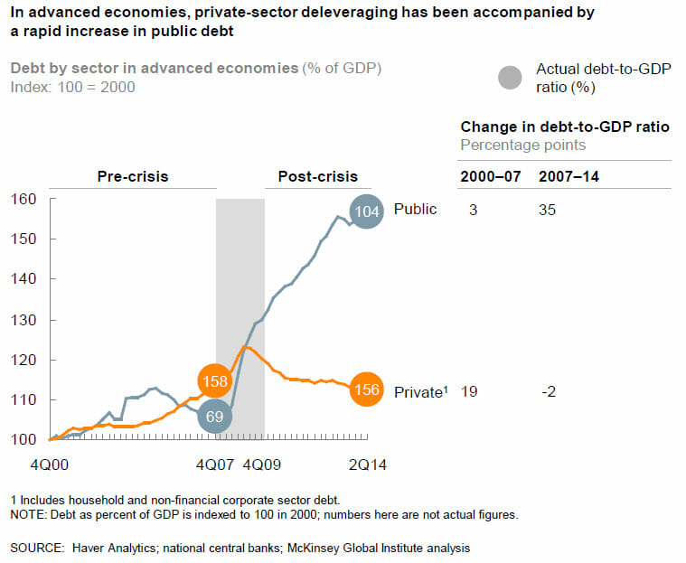
The situation in the US is the same as it is worldwide. While those evil private short-term-focused private actors have used the improving economy to de-leverage back below 2007 levels, governments have increased their debt as a percentage of GDP by just over 50% since just before the last recession.
Since 2007, according to my old friends at McKinsey, global government debt has risen by $25 trillion since 2007. If you really care about Keynesian stimulus in recessions, and not just "mindlessly" (I can use that term too) increase government spending, wouldn't you want to be building up some reserves for next time?
President Obama wants to spend something like a half trillion incremental dollars on "infrastructure". I have found that these initiatives to sell infrastructure tend to be great bait and switch programs. Infrastructure is generally the one type of government spending that polls well across all parties and demographics. So it is used by government officials to pass big spending increases, but in fact what really happens is that the government takes a wish-list of stuff that most of the public would not be OK with increasing spending on, then they put a few infrastructure projects on top like a cherry to sell the thing. They call it an "infrastructure" program when in fact it is no such thing.
Obama would never do that, right? Hope and change? In fact, he already has. The first time around he sold the stimulus bill as mainly an infrastructure spending bill -- remember all that talk of shovel-ready projects? Only a trivial percentage of that bill was infrastructure. At most 6% was infrastructure, and in practice a lot less since Obama admitted later there were no shovel-ready projects. (also here). The rest of it was mainly stuff like salary support for state government officials. Do you think he would have as easily sold the "wage support for state government officials" bill in the depth of a recession? No way, so he called it, falsely, an infrastructure bill.
The other bait and switch that occurs is within the infrastructure category. We have seen this at the state level in AZ several times. Politicians love light rail, for some reason I do not understand, perhaps because it increases their personal power in a way that individual driving does not. Anyway, they always want money for light rail projects, but bills to fund light rail almost always fail. So they tack on a few highway projects, that people really want, call it a highway bill and pass it that way. But it turns out most of the money is for non-highway stuff. That is the other bait and switch that occurs.
Expect to see both of these with the new infrastructure proposal.
By the way, Randal O'Toole has a nice summary of the drawbacks of light rail and trolley spending
For the past two decades or so, however, much of our transportation spending has focused on infrastructure that is slower, more expensive, less convenient, and often more dangerous than before. Too many cities have given up on trying to relieve congestion. Instead, they have allowed it to grow while they spend transportation dollars (nearly all paid by auto users) on other forms of travel such as rail transit. Such transportation is:
Slower: Where highway speeds even in congested cities average 35 miles per hour or more, the rail transit lines built with federal dollars mostly average 15 to 20 mph.
More expensive: In 2013, Americans auto users spent less than 45 cents per vehicle mile (which means, at average occupanies of 1.67 people per car, about 26 cents per passenger mile), and subsidies to roads average under a penny per passenger mile. By comparison, transit fares are also about 26 cents per passenger mile, but subsidies are 75 cents per passenger mile.
Less convenient: Autos can go door to door, while transit requires people to walk or use other forms of travel, often at both ends of the transit trip.
Less safe: For every billion passenger miles carried, urban auto accidents kill about 5 people, while light rail kills about 12 people and commuter trains kill 9. Only subways and elevateds are marginally safer than auto travel, at 4.5, but we haven’t built many of those lately.
I know I have been warning about a Chinese recession/depression for a while, but it takes a while (and still will take some time) for this disaster to play out. But the warning signs are all there. This article today in the WSJ is a great example.
A little over a year ago, a Chinese credit agency downgraded a government-owned financing company in this dusty industrial city. Default—nearly unheard-of in China on government bonds—was a possibility, it said.
But during discussions with lenders, city officials made sure Wuhan Urban Construction Investment & Development Corp. could keep borrowing, officials with knowledge of the matter say. The city during those discussions said it backed the finance firm, essentially guaranteeing the debt, and helped the company restructure its assets to entice investors to lend more.
Borrowing by firms like Wuhan Urban is a big reason China’s debt load is expanding. The International Monetary Fund says China’s debt is growing more rapidly than debt in Japan, South Korea and the U.S. did before they tumbled into deep recessions. Local-government borrowing is responsible for one-fourth of the buildup in China’s overall domestic debt since 2008....
“The guys running local government financing operations won’t roll over and die,†says Fraser Howie, co-author of “Red Capitalism,†a study of China’s financial system. “These companies take on a life of their own.â€
Perhaps we should call this the looming Thomas Friedman recession, as China goes bankrupt doing exactly what Friedman admires - building more and more infrastructure and then taking out debt and building even more.
There is absolutely no reason to believe, as folks like Friedman do, that this investment in infrastructure automatically has a positive return, and in fact there are a lot of reasons to think it does not (ie gluts of housing and basic materials). As I have written before, like light rail spending in the US, these infrastructure investments pay their benefits mostly in prestige to local government officials and rents for politically connected contractors and government workers and not in real returns to future economic growth.
I tend to accept the Austrian theory of recessions, which I would simplify (perhaps inaccurately) as mis-allocation of capital and labor investments leading to economic downturns as the economy restructures. The longer the reckoning is put off, the worse the recession. These mis-allocations can sometimes be due to private causes (e.g. over-euphoric investments in early Internet companies in the late 1990's) but they often have public causes (e.g. artificially low interest rates or government programs to promote investment in a single industry like, say, housing).
I am convinced this is what brought down Japan -- after years of admiration for Japan, inc. and MITI economic management, it turns out the government had directed all capital into a few export manufacturing industries, while continuing to protect retail and agriculture locally from any real change or competition. Which is why 25 years of government directed deficit spending has not fixed the recession -- it just doubles down on the original cause. For those of you too young to remember, the Friedman-types of the world were all praising Japan to the hilt in the late 80's as the model we should all be following. People like this don't admit error, they simply shut up about Japan and started praising the same behaviors in China.
The same reckoning is coming to China. Probably not this year or the next, but within the next 5 years almost for sure. It is 1928 in China.
Postscript: By 1928, I mean a year of apparent prosperity before the Great Depression in 1929. I am not referring to the nominal reunification of China or start of the "republic" under Chiang Kai-shek.
There has been a lot of back and forth over the last few years about "austerity". I have wondered how government spending levels over the last few years that dwarf any peacetime levels in history could be called "austerity", but that is exactly what folks like Paul Krugman have been doing. Apparently, the new theory is that the level of spending is irrelevant to stimulus, and only the first derivative matters. In other words, high spending is not stimulative unless it is also increasing year by year. Kevin Drum provides an explanation of this position:
Austerity is all about the trajectory of government spending, and this is what it looks like. You can argue about whether flat spending represents austerity, but a sustained decline counts in anyone's book. The story here is simple: for a little while, in 2009 and 2010, stimulus spending partially offset state and local cuts, but by the end of 2010 the stimulus had run its course. From then on, the drop in government expenditures was steady and significant. It was also unprecedented. If you run this chart back for 50 years you'll never see anything like it. In all previous recessions and their aftermaths, government spending rose.
So, by this theory of stimulus, the fact that we spent substantially more money in 2010-2014 than in pre-recession years (and are still spending more money) turns out not to be stimulative. The only way government can stimulate the economy is to increase year-over-year per capital real spending every single year.
I will leave macro theory (of which I am increasingly skeptical) to the Phd's. In this case however, Drum's narrative is undermined by his own chart he published a few weeks ago:
In his recent austerity article quoted above, he describes a sluggish recovery with a step-change in 2014 only after "austerity" ends. But his chart from a few weeks earlier shows a steady recovery from 2010-2014, right through his "austerity" period. In fact, during the Bush recovery he derides, we actually did do exactly what he thinks is stimulative, ie increase government spending per capita steadily year by year. How do we know this? From another Drum chart, this one from last year. I changed the colors (described in this article) and compared his two charts:
By Drum's austerity theory, the Bush spending was stimulative but the Obama spending was austerity. But the chart on the right sure makes it look like the Obama recovery is stronger than the Bush recovery.
A better explanation of the data is that a recession driven by the highly-leveraged mis-allocation of too much capital to home real estate was made worse in 2008-2009 by a massive increase in government spending, which is almost by definition a further mis-allocation of capital (government is taking money from where the private sector thinks it should be invested and moves it to where politicians think it should be spent). The economy has recovered as that increase in government spending has been unwound.
This is a follow-up from a post this morning here. Kevin Drum is a Keynesian who thinks that the government is committing economic suicide if it does not increase its spending substantially during and after a recession. Kevin Drum is also a fierce partisan who wants to defend President Obama against his detractors. Unfortunately, trying to do the two simultaneously has led to what I think may be an embarrassing result for him.
In the chart below, I combine two graphs of his. The one on the left is a chart from last year in a Mother Jones cover story blasting "austerity" and lamenting how dumb it was to decrease spending in the years after a recession. The chart on the right is from the other day, when Drum is agreeing with Paul Krugman that the recession recovery under Obama has been much stronger than the one under Bush II. The result is a juxtaposition that seems to undermine his Keynesian assumptions - specifically, the recession where we had the "austerity" was the one with the better recovery. The only thing I have done to his charts is removed lines in the left chart for other past recessions and changed the line colors on the two charts to match. You can click to enlarge:
The blue line is the Bush II recession, the red line is the Obama recession. I believe the start dates are consistent in both charts. All the numbers and choice of start dates and measurement scales are Drum's. Don't yell at me for something in the chart construction being unfair -- they are his choices.
The conclusion? Higher government spending seems to inhibit recovery. Thanks Kevin!
Update: I have posted an update with a side by side chart comparison here.
Last year, Kevin Drum wrote what I believe was the cover story of the September / October issue of Mother Jones (I read the online edition so exactly how the print version is laid out is opaque to me). That article, entitled "It's the Austerity, Stupid: How We Were Sold an Economy-Killing Lie" features this analysis:
He described the chart as follows:
In the end, for reasons both political and ideological, Obama decided that he needed to demonstrate that he took the deficit seriously, and in his 2010 State of the Union address he did just that. "Families across the country are tightening their belts," he said, and the federal government should do the same. To that end, he announced a three-year spending freeze and the formation of a bipartisan committee to address the long-term deficit.
The Beltway establishment may have applauded Obama's pivot to the deficit, but much of the economic community saw it as nothing short of a debacle. Sure, there were still a few economists who believed that even in a deep recession government spending merely crowded out private spending and thus did no good, but they were a distinct minority. Most economists acknowledged that deficit spending was appropriate at a time like this. Paul Krugman fumed that Obama was cravenly trying to score political points by doing a "deficit peacock-strut" that would be destructive in the wake of the financial crisis. Mark Zandi, a centrist economist who has advised leaders of both parties, used more judicious language, but likewise warned that spending cuts might "cost the economy significantly in the longer run."...
This was unprecedented, as the chart above shows. After every other recent recession, government spending has continued rising steadily throughout the recovery, providing a backstop that prevented the economy from sliding backward. It happened under Ronald Reagan after the recession of 1981, under George H.W. Bush after the recession of 1990, and under George W. Bush after the recession of 2001. But this time, even though the 2008 recession was deeper than any of those previous ones, it didn't.
I thought the choice of baseline dates for his charts was deceptive, but never-the-less for the moment lets accept this at face value. Make sure to take a note of the red line, which is the current recession, and the brown line, which was the recovery from the recession in the late Clinton / early Bush years. By Mr. Drum's earlier analysis, the earlier 1990 recession was better handled than the current one (against his Keynesian assumptions) by the government continuing to increase spending after the recession to keep the recovery going. The point of Drum's earlier article was to say that Republicans in Congress were sinking the current economy by not increasing spending as was done after these earlier recessions.
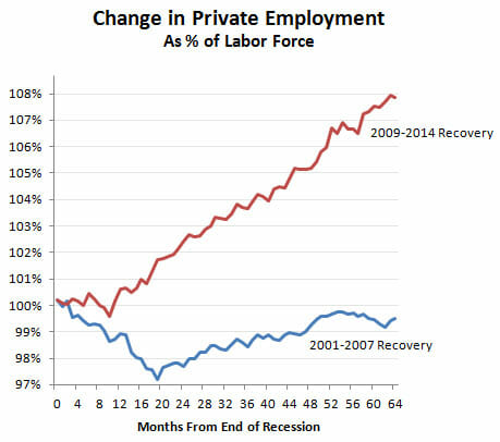
But I think Krugman undersells his case. He shows that the current recovery has created more private sector jobs than the 2001-2007 recovery, and that's true. But in fairness to the Bush years, the labor force was smaller back then and Bush was working from a smaller base. So of course fewer jobs were created. What you really want to look at is jobs as a percent of the total labor force. And here's what you get:
The Obama recovery isn't just a little bit better than the Bush recovery. It's miles better. But here's the interesting thing. This chart looks only at private sector employment. If you want to make Bush look better, you can look at total employment instead. It's still not a great picture, but it's a little better:
Awesome, Kevin! So I guess that austerity you were complaining about was the right thing to do, yes?
Seriously, in his article a year ago Drum argued that the Republicans in Congress were sinking the economy vis a vis the 1990 recession by not continuing to boost spending in the years after the recession. Now, he admits (though since he does not refer back to the original article I guess it is not an admission per se) that this "austerity" led to a stronger recovery than the spending-fueled 1990 version. All hail smaller government, the solution to growing employment!
PS- I wonder how much of this change in private employment since the last recession came in the oil and gas industry, whose expansion the Left generally opposes? Well, they'll bash on oil tomorrow but today, they will take credit for the jobs added.
Update: Here are the two charts combined, with other recessions removed and the colors on the data series set to match (click to enlarge)
Check this graph out from the Phoenix Metro web site. It shows bus ridership in years past, and more recently both bus and light rail ridership.
You can see a few things. First, note that almost all the rail ridership came at the expense of bus ridership. It was almost a pure 1:1 substitution. The bus ridership, even with a half year of light rail being open, was 65.7 million in 2009. Total ridership was only 67.6 million in 2010 and 2011. Yes there is a recession here, but of the 12 million or so in light rail ridership, at least 10-11 million of that came out of buses. Essentially, we paid $1.4 billion in capital costs to move 10 million riders to a mode of transit that is at least an order of magnitude more expense. Nice work.
Second, note that after over 12 years of growth, with the onset of light rail transit ridership has stagnated for 6 years. Some of this, at least initially, is likely due to the recession but in fact recessions are supposed to spur transit ridership, not reduce it, as people look for lower cost alternatives. There is a good explanation for this. Because light rail is so much more expensive, the cost per rider for the entire transit system has skyrocketed. With budgets unable to be increased this fast (and with fares covering only a tiny percentage of rail costs), the system must cut back somewhere. Since rail can't really be cut back, bus routes are cut.
If we had seen the same growth rate from 2009 to 2014 as we had seen in the twelve years prior, we should have over 86 million trips in 2014 (note these are fiscal years, and fiscal year 2014 is already closed, so this is not partial year data).
We paid, and continue to pay (since rail must be subsidized heavily) billions of dollars to reduce transit ridership.
In a National Bureau of Economic Research working paper this month, economists at Texas A&M return to Cash for Clunkers, the 2009 stimulus fillip that dispensed vouchers worth as much as $4,500 if people turned in their old cars for destruction and bought a new set of wheels. Mark Hoekstra, Steven Puller and Jeremy West report their "striking" finding that the $3 billion program's two-month run subtracted between $2.6 billion and $4 billion from the auto industry.
The irony is that the goals were to help Detroit through the recession by subsidizing sales and to please the green lobby by putting more fuel-efficient cars on the road. By pulling forward purchases that consumers would make later anyway, the Obama Administration also hoped to add to GDP. Christina Romer, then chair of the Council of Economic Advisers, called Cash for Clunkers "very nearly the best possible countercyclical fiscal policy in an economy suffering from temporarily low aggregate demand."
The A&M economists had the elegant idea of comparing the buying behavior of Texas drivers who owned cars that barely qualified for cash (those that got 18 miles per gallon of gas or less) and those that barely did not (19 mph). Using state DMV sales records, this counterfactual allowed them to isolate the effects of the Cash for Clunkers incentives and show what would have happened without the program.
The two groups were equally likely to purchase a new vehicle over the nine month period that started with Cash for Clunkers, so the subsidy did not create any extra auto business. But in order to meet the fuel efficiency mandate, consumers who got the subsidy were induced to purchase smaller vehicle models with less horsepower that cost on average $2,500 to $3,000 less than those bought by their ineligible peers. The clunkers bought more Corollas, and everybody else more Chevys.
Extrapolated nationally, auto revenues may have plunged by more than what the government spent. And any environmental benefits cannot be justified under the federal social cost of carbon estimate of $33 a ton. Prior research from 2009 and 2013 has shown that the program cost between $237 and $288 a carbon ton.
This is a pretty amazing chart from Jed Graham and IBD which I have annotated a bit
Note first that the diversion between high and low-wage** industries did not occur during the recession, and in fact through the recession the two groups tracked each other pretty closely until early 2010. Then, in early 2010, something made the two lines start to diverge and in 2012-2013 they really went in opposite directions.
Well, my suggestion for the "something" is Obamacare. In March 2010, the PPACA was passed. Looking at the jobs data, one can date the stall in the economic recovery almost precisely from the date the PPACA was passed (e.g. here).
The more important date, though, is January 1, 2013. This is a date that every business owner was paying attention to at the time but which seems entirely lost on the media. All the media was focused on the start-date of the employer mandate on January 1, 2014. Why was the earlier date important? Let's go back in time.
At that time, the employer mandate had yet to be delayed. The PPACA and IRS rules in place at the time called for a look-back period in 2013 where actual hours worked for each employee would be tracked to determine whether the employee would classified as full or part-time on the Jan 1, 2014 start date. So, if a company wanted to classify an employee as part-time at the start of the employer mandate (and thus avoid penalties for that employee), that employee needed to be converted to part-time as early as possible, preferably before 2013 even started and at worst by mid-year 2013 [sorry, I typo-ed these dates originally].
Unlike the government, which apparently waits until after the start-up date to begin building large pieces of major computer systems, businesses often tackle problems head on and well in advance. Faced with the need to have employees be working 29 hours or less a week in the 2013 look-back period, many likely started making changes back in 2012. Our company, for example, shifted everyone we could to part time in the fourth quarter of 2012. I know from talking to the owners of several restaurant chains that they were making their changes even earlier in 2012. One employee of mine went to Hawaii in October of 2012 and said that all the talk among the resort employees was how they were getting cut to part-time over Obamacare.
Yes, the employer mandate was eventually delayed, but by the time the delay was announced, every reasonably forward-looking company that was going to make changes had already done so. Having made the changes, there is no way they were going to switch back, and then back yet again when the Administration finally stumbles onto an actual implementation date.
If this chart gets any traction over the next few days, expect to see a lot of ignorance as PPACA defenders claim that the fall in low-wage work hours can't possibly have anything to do with the PPACA because the employer mandate has not even started. Now you know why this argument is wrong. The PPACA, and associated IRS implementation rules, drove companies to convert full-time to part-time jobs as early as 2012.
Usual warning: Correlation is not causation. However, I will submit that I was predicting exactly this sort of result years before it occurred. This is not a spurious correlation that is ex post facto blamed on whatever particular bete noir I might have. I and many other predicted that Obamacare would drive down work hours per week in lower-wage industries, and now having seen exactly that correlated with key Obamacare dates, it is not going to far to hypothesize a connection.
** Why could low-wage industries be impacted more than high-wage? Two reasons. One, low-wage industries are far less likely to offer a full Obamacare-compatible health plan to employees than high wage industries. Second, the fixed penalties ($2000 and $3000 per employee) for lack of insurance plans are obviously a far higher percentage of the total pay in low-wage vs. high-wage industries. A penalty that is 15% of annual pay is much more likely to cause employers to shift or reduce work than a 3% penalty.
Up to this point, after some initial bad impressions trying Windows 8 briefly, I have avoided it like the plague. However, my son needed a new laptop and the only ones that really met our requirements only came in Windows 8 flavors, so we bought one.
What an awful mess. The system boots up into a tiled mess that looks like some cheesy website covered in moving gifs and viagra ads. To make matters worse, nothing on this tablet-based interface is organized at all logically. The interface is like the room of an ADD child that dropped all of his toys and books in random spots. I am sure these tiles have some sort of navigation paradigm, but it is completely different from any used in past windows versions. I could not, for example, figure out how to easily exit the store except to alt-tab out (there is no exit or quit option and right-click context menus which are one of the great advantages of windows over mac don't seem to work a lot of the time). Again, I am sure there is some way to do it, but I have no idea what it is and no desire to learn new navigation commands. Perhaps Microsoft intends that one use a gamepad instead of a mouse -- I would not be surprised at this point.
Unlike older versions of windows, windows update did not run automatically at first bootup. I knew from past experience there were likely dozens of security patches I needed to install right away. I hunted for quite a while just to find the windows control panel (so I could run windows update). It was buried in a sub-menu of a toolbar on the right side of the screen that only pops up if you find a tiny (unmarked) spot in the corner of the screen with your mouse. It amazes me that anyone thought replacing the start button with an unmarked spot on the screen was a good idea.
Of course, the control panel is called something entirely different now, but I did eventually find windows update and there were, as expected, over 70 security patches that needed to be installed. But for some reason they would not download immediately, but kept giving me a message that they would be downloaded at some future indeterminate date. I finally found a way to force them to download.
My next step was to get rid of the stupid application tile interface and get the computer to boot directly to desktop and get the old start button back. This requires a free upgrade to windows 8.1, but there is no obvious way to do this, even through windows update. I finally had to search the internet to find the link. This sent me into the windows 8 app store. What a total mess that is! If anything, it is more poorly organized than the Apple app store. Like the Apple store, it seems aimed at people who want to browse applications virtually at random rather than find something specific. Incredibly, there is no search function. Yes, I know, I have to be wrong about that, but I scrolled all over that damn storefront and cannot find a search box.
So I cannot actually find the Windows 8.1 upgrade. The web site tells me that I should be presented with a prominent option to download it in the store, but I am not. It is nowhere to be found. I found an FAQ somewhere that suggested that I would not be offered the 8.1 upgrade if my 8.0 installation is missing certain patches, so I am going back to windows update to see if there is something I am still missing.
I was wrong about windows 8 -- I once wrote it was bad but perhaps not as bad as Vista or ME. But it is. This is the worst thing I have ever seen come out of Microsoft. It is inexplicable that this company with such a strong market share in the business world could saddle its flagship OS with an interface more appropriate to an XBOX.
In the past, I have said that I would not want a desktop with a tablet interface. But at the end of the day, I would not want a tablet with this interface. Perhaps with hours of work, I will make this computer usable. Who would have ever thought I would have longed for the day when I had to spend an hour with a new computer removing bloatware. Now I have to spend a day trying to emulate the windows 7 experience on windows 8.
People have developed many hypotheses for the lingering recession. Some say it was too small a stimulus. Some blame the sequester. I blame the Windows 8 launch, which I think has a lot to do with suppressing PC sales and thus much of the electronics and retailing sector.
It turns out that the US is one of the few industrialized nations to meet the terms of the Kyoto protocols (reduce CO2 emissions to 1997 levels) despite the fact we never signed it or did anything to try to meet the goals.
Thank the recession and probably more importantly the natural gas and fracking revolution. Fracking will do more to reduce CO2 than the entire sum of government and renewable energy projects (since a BTU from natural gas produces about half the CO2 as a BTU form coal). Of course, environmentalists oppose fracking. They would rather carpet the desert with taxpayer-funded solar panels and windmills than allow the private sector to solve the problem using 50-year-old technology.
UPDATE: Mea culpa. One point in the original post was dead wrong. It is possible, contrary to what I wrote below, to get something like a 0.7% difference in annual growth rates with the assumptions he has in the chart below (Drum still exaggerated when he called it 1%). I don't know if the model is valid (I have little faith in any macro models) but I was wrong on this claim. Using the 0.7% and working more carefully by quarter we get a cumulative GDP addition a bit lower than the cumulative debt addition. There is still obviously a reasonable question even at a multiplier near 1 whether $1 of economic activity today is worth $1 of debt repayment plus interest in the future.
I am not a believer, obviously, in cyclical tweaking of the economy by the Feds. To my thinking, the last recession was caused by a massive government-driven mis-allocation of capital so further heavy-handed government allocation of capital seems like a poor solution. But what really drives me crazy is that most folks on the Left will seductively argue that now is not the time to reduce debt levels, implying sometime in the future when the economy is better will be the appropriate time. But when, in any expansion, have you heard anyone on the Left say, "hey, its time to reduce spending and cut debt because we need the fiscal flexibility next time the economy goes wrong."
I will leave the stuff in error below in the post because I don't think it is right to disappear mistakes. For transparency, my spreadsheet reconstruction both confirming the 0.7% and with the updated numbers below is here: reconstruction.xls.
I see that Macroecomic Advisors has produced a comprehensive estimate of the total effect of bad fiscal policies. Their conclusion: austerity policies since the start of 2011 have cut GDP growth by about 1 percentage point per year.
Something seemed odd to me -- when I opened up the linked study, it said the "lost" government discretionary spending is about 2% of GDP. Is Drum really arguing that we should be spending 2% of GDP to increase GDP by 1%?
Of course, the math does not work quite this way given compounding and such, but it did cause me to check things out. The first thing I learned is that Drum partook of some creative rounding. The study actually said reductions in discretionary spending as a percent of GDP reduced GDP growth rates since the beginning of 2011 by 0.7% a year, not 1% (the study does mention a 1% number but this includes other effects as well).
But it is weirder than that, because here is the chart in the study that is supposed to support the 0.7% number:
Note that in the quarterly data, only 2 quarters appear to show a 0.7% difference and all the others are less. I understand that compounding can do weird things, but how can the string of numbers represented by the green bars net to 0.7%? What it looks like they did is just read off the last bar, which would be appropriate if they were doing some sort of cumulative model, but that is not how the chart is built. If we interpolate actual values and are relatively careful about getting the compounding right, the difference is actually about 0.45%. So now we are down to less than half the number Drum quoted see update above (I sent an email to the study author for clarification but have not heard back. Update: he was nice enough to send me a quick email).
So let's accept this 0.45% 0.7% number for a moment. If GDP started somewhere around 16 trillion in 2010, if we apply a 0.45% the quarterly growth numbers from his chart, we get an incremental economic activity from 2011 through 2013:Q2 of about $333 billion.
So now look at the spending side. The source says that discretionary spending fell by about 2% of GDP over this period. From the graph above, it seems to bite pretty early, but we will assume it fell 1/12 of this 2% figure each quarter, so that by the end of 2013 or beginning of 2014 we get a fall in spending by 2% of GDP. Cumulatively, this would be a reduction in spending over the 2.5 years vs. some "non-austere" benchmark of $388 billion.
Thus, in exchange for running up $677 billion $388 billion in additional debt, we would have had $445 billion $333 billion in incremental economic activity. A couple of reactions:
Having the government borrow money and spend it definitely increases near-term GDP. No one disputes that. It is not even in question. Those of us who favor reigning in government spending acknowledge this. The question is, at what cost in terms of future obligations. In fact, this very study Drum is quoting says
Economists agree that failure to shrink prospective deficits and debt will bestow significant economic consequences and risks on future generations. Federal deficits drive up interest rates, “crowding out” private investment. If government borrowing supports consumption (e.g., through Social Security and major health programs) rather than public investment, the nation’s overall capital stock declines, undermining our standard of living. The process is slow but the eventual impact is large.2 In addition, accumulating debt raises the risk of a fiscal crisis. No one can say when this might occur but, unlike crowding out, a debt crisis could develop unexpectedly once debt reached high levels.
High deficits and debt also undermine the efficacy of macroeconomic policies and reduce policymakers’ flexibility to respond to unexpected events. For example, in a recession, it would be harder to provide fiscal stimulus if deficits and debt already were high. Furthermore, fiscal stimulus might be less effective then. Additional deficit spending could be seen as pushing the nation closer to crisis, thereby forcing up interest rates and undercutting the effects of the stimulus. With fiscal policy hamstrung, the burden of counter-cyclical policy is thrust on the Federal Open Market Committee (FOMC) but, particularly in a low interest-rate environment, the FOMC may be unable (or unwilling) to provide additional monetary
stimulus.
I guess we have pretty much given up on the >1 multiplier, huh? Beggaring our children for incremental economic growth today is a risky enough strategy, but particularly so with the implied .66 .85 multiplier here.
Yesterday I challenged a graph by Kevin Drum in Mother Jones as being a disingenuous attempt to paint US government spending as some sort of crazed austerity program which is making the recovery worse. He uses this graph to "prove" that our fiscal response to this recession is weak vis a vis past recessions. The graph is a bit counter-intuitive -- note that it begins at the end of each recession. His point is that Keynesian spending needs to continue long after (five years ?!) after the recession is over to guarantee a good recovery, and that we have not done that.
For anyone not steeped in the special reality of the reality-based community, it is a bit counter intuitive for those of us who have actually lived through the last 5 years to call government spending austere.
The key is in the dates he selects. He leaves out the actual recession years. So by his chart, responses that are late and occur after the recession look better than responses that are fast and large but happen during the recession. This seems odd, but it is the conclusion one has to draw.
I took roughly the same data and started each line two years earlier, so that my first year is two years ahead of his graph and the zero year in my graph is the same as the zero point in Drum's chart. His data is better in the sense that he has quarterly data and I only have annual. Mine is better in that it looks at changes in spending as a percentage of GDP, which I would guess would be the more relevant Keynesian metric (it also helps us correct for the chicken and egg problem of increased government spending being due to, rather than causing, economic expansion).
Here are the results (I tried to use roughly the same colors for the same data series, but who in the world with the choice of the entire color pallet uses two almost identical blues?)
You can see that Drum makes spending look lower in the current recession by carefully dating the data series to the peak of the spending, rather than comparing it to pre-recession levels. The right hand scale is the difference in government spending as a percentage of GDP from the -2 year. So, for example, in the current recession government spending was 34.2% in 2007 and 41.4% in 2009 for a reading of 7.2% in year 0.
Even with the flat spending over the last three or four years in the current recession (flat nominal spending leads do a declining percent of GDP) the spending increase from pre-recession levels is still about twice as high as in other recent recessions.
Update:OK, I pulled together the data and did what Drum should have done, is take the graph back to pre-recession levels. Shouldn't it be even better if the increase in spending came during the recession rather than after? See update here.
Kevin Drum complains about US government austerity (I know, I know, only some cocooned progressive could describe recent history as austerity, but let's deal with his argument). He uses this chart to "prove" that we have been austere vs. other recessions, and thus austerity helps explain why recovery from this recession has been particularly slow. Here is his chart
This is absurdly disingenuous. Why? Simple -- it is impossible to evaluate post recession spending without looking at what spending did during the recession. All these numbers begin after the recession is over. But what if, in the current recession, we increased spending much more than in other recessions. We would still be at a higher level vs. pre-recession spending now, despite a lack of further increases after the recession.
In the time before this chart even starts, total state, local, Federal spending increased from 2007 to 2008 by 10.2%. It increased another 11.1 % from 2008 to 2009. So he starts the chart at the peak, only AFTER spending had increased in response to the recession by 22.5%. Had he started the chart at the correct date and not at a self-serving one, my guess is that it would have shown that in this recession we increased spending more than any other recent recession, not less. So went digging for some data.
I actually have a day job, so I don't have time to create a chart of total government spending since 1981, so I will look at just Federal spending, but it makes my point. I scavenged this chart from Factcheck.org. The purple bars are the year that each of Drum's data series begin plus the year prior (which is excluded from Drum's chart). Essentially the growth in spending between the two purple lines is the growth left out just ahead of when Drum started each data series in his chart. The chart did not go back to 1981 so I could not do that year.
Hopefully, you can see why I say that Drum is disingenuous for not going back to pre-recession numbers. In this case, you can see the current recession has an unprecedented pop in spending in the year before Drum starts his data series, so it is not surprising that post recession spending might be flatter (remember, the pairs of purple lines are essentially the change in spending the year before each of Drum's data series). In fact, it is very clear that relative to the pre-recession year of 2008 (really 2007, but I will give him a small break), even after 5 years of "austerity" our federal spending as a percent of GDP will be far higher than in any other recession he considers. In no previous recession in this era did post recession spending end up more than 2 points higher (as a percent of GDP) than pre-recession levels. In this recession, we are likely to end up 4-5 points higher.
By the way, isn't it possible that he has cause and effect reversed? He argues that post-recession recovery was faster in other recessions because government spending kept increasing over five years after the recession is over. But isn't it just possible that the truth is the reverse -- that government spending increased more rapidly after other recessions because recovery was faster, thus increasing tax revenues. Congress then promptly spent the new revenues on new toys.
Let's look at the same chart, highlighted in a different way. I will circle the 4-5 years included in each of Drum's data series:
You can see that despite the fact that government spending in these prior recessions was increasing in real terms, it was falling in two our of three of them as a percentage of GDP (the third increased due to war spending in Afghanistan and Iraq, spending which I, and I suspect Drum, would hesitate to call stimulative, particular since he and others at the time called it a jobless recovery).
How can it be that spending was increasing but falling as a percent of GDP? Because the GDP was growing really fast, faster than government spending. This does not prove my point, but is a good indicator that recovery is likely leading spending increases, rather than the other way around.
The Arizona Republic today reviews a speech given by Yellen in January, 2007 in Phoenix:
It was January 2007 when Yellen, then head of the Federal Reserve Bank of San Francisco, spoke here about financial literacy before transitioning into comments about the economy — comments that now look remarkably unperceptive.
Back then, months before the real-estate and banking crisis took down the economy, Yellen expressed concern that inflation was uncomfortably high while job gains were coming too swiftly.
“If labor markets are as tight as the unemployment rate suggests, then there may be reason for concern about building inflationary pressures,” she said according to my Jan. 18, 2007, article.
Subsequent events showed that inflation was the last thing we had to worry about, while the lack of jobs has emerged as a central drag on the economy. Back then, U.S. unemployment was around 4.5 percent. But after the recession took hold, it more than doubled, peaking at 10 percent in late 2009. At 7.3 percent currently, it remains well above where it should be this far into an economic recovery.
In contrast, core consumer inflation (which excludes food and energy costs) of 1.8 percent today has hardly budged from the 2.2 percent rate that had Yellen all worked up back then.
In another comment during her Phoenix talk that now looks wildly off-base, Yellen, who later was named vice chair of the Fed’s board of governors, said recession risks had receded despite lingering weakness in housing. She cited the Valley as a place where home-price appreciation had come down from unsustainably high rates of increase.
The Great Recession, as we all now know in hindsight, began later that year, triggered by a home-price slide of epic proportions.
I don't want to beat her up too bad for missing the bubble burst, since most everyone did. They also all missed the last bubble burst, and the one before that, etc.
This is what makes me crazy: not that these folks were wrong, even consistently brutally wrong, but that they display absolutely no modesty in their actions given that they were so wrong. They propose policy steps, such as seemingly eternal QE, that are astoundingly risky unless one assumes that they have a very, very good grasp on exactly where the economy is going. Which they clearly never have had in the past. If they acted like they had been wrong most of the time, then I would have little to criticize. But to be consistently wrong and then make huge risky bets as if you have reliable predictive powers is hubris of the worst sort.
The pay gap between the richest 1 percent and the rest of America widened to a record last year.
...
Last year, the incomes of the top 1 percent rose 19.6 percent compared with a 1 percent increase for the remaining 99 percent.
...
But since the recession officially ended in June 2009, the top 1 percent have enjoyed the benefits of rising corporate profits and stock prices: 95 percent of the income gains reported since 2009 have gone to the top 1 percent.
That compares with a 45 percent share for the top 1 percent in the economic expansion of the 1990s and a 65 percent share from the expansion that followed the 2001 recession.
The Federal Reserve is pumping over a half trillion dollars of printed money into inflating a bubble in financial assets (stocks, bonds, real estate, etc). It should be zero surprise that the rich, who disproportionately get their income and wealth from such financial assets, should benefit the most. QE is the greatest bit of cronyism the government has yet to invent.
(yes, I understand that there are many reasons for this one-year result, including tax changes that encouraged income to be moved forward into last year and the fact it was a recovery off of a low base. Never-the-less, despite decades of Progressive derision for "trickle down" economics, this Administration has pursue the theory that creating an asset bubble that makes the rich much richer will in the long term help the economy via the "wealth effect.")
I have written many times about my problems with Phoenix light rail -- examples are here and here. We paid $1.4 billion in initial capital costs, plus tens of millions a year in operating losses that must be subsidized by taxpayers, for a line that carries a tiny tiny percentage of Phoenix commuters. Capital costs equate to something like $75,000 per daily round trip rider -- If we had simply bought every daily rider a Prius, we would have save a billion dollars.
But, as with most things the government does, it is worse than I thought. Over the last several years, I have been treating these daily light rail riders as if they are incremental users of the area's transit system. In fact, they are not, by Valley Metro's (our regional transit authority) own numbers. Here is the key chart, from their web site.
Compare 2009 to 2012. Between those years, light rail ridership increased by just a hair under 8 million. In the same time period, bus ridership fell by just a hair over 8 million. So all new light rail ridership is just cannibalizing buses. We have spent $1.4 billion dollars to shift people to a far more expensive transit platform, which does not offer any faster service along its route (the light rail has to fight through traffic lights on the surface streets same as buses).
This is a pattern seen in most cities that adopt light rail. Over time, total ridership is flat or falls despite rising rail ridership, because rail is so expensive that it's operation forces transit authorities to cut back on bus service to balance their budgets. Since the cost per rider is so much higher for light rail than buses, a dollar shifted from buses to light rail results in a net reduction in ridership.
Postscript: Looking at the chart, light rail has achieved something that Valley Metro has not seen in decades -- a three year period with a decline in total ridership. Sure, I know there was a recession, but going into the recession the Valley Metro folks were arguing that a poor economy and rising gas prices should boost their ridership.
Up until now, I had never know that there was actually a theory, propounded by people with a straight face, that trapping people in neighborhoods and institutions (like public schools) is a positive because it promotes civic virtue.
If you own your home, then a lot of your wealth is tied in with the quality of your neighborhood. In theory, this should motivate you to vote more carefully in local elections. On the other hand, if you are a renter, and the neighborhood goes downhill, you will simply leave.
Collectivists prefer to trap households within specific government service areas. Their thinking is that with the “exit” option foreclosed, households will be forced to exercise their “voice” option, to everyone’s benefit. This is an argument against private schools. It goes back at least as far as A.O. Hirschman’s classic book, Exit, Voice, and Loyalty.
I would argue just the opposite, that this creates state monopolies ripe for abuse, and besides, is disastrous for labor mobility and thus the healthy functioning of labor markets. People keep arguing that this recession is long because recessions after financial bubbles are always long. I am not sure that is proven out by history.
I would argue a big reason this recession is long is that the nature of this bubble, being in housing markets, short-circuited one of the ways we get out of recessions, which is labor mobility. Trapped in homes the government encouraged them to buy but now they cannot sell, people can't move to find new regional opportunities. Where are the mass migrations to the North Dakota oil fields?
In 2010, Arizona v0ters passed proposition 100, a 1% "temporary" sales tax increase that was meant to help fill in the budget hole created by the recession. The tax was only to last 3 years.
It is pretty clear that by the end of 2013, when the tax expires, the rationale for the temporary tax cut will have passed. Already the state's finances are improving and all signs are that by 2014 the economy and real estate market should be greatly recovered.
But, having got taxpayers used to paying the higher tax, supporters of big government and public employees unions have put a proposition on the ballot this year (204) to make the 2010 tax increase permanent. The tax extension will go to a mish-mash of new programs.
This is how the government spending ratchet works. A "temporary" tax increase is justified in a fiscal emergency to fill in a recession-created hole. Government insiders decide they like having more money, and make the tax permanent. The new money is used to create brand new programs. Then, in the next recession, when all these brand new programs are now "essential" and "beyond the reach of even the worst austerity", a new, even higher "temporary" tax increase is necessary.


