The Big Government Trap: Does Stimulus Require Government Spending to Continuously Rise?
There has been a lot of back and forth over the last few years about "austerity". I have wondered how government spending levels over the last few years that dwarf any peacetime levels in history could be called "austerity", but that is exactly what folks like Paul Krugman have been doing. Apparently, the new theory is that the level of spending is irrelevant to stimulus, and only the first derivative matters. In other words, high spending is not stimulative unless it is also increasing year by year. Kevin Drum provides an explanation of this position:
Austerity is all about the trajectory of government spending, and this is what it looks like. You can argue about whether flat spending represents austerity, but a sustained decline counts in anyone's book. The story here is simple: for a little while, in 2009 and 2010, stimulus spending partially offset state and local cuts, but by the end of 2010 the stimulus had run its course. From then on, the drop in government expenditures was steady and significant. It was also unprecedented. If you run this chart back for 50 years you'll never see anything like it. In all previous recessions and their aftermaths, government spending rose.
So, by this theory of stimulus, the fact that we spent substantially more money in 2010-2014 than in pre-recession years (and are still spending more money) turns out not to be stimulative. The only way government can stimulate the economy is to increase year-over-year per capital real spending every single year.
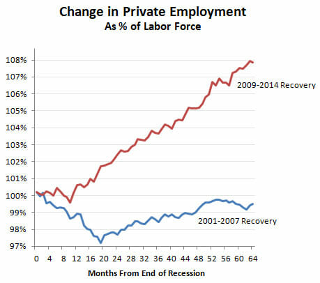
I will leave macro theory (of which I am increasingly skeptical) to the Phd's. In this case however, Drum's narrative is undermined by his own chart he published a few weeks ago:
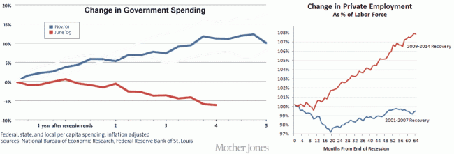
In his recent austerity article quoted above, he describes a sluggish recovery with a step-change in 2014 only after "austerity" ends. But his chart from a few weeks earlier shows a steady recovery from 2010-2014, right through his "austerity" period. In fact, during the Bush recovery he derides, we actually did do exactly what he thinks is stimulative, ie increase government spending per capita steadily year by year. How do we know this? From another Drum chart, this one from last year. I changed the colors (described in this article) and compared his two charts:
By Drum's austerity theory, the Bush spending was stimulative but the Obama spending was austerity. But the chart on the right sure makes it look like the Obama recovery is stronger than the Bush recovery.
A better explanation of the data is that a recession driven by the highly-leveraged mis-allocation of too much capital to home real estate was made worse in 2008-2009 by a massive increase in government spending, which is almost by definition a further mis-allocation of capital (government is taking money from where the private sector thinks it should be invested and moves it to where politicians think it should be spent). The economy has recovered as that increase in government spending has been unwound.


