Posts tagged ‘recovery’

Regime Uncertainty and Trump's Trade Machinations

Conservatives rightly criticised the Obama Administration for rewriting rules so frequently and seemingly arbitrarily that businesses were reluctant to make long term investments.  As the WSJ editorialized in 2016:

Pfizer CEO Ian Read defends the company’s planned merger in an op-ed nearby, and his larger point about capricious political power helps explain the economic malaise of the last seven years. “If the rules can be changed arbitrarily and applied retroactively, how can any U.S. company engage in the long-term investment planning necessary to compete,” Mr. Read writes. “The new ‘rules’ show that there are no set rules. Political dogma is the only rule.”

He’s right, as every CEO we know will admit privately. This politicization has spread across most of the economy during the Obama years, as regulators rewrite longstanding interpretations of longstanding laws in order to achieve the policy goals they can’t or won’t negotiate with Congress. Telecoms, consumer finance, for-profit education, carbon energy, auto lending, auto-fuel economy, truck emissions, home mortgages, health care and so much more.

Capital investment in this recovery has been disappointingly low, and one major reason is political intrusion into every corner of business decision-making. To adapt Mr. Read, the only rule is that the rules are whatever the Obama Administration wants them to be. The results have been slow growth, small wage gains, and a growing sense that there is no legal restraint on the political class.

I am willing to believe this is true. On my own smaller scale, our company has disinvested in California because we simply cannot keep up with the changing rules there.

But all this forces me to ask, why doesn't this same Conservative criticism apply to Trump's trade policy?  The rules are changing literally by the day -- Consumers of goods from Mexico are going to be hit by new tariffs, Mexican goods are not going to be hit by new tariffs, China is hit by new tariffs, a China deal is near, a China deal is not near, Company A got a special tariff exemption, Company B did not get a special exemption, etc. How can any company with a global supply chain, which is most any US manufacturer nowadays, plan for new products or investments in this environment when they have no ability to make long-term plans for their supply chain?

Another Phoenix Light Rail Fail: Light Rail KILLS Transit Systems

Well, another year's ridership numbers are out for Valley Metro and Phoenix light rail and they are just as grim as they have been every year since Phoenix spent the first $1.4 billion on the first leg of the rail system (source)

Now, this picture is bad enough, until you realize that Valley Metro completed a huge extension of the rail line in 2016.  In 2016 the line length was increased by 31% and the cumulative capital investment increased by 36%.  With, as you can see, essentially zero effect on rail ridership in red.  The only small highlight was that after falling for years, bus ridership actually perked up a few percent.  As you may remember from earlier posts, bus ridership could be expected to fall due to cannibalization from light rail, but in fact it tends to fall even faster than rail ridership rises, causing total ridership to fall.  The reason is that light rail costs at least an order of magnitude more (including amortized capex) per passenger mile than busses, and so light rail tends to starve the bus system of funds.  Every light rail system implementation has been met with the need to slash bus service to pay for the huge light rail costs.  So despite enormous operating subsidies and more than $2 billion in cumulative capex, rail ridership has been flat and total transit ridership has fallen.

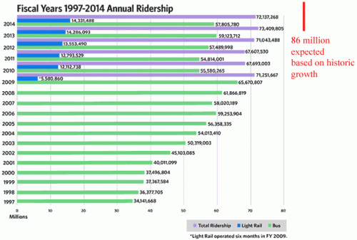
But in fact the picture is worse than this when you look over a longer timeframe, which is why Valley Metro has probably changed their practice from graphing nearly 20 years of history to graphing just 6.  Here is an older chart of theirs I posted years ago: (the top year in this chart is the bottom year in the chart above)

I will get back to the annotation in a moment.  But notice that despite all the cost and disruption and higher taxes from the light rail system, total ridership this year of 66.8 million is less than any year since light rail was opened and baredly 8% higher than it was before light rail opened 10 years ago in 2008.  Just organic city growth and recovery of the economy since 2008 should have driven faster growth than this.  In fact, in the 10 years before light rail was opened, Phoenix transit ridership grew 70%.  If that organic growth rate in bus service had been allowed to continue without the backbreaking costs and limited capacity of light rail being added to the mix, we should have expected 105 million riders this past year, not 66.8 million.

Shifting Mix is Often Ignored as the Reason Behind A Shifting Mean

I have written about this mix effect many times, eg here.  Imagine a corporate division that sells tables and chairs.  The CEO is reviewing this division's performance, and sees that their revenues are increasing but their profit margin is falling.  He asks his analyst to look into it - is it the tables or the chairs or both that are showing falling margins.  Our poor harassed analyst comes back and says, uh, neither.  The profit margins for both tables and chairs went up last year.  Well, the CEO asks, if revenues are up and all their component margins are going up, how is their total margin falling?  It turns out that tables make a much higher margin than chairs, and over the last year the company has seen a much higher growth in chair sales than table sales.  The mix is shifting towards a lower margin product and is bringing the averages down.  By the way, I can say with authority that this conversation is much harder when the analyst is yours truly and the CEO is famed tough (but talented) boss Chuck Knight of Emerson Electric.

Whether the media mentions this effect or not, it is happening all the time.  Here is an example from the WSJ:

One mystery of this economic expansion is that wage growth has remained slow even as the labor market has finally tightened. One widely cited culprit is historically low productivity growth. But a new analysis from the Federal Reserve Bank of San Francisco adds a more optimistic, albeit paradoxical, explanation.

The Bureau of Labor Statistics recently reported that median weekly earnings had risen in July by a healthy 4.2% on an annual basis, the fastest growth in a decade. As labor markets tighten, employers typically increase wages. Until this past year, however, median weekly earnings growth had hovered near 2%, which is significantly less than the 3.25% average from 1983 to 2015.

So why haven’t wages risen faster amid an increase in hiring and unfilled jobs? One answer is that wages have actually been growing at a faster clip—around 4% to 5%—at least for full-time workers with steady jobs. But new full-time workers who are generally paid less than the retirees they replace are dragging down the average wage increase.

Researchers at the San Francisco Fed this week updated their 2016 paper that disaggregated the wages of full-time workers with steady employment from recent entrants—that is, new workers or those returning to full-time work. Their earlier analysis showed that average wage growth had slowed less than expected during the recession while staying relatively flat during the recovery.

That’s because workers who lost jobs during the recession were generally lower skilled and lower paid, so average weekly wages didn’t fall significantly. However, many of those workers have since been rehired at below-average wages, which has depressed the aggregate.

In prior expansions, wage growth has been driven mostly by continuously full-time employed workers, and the researchers find that’s still the case. Wage growth for these workers is now close to the pre-recession 2007 peak. But there are now many more workers who have been on the labor-force sidelines who are moving to full-time employment, thus creating a drag on wages.

This is frequently how mix shifts play out in the news.  Notice that there are actually two pieces of good news here:  1.  Wages for full-time workers who have been employed for a while are growing well and 2.  lower-skilled and less experienced workers who left the labor force are now getting jobs and returning to work.  However, when these are combined, the net is portrayed as bad news, ie wage growth in the US is sluggish.  Because the mix was ignored.

Aging and Using Run Walk Run in Marathons

This is a really niche post, but I had a good experience last week running and wanted to share.   First, I have never been a fast runner.  Generally I can get into a steady pace, though, and keep turning miles.  Even when I was much younger, at 40 (about 15 years ago) I tended to run half-marathons (13.1 miles) in about 11 minutes per mile (which for the uninitiated is slllooowww).  Since that time, as I have aged and I have developed mild arthritis in my knees, my times have suffered.

I was always too snooty to try run walk run.  Even if I was slow, I took pride in just being able to keep running for 2-1/2 (or 5 for a marathon) hours continuously.  However, I noticed a while back that even a brief stop, say walking through a water station in a race, really provided a lot of recovery to my sore joints.  So for the last 2 months I have been training with run-walk-run.   After some experimentation, I created a pattern of 2:40 running followed by 1:00 walking.  I don't have to stare at a clock, I have an app (there are zillions of them) on my phone that once programmed with the time just tells me in my ear over my music when to start running and when to start walking.

At first, I did not expect a lot of improvement, probably because I didn't understand how jogging along and then walking could be faster.  But the point is that even a one minute walk is very refreshing and I tend to burst out of each walk with new energy and run the next section much faster than my usual jogging pace.   The theory is then that -- for running pace R > jogging pace J > Walking pace W -- R+W combined will be faster than all J.  And this certainly turned out to be the case for me.  Last weekend I ran in the Disney Princess Half Marathon (this is my favorite race and my daughter and I started running it years ago) and finished at a pace just a hair behind where I was 15 years ago, a full 2 minutes per mile faster than I was running before doing run-walk-run.

The one downside is that this can be tremendously irritating to other runners, particularly on a crowded course.  Races group people into start corrals by time, so that everyone in a certain part of the racecourse should theoretically be running about the same pace and not bumping into each other.  Run-walk-run folks screw this up.  But at this point, so many people are doing run-walk-run that I no longer feel a lot of guilt.

By the way, we generally run the Disney races in costume, so I used my Ironman running costume I did for the Marvel race and added a fetching matching tutu.  Here I am running through the Magic Kingdom.  The tutu is a little worse for wear by mile 6.

A Modest Proposal for Fixing NFL Thursday Night Games -- Take Advantage of the Bye Week

NFL coaches hate Thursday night games, because their players have essentially only half the preparation and recovery time as they do on a normal Sunday game schedule.

So here is my (partial) solution.  Where possible, teams playing Thursday night should have their bye week the previous weekend.  For teams with the bye week the previous week, a Thursday night game is no issue -- in fact, it might even be a benefit, breaking up a single long-preparation period between games into two longer-than-average periods.

This is probably only a partial solution.  Only 8 weeks have bye weeks, and since for week 1 the Thursday game is no issue, this only solves the Thursday problem on 9 of the 17 regular season weeks.  I suppose we could extend by weeks to more weeks of the season, but even as they exist today a partial solution is better than none at all, right?

Why Valley Metro (Phoenix Light Rail) Can't Be Trusted and Shouldn't Be Given More Tax Money to Play With

I was reading this article in the Arizona Republic (which is generally an unskeptical cheerleader for light rail investments) and looking at the claim that Valley Metro (the operator of Phoenix light rail) had a 45% fare recovery ratio in 2013.  One would think that means that their fares cover 45% of their costs -- which would be awful for any real enterprise but is pretty good for government-run rail systems.

But in fact, Valley Metro (along with rail supporters in the Administration) stack the deck by defining most of the costs out of this metric so it looks far better than it really is.  In fact, by my reading of their financial statements, the true fare recovery is at best 15.2% and likely much worse.

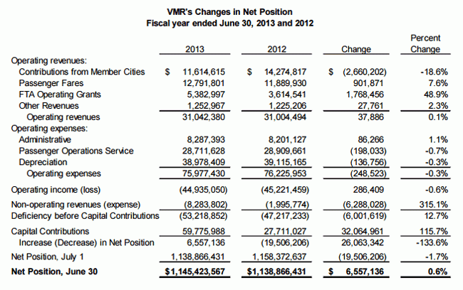
Here are the Valley Metro financials for 2013, from their annual report

vmr-finances


Look at their costs of $75+ million and fares of about $12.8 million.  How do they get to 45%?  Simple -- they leave the majority of their costs out.  They exclude administrative costs, financing costs, and depreciation (essentially their capital cost) from the equation.  This means that their fare recover is 45% -- IF you ignore their large administrative costs and you ignore the $1.4+ billion the line cost to build.   Further, because of the way the government does its finances, it is also missing any financing costs (interest and such on debt).

So the true cost recovery, stated in a way that  a reasonable person would think about such a number, is 16.8% at best.  If one takes into account the $8.28 million in "non-operating expenses" the number is 15.2%.  And it is even lower if you were to include interest and other financing costs.

I am sure Valley Metro will argue that this is the way the Feds measure it.  I don't care.  It has an obligation to accurately report its financial position to the public who is paying for it, particularly when the public is considering further investments in the form of higher taxes.  The 45% is a meaningless number that is crafted solely to make light rail look financial stronger than it really is.

This, by the way, is why total ridership of rail + buses has stalled since the construction of the light rail line.  Light rail is so expensive per rider that it is starving cash from the rest of the system.

Customers Love Uber, But It Can Be Great For Drivers as Well. Here is an Example.

I see a lot of folks wanting to poo-poo the notion that Uber's flexibility in terms of hours driven and such is good for drivers.  Folks on the Left have in their head that any job that does not punch in and punch out at fixed hours with a defined lunch break and actually rewards working more than the minimum is somehow exploitive.

This got be thinking about a Kickstarter update I received a while back (for a computer game project).  The entrepreneur wrote:

Looking back, most of the year was spent trying to recover from the 2013 Robotoki saga which delayed development by almost an entire year, left me financially devastated, and almost sunk this project beyond recovery. We’ve had our ups and downs and I’ve always found a way through, but man, these were not fun times. I was actually living out of my car when I signed the private investment contract a few months ago, so it’s been a little bit of a rough year.

This project and I are currently surviving on that private loan, my personal credit cards, and whatever I can make driving for Uber, but at least we’re getting close to launch now. I hope this doesn’t come off as a “whoa is me” kinda thing. I only mention all of this because I want to put the project into perspective and give some deserved answers about what has been going on. I know it sucks that the game is severely late and I hope you know that I’ve done everything in my power to not give up.

This entrepreneur is trying to fund his game development effort in part by working during the day on the game and driving for Uber in his spare hours.  There is no way he could work really anywhere else because he would have to be an official employee and keep a regular schedule -- you can't imagine someone just showing up at McDonald's to cook whenever they feel like it.  But that is what he can do for Uber.  And now California is trying to kill that flexibility.


Root Cause Failure Analysis Fail

I just finished setting up 10 laptops for new managers.  I hate this process, but it is much faster now since I figured out how to get one exactly right and then clone a disk image onto a usb hard drive.  I can then boot the new computer with a recovery disk and apply the disk image.

Anyway, there was something wrong with two of the installations.  Symantec had server issues all this week and two of the PC's simply would not sync with their servers, probably because I set them up at the heights of their issues.  So I had to pull them out, and do the uninstall-reinstall thing on the virus software.

But the very first laptop did not work -- it was coming on but its screen was blank.  I pulled another out of the box.  Same problem.  And again.

Panicking I changed the power supply, checked the power outlets, and everything else I could think of.  I finally called Dell in a rage.

Before they could really even pick up the phone, I happened to tilt the computer.  The screen came on.  I lifted it up in the air.  Worked fine.

I finally figured out that I was sitting the laptop on top another closed laptop (of the same model) I had been working on.  The bottom laptop was powered down, but it turned out that something was causing the laptop on top of it to have its screen not work.  I can only guess it was some magnetic thing from the battery charging apparatus, since that was the only thing that was likely energized in the other laptop.

Anyway, problem solved but I never would have guessed that stacking laptops would make them not work.

Surprise! Greek Problems Were Not Solved By Kicking the Can Down the Road

Greece is looking like it's falling apart again.  Or perhaps more accurately: Greece continues to fall apart and the lipstick Europe put on the pig a few years ago is wearing off and people are noticing again.

I warned about this less than a year ago:

Kevin Drum quotes Hugo Dixon on the Greek recovery:

Greece is undergoing an astonishing financial rebound. Two years ago, the country looked like it was set for a messy default and exit from the euro. Now it is on the verge of returning to the bond market with the issue of 2 billion euros of five-year paper.

There are still political risks, and the real economy is only now starting to turn. But the financial recovery is impressive. The 10-year bond yield, which hit 30 percent after the debt restructuring of two years ago, is now 6.2 percent....The changed mood in the markets is mainly down to external factors: the European Central Bank’s promise to “do whatever it takes” to save the euro two years ago; and the more recent end of investors’ love affair with emerging markets, meaning the liquidity sloshing around the global economy has been hunting for bargains in other places such as Greece.

That said, the centre-right government of Antonis Samaras has surprised observers at home and abroad by its ability to continue with the fiscal and structural reforms started by his predecessors. The most important successes have been reform of the labour market, which has restored Greece’s competiveness, and the achievement last year of a “primary” budgetary surplus before interest payments.

Color me suspicious.  Both the media and investors fall for this kind of thing all the time -- the dead cat bounce masquerading as a structural improvement.  I hope like hell Greece has gotten its act together, but I would not bet my own money on it.

In that same article, I expressed myself skeptical that the Greeks had done anything long-term meaningful in their labor markets.  They "reformed" their labor markets in the same way the Obama administration "reformed" the VA -- a lot of impressive statements about the need for change, a few press releases and a few promised but forgotten reforms.  At the time, the Left wanted desperately to believe that countries could continue to take on near-infinite amounts of debt with no consequences, and so desperately wanted to believe Greece was OK.

I have said it for four years:  There are only two choices here:  1.  The rest of Europe essentially pays off Greek debt for it or 2.  Greece leaves the Euro.  And since it is likely Greece will get itself into the same hole again some time in the future if #1 is pursued, there is really only leaving the Euro.  The latter will be a mess, with rampant inflation in Greece and destruction savings, but essentially the savings have already been destroyed by irresponsible government borrowing and bank bail-ins.  At least the falling value of Greek currency would make it an attractive place at for tourism if not investment and Greece could start rebuilding its economy on some sort of foundation.  Instead of bailing out banks and Greek officials, Germany should let it all fall apart and spend its money on helping Greece to pick up the pieces.

By letting Greece join the Euro, the Germans essentially let their irresponsible country cousins use their American Express Platinum card, and the Greeks went on a bender with the card.   The Germans can't keep paying the bill -- at some point you have to take the card away.

The Big Government Trap: Does Stimulus Require Government Spending to Continuously Rise?

There has been a lot of back and forth over the last few years about "austerity".  I have wondered how government spending levels over the last few years that dwarf any peacetime levels in history could be called "austerity", but that is exactly what folks like Paul Krugman have been doing.   Apparently, the new theory is that the level of spending is irrelevant to stimulus, and only the first derivative matters.  In other words, high spending is not stimulative unless it is also increasing year by year.   Kevin Drum provides an explanation of this position:

Austerity is all about the trajectory of government spending, and this is what it looks like. You can argue about whether flat spending represents austerity, but a sustained decline counts in anyone's book. The story here is simple: for a little while, in 2009 and 2010, stimulus spending partially offset state and local cuts, but by the end of 2010 the stimulus had run its course. From then on, the drop in government expenditures was steady and significant. It was also unprecedented. If you run this chart back for 50 years you'll never see anything like it. In all previous recessions and their aftermaths, government spending rose.

blog_total_govt_expenditures_per_capita_inflation

So, by this theory of stimulus, the fact that we spent substantially more money in 2010-2014 than in pre-recession years (and are still spending more money) turns out not to be stimulative.  The only way government can stimulate the economy is to increase year-over-year per capital real spending every single year.

I will leave macro theory (of which I am increasingly skeptical) to the Phd's.  In this case however, Drum's narrative is undermined by his own chart he published a few weeks ago:

blog_private_employment_2001_vs_2010

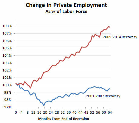
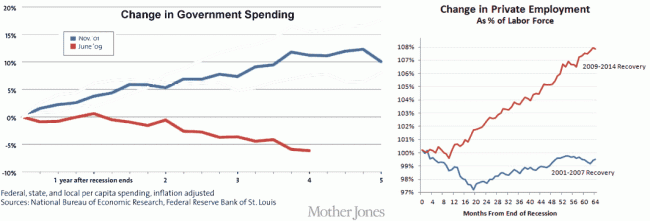
In his recent austerity article quoted above, he describes a sluggish recovery with a step-change in 2014 only after "austerity" ends.  But his chart from a few weeks earlier shows a steady recovery from 2010-2014, right through his "austerity" period.  In fact, during the Bush recovery he derides, we actually did do exactly what he thinks is stimulative, ie increase government spending per capita steadily year by year.  How do we know this?  From another Drum chart, this one from last year.  I changed the colors (described in this article) and compared his two charts:

click to enlarge


By Drum's austerity theory, the Bush spending was stimulative but the Obama spending was austerity.  But the chart on the right sure makes it look like the Obama recovery is stronger than the Bush recovery.


A better explanation of the data is that a recession driven by the highly-leveraged mis-allocation of too much capital to home real estate was made worse in 2008-2009 by a massive increase in government spending, which is almost by definition a further mis-allocation of capital (government is taking money from where the private sector thinks it should be invested and moves it to where politicians think it should be spent).  The economy has recovered as that increase in government spending has been unwound.

What is Normal?

I titled my very first climate video "What is Normal," alluding to the fact that climate doomsayers argue that we have shifted aspects of the climate (temperature, hurricanes, etc.) from "normal" without us even having enough historical perspective to say what "normal" is.

A more sophisticated way to restate this same point would be to say that natural phenomenon tend to show various periodicities, and without observing nature through the whole of these cycles, it is easy to mistake short term cyclical variations for long-term trends.

A paper in the journal Water Resources Research makes just this point using over 200 years of precipitation data:

We analyze long-term fluctuations of rainfall extremes in 268 years of daily observations (Padova, Italy, 1725-2006), to our knowledge the longest existing instrumental time series of its kind. We identify multidecadal oscillations in extremes estimated by fitting the GEV distribution, with approximate periodicities of about 17-21 years, 30-38 years, 49-68 years, 85-94 years, and 145-172 years. The amplitudes of these oscillations far exceed the changes associated with the observed trend in intensity. This finding implies that, even if climatic trends are absent or negligible, rainfall and its extremes exhibit an apparent non-stationarity if analyzed over time intervals shorter than the longest periodicity in the data (about 170 years for the case analyzed here). These results suggest that, because long-term periodicities may likely be present elsewhere, in the absence of observational time series with length comparable to such periodicities (possibly exceeding one century), past observations cannot be considered to be representative of future extremes. We also find that observed fluctuations in extreme events in Padova are linked to the North Atlantic Oscillation: increases in the NAO Index are on average associated with an intensification of daily extreme rainfall events. This link with the NAO global pattern is highly suggestive of implications of general relevance: long-term fluctuations in rainfall extremes connected with large-scale oscillating atmospheric patterns are likely to be widely present, and undermine the very basic idea of using a single stationary distribution to infer future extremes from past observations.

Trying to work with data series that are too short is simply a fact of life -- everyone in climate would love a 1000-year detailed data set, but we don't have it.  We use what we have, but it is important to understand the limitations.  There is less excuse for the media that likes to use single data points, e.g. one storm, to "prove" long term climate trends.

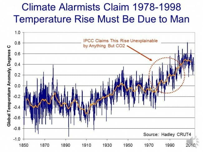
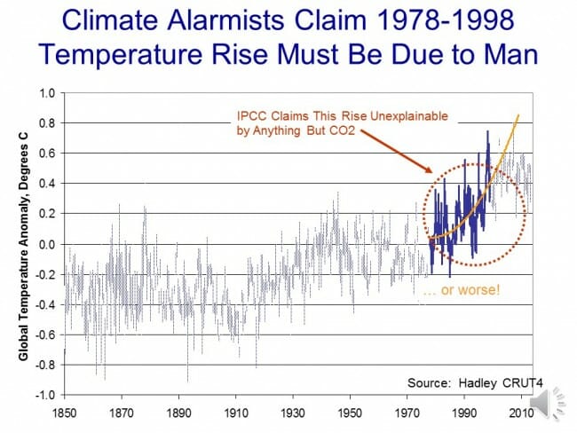
A good example of why this is relevant is the global temperature trend.  This chart is a year or so old and has not been updated in that time, but it shows the global temperature trend using the most popular surface temperature data set.  The global warming movement really got fired up around 1998, at the end of the twenty year temperature trend circled in red.

click to enlarge


They then took the trends from these 20 years and extrapolated them into the future:

click to enlarge

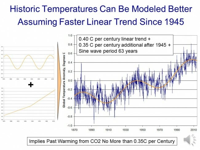
But what if that 20 years was merely the upward leg of a 40-60 year cyclic variation?  Ignoring the cyclic functions would cause one to overestimate the long term trend.  This is exactly what climate models do, ignoring important cyclic functions like the AMO and PDO.

In fact, you can get a very good fit with actual temperature by modeling them as three functions:  A 63-year sine wave, a 0.4C per century long-term linear trend  (e.g. recovery from the little ice age) and a new trend starting in 1945 of an additional 0.35C, possibly from manmade CO2.Slide52

In this case, a long-term trend still appears to exist but it is exaggerated by only trying to measure it in the upward part of the cycle (e.g. from 1978-1998).


Kevin Drum Inadvertently Undermines His Own Keynesianism

This is a follow-up from a post this morning here.  Kevin Drum is a Keynesian who thinks that the government is committing economic suicide if it does not increase its spending substantially during and after a recession.  Kevin Drum is also a fierce partisan who wants to defend President Obama against his detractors.  Unfortunately, trying to do the two simultaneously has led to what I think may be an embarrassing result for him.

In the chart below, I combine two graphs of his.  The one on the left is a chart from last year in a Mother Jones cover story blasting "austerity" and lamenting how dumb it was to decrease spending in the years after a recession.  The chart on the right is from the other day, when Drum is agreeing with Paul Krugman that the recession recovery under Obama has been much stronger than the one under Bush II.  The result is a juxtaposition that seems to undermine his Keynesian assumptions - specifically, the recession where we had the "austerity" was the one with the better recovery.  The only thing I have done to his charts is removed lines in the left chart for other past recessions and changed the line colors on the two charts to match.   You can click to enlarge:

click to enlarge

The blue line is the Bush II recession, the red line is the Obama recession.  I believe the start dates are consistent in both charts.  All the numbers and choice of start dates and measurement scales are Drum's.  Don't yell at me for something in the chart construction being unfair -- they are his choices.

The conclusion?  Higher government spending seems to inhibit recovery.  Thanks Kevin!

Kevin Drum Undermines His Own Cover Story and Refutes His Own Keynesian Assumptions

Update:  I have posted an update with a side by side chart comparison here.

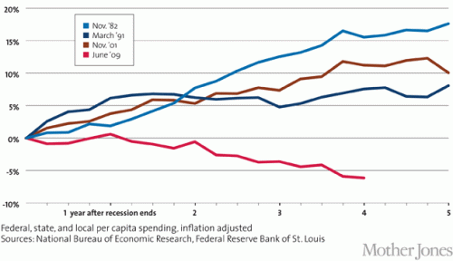
Last year, Kevin Drum wrote what I believe was the cover story of the September / October issue of Mother Jones (I read the online edition so exactly how the print version is laid out is opaque to me).  That article, entitled "It's the Austerity, Stupid: How We Were Sold an Economy-Killing Lie" features this analysis:

Click to enlarge


He described the chart as follows:

 In the end, for reasons both political and ideological, Obama decided that he needed to demonstrate that he took the deficit seriously, and in his 2010 State of the Union address he did just that. "Families across the country are tightening their belts," he said, and the federal government should do the same. To that end, he announced a three-year spending freeze and the formation of a bipartisan committee to address the long-term deficit.

The Beltway establishment may have applauded Obama's pivot to the deficit, but much of the economic community saw it as nothing short of a debacle. Sure, there were still a few economists who believed that even in a deep recession government spending merely crowded out private spending and thus did no good, but they were a distinct minority. Most economists acknowledged that deficit spending was appropriate at a time like this. Paul Krugman fumed that Obama was cravenly trying to score political points by doing a "deficit peacock-strut" that would be destructive in the wake of the financial crisis. Mark Zandi, a centrist economist who has advised leaders of both parties, used more judicious language, but likewise warned that spending cuts might "cost the economy significantly in the longer run."...

Taken as a whole, these measures have cut the deficit by $3.9 trillion over the next 10 years. And that doesn't even count the expiration of desperately needed stimulus measures like the payroll tax holiday and extended unemployment benefits.

This was unprecedented, as the chart above shows. After every other recent recession, government spending has continued rising steadily throughout the recovery, providing a backstop that prevented the economy from sliding backward. It happened under Ronald Reagan after the recession of 1981, under George H.W. Bush after the recession of 1990, and under George W. Bush after the recession of 2001. But this time, even though the 2008 recession was deeper than any of those previous ones, it didn't.


I thought the choice of baseline dates for his charts was deceptive, but never-the-less for the moment lets accept this at face value.  Make sure to take a note of the red line, which is the current recession, and the brown line, which was the recovery from the recession in the late Clinton / early Bush years.  By Mr. Drum's earlier analysis, the earlier 1990 recession was better handled than the current one (against his Keynesian assumptions) by the government continuing to increase spending after the recession to keep the recovery going.   The point of Drum's earlier article was to say that Republicans in Congress were sinking the current economy by not increasing spending as was done after these earlier recessions.

So this is what Drum published the other day, I think based on a Paul Krugman article.

But I think Krugman undersells his case. He shows that the current recovery has created more private sector jobs than the 2001-2007 recovery, and that's true. But in fairness to the Bush years, the labor force was smaller back then and Bush was working from a smaller base. So of course fewer jobs were created. What you really want to look at is jobs as a percent of the total labor force. And here's what you get:

blog_private_employment_2001_vs_2010

The Obama recovery isn't just a little bit better than the Bush recovery. It's miles better. But here's the interesting thing. This chart looks only at private sector employment. If you want to make Bush look better, you can look at total employment instead. It's still not a great picture, but it's a little better:

Awesome, Kevin!  So I guess that austerity you were complaining about was the right thing to do, yes?

Seriously, in his article a year ago Drum argued that the Republicans in Congress were sinking the economy vis a vis the 1990 recession by not continuing to boost spending in the years after the recession.  Now, he admits  (though since he does not refer back to the original article I guess it is not an admission per se) that this "austerity" led to a stronger recovery than the spending-fueled 1990 version.  All hail smaller government, the solution to growing employment!

PS-  I wonder how much of this change in private employment since the last recession came in the oil and gas industry, whose expansion the Left generally opposes?  Well, they'll bash on oil tomorrow but today, they will take credit for the jobs added.

Update:  Here are the two charts combined, with other recessions removed and the colors on the data series set to match (click to enlarge)

click to enlarge

Everything Looks Like a Nail When You Have A Hammer

Kevin Drum quotes Hugo Dixon on the Greek recovery:

Greece is undergoing an astonishing financial rebound. Two years ago, the country looked like it was set for a messy default and exit from the euro. Now it is on the verge of returning to the bond market with the issue of 2 billion euros of five-year paper.

There are still political risks, and the real economy is only now starting to turn. But the financial recovery is impressive. The 10-year bond yield, which hit 30 percent after the debt restructuring of two years ago, is now 6.2 percent....The changed mood in the markets is mainly down to external factors: the European Central Bank’s promise to “do whatever it takes” to save the euro two years ago; and the more recent end of investors’ love affair with emerging markets, meaning the liquidity sloshing around the global economy has been hunting for bargains in other places such as Greece.

That said, the centre-right government of Antonis Samaras has surprised observers at home and abroad by its ability to continue with the fiscal and structural reforms started by his predecessors. The most important successes have been reform of the labour market, which has restored Greece’s competiveness, and the achievement last year of a “primary” budgetary surplus before interest payments.

Color me suspicious.  Both the media and investors fall for this kind of thing all the time -- the dead cat bounce masquerading as a structural improvement.  I hope like hell Greece has gotten its act together, but I would not bet my own money on it.

Anyway, that is a bit beside the point.  I found Drum's conclusion from all this odd:

If this keeps up—and that's still a big if—it also might be a lesson in the virtue of kicking the can down the road. Back in 2012, lots of commenters, including me, believed that the eurozone had deep structural problems that couldn't be solved by running fire drills every six months or so and then hoping against hope that things would get better. But maybe they will! This probably still wasn't the best way of forging a recovery of the eurozone, but so far, it seems to have worked at least a little better than the pessimists imagined. Maybe sometimes kicking the can is a good idea after all.

For those that are not frequent readers of his, I need to tell you that one of the themes he has been pounding on of late is that the US should not be worried about either its debt levels or inflation -- attempting to rebut the most obvious critiques of his strong support for more deficit spending and monetary stimulus.

I would have thought the obvious moral of this story was that austerity and dismantling all sorts of progressive labor market claptrap led to a recovery far faster than expected**.  But since Drum opposes all those steps, his  conclusion seems to be simply a return to his frequent theme that debt is A-OK and we shouldn't be worried about addressing it any time soon.

** I don't believe for a moment that Greece has really changed the worst of its structural labor market, regulatory,  and taxation issues.  This story gets written all the time about countries like, say, Argentina.  Sustained incompetence is not really newsworthy, which is likely one reason we get so few African stories.  They would all be like "Nigeria still a mess."  A false recovery story gives the media two story cycles, one for the false recovery and one for the inevitable sinking back into the pit.

Obamacare and Jobs in One Chart

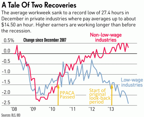
This is a pretty amazing chart from Jed Graham and IBD which I have annotated a bit

click to enlarge


Note first that the diversion between high and low-wage** industries did not occur during the recession, and in fact through the recession the two groups tracked each other pretty closely until early 2010.  Then, in early 2010, something made the two lines start to diverge and in 2012-2013 they really went in opposite directions.

Well, my suggestion for the "something" is Obamacare.  In March 2010, the PPACA was passed.  Looking at the jobs data, one can date the stall in the economic recovery almost precisely from the date the PPACA was passed (e.g. here).

The more important date, though, is January 1, 2013.  This is a date that every business owner was paying attention to at the time but which seems entirely lost on the media.   All the media was focused on the start-date of the employer mandate on January 1, 2014.  Why was the earlier date important?  Let's go back in time.

At that time, the employer mandate had yet to be delayed.  The PPACA and IRS rules in place at the time called for a look-back period in 2013 where actual hours worked for each employee would be tracked to determine whether the employee would classified as full or part-time on the Jan 1, 2014 start date.  So, if a company wanted to classify an employee as part-time at the start of the employer mandate (and thus avoid penalties for that employee), that employee needed to be converted to part-time as early as possible, preferably before 2013 even started and at worst by mid-year 2013 [sorry, I typo-ed these dates originally].

Unlike the government, which apparently waits until after the start-up date to begin building large pieces of major computer systems, businesses often tackle problems head on and well in advance.   Faced with the need to have employees be working 29 hours or less a week in the 2013 look-back period, many likely started making changes back in 2012.  Our company, for example, shifted everyone we could to part time in the fourth quarter of 2012.  I know from talking to the owners of several restaurant chains that they were making their changes even earlier in 2012.  One employee of mine went to Hawaii in October of 2012 and said that all the talk among the resort employees was how they were getting cut to part-time over Obamacare.

Yes, the employer mandate was eventually delayed, but by the time the delay was announced, every reasonably forward-looking company that was going to make changes had already done so.   Having made the changes, there is no way they were going to switch back, and then back yet again when the Administration finally stumbles onto an actual implementation date.

If this chart gets any traction over the next few days, expect to see a lot of ignorance as PPACA defenders claim that the fall in low-wage work hours can't possibly have anything to do with the PPACA because the employer mandate has not even started.  Now you know why this argument is wrong.  The PPACA, and associated IRS implementation rules, drove companies to convert full-time to part-time jobs as early as 2012.

Usual warning:  Correlation is not causation.  However, I will submit that I was predicting exactly this sort of result years before it occurred.  This is not a spurious correlation that is ex post facto blamed on whatever particular bete noir I might have.  I and many other predicted that Obamacare would drive down work hours per week in lower-wage industries, and now having seen exactly that correlated with key Obamacare dates, it is not going to far to hypothesize a connection.

** Why could low-wage industries be impacted more than high-wage?  Two reasons.  One, low-wage industries are far less likely to offer a full Obamacare-compatible health plan to employees than high wage industries.  Second, the fixed penalties ($2000 and $3000 per employee) for lack of insurance plans are obviously a far higher percentage of the total pay in low-wage vs. high-wage industries.   A penalty that is 15% of annual pay is much more likely to cause employers to shift or reduce work than a 3% penalty.

Eeek! Austerity! Oh, Never Mind.

Yesterday I challenged a graph by Kevin Drum in Mother Jones as being a disingenuous attempt to paint US government spending as some sort of crazed austerity program which is making the recovery worse.  He uses this graph to "prove" that our fiscal response to this recession is weak vis a vis past recessions.  The graph is a bit counter-intuitive -- note that it begins at the end of each recession.  His point is that Keynesian spending needs to continue long after (five years ?!) after the recession is over to guarantee a good recovery, and that we have not done that.

Click to enlarge

For anyone not steeped in the special reality of the reality-based community, it is a bit counter intuitive for those of us who have actually lived through the last 5 years to call government spending austere.

The key is in the dates he selects.  He leaves out the actual recession years.  So by his chart, responses that are late and occur after the recession look better than responses that are fast and large but happen during the recession.  This seems odd, but it is the conclusion one has to draw.

I took roughly the same data and started each line two years earlier, so that my first year is two years ahead of his graph and the zero year in my graph is the same as the zero point in Drum's chart.  His data is better in the sense that he has quarterly data and I only have annual.  Mine is better in that it looks at changes in spending as a percentage of GDP, which I would guess would be the more relevant Keynesian metric (it also helps us correct for the chicken and egg problem of increased government spending being due to, rather than causing, economic expansion).

Here are the results (I tried to use roughly the same colors for the same data series, but who in the world with the choice of the entire color pallet uses two almost identical blues?)

recession-redux2

You can see that Drum makes spending look lower in the current recession by carefully dating the data series to the peak of the spending, rather than comparing it to pre-recession levels.  The right hand scale is the difference in government spending as a percentage of GDP from the -2 year.  So, for example, in the current recession government spending was 34.2% in 2007 and 41.4% in 2009 for a reading of 7.2% in year 0.

Even with the flat spending over the last three or four years in the current recession (flat nominal spending leads do a declining percent of GDP) the spending increase from pre-recession levels is still about twice as high as in other recent recessions.

Does this look like austerity to anyone?

Deceptive Chart of the Day from Kevin Drum and Mother Jones to Desperately Sell the "Austerity" Hypothesis

Update:  OK, I pulled together the data and did what Drum should have done, is take the graph back to pre-recession levels.  Shouldn't it be even better if the increase in spending came during the recession rather than after?  See update here.

Kevin Drum complains about US government austerity (I know, I know, only some cocooned progressive could describe recent history as austerity, but let's deal with his argument).  He uses this chart to "prove" that we have been austere vs. other recessions, and thus austerity helps explain why recovery from this recession has been particularly slow.  Here is his chart

Austerity_2_WM_630

This is absurdly disingenuous.  Why?  Simple -- it is impossible to evaluate post recession spending without looking at what spending did during the recession.   All these numbers begin after the recession is over.  But what if, in the current recession, we increased spending much more than in other recessions.  We would still be at a higher level vs. pre-recession spending now, despite a lack of further increases after the recession.

In the time before this chart even starts, total state, local, Federal spending increased from 2007 to 2008 by 10.2%.  It increased another 11.1 % from 2008 to 2009.  So he starts the chart at the peak, only AFTER spending had increased in response to the recession by 22.5%.  Had he started the chart at the correct date and not at a self-serving one, my guess is that it would have shown that in this recession we increased spending more than any other recent recession, not less.  So went digging for some data.

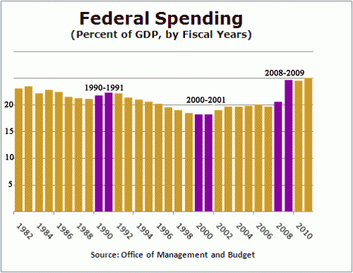
I actually have a day job, so I don't have time to create a chart of total government spending since 1981, so I will look at just Federal spending, but it makes my point.  I scavenged this chart from Factcheck.org.  The purple bars are the year that each of Drum's data series begin plus the year prior (which is excluded from Drum's chart).  Essentially the growth in spending between the two purple lines is the growth left out just ahead of when Drum started each data series in his chart.  The chart did not go back to 1981 so I could not do that year.

click to enlarge

Hopefully, you can see why I say that Drum is disingenuous for not going back to pre-recession numbers.  In this case, you can see the current recession has an unprecedented pop in spending in the year before Drum starts his data series, so it is not surprising that post recession spending might be flatter (remember, the pairs of purple lines are essentially the change in spending the year before each of Drum's data series).  In fact, it is very clear that relative to the pre-recession year of 2008 (really 2007, but I will give him a small break), even after 5 years of "austerity" our federal spending as a percent of GDP will be far higher than in any other recession he considers.  In no previous recession in this era did post recession spending end up more than 2 points higher (as a percent of GDP) than pre-recession levels.    In this recession, we are likely to end up 4-5 points higher.

By the way, isn't it possible that he has cause and effect reversed?  He argues that post-recession recovery was faster in other recessions because government spending kept increasing over five years after the recession is over.  But isn't it just possible that the truth is the reverse -- that government spending increased more rapidly after other recessions because recovery was faster, thus increasing tax revenues. Congress then promptly spent the new revenues on new toys.

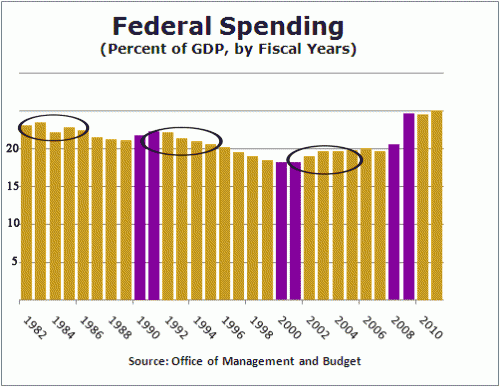
Let's look at the same chart, highlighted in a different way.  I will circle the 4-5 years included in each of Drum's data series:

spending-2

You can see that despite the fact that government spending in these prior recessions was increasing in real terms, it was falling in two our of three of them as a percentage of GDP (the third increased due to war spending in Afghanistan and Iraq, spending which I, and I suspect Drum, would hesitate to call stimulative, particular since he and others at the time called it a jobless recovery).

How can it be that spending was increasing but falling as a percent of GDP?  Because the GDP was growing really fast, faster than government spending.  This does not prove my point, but is a good indicator that recovery is likely leading spending increases, rather than the other way around.

Most Unsurprising Headline of the Year

Via the AZ Republic:

The pay gap between the richest 1 percent and the rest of America widened to a record last year.

...

Last year, the incomes of the top 1 percent rose 19.6 percent compared with a 1 percent increase for the remaining 99 percent.

...

But since the recession officially ended in June 2009, the top 1 percent have enjoyed the benefits of rising corporate profits and stock prices: 95 percent of the income gains reported since 2009 have gone to the top 1 percent.

That compares with a 45 percent share for the top 1 percent in the economic expansion of the 1990s and a 65 percent share from the expansion that followed the 2001 recession.

The Federal Reserve is pumping over a half trillion dollars of printed money into inflating a bubble in financial assets (stocks, bonds, real estate, etc).  It should be zero surprise that the rich, who disproportionately get their income and wealth from such financial assets, should benefit the most.   QE is the greatest bit of cronyism the government has yet to invent.

(yes, I understand that there are many reasons for this one-year result, including tax changes that encouraged income to be moved forward into last year and the fact it was a recovery off of a low base.  Never-the-less, despite decades of Progressive derision for "trickle down" economics, this Administration has pursue the theory that creating an asset bubble that makes the rich much richer will in the long term help the economy via the "wealth effect.")

Chutzpah of the Day

It is interesting that the buck just never stops at this President's desk.  Apparently, the reason for the delay in approval of the Keystone Pipeline is the Republicans.

The approval process for the Keystone XL pipeline has been delayed by Republicans playing “political games,” Treasury Secretary Jack Lew says.

Lew said that the economy is “strong” and more resilient after 40 months of growth but the economic recovery is not fast enough, which led Chris Wallace on “Fox News Sunday” to ask whether approving the pipeline would help speed up job growth.

“If you’re so interested in creating more jobs, why not approve the Keystone pipeline, which will create tens of thousands of jobs?” Wallace asked of the pipeline under review.

“There were some political games that were played, that took it off the trail and path to completion, where Republicans put it out there as something that was put on a timetable that it could not be resolved. It caused a delay,” Lew said. “Playing political games with something like this was a mistake.”


When Environmentally Sustainable Actually Was Sustainable

Many of your know that my company operates public parks.  So I see a lot of different approaches to park design and construction.  Of late I have been observing a trend in "environmental sustainability" in park design that is actually the opposite.

The US Forest Service has built more campgrounds, by far, than any other entity in the world.  For decades, particularly in the western United States, the USFS had a very clear idea about what they wanted in a campground -- they wanted it to be well-integrated with nature, simple, and lightly developed.  They eschewed amenities like pools and playgrounds and shuffleboard.  They avoided building structures except bathroom and shower buildings.  The camp sites were simple, often unpaved with a table and fire ring and a place for a tent.  They used nature itself to make these sites beautiful, keeping the environment natural and creating buffers of trees and natural vegetation between sites.   I have never seen an irrigation system in a western USFS campground -- if it doesn't grow naturally there, it doesn't grow.

This has proven to be an eminently sustainable design.  With the exception of their underground water systems, which tend to suck, they are easy to maintain.  There is not much to go wrong.  The sites need new gravel every once in a while.  Every 5-10 years the tables and fire rings needs replacement, hardly a daunting task.  And every 20-30 years the bathrooms needs refurbishment or replacement.  The design brilliance was in the placement of the sites and their integration with the natural environment.

Over the last several months, I have been presented with plans from three different public parks agencies for parks they want to redevelop.   Each of these have been $10+ million capital projects and each one had a major goal of being "sustainable."   I have run away from all three.  Why -- because each and every one will be incredibly expensive and resource intensive to operate and of questionable popularity with the public.  Sustainability today seems to mean "over-developed with a lot of maintenance-intensive facilities".

What each of these projects has had in common are a myriad of aggressively architected buildings - not just bathrooms but community rooms and offices and interpretive centers.  These buildings have been beautiful and complex, made from expensive materials like stainless steel and fine stone.  They have also had a lot of fiddly bits, like rainwater collection and recycling systems and solar and windmills.  They have automatic plumbing valves that never seem to work right.  The grounds have all been heavily landscaped, with large lawns that require water and mowing, with non-native plants that need all kinds of care.  Rather than a traditional sand pad for tents they have elaborate wooden platforms.

The plans for these facilities are beautiful.  They win awards.  In fact, I am increasingly convinced that that is their whole point, to increase prestige of the designer and the agency that hired them through awards.  But they make no sense as a recreation facility.  In 10 years, they will look like hell.  Or sooner, since one agency that is in the process of spending a $22 million bond issue on 5 campgrounds seems to not have one dollar budgeted for operation and maintenance.

These things actually win awards for sustainability, which generally means they save money on one input at the expense of increasing many others.  One design  got attention for having grass on the roofs, which perhaps saved a few cents of electricity at the cost of having to irrigate and mow the roof (not to mention the extra roof bracing to carry the load).  I briefly operated a campground that had a rainwater recovery system on the bathrooms, which required about 5 hours of labor each week to keep clean and running to save about a dollar of water costs.

Tony Soprano Environmentalism

The Ecuadoran $18 billion court decision is turning out to be a monumental case of environmental fraud.  I am willing to believe that early critics of Texaco (now Chevron) had legitimate beefs about the company's stewardship in its drilling operations in the 1970's in the Amazon.  However, all semblance of principle has gone right out the window in a gigantic money grab.

A while back, it was reported that environmentalists (featured in the movie "Crude" were captured in the outtakes of the movie discussing how they lied about the science to the courts in order to score a big payday (bonus points for Obama appointing one of the fraudsters to the National Academy of Sciences).  See the link for the video evidence.

Past fraud revelations have cast doubt on the key scientific report submitted to the court as part of the proceedings, a report that is now known to have been ghost-written by the plaintiffs.  However, supporters of the judgement against Chevron have argued that the judge has always claimed that this study did not sway his decision in the case.  Now we know what did sway his decision:

Today new allegations of deceit and wrongdoing were leveled against the plaintiffs' lawyers bringing the already deeply troubled environmental suit against Chevron in Lago Agrio, Ecuador, which stems from Texaco's oil drilling in the Ecuadorian Amazon between 1964 and 1992. (Texaco was acquired by Chevron in 2001.)

In Manhattan federal district court this morning, Chevron filed the declaration of a former Ecuadorian judge, Alberto Guerra, who describes how he and a second former judge, Nicolás Zambrano, allegedly allowed the plaintiffs lawyers to ghostwrite their entire 188-page, $18.2 billion judgment against Chevron in exchange for a promise of $500,000 from the anticipated recovery.

Forgetting the Fed -- Why a Recovery May Actually Increase Public Debt

Note:  I am not an expert on the Fed or the operation of the money supply.  Let me know if I am missing something fundamental below

Kevin Drum dredges up this chart from somewhere to supposedly demonstrate that only a little bit of spending cuts are needed to achieve fiscal stability.

Likely the numbers in this chart are a total crock - spending cuts over 10 years are never as large as the government forecasts and tax increases, particularly on the rich, seldom yield as much revenue as expected.

But leave those concerns aside.  What about the Fed?  The debt as a percent of GDP shown for 2012 in this chart is around 72%.  Though it is not labelled as such, this means that this chart is showing public, rather than total, government debt.  The difference is the amount of debt held by federal agencies.  Of late, this amount has been increasing rapidly as the Fed buys Federal debt with printed money.  Currently the total debt as a percent of GDP is something like 101%.

The Left likes to use the public debt number, both because it is lower and because it has been rising more slowly than total debt (due to the unprecedented growth of the Fed's balance sheet the last several years).  But if one insists on making 10-year forecasts of public debt rather than total debt, then one must also forecast Fed actions as part of the mix.

Specifically, the Fed almost certainly will have to start selling some of the debt on its books to the public when the economy starts to recover.  That, at least, is the theory as I understand it: when interest rates can't be lowered further, the Fed can apply further stimulus via quantitative easing, the expansion of the money supply achieved by buying US debt with printed money.  But the flip side of that theory is that when the economy starts to heat up, that debt has to be sold again, sopping up the excess money supply to avoid inflation.  In effect, this will increase the public debt relative to the total debt.

It is pretty clear that the authors of this chart have not assumed any selling of debt from the Fed balance sheet.  The Fed holds about $2 trillion in assets more than it held before the financial crisis, so that selling these into a recovery would increase the public debt as a percent of GDP by 12 points.  In fact, I don't know how they get the red line dropping like it does unless they assume the current QE goes on forever, ie that the FED continues to sop up a half trillion dollars or so of debt every year and takes it out of public hands.

This is incredibly unrealistic.  While a recovery will likely be the one thing that tends to slow the rise of total debt, it may well force the Fed to dump a lot of its balance sheet (and certainly end QE), leading to a rise in public debt.

Here is my prediction:  This is the last year that the Left will insist that public debt is the right number to look at (as opposed to total debt).  With a reversal in QE, as well as the reversal in Social Security cash flow, public debt will soon be rising faster than total debt, and the Left will begin to assure us that total debt rather than public debt is the right number to look at.

So How Did It Go?

Since I blogged on the colonoscopy run-up, I supposed I am obligated to close the loop.  As Dave Barry warns, the prep is the bad part.  A day of eating lime jello combined with five or six hours of massive diarrhea.  Uncomfortable, mildly embarrassing, but quite manageable. The good part is that you know it is coming, you can prepare for it, and you know it is going to be over by the end of the day.

The procedure was a breeze.  The drugs are like a time machine.  One minute you are laying down, with the IV inserted and the next minute you are teleported 45 minutes into the future and in recovery with the whole thing done, feeling mellow.  No pain, before or afterwards.

Only two after-effects.  One, they apparently inflate your colon with air, like a bicycle tire tube, so they can see better.  Once I woke up, I passed gas in epic style, reminiscent of Peter Griffin in a Family Guy episode.  Second, I was freaking ravenous, since I hadn't eaten anything solid for 36 hours and anything at all for 12 hours.  That was solved by picking up the largest steak I could find at Whole Foods on the way home.

All is well medically, by the way.

Myth-Making By the Left on Europe Continues

The Left continues to push the myth that government "austerity"  (defined as still running a massive deficit but running a slightly smaller massive deficit) is somehow pushing Europe into a depression.  Well, this myth-making worked with Hoover, who is generally thought to have worsened the Depression through austerity despite the reality that he substantially increased government spending.

It is almost impossible to spot this mythical austerity beast in action in these European countries.  Sure, they talk about austerity, and deficit reduction, and spending increases, but if such talk were reality we would have a balanced budget in this country.  If one looks at actual government spending in European nations, its impossible to find a substantial decline.  Perhaps they are talking about tax increases, which I would oppose and have been occurring, but I doubt the Left is complaining about tax increases.

Seriously, I would post the chart showing the spending declines but I can't because I keep following links and have yet to find one.  I keep seeing quotes about "commitment" to austerity, but no actual evidence of such.

Let's take Britain.  Paul Krugman specifically lashed out at "austerity" programs there are undermining the British and European economy.  So, from this source, here is actual and budgeted British government spending by year, in billions of pounds:

2007: 544.0

2008: 575.7

2009: 621.5

2010:  660.6

2011:  683.4

2012:  703.4

2013: 722.2

Seriously, I will believe the so-called austerity when someone shows it to me.  And this is not even to mention the irresponsibility of demanding more deficit spending without even acknowledging the fact that whole countries already have so much debt they are teetering on the edge of bankruptcy.

Here is the European problem -- they are pouring hundreds of billions of Euro into bailing out failed banks and governments.  They are effectively taking massive amounts of available resources out of productive hands and pouring it into failed institutions.   Had they (or we) let these institutions crash four years ago, Europe would be seeing a recovery today.  The hundreds of billions of Euros used to keep banks on life support could have instead been used to mitigate the short term effects of bigger financial crash.

New Greek Bailout Announced

It is an open question how long this bailout will plug the dam.  I continue to maintain the position that Greece is going to have to be let out of the Euro. Pulling this Band-Aid off a millimeter at a time is delaying any possible recovery of the Greek economy, and really the European economy, indefinitely.  All to protect the solvency of a number of private banks (or perhaps more accurately, to protect the solvency of the counter-parties who wrote the CDO's on all that debt).

Anyway, the interesting part for me is that with this bailout, the total cumulative charity sent the Greek's way by other European countries now exceeds Greek GDP, by a lot.