Posts tagged ‘1981’

Failing at Fairness: Getting the Story 180 Degrees Backwards

The other day the indispensable Mark Perry wrote:

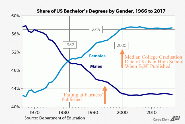
....women have earned a majority of bachelor’s degrees for the last 36 years starting in 1982. Not shown here, but women previously earned a majority of associate’s degrees starting in 1978 and a majority of master’s degrees starting in 1981. By 2006, women earned a majority of doctoral degrees and the “takeover” of higher education by women was complete for degrees at all levels! But instead of declaring “victory” and moving on, many women are still claiming “victim status” in higher education with the need for special gender preferences in the form of funding, scholarships, centers, commissions, fellowships, awards, programs, and initiatives that are only available for women, or are primarily for women.

I have annotated his chart (shown below) to amplify his last sentence.

One of the seminal books on the topic of girls in education was "Failing at Fairness" by Myra P Sadker and published in 1994.  The Google Books summary of the book is as follows:

Failing at Fairness, the result of two decades of research, shows how gender bias makes it impossible for girls to receive an education equal to that given to boys.

  • Girls' learning problems are not identified as often as boys' are
  • Boys receive more of their teachers' attention
  • Girls start school testing higher in every academic subject, yet graduate from high school scoring 50 points lower than boys on the SAT

The book was very influential.  I know it sat on my feminist wife's night table for quite a while.  But note the publication date on Mark Perry's chart above.  For kids in high school when that book was published, a fair median date for their college graduation would be 6 years later, or around the year 2000.  It's fair to estimate that girls in high school at the time Sadker was writing were going to be 33% more likely to get a college degree than the boys in the same classes.   Anyone who had read that book alone and nothing else on the topic would have called you a liar for predicting that.

Look, I have no doubt that one could easily put together a book about all the ways the public education system fails girls because I think the public education system in many parts of this country fails EVERYONE.  But we seem to keep obsessively questioning whether we are doing enough for girls in education when the problem seems to be boys.

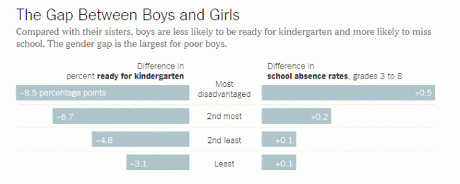
The New York Times actually talked about boys falling behind in education a few years ago, and had this telling chart about ways in which boys lagged in education.  The article forced on poor boys, but note that boys of all socioeconomic classes lagged.

And this is before we even get to the most disturbing metrics about boys and girls, such as youth crime.  While girls have closed the gender gap in crime somewhat, boys are still 10 times more likely than girls to be arrested for a homicide, and boys are more than twice as likely to be arrested for any sort of crime than girls (source).  Remember that last mass shooter who was female?  Neither do I.

I am not an expert on why this is.   Shifting success norms from competition to cooperation, elimination of historic outlets for non-academic males like vocational programs, and huge amounts of money and counseling resources all dedicated to girls probably play a part.  But the frustrating thing is you almost never see a discussion of this topic.  Anyone who does try to address it is immediately pigeon-holed as some alt-right male rights extremist and defenestrated from the Overton Window.
Wow. Thanks Capitalism!

A Great Example of How the Media Twists Facts on Climate

First, let's start with the Guardian headline:

Exxon knew of climate change in 1981, email says – but it funded deniers for 27 more years

So now let's look at the email, in full, which is the sole source for the Guardian headline.  I challenge you, no matter how much you squint, to find a basis for the Guardian's statement.  Basically the email says that Exxon knew of the concern about global warming in 1981, but did not necessarily agree with it.  Hardly the tobacco-lawyer cover-up the Guardian is trying to make it sound like.  I will reprint the email in full because I actually think it is a pretty sober view of how good corporations think about these issues, and it accurately reflects the Exxon I knew from 3 years as a mechanical / safety engineer in a refinery.

I will add that you can see the media denial that a lukewarmer position even exists (which I complained about most recently here) in full action in this Guardian article.  Exxon's position as described in the Guardian's source looks pretty close to the lukewarmer position to me -- that man made global warming exists but is being exaggerated.   But to the Guardian, and many others, there is only full-blown acceptance of the most absurd exaggerated climate change forecasts or you are a denier.  Anyway, here is the email in full:

Corporations are interested in environmental impacts only to the extent that they affect profits, either current or future. They may take what appears to be altruistic positions to improve their public image, but the assumption underlying those actions is that they will increase future profits. ExxonMobil is an interesting case in point.

Exxon first got interested in climate change in 1981 because it was seeking to develop the Natuna gas field off Indonesia. This is an immense reserve of natural gas, but it is 70% CO2. That CO2 would have to be separated to make the natural gas usable. Natural gas often contains CO2 and the technology for removing CO2 is well known. In 1981 (and now) the usual practice was to vent the CO2 to the atmosphere. When I first learned about the project in 1989, the projections were that if Natuna were developed and its CO2 vented to the atmosphere, it would be the largest point source of CO2 in the world and account for about 1% of projected global CO2 emissions. I’m sure that it would still be the largest point source of CO2, but since CO2 emissions have grown faster than projected in 1989, it would probably account for a smaller fraction of global CO2 emissions.

The alternative to venting CO2 to the atmosphere is to inject it into ground. This technology was also well known, since the oil industry had been injecting limited quantities of CO2 to enhance oil recovery. There were many questions about whether the CO2 would remain in the ground, some of which have been answered by Statoil’s now almost 20 years of experience injecting CO2 in the North Sea. Statoil did this because the Norwegian government placed a tax on vented CO2. It was cheaper for Statoil to inject CO2 than pay the tax. Of course, Statoil has touted how much CO2 it has prevented from being emitted.

In the 1980s, Exxon needed to understand the potential for concerns about climate change to lead to regulation that would affect Natuna and other potential projects. They were well ahead of the rest of industry in this awareness. Other companies, such as Mobil, only became aware of the issue in 1988, when it first became a political issue. Natural resource companies – oil, coal, minerals – have to make investments that have lifetimes of 50-100 years. Whatever their public stance, internally they make very careful assessments of the potential for regulation, including the scientific basis for those regulations. Exxon NEVER denied the potential for humans to impact the climate system. It did question – legitimately, in my opinion – the validity of some of the science.

Political battles need to personify the enemy. This is why liberals spend so much time vilifying the Koch brothers – who are hardly the only big money supporters of conservative ideas. In climate change, the first villain was a man named Donald Pearlman, who was a lobbyist for Saudi Arabia and Kuwait. (In another life, he was instrumental in getting the U.S. Holocaust Museum funded and built.) Pearlman’s usefulness as a villain ended when he died of lung cancer – he was a heavy smoker to the end.

Then the villain was the Global Climate Coalition (GCC), a trade organization of energy producers and large energy users. I was involved in GCC for a while, unsuccessfully trying to get them to recognize scientific reality. (That effort got me on to the front page of the New York Times, but that’s another story.) Environmental group pressure was successful in putting GCC out of business, but they also lost their villain. They needed one which wouldn’t die and wouldn’t go out of business. Exxon, and after its merger with Mobil ExxonMobil, fit the bill, especially under its former CEO, Lee Raymond, who was vocally opposed to climate change regulation. ExxonMobil’s current CEO, Rex Tillerson, has taken a much softer line, but ExxonMobil has not lost its position as the personification of corporate, and especially climate change, evil. It is the only company mentioned in Alyssa’s e-mail, even though, in my opinion, it is far more ethical that many other large corporations.

Having spent twenty years working for Exxon and ten working for Mobil, I know that much of that ethical behavior comes from a business calculation that it is cheaper in the long run to be ethical than unethical. Safety is the clearest example of this. ExxonMobil knows all too well the cost of poor safety practices. The Exxon Valdez is the most public, but far from the only, example of the high cost of unsafe operations. The value of good environmental practices are more subtle, but a facility that does a good job of controlling emission and waste is a well run facility, that is probably maximizing profit. All major companies will tell you that they are trying to minimize their internal CO2 emissions. Mostly, they are doing this by improving energy efficiency and reducing cost. The same is true for internal recycling, again a practice most companies follow. Its just good engineering.

Explaining the Flaw in Kevin Drum's (and Apparently Science Magazine's) Climate Chart

I won't repeat the analysis, you need to see it here.  Here is the chart in question:

la-sci-climate-warming

My argument is that the smoothing and relatively low sampling intervals in the early data very likely mask variations similar to what we are seeing in the last 100 years -- ie they greatly exaggerate the smoothness of history and create a false impression that recent temperature changes are unprecedented (also the grey range bands are self-evidently garbage, but that is another story).

Drum's response was that "it was published in Science."  Apparently, this sort of appeal to authority is what passes for data analysis in the climate world.

Well, maybe I did not explain the issue well.  So I found a political analysis that may help Kevin Drum see the problem.  This is from an actual blog post by Dave Manuel (this seems to be such a common data analysis fallacy that I found an example on the first page of my first Google search).  It is an analysis of average GDP growth by President.  I don't know this Dave Manuel guy and can't comment on the data quality, but let's assume the data is correct for a moment.  Quoting from his post:

Here are the individual performances of each president since 1948:

1948-1952 (Harry S. Truman, Democrat), +4.82%

1953-1960 (Dwight D. Eisenhower, Republican), +3%

1961-1964 (John F. Kennedy / Lyndon B. Johnson, Democrat), +4.65%

1965-1968 (Lyndon B. Johnson, Democrat), +5.05%

1969-1972 (Richard Nixon, Republican), +3%

1973-1976 (Richard Nixon / Gerald Ford, Republican), +2.6%

1977-1980 (Jimmy Carter, Democrat), +3.25%

1981-1988 (Ronald Reagan, Republican), 3.4%

1989-1992 (George H. W. Bush, Republican), 2.17%

1993-2000 (Bill Clinton, Democrat), 3.88%

2001-2008 (George W. Bush, Republican), +2.09%

2009 (Barack Obama, Democrat), -2.6%

Let's put this data in a chart:

click to enlarge


Look, a hockey stick , right?   Obama is the worst, right?

In fact there is a big problem with this analysis, even if the data is correct.  And I bet Kevin Drum can get it right away, even though it is the exact same problem as on his climate chart.

The problem is that a single year of Obama's is compared to four or eight years for other presidents.  These earlier presidents may well have had individual down economic years - in fact, Reagan's first year was almost certainly a down year for GDP.  But that kind of volatility is masked because the data points for the other presidents represent much more time, effectively smoothing variability.

Now, this chart has a difference in sampling frequency of 4-8x between the previous presidents and Obama.  This made a huge difference here, but it is a trivial difference compared to the 1 million times greater sampling frequency of modern temperature data vs. historical data obtained by looking at proxies (such as ice cores and tree rings).  And, unlike this chart, the method of sampling is very different across time with temperature - thermometers today are far more reliable and linear measurement devices than trees or ice.  In our GDP example, this problem roughly equates to trying to compare the GDP under Obama (with all the economic data we collate today) to, say, the economic growth rate under Henry the VIII.  Or perhaps under Ramses II.   If I showed that GDP growth in a single month under Obama was less than the average over 66 years under Ramses II, and tried to draw some conclusion from that, I think someone might challenge my analysis.  Unless of course it appears in Science, then it must be beyond question.

Deceptive Chart of the Day from Kevin Drum and Mother Jones to Desperately Sell the "Austerity" Hypothesis

Update:  OK, I pulled together the data and did what Drum should have done, is take the graph back to pre-recession levels.  Shouldn't it be even better if the increase in spending came during the recession rather than after?  See update here.

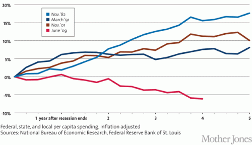
Kevin Drum complains about US government austerity (I know, I know, only some cocooned progressive could describe recent history as austerity, but let's deal with his argument).  He uses this chart to "prove" that we have been austere vs. other recessions, and thus austerity helps explain why recovery from this recession has been particularly slow.  Here is his chart

Austerity_2_WM_630

This is absurdly disingenuous.  Why?  Simple -- it is impossible to evaluate post recession spending without looking at what spending did during the recession.   All these numbers begin after the recession is over.  But what if, in the current recession, we increased spending much more than in other recessions.  We would still be at a higher level vs. pre-recession spending now, despite a lack of further increases after the recession.

In the time before this chart even starts, total state, local, Federal spending increased from 2007 to 2008 by 10.2%.  It increased another 11.1 % from 2008 to 2009.  So he starts the chart at the peak, only AFTER spending had increased in response to the recession by 22.5%.  Had he started the chart at the correct date and not at a self-serving one, my guess is that it would have shown that in this recession we increased spending more than any other recent recession, not less.  So went digging for some data.

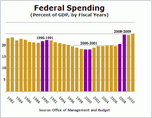
I actually have a day job, so I don't have time to create a chart of total government spending since 1981, so I will look at just Federal spending, but it makes my point.  I scavenged this chart from Factcheck.org.  The purple bars are the year that each of Drum's data series begin plus the year prior (which is excluded from Drum's chart).  Essentially the growth in spending between the two purple lines is the growth left out just ahead of when Drum started each data series in his chart.  The chart did not go back to 1981 so I could not do that year.

click to enlarge

Hopefully, you can see why I say that Drum is disingenuous for not going back to pre-recession numbers.  In this case, you can see the current recession has an unprecedented pop in spending in the year before Drum starts his data series, so it is not surprising that post recession spending might be flatter (remember, the pairs of purple lines are essentially the change in spending the year before each of Drum's data series).  In fact, it is very clear that relative to the pre-recession year of 2008 (really 2007, but I will give him a small break), even after 5 years of "austerity" our federal spending as a percent of GDP will be far higher than in any other recession he considers.  In no previous recession in this era did post recession spending end up more than 2 points higher (as a percent of GDP) than pre-recession levels.    In this recession, we are likely to end up 4-5 points higher.

By the way, isn't it possible that he has cause and effect reversed?  He argues that post-recession recovery was faster in other recessions because government spending kept increasing over five years after the recession is over.  But isn't it just possible that the truth is the reverse -- that government spending increased more rapidly after other recessions because recovery was faster, thus increasing tax revenues. Congress then promptly spent the new revenues on new toys.

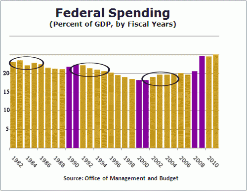
Let's look at the same chart, highlighted in a different way.  I will circle the 4-5 years included in each of Drum's data series:

spending-2

You can see that despite the fact that government spending in these prior recessions was increasing in real terms, it was falling in two our of three of them as a percentage of GDP (the third increased due to war spending in Afghanistan and Iraq, spending which I, and I suspect Drum, would hesitate to call stimulative, particular since he and others at the time called it a jobless recovery).

How can it be that spending was increasing but falling as a percent of GDP?  Because the GDP was growing really fast, faster than government spending.  This does not prove my point, but is a good indicator that recovery is likely leading spending increases, rather than the other way around.

Go Gary Johnson

I decided today to volunteer for Gary Johnson's independent libertarian run for President.  I have always been a Johnson supporter, and was disappointed that he did not get more attention in the debates and nomination process.

Yes, I know folks will be saying that if Gary Johnson does well, it will just be guaranteeing an Obama victory.  You know what?  Given the choices, I don't care.  My other choices seem to be the guy who pilot-tested Obamacare and Rick Santorum, perhaps the only person the Republicans could have found with a deeper authoritarian streak than Obama.  You know those 2x2 matrices where one leg is "government intervention in social issues" and the other is "government intervention in economic issues?"  Where libertarians are low-low and Republicans and Democrats are each in one of the low-high boxes?  Did you ever wonder who was in the high-high box?  Well, Obama has moved pretty strongly into that space.  But Santorum staked it out years ago.   He is right out of the John McCain, I-am-nominally-for-small-governemnt-but-support-authoritarian-solutions-for-a-range-of-random-issues school.

In fact, I might argue that freedom and small government would be better served by an Obama second term that the yahoos likely to gain the Republic nomination.  First, there is nothing worse than having statism and crony capitalism sold by someone who is nominally pro-market (see either of the Bushes as an example).  Second, Republicans are much feistier about limiting spending and regulation in Congress when in opposition.  They tend to roll over for expansions of state power when they have a fellow Republican in the White House -- just compare spending of the Republican Congress under Clinton vs. Bush.  Medicare Part D, anyone?

As I heard Ayn Rand say in a public speech in 1981, there is only so far I can go choosing the lesser of two evils.  I am now all in for Gary Johnson.

Why Libertarians Aren't just Republicans Who Smoke Pot

Because we also think this kind of intrusion by the state is offensive.

Yesterday, the House Judiciary Committee voted 19-10 for H.R. 1981, a data-retention bill that will require your ISP to spy on everything you do online and save records of it for 12 months. California Rep Zoe Lofgren, one of the Democrats who opposed the bill, called it a “data bank of every digital act by every American” that would “let us find out where every single American visited Web sites.”

It really pisses me off that the Republicans wrap themselves in the mantle of individual liberty when challenging Obama over insane spending levels, but then, simultaneously, do this kind of crap.

The Baseline

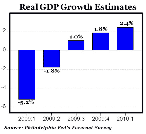
One problem with the stimulus bill is that it is so diffuse, so poorly understood, and so impossible to measure, that it will allow its supporters to claim anything about its effects.  If no one knows what is in it, how do you measure effectiveness?  Long recession?  Those dang Republicans slowed the bill and kept the size too low.  End of 2009 recovery?  It's because of the stimulus bill (never mind that the money will not have even really been spent).  So, in the interests of setting a reasonable baseline, here is the pre-stimulus economic projections:

gdp_forecast

Via Carpe Diem.

In case you are not infuriated enough over this bill, remember that Obama is looking at exactly this data when he makes his proclamations of continued economic doom to scare folks into passing his pork-spending liberal wish list stimulus bill.    Remember when Obama said "My economic advisers have told me this recession will last 4-5 more months, and then we will start to see a recovery?"  Yeah, neither do I.  I remember him projecting another 5 million lost jobs.   Do you think if he said "the economy will start growing again in 5 months" he could have passed a 10-year "stimulus" bill?  Fat chance.  Maybe he is the new FDR, but with a new phrase "The only thing we have to promote is fear itself."

Carpe Diem also has a useful comparison to 1981:

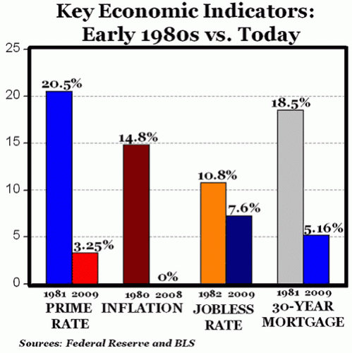
1981

Back then, we responded with tax cuts and a focus by the President on reducing the size of government.  Twenty-five years of prosperity followed.  Today we are responding with a trillion dollars of money for government bureaucrats, increases in welfare, and pork for favored corporations.  I am not hugely confident.

Someone Should Study this Phenomenon

Of late, Democratic lawmakers have argued that gasoline prices are set at the caprice of oil companies, and mainly serve to provide them with undeserved profits.  However, we here at Coyote Blog try to bring you breaking news at the frontiers of scientific inquiry, and, via the USA Today, we get this fascinating revelation:

The average American motorist is driving
substantially fewer miles for the first time in 26 years because of
high gas prices and demographic shifts, according to a USA TODAY
analysis of federal highway data.

The growth in miles driven has leveled off
dramatically in the past 18 months after 25 years of steady climbs
despite the addition of more than 1 million drivers to the nation's
streets and highways since 2005. Miles driven in February declined 1.9%
from February 2006 before rebounding slightly for a 0.3% year-over-year
gain in March, data from the Federal Highway Administration show.
That's in sharp contrast to the average annual growth rate of 2.7%
recorded from 1980 through 2005....

The nation has not seen such stagnant growth in
driving since 1981, when the USA staggered through an oil shortage and
a recession. Gas prices reached an all-time high of $3.223 in March
1981 when adjusted for inflation in today's dollars.

Wow!  This seems to imply that prices have a here-to-for unsuspected utility.  They might actually be useful for matching supply and demand of scarce resources.  Fascinating.  Maybe Congress can commission a study of this phenomenon.

Postscript: Leaving the snark aside, it is hilarious in this article to see an urban planning group trying to bend over backwards to say that really, price was only a minor factor -- this really had to do with demographics and the success of our urban planning and public transportation.  Of course, it's just a coincidence that this step change occurred at the same time as a gas price spike, and that the last time it happened was the last time that gas price spiked.  Note that none of the data in the article actually supports the point of view that this was anything but a direct response to price signals.

Cotton Growing Dying in Phoenix -- Good!

I have written a number of articles about the ridiculous subsidies paid to cotton growers in Arizona.  The AZ Republic has a semi-nostalgic look at the decline of cotton farming in the Valley, mainly due to the pressure of urban growth.  I say:  Good!  How have we tolerated a situation like this so long:

This year, Arizona farmers planted 215,000 acres of cotton, a 66
percent drop from the 633,000 acres in production in 1981, said Rick
Lavis, vice president of the Arizona Cotton Growers Association.

"I wish we could grow more and the prices were better," Lavis said.

Cotton averages 55 cents per pound, up from five years ago, Lavis said. But it costs 75 cents a pound to produce, he said.

"Doesn't sound very profitable, does it?" Lavis asked. "If the trend
lines tell us anything, it probably is continuing to be a diminishing
commodity because of urbanization and price. If you're not making back
the 72 cents to 75 cents a pound that it costs to produce it, cotton
growers may say, 'Gee, I need to grow something else.' "

A variety of federal subsidies, including guaranteed payments, price
supports and below-market loan rates, keep cotton profitable for
Arizona farmers, Lavis said. When cotton prices rise, subsidies
decline, he said.

You mean at some point when prices are 20 cents under the cost of production, farmers might eventually consider planting something else?  Duh.  Farmers, generally rational sorts, would have made this decision long ago if it weren't for the enormous federal subsidies mentioned in the last paragraph that keep cotton profitable.  And this underestimates the total subsidy, since farmers in Arizona (as well as Southern California) use millions of gallons of subsidized water, ofter priced below cost, usually priced below what we other citizens pay, and always priced below what a true market clearing price would be (which explains why Lake Powell is drying up).

In this post I list information on cotton subsidies
-- over $100 million in Arizona just for cotton in 2003, and 2006 appears to be a worse year.  And notice the top three subsidy recipients are all Indian Tribes with very, very profitable casino operations.  These are not struggling family farms.  Most every one of these farmers on the top subsidy list are in cities (Goodyear & Queen Creek for example) that are right at the wavefront of Phoenix expansion and so probably sit on a fortune in real estate.  I am sure they are happy to have the USDA pay them a half million dollars a year so they can cover the carrying cost of their land until they find the right developer to buy it for millions.

Vioxx and Merck Lose Again

Vioxx went to 3 for 6 in jury verdicts today as Merck lost a case in Texas (WSJ $).  Merck got hit with $7 million in damages plus $25 million in punitive damages, presumably since Merck was so clearly at fault as to be considered to have acted recklessly.  With that in mind, consider a couple of facts in the case:  First, the plaintiff..

died of a heart attack after taking Vioxx for less than a month.

I know what you are thinking.  How, after less than a month of use (and maybe as little as a week), could any plaintiff prove their heart attack was from Vioxx?   I mean, out of the thousands of people who took Vioxx, some statistically were due for a heart attack even had they not taken the drug.  Having one event (the heart attack) follow another (Vioxx use) does not prove causation, after all.  I guess the jury decided that this guy was not at risk for a heart attack otherwise.  Of course, they admitted that:

Mr. Garza, a Vietnam veteran who was 71 years old when he died in 2001,
had a history of smoking, had suffered a prior heart attack in 1981 and
had quadruple bypass surgery in 1985.

But I'm sure that had no bearing on his heart attack.  It must have been from the week of Vioxx.  His lawyers mitigated this by arguing:

he had a stress test shortly before his heart attack that showed he was in good health

Do you know how many men die of heart attacks within months of having a clean stress test?  A lot.

The plaintiffs initially asked for a billion dollars, so I guess if only by comparison the verdict was reasonable.  I wrote more about the danger of making uninformed juries the arbiter of what risk trade-offs we as individuals can take with our medications here and here and here.  I questioned multiple punitive damage awards for the same offense in the context of double jeopardy here.

Report on the Stones

Quick report on the Rolling Stones concert last night:

  • Against all odds, Keith Richards is still alive
  • Ron Wood still has Rod Stewart's haircut, long after Rod gave it up
  • Per my wife, Ron Wood has the smallest butt she has ever seen
  • Mick Jagger still puts on a great show
  • The stage was great - they actually moved the stage for about 20% of the show to the center of the floor, which moved us from 20th row floor to right on the stage for that portion.  Cool.
  • When I last saw the Stones in 1981, everyone at the concert was about my age.  This time, nearly 25 years later, everyone was again my age.

I can only hope I have that much energy at age 62.

The Rolling Stones and I are Both Still Alive

Yes, blogging has been so light of late as to be non-existent.  We have two large proposals due next week for the recreation business so I have been just swamped with other writing. 

The reference to the Stones is because my wife and I have tickets to see the Stones tonight in Glendale.  I remember in 1981 or 82, when I was in college, my roommate and I decided we had to drive to Philadelphia to see the Stones in concert.  After all, we thought, they are older than god and surely this was about their last tour.  LOL.  25 years later and I am seeing them again.  What odds would you have given in 1980 that Keith Richards would even be alive in 2005, much less touring?