Posts tagged ‘Historical Climate Network’

A Junior High Science Project That Actually Contributes A Small Bit to Science

Cross-posted from Climate Skeptic

Tired of build-a-volcano junior high science fair projects, my son and I tried to identify something he could easily do himself (well, mostly, you know how kids science projects are) but that would actually contribute a small bit to science.  This year, he is doing a project on urban heat islands and urban biases on temperature measurement.   The project has two parts:  1) drive across Phoenix taking temperature measurements at night, to see if there is a variation and 2) participate in the surfacestations.org survey of US Historical Climate Network temperature measurement sites, analyzing a couple of sites for urban heat biases. 

The results of #1 are really cool (warm?) but I will save posting them until my son has his data in order.  Here is a teaser:  While the IPCC claims that urban heat islands have a negligible effect on surface temperature measurement, we found a nearly linear 5 degree F temperature gradient in the early evening between downtown Phoenix and the countryside 25 miles away.  I can't wait to try this for myself near a USHCN site, say from the Tucson site out to the countryside.

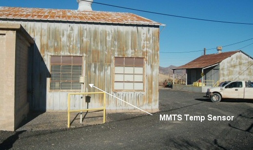
For #2, he has posted two USHCN temperature measurement site surveys here and here.  The fun part for him is that his survey of the Miami, AZ site has already led to a post in response at Climate Audit.  It turns out his survey adds data to an ongoing discussion there about GISS temperature "corrections."

Miami_az_mmts

Out-of-the-mouth-of-babes moment:  My son says, "gee, dad, doesn't that metal building reflect a lot of heat on the thermometer-thing."  You can bet it does.  This is so obvious even a 14-year-old can see it, but don't tell the RealClimate folks who continue to argue that they can adjust the data for station quality without ever seeing the station.

This has been a very good science project, and I would encourage others to try it.  There are lots of US temperature stations left to survey, particularly in the middle of the country.  In a later post I will show you how we did the driving temperature transects of Phoenix.

Signal to Noise Ratio in Measurement

Over at Climate Skeptic, I discuss Anthony Watt's preliminary findings as to the quality of measurement in the surface temperature installations that are used to measure global warming.  If we call global warming "the signal", then the signal is currently thought to have been about 0.6C over the last century.  However, Watt has good reason to estimate that 85% of the US Historical Climate Network has installation biases that create errors from 1-5C,or about 2-8 times the signal.  And these are not random biases that cancel out, but tend to all bias the numbers higher, leading to systematic over-estimation of temperature increases.

Nothing Sinister Here. Move Along.

A while back, I discussed an effort by Anthony Watts to create a pictorial data base of the US Historical Climate Network, the 1000 or so temperature and weather sensors whose data are used in historical climate numbers, including IPCC and NOAA and GISS global warming data bases. 

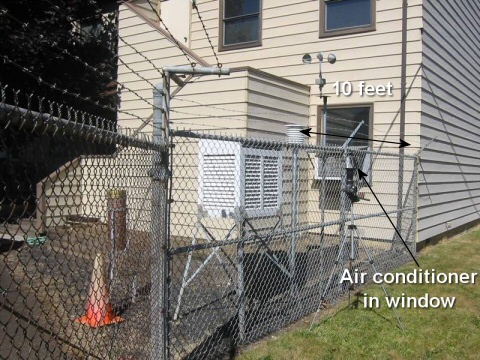
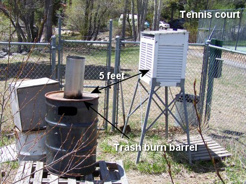
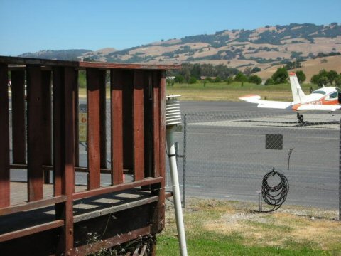
Already, this effort has identified numerous egregious installations that call into question the quality of historical temperature measurement.  Note here and here and here and here.  The whole data base is at SurfaceStations.org and my humble contributions are here and here.  Was 2006 the second warmest of all time, or did 2006 have the most hot exhaust blowing on measurement instruments?

Roger Pielke, a climate scientist in Colorado, reports on an odd response by the NOAA to this effort:

Recently, Anthony Watts has established a website [www.surfacestations.org] to record these photographs. He has worked to assure that the photographs are obtained appropriately.

As a result of this effort, NOAA has removed location information
from their website as to where they are located. This information has
been available there for years.

There are a few USHCN stations at people's homes, so in some cases there may be privacy concerns, but most all of the ones I have seen are at public locations, from fire houses to ranger stations to water plants.  Pielke offers up a logical solution for where there are privacy issues:

"over 4 years ago there was a big push in the Cooperative Observer
program to make sure that all 7000+ sites across the country were
photodocumented. All 120 Data Acquisition Programs were equipped with
high quality digital cameras. Most took photos. However, at the higher
levels where they were developing the upload and archive system for the
photos the issue of observer privacy was raised and as best we can tell
the result was that those photos were not archived and certainly are
not available."

This is a very disturbing development, as individuals in NOAA's
leadership have used their authority to prevent the scientific
community and the public access to critical information that is being
used as part of establishing climate and energy policy in the United
States.

The solution to this issue is, of course, straightforward. Either
make the photographs where datasets are being used in research (i.e.
the HCN sites), available, or permit others to take them. Privacy
rules, such as not publishing the names and addresses of the observers,
should be made, however, the photographs themselves, viewing the site,
and views in the four orthogonal directions must be public. Volunteers
who are HCN Cooperative Observers need to either grant this permission
or not volunteer.

If you observe the state of climate science at all, you will know that any measurement (e.g. satellite or radiosonde temperature measurements) that conflict even the slightest with the main story line of anthropogenic global warming are subjected to intense and withering scrutiny.  Even the tiniest source of error or methodological sloppiness in these conflicting data sets cause global warming zealots to throw out the data as flawed.  It is instructive that perhaps the sloppiest data set of all is the surface climate measurement system they use primarily to support their case, and it is one they show absolutely no interest in scrutinizing, or letting anyone else scrutinize.

Signal to Noise Ratio, Part 2

Anthony Watts and Steven McIntyre make an interesting observation, using an example temperature measurement point in the US and Global Historical Climate Network (the network that most historic global warming estimates are made from).

Over time, temperature measurement points, even those nominally in the same town, tend to change.  The measurement technology changes (from bulbs to electronics) the location can move across town, and towns with their heat islands can encroach.  As a result, scientists try to make guesstimate corrections to the historical data to take these events into account. 

Taking just one example measurement point, at Petaluma CA, Watts and McIntyre show how two different adjustment approaches by scientists at this location change the historic warming measured by over 1.5 degrees C.  Note that this "noise" is more than twice the value of the estimated "signal" -- the estimated 0.6 degrees C global warming over the last century.

More on signal to noise ratios in global warming measurement.

Does this Make Sense?

I am just finishing up my paper "A Skeptical Layman's Guide to Anthropogenic Global Warming," and one thing I encounter a lot with sources and websites that are strong supporters of Anthropogenic Global Warming (AGW) theory is that they will often say such-and-such argument by skeptics was just disproved by so-and-so. 

For example, skeptics often argue that historical temperature records do not correct enough for the effects of urbanization on long-term measurement points.  The IPCC, in fact, has taken the position that what is called the urban heat island effect is trivial, and does not account for much or any of measured warming over the last 100 years.  To this end, one of the pro-AGW sites (either RealClimate.org or the New Scientist, I can't remember which) said that "Parker in 2006 has disproved the urban heat island effect."

Now, if you were going to set out to do such a thing, how would you do it?  The logical way, to me, would be to draw a line from the center of the city to the rural areas surrounding it, and take a bunch of identical thermometers and have people record temperatures every couple of miles along this line.  Then you could draw a graph of temperature vs. nearness to the city center, and see what you would find.

Is that what Parker did?  Uh, no.  I turn it over to Steve McIntyre, one of the two men who helped highlight all the problems with the Mann hockey stick several years ago.

If you are not a climate scientist (or a realclimate reader), you
would almost certainly believe, from your own experience, that cities
are warmer than the surrounding countryside - the "urban heat island".
From that, it's easy to conclude that as cities become bigger and as
towns become cities and villages become towns, that there is a
widespread impact on urban records from changes in landscape, which
have to be considered before you can back out what portion is due to
increased GHG.

One of the main IPCC creeds is that the urban heat island effect has
a negligible impact on large-scale averages such as CRU or GISS. The
obvious way of proving this would seem to be taking measurements on an
urban transect and showing that there is no urban heat island. Of
course, Jones and his associates can't do that because such transects
always show a substantial urban heat island. So they have to resort to
indirect methods to provide evidence of "things unseen", such as Jones
et al 1990, which we've discussed in the past.

The newest entry in the theological literature is Parker (2004, 2006),
who, once again, does not show the absence of an urban heat island by
direct measurements, but purports to show the absence of an effect on
large-scale averages by showing that the temperature trends on calm
days is comparable to that on windy days. My first reaction to this,
and I'm sure that others had the same reaction was: well, so what? Why
would anyone interpret that as evidence one way or the other on UHI?

He goes on to take the study apart in detail, but I think most of you can see that the methodology makes absolutely zero sense unless one is desperately trying to toe the party line and win points with AGW supporters by finding some fig leaf to cover up this urban heat island problem.  By the way, plenty of people have performed the analysis the logical way we discussed first, and have shown huge heat island effects:

Uhi(Click for a larger view)

The bottom axis by the way is a "sky-view" metric I had not seen before, but is a measurement of urban topology.  Effectively the more urbanized and the more tall buildings around you that create a canyon effect, the lower the sky view fraction.  Note that no one gets a number for the Urban Heat Island effect less than 1 degree C, and many hover around 6 degrees (delta temperature from urban location to surrounding rural countryside).  Just a bit higher than the 0.2C assumed by the IPCC.  Why would they assume such a low number in the face of strong evidence?  Because assuming a higher number would reduce historical warming numbers, silly.

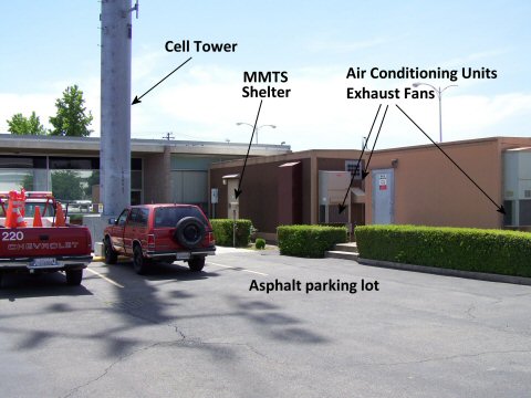
Oh, and the IPCC argues that the measurement points it uses around the world are all rural locations so urban heat island corrections are irrelevant.  Below are some sample photos of USHCN sites, which are these supposedly rural sites that are used in the official historical warming numbers.  By the way, these US sites are probably better than what you would find anywhere else in the world. (All pictures from surfacesations.org)  As always, you can click for a larger view.
Marysville_issues1 

Forestgrove

Tahoe_city3

Petaluma_east

You can help with the effort of documenting all the US Historical Climate Network (USHCN) stations.  See my post here -- I have already done two and its fun!
Climate Scavenger Hunt (No Climate Expertise Required)

Anthony Watts is offering an opportunity to help out climate science and participate in something of a climate scavenger hunt.  What is considered the most "trustworthy" temperature history of the US comes from a series of temperature measurement points called the US Historical Climate Network (USHCN).  There are perhaps 20-25 such measurement points in each state, usually in smaller towns and more remote spots.  Some of these stations are well-located, while others are not - having been encroached by urban heat islands of growing towns or having been placed carelessly (see here and here for examples of  inexcusably bad installations that are currently part of the US historical temperature record).

Historically, climate scientists have applied statistical corrections to try to take into account these biasing effects.  Unfortunately, these statistical methods are blind to installation quality.  Watt is trying to correct that, by creating a photo database of these installations, with comments by reviewers about the installation and potential local biases. 

He has created an online database at surfacestations.org, which he explains here.  Your faithful blogger Coyote actually contributed one of the early entries, and it was fun  -- a lot like geocaching but with more of a sense of accomplishment, because it was contributing to science.

So why is it a scavenger hunt?  Well, my son had a double header in Prescott, AZ, which I saw was near the Prescott USHCN station.  Here is what I began with, from the official listing: 

PRESCOTT (34.57°N, 112.44°W; 1586 m)

That looks easy -- latitude and longitude.  Well, I stuck it in Google maps and found this.  Turns out on satellite view that there is nothing there.  So I then asked around to the state climatologist's office - do you know the address of this station.  Nope.  So I zoomed out a bit, and started doing some local business searches in Google maps around the original Lat/Long.  I was looking for government property - fire stations, ranger stations, airports, etc.  These are typically the location of such stations.  The municipal water treatment plant to the east looked good.  So we drove by, and found it in about ten minutes and took our pictures.  My entry is here.

Not only was it fun, but this is important work.  In trying to find some stations in several states, I actually called the offices of the local state climatologist (most states have one).  I have yet to find one that had any idea where these installations were beyond the lat-long points in the data base.  If we are going to make trillion dollar political choices based on the output of this network, it is probably a good idea to understand it better.