Archive for the ‘Climate’ Category.

Must...Not...Make...Ad...Hominem...Attack

A couple of weeks ago, Newsweek published a front-page article demonizing ExxonMobil for given $10,000 honorariums to researchers likely to publish work skeptical of catastrophic man-made global warming.  If $10,000 is corrupting and justifies such an ad hominem attack, what are we to make of $100 million (pronounced in Dr. Evil voice with pinkie to lips) a year in pro-catastrophe spending:

That's right, $100 million per year. Al Gore,
who seems to think it is sinister for other people to spend money in
order to communicate their ideas about sound public policy is going to
outspend the entire mass of climate policy critics tenfold in order to
spread his message of environmental catastrophism to the public.

Speech:  OK for me, but not for thee.

Postscript:  By the way, I fully support Mr. Gore and his donor's efforts to let their viewpoint be heard.  I just wonder why they don't extend me the same courtesy.

Reality Checking Global Warming Forecasts

I know I have deluged you with a lot of climate change posts of late.  I think this particular post is important, as it is the clearest single argument I can make as to why I am skeptical that man-made global warming will rise to catastrophic levels.  It is not comprehensive, it took me 80 pages to do that, but it should get anyone thinking.

It turns out to be quite easy to do a simple but fairly robust reality check of global warming forecasts, even without knowing what a "Watt" or a "forcing" is.   Our approach will be entirely empirical, based on the last 100 years of climate history.  I am sensitive that we skeptics not fall into the
9/11 Truther syndrome of arguing against a coherent theory from
isolated anomalies
.  To this end, my approach here is holistic and not
anomaly driven.  What we
will find is that, extrapolating from history, it is almost impossible to get warming numbers as high as those quoted by global warming alarmists.

Climate Sensitivity

The one simple concept you need to understand is "climate sensitivity."  As used in most global warming literature, climate sensitivity is the amount of global warming that results from a doubling in atmospheric CO2 concentrations.   Usually, when this number is presented, it refers to the warming from a doubling of CO2 concentrations since the beginning of the industrial revolution.  The pre-industrial concentration is generally accepted as 280ppm (0.028% of the atmosphere) and the number today is about 380ppm, so a doubling would be to 560ppm.

As a useful, though not required, first step before we begin, I encourage you to read the RealClimate simple "proof" for laymen that the climate sensitivity is 3ºC, meaning the world will warm 3 degrees C with a doubling of CO2 concentrations from their pre-industrial level.  Don't worry if you don't understand the whole description, we are going to do it a different, and I think more compelling, way (climate scientists are a bit like the Wizard of Oz -- they are afraid if they make things too simple someone might doubt they are a real wizard).  3ºC is a common number for sensitivity used by global warming hawks, though it is actually at the low end of the range that the UN IPCC arrived at in their fourth report.  The IPCC (4th report, page 798) said that the expected value is between 3ºC and 4ºC and that there was a greater chance the sensitivity was larger than 6ºC than that it was 1.5ºC or less.  I will show you why I think it is extraordinarily unlikely that the number is greater even than 1.5ºC.

Our Approach

We are going to derive the sensitivity (actually a reasonable range for sensitivity) for ourselves in three steps.  First, we will do it a simple way.  Then, we will do it a slightly harder but more accurate way.  And third, we will see what we would have to assume to get a number anywhere near 3ºC.  Our approach will be entirely empirical, using past changes in CO2 and temperature to estimate sensitivity.  After all, we have measured CO2 going up by about 100 ppm.  That is about 36% of the way towards a doubling from 280 to 560.  And, we have measured temperatures -- and though there are a lot of biases in these temperature measurements, these measurements certainly are better than our guesses, say, of temperatures in the last ice age.  Did you notice something odd, by the way, in the RealClimate derivation?  They never mentioned measured sensitivities in the last 100 years -- they jumped all the way back to the last ice age.  I wonder if there is a reason for that?

A First Approximation

OK, let's do the obvious.  If we have experienced 36% of a doubling, then we should be able to take the historic temperature rise from CO2 for the same period and multiply it by 2.8 (that's just reciprocal of 36%) and derive the temperature increase we would expect for a full doubling.

The problem is that we don't know the historic temperature rise solely form CO2.  But we do know how to bound it.  The IPCC and most global warming hawks place the warming since 1900 at about 0.6ºC.  Since no one attributes warming before 1900 to man-made CO2  (it did warm, but this is attributed to natural cyclical recovery from the little ice age) then the maximum historic man-made warming is 0.6ºC.  In fact, all of that warming is probably not from CO2.  Some probably is from continued cyclical warming out of the little ice age.  Some, I believe strongly, is due to still uncorrected biases, particularly of urban heat islands, in surface temperature data. 

But let's for a moment attribute, unrealistically, all of this 0.6ºC to man-made CO2 (this is in fact what the IPCC does in their report).   This should place an upper bound on the sensitivity number.  Taking 0.6ºC times 2.8 yields an estimated  climate sensitivity of  1.7ºC.  Oops.  This is about half of the RealClimate number or the IPCC number! And if we take a more realistic number for man-made historic warming as 0.4ºC, then we get a sensitivity of 1.1ºC.  Wow, that's a lot lower! We must be missing something important!  It turns out that we are, in this simple analysis, missing something important.  But taking it into account is going to push our sensitivity number even lower.

A Better Approximation

What we are missing is that the relation between CO2 concentration and warming is not linear, as implied in our first approximation.  It is a diminishing return.  This means that the first 50 ppm rise in CO2 concentrations causes more warming than the next 50 ppm, etc.  This effect has often been compared to painting a window.  The first coat of paint blocks out a lot of light, but the window is still translucent.  The next coat blocks out more light, but not as much as the first.  Eventually, subsequent coats have no effect because all the light is already blocked.  CO2 has a similar effect on warming.  It only absorbs certain wavelengths of radiation returning to space from earth.  Once the absorption of those wavelengths is saturated, extra CO2 will do almost nothing. (update:  By the way, this is not some skeptic's fantasy -- everyone in climate accepts this fact).

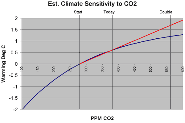
So what does this mean in English?  Well, in our first approximation, we assumed that 36% of a CO2 doubling would yield 36% of the temperature we would get in a doubling.  But in reality, since the relationship is a diminishing return, the first 36% of a CO2 doubling will yield MORE than 36% of the temperature increase you get for a doubling.  The temperature increase is front-loaded, and diminishes going forward.   An illustration is below, with the linear extrapolation in red and the more realistic decreasing exponential extrapolation in blue.

Sensitivity

The exact shape and equation of this curve is not really known, but we can establish a reasonable range of potential values.  For any reasonable shapes of this curve, 36% of a CO2 doubling (where we are today) equates to from 43% to 63% of the final temperature increase over a doubling.  This would imply that a multiplier between 2.3 and 1.6 for temperature extrapolation  (vs. 2.8 derived above for the straight linear extrapolation above) or a climate sensitivity of 1.4ºC to 1.0ºC if man-made historic warming was 0.6ºC and a range of 0.9ºC to 0.6ºC for a man-made historic warming of 0.4ºC.  I tend to use the middle of this range, with a multiplier of about 1.9 and a man-made historic warming of 0.5ºC to give a expected sensitivity of 0.95ºC, which we can round to 1ºC. 

This is why you will often hear skeptics cite numbers closer to 1ºC rather than 3ºC for the climate sensitivity.   Any reasonable analysis of actual climate experience over the last 100 years yields a sensitivity much closer to 1ºC than 3ºC.  Most studies conducted before the current infatuation with showing cataclysmic warming forecasts came up with this same 1ºC, and peer-reviewed work is still coming up with this same number

So what does this mean for the future?  Well, to predict actual temperature increases from this sensitivity, we would have to first create a CO2 production forecast and, you guessed it, global warming hawks have exaggerated that as well.  The IPCC says we will hit the full doubling to 560ppm around 2065 (Al Gore, incredibly, says we will hit it in the next two decades).  This means that with about 0.5C behind us, and a 3 sensitivity, we can expect 2.5C more warming in the next 60 years.  Multiply that times exaggerated negative effects of warming, and you get instant crisis.

However, since actual CO2 production is already below IPCC forecasts, we might take a more reasonable date of 2080-2100 for a doubling to 560.  And, combining this with our derived sensitivity of 1ºC (rather than RealClimate's 3ºC) we will get 0.5C more warming in the next 75-100 years.  This is about the magnitude of warming we experienced in the last century, and most of us did not even notice.

I know you are scratching you head and wondering what trick I pulled to get numbers so much less than the scientific "consensus."  But there is no trick, all my numbers are empirical and right out of the IPCC reports.  In fact, due to measurement biases and other climate effects that drive warming, I actually think the historic warming from CO2 and thus the sensitivity is even lower, but I didn't want to confuse the message. 

So what are climate change hawks assuming that I have not included?  Well, it turns out they add on two things, neither of which has much empirical evidence behind it.  It is in fact the climate hawks, not the skeptics, that need to argue for a couple of anomalies to try to make their case.

Is Climate Dominated by Positive Feedback?

Many climate scientists argue that there are positive feedbacks in the climate system that tend to magnify and amplify the warming from CO2.  For example, a positive feedback might be that hotter climate melts sea ice and glaciers, which reduces the reflectiveness of the earth's surface, which causes more sunlight to be absorbed, which warms things further.  A negative feedback might be that warmer climate vaporizes more water which forms more clouds which blocks sunlight and cools the earth. 

Climate scientists who are strong proponents of catastrophic man-made warming theory assume that the climate is dominated by positive feedbacks.  In fact, my reading of the IPCC report says that the climate "consensus" is that net feedback in the climate system is positive and tends to add 2 more degrees of temperature for every one added from CO2.  You might be thinking - aha - I see how they got a sensitivity of 3ºC:  Your 1ºC plus 2ºC in feedback equals 3ºC. 

But there is a problem with that.  In fact, there are three problems with this.  Here they are:

  1. We came up with our 1ºC sensitivity empirically.  In other words, we observed a 100ppm past CO2 increase leading to 0.5ºC measured temperature increase which implies 1ºC sensitivity.  But since this is empirical, rather than developed from some set of forcings and computer models, then it should already be net of all feedbacks.  If there are positive feedbacks in the system, then they have been operating and should be part of that 1ºC.
  2. There is no good scientific evidence that there is a large net positive feedback loop in climate, or even that the feedback is net positive at all.  There are various studies, hypotheses, models, etc., but no proof at all.  In fact, you can guess this from our empirical data.  History implies that there can't be any large positive feedbacks in the system or else we would have observed higher temperatures historically.  In fact, we can go back in to the distant historical record (in fact, Al Gore showed the chart I am thinking of in An Inconvenient Truth) and find that temperatures have never run away or exhibited any sort of tipping point effect.
  3. The notion that a system like climate, which has been reasonably stable for millions of years, is dominated by positive feedback should offend the intuition of any scientist.  Nature is dominated in large part by negative feedback processes.  Positive feedback processes are highly unstable, and tend to run away to a distant endpoint.  Nuclear fission, for example, is a positive feedback process

Do aerosols and dimming imply a higher sensitivity?

Finally, the last argument that climate hawks would employ is that anthropogenic effects, specifically emission of SO2 aerosols and carbon black, have been reflecting sunlight and offsetting the global warming effect.  But, they caution, once we eliminate these pollutants, which we have done in the West (only to be offset in China and Asia) temperatures will no longer be suppressed and we will see the full extent of warming.

First, again, no one really has any clue the magnitude of this effect, or even if it is an effect at all.  Second, its reach will tend to be localized over industrial areas (since their presence in the atmosphere is relatively short-lived), whereas CO2 acts worldwide.  If these aerosols and carbon black are concentrated say over 20% of the land surface of the world, this means they are only affecting the temperature over 5% of the total earth' s surface.  So its hard to argue they are that significant.

However, let's say for a moment this effect does exist.  How large would it have to be to argue that a 3.0ºC climate sensitivity is justified by historical data?  Well, taking 3.0ºC and dividing by our derived extrapolation multiplier of 1.9, we get required historic warming due to man's efforts of 1.6ºC.  This means that even if all past 0.6ºC of warming is due to man (a stretch), then aerosols must be suppressing a full 1ºC of warming.   I can't say this is impossible, but it is highly unlikely and certainly absolutely no empirical evidence exists to support any number like this. Particularly since dimming effects probably are localized, you would need as much as 20ºC suppression in these local areas to get a 1ºC global effect.  Not very likely.

Why the number might even be less

Remember that when we calculated sensitivity, we needed the historical warming due to man's CO2.  A simple equation for arriving at this number is:

Warming due to Man's CO2 = Total Historic Measured Warming - Measurement Biases - Warming from other Sources + Warming suppressed by Aerosols

This is why most skeptics care if surface temperature measurements are biased upwards or if the sun is increasing in intensity.  Global warming advocates scoff and say that these effects don't undermine greenhouse gas theory.  And they don't.  I accept greenhouse gases cause some warming.  BUT, the more surface temperature measurements are biased upwards and the more warming is being driven by non-anthropogenic sources, the less that is being caused by man.  And, as you have seen in this post, the less warming caused by man historically means less that we will see in the future.  And while global warming hawks want to paint skeptics as "deniers", we skeptics want to argue the much more interesting question "Yes, but how much is the world warming, and does this amount of warming really justify the costs of abatement, which are enormous."


As always, you can find my Layman's Guide to Skepticism about Man-made Global Warming here.  It is available for free in HTML or pdf download, or you can order the printed book that I sell at cost.  My other recent posts about climate are here.

Um, Whatever

James Hansen, NASA climate scientist and lead singer in the climate apocalypse choir, responded to his  temperature data revisions a week ago:

What we have here is a case of dogged contrarians who
present results in ways intended to deceive the public into believing
that the changes have greater significance than reality. They aim to
make a mountain out of a mole hill. I believe that these people are not
stupid, instead they seek to create a brouhaha and muddy the waters in
the climate change story. They seem to know exactly what they are doing
and believe they can get away with it, because the public does not have
the time, inclination, and training to discern what is a significant
change with regard to the global warming issue.

The proclamations of the contrarians are a deceit

Um, whatever.  Remember, this is the man who had large errors in his data set, used by nearly every climate scientist in the world, for years, and which were only recently discovered by Steven McIntyre (whom Hansen refuses to even name in his letter).  These errors persisted for years because Mr. Hansen refuses to allow the software and algorithms he uses to "correct" and adjust the data to be scrutinized by anyone else.  He keeps critical methodologies that are paid for by we taxpayers a secret.  But it is his critics who are deceitful? 

In particular, he is bent out of shape that critics' first presented the new data as a revised ranking of the hottest years rather than as a revised line graph.  But it was Hansen and his folks who made a big deal in the press that 1998 was the hottest year in history.  It was he that originally went for this sound byte rather than the more meaningful and data-rich graph when communicating with the press.  But then he calls foul when his critics mimic his actions?  (Oh, and by the way, I showed it both ways).

Hansen has completely ignored the important lessons from this experience, while focusing like a laser on the trivial.  I explained in detail why this event mattered, and it was not mainly because of the new numbers.  In short, finding this mistake was pure accident -- it was a bit like inferring that the furniture in a house is uncomfortable solely by watching the posture of visitors leaving the house.  That's quite an deductive achievement, but how much more would you learn if the homeowners would actually let you in the house to inspect the furniture.  Maybe its ugly too.

So why does Hansen feel he should be able to shield himself from scrutiny and keep the details of his database adjustments and aggregation methodology a secret?  Because he thinks he is the king.    Just read his letter:

The contrarians will be remembered as court jesters. There is no point
to joust with court jesters. "¦ Court jesters serve as a distraction, a
distraction from usufruct. Usufruct is the matter that the captains
wish to deny, the matter that they do not want their children to know
about.

Why do we allow this kind of secrecy and spurning of scrutiny in science?  Is it tolerated in any other discipline?

Steve McIntyre has his response here.  McIntyre still has my favorite comment ever about Hansen and his gang:

While acolytes may call these guys "professionals", the process of
data adjustment is really a matter of statistics and even accounting.
In these fields, Hansen and Mann are not "professionals" - Mann
admitted this to the NAS panel explaining that he was "not a
statistician". As someone who has read their works closely, I do not
regard any of these people as "professional". Much of their reluctance
to provide source code for their methodology arises, in my opinion,
because the methods are essentially trivial and they derive a certain
satisfaction out of making things appear more complicated than they
are, a little like the Wizard of Oz. And like the Wizard of Oz, they
are not necessarily bad men, just not very good wizards.

Update:  If you have a minute, read Hansen's letter, and then ask yourself:  Does this sound like what I would expect of scientific discourse?  Does he sound more like a politician or a scientist?

Balanced on the Knife Edge

OK, obviously I am not going to be able to stop posting on climate.  TigerHawk has a nice article on the global cooling panic from the April
28, 1975 issue of Newsweek
. 
However, rather than highlight the fact that climatologists have
reversed themselves on cooling vs. warming, because that sometimes
happens in science, I want to highlight what they described as the
effects of global cooling: 

They begin
by noting the slight drop in over-all temperature that produces large numbers
of pressure centers in the upper atmosphere. These break up the smooth flow of westerly winds over temperate
areas. The stagnant air produced in this
way causes an increase in extremes of local weather such as droughts, floods,
extended dry spells, long freezes, delayed monsoons and even local temperature
increases "“ all of which have a direct impact on food supplies.

So
cooling will cause more droughts, floods, extreme weather, and even
local temperature increases.  And we have been told constantly that
warming
will
cause more droughts, floods, extreme weather, and even local
temperature decreases.  So does this mean that we are currently
balanced on the knife edge of the perfect climate, and any change
cooler or warmer will make it worse?  Or could it be that the
weather-disaster-hype-machine has a defined playbook and these are its
elements?

Cities and Global Warming

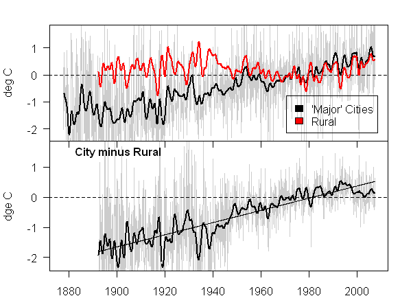
OK, I lied.  I have one more post I want to make on global warming now that Steve McIntyre's site is back up.  I suspect I tend to bury the lede in my warming posts, because I try to be really careful to set up the conclusion in a fact-based way.  However, for this post, I will try a different approach.  Steven McIntyre has reshuffled the data in a study on urbanization and temperature that is relied on by the last IPCC report to get this chart for US Temperature data.
Peters27

Conclusion?  For this particular set of US temperature data, all the 20th century warming was observed in urban areas, and none was observed in rural areas less affected by urban heat islands, asphalt, cars, air conditioning, etc.

If it can be generalized, this is an amazing conclusion -- it would imply that the sum of US measured warming over the last century could be almost 100% attributed to urban heat islands (a different and more localized effect than CO2 greenhouse gas warming).  Perhaps more importantly, outside of the US nearly all of the historical temperature measurement is in urban areas -- no one has 100 year temperature records for the Chinese countryside.  However much this effect might be over-stating US temperature increases, it would probably be even more pronounced in measurements in other parts of the word.

OK, so how did he get this chart?  Did he cherry-pick the data?  First, a bit of background.

The 2003 Peterson study on urban effects on temperature was adopted as a key study for the last IPCC climate report.  In that report, Peterson concluded:

Contrary to generally accepted wisdom, no statistically significant
impact of urbanization could be found in annual temperatures.

This study (which runs counter to both common sense and the preponderance of past studies) was latched onto by the IPCC to allow them to ignore urban heat island effects on historical temperatures and claim that most all past warming in the last half-century was due to CO2.  Peterson's methodology was to take a list of several hundred US temperature stations (how he picked these is unclear, they are a mix of USHCN and non-USHCN sites) and divide them between "urban" and "rural" using various inputs, including satellite photos of night lights.  Then he compared the temperature changes over the last century for the two groups, and declared them substantially identical.

However, McIntyre found a number of problems with his analysis.  First, looking at Peterson's data set, he saw that the raw temperature measurement did show an urbanization effect of about 0.7C over the last century, a very large number.  It turns out that Peterson never showed these raw numbers in his study, only the numbers after he applied layers of "corrections" to them, many of which appear to McIntyre to be statistically dubious.  I discussed the weakness of this whole "adjustment" issue here.

Further, though, McIntyre found obviously rural sites lurking in the urban data, and vice versa, such that Peterson was really comparing a mixed bag with a mixed bag.  For example, Snoqualmie Falls showed as urban -- I have been to Snoqualmie Falls several times, and while it is fairly close to Seattle, it is not urban.  So McIntyre did a simple sort.  He took from Peterson's urban data set only large cities, which he defined as having a major league sports franchise  (yes, a bit arbitrary, but not bad).  He then compared this narrower urban data set from Peterson against Peterson's rural set and got the chart above.  The chart is entirely from Peterson's data set, with no cherry-picking except to clean up the urban list.

Postscript:  Please don't get carried away.  Satellite measurement of the troposphere, which are fairly immune to these urbanization effects, show the world has been warming, though far less than the amount shown in surface temperature databases.

Update: To reinforce the point about global sites, Brazil apparently only has six (6) sites in the worldwide database.  That is about 1/200 of the number of sites in the continental US, which has about the same land area.  And of those six, McIntyre compares urban vs. rural sites.  Guess what he finds?  And, as a follow up from the postscript, while satellites show the Northern Hemisphere is warming, it shows that the Southern Hemisphere is not.

Done with Climate for a While (I think)

Sorry for the slew of climate-related posts.  I really don't want to turn this into a climate blog, but over the last 6 or 7 days I have been getting tons of climate-related traffic from a number of links.  I am going back to working on the next version of my climate book, and will try to put most of my material there and get this blog back to finance and economics topics.

Of course if something comes up....

Denier vs. Skeptic

We all know why Newsweek and many others (like Kevin Drum) choose to use the term "denier" for those of us who are skeptical of catastrophic anthropogenic global warming:  These media folks, who are hesitant to use the word "terrorist" because of its emotional content, want to imply that we skeptics are somehow similar to Holocaust deniers.

But beyond just the issues of false emotional content, the word denier is incorrect as applied to most skeptics, including myself, and helps man-made warming hawks avoid a difficult argument.  I try to be careful to say that I am a skeptic of "catastrophic man-made (or anthropogenic) global warming theory." 

  • So, does that mean I think the world is not warming?  In fact, the evidence is pretty clear that it is warming (though perhaps not by as much as shown in current surface temperature databases).
  • So does this mean that I think that human activities are not causing some warming?  In fact, I do think man-made CO2 is causing some, but not all the current 20th century warming trend.  I also think that man's land use  (urbanization, irrigated agriculture, etc) has effects on climate.

Where I really get skeptical is the next proposition -- that man's burning of fossil fuels is going to cause warming in the next century that will carry catastrophic impacts, and that these negative effects will justify massive current spending and government interventions (that will have their own negative consequences in terms of lost economic growth, increased poverty, and reduction in freedoms). 

Strong supporters of catastrophic man-made global warming theory do not usually want to argue this last point.  It is much easier to argue points 1 and 2, because the science is pretty good that the earth has warmed (though the magnitude is in question) and that CO2 greenhouse effect does cause warming (though the magnitude is in question).  That is why skeptics are called deniers.  It is in effect a straw man that allows greenhouse supporters to stay on 1 and 2 without getting into the real meat of the question.

Here is a quick example to prove my point.  Follow me for three paragraphs, then ask yourself if you have ever heard any of this in the media or on any RealClimate-type site's FAQ.

Anthropogenic global warming hawks admit that the warming solely from the CO2 greenhouse effect will likely NOT rise to catastrophic levels.  So how do they get such big, scary forecasts?  The answer is positive feedback.

Almost every process you can think of in nature operates by negative
feedback, meaning that an input to a system is damped.  Roll a ball, and eventually friction and wind resistance
bring
it to a stop.    Positive feedback means that an input to the system is multiplied and increased.  Negative feedback is a ball in the bottom of a bowl, always returning to the center; positive feedback is a ball perched precariously at the top of a
mountain that will run faster and faster downhill with a tiny push. Positive feedback
breeds instability, and processes that operate by positive feedback are
dangerous, and usually end up in extreme states -- these processes tend
to
"run away" like the ball rolling down the hill.  Nuclear fission, for
example, is a positive feedback process. 

Current catastrophic man-made global warming theory asserts that our climate is dominated
by positive feedback.  The last UN IPCC report posits that a small increase in
temperature from CO2 is multiplied 2,3,4 times or more by positive
feedbacks like humidity and ice albedo.   So a modest degree or degree and a half of warming from the greenhouse effect becomes a scary five or eight degrees of warming in the next century once any number of hypothesized positive feedbacks are applied.  Add to this exaggerated, sometimes over-the-top visions of possible negative consequences, and that is how global warming hawks justify massive government action.

OK, that is a very brief description of what I consider a sophisticated reason to be skeptical:  Most catastrophic warming forecasts depend on positive feedback loops, feedbacks for which we have little or no evidence and which don't tend to dominate in other stable systems.  So how many times have you seen this issue discussed?  Zero?  Yeah, its so much easier just to call us deniers.

If you are interested, here is slightly longer version of my skeptic's point of view.  Here is my much longer version.  Here is the specific chapter that discusses feedback loops.  Here is Roy Spencer discussing problems with studies trying to measure these feedbacks.

Postscript:  By the way, it is in this context that the discussions about restating temperatures and problems with historical surface temperature measurements are important.  Exaggerated historical warming numbers leave more room to posit positive feedback loops.  Lower historical numbers, or evidence past warming is driven by non-man-made sources (e.g. solar activity), leave less room to justify positive feedback loops.

Update:  RealClimate has posted their six steps to explain catastrophic warming from CO2.  Seems have buried the feedback issue.  Note that forcings mentioned here include feedbacks, they are not from CO2 alone but from CO2 + positive feedback.  Strange they didn't mention this.

A Temperature Adjustment Example

I won't go back into all the details, but I have posted before about just how large the manual adjustments to temperature numbers are (the "noise") as compared to the magnitude of measured warming (the "signal").  This issue of manual temperature corrections is the real reason the NASA temperature restatements are important (not the absolute value of the restatement).

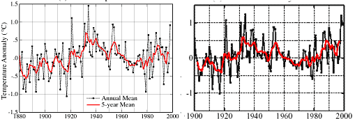
Here is a quick visual example.  Both charts below are from James Hansen and the GISS and are for the US only.  Both use basically the same temperature measurement network (the USHCN).  The one on the left was Hansen's version of US temperatures in 1999.  The one on the right he published in 2001.
Hansen_1999_v_2001

The picture at the right is substantially different  than the one on the left.  Just look at 1932 and 1998.  Between the first and second chart, none of the underlying temperature measurements changed.  What changed  were the adjustments to the underlying measurements applied by the NOAA and by the GISS.  For some reason, temperatures after 1980 have been raised and temperatures in the middle of the century were lowered.

For scientists to apply a negative temperature adjustment to measurements, as they did for the early 1930's, it means they think there was some warming bias in 1932 that does not exist today.  When scientists raise current temperatures, they are saying there is some kind of cooling bias that exists today that did not exist in the 1930's.  Both of these adjustments are basically implying the same thing:  That temperature measurement was more biased upwards, say by asphalt and urbanization and poor sitings, in 1932 than they are today.  Does this make any freaking sense at all?

Of course, there may be some other bias at work here that I don't know about.  But I and everyone else in the world are forced to guess because the NOAA and the GISS insist on keeping their adjustment software and details a secret, and continue to resist outside review.

Read much more about this from Steve McIntyre.

Some Final Thoughts on The NASA Temperature Restatement

I got a lot of traffic this weekend from folks interested in the US historical temperature restatement at NASA-GISS.  I wanted to share to final thoughts and also respond to a post at RealClimate.org (the #1 web cheerleader for catastrophic man-made global warming theory).

  1. This restatement does not mean that the folks at GISS are necessarily wrong when they say the world has been warming over the last 20 years.  We know from the independent source of satellite measurements that the Northern Hemisphere has been warming (though not so much in the Southern Hemisphere).  However, surface temperature measurements, particularly as "corrected" and aggregated at the GISS, have always been much higher than the satellite readings.  (GISS vs Satellite)  This incident may start to give us an insight into how to bring those two sources into agreement. 
  2. For years, Hansen's group at GISS, as well as other leading climate scientists such as Mann and Briffa (creators of historical temperature reconstructions) have flaunted the rules of science by holding the details of their methodologies and algorithm's secret, making full scrutiny impossible.  The best possible outcome of this incident will be if new pressure is brought to bear on these scientists to stop saying "trust me" and open their work to their peers for review.  This is particularly important for activities such as Hansen's temperature data base at GISS.  While measurement of temperature would seem straight forward, in actual fact the signal to noise ration is really low.  Upward "adjustments" and fudge factors added by Hansen to the actual readings dwarf measured temperature increases, such that, for example, most reported warming in the US is actually from these adjustments, not measured increases.
  3. In a week when Newsweek chose to argue that climate skeptics need to shut up, this incident actually proves why two sides are needed for a quality scientific debate.  Hansen and his folks missed this Y2K bug because, as a man-made global warming cheerleader, he expected to see temperatures going up rapidly so he did not think to question the data.  Mr. Hansen is world-famous, is a friend of luminaries like Al Gore, gets grants in quarter million dollar chunks from various global warming believers.  All his outlook and his incentives made him want the higher temperatures to be true.  It took other people with different hypotheses about climate to see the recent temperature jump for what it was: An error.

The general response at RealClimate.org has been:  Nothing to see here, move along.

Among other incorrect stories going around are that the mistake was due
to a Y2K bug or that this had something to do with photographing
weather stations. Again, simply false.

I really, really don't think it matters exactly how the bug was found, except to the extent that RealClimate.org would like to rewrite history and convince everyone this was just a normal adjustment made by the GISS themselves rather than a mistake found by an outsider.  However, just for the record, the GISS, at least for now until they clean up history a bit, admits the bug was spotted by Steven McIntyre.  Whatever the bug turned out to be, McIntyre initially spotted it as a discontinuity that seemed to exist in GISS data around the year 2000.  He therefore hypothesized it was a Y2K bug, but he didn't know for sure because Hansen and the GISS keep all their code as a state secret.  And McIntyre himself says he became aware of the discontinuity during a series of posts that started from a picture of a weather station at Anthony Watts blog.  I know because I was part of the discussion, talking to these folks online in real time.  Here is McIntyre explaining it himself.

In sum, the post on RealClimate says:

Sum total of this change? A couple of hundredths of degrees in the US
rankings and no change in anything that could be considered
climatically important (specifically long term trends).

A bit of background - surface temperature readings have read higher than satellite readings of the troposphere, when the science of greenhouse gases says the opposite should be true.  Global warming hawks like Hansen and the GISS have pounded on the satellite numbers, investigating them 8 ways to Sunday, and have on a number of occasions trumpeted upward corrections to satellite numbers that are far smaller than these downward corrections to surface numbers. 

But yes, IF this is the the only mistake in the data, then this is a mostly correct statement from RealClimate.org..  However, here is my perspective:

  • If a mistake of this magnitude can be found by outsiders without access to Hansen's algorithm's or computer code just by inspection of the resulting data, then what would we find if we could actually inspect the code?  And this Y2K bug is by no means the only problem.  I have pointed out several myself, including adjustments for urbanization and station siting that make no sense, and averaging in rather than dropping bad measurement locations
  • If we know significant problems exist in the US temperature monitoring network, what would we find looking at China? Or Africa?  Or South America.  In the US and a few parts of Europe, we actually have a few temperature measurement points that were rural in 1900 and rural today.  But not one was measuring rural temps in these other continents 100 years ago.  All we have are temperature measurements in urban locations where we can only guess at how to adjust for the urbanization.  The problem in these locations, and why I say this is a low signal to noise ratio measurement, is that small percentage changes in our guesses for how much the urbanization correction should be make enormous changes (even to changing the sign) of historic temperature change measurements.

Here are my recommendations:

  1. NOAA and GISS both need to release their detailed algorithms and computer software code for adjusting and aggregating USHCN and global temperature data.  Period.  There can be no argument.  Folks at RealClimate.org who believe that all is well should be begging for this to happen to shut up the skeptics.  The only possible reason for not releasing this scientific information that was created by government employees with taxpayer money is if there is something to hide.
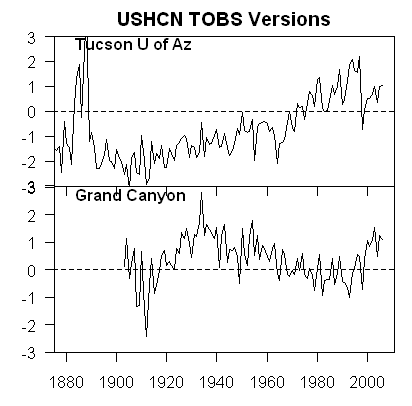
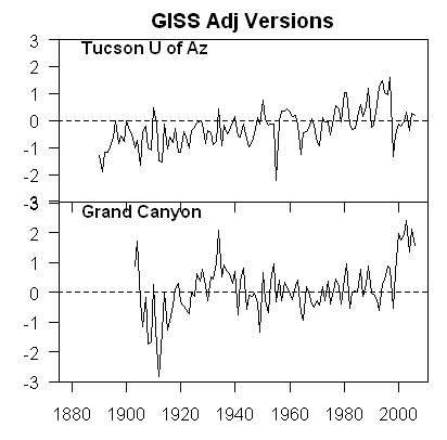
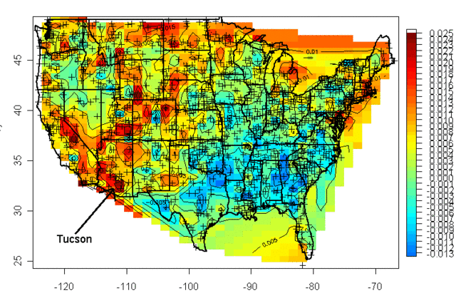
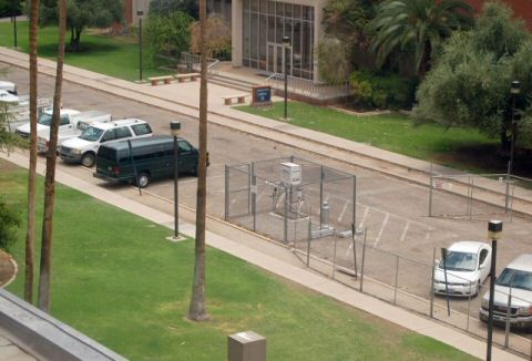
  2. The NOAA and GISS need to acknowledge that their assumptions of station quality in the USHCN network are too high, and that they need to incorporate actual documented station condition (as done at SurfaceStations.org) in their temperature aggregations and corrections.  In some cases, stations like Tucson need to just be thrown out of the USHCN.  Once the US is done, a similar effort needs to be undertaken on a global scale, and the effort needs to include people whose incentives and outlook are not driven by making temperatures read as high as possible.
  3. This is the easiest of all.  Someone needs to do empirical work (not simulated, not on the computer, but with real instruments) understanding how various temperature station placements affect measurements.  For example, how do the readings of an instrument in an open rural field compare to an identical instrument surrounded by asphalt a few miles away?  These results can be used for step #2 above.  This is cheap, simple research a couple of graduate students could do, but climatologists all seem focused on building computer models rather than actually doing science.
  4. Similar to #3, someone needs to do a definitive urban heat island study, to find out how much temperature readings are affected by urban heat, again to help correct in #2.  Again, I want real research here, with identical instruments placed in various locations and various radii from an urban center  (not goofy proxys like temperature vs. wind speed -- that's some scientist who wants to get a result without ever leaving his computer terminal).  Most studies have shown the number to be large, but a couple of recent studies show smaller effects, though now these studies are under attack not just for sloppiness but outright fabrication.  This can't be that hard to study, if people were willing to actually go into the field and take measurements.  The problem is everyone is trying to do this study with available data rather than by gathering new data.

Postscript:  The RealClimate post says:

However, there is clearly a latent and deeply felt wish in some sectors for the whole problem of global warming to be reduced to a statistical quirk or a mistake.

If catastrophic man-made global warming theory is correct, then man faces a tremendous lose-lose.  Either shut down growth, send us back to the 19th century, making us all substantially poorer and locking a billion people in Asia into poverty they are on the verge of escaping, or face catastrophic and devastating changes in the planet's weather.

Now take two people.  One in his heart really wants this theory not to be true, and hopes we don't have to face this horrible lose-lose tradeoff.  The other has a deeply felt wish that this theory is true, and hopes man does face this horrible future.  Which person do you like better?  And recognize, RealClimate is holding up the latter as the only moral man. 

Update:  Don't miss Steven McIntyre's take from the whole thing.  And McIntyre responds to Hansen here.

Computer Models In Complex Systems

Apparently, there are some dangers with getting too confident about your computer modeling of complex systems:

Computers don't always work.

That was the lesson so far this month for many so-called quant hedge
funds, whose trading is dictated by complex computer programs.

The markets' volatility of the past few weeks has taken a toll on
many widely known funds for sophisticated investors, notably a
once-highflying hedge fund at Wall Street's Goldman Sachs Group Inc.

Global Alpha, Goldman's widely known internal hedge fund, is now
down about 16% for the year after a choppy July, when its performance
fell about 8%, according to people briefed on the matter.

This kind of reminds me of another kind of computer modeling of complex systems.

Letter to Newsweek

Editors-

Oh, the delicious irony.

As a skeptic of catastrophic man-made global warming, I was disturbed to see that Newsweek in its August 13, 2007 issue (The Truth About Denial)
had equated me with a Holocaust denier.  There are so many interesting
scientific issues involved in climate change that it was flabbergasting
to me that Newsweek would waste time on an extended ad hominem
attack against one side in a scientific debate.  I was particularly
amazed that Newsweek would accuse the side of the debate that is
outspent 1000:1 with being tainted by money.  This is roughly
equivalent to arguing that Mike Gravel's spending is corrupting the
2008 presidential election.

However, fate does indeed have a sense of humor.  Skeptics' efforts of the sort Newsweek derided just this week
forced NASA-Goddard (GISS) to revise downward recent US temperature
numbers due to a programming mistake that went unidentified for
years, in part because NASA's taxpayer-paid researchers refuse to
release their temperature adjustment and aggregation methodology to the
public for scrutiny.  The problem was found by a chain of events that
began with amateur volunteers and led ultimately to Steven McIntyre (he
of the Michael Mann hockey stick debunking) calling foul.

The particular irony is that the person who is in charge of this
database, and is responsible for the decision not to allow scientific
scrutiny of his methodologies, is none other than James Hansen, who
Newsweek held up as the shining example of scientific objectivity in
its article.  Newsweek should have been demanding that taxpayer-funded
institutions like NASA should be opening their research to full review,
but instead Newsweek chose to argue that Mr. Hansen should be shielded
from scrutiny.

Warren Meyer

Breaking News: Recent US Temperature Numbers Revised Downwards Today

This is really big news, and a fabulous example of why two-way scientific discourse is still valuable, in the same week that both Newsweek and Al Gore tried to make the case that climate skeptics were counter-productive and evil. 

Climate scientist Michael Mann (famous for the hockey stick chart) once made the statement that  the 1990's were the
warmest decade in a millennia and that "there is a 95 to 99% certainty
that 1998 was the hottest year in the last one thousand years." (By
the way, Mann now denies he ever made this claim, though you can watch him say
these exact words in the CBC documentary Global
Warming:  Doomsday Called Off
).

Well, it turns out, according to the NASA GISS database, that 1998 was not even the hottest year of the last century.  This is because many temperatures from recent decades that appeared to show substantial warming have been revised downwards.  Here is how that happened (if you want to skip the story, make sure to look at the numbers at the bottom).

One of the most cited and used historical surface temperature databases is that of NASA/Goddard's GISS.  This is not some weird skeptics site.  It is considered one of the premier world temperature data bases, and it is maintained by anthropogenic global warming true believers.  It has consistently shown more warming than any other data base, and is thus a favorite source for folks like Al Gore.  These GISS readings in the US rely mainly on the US Historical Climate Network (USHCN) which is a network of about 1000 weather stations taking temperatures, a number of which have been in place for over 100 years.

Frequent readers will know that I have been a participant in an effort led by Anthony Watts at SurfaceStations.org to photo-document these temperature stations as an aid to scientists in evaluating the measurement quality of each station.  The effort has been eye-opening, as it has uncovered many very poor instrument sitings that would bias temperature measurements upwards, as I found in Tucson and Watts has documented numerous times on his blog.

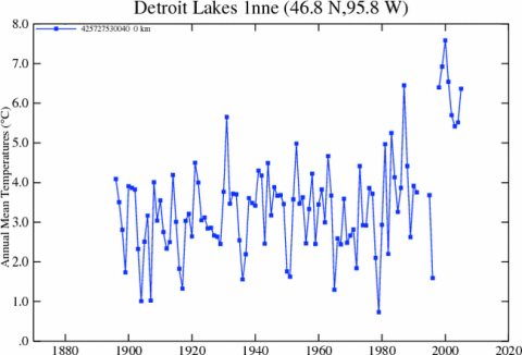
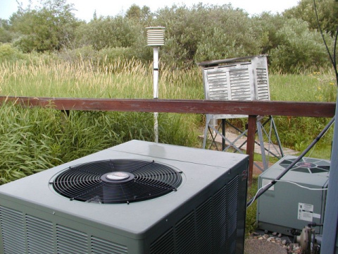
One photo on Watt's blog got people talking - a station in MN with a huge jump in temperature about the same time some air conditioning units were installed nearby.   Others disagreed, and argued that such a jump could not be from the air conditioners, since a lot of the jump happened with winter temperatures when the AC was dormant.  Steve McIntyre, the Canadian statistician who helped to expose massive holes in Michael Mann's hockey stick methodology, looked into it.  After some poking around, he began to suspect that the GISS data base had a year 2000 bug in one of their data adjustments.

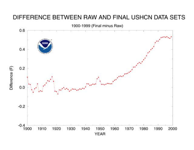
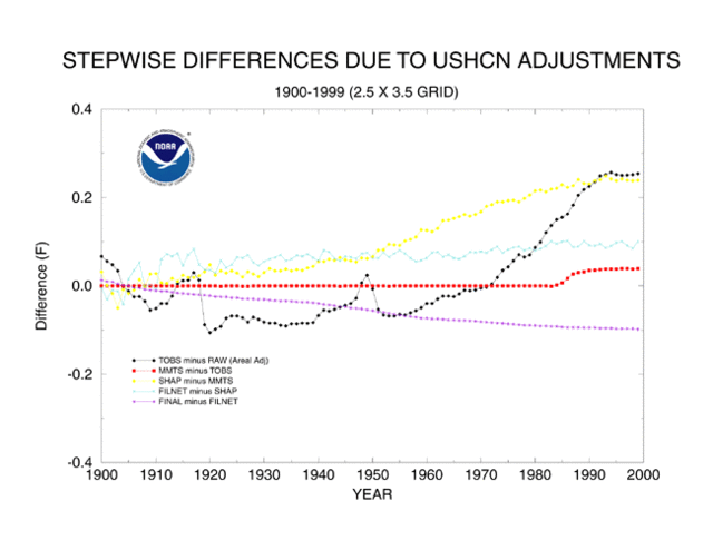
One of the interesting aspects of these temperature data bases is that they do not just use the raw temperature measurements from each station.  Both the NOAA (which maintains the USHCN stations) and the GISS apply many layers of adjustments, which I discussed here.  One of the purposes of Watt's project is to help educate climate scientists that many of the adjustments they make to the data back in the office does not necessarily represent the true condition of the temperature stations.  In particular, GISS adjustments imply instrument sitings are in more natural settings than they were in say 1905, an outrageous assumption on its face that is totally in conflict to the condition of the stations in Watt's data base.  Basically, surface temperature measurements have a low signal to noise ratio, and climate scientists have been overly casual about how they try to tease out the signal.

Anyway, McIntyre suspected that one of these adjustments had a bug, and had had this bug for years.  Unfortunately, it was hard to prove.  Why?  Well, that highlights one of the great travesties of climate science.  Government scientists using taxpayer money to develop the GISS temperature data base at taxpayer expense refuse to publicly release their temperature adjustment algorithms or software (In much the same way Michael Mann refused to release the details for scrutiny of his methodology behind the hockey stick).  Using the data, though, McIntyre made a compelling case that the GISS data base had systematic discontinuities that bore all the hallmarks of a software bug.

Today, the GISS admitted that McIntyre was correct, and has started to republish its data with the bug fixed.  And the numbers are changing a lot.  Before today, GISS would have said 1998 was the hottest year on record (Mann, remember, said with up to 99% certainty it was the hottest year in 1000 years) and that 2006 was the second hottest.  Well, no more.  Here are the new rankings for the 10 hottest years in the US, starting with #1:

1934, 1998, 1921, 2006, 1931, 1999, 1953, 1990, 1938, 1939

Three of the top 10 are in the last decade.  Four of the top ten are in the 1930's, before either the IPCC or the GISS really think man had any discernible impact on temperatures.  Here is the chart for all the years in the data base:
New_giss

There are a number of things we need to remember:

  • This is not the end but the beginning of the total reexamination that needs to occur of the USHCN and GISS data bases.  The poor correction for site location and urbanization are still huge issues that bias recent numbers upwards.  The GISS also has issues with how it aggregates multiple stations, apparently averaging known good stations with bad stations a process that by no means eliminates biases.  As a first step, we must demand that NOAA and GISS release their methodology and computer algorithms to the general public for detailed scrutiny by other scientists.
  • The GISS today makes it clear that these adjustments only affect US data and do not change any of their conclusions about worldwide data.  But consider this:  For all of its faults, the US has the most robust historical climate network in the world.  If we have these problems, what would we find in the data from, say, China?  And the US and parts of Europe are the only major parts of the world that actually have 100 years of data at rural locations.  No one was measuring temperature reliably in rural China or Paraguay or the Congo in 1900.  That means much of the world is relying on urban temperature measurement points that have substantial biases from urban heat.
  • All of these necessary revisions to surface temperatures will likely not make warming trends go away completely.  What it may do is bring the warming down to match the much lower satellite measured warming numbers we have, and will make current warming look more like past natural warming trends (e.g. early in this century) rather than a catastrophe created by man.  In my global warming book, I argue that future man-made warming probably will exist, but will be more like a half to one degree over the coming decades than the media-hyped numbers that are ten times higher.

So how is this possible?  How can the global warming numbers used in critical policy decisions and scientific models be so wrong with so basic of an error?  And how can this error have gone undetected for the better part of a decade?  The answer to the latter question is because the global warming  and climate community resist scrutiny.  This weeks Newsweek article and statements by Al Gore are basically aimed at suppressing any scientific criticism or challenge to global warming research.  That is why NASA can keep its temperature algorithms secret, with no outside complaint, something that would cause howls of protest in any other area of scientific inquiry.

As to the first question, I will leave the explanation to Mr. McIntyre:

While acolytes may call these guys "professionals", the process of
data adjustment is really a matter of statistics and even accounting.
In these fields, Hansen and Mann are not "professionals" - Mann
admitted this to the NAS panel explaining that he was "not a
statistician". As someone who has read their works closely, I do not
regard any of these people as "professional". Much of their reluctance
to provide source code for their methodology arises, in my opinion,
because the methods are essentially trivial and they derive a certain
satisfaction out of making things appear more complicated than they
are, a little like the Wizard of Oz. And like the Wizard of Oz, they
are not necessarily bad men, just not very good wizards.

For more, please see my Guide to Anthropogenic Global Warming or, if you have less time, my 60-second argument for why one should be skeptical of catastrophic man-made global warming theory.

Update:
Nothing new, just thinking about this more, I cannot get over the irony that in the same week Newsweek makes the case that climate science is settled and there is no room for skepticism, skeptics discover a gaping hole and error in the global warming numbers.

Update #2:  I know people get upset when we criticize scientists.  I get a lot of "they are not biased, they just made a mistake."  Fine.  But I have zero sympathy for a group of scientists who refuse to let other scientists review their methodology, and then find that they have been making a dumb methodology mistake for years that has corrupted the data of nearly every climate study in the last decade.

Update #3:  I labeled this "breaking news," but don't expect to see it in the NY Times anytime soon.  We all know this is one of those asymmetric story lines, where if the opposite had occurred (ie things found to be even worse/warmer than thought) it would be on the front page immediately, but a lowered threat will never make the news.

Oh, and by he way.  This is GOOD news.  Though many won't treat it that way.  I understand this point fairly well because, in a somewhat parallel situation, I seem to be the last anti-war guy who treats progress in Iraq as good news.

Update #4: I should have mentioned that the hero of the Newsweek story is catastrophic man-made global warming cheerleader James Hansen, who runs the GISS and is most responsible for the database in question as well as the GISS policy not to release its temperature aggregation and adjustment methodologies.  From IBD, via CNN Money:

Newsweek portrays James Hansen, director of NASA's Goddard Institute for Space Studies, as untainted by corporate bribery.

Hansen
was once profiled on CBS' "60 Minutes" as the "world's leading
researcher on global warming." Not mentioned by Newsweek was that
Hansen had acted as a consultant to Al Gore's slide-show presentations
on global warming, that he had endorsed John Kerry for president, and
had received a $250,000 grant from the foundation headed by Teresa
Heinz Kerry.

Update #5: My letter to the editor at Newsweek.  For those worried that this is some weird skeptic's fevered dream, Hansen and company kind of sort of recognize the error in the first paragraph under background here.  Their US temperature chart with what appears is the revised data is here.

Update #6: Several posts are calling this a "scandal."  It is not a scandal.  It is a mistake from which we should draw two lessons:

  1. We always need to have people of opposing opinions looking at a problem.  Man-made global warming hawks expected to see a lot of warming after the year 2000, so they never questioned the numbers.  It took folks with different hypotheses about climate to see the jump in the numbers for what it was - a programming error.
  2. Climate scientists are going to have to get over their need to hold their adjustments, formulas, algorithms and software secret.  It's just not how science is done.  James Hansen saying "trust me, the numbers are right, I don't need to tell you how I got them" reminds me of the mathematician Fermat saying he had a proof of his last theorem, but it wouldn't fit in the margin.  How many man-hours of genius mathematicians was wasted because Fermat refused to show his proof (which was most likely wrong, given how the theorem was eventually proved).

Final Update:  Some parting thoughts, and recommendations, here.

Food Miles Stupidity

Via the New York Times:

THE term "food miles" "” how far food has traveled before you buy it "” has entered the enlightened lexicon.

Which should tell you all you need to know about the "enlightened."

There are many good reasons for eating local "” freshness, purity,
taste, community cohesion and preserving open space "” but none of these
benefits compares to the much-touted claim that eating local reduces
fossil fuel consumption. In this respect eating local joins recycling,
biking to work and driving a hybrid as a realistic way that we can, as individuals, shrink our carbon footprint and be good stewards of the environment.

Actually, most recycling, with the exception of aluminum which takes tons of electricity to manufacture in the first place, does nothing to reduce our carbon footprint.  And I must say that I often enjoy buying from farmers markets and such.  But does "food miles" mean anything?  And should we really care?  Well, here is an early hint:  The ultimate reduction in food miles, the big winner on this enlightened metric, is subsistence farming.  Anyone ready to go there yet?  These are the economics Ghandi promoted in India, and it set that country back generations.

Well, lets go back to economics 101.  The reason we do not all grow our own food, make our own clothes, etc. is because the global division of labor allows food and clothing and everything else to be produced more efficiently by people who specialize and invest in those activities than by all of us alone in our homes.  So instead of each of us growing our own corn, in whatever quality soil we happen to have around our house, some guy in Iowa grows it for thousands of us, and because he specialized and grows a lot, he invests in equipment and knowledge to do it better every year.  The cost of fuel to move the corn or corn products to Phoenix from Iowa are trivial compared to the difference in efficiency that guy in Iowa has over me trying to grow corn in my back yard.  Back to the New York Times:

On its face, the connection between lowering food miles and decreasing greenhouse gas emissions is a no-brainer.

Sure, if you look at complex systems as single-variable linear equations.  Those of us who don't immediately treated the food mile concept as suspect.  It turns out, for good reason:

It all depends on how you wield the carbon calculator. Instead of
measuring a product's carbon footprint through food miles alone, the
Lincoln University scientists expanded their equations to include other
energy-consuming aspects of production "” what economists call "factor
inputs and externalities" "” like water use, harvesting techniques,
fertilizer outlays, renewable energy applications, means of
transportation (and the kind of fuel used), the amount of carbon
dioxide absorbed during photosynthesis, disposal of packaging, storage
procedures and dozens of other cultivation inputs.

Incorporating
these measurements into their assessments, scientists reached
surprising conclusions. Most notably, they found that lamb raised on
New Zealand's clover-choked pastures and shipped 11,000 miles by boat
to Britain produced 1,520 pounds of carbon dioxide emissions per ton
while British lamb produced 6,280 pounds of carbon dioxide per ton, in
part because poorer British pastures force farmers to use feed. In
other words, it is four times more energy-efficient for Londoners to
buy lamb imported from the other side of the world than to buy it from
a producer in their backyard. Similar figures were found for dairy
products and fruit.

All I can say is just how frightening it is that the paper of record could find this result "surprising."  The price mechanism does a pretty good job of sorting this stuff out.  If fuel prices rise a lot, then agriculture might move more local, but probably not by much.  The economies to scale and location just dwarf the price of fuel. 

By the way, one reason this food-mile thing is not going away, no matter how stupid it is, has to do with the history of the global warming movement.  Remember all those anti-globalization folks who rampaged in Seattle?  Where did they all go?  Well, they did not get sensible all of a sudden.  They joined the environmental movement.  One reason a core group of folks in the catastrophic man-made global warming camp react so poorly to any criticism of the science is that they need and want it to be true that man is causing catastrophic warming -- anti-corporate and anti-globalization activists jumped into the global warming environmental movement, seeing in it a vehicle to achieve their aims of rolling back economic growth, global trade, and capitalism in general.  Food miles appeals to their disdain for world trade, and global warming and carbon footprints are just a convenient excuse for trying to sell the concept to other people.

A little while back, I posted a similar finding in regards to packaging, that is worth repeating here for comparison.

Contrary to current wisdom, packaging can reduce total rubbish
produced. The average household in the United States generates one
third
less trash each year than does the average household in Mexico,
partly because packaging reduces breakage and food waste. Turning a
live chicken into a meal creates food waste. When chickens are
processed commercially, the waste goes into marketable products
(such as pet food), instead of into a landfill. Commercial processing
of 1,000 chickens requires about 17 pounds of packaging, but it also
recycles at least 2,000 pounds of by-products.

More victories for the worldwide division of labor.  So has the NY Times seen the light and accepted the benefits of capitalism?  Of course not.  With the New Zealand example in hand, the writer ... suggests we need more state action to compel similar situations.

Given these problems, wouldn't it make more sense to stop obsessing
over food miles and work to strengthen comparative geographical
advantages? And what if we did this while streamlining transportation
services according to fuel-efficient standards? Shouldn't we create
development incentives for regional nodes of food production that can
provide sustainable produce for the less sustainable parts of the
nation and the world as a whole? Might it be more logical to
conceptualize a hub-and-spoke system of food production and
distribution, with the hubs in a food system's naturally fertile hot
spots and the spokes, which travel through the arid zones, connecting
them while using hybrid engines and alternative sources of energy?

Does anyone even know what this crap means?  You gotta love technocratic statists -- they just never give up.  Every one of them thinks they are smarter than the the sum of billions of individual minds working together of their own free will to create our current world production patterns.

Postscript: There is one thing the government could do tomorrow to promote even more worldwide agricultural efficiency:  Drop subsidies and protections on agriculture.   You would immediately get more of this kind of activity, for example with Latin America and the Caribbean supplying more/all of the US's sugar and other parts of Asia providing more/all of Japan's rice.

Storm Frequency

I already discussed Newsweek's happy little ad hominem attack on climate skeptics here.  However, as promised, I wanted to talk about the actual, you know, science for a bit, starting from the Newsweek author's throwaway statement that she felt required no
proof, "The frequency of Atlantic hurricanes has already doubled in the
last century."

This is really a very interesting topic, much more interesting than following $10,000 of skeptics' money around in a global warming industry spending billions on research.  One would think the answer to this hurricane question is simple.  Can we just look up the numbers?  Well, let's start there.  Total number of Atlantic hurricanes form the HURDAT data base, first and last half of the last century:

1905-1955 = 366
1956-2006 = 458

First, you can see nothing like a doubling.  This is an increase of 25%.  So already, we see that in an effort to discredit skeptics for fooling America about the facts, Newsweek threw out a whopper that absolutely no one in climate science, warming skeptic or true believer, would agree with.

But let's go further, because there is much more to the story.  Because 25% is a lot, and could be damning in and of itself.  But there are problems with this data.  If you think about storm tracking technology in 1905 vs. 2005, you might see the problem.  To make it really clear, I want to talk about tornadoes for a moment.

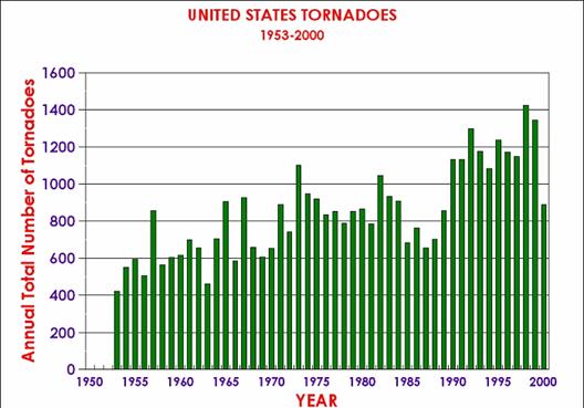
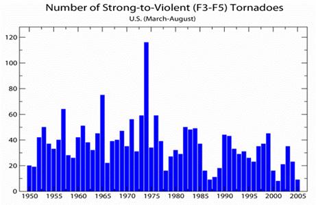
In An Inconvenient Truth, Al Gore and company said that global warming was increasing the number of tornadoes in the US.  He claimed 2004 was the highest year ever for tornadoes in the US.  In his PowerPoint slide deck (on which the movie was based) he sometimes uses this chart (form the NOAA):

Whoa, that's scary.  Any moron can see there is a trend there.  Its like a silver bullet against skeptics or something.  But wait.  Hasn't tornado detection technology changed over the last 50 years?  Today, we have doppler radar, so we can detect even smaller size 1 tornadoes, even if no one on the ground actually spots them (which happens fairly often).  But how did they measure smaller tornadoes in 1955 if no one spotted them?  Answer:  They didn't.  In effect, this graph is measuring apples and oranges.  It is measuring all the tornadoes we spotted by human eye in 1955 with all the tornadoes we spotted with doppler radar in 2000.   The NOAA tries to make this problem clear on their web site.

With increased national doppler
radar coverage, increasing population, and greater attention to tornado
reporting, there has been an increase in the number of tornado reports over the
past several decades. This can create a misleading appearance of an increasing
trend in tornado frequency. To better understand the true variability and trend
in tornado frequency in the US, the total number of strong to violent tornadoes
(F3 to F5 category on the Fujita scale) can be analyzed. These are the
tornadoes that would have likely been reported even during the decades before
Dopplar radar use became widespread and practices resulted in increasing
tornado reports. The bar chart below indicates there has been little trend in
the strongest tornadoes over the past 55 years.

So itt turns out there is a decent way to correct for this.  We don't think that folks in 1955 were missing many of the larger class 3-5 tornadoes, so comparing 1955 and 2000 data for these larger tornadoes should be more apples to apples (via NOAA).

Well, that certainly is different (note 2004 in particular, given the movie claim).  No upward trend at all when you get the data right.  I wonder if Al Gore knows this?  I am sure he is anxious to set the record straight.

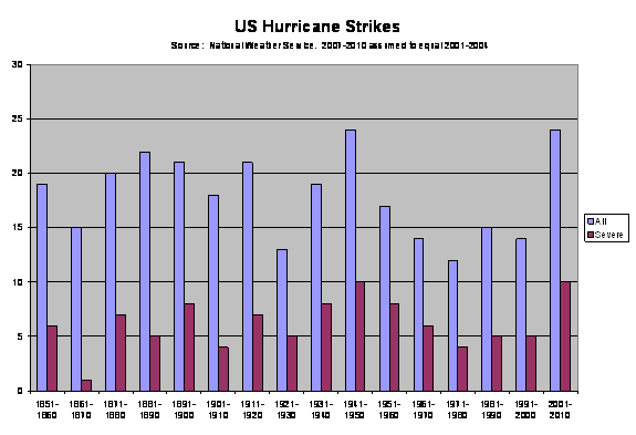
OK, back to hurricanes.  Generally, whether in 1905 or 2005, we know if a hurricane hits land in the US.  However, what about all the hurricanes that don't hit land or hit land in some undeveloped area?  Might it be that we can detect these better in 2006 with satellites than we could in 1905?  Just like the tornadoes?

Well, one metric we have is US landfall.  Here is that graph  (data form the National Weather Service -- I have just extrapolated the current decade based on the first several years).

Not much of a trend there, though the current decade is high, in part due to the fact that it does not incorporate the light 2006 season nor the light-so-far 2007 season.  The second half of the 20th century is actually lower than the first half, and certainly not "twice as large".  But again, this is only a proxy.  There may be reasons more storms are formed but don't make landfall (though I would argue most Americans only care about the latter).

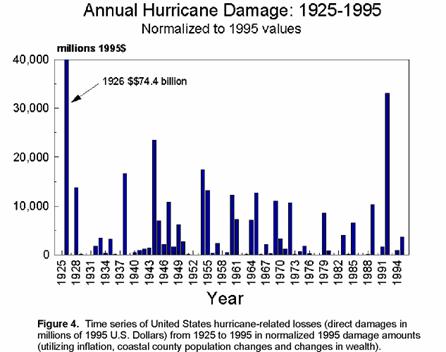
But what about hurricane damages?  Everyone knows that the dollar damages from hurricanes is way up.  Well, yes.  But the amount of valuable real estate on the United State's coast is also way up.  Roger Pielke and Chris Landsea (you gotta love a guy studying hurricane strikes named Landsea) took a shot at correcting hurricane damages for inflation and the increased real estate value on the coasts.  This is what they got:

Anyway, back to our very first data, several scientists are trying to correct the data for missing storms, particularly in earlier periods.  There is an active debate here about corrections I won't get into, but suffice it to say the difference between the first half of the 20th century to the latter half in terms of Atlantic hurricane formations is probably either none or perhaps a percentage increase in the single digits (but nowhere near 100% increase as reported by Newsweek).

Debate continues, because there was a spike in hurricanes from 1995-2005 over the previous 20 years.  Is this anomalous, or is it similar to the spike that occurred in the thirties and forties?  No one is sure, but isn't this a lot more interesting than figuring out how the least funded side of a debate gets their money?  And by the way, congratulations again to MSM fact-checkers.

My layman's guide to skepticism of catastrophic man-made global warming is here.  A shorter, 60-second version of the best climate skeptic's arguments is here.

Update:  If the author bothered to have a source for her statement, it would probably be Holland and Webster, a recent study that pretty much everyone disagrees with and many think was sloppy.  And even they didn't say activity had doubled.  Note the only way to get a doubling is to cherry-pick a low decade in the first half of the century and a high decade in the last half of the century and compare just those two decades -- you can see this in third paragraph of the Scientific American article.  This study bears all the hallmarks -- cherry picking data, ignoring scientific consensus, massaging results to fit an agenda -- that the Newsweek authors were accusing skeptics of.

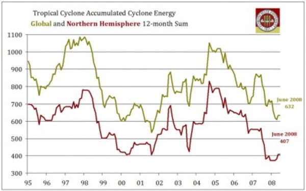
Update #2:  The best metric for hurricane activity is not strikes or numbers but accumulated cyclonic energy.  Here is the ACE trend, as measured by Florida State.  As you can see, no upward trend.

6a00e54eeb9dc1883400e553bfddf188338

I Was Teenage Warming-Denying Werewolf

Update:  My post on breaking news about downward revisions to US temperature numbers is here.

Well, I finally read Newsweek's long ad hominem attack on climate skeptics in the recent issue.  It is basically yet another take on the global-warming-skeptics-are-all-funded-by-Exxon meme.  The authors breathlessly "follow the money to show how certain scientists have taken as much as $10,000 (gasp) from fossil-fuel related companies to publish skeptical work.  Further, despite years of hand-wringing about using emotionally charged words like "terrorist" in their news articles, Newsweek happily latches onto "denier" as a label for skeptics, a word chosen to parallel the term "Holocaust denier" -- nope, no emotional content there.

I'm not even going to get into it again, except to make the same observation I have made in the past:  Arguing that the global warming debate is "tainted" by money from skeptics is like saying the 2008 presidential election is tainted by Mike Gravel's spending.  Money from skeptics is so trivial, by orders of magnitude, compared to spending by catastrophic warming believers that it is absolutely amazing folks like Newsweek could feel so threatened by it.  In my Layman's Guide To Man-Made Global Warming Skepticism, I estimated skeptics were being outspent 1000:1.  I have no way to check his figures, but Senator Inhofe's office estimated skeptics were being outspent $50 billion to 19 million, which is about the same order of magnitude as my estimate.

Given this skew in spending, and the fact that most of the major media accepts catastrophic man-made  global warming as a given, this was incredible:

Look for the next round of debate to center on what Americans are
willing to pay and do to stave off the worst of global warming. So far
the answer seems to be, not much. The NEWSWEEK Poll finds less than half in favor of requiring high-mileage cars or energy-efficient appliances and buildings....

Although the figure is less than in earlier polls, A new NEWSWEEK Poll finds that the influence of the denial machine remains strong.39
percent of those asked say there is "a lot of disagreement among
climate scientists" on the basic question of whether the planet is
warming; 42 percent say there is a lot of disagreement that human
activities are a major cause of global warming. Only 46 percent say the
greenhouse effect is being felt today.

It has to be the "denial machine" at fault, right?  I can't possibly be because Americans think for themselves, or that they tend to reject micro-managing government regulations.  The author sounds so much like an exasperated parent "I kept telling my kids what's good for them and they just don't listen."

Yes, I could easily turn the tables here, and talk about the financial incentives in academia for producing headlines-grabbing results, or discuss the political motivations behind Marxist groups who have latched onto man-made global warming for their own ends.  But this does not really solve the interesting science questions, and ignores the fact that many catastrophic climate change believers are well meaning and thoughtful, just as many skeptics are.  The article did not even take the opportunity to thoughtfully discuss the range of skeptic's positions.  Some reject warming entirely, while others, like myself, recognize the impact man can have on climate, but see man's impact being well below catastrophic levels (explained here in 60 seconds).  Anyway, I don't have the energy to fisk it piece by piece, but Noel Sheppard does.

For those of you who are interested, I have a follow-up post on the science itself, which is so much more interesting that this garbage.  I use as a starting point the Newsweek author's throwaway statement that she felt required no proof, "The frequency of Atlantic hurricanes has already doubled in the last century."  (Hint:  the answer turns out to be closer to +5% than +100%)

Adjusting Data to Get the "Right" Answer

On several occasions, I have discussed how much of the reported temperature increases worldwide in the last century are actually the results of adjustments to the actual gauge measurements.  These upward adjustments in the numbers by climate scientists actually dwarf measured increases.

Thanks to reader Scott Brooks, here is another such example except this time with measurement of sea level increases.  Dr. Nils-Axel Morner is the head of the Paleogeophysics and Geodynamics department at Stockholm University in Sweden.  He has studied sea-level changes for 35 years (emphasis added).

Another
way of looking at what is going on is the tide gauge. Tide gauging is
very complicated, because it gives different answers for wherever you
are in the world. But we have to rely on geology when we interpret it.
So, for example, those people in the IPCC [Intergovernmental Panel on
Climate Change], choose Hong Kong, which has six tide gauges, and they
choose the record of one, which gives 2.3 mm per year rise of sea
level. Every geologist knows that that is a subsiding area. It's the
compaction of sediment; it is the only record which you shouldn't use.
And if that figure [for sea level rise] is correct, then Holland would not be subsiding, it
would be uplifting.

And
that is just ridiculous. Not even ignorance could be responsible for a
thing like that. So tide gauges, you have to treat very, very
carefully. Now, back to satellite altimetry, which shows the water, not
just the coasts, but in the whole of the ocean. And you measure it by
satellite. From 1992 to 2002, [the graph of the sea level] was a
straight line, variability along a straight line, but absolutely no
trend whatsoever. We could see those spikes: a very rapid rise, but
then in half a year, they fall back again. But absolutely no trend, and
to have a sea-level rise, you need a trend.

Then,
in 2003, the same data set, which in their [IPCC's] publications, in
their website, was a straight line suddenly it changed, and showed a
very strong line of uplift, 2.3 mm per year, the same as from the tide
gauge. And that didn't look so nice. It looked as though they had
recorded something; but they hadn't recorded anything. It was the
original one which they had suddenly twisted up, because they entered a correction factor, which they took from the tide gauge.
So it was not
a measured thing, but a figure introduced from outside.
I accused them
of this at the Academy of Sciences in Moscow I said you have
introduced factors from outside; it's not a measurement. It looks like
it is measured from the satellite, but you don't say what really
happened. And they ans-wered, that we had to do it, because otherwise
we would not have gotten any trend!

That
is terrible! As a matter of fact, it is a falsification of the data
set. Why? Because they know the answer. And there you come to the
point: They know the answer; the rest of us, we are searching for the
answer. Because we are field geologists; they are computer scientists.
So all this talk that sea level is rising, this stems from the computer
modeling, not from observations. The observations don't find it!

I have
been the expert reviewer for the IPCC, both in 2000 and last year. The
first time I read it, I was exceptionally surprised. First of all, it
had 22 authors, but none of them  none were sea-level specialists. They
were given this mission, because they promised to answer the right
thing. Again, it was a computer issue. This is the typical thing: The meteorological community works with computers, simple computers.

Geologists
don't do that! We go out in the field and observe, and then we can try
to make a model with computerization; but it's not the first thing.

I am working on my next version of a layman's guide to skeptics arguments against catastrophic man-made global warming, which you can find here.

Steve McIntyre Comments on Historical Temperature Adjustments

Steve McIntyre, the statistician than called into question much of the methodology behind the Mann Hockey Stick chart, has some observations on adjustments to US temperature records I discussed here and here.

Eli Rabett and Tamino have both advocated faith-based climate
science in respect to USHCN and GISS adjustments. They say that the
climate "professionals" know what they're doing; yes, there are
problems with siting and many sites do not meet even minimal compliance
standards, but, just as Mann's "professional" software was able to
extract a climate signal from the North American tree ring data, so
Hansen's software is able to "fix" the defects in the surface sites.
"Faith-based" because they do not believe that Hansen has any
obligation to provide anything other than a cursory description of his
software or, for that matter, the software itself. But if they are
working with data that includes known bad data, then critical
examination of the adjustment software becomes integral to the
integrity of the record - as there is obviously little integrity in
much of the raw data.

While acolytes may call these guys "professionals", the process of
data adjustment is really a matter of statistics and even accounting.
In these fields, Hansen and Mann are not "professionals" - Mann
admitted this to the NAS panel explaining that he was "not a
statistician". As someone who has read their works closely, I do not
regard any of these people as "professional". Much of their reluctance
to provide source code for their methodology arises, in my opinion,
because the methods are essentially trivial and they derive a certain
satisfaction out of making things appear more complicated than they
are, a little like the Wizard of Oz. And like the Wizard of Oz, they
are not necessarily bad men, just not very good wizards.

He goes on to investigate a specific example the "professionals" use
as a positive example, demonstrating they appear to have a Y2K error in
their algorithm.   This is difficult to do, because like Mann, government scientists maintaining a government temperature data base taken from government sites paid for with taxpayer funds refuse to release their methodology or algorithms for inspection.

In the case cited, the "professionals" also make adjustments that imply the site has
decreasing urbanization over the last 100 years, something I am not
sure one can say about any site in the US except perhaps for a few
Colorado ghost towns.  The "experts" also fail to take the basic step of actually analyzing the site itself which, if visited, would reveal recently installed air conditioning unites venting hot air on the temperature instrument.   

A rebuttal, arguing that poor siting of temperature instruments is OK and does not affect the results is here.  I find rebuttals of this sort really distressing.  I studied physics for a while, before switching to engineering, and really small procedural mistakes in measurement could easily invalidate one's results.  I find it amazing that climate scientists seek to excuse massive mistakes in measurement.  I'm sorry, but in no other branch of science are results considered "settled" when the experimental noise is greater than the signal.  I would really, really, just for once, love to see a anthropogenic global warming promoter say "well, I don't think the siting will change the results, but you are right, we really need to go back and take another pass at correcting historical temperatures based on more detailed analysis of the individual sites."

More Thoughts on Historic Temperature Adjustments

A few posts back, I showed how nearly 85% of the reported warming in the US over the last century is actually due to adjustments and added fudge-factors by scientists rather than actual measured higher temperatures.  I want to discuss some further analysis Steve McIntyre has done on these adjustments, but first I want to offer a brief analogy.

Let's say you had two compasses to help you find north, but the compasses are reading incorrectly.  After some investigation, you find that one of the compasses is located next to a strong magnet, which you have good reason to believe is strongly biasing that compass's readings.  In response, would you

  1. Average the results of the two compasses and use this mean to guide you, or
  2. Ignore the output of the poorly sited compass and rely solely on the other unbiased compass?

Most of us would quite rationally choose #2.  However, Steve McIntyre shows us a situation involving two temperature stations in the USHCN network in which government researchers apparently have gone with solution #1.  Here is the situation:

He compares the USHCN station at the Grand Canyon (which appears to be a good rural setting) with the Tucson USHCN station I documented here, located in a parking lot in the center of a rapidly growing million person city.   Unsurprisingly, the Tucson data shows lots of warming and the Grand Canyon data shows none.  So how might you correct Tucson and the Grand Canyon data, assuming they should be seeing about the same amount of warming?  Would you
average them, effectively adjusting the two temperature readings
towards each other, or would you assume the Grand Canyon data is cleaner
with fewer biases and adjust Tucson only?   Is there anyone who would not choose the second option, as with the compasses?

The GISS data set, created by the Goddard Center of NASA, takes the USHCN data set and somehow uses nearby stations to correct for anomalous stations.  I say somehow, because, incredibly, these government scientists, whose research is funded by taxpayers and is being used to make major policy decisions, refuse to release their algorithms or methodology details publicly.  They keep it all secret!  Their adjustments are a big black box that none of us are allowed to look into  (and remember, these adjustments account for the vast majority of reported warming in the last century).

We can, however, reverse engineer some of these adjustments, and McIntyre does.  What he finds is that the GISS appears to be averaging the good and bad compass, rather than throwing out or adjusting only the biased reading.  You can see this below.  First, here are the USHCN data for these two stations with only the Time of Observation adjustment made (more on what these adjustments are in this article).
Grand_12

As I said above, no real surprise - little warming out in undeveloped nature, lots of warming in a large and rapidly growing modern city.  Now, here is the same data after the GISS has adjusted it:

Grand_15

You can see that Tucson has been adjusted down a degree or two, but Grand Canyon has been adjusted up a degree or two (with the earlier mid-century spike adjusted down).  OK, so it makes sense that Tucson has been adjusted down, though there is a very good argument to be made that it should be been adjusted down more, say by at least 3 degrees**.  But why does the Grand Canyon need to be adjusted up by about a degree and a half?  What is biasing it colder by 1.5 degrees, which is a lot?  The answer:  Nothing.  The explanation:  Obviously, the GISS is doing some sort of averaging, which is bringing the Grand Canyon and Tucson from each end closer to a mean. 

This is clearly wrong, like averaging the two compasses.  You don't average a measurement known to be of good quality with one known to be biased.  The Grand Canyon should be held about the same, and Tucson adjusted down even more toward it, or else thrown out.  Lets look at two cases.  In one, we will use the GISS approach to combine these two stations-- this adds 1.5 degrees to GC and subtracts 1.5 degrees from Tucson.  In the second, we will take an approach that applies all the adjustment to just the biases (Tucson station) -- this would add 0 degrees to GC and subtract 3 degrees from Tucson.  The first approach, used by the GISS, results in a mean warming in these two stations that is 1.5 degrees higher than the more logical second approach.  No wonder the GISS produces the highest historical global warming estimates of any source!  Steve McIntyre has much more.

** I got to three degrees by applying all of the adjustments for GC and Tucson to Tucson.  Here is another way to get to about this amount.   We know from studies that urban heat islands can add 8-10 degrees to nighttime urban temperatures over surrounding undeveloped land.  Assuming no daytime effect, which is conservative, we might conclude that 8-10 degrees at night adds about 3 degrees to the entire 24-hour average.

Postscript: Steve McIntyre comments (bold added):

These adjustments are supposed to adjust for station moves - the
procedure is described in Karl and Williams 1988 [check], but, like so
many climate recipes, is a complicated statistical procedure that is
not based on statistical procedures known off the island.
(That's not
to say that the procedures are necessarily wrong, just that the
properties of the procedure are not known to statistical civilization.
)
When I see this particular outcome of the Karl methodology, my
impression is that, net of the pea moving under the thimble, the Grand
Canyon values are being blended up and the Tucson values are being
blended down. So that while the methodology purports to adjust for
station moves, I'm not convinced that the methodology can successfully
estimate ex post the impact of numerous station moves and my guess is
that it ends up constructing a kind of blended average.

LOL.  McIntyre, by the way, is the same gentleman who helped call foul on the Mann hockey stick for bad statistical procedure.

An Interesting Source of Man-Made Global Warming

The US Historical Climate Network (USHCN) reports about a 0.6C temperature increase in the lower 48 states since about 1940.  There are two steps to reporting these historic temperature numbers.  First, actual measurements are taken.  Second, adjustments are made after the fact by scientists to the data.  Would you like to guess how much of the 0.6C temperature rise is from actual measured temperature increases and how much is due to adjustments of various levels of arbitrariness?  Here it is, for the period from 1940 to present in the US:

Actual Measured Temperature Increase: 0.1C
Adjustments and Fudge Factors: 0.5C
Total Reported Warming: 0.6C

Yes, that is correct.  Nearly all the reported warming in the USHCN data base, which is used for nearly all global warming studies and models, is from human-added fudge factors, guesstimates, and corrections.

I know what you are thinking - this is some weird skeptic's urban legend.  Well, actually it comes right from the NOAA web page which describes how they maintain the USHCN data set.  Below is the key chart from that site showing the sum of all the plug factors and corrections they add to the raw USHCN measurements:
Ushcn_corrections
I hope you can see this significance.  Before we get into whether these measurements are right or wrong or accurate or guesses, it is very useful to understand that almost all the reported warming in the US over the last 70 years is attributable to the plug figures and corrections a few government scientists add to the data in the back room.  It kind of reduces one's confidence, does it not, in the basic conclusion about catastrophic warming? 

Anyway, lets look at the specific adjustments.  The lines in the chart below should add to the overall adjustment line in the chart above.
Ushcn_corrections2

  • Black line is a time of observation adjustment, adding about 0.3C since 1940
  • Light Blue line is a missing data adjustment that does not affect the data much since 1940
  • Red line is an adjustment for measurement technologies, adding about 0.05C since 1940
  • Yellow line is station location quality adjustment, adding about 0.2C since 1940
  • Purple line is an urban heat island adjustment, subtracting about 0.05C since 1950.

Let's take each of these in turn.  The time of observation adjustment is defined as follows:

The Time of Observation Bias (TOB) arises when the 24-hour daily
summary period at a station begins and ends at an hour other than local
midnight. When the summary period ends at an hour other than midnight,
monthly mean temperatures exhibit a systematic bias relative to the
local midnight standard

0.3C seems absurdly high for this adjustment, but I can't prove it.  However, if I understand the problem, a month might be picking up a few extra hours from the next month and losing a few hours to the previous month.  How is a few hour time shift really biasing a 720+ hour month by so large a number? I will look to see if I can find a study digging into this. 

I will skip over the missing data and measurement technology adjustments, since they are small.

The other two adjustments are fascinating.  The yellow line says that siting has improved on USHCN sites such that, since 1900, their locations average 0.2C cooler due to being near more grass and less asphalt today than in 1900. 

During this time, many sites were relocated from city locations to
airports and from roof tops to grassy areas. This often resulted in
cooler readings than were observed at the previous sites.

OK, without a bit of data, does that make a lick of sense?  Siting today in our modern world has GOT to be worse than it was in 1900 or even 1940.  In particular, the very short cable length of the newer MMTS sensors that are standard for USHCN temperature measurement guarantee that readings today are going to be close to buildings and paving.  Now, go to SurfaceStations.org and look at pictures of actual installations, or look at the couple of installations in the Phoenix area I have taken pictures of here.  Do these look more grassy and natural than measurement sites were likely to be in 1900?  Or go to Anthony Watts blog and scroll down his posts on horrible USHCN sites.

The fact is that not only is NOAA getting this correction wrong, but it probably has the SIGN wrong.  The NOAA has never conducted the site by site survey that we discussed above.  Their statement that locations are improving is basically a leap of faith, rather than a fact-based conclusion.  In fact, NOAA scientists who believe that global warming is a problem tend to overlay this bias on the correction process.  Note the quote above -- temperatures that don't increase as they expect are treated as an error to be corrected, rather than a measurement that disputes their hypothesis.

Finally, lets look the urban heat island adjustment.  The NOAA is claiming that the sum total of urban heat island effects on its network since 1900 is just 0.1C, and less than 0.05C since 1940.  We're are talking about the difference between a rural America with horses and dirt roads and a modern urban society with asphalt and air conditioning and cars.  This rediculously small adjustment reflects two biases among anthropogenic global warming advocates:  1)  That urban heat island effects are negligible and 2) That the USHCN network is all rural.  Both are absurd.  Study after study has show urban heat island effects as high as 6-10 degrees.  Just watch you local news if you live in a city --  you will see actual temperatures and forecasts lower by several degrees in the outlying areas than in the center of town.  As to the locations all being rural, you just have to go to surfacestations.org and see where these stations are.  Many of these sites might have been rural in 1940, but they have been engulfed by cities and towns since.

To illustrate both these points, lets take the case of the Tucson site I visited.  In 1900, Tucson was a dusty one-horse town (Arizona was not even a state yet).  In 1940, it was still pretty small.  Today, it is a city of over one million people and the USHCN station is dead in the center of town, located right on an asphalt parking lot.  The adjustment NOAA makes for all these changes?  Less than one degree.  I don't think this is fraud, but it is willful blindness.

So, let's play around with numbers.  Let's say that instead of a 0.2C site quality adjustment we instead used a -0.1C adjustment, which is still probably generous.  Let's assume that instead of a -0.05C urban adjustment we instead used -0.2C.  The resulting total adjustment from 1940 to date would be +0.05 and the total measurement temperature increase in the US would fall from 0.6C to 0.15C.  And this is without even changing the very large time of observation adjustment, and is using some pretty conservative assumptions on my part.  Wow!  This would put US warming more in the range of what satellite data would imply, and would make it virtually negligible. It means that the full amount of reported US warming may well be within the error bars for the measurement network and the correction factors.

While anthropogenic global warming enthusiasts are quick to analyze the reliability of any temperature measurement that shows lower global warming numbers (e.g. satellite), they have historically resisted calls to face up to the poor quality of surface temperature measurement and the arbitrariness of current surface temperature correction factors.  As the NOAA tellingly states:

The U.S. Historical Climatology Network (USHCN, Karl et al. 1990)
is a high-quality moderate sized data set of monthly averaged maximum,
minimum, and mean temperature and total monthly precipitation developed
to assist in the detection of regional climate change. The USHCN is
comprised of 1221 high-quality stations from the U.S. Cooperative
Observing Network within the 48 contiguous United States.

Does it sound defensive to anyone else when they use "high-quality" in both of the first two sentences?  Does anyone think this is high qualityOr this?  Or this?  Its time to better understand what this network as well as its limitations.

My 60-second climate skepticism argument is here.  The much longer paper explaining the breath of skeptic's issues with catastrophic man-made global warming is available for free here.

PS- This analysis focuses only on the US.  However, is there anyone out there who thinks that measurement in China and India and Russia and Africa is less bad?

UpdateThis pdf has an overview of urban heat islands, including this analysis showing the magnitude of the Phoenix nighttime UHI as well as the fact that this UHI has grown substantially over the last 30 years.

Uhi1

Update2: Steve McIntyre looks at temperature adjustments for a couple of California Stations.  In one case he finds a station that has not moves for over one hundred years getting an adjustment that implies a urban heat island reduction over the past 100 years.

Air Conditioning Is Causing Global Warming

Yep, I admit it, air conditioning may indeed be causing us to measure higher temperatures.  Here is the historic temperature plot of Detroit Lake, MN, one of the thousand or so measurement points in the data base that is used to compute historical warming in the US.
Detroit_lakes_gissplot

Look at that jump in the last 10 years.  It must be global warming!  Can't possibly be due to these air conditioning units installed around 2000 and venting hot gas on the temperature instrument (in that round louvered thing on the post).
Detroit_lakes_ushcn_2

More from Anthony Watts, who is leading the effort to document all these stations. You too can help.  The odds are you live less than an hour from one of these stations -- take your camera and add it to the data base.  Its fun!

Incredibly, the global warming community still argues that documenting the quality of the installations used in the official global warming numbers is unnecessary.  More air conditioners blowing on official temperature measurements hereWorst temperature installation found to date here, "coincidently" at the site with the highest measured 20th century warming.

Phoenix Envy

Today I read one of the most bizarre articles I have read in quite a long time.  Murray Whyte of the Toronto Star (HT: Junk Science) seems to have developed a fantasy that climate change will drive people out of Arizona and back to Cleveland, Buffalo and Toronto.  Uh, yeah.  The article is laden with shoddy science, gross contradictions, bad economics, and a recurrent envy of wealth and success.  The article is so much of a mess that I just can't resist fisking it in detail, despite its length. 

Before I begin, though, I am not necessarily a huge Arizona booster.  Phoenix works pretty well for me at this point in my life, but I have lived in many great places.  And I am the last one to criticize anyone who decides that they just can't live in a place where it is 110F for 6 weeks straight.  That being said, lets get into it.  The article is titled: 

Climate Change Herald Mass Migration:  Concerns
raised as the U. S. Southwest grapples with historic drought, water
supply depletion and the creeping sense that things can only get worse.

We will get into all this later, but you gotta love the "creeping sense that things can only get worse."  Who has this sense, other than the author?  Phoenix is one of the most optimistic and positive places I have ever lived.

The state of Arizona has more than 300 golf courses, a booming economy,
endless sunshine and, at last count, at least five Saks Fifth Avenue
department stores "” in short, nearly everything the well-heeled
sybarite would need.

He sets the tone right up front.  This article is not about climate or rain or anything else.  It is about envy and a distaste for other people's wealth and success.

There's just one thing missing: rain.

For the past
month, not a drop has fallen in Maricopa County, home to greater
Phoenix, the state's economic engine and fastest-growing hub. Over that
period, temperatures have hovered five to seven degrees above the
30-year average, at one point holding steady at over 43C for 10
straight days, while hundreds of brush fires burned statewide.

Its the freaking Sonoran desert!  We go months without rain.  We are supposed to go months without rain.  We average like 8 inches a year.  This county went months at a time without rain long before human beings burned their first molecule of fossil fuels.  If we got much more rain than this, all of our Saguaro cactuses would die.

And 43c is 109F.  We almost always go 4-6 weeks with temperatures over 109.  And he is saying this is 6C (10F) more than normal.  Get real!  I can't remember any June or July we ever went even 5 straight days under 100F during this part of the summer. By the way, Arizona's highest June temperature was recorded in 1994, its highest July temperature in 1905, and its highest August temperature in 1933. So much for record highs of late. (Maybe one reason it seems to be getting hotter is that they are measuring the temperature of asphalt parking lots).

"And they're still building billion-dollar houses, right in the
middle of the desert," says Paul Oyashi, incredulous. "It doesn't seem
rational, does it?"

Holy Crap!  Billion dollar houses!  Our retractable roof football stadium didn't cost a billion dollars, Canadian or US.  Oh, and you see that having gone 4 paragraphs without being snide about wealth, he needed to get back to this topic.  And who the $%@!! is Paul Oyashi?

In a word, no. Rational, some would say,
would be a mass migration from the drought-ravaged American southwest,
where Southern California just experienced its driest 12-month period
in recorded history, to more verdant climes.

One such place?
Cleveland, the battered hub of Cuyahoga County, where Oyashi sits as
director of the department of development. "We don't have earthquakes,
we don't have brush fires, we've got all the fresh water you could ever
want," Oyashi says. "That's logic. But the problem is, it flies in the
face of reality."

So this Oyashi guy is the development guy for Cleveland?  Who made the Toronto Star a shill for the Cleveland chamber of commerce?  Is it really this writer's premise that we are on the verge of a reverse migration from Phoenix to Cleveland?  My sense is that we are not on the verge of such a reverse migration, and this is a chance for everyone in the Rust Belt to lament that fact.

At first glance, the crises
of the rust belt and the Southwest would seem unrelated. They are, in
fact, inexorably linked. Each has what the other does not. In Phoenix,
tremendous affluence; in Cleveland, and in Detroit, Toledo, Youngstown,
Buffalo, Rochester, Thunder Bay and Sault Ste. Marie, abundant,
near-endless water "“ in the Great Lakes alone, as much as 25 per cent
of the world's supply.

Note the writer implicitly accepts the zero-sum wealth fallacy -- in his eyes, wealth is a natural resource just like water.  Cleveland has water, Phoenix has wealth.  I won't get into this fallacy much here, but suffice it to say wealth is not something that springs magically from a well.  More here.  For a hundred years, Cleveland was a wealth-creation machine.  To the extent they are not today, they might check their tax and regulatory policies.

And as the Southwest and parts of the
Southeast grapple with historic drought, water supply depletion "“
earlier this year, Lake Okeechobee in Florida, a primary water source
for the Everglades, caught fire "“ and the creeping sense that, with
climate change, things can only get worse, a new reality is dawning:
that logic, finally, will have a larger role to play in human migratory
dynamics, continent-wide. With it come not just doomsday scenarios, but
for certain urban centres left for dead in the post-industrial
quagmire, a chance at new life.

Wow, where to start?  Anyone note the irony of Cleveland pointing fingers at someone because their lake caught on fire?  Not that he bothers to explain why a lake catching on fire is related to climate change or even drought.  And why on an article on the Southwest is the only example of water shortage taken from Florida?

But what you really need to note is the arrogant technocratic bent of the author.  He is saying that all you idiots in Phoenix are defying reality, and that finally maybe you will start making the right choices.  This is typical elitist crap.  In the author's world, anyone who makes a choice the author would not is making a wrong choice.

"Sticking a straw in the Great
Lakes is not a solution to Phoenix's water problems," says Robert
Shibley, director of the Urban Design Project at the State University
of New York at Buffalo. "Maybe it's time to really think about what
constitutes need and stop spending money to build carrying capacity in
places that don't have it by nature, and start investing in places that
do."

Shibley has long been a champion of Buffalo's dormant
potential "“ a potential reduced by half or more through the latter part
of the 20th century, as the population fell below 300,000 from a
historic high of more than 700,000.

OK, now we quote a second guy about problems in the American Southwest.  This guy is from Buffalo, New York and is a promoter of the city of Buffalo.  Why is the Toronto Star giving these guys paid advertising for their causes under the guise of a news article?  And who the hell ever suggested sending water from the Great Lakes to Phoenix?  This is a "straw" man if I ever heard one.  Even if we started building pipelines east, there would be no reason to go past the Missouri or Mississippi.

And I love this "investing in carrying capacity" thing.  What the hell does that mean?  Yeah, we have to build infrastructure when the city grows.  We have to look for water, you have to pay for snow plows.  To build in the desert, we have to pipe in water to survive.  So what?  Buffalo and Toronto and Cleveland have to truck or pipe in coal and heating oil in the winter to survive.  What's the difference?

He suggests that in the
Great Lakes basin, where less than half a per cent of the world's
population sits within easy reach of a quarter of the planet's fresh
water, the opportunity for harmony exists. In a perfect world governed
by reason, Shibley says, the only robust economic centre in the region
would serve as its heart. And that would be Toronto.

Oh my God, what a statement.  Humanity's last hope to live in harmony with nature is to move to the Rust Belt, home of a disproportionate number of America's Superfund sites and the burning Coyahoga River.  These are cities that still use the Great Lakes as a toilet, dumping tons of raw sewage out in the lakes every day.

That's an
issue for international bureaucrats to solve. But the reality is this:
according to the U.S. government, the population of the United States
is expected to reach 450 million by 2050 "“ an increase of almost 50 per
cent. The predicted pattern of settlement for these new citizens will
take them to the seven most built-out regions of the country "“ Arizona,
Texas, Florida and California among them.

Have you seen Arizona?  Is this guy really arguing that Arizona is more built-out than Michigan, New York, and Ohio?

"You're going to have
150 million people living in at least seven of the major regions that
don't have water, don't have carrying capacity, can't feed themselves,"
Shibley says. "It's an ecological disaster waiting to happen. So
there's a good reason to think that people should come back to the
Northeast, where we have the carrying capacity, and have the water."

First, we have water.  We don't even have rationing here in Phoenix, and have not in my memory.  What does "have no water mean?"  The issue with Phoenix water is that we have about the cheapest water in the country.  Any overuse (whatever that means) of water here is because politicians pander to citizens and set the price very low.  So yes, I have a big lawn that seems nuts in the desert, but that is because my water bill here is less than half of what it was in Seattle(!)  Raise the price, and I would probably xerascape my lawn.

And what city in the Great Lakes area "feeds itself?"  No one in American cities feeds themselves.  Its called division of labor.

Some have already taken notice. Last year, The Economist
ranked Cleveland the most liveable city in America (26th in the world)
based on five categories: stability, health care, culture and
environment, education and infrastructure. Among the booming cities of
the Southwest, only Los Angeles and Houston cracked the top 50. Phoenix
didn't make the list, falling behind Nairobi, Algiers and Phnomh Penh
among the world's top 126 urban centres.

LOL.  I love it, we're behind Nairobi in some survey.  Look, there is a huge disconnect in this whole argument.  If Cleveland is really more liveable, then people will move there.  But the author is saying that people are moving to Phoenix instead.  So the theme of the article is that, what?  Phoenix has a problem with too many people moving in and has a problem with too many people moving out?  This is back to the technocratic elitism.  The author is just upset that ordinary people don't do what journalists tell them they should do.

Water is a factor. It
is already a significant issue in the major regions Shibley mentions
which, not coincidentally, depend on the same diminishing source for
much of their hydration.

In 1922, seven states "“ many of them,
like Nevada, Arizona, Texas and California, desperately arid "“ signed
the Colorado River Compact, which divvied up the mighty waterway's
seemingly abundant flow.

But recent observation of the river is
alarming. Only two per cent of the river's water makes it beyond the
U.S. border, where large Mexican cities dependent on its bounty are
left with a trickle "“ much less than they need. With climate change,
river flow has been dwindling, due, among other things, to decreasing
snowfall and less consequent spring runoff, which forms a significant
part of the Colorado River basin's lifeblood.

The river is the
main water source for more than 30 million people stretching from
Colorado in the north all the way down to the U.S.-Mexico border. By
the end of the century, inflow to the river (which includes runoff and
tributaries) is expected to drop by as much as 40 per cent.

First, who is saying that climate change is affecting the flow of the Colorado River?  Annual variations certainly affect it, but no one, and I mean no one, has created a climate model with the resolution to say that if there is substantial global warming in the future,the effect on the Colorado River flow will be X or Y.  Even the IPCC admits it really doesn't have a clue how world temperature changes might affect river flows, or the water cycle in general.  People always want to assume that hotter means drier, but hotter also means a lot more ocean evaporation which can translate into more, not less, precipitation. 

The problem with the use of the Colorado is not climate, but price.  As mentioned above, Phoenix has among the lowest water prices in the country.  In addition, farmers in Arizona and Southern California, who use most of the water despite the snide remarks about golf courses and billion dollar homes, get rates subsidized even lower.  Letting water prices rise to a real supply/demand clearing price that matches demand to river flow would solve the water "crisis" in about five minutes.

At
the same time, climate change projections show temperatures in the most
parched regions of the Southwest increasing between five and seven
degrees. That would make Phoenix's hottest days well over 54C.

Five to seven degrees C are at the high, worst case end of the IPCC projections, which are themselves grossly overstated for a number of reasons I wrote here and here.  Also, much of the warming would be winter nights -- you just can't add the global warming projections to the daytime maximums -- this is plain ignorant.   One thing I agree with -- if our daytime temperatures were to reach 54C, which is over 129F, I will be moving. 

In
Arizona, though, these warnings seem to fall on deaf ears. "The Greater
Phoenix region continues to bust at the seams," says Christopher Scott,
a research professor of water resource policy at the University of
Arizona in Tucson. "People look at this and think, `This can't go on,
can it?'"

But it does, and faster than anywhere else in America.
From 1990 to 2005, the population of Greater Phoenix grew 47.7 per
cent. In Scottsdale, a posh, affluent corner of Greater Phoenix that,
despite the lack of moisture, has more golf courses per capita than
anywhere else in America, growth was 72.1 per cent over the same
period.

Altogether, Greater Phoenix will likely crest at 4
million people some time this year, making it the fourth-largest
metropolitan area in America. By mid-century, some estimates suggest it
will reach 10 million, leaving Phoenix and Tucson fused in the desert.
"We'll basically be one massive urban corridor," Scott says.

Hey, he quoted a guy from west of the Mississippi!  This is the same kind of language that every anti-growth person uses in every city.  And by the way, there is that class thing again -- "posh, affluent."  And what does "bust at the seams" mean?  Phoenix has some of the least-bad traffic of any major city, we have sufficient water, sufficient power, lots of raw land, etc.

Phoenix
receives water from the Colorado through canals hundreds of kilometres
long, pumped through parched landscapes and small communities along the
way that take their fill. It is, essentially, a city that shouldn't be
there, so distant is the water supply.

"Shouldn't be there," by what definition?  Here is what that means:  "I, the author, don't think there should be a city there."  OK, don't live here.  Couldn't I write this sentence instead, "Cleveland receives petroleum from Texas and the Middle East in pipelines hundreds of miles long to provide needed heat in their cold winters.  Its is, essentially, a city that shouldn't be there, so distant is its energy supply."  Jeez, why is it we can have a global economy and division of labor and move resources around the world, but we have to build cities right next to water sources.  What about Aluminum, oil, gold, bauxite, lead, zinc, and iron?  Must we only build cities where all these are near by as well?

Scott, who has studied
water supply issues from India to Mexico to West Africa, has seen no
end to water-appropriation schemes in development-crazy Arizona.
"Piping in sea water from the Sea of Cortez in Mexico, desalinating it,
and then piping the salty brine back into the ocean "“ that's the kind
of hare-brained notion I've heard here," he says. "Do I consider these
things tenable? Not at all. But these are proposals people are talking
about seriously, in public, and they're getting a lot more play."

Scott
worries that technology may well make such things possible, but at a
destructive energy cost that simply exacerbates the problem. "We're
already starting to ask questions about the larger issues associated
with pumping in all that water along those canals "“ the energy costs,
and the carbon impact associated with it," he says. "They may solve the
water issue short-term, but they pull the sustainability rug out from
under you in the process."

We now see the author's real position.  He is not really lamenting the lack of water in the Southwest - he likes it.  He wants to drive people out.  We see he and professor Scott here actually lamenting the fact that technology might solve the water problem.

As to the sustainability issue, its absurd.  I will admit I don't know the figures, but I would be shocked if moving water around was even 0.1% of US energy use.  And besides, we move everything else around the world, moving water is trivial.

Finally, I don't really want to accept the author's premise that CO2 reduction is so critical, but if I were to accept it, I might point out that most of our electricity in Phoenix is provided by America's largest nuclear plant supplemented by natural gas, while mid-Western cities are fed mostly by big old honkin coal burning plants.  I would put our electric generation carbon footprint up against most any Rust Belt city.

The long-term solution, of course, is
to relocate people where they can comfortably exist. (Oyashi certainly
knows a place where you can get a decent house on the cheap.) In a free
society, of course, forced migration isn't really an option.

Do you get the sense he says the last line with a frustrated sigh, lamenting the fact that he can't force people to live where he thinks they should live?

But
as the sustainability crisis worsens, "usually economic forces will do
it for you," says Robert McLeman, a professor of geography at the
University of Ottawa. "When cities have to build new infrastructure and
to jack up taxes to cope, when the cost of running a household becomes
prohibitive, people will move."

Fine, but I will bet you a million dollars our taxes in Phoenix are a lot lower than they are in Toronto. And I know for a fact, since I almost moved there once, that our cost of living is a lot lower.  So maybe this infrastructure and sustainability crisis in Phoenix is a chimera?  Maybe its just wishful thinking?

..."Once the heat becomes unbearable, they may find the
freezing cold a little more bearable"“especially if it's not quite so
freezing cold as they remember."

It won't happen without help. In
Buffalo, Shibley speaks of a federal urban sustainabilty plan that
funnels federal money to the Great Lakes region to help draw population
back. It's been more than 30 years since the U.S. had a comprehensive
national urban plan. Looming ecological crises in burgeoning urban
centers more than justify a revival. "Cities don't grow by topsy, it's
not a thing of nature "“ it's a function of public policy," he says.

Oops, we seem to be abandoning the whole "free society" thing above.  Sure looks like they want to use federal law and tax policy to drive migration where they want it to go, against where people are moving currently of their own free will.  Oh, and city growth is NOT a function of public policy.  Cities grew up and evolved long before government ever took a heavy hand in their development.

But
a significant piece is missing, McLeman warns. "These cities will have
milder climates, be easier to live in, and cheaper," he says, "but
ultimately, they'll have to have the jobs to go with them."

Oyashi
is painfully familiar with the concept. Cleveland may have a surfeit of
cheap, liveable housing and an abundance of fresh water, but its
problems are legion. Abandoned industrial sites litter the area, too
big or too expensive to put to other purposes. Small victories pale in
the face of greater challenges, like trying to convince Ford not to
close two of its three plants in the region. "We've got some dinosaurs
walking around here," he says.

Speaking of public policy and taxation, you don't think that different public policy choices in Cleveland vs. Phoenix might have a teensy bit to do with this?

But those problems, endemic
rust-belt-wide, are just the most visible. High crime rates,
languishing schools and spiralling urban poverty plague Cleveland, too.
Phoenix, for all its money, can't make it rain any more than Cleveland,
with all its water, can print the money it needs....

Gee, the relative growth in Phoenix vs. the lack thereof in Cleveland sure is a head scratcher.  Its incredible that people would tolerate long transportation distances for water just to escape things like high crime rates, languishing schools and spirally urban poverty.

He lays the responsibility at the federal
government's door. "It's not like we have a policy that says, `You
know, we should have a national policy that provides incentive for
people to live in ecologically sustainable areas,'" he says. "What we
have here is `Go wherever you want, do whatever you want, and the
government will follow with its chequebook.' You get this haphazard
checkerboard of winners and losers, rather than directed development in
the regions that can sustain it. It's crisis management."

Yes, its just awful that the government lets people live wherever they want and then puts infrastructure in the places people choose to live.  So haphazard!  People are doing things that are not controlled or directed!  Eek!Clearly the author thinks the government should build the infrastructure wherever it wants to, and then force people to live in those places.   We elites know better!  We will tell you where you should live!  And by the way, who in the hell anointed the Rust Belt with the title of "most sustainable area."  And what is sustainability?  Couldn't I argue that all those midwest cities are sitting on valuable cropland or forest land, and that Phoenix is the most sustainable because we are just building on empty desert?  And if there is such a thing as sustainability in city development, who decided that the proximity of fresh water was the #1 be-all end-all component?

So, I will make a counter-proposal.   Rather than focusing on cities, let's focus on agriculture, because water IS a be-all end-all component to agriculture.  Much of the water we use in the Southwest is for agriculture, and I
don't think that agriculture would be here without huge subsidies. Frankly, the sustainability problem of agriculture in the desert is orders of magnitude worse than that of cities here.  So here is the plan:

1) Sell water in Arizona for a price that better matches supply and demand

2) Stop subsidizing water for agriculture

3) Stop sending farm subsidies, such as for cotton, to people to grow crops in the desert.

This would relieve a taxpayer burden AND it would likely shift farming out of the Southwest to places like the Midwest.    As a result, you would get a migration of farmers and agriculture back east and you would free up a lot of water in the southwest so more people can live here, where they really want to live.    But of course, this is not what the author wants.  He wants more people in the cities, paying absurdly high Detroit property and income taxes.  Well, good luck.

Update:  Large follow-up post to this one, including research on Arizona water use and how the Rust Belt treats the Great Lakes like a toilet here.
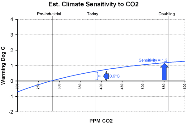
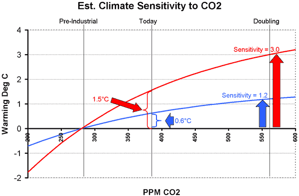
Contributing to Science

I got to make a real contribution to science this weekend, and I will explain below how you can too.  First, some background.

A while back, Steve McIntyre was playing around with graphing temperature data form the US Historical Climate Network (USHCN).  This is the data that is used in most global warming studies and initializes most climate models.  Every climate station is not in this data base - in fact, only about 20 per state are in the data base, with locations supposedly selected in rural areas less subject to biases over time from urban development (urban areas are hotter, due to pavement and energy use, for reasons unrelated to the greenhouse effect).  The crosses below on the map show each station.

He showed this graph, of the USHCN data for temperature change since 1900 (data corrected for time of day of measurement).  Redder shows measured temperatures have increased since 1900, bluer means they have decreased.
Usgrid80

He mentioned that Tucson was the number one warming site -- you can see it in the deepest red.  My first thought was, "wow, that is right next door to me."   My second thought was "how can Tucson, with a million people, count as rural?"   Scientists who study global warming apply all kinds of computer and statistical tricks to this data, supposedly to weed out measurement biases and problems.  However, a number of folks have been arguing that scientists really need to evaluate biases site by site.  Anthony Watts has taken this idea and created SurfaceStations.org, a site dedicated to surveying and photographing these official USHCN stations.

So, with his guidance, I went down to Tucson to see for myself.  My full report is here, but this is what I found:
Tucson1

The measurement station is in the middle of an asphalt parking lot!  This is against all best practices, and even a layman can see how that would bias measurements high.  Watts finds other problems with the installation from my pictures that I missed, and comments here that it is the worst station he has seen yet.  That, by the way, is the great part about this exercise.  Amateurs like me don't need to be able to judge the installation, they just need to take good pictures that the experts can use to analyze problems.

As a final note on Tucson, during the time period between 1950 and today, when Tucson saw most of this measured temperature increase, the population of Tucson increased from under 200,000 to over 1,000,000.  That's a lot of extra urban heat, in addition to the local effects of this parking lot.

The way that scientists test for anomalies without actually visiting or looking at the sites is to do some statistical checks against other nearby sites.  Two such sites are Mesa and Wickenburg.  Mesa immediately set off alarm bells for me.  Mesa is a suburb of Phoenix, and is often listed among the fastest growing cities in the country.  Sure enough, the Mesa temperature measurements were discontinued in the late 1980's, but surely were biased upwards by urban growth up to that time.

So, I then went to visit Wickenburg.  Though is has been growing of late, Wickenburg would still be considered by most to be a small town.  So perhaps the Wickenburg measurement is without bias?  Well, here is the site:

Wickenburg_facing_sw

That white coffee can looking thing on a pole in the center is the temperature instrument.  Again, we have it surrounded by a sea of black asphalt, but we also have two building walls that reflect heat onto the instrument.  Specs for the USHCN say that instruments should be installed in an open area away from buildings and on natural ground.  Oops.  Oh, and by the way, lets look the other direction...

Wickenburg_facing_se

What are those silver things just behind the unit?  They are the cooling fans for the building's AC.  Basically, all the heat from the building removed by the AC gets dumped out about 25 feet from this temperature measurement.

Remember, these are the few select stations being used to determine how much global warming the US is experiencing.  Pretty scary.  Another example is here.

Believe it or not, for all the work and money spent on global warming, this is something that no one had done -- actually go document these sites to check their quality and potential biases.  And you too can have the satisfaction of contributing to science.  All you need is a camera (a GPS of some sort is also helpful).  I wrote a post with instructions on how to find temperature stations near you and how to document them for science here.

For those interested, my paper on the skeptics' arguments against catastrophic man-made global warming is here.  If that is too long, the 60-second climate skeptic pitch is here.

Offset Sellers Only Double-Dipping?

From Steven Malloy:

Congress
began investigating the carbon offset industry this week. The inquiry
could produce some "inconvenient truths" for Al Gore and the nascent
offset industry.

Carbon offsets ostensibly allow buyers to
expunge their consciences of the new eco-sin of using energy derived
from fossil fuels. Worried about the 8 tons of carbon dioxide (CO2)
emitted each year by your SUV? Similar to the indulgences offered by
Pope Leo X in the 16th century, you can absolve yourself of sin by
purchasing $96 worth of CO2 offsets "“ typically offered at $12 per ton
of CO2 emitted "“ from offset brokers who, in turn, supposedly use your
cash to pay someone else to produce electricity with low or no CO2
emissions....

A
Capitol Hill staffer told me that the congressional inquiry would look
into the possibility of "double-dipping" in the offset industry.

Only double-dipping?  Earlier, I argued that the purveyors of offsets may be triple dipping:

  1. Their energy projects produce electricity, which they sell to
    consumers.  Since the
    electricity is often expensive, they sell it as "CO2-free"
    electricity.  This is possible in some sates -- for example in Texas,
    where Whole Foods made headlines by buying only CO2-free power.  So the
    carbon offset is in the bundle that they sell to
    electricity customers.  That is sale number one. 
  2. The company most assuredly seeks out and gets
    government subsidies.  These subsidies are based on the power being
    "CO2-free".  This is sale number two, in exchange for subsidies. 
  3. They still have to finance the initial construction of the plant, though.  Regular heartless
    investors require a, you know, return on capital.  So Terrapass
    finances their projects in part by selling these little certificates that you
    saw at the Oscars.  This is a way of financing their plants from people
    to whom they don't have to pay dividends or interest "”just the feel-good
    sense of abatement.  This is the third sale of the carbon credits.

The 60-Second Climate Skeptic

I was trying to think about what I wanted to do for my last post in my recent orgy of global warming writing.  My original attempt to outline the state of the climate skeptic's case ballooned into 80+ pages, so there may be many people who rationally just have no desire to tackle that much material.  So I decided for this last post to try to select the one argument I would use if I had only 60 seconds to make the climate skeptic's case. But how do you boil down 80 pages to a few simple statements?

I'm not that interested in the Sun or cosmic rays -- they are interesting topics, but its dumb to try to argue we overestimate our understanding of man's impact on climate only to counter with topics we understand even less.  One of the reasons I wrote the paper in the first place was because I thought recent skeptical documentaries spent too much time on this subject.  And I would not get into tree rings or ice cores or other historic proxy data, though there is a lot happening in these areas.  I wouldn't even delve into the hysterical treatment of skeptics by man-made climate advocates  -- these are ad hominem issues that are useful to understand in a more comprehensive view but don't make for strong stand-alone arguments.

Anyway, here goes, in a logic chain of 8 steps.

  1. CO2 does indeed absorb reflected sunlight returning to space from earth, having a warming effect.  However, this effect is a diminishing return -- each successive increment of CO2 concentrations will have a much smaller effect on temperatures than the previous increment.  Eventually, CO2 becomes nearly saturated in its ability to absorb radiation.  The effect is much like painting a red room with white paint.  The first coat covers a lot of red but some still shows through.  Each additional coat will make the room progressively whiter, but each successive coat will have a less noticeable effects than the previous coat, until the room is just white and can't get any whiter.
  2. In the 20th century, the UN IPCC claims Earth's surface temperatures have increased by about a 0.6 degree Celsius (though there are some good reasons to think that biases in the installation of temperature instruments have exaggerated this apparent increase).  To be simple (and generous), let's assume all this 0.6C increase is due to man-made greenhouse gasses.  Some may in fact have been due to natural effects, but some may also have been masked by man-made sulfate aerosols, so lets just call man-made warming to be 0.6C. 
  3. Since the beginning of the industrial revolution, it is thought that man has increased atmospheric CO2 concentrations from 0.028% of the atmosphere to 0.038% of the atmosphere.  Since scientists often talk about the effect of a doubling of CO2, this historic rise in CO2 is 36% of a doubling.
  4. Using simple math, we see that if temperatures have risen 0.6C due to 36% of a doubling, we might expect them to rise by 1.67C for a full doubling to 0.056% of the atmosphere.  But this assumes that the rise is linear -- and we already said (and no one denies) that it is in fact a diminishing return relationship.  Using a truer form of the curve, a 0.6C historic rise for 36% of a doubling implies a full doubling would raise temperatures by about 1.2C, or about 0.6C more than we have seen to date (see chart below).   This means that the magnitude of global warming in the next century might be about what we have seen (and apparently survived) since 1900.
  5. Obviously, there is some kind of disconnect here.  The IPCC predicts temperature increases in the next century of 4-8 degrees C.  Big difference.  In fact, the IPCC predicts we will get a 0.5C rise in just 20 years, not 70-100.  Whereas we derived a climate sensitivity of 1.2 from empirical data, they arrive at numbers between 3 and 4 or even higher for sensitivity.  The chart below shows that to believe sensitivity is 3, we would have to have seen temperature rises due to man historically of 1.5C, which nobody believes. 

    So how do they get accelerating temperatures from what they admit to be a diminishing return relation between CO2 concentration and temperature? And for which there is no empirical evidence?  Answer:  Positive feedback.

  6. Almost every process you can think of in nature operates by negative
    feedback.  Roll a ball, and eventually friction and wind resistance bring
    it to a stop.  Negative feedback is a ball in the bottom of a bowl; positive feedback is a ball perched precariously at the time of a mountain. Positive feedback
    breeds instability, and processes that operate by positive feedback are
    dangerous, and usually end up in extreme states -- these processes tend to
    "run away" like the ball rolling down the hill.  Nuclear fission, for example, is a positive feedback process.  We should be happy there are not more positive feedback
    processes on our planet.  Current man-made global warming theory, however, asserts that our climate is dominated by positive feedback.  The IPCC posits that a small increase in temperature from CO2 is multiplied 2,3,4 times or more by positive feedbacks like humidity and ice albedo.
  7. There are three problems with these assumptions about positive feedback.  One, there is no empirical evidence at all that positive feedbacks in climate dominate negative feedbacks.   The 20th century temperature numbers we discussed above show no evidence of these feedbacks.  Two, the long-term temperature record demonstrates that positive feedbacks can't dominate, because past increases in temperature and CO2 have not run away.  And three, characterizations of stable natural processes as being dominated by positive feedback should offend the intuition and common sense of any scientist.
  8. An expected 21st century increase of 0.5 or even 1 degree C does not justify the massive imposed government interventions that will be costly both in dollars and lost freedoms.  In particular, the developing world will be far better off hotter by a degree and richer than it would be cooler and poorer.  This is particularly true since sources like an Inconvenient Truth wildly exaggerate the negative effects of global warming.  There is no evidence tornadoes or hurricanes or disease or extinction are increasing as the world warms, and man-made warming advocates generally ignore any potential positive effects of warming.  As to rising sea levels, the IPCC predicts only a foot and a half of sea level rise even with 4 or more degrees of warming.  Sea level rise from a half to one degree of warming would be measured at most in inches.

OK, so that was more than 60 seconds.  But it is a lot less than 80 pages.  There is a lot of complexity behind every one of these statements.  If you are intrigued, or at least before you accuse me of missing something critical, see my longer paper on global warming skepticism first, where all these issues and much more (yes, including tree rings and cosmic rays) are discussed in more depth.