An Interesting Source of Man-Made Global Warming
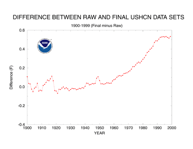
The US Historical Climate Network (USHCN) reports about a 0.6C temperature increase in the lower 48 states since about 1940. There are two steps to reporting these historic temperature numbers. First, actual measurements are taken. Second, adjustments are made after the fact by scientists to the data. Would you like to guess how much of the 0.6C temperature rise is from actual measured temperature increases and how much is due to adjustments of various levels of arbitrariness? Here it is, for the period from 1940 to present in the US:
| Actual Measured Temperature Increase: | 0.1C |
| Adjustments and Fudge Factors: | 0.5C |
| Total Reported Warming: | 0.6C |
Yes, that is correct. Nearly all the reported warming in the USHCN data base, which is used for nearly all global warming studies and models, is from human-added fudge factors, guesstimates, and corrections.
I know what you are thinking - this is some weird skeptic's urban legend. Well, actually it comes right from the NOAA web page which describes how they maintain the USHCN data set. Below is the key chart from that site showing the sum of all the plug factors and corrections they add to the raw USHCN measurements:
I hope you can see this significance. Before we get into whether these measurements are right or wrong or accurate or guesses, it is very useful to understand that almost all the reported warming in the US over the last 70 years is attributable to the plug figures and corrections a few government scientists add to the data in the back room. It kind of reduces one's confidence, does it not, in the basic conclusion about catastrophic warming?
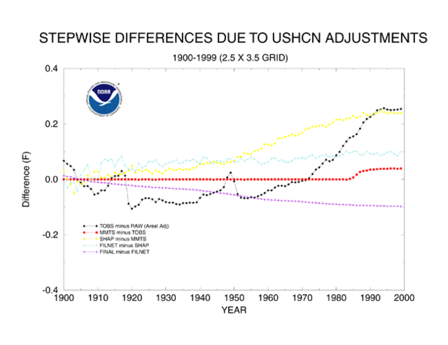
Anyway, lets look at the specific adjustments. The lines in the chart below should add to the overall adjustment line in the chart above.
- Black line is a time of observation adjustment, adding about 0.3C since 1940
- Light Blue line is a missing data adjustment that does not affect the data much since 1940
- Red line is an adjustment for measurement technologies, adding about 0.05C since 1940
- Yellow line is station location quality adjustment, adding about 0.2C since 1940
- Purple line is an urban heat island adjustment, subtracting about 0.05C since 1950.
Let's take each of these in turn. The time of observation adjustment is defined as follows:
The Time of Observation Bias (TOB) arises when the 24-hour daily
summary period at a station begins and ends at an hour other than local
midnight. When the summary period ends at an hour other than midnight,
monthly mean temperatures exhibit a systematic bias relative to the
local midnight standard
0.3C seems absurdly high for this adjustment, but I can't prove it. However, if I understand the problem, a month might be picking up a few extra hours from the next month and losing a few hours to the previous month. How is a few hour time shift really biasing a 720+ hour month by so large a number? I will look to see if I can find a study digging into this.
I will skip over the missing data and measurement technology adjustments, since they are small.
The other two adjustments are fascinating. The yellow line says that siting has improved on USHCN sites such that, since 1900, their locations average 0.2C cooler due to being near more grass and less asphalt today than in 1900.
During this time, many sites were relocated from city locations to
airports and from roof tops to grassy areas. This often resulted in
cooler readings than were observed at the previous sites.
OK, without a bit of data, does that make a lick of sense? Siting today in our modern world has GOT to be worse than it was in 1900 or even 1940. In particular, the very short cable length of the newer MMTS sensors that are standard for USHCN temperature measurement guarantee that readings today are going to be close to buildings and paving. Now, go to SurfaceStations.org and look at pictures of actual installations, or look at the couple of installations in the Phoenix area I have taken pictures of here. Do these look more grassy and natural than measurement sites were likely to be in 1900? Or go to Anthony Watts blog and scroll down his posts on horrible USHCN sites.
The fact is that not only is NOAA getting this correction wrong, but it probably has the SIGN wrong. The NOAA has never conducted the site by site survey that we discussed above. Their statement that locations are improving is basically a leap of faith, rather than a fact-based conclusion. In fact, NOAA scientists who believe that global warming is a problem tend to overlay this bias on the correction process. Note the quote above -- temperatures that don't increase as they expect are treated as an error to be corrected, rather than a measurement that disputes their hypothesis.
Finally, lets look the urban heat island adjustment. The NOAA is claiming that the sum total of urban heat island effects on its network since 1900 is just 0.1C, and less than 0.05C since 1940. We're are talking about the difference between a rural America with horses and dirt roads and a modern urban society with asphalt and air conditioning and cars. This rediculously small adjustment reflects two biases among anthropogenic global warming advocates: 1) That urban heat island effects are negligible and 2) That the USHCN network is all rural. Both are absurd. Study after study has show urban heat island effects as high as 6-10 degrees. Just watch you local news if you live in a city -- you will see actual temperatures and forecasts lower by several degrees in the outlying areas than in the center of town. As to the locations all being rural, you just have to go to surfacestations.org and see where these stations are. Many of these sites might have been rural in 1940, but they have been engulfed by cities and towns since.
To illustrate both these points, lets take the case of the Tucson site I visited. In 1900, Tucson was a dusty one-horse town (Arizona was not even a state yet). In 1940, it was still pretty small. Today, it is a city of over one million people and the USHCN station is dead in the center of town, located right on an asphalt parking lot. The adjustment NOAA makes for all these changes? Less than one degree. I don't think this is fraud, but it is willful blindness.
So, let's play around with numbers. Let's say that instead of a 0.2C site quality adjustment we instead used a -0.1C adjustment, which is still probably generous. Let's assume that instead of a -0.05C urban adjustment we instead used -0.2C. The resulting total adjustment from 1940 to date would be +0.05 and the total measurement temperature increase in the US would fall from 0.6C to 0.15C. And this is without even changing the very large time of observation adjustment, and is using some pretty conservative assumptions on my part. Wow! This would put US warming more in the range of what satellite data would imply, and would make it virtually negligible. It means that the full amount of reported US warming may well be within the error bars for the measurement network and the correction factors.
While anthropogenic global warming enthusiasts are quick to analyze the reliability of any temperature measurement that shows lower global warming numbers (e.g. satellite), they have historically resisted calls to face up to the poor quality of surface temperature measurement and the arbitrariness of current surface temperature correction factors. As the NOAA tellingly states:
The U.S. Historical Climatology Network (USHCN, Karl et al. 1990)
is a high-quality moderate sized data set of monthly averaged maximum,
minimum, and mean temperature and total monthly precipitation developed
to assist in the detection of regional climate change. The USHCN is
comprised of 1221 high-quality stations from the U.S. Cooperative
Observing Network within the 48 contiguous United States.
Does it sound defensive to anyone else when they use "high-quality" in both of the first two sentences? Does anyone think this is high quality? Or this? Or this? Its time to better understand what this network as well as its limitations.
My 60-second climate skepticism argument is here. The much longer paper explaining the breath of skeptic's issues with catastrophic man-made global warming is available for free here.
PS- This analysis focuses only on the US. However, is there anyone out there who thinks that measurement in China and India and Russia and Africa is less bad?
Update- This pdf has an overview of urban heat islands, including this analysis showing the magnitude of the Phoenix nighttime UHI as well as the fact that this UHI has grown substantially over the last 30 years.
Update2: Steve McIntyre looks at temperature adjustments for a couple of California Stations. In one case he finds a station that has not moves for over one hundred years getting an adjustment that implies a urban heat island reduction over the past 100 years.
