Posts tagged ‘US’

Reconciling Seemingly Contradictory Climate Claims

At Real Science, Steven Goddard claims this is the coolest summer on record in the US.

The NOAA reports that both May and June were the hottest on record.

It used to be the the media would reconcile such claims and one might learn something interesting from that reconciliation, but now all we have are mostly-crappy fact checks with Pinocchio counts.  Both these claims have truth on their side, though the NOAA report is more comprehensively correct.  Still, we can learn something by putting these analyses in context and by reconciling them.

The NOAA temperature data for the globe does indeed show May and June as the hottest on record.  However, one should note a couple of things

  • The two monthly records do not change the trend over the last 10-15 years, which has basically been flat.  We are hitting records because we are sitting on a plateau that is higher than the rest of the last century (at least in the NOAA data).  It only takes small positive excursions to reach all-time highs
  • There are a number of different temperature data bases that measure the temperature in different ways (e.g. satellite vs. ground stations) and then adjust those raw readings using different methodologies.  While the NOAA data base is showing all time highs, other data bases, such as satellite-based ones, are not.
  • The NOAA database has been criticized for manual adjustments to temperatures in the past which increase the warming trend.  Without these adjustments, temperatures during certain parts of the 1930's (think: Dust Bowl) would be higher than today.  This was discussed here in more depth.  As is usual when looking at such things, some of these adjustments are absolutely appropriate and some can be questioned.  However, blaming the whole of the warming signal on such adjustments is just wrong -- satellite data bases which have no similar adjustment issues have shown warming, at least between 1979 and 1999.

The Time article linked above illustrated the story of these record months with a video partially on wildfires.  This is a great example of how temperatures are indeed rising but media stories about knock-on effects, such as hurricanes and fires, can be full of it.  2014 has actually been a low fire year so far in the US.

So the world is undeniably on the warm side of average (I won't way warmer than normal because what is "normal"?)  So how does Goddard get this as the coolest summer on record for the US?

Well, the first answer, and it is an important one to remember, is that US temperatures do not have to follow global temperatures, at least not tightly.  While the world warmed 0.5-0.7 degrees C from 1979-1999, the US temperatures moved much less.  Other times, the US has warmed or cooled more than the world has.  The US is well under 5% of the world's surface area.  It is certainly possible to have isolated effects in such an area.  Remember the same holds true the other way -- heat waves in one part of the world don't necessarily mean the world is warming.

But we can also learn something that is seldom discussed in the media by looking at Goddard's chart:

click to enlarge

First, I will say that I am skeptical of any chart that uses "all USHCN" stations because the number of stations and their locations change so much.  At some level this is an apples to oranges comparison -- I would be much more comfortable to see a chart that looks at only USHCN stations with, say, at least 80 years of continuous data.  In other words, this chart may be an artifact of the mess that is the USHCN database.

However, it is possible that this is correct even with a better data set and against a backdrop of warming temperatures.  Why?  Because this is a metric of high temperatures.  It looks at the number of times a data station reads a high temperature over 90F.  At some level this is a clever chart, because it takes advantage of a misconception most people, including most people in the media have -- that global warming plays out in higher daytime high temperatures.

But in fact this does not appear to be the case.  Most of the warming we have seen over the last 50 years has manifested itself as higher nighttime lows and higher winter temperatures.  Both of these raise the average, but neither will change Goddard's metric of days above 90F.  So it is perfectly possible Goddard's chart is right even if the US is seeing a warming trend over the same period.  Which is why we have not seen any more local all-time daily high temperature records set recently than in past decades.  But we have seen a lot of new records for high low temperature, if that term makes sense.  Also, this explains why the ratio of daily high records to daily low records has risen -- not necessarily because there are a lot of new high records, but because we are setting fewer low records.  We can argue about daytime temperatures but nighttime temperatures are certainly warmer.

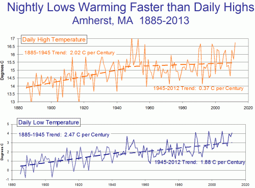
This chart shows an example with low and high temperatures over time at Amherst, MA  (chosen at random because I was speaking there).  Note that recently, most warming has been at night, rather than in daily highs.

Quick: From Media Reporting and Obama Speeches, What Is Your Impression of Wildfire Severity This Year

Wildfires are becoming a perennial favorite of our "Trend that is not a trend" series, showing how media creates trends out of single data points and even out of thin air.  Often, the evidence behind trends in media stories tends to be ... the increasing volume of media stories on that topic.  Thus the "Summer of the Shark" media fiasco.

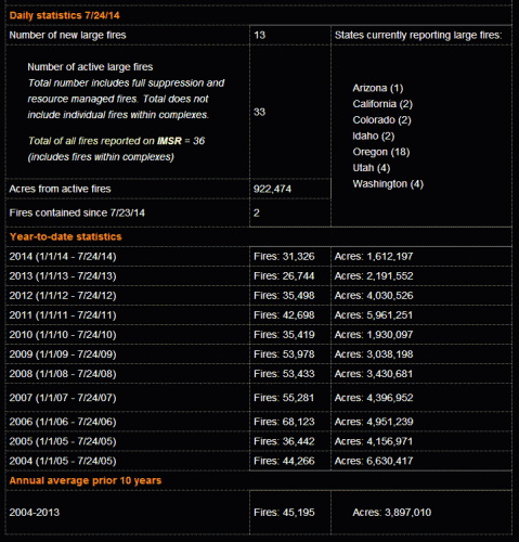
About 98 out of 100 people I might ask would say that this is a record year for wildfires in the US.  In fact, it is, so far, one of the slowest wildfire seasons in recent memory.

Here is a screencap of the data from the National Inter-agency Fire Center.  Here is the link so you can see for yourself (though of course the data will be different over time since it shows year to date data for the day you check).

click to enlarge


Note that there is no apples to oranges BS here -- all data for all years are for Jan 1 to July 24 of that year.  So far this year, the number of fires is 31% below average and the total acres burned is nearly 60% below average.

Postscript:  By the way, I have every reason to hate wildfires.  A wildfire in the Sedona area shut down my largest business for the year, pretty much wiping out our company's earnings for the year.

Postscript #2:  There is clearly a trend in the data for acres burned (see whole database here).  I am not denying the trend, though we can argue how much is climate and how much is forest management and how much is simply more human contact with the wilderness.   What I object to is using individual events, particularly individual events in below-average years, as proof of the trend


When Regulation Makes Things Worse -- Banking Edition

One of the factors in the financial crisis of 2007-2009 that is mentioned too infrequently is the role of banking capital sufficiency standards and exactly how they were written.   Folks have said that capital requirements were somehow deregulated or reduced.  But in fact the intention had been to tighten them with the Basil II standards and US equivalents.  The problem was not some notional deregulation, but in exactly how the regulation was written.

In effect, capital sufficiency standards declared that mortgage-backed securities and government bonds were "risk-free" in the sense that they were counted 100% of their book value in assessing capital sufficiency.  Most other sorts of financial instruments and assets had to be discounted in making these calculations.  This created a land rush by banks for mortgage-backed securities, since they tended to have better returns than government bonds and still counted as 100% safe.

Without the regulation, one might imagine  banks to have a risk-reward tradeoff in a portfolio of more and less risky assets.  But the capital standards created a new decision rule:  find the highest returning assets that could still count for 100%.  They also helped create what in biology we might call a mono-culture.  One might expect banks to have varied investment choices and favorites, such that a problem in one class of asset would affect some but not all banks.  Regulations helped create a mono-culture where all banks had essentially the same portfolio stuffed with the same one or two types of assets.  When just one class of asset sank, the whole industry went into the tank,

Well, we found out that mortgage-backed securities were not in fact risk-free, and many banks and other financial institutions found they had a huge hole blown in their capital.  So, not surprisingly, banks then rushed into government bonds as the last "risk-free" investment that counted 100% towards their capital sufficiency.  But again the standard was flawed, since every government bond, whether from Crete or the US, were considered risk-free.  So banks rushed into bonds of some of the more marginal countries, again since these paid a higher return than the bigger country bonds.  And yet again we got a disaster, as Greek bonds imploded and the value of many other countries' bonds (Spain, Portugal, Italy) were questioned.

So now banking regulators may finally be coming to the conclusion that a) there is no such thing as a risk free asset and b) it is impossible to give a blanket risk grade to an entire class of assets.  Regulators are pushing to discount at least some government securities in capital calculations.

This will be a most interesting discussion, and I doubt that these rules will ever pass.  Why?  Because the governments involved have a conflict of interest here.  No government is going to quietly accept a designation that its bonds are risky while its neighbor's are healthy.  In addition, many governments (Spain is a good example) absolutely rely on their country's banks as the main buyer of their bonds.  Without Spanish bank buying, the Spanish government would be in a world of hurt placing its debt.  There is no way it can countenance rules that might in any way shift bank asset purchases away from its government bonds.

On The Steven Goddard Claim of "Fabricated" Temperature Data

Steven Goddard of the Real Science blog has a study that claims that US real temperature data is being replaced by fabricated data.  Christopher Booker has a sympathetic overview of the claims.

I believe that there is both wheat and chaff in this claim, and I would like to try to separate the two as best I can.  I don't have time to write a well-organized article, so here is just a list of thoughts

  1. At some level it is surprising that this is suddenly news.  Skeptics have criticized the adjustments in the surface temperature database for years
  2. There is certainly a signal to noise ratio issue here that mainstream climate scientists have always seemed insufficiently concerned about.  Specifically, the raw data for US temperatures is mostly flat, such that the manual adjustments to the temperature data set are about equal in magnitude to the total warming signal.  When the entire signal one is trying to measure is equal to the manual adjustments one is making to measurements, it probably makes sense to put a LOT of scrutiny on the adjustments.  (This is a post from 7 years ago discussing these adjustments.  Note that these adjustments are less than current ones in the data base as they have been increased, though I cannot find a similar chart any more from the NOAA discussing the adjustments)
  3. The NOAA HAS made adjustments to US temperature data over the last few years that has increased the apparent warming trend.  These changes in adjustments have not been well-explained.  In fact, they have not really be explained at all, and have only been detected by skeptics who happened to archive old NOAA charts and created comparisons like the one below.  Here is the before and after animation (pre-2000 NOAA US temperature history vs. post-2000).  History has been cooled and modern temperatures have been warmed from where they were being shown previously by the NOAA.  This does not mean the current version  is wrong, but since the entire US warming signal was effectively created by these changes, it is not unreasonable to act for a detailed reconciliation (particularly when those folks preparing the chart all believe that temperatures are going up, so would be predisposed to treating a flat temperature chart like the earlier version as wrong and in need of correction.
    1998changesannotated
  4. However, manual adjustments are not, as some skeptics seem to argue, wrong or biased in all cases.  There are real reasons for manual adjustments to data -- for example, if GPS signal data was not adjusted for relativistic effects, the position data would quickly get out of whack.  In the case of temperature data:
    • Data is adjusted for shifts in the start/end time for a day of measurement away from local midnight (ie if you average 24 hours starting and stopping at noon).  This is called Time of Observation or TOBS.  When I first encountered this, I was just sure it had to be BS.  For a month of data, you are only shifting the data set by 12 hours or about 1/60 of the month.  Fortunately for my self-respect, before I embarrassed myself I created a spreadsheet to monte carlo some temperature data and play around with this issue.  I convinced myself the Time of Observation adjustment is valid in theory, though I have no way to validate its magnitude  (one of the problems with all of these adjustments is that NOAA and other data authorities do not release the source code or raw data to show how they come up with these adjustments).   I do think it is valid in science to question a finding, even without proof that it is wrong, when the authors of the finding refuse to share replication data.  Steven Goddard, by the way, believes time of observation adjustments are exaggerated and do not follow NOAA's own specification.
    • Stations move over time.  A simple example is if it is on the roof of a building and that building is demolished, it has to move somewhere else.  In an extreme example the station might move to a new altitude or a slightly different micro-climate.  There are adjustments in the data base for these sort of changes.  Skeptics have occasionally challenged these, but I have no reason to believe that the authors are not using best efforts to correct for these effects (though again the authors of these adjustments bring criticism on themselves for not sharing replication data).
    • The technology the station uses for measurement changes (e.g. thermometers to electronic devices, one type of electronic device to another, etc.)   These measurement technologies sometimes have known biases.  Correcting for such biases is perfectly reasonable  (though a frustrated skeptic could argue that the government is diligent in correcting for new cooling biases but seldom corrects for warming biases, such as in the switch from bucket to water intake measurement of sea surface temperatures).
    • Even if the temperature station does not move, the location can degrade.  The clearest example is a measurement point that once was in the country but has been engulfed by development  (here is one example -- this at one time was the USHCN measurement point with the most warming since 1900, but it was located in an open field in 1900 and ended up in an asphalt parking lot in the middle of Tucson.)   Since urban heat islands can add as much as 10 degrees F to nighttime temperatures, this can create a warming signal over time that is related to a particular location, and not the climate as a whole.  The effect is undeniable -- my son easily measured it in a science fair project.  The effect it has on temperature measurement is hotly debated between warmists and skeptics.  Al Gore originally argued that there was no bias because all measurement points were in parks, which led Anthony Watts to pursue the surface station project where every USHCN station was photographed and documented.  The net results was that most of the sites were pretty poor.  Whatever the case, there is almost no correction in the official measurement numbers for urban heat island effects, and in fact last time I looked at it the adjustment went the other way, implying urban heat islands have become less of an issue since 1930.  The folks who put together the indexes argue that they have smoothing algorithms that find and remove these biases.  Skeptics argue that they just smear the bias around over multiple stations.  The debate continues.
  5. Overall, many mainstream skeptics believe that actual surface warming in the US and the world has been about half what is shown in traditional indices, an amount that is then exaggerated by poorly crafted adjustments and uncorrected heat island effects.  But note that almost no skeptic I know believes that the Earth has not actually warmed over the last 100 years.  Further, warming since about 1980 is hard to deny because we have a second, independent way to measure global temperatures in satellites.  These devices may have their own issues, but they are not subject to urban heat biases or location biases and further actually measure most of the Earth's surface, rather than just individual points that are sometimes scores or hundreds of miles apart.  This independent method of measurement has shown undoubted warming since 1979, though not since the late 1990's.
  6. As is usual in such debates, I find words like "fabrication", "lies",  and "myth" to be less than helpful.  People can be totally wrong, and refuse to confront their biases, without being evil or nefarious.

Postscript:  Not exactly on topic, but one thing that is never, ever mentioned in the press but is generally true about temperature trends -- almost all of the warming we have seen is in nighttime temperatures, rather than day time.  Here is an example from Amherst, MA (because I just presented up there).  This is one reason why, despite claims in the media, we are not hitting any more all time daytime highs than we would expect from a normal distribution.  If you look at temperature stations for which we have 80+ years of data, fewer than 10% of the 100-year highs were set in the last 10 years.  We are setting an unusual number of records for high low temperature, if that makes sense.

click to enlarge


Where's Coyote?

As most of you may know, our company privately operates public parks.  Just before Memorial Day, our largest contract (which covers a lot of our overhead) was shut down by a fire in the Sedona area.  Since that time, our landlord the US Forest Service has announced it is going to keep all of these locations closed indefinitely out of fear of flash flooding (fire-damaged hillsides create a lot more runoff in eve light rain due to loss of ground cover and chemical changes in the soil that make it less permeable).  I think they are over-reacting, but it is not my decision to make.

The result of this is I have been in total operational scrambling mode and may remain so for a while, reducing the amount of blogging I do.

Bizarre Payback Analysis Being Used for Alternate Energy

Check out this payback analysis that is being trumpeted for wind power:

US researchers have carried out an environmental lifecycle assessment of 2-megawatt wind turbines mooted for a large wind farm in the US Pacific Northwest. Writing in the International Journal of Sustainable Manufacturing, they conclude that in terms of cumulative energy payback, or the time to produce the amount of energy required of production and installation, a wind turbine with a working life of 20 years will offer a net benefit within five to eight months of being brought online.

So of all the scarce resources that go into producing wind power, if you look at only one of these (energy), then the project pays itself back in less than a year.  This is stupid.  Yes, I understand that there are some "green" energy sources (*cough* corn ethanol *cough*) that cannot even produce more energy than they consume, so I suppose this finding is a step forward from that.  But what about all the other scarce resources used in producing wind power-- steel, labor, engineering talent, concrete, etc?  This is roughly like justifying the purchase of an 18-wheeler truck by saying it will pay off all the vanadium used in its production in less than a year.

Environmentalists seem to all feel that capitalism is the enemy of sustainability, but in fact capitalism is the greatest system to promote sustainability that has ever been devised.  Every single resource has a price that reflects its relative scarcity as compared to demand.  Scarcer resources have higher prices that automatically promote conservation and seeking of substitutes.  So an analysis of an investment's ability to return its cost is in effect a sustainability analysis.  What environmentalists don't like is that wind does not cover the cost of its resources, in other words it does not produce enough power to justify the scarce resources it uses.  Screwing around with that to only look at some of the resources is just dishonest.

The one reasonable argument is that the price of fuels does not adequately reflect the externalities of Co2 production.  I don't think these are high but obviously there are those who disagree.  The right way to do this analysis is to say that wind power provides a return only if electricity prices are X (X likely being well above current market rates) which in turn reflects a Co2 cost of Y $/ton.  My gut feel is that it would take a Y -- a cost per ton of CO2 -- way higher than any of the figures that are typically bandied about even by environmentalists to make wind work.

Postscript:  I did not critique the analysis of energy payback per se, but if I were to dig into it, I would want to look at two common fallacies with many wind analyses.  1) They typically miss the cost of standby power needed to cover wind's unpredictability, which has a substantial energy cost.  In Germany, during their big wind push, they had to have 80-90% of wind power backed up with hot fossil fuel backup.  2)  They typically look at nameplate capacity and not real capacities in the field.  In fact, real capacities should further be discounted for when wind power produces electricity that the grid cannot take (ie when there is negative pricing in the wholesale market, which actually occurs).

D-Day More Important in Containing the Soviets than Defeating the Nazis

Over time, my understanding of the importance of the D-Day invasions has shifted.  Growing up, I considered these events to be the single key event in defeating the Nazis.  Listening to the radio this morning, this still seems to be the common understanding.

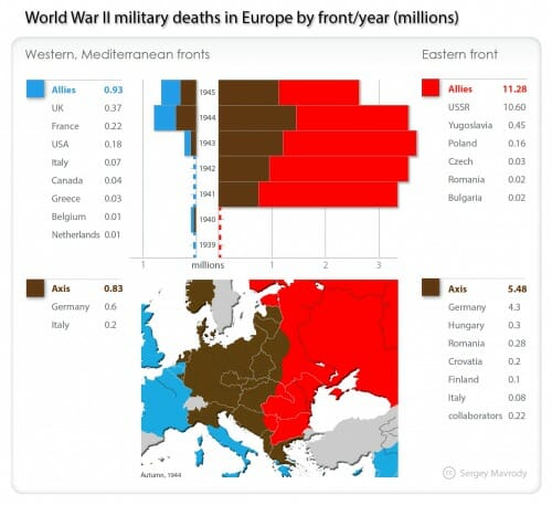
Over time, I have had to face the fact that the US (or at least the US Army) was not primarily responsible for defeating Germany -- the Russians defeated Germany, and what's more, would have defeated them whether the Allies had landed in France or not.  Check out the casualties by front, from Wikipedia:

click to enlarge

The Russians defeated Germany.  Period.   And I don't think the western allies would ever have had the stomach to inflict the kind of casualties on Germany that were ultimately necessary to defeat her without Russian help.  To me, this is the great irony of WWII, that it was not ultimately a victory for democracy.  Only totalitarian Russia could defeat totalitarian Germany.  This thought often bothers me a lot.  It doesn't fit with how we want to view the war.

However, D-Day did have an important effect -- it kept Western Europe out of Soviet hands.  We did not know it at the time, but I would argue in retrospect that from mid-1944 on we were competing with Russia to see how Europe would get divided up after the war.  D-Day allowed the western allies to overrun most of Western Europe and keep it out of Soviet hands, perhaps an even more important outcome than just speeding the defeat of the Germans.  Sure, FDR gets grief for giving the farm away to Russia at Yalta, but what could he do?  The Soviet occupation of Eastern Europe at that point was a fait accompli.  What would have been FDR & Churchill's negotiation position at Yalta if their armies were not even on the continent (excepting Italy, where we might still be fighting in 2014 and getting nowhere)?

Even an Influential Chart Can Be A Graphics Fail

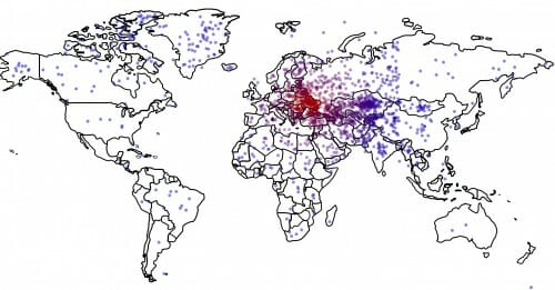
Presumably most of you have seen this chart frm a study that says that not only do Americans not know where the Ukraine is, but that desire for US intervention there is correlated with such knowledge or lack thereof (the less people understand where it is, the more they support intervention).

click to enlarge

I find the study results both depressing and unsurprising, so I won't comment on them per se.   Though I suppose if you confuse the Ukraine with the Yukon (as a number of respondents seem to), interventionism might make more sense.  My only question is:  where were such studies of domain knowledge vs. policy recommendations in the health care or minimum wage debate?

However much impact this chart has had, though, it is still a graphics fail in my mind.  Why?  Because the author attempts to portray a second variable by the dot color.  But the variable he or she chooses to portray is the distance of the point from the correct location (red being more correct, blue less).  But that is easy to see without the variation in color.  It is redundant information.

A much better chart would have been to color code each dot with that respondent's Ukraine prescription, from blue = intervention to red = non-intervention.  This way the chart would have supported the full findings of the study (link between geographical knowledge and policy prescription) rather than just one aspect (quality of geographic knowledge).

Update:  If so many people got the Ukraine and the Yukon confused, God help us if the next Russian crisis is in Georgia.

Is Their a Guinsess Record for the Longest Correction?

This correction by Michel Taylor of something called the Australian Independent Media Network has got to be the longest correction in history.  You know it is an incredible correction when this is just a tiny part of the errors admitted:

  • Evans does not believe, and has never believed, that 9/11 was an inside job perpetrated by the Rothschild family, that US President Barack Obama is a secret Jew, that the Holocaust never happened or that Jewish bankers and the Rothschild family have assassinated at least two US Presidents.

The author also admits to getting Evans' education, occupation, organization, and sources of funding wrong.

In part I suppose kudos are owed to Mr. Taylor for being so honest, but seriously, how can one be so comprehensively wrong? (I will actually explain why in a minute).  The correction runs on so long in part because he Taylor also has to correct an earlier correction where he blamed one of his original sources for being intentionally misleading.  He also apologizes for that.

I would likely have posted this anyway just because it is sort of funny.  But it just so happens to tie into what I wrote yesterday here.  Because it is clear that Mr. Taylor's core mistake is that he researched the positions of a climate skeptic (Mr. Evans) solely by asking climate alarmists (and climate alarmist web sites) what this skeptic believed.  He felt no need to hear the skeptic case from the skeptic himself.  And what do you know, the descriptions of Mr. Evans' beliefs as portrayed by his ideological enemies were full of errors, exaggerations, straw men, and outright lies.  Who would have thought?

We can laugh at Mr. Taylor, but at least he admitted his mistakes in great depth.  But outlets such as the LA Times and the BBC have recently made it a rule they will never allow skeptic voices into their reporting.  They have institutionalized Mr. Taylor's mistake.

Trying, And Failing to Get Transparency About the Government Shutdown of Private Park Operators

Hans Bader submitted a FOIA on October 9 about US Forest Service and Dept. of Agriculture decision-making leading up to the unprecedented shutdown of private operations on US Forest Service land.  I have seen the FOIA results and -- almost laughably -- virtually all of the documents relate to the end of the shutdown, and all of the documents are dated after the date of his FOIA.  In other words, the US Forest Service essentially ignored the documents requested by the FOIA request and submitted a stacks of unrelated documents.

More from Mr. Bader here

The World's Most Famous Investor Is Now Investing in...

...government access.  Clearly Warren Buffet saw the writing on the wall in 2009, that the way to make money in the US was no longer to build products and factories but to invest in lobbying to get crony advantages and giveaways.

click to enlarge

This Administration and Senate makes all kinds of progressive noises, but all the while they are running perhaps the greatest expansion of cronyism in US history.  And the smart money knows it.


The Weird Way We Look At Forests

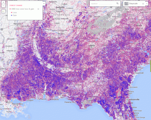
We have never really been able to look at trees as the agricultural crop that they are.  I am reminded of this fact from this forest watch site at Google, which purports to track deforestation around the world.

I have no problem calling activity in the Amazon where old growth is logged out in a tragedy of the commons "deforestation".  But the map is odd to me in the Southeast US.  While there likely is some reduction in forested lands around urban areas, overall the US has actually been increasing its forest cover since the early 1900's.  But the Google map of the southeast shows lots of forest "loss".  It also shows about as much forest "gain". (red is loss, blue is gain, click to enlarge)

click to enlarge

Why is that?

Of late, I have spent a lot of time in the southeast and what I have observed are a lot of private forest lands that are harvested for timber.  One plot is harvested one year, and fast growing trees are replanted.  Then the next year a neighboring plot is harvest, etc, until it all starts over with the first plot.  In a large sense this is no different than any other kind of farming, just with a 15 year growing season instead of a one-summer season.

Calling harvested lands in this area "forest loss" and new growth "forest gain" makes about as much sense as calling land held fallow for a season in Iowa as "corn loss" and newly planted land as "corn gain."  There is a difference  between farming trees and strip-mining them that gets lost in this data.

It is Time to End Favored Tax Treatment of Capital Gains

My new column is up at Forbes.com, and asks why we fetishize capital gains over regular income

Let's consider two investors.  Investor A buys a piece of land and builds a campground on it, intending to run the campground for decades.  Investor A gets her return on investment from the profits each year running the campground, profits that are taxed as regular income  (Full disclosure:  In my business life, I am essentially investor A).

On the other hand, Investor B buys the same piece of land and builds the same campground on it, but in about a year Investor B sells the newly developed facility, making a profit on the sale over his original investment.  Investor B likely will pay taxes on this gain at reduced capital gains tax rates.

But why?  When Investor B sold the property, the price he got was probably something like the present value of the expected cash flows from operating the campground.   Both Investor A and B created essentially the same value., but Investor B took the value as a single lump sum rather than as a stream of income over time.  Why is Investor B's approach preferred in the tax code?  Or, stated another way, why does the tax code favor asset flipping over long-term operations?

Is Bing Censoring US Searches on Chinese Topics?

The other day I had a little fun with Bing's search results on Windows 8 problems.  But this seems much more serious.  From a reader:

No comment.

That’s Microsoft’s response to new revelations that the search engine is censoring Chinese searches in the United States — not just in China. Searches on Chinese topics in the U.S. now produce markedly different search results than Google, results that mimic those  in China. China broadly censors the Internet, blocking topics like the Dalai Lama and Tiananmen Square.

The censorship blog Greatfire.org was the first to point out  that Bing’s search results display information propagated by Chinese authorities. A Chinese language search in Bing for the Dalai Lama (达赖喇嘛 in Chinese) produces two results from China’s Wikipedia (Baidu Baike) and one from the state-owned television station CCTV. In Google, the same search returns two Wikipedia entries and the Dalai Lama’s official site.

Click here to see the results in Bing, versus the results in Google.

Even more shocking, a search for the anti-censorship software FreeGate produces the result: “Due to restrictions on Chinese laws and regulations, we removed the results of these search terms. For more information, see here.”

Microsoft responded to a request from Charlie Smith’s Greatfire to explain the discrepancy. At first, the  software juggernaut replied: “We’ve conducted an investigation of the claims raised by Greatfire.org. First, Bing does not apply China’s legal requirements to searches conducted outside of China. Due to an error in our system, we triggered an incorrect results removal notification for some searches noted in the report but the results themselves are and were unaltered outside of China.”

But after finding the “due to Chinese laws and regulations” search result, Microsoft replied: “Thanks for your inquiry. We have no comment on this topic.”

Much more detail at the link, with examples and screenshots

Temperature Trends and the Farmer Error

My dad grew up in farm country in Iowa.  He told me stories of the early days of commodity futures when a number of farmers lost a lot of money betting the wrong way.  The error they made is that they would look at their local weather and assume everyone was experiencing the same.  For example, some guy in Iowa would be experiencing a drought and facing a poor corn crop, and would buy corn futures assuming the crop would be bad everywhere.  Unfortunately, this was often not the case.

A few climate sites have monthly contests to predict the next month's average global temperature anomaly.   Apparently, everyone really missed in the January betting.  Since most of the participants were American, they assumed that really cold weather in the US would translate to falling global temperatures.  They were wrong.  The global temperature anomaly in January actually rose a bit.

This is a variation of the same effect I often point out in the opposite direction -- that heat waves in even seemingly large areas do not necessarily mean anything for global temperatures.  The US is only about 2% of the global surface area (land and ocean) and since the cold spell was in the eastern half of the US, it therefore affected perhaps 1% of the globe.  And remember, on average, some area representing 1% of the globe should constantly be seeing a 100-year high or low for that particular day.  It's just how averages work.

No particularly point here, except to emphasize just how facile it is to try to draw conclusions about global temperature trends from regional weather events.

Gee, I Wonder Why US Business Investment Is Sluggish?

From Jon Gabriel:

Trader Joe’s wanted to build a new store in Portland, Oregon. Instead of heading to a tony neighborhood downtown or towards the suburbs, the popular West Coast grocer chose a struggling area of Northeast Portland.

The company selected two acres along Martin Luther King Blvd. that had been vacant for decades. It seemed like the perfect place to create jobs, improve customer options and beautify the neighborhood. City officials, the business community, and residents all seemed thrilled with the plan. Then some community organizers caught wind of it.

The fact that most members of the Portland African-American Leadership Forum didn’t live in the neighborhood was beside the point. “This is a people’s movement for African-Americans and other communities, for self-determination,” member Avel Gordly said in a press conference. Even the NAACP piled on, railing against the project as a “case study in gentrification.” (The area is about 25 percent African-American.)

After a few months of racially tinged accusations and angry demands, Trader Joe’s decided it wasn’t worth the hassle. “We run neighborhood stores and our approach is simple,” a corporate statement said. “If a neighborhood does not want a Trader Joe's, we understand, and we won't open the store in question.”

Hours after Trader Joe’s pulled out, PAALF leaders arrived at a previously scheduled press conference trying to process what just happened. The group re-issued demands that the now-cancelled development include affordable housing, mandated jobs based on race, and a small-business slush fund. Instead, the only demand being met is two fallow acres and a lot of anger from the people who actually live nearby.

Mandatory Minimum Sentences are Bad Precisely Because Prosecutors Love Them

Apparently, hundreds of US prosecutors have written Eric Holder opposing his support for reduced mandatory minimum sentences.    Their letter to Holder illustrates exactly why these mandatory minimums need to be reduced:

As you know, mandatory minimum sentences are a critical tool in persuading defendants to cooperate, thereby enabling law enforcement to dismantle large drug organizations and violent gangs. Present law provides numerous opportunities for deserving defendants to avoid mandatory sentences through: cooperation in providing information about other criminals and criminal enterprises; plea bargaining, which resolves the vast majority of federal cases; the “Safety Valve,” which has allowed tens of thousands of defendants to receive lower sentences; and executive clemency, which President Obama recently employed.

The last of these is of course a joke, since Obama plays more rounds of golf in two weeks than he has commuted sentences.  But this does illustrate exactly why prosecutors all love mandatory minimums and why we should hate them.  Read what they are saying in this paragraph.  Basically it says that mandatory minimums take sentencing out of the hands of judges and juries and puts it in the hands of ... federal prosecutors.

The problem is that very high mandatory minimums raise the stakes so high that even the innocent are often forced to cut a deal.  People sometimes wonder how the innocent could ever plead guilty to something.  Well, think of it this way.  Can you stand on one foot for 10 seconds without losing your balance?  Are you sure?   Would you bet $100 on it?  You would?  OK, would you bet 20 years of your life on it?

How sure of something would you have to be to bet your life on it?  And no matter how innocent you are, can you ever be that sure that a jury will see it your way when the federal government is sending everything it has at you?

Mandatory minimum sentences raise the stakes of trusting the judicial process so high that few people can tolerate that much risk.  They cannot afford to risk going to a jury.  So with this threat in hand, prosecutors gain 1) a slave that will basically do or say whatever they demand and 2) total control of the outcome of cases that should be going to trial.

I was not aware Eric Holder had supported this change but despite having my issues in the past with Holder I have to give him Kudos.

Update:  Ken White at Popehat (writing about a different story) says, "As I often say here, the criminal justice system is full of people who believe that its purpose is to deliver convictions and any other result shows a malfunction."  By the way, read the Popehat article at the link, it will horrify you.

How Regulators Strangle Legal Businesses

Apparently the Feds are using banking regulation to strangle businesses, even legal ones, that they don't like by cutting off their access to the banking system (via Overlawyered).

Wall Street Journal reporter Robin Sidel, along with Andrew Johnson, reported on the success that the federal government is having in barring access to the banking system for a number of businesses. As we've discussed previously, "Operation Choke Point" and related arm-twisting efforts by the Feds are aimed at making life difficult for a variety of targeted businesses. Among those disfavored businesses are online lenders, payday lenders, check cashers, virtual currency dealers, gaming businesses, and marijuana-related businesses (although our beloved US Attorney General has been making noises that he simply will look the other way when it comes to enforcing federal drug laws against marijuana businesses that are operating legally under state law)....

In the article and a companion audio interview, Sidel states that the primary concern appears to be with the difficulty of complying with BSA and money laundering risk. While that's certainly true with many of the businesses, it's also true that some of the businesses have been targeted by the regulators for extra scrutiny because they're in a line of business, like payday lending, where the regulators simply don't like the business model on social policy grounds. If we see the Feds back off of weed but still keep the heat on payday lenders, then the argument that it's all about money laundering risk becomes a bit tenuous.

Inequality Metrics Exclude Effects of Government Actions to Reduce Inequality

I have seen this fact a number of times and am always amazed when I read it, since poverty figures are never, ever presented with this bit of context

LBJ promised that the war on poverty would be an "investment" that would "return its cost manifold to the entire economy." But the country has invested $20.7 trillion in 2011 dollars over the past 50 years. What does America have to show for its investment? Apparently, almost nothing: The official poverty rate persists with little improvement.

That is in part because the government's poverty figures are misleading. Census defines a family as poor based on income level but doesn't count welfare benefits as a form of income. Thus, government means-tested spending can grow infinitely while the poverty rate remains stagnant.

Rector argues that poor today is very different than poor in  Johnson's day, and that perhaps we might celebrate a bit

Not even government, though, can spend $9,000 per recipient a year and have no impact on living standards. And it shows: Current poverty has little resemblance to poverty 50 years ago. According to a variety of government sources, including census data and surveys by federal agencies, the typical American living below the poverty level in 2013 lives in a house or apartment that is in good repair, equipped with air conditioning and cable TV. His home is larger than the home of the average nonpoor French, German or English man. He has a car, multiple color TVs and a DVD player. More than half the poor have computers and a third have wide, flat-screen TVs. The overwhelming majority of poor Americans are not undernourished and did not suffer from hunger for even one day of the previous year.

Remember what I presented a while back.  This is what the Left thinks, or wants us to think, American income inequality looks like -- our rich are richer than comparable European welfare states because our poor are poorer.

click to enlarge

And this is what income inequality in the US actually looks like -- our rich and middle class are richer, but our poor are not poorer.  A less redistributionist approach floats all boats.  I compared the US to many European welfare states, using the Left's own data source.  Here is an example, but hit the link to see it all.

click to enlarge

Historical Revisionism

Revisionism on the causes of WWI seems to ebb and flow like a 20-year clock.  It was Germany's fault, no it wasn't, yes it was.  Etc.  Here is the latest iteration.

I have read quite a bit on the topic of late.  It was horribly complex, but here are a few thoughts.

  • At some level, it was everyone's fault, at least as measured by the enthusiasm that greeted the war in nearly every country.  It was the last war begun by folks who thought it would be incredibly romantic and glorious.
  • Austria simply has to bear a lot of the blame.  No doubt a crisis in the Balkans could have been started by Russia or Serbia, and in an alternative universe where the Archduke was not assassinated, they might well have.  But the fact is that Austria made this one happen.  They crafted a set of demands on Serbia that were supposed to be unreasonable.  They were meant to be a Casus Belli.  Austria had determined it was going to war with Serbia.
  • Much is made of the German blank check to Austria, but the key fact for me were the actions of Germany several weeks later.  In response to a building crisis in the Balkans to their southeast, the Germans entered the war attacking to the northwest, into Belgium and France.  With conflict inevitable in the Balkans, the Germans (with a helping hand from the Russians) helped turn a limited conflict into a World War.

The Germans were also responsible through bad decisions in bringing the US into the war, via a u-boat campaign that failed to achieve its goals (starve the Brits) but managed to bring US troops to Europe at almost the exact moment when British and French troops might have collapsed.  Incredibly, the Germans made the exact same mistake in WWII, declaring war on the US so they could initiate a u-boat campaign against US shipping, when Congress might well have been happy to keep America's war limited to Japan.


Arnold Kling Provides An Interesting Framework for Economic Growth

I thought this was a useful simple picture from Arnold Kling, vis a vis countries and their economies:

Low Creation High Creation
Low Destruction Corporatist Stagnation Schumpeterian Boom
High Destruction Minsky Recession Rising Dynamism

He suggests the US may currently be in the lower-left quadrant.  Europe and Japan in the upper left.   My sense is that China is in the upper right, not the lower right (too much of the economy is controlled by the politicians in power for any real destruction to occur).

Once a government gains powerful tools for economic intervention, it becomes politically almost impossible to allow destruction to occur, no matter how long-term beneficial it can be.  The US is one of the few countries in the world that has ever allowed such destruction to occur over an extended period.  The reason it is hard is that successful incumbents are able to wield political power to prevent upstart competition that might threaten their position and business model (see here for example).

It takes a lot of discipline to have government not intervene in favor of such incumbents.  Since politicians lack this discipline, the only way to prevent such intervention is by castrating the government, by eliminating its power to intervene in the first place.  Feckless politicians cannot wield power that does not exist (though don't tell Obama that because he seems to be wielding a lot of power to modify legislation that is not written into my copy of the Constitution.).

Is Israel Really The Worst Country On Earth?

The American Studies Association has voted to initiate an academic boycott of Israel ostensibly to protest its denial of civil rights to Palestinians in the occupied territories.   Forgetting for a moment Israel's unique security concerns (what would the US do if Mexico routinely lobbed rockets and artillery shells into US border towns), the implication is that the Palestinians in Israels have it worse than any other group in the world, since this is the first and only such boycott the ASA has ever entered into.  Is it really worse to be a Palestinian in Israel than, say, a woman anywhere in the Arab world** or about anyone in North Korea?  Do academics in Cuba have more ability to write honestly than they do in Israel?  I doubt it.

The only statement the ASA makes on the subject that I can find is in their FAQ on the boycott

7) Does the boycott resolution unfairly single out Israel? After all there are many unjust states in the world.

The boycott resolution responds to a request from the Palestinian people, including Palestinian academics and students, to act in solidarity. Because the U.S. contributes materially to the Israeli occupation, through significant financial and military aid - and, as such, is an important ally of the Israeli state - and because the occupation daily confiscates Palestinian land and devastates Palestinian lives, it is urgent to act now.

A couple of thoughts.  First, I am not sure why US material aid is relevant to choosing a boycott target.  I suppose the implication is that this boycott is aimed more at the US than at Israel itself.  But the question still stands as to why countries like Saudi Arabia, which receives a lot of US material aid as well, get a pass.  Second, the fact that Palestinian academics can seek international help tends to disprove that their situation is really the worst in the world.  I don't think the fact that the ASA is not hearing cries for help from liberal-minded academics in North Korea means that there is less of a problem in North Korea.  It means there is more of a problem.

I am not a student of anti-semitism, so I can't comment on how much it may explain this decision.  However, I think it is perfectly possible to explain the ASA's actions without resorting to anti-semitism as an explanation.  As background, remember that it is important for their social standing and prestige for liberal academics to take public positions to help the downtrodden in other countries.  This is fine -- not a bad incentive system to feel social pressure to speak out against injustice.  But the problem is that most sources of injustice are all either a) Leftish regimes the Left hesitates to criticize for ideological reasons or b) Islamic countries that the left hesitates to criticize because they have invested so much in calling conservatives Islamophobic.

So these leftish academics have a need to criticize, but feel constrained to only strongly criticizing center-right or right regimes.  The problem is that most of these are gone.  Allende, the Shah, Franco, South Africa -- all gone or changed.  All that's left is Israel (which is odd because it is actually fairly socialist but for some reason never treated as such by the Left).  So if we consider the universe of appropriate targets -- countries with civil rights and minority rights issues that are not leftish or socialist governments and not Islamic, then the ASA has been perfectly consistent, targeting every single country in that universe.

** To this day I am amazed how little heat the gender apartheid in the Arab world generates in the West in comparison to race apartheid in South Africa.  I am not an expert on either, but from what I have read I believe it is a true statement to say that blacks in apartheid South Africa had more freedom than women have today in Saudi Arabia.  Thoughts?

Update:  I twice emailed the ASA for a list of other countries or groups they have boycotted and twice got a blurb justifying why Israel was selected but with no direct answer to my question.  I guess I will take that as confirmation this is the first and only country they have ever targeted.  They did want to emphasize that the reason Israel was selected (I presume vs. other countries but they did not word it thus) had a lot to do with he fact that Israel was the number one recipient of US aid money (mostly military) and that it was this American connection given they represent American studies professors that made the difference.  Why Pakistan or Afghanistan, who treat their women far worse than Israel treats Palestinians, and which receive a lot of US aid, were not selected or considered or mentioned is not explained.  Basically, I would explain it thus:  "all the cool kids are doing it, and we determined that to remain among the cool kids we needed to do it too".  This is a prestige and signalling exercise, and it makes a lot more sense in that context, because then one can ask about the preferences of those to whom they are signalling, rather than try to figure out why Israel is somehow the worst human rights offender in the world.

By the way, by the ASA logic, it should be perfectly reasonable, even necessary, for European academic institutions to boycott US academic institutions because the US government gives aid to such a bad country like Israel.  This seems like it would be unfair to US academics who may even disagree with US policy, but no more unfair than to Israeli academics who are being punished for their government's policies.   I wonder how US academics would feel about being boycotted from European events and scholarship over US government policy?

When Private Enterprise is Inflamatory

When people ask me about my business, one of the things that is hard to explain is just how deep and visceral the skepticism of private enterprise can be.  I constantly have people take single words I might have uttered in the immediacy of a live TV interview and try to craft straw man positions for me out of them**.  Sometimes it is not even something I said, but something where some lazy journalist has poorly paraphrased my position.

Here is a great example, where a Flagstaff writer (who by the way knows me and my phone number quite well but did not bother to interview me) tries to take my opposition to the government shutdown to paint me with some sort of entitlement.  She lectures me that I don't actually own the land on which I operate, as if that is somehow news to me.  You can read my comments if you are interested, but the issue with the shutdown was the lawlessness of Administration officials, not any sense that I am entitled to the land any more than my lease contract allows me to be.  (As an aside, she seems to be expressing a strong theory of landlord rights, that my landlord (the US Forest Service) should have the absolute right to shut me down whenever they want.  Why is it that I don't think she has the same position vis a vis other tenants and landlords?)

By the way, compare her straw man to my actual position on public land, which is likely to the Left of many of my readers:

In my history of public discussions on private operation of public parks, it is no surprise that I run into a lot of skepticism about having any private role at all.  But I also run into the opposite -- folks who ask (or demand) that the government sell all the parks to private buyers.  So why shouldn't privatization of parks just consist of a massive land sale?

The answer has to do with profit potential.  Over time, if in private hands, a piece of land will naturally migrate towards the use which can generate the highest returns.  And often, for a unique piece of land, this most profitable use might not be a picnic area with a $6 entrance fee -- it might instead be something very exclusive which only a few can enjoy, like an expensive resort or a luxury home development (think: Aspen or Jackson Hole).  The public has asked its government to own certain unique lands in order to control their development and the public access to them.

Public ownership of unique lands, then, tends to have the goal of allowing access to and enjoyment of a particular piece of land for all of the public, not just a few.  Typically this entails a public agency owning the land and controlling the types of uses allowed on the land and the nature and style of facility development.  I call these state activities controlling the "character" of the land and its use.  (One could legitimately argue that private land trusts could fulfill the same role, and in fact I have personally been a supporter of and donor to private land trusts.  However, I am not an expert in this field and will leave this discussion to others).

Having established a role for the government in setting the character of the lands we call "parks," we can then legitimately ask, "does this goal require that government employees actually staff the parks and clean the bathrooms?"

** Postscript:  A couple of years ago I was asked to do an interview with Glen Beck on my proposal to keep open, via private operation, a number of Arizona parks slated for closure.  It was the first time I ever did live TV, and a national show to boot.  I had never seen his show but he had the reputation of being freaky and unpredictable, which just made me more nervous.   Anyway, during the interview I said that typically an agency would contract with us for a group of parks, instead of just one, so the stars could help cover the cost of the dogs.  This terminology is from a framework many business school students learn early, often called a BCG matrix (named after the Boston Consulting Group).  It is a two by two matrix with market share or profitability on one axis and market growth on the other.  Anyway, the profitable high revenue units within a company are stars and the unprofitable stagnant ones are called dogs (the profitable stagnant ones were cash cows and I can't actually remember what was in the fourth box).  You can see this nomenclature is so established they actually put little pictures of stars and dogs in the boxes.

Anyway, it was a poor choice of wording, but the nomenclature is wired do deep in my now it just came out.  The context of the entire interview was that I cared deeply about the parks and that I was offended that the legislature was going to let them close when there was an easy solution at hand.  No matter.  The #2 guy at Arizona State Parks took the video and make the rounds of the state park staff, highlighting my use of the word "dog" and inflaming their rank and file that I thought their parks were bad places and I was bent on destroying them, or something.  Anyway, none of the Arizona Park Staff I have ever talked to has ever seen an operations manual for their parks but they have all seen the video of me saying "dogs."

Postscript #2:  Don't ever think that consulting is different from any other business.  When I was an McKinsey, we had piles of frameworks we used (the 7S organization framework being perhaps the most common and actually fairly useful, as its intent was to take focus away from structure alone in organizational work).  Anyway, McKinsey had to have a growth-share matrix, but to try to differentiate this product a bit they had a 3x3 matrix rather than a 2x2.

Since I am somehow oddly onto a consulting tangent here, the single most useful thing I garnered from McKinsey was the pyramid principle in persuasive and analytical writing.  I have talked to a lot of other ex-McKinsey folks, and almost all of them wonder why the pyramid principle is not taught in high school.  I am not a believer in business books -- I am looking around my office and I don't think I see even one here.  But if I had to offer one book for someone who wanted a business book, this is it.

Global Warming Folly

I have not written much about climate of late because my interest, err, runs hot and cold.  As most readers know, I am in the lukewarmer camp, meaning that I accept that Co2 is a greenhouse gas but believe that catastrophic warming forecasts are greatly exaggerated (in large part by scientifically unsupportable assumptions of strong net positive feedback in the climate system).  If what I just said is in any way news to you, read this and this for background.

Anyway, one thing I have been saying for about 8 years is that when the history of the environmental movement is written, the global warming obsession will be considered a great folly.  This is because global warming has sucked all the air out of almost anything else in the environmental movement.  For God sakes, the other day the Obama Administration OK'd the wind industry killing more protected birds in a month than the oil industry has killed in its entire history.  Every day the rain forest in the Amazon is cleared away a bit further to make room for ethanol-making crops.

This picture demonstrates a great example of what I mean.   Here is a recent photo from China:

20131211_china1


You might reasonably say, well that pollution is from the burning of fossil fuels, and the global warming folks want to reduce fossil fuel use, so aren't they trying to fight this?  And the answer is yes, tangentially.   But here is the problem:  It is an order of magnitude or more cheaper to eliminate polluting byproducts of fossil fuel combustion than it is to eliminate fossil fuel combustion altogether.

What do I mean?  China gets a lot of pressure to reduce its carbon emissions, since it is the largest emitter in the world.  So it might build a wind project, or some solar, or some expensive high speed rail to reduce fossil fuel use.  Let's say any one of these actions reduces smog and sulfur dioxide and particulate pollution (as seen in this photo) by X through reduction in fossil fuel use.  Now, let's take whatever money we spent in, say, a wind project to get X improvement and instead invest it in emissions control technologies that the US has used for decades (coal plant scrubbers, gasoline blending changes, etc) -- invest in making fossil fuel use cleaner, not in eliminating it altogether.  This same money invested in this way would get 10X, maybe even up to 100X improvement in these emissions.

By pressuring China on carbon, we have unwittingly helped enable their pollution problem.  We are trying to get them to do 21st century things that the US can't even figure out how to do economically when in actuality what they really need to be doing is 1970's things that would be relatively easy to do and would have a much bigger impact on their citizen's well-being.

Do We Care About Income Inequality, or Absolute Well-Being?

I have a new column up at Forbes.com, and it addresses an issue that has bothered me for a while, specifically:

Do we really care about income inequality, or do we care about absolute well-being of our citizens?  Because as I will show today, these are not necessarily the same thing.

What has always frustrated me about income inequality arguments is that no one ever seems to compare the actual income numbers of the poor between countries.  Sure, the US is more unequal, and I suppose from this we are supposed to infer that the poor in the US are worse off than in “more equal” countries, but is this so?  Why do we almost never see a comparison across countries of absolute well-being?

I have never been able to find a good data source to do this analysis, though I must admit I probably did not look that hard.  But then Kevin Drum (in a post titled “America is the stingiest rich country in the world”) and John Cassidy in the New Yorker pointed me to something called the LIS database, which has cross-country income and demographic data.  I can't vouch for the data quality, but it has the income distribution data and it struck me as appropriate to respond to Drum and Cassidy with their own data.

In short, Cassidy made the point that the Gini coefficient (a statistical measure of income inequality) was higher in the US than for most other wealthy western countries.  Drum made the further point that the US is "stingy" because we do the least to coercively alter this pattern through forced redistribution.

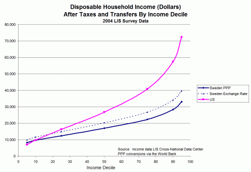
But all we ever see are Gini's are ratios.  We never, ever see a direct comparison of income levels between countries.  So I did that with the data.  I won't reiterate the whole article here, but here is a sample of the analysis, in this case for Sweden which has one of the lowest Gini ratios of western nations and which Drum ranks as among the least "stingy".  This is the model to which the Left wants us to aspire:

click to enlarge


I argue that the purchasing power parity(ppp) numbers are the right way to look at this since we are comparing well-being, and on this basis Sweden may be more equal, but more than 90% of the people in the US are better off.  Sweden does not have a lower Gini because their poor are better off (in fact, if you consider the bottom quartile, the poor are better off in the US).

We are going to see months of obsession by the Left and Obama over income inequality -- but which country would you rather live in, even if you were poor?

Read the whole thing, there are lots of other interesting charts.