Even an Influential Chart Can Be A Graphics Fail
Presumably most of you have seen this chart frm a study that says that not only do Americans not know where the Ukraine is, but that desire for US intervention there is correlated with such knowledge or lack thereof (the less people understand where it is, the more they support intervention).
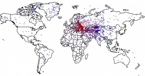
I find the study results both depressing and unsurprising, so I won't comment on them per se. Though I suppose if you confuse the Ukraine with the Yukon (as a number of respondents seem to), interventionism might make more sense. My only question is: where were such studies of domain knowledge vs. policy recommendations in the health care or minimum wage debate?
However much impact this chart has had, though, it is still a graphics fail in my mind. Why? Because the author attempts to portray a second variable by the dot color. But the variable he or she chooses to portray is the distance of the point from the correct location (red being more correct, blue less). But that is easy to see without the variation in color. It is redundant information.
A much better chart would have been to color code each dot with that respondent's Ukraine prescription, from blue = intervention to red = non-intervention. This way the chart would have supported the full findings of the study (link between geographical knowledge and policy prescription) rather than just one aspect (quality of geographic knowledge).
Update: If so many people got the Ukraine and the Yukon confused, God help us if the next Russian crisis is in Georgia.
"If so many people got the Ukraine and the Yukon confused, God help us if the next Russian crisis is in Georgia."
They already did Georgia a few years ago.
Dot color is only redundant if you already know where Ukraine is.
I'm surprised that the results are so good. Most people know where Russia is, and they guessed that Ukraine was either west or south of Russia. I also wonder how many respondents treated the survey as a joke. Who would believe that Russia is fighting for territory in Australia, Indonesia, Brazil, or mid-west USA?
I think I can understand the concentration of dots in Alaska.
After all, Alaska was previously a Russian territory, and it's plausible that in a referendum of its residents, a majority might vote to secede.
I also wondered how many treated the survey as a joke.
Except it would be easy to put an arrow or something pointing to it.
Not to underestimate the dumbness of Americans, but I too find it surprising how many respondents chose a location in North America. The other visually interesting thing I noticed on the map is the near vertical demarcation running through central Russia and western China. Makes me wonder if the map did not work properly for a large number of respondents. Both of those lead me to call foul on the validity of the results.
Confusing Ukraine with Yukon doesn't make me feel much better since there are only a handful of dots located in the Yukon. What's really puzzling is the number of people who selected Greenland.
It might have been easier if water had been colored blue.
Also, as much as I like to make fun of people, guessing Kazakhstan is not really so terrible, people at least knew that Ukraine was a large oblong country kind of to the south of Russia. Still more accurate than the map in the board game "Risk."
Just a quibble, but why the red dot in Poland, or is the survey just garbage?
And to quibble a bit more, the authors claim dots in the Indian Ocean, but I only see them the Arabian Sea and the Bay of Bengal.
They're actually clusters of points in the middle of Kyrgyzstan and Kazakhstan. Mongolia has it's own cluster too.
That explains the people picking the Black Sea too.
But we still have The Allman Brothers - right?
Those crazy Russians; why are they picking on Canada. We have to help the Canucks.
I had the same thought when I saw the map. The problem with showing the intervention prescription scale is that it's probably based on something like a 5- or 7-point scale, which would mean a lot of duplicate, and therefore hard-to-interpret, coloring.
"..If so many people got the Ukraine and the Yukon confused, God help us if the next Russian crisis is in Georgia." Well, that could be a good thing. Invading ourselves may be the best way we have to get those shovel ready jobs, really shovel ready. Invade, bomb everything, rebuild like new. In ten years, we can have a new country. And no money wasted overseas. I like it.
About the Ukraine and Russia, Putin looks like he is stuck on stupid and yearning for the glories of yesteryear. So, the money and businesses will continue to flee and Russia will continue to decline. The jihadists will increase in number and range, guerrilla warfare will spread. If and when the Germans decide to pull their considerable investments out of Russia, famine will return. Just like the good old days. Oh well, their best writers were always very depressed, very drunk and starving. We might get some good books from them, but it looks like Russians aren't good for much else.
When they get Athens, Georgia, will they think they're in Greece?
And no, the AllMan Brothers was considered too Patriarchal and Dead White Maleish. The RadFems have consigned them to the Memory
Holeer, uhreceptacle, um, thingy!No. No, we don't.
Not much for sarcasm eh?
Nice touch with the "eh?" considering the Canuck reference. ;-)
Thank you...
I decided to ask people to self-identify themselves by political party, then asked them to identify where Mr. Obama's head was located on a picture of him. Below is the result, similar to the technique above but separated by political affiliation....
[IMG]http://i58.tinypic.com/b49evn.jpg[/IMG]
I don't get your point about confusing Ukraine with "the Yukon." You are doing the exact same thing by referring to it as "the Ukraine." That is what is meant when people say that the two get confused--people refer to "the Ukraine" when they're thinking of "the Yukon. The country is just Ukraine, much as there is no "the France" or "the Canada." That is the only confusion that exists; people don't confuse them geographically. Good lord, smfh.