Everything is Pretty Damn Awesome
At the age of about 60, my wife began having terrible pain in her hip. For about a year, this greatly limited her ability to walk longer distances. One of her great joys, exploring new places on foot, was suddenly impossible to pursue. And then the pain got so bad that she could barely sleep, making her life pretty miserable. Projecting forward years or even months, at the pace things were getting worse, it is hard to imagine any sort of reasonably enjoyable life. In any other era in the history of human beings, her life would have been effectively over.
But in her case it wasn't. She had a relatively routine operation where the doctor cut into her leg, carved out a large part of the femur and socket joint, and replaced it with a contraption of titanium, cobalt-chromium, ceramic and plastic. Sixty years ago this operation was unheard of, and 100 years ago many of the materials used were unknown. But now we do it routinely. I have a partial knee replacement that is only weeks old and walked 3 miles on it this morning. It is unusual for me to meet anyone my age or older who doesn't have some sort of prosthesis, whether it be a joint replacement or a heart stent or a pacemaker. What we all have in common is that a century ago our lives would likely either be literally over or at least so painful we might wish it were so.
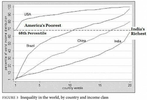
This may seem like an odd way to restart my blogging, but before I spend the coming months and years criticizing everything and everyone, it is worth remembering that we live in the greatest time in human history. The median human experience in all of history is miserable subsistence poverty. At least until the recent explosion of wealth and mass escape from poverty that has characterized the last 75 years, the 95th percentile human experience was probably subsistence poverty. Everyone alive today is probably in the top 10% or even 1% of historical humans in terms of income and well-being. This is even more so for a resident of the US, where even a person on the poverty line in the United States today, say around the 20th percentile of income, is likely in the 80-90th percentile worldwide.**
The times we live in are a miracle. We are all richer on any reasonable metric, except absolute value of our bank accounts, than the richest men of the gilded age, say in 1870. Years and years ago I compared a modest house in my neighborhood with the crazy huge mansion of Mark Hopkins. I wrote:
One house has hot and cold running water, central air conditioning, electricity and flush toilets. The other does not. One owner has a a computer, a high speed connection to the Internet, a DVD player with a movie collection, and several television sets. The other has none of these things. One owner has a refrigerator, a vacuum cleaner, a toaster oven, an iPod, an alarm clock that plays music in the morning, a coffee maker, and a decent car. The other has none of these. One owner has ice cubes for his lemonade, while the other has to drink his warm in the summer time. One owner can pick up the telephone and do business with anyone in the world, while the other had to travel by train and ship for days (or weeks) to conduct business in real time.
I think most of you have guessed by now that the homeowner with all the wonderful products of wealth, from cars to stereo systems, lives on the right (the former home of a friend of mine in the Seattle area). The home on the left was owned by Mark Hopkins, railroad millionaire and one of the most powerful men of his age in California. Hopkins had a mansion with zillions of rooms and servants to cook and clean for him, but he never saw a movie, never listened to music except when it was live, never crossed the country in less than a week. And while he could afford numerous servants around the house, Hopkins (like his business associates) tended to work 6 and 7 day weeks of 70 hours or more, in part due to the total lack of business productivity tools (telephone, computer, air travel, etc.) we take for granted. Hopkins likely never read after dark by any light other than a flame.
If Mark Hopkins or any of his family contracted cancer, TB, polio, heart disease, or even appendicitis, they would probably die. All the rage today is to moan about people's access to health care, but Hopkins had less access to health care than the poorest resident of East St. Louis. Hopkins died at 64, an old man in an era where the average life span was in the early forties. He saw at least one of his children die young, as most others of his age did. In fact, Stanford University owes its founding to the early death (at 15) of the son of Leland Stanford, Hopkin's business partner and neighbor. The richest men of his age had more than a ten times greater chance of seeing at least one of their kids die young than the poorest person in the US does today.
You don't even have to go back to the 19th century to find high childhood death rates. Both my mom and dad (who were born in the 1920s and 1930s) lost a brother when they were young to disease, both whooping cough I think. My dad contracted polio as a teen and never regained full strength in one leg. They both talked about these things like they were so normal -- I am sure it was a tragedy for the families but a sort of normal and expected tragedy.
Most of the issues that have people convinced that everything is awful are not so daunting when viewed on a historic scale.
The environment? The air in cities is immeasurably cleaner than when I grew up (I remember smog so think in LA you couldn't see anything). Water quality is better, litter has almost completely disappeared (at least compared to when I grew up). The thing that never really gets mentioned in lovely period pieces like Bridgerton is just how bad everything smelled and how dangerous the water was. Today, we tend to be arguing over smaller and smaller concentrations of smaller and smaller risks. There is the climate issue of course, but many of the disasters blamed on climate change are historically typical and have little to do with warming temperatures (starting with the LA fires). We will get back to climate in due course.
Or take the issue of race. Growing up in the South in the 1960s and 1970s, the improvements we have seen in race relations, at least until about 2000, were remarkable. Tribalism and xenophobia are too wired into humans to purge entirely, but to a remarkable extent in the US we had limited overt racism to the low status fringe. Another generation or two and we were well-positioned for a truly race-blind society. [We have unfortunately lost ground on this in the last 25 years, as racism and anti-semitism seem to have re-emerged in high-status groups from a toxic mix of marxism and falling academic standards. But I have hope]
This is not to say that life doesn't suck for many people on Earth. Though there are billions fewer than fifty years ago, you could be one of a billion people living in less than $1 a day poverty. You could be a woman living in virtual slavery in Iran, a mother who just wants her kids to survive in Gaza, or a Russian soldier enduring years at war in the Ukraine. But for the vast majority of people on Earth, and for a huge proportion of the people in this county, the Earth is the best world we have ever had. Understanding that, and the connection between our current prosperity and ideas like individual rights, capitalism, free trade and scientific inquiry will continue to be a key focus of this blog.
I am not a Pollyanna -- I see threats and worrying trends in every direction, and will be writing about them. For example, tomorrow we trade a President with an immense set of flaws for another with an immense set of entirely different flaws. Perhaps I am not as disappointed as some by recent trends because I have always treated politicians and the media and academia with immense skepticism, so I am less surprised by their obvious failings. I have always expected people in power -- government, corporations, wherever -- to abuse their power and believe the trick is to wire the system in a way that they cannot do too much damage. In preparation for blogging again, and looking back over my old writing, one consistent theme I see is a disdain for solutions that boil down to "if only we replace their people with our people." That's a hopeless approach. We have flip-flopped the Coke and Pepsi parties in power more times in the last 50 years than we did in 100+ years before that, and its not making things better. If anything its escalating a tit for tat power grab as each new administration pushes the precedent frontier forward more toward Presidential authoritarian power. This is not a secret: Trump is bragging about it.
One of my first long-form posts will be on the breakdown of the US political consensus around free speech and free trade. Both concepts have been critical to the prosperity I write about above, but both are concepts politicians tend to shy away from (free speech allows their opposition to speak out and potentially remove them from power, while free trade limits the economic spoils they can dole out to powerful labor and business supporters). To a large extent, US moral and intellection leadership post WWII on free speech and free trade has been critical to keeping these concepts alive around the world against the headwinds of authoritarianism. Now, with a breakdown of support in the US for both, one wonders what future they have. More later....
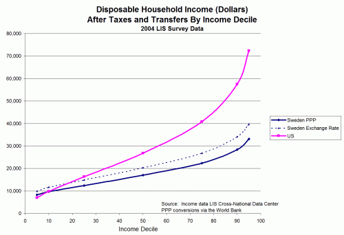
**footnote: It is remarkably hard to get the data to do this analysis. Everyone that collates income inequality data wants to show the US as awful so they will compare US only with the US and not with any other countries. This chart is the closest I have found recently and actually seems to say that the US 20th percentile is about at the world 65th percentile. But this underestimates the US position since it uses the other major trick of poverty stats -- it omits the effect of taxes and government transfer programs. No one ever believes me when I tell them, but most poverty stats, including the US poverty line, are based on income without transfers, ie BEFORE the effect of anti-poverty programs. The stats thus always show no progress on poverty and argue for more government anti-poverty programs while excluding the effect of existing anti-poverty programs from their data. On a world scale US anti-poverty programs are robust, and we have (again against perceptions) one of the most progressive tax codes anywhere so with the effect of anti-poverty programs my guess is that the US 20th percentile is over the 80th percentile worldwide. I took a shot at this analysis vs Scandinavian countries quite a while ago here. When I have a chance, I will see if there is newer raw data available,/footnote


