Posts tagged ‘pictures’

Look at the Pollution! Oh, its Water, Never Mind

I think most of us are familiar with the clever movie poster for An Invconvinient Truth, with the smoke from a factory swirling into a hurricane:

Tn_nconvient_truth

In fact, this same picture of a white plume coming from a factory or power plant stack is often used to illustrate articles on pollution.  Just searching the first page of images googling "air pollution" gives us these relatively similar images illustrating air pollution articles:

Ap1 Ap2 Ap3 Ap4

Ap5 Ap6 Ap7 Ap8

Here is a big Roseanne Rosanadana Emily Litella moment for all of you using these images:  The big white cloud coming out of all those stacks is steam.  Water vapor.  H2O.  Though actually a much more powerful greenhouse gas than CO2, no one has had the temerity to label water a pollutant (except in that great Bullshit! issue when Penn & Teller get environmentalists to sign a petition banning dihydrogen monoxide).  All of these guys are using big plumes of water vapor to panic people about pollution.  That is because most pollutants emitted by combustion are invisible.  Visible smoke was licked by most plants decades ago (here is the only "factory" picture in the google search I could find with actual smoke). 

Just to avoid being misunderstood, my point is not that pollution is OK because it is invisible.  My point is that these scare pictures are yet another example of how environmentalists feel its OK to ignore science to advance their agenda in public.  Sometimes they even go further, as Small Dead Animals points out, resorting to photo-shopping to make things seem worse, but the dreaded steam plumes are still there front and center.  (I noticed that several of the pictures above where photographed at sunset.  I thought at first this was to make them look prettier, but maybe they liked the effect because it made the steam look browner without photo-shopping).

I did not go too deep into the Google search, but I went far enough to award my personal favorite for a scare picture that has nothing to do with the point being made:

Air_pollution

This one is a classic, with the sad-faced little girl and her asthma** inhaler super-imposed over a scene of "industrial pollution."  Except, the scene is from a nuclear power plant!  The unique shaped cooling tower is almost exclusively used on nuclear power plants, but the ultimate proof is the small nuclear reactor containment dome you can see to the right.  That plume, which is supposed to represent pollution, has to be 100% water.  There are no combustion products at a nuclear plant, and even if there were, given the way the cooling tower works, this can only be water vapor coming out of the cooling tower.  The really sad and pathetic thing is that this illustration is from the air pollution site at Battelle, which is a world-renowned private scientific and technical organization. 

What's my point?   I think that scientists and academics, in their increasing arrogance, have no respect for the general public.  The only way I can consistently interpret scientist's actions, for example around the global warming debate, is to hypothesize that they consider truth and facts important when talking to other scientists, but irrelevant when talking to the public because, in their mind, the public is stupid and its OK to tell them anything.  I will leave you with this
quote
from National Center for Atmospheric Research (NOAA) climate researcher and global warming action promoter,
Steven Schneider:

[In talking to the public about the climate] We have to offer up scary scenarios, make simplified, dramatic statements,
and make little mention of any doubts we have. Each of us has to decide what
the right balance is between being effective and being honest.

** By the way, there is growing evidence that increasing reported asthma rates are not correlated with outdoor air pollution. I wrote about this here, and hypothesized that the growth in asthma has coincided with the post-70s-energy-crisis steps everyone has taken to better insulate and seal up their houses and buildings, making indoor air pollution more of a problem.

Update: I started to think the dome I was calling a nuclear containment building might be telescope dome on the top of the building below.  It's not.

Beautiful Weekend

It was a stunning weekend here in Phoenix.  Spent most of it at kid's sporting events, but got a chance to go to the Phoenix zoo and finally visit our new orangutan baby.  Got some great pictures with my Nikon D50, including this one that really came out great:

Monkey1

My Pumpkin

I had meant to post pictures of my pumpkin, and just forgot.  Here are a couple of my world pumpkin, which I carved by thinning out the pumpkin where the landmasses are, but not carving all the way through, such that the skin over the land was more translucent.

Pumpkin1   Pumpkin2

(click on pictures for larger view).  I didn't have a tripod handy so my long-exposure night photography is kind of shaky.

World's Ugliest Currency

My vote for the world's ugliest bank note is the new US $10 bill (click for larger pictures)

800pxus_10_series_2004_face

800pxus_10_series_2004_back

Really these images don't do justice to just how butt-ugly this bill is.  I understand the need to introduce color and anti-counterfeiting technologies.  I also understand that they are trying to maintain elements of the historic greenback.  But this bill marks the point where it is now impossible to sustain both these goals.  If we need color, then its time to go color -- maybe Peter Maxx could design a new bill.

Really, who designed this thing?  The combination of colors is god-awful. And what's that blank oval on the back that looks like a misprint?  This thing is a mess.

(Note to my wife:  Yes, I am actually blogging about this.  She thinks that some of the things I get worked up about are kind of trivial.)

Update:  One of the commenters reminded me that there were for a while calls to replace Hamilton with Reagan.  I guess Hamilton was singled out because like Franklin, he is a non-president.  Which is kind of ironic, since Hamilton probably knew more about money and banking than all the presidents on the other bills combined.  I'd be a lot happier if they instituted some kind of waiting period, like for the Hall of Fame, of say 50 years before you can get your face on currency.  Besides, everyone know that the Gipper is supposed to be on the quadrillion dollar note.

Photography Bleg

I am only a novice photographer, but am trying to get better results than I used to with just a compact digital camera.  I am using a Nikon D50, in this case with a 18-55 zoom lens and a UV filter.  I am shooting at maximum res. and quality because I have a big memory card so what the heck.

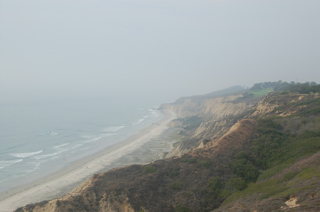
This is the kind of shot that is frustrating the heck out of me.  This was taken in the afternoon down the beach from the Torry Pines glider port.  The problem is that the subject on this day looked gorgeous through the viewfinder, but the pictures are coming out looking much hazier than I remember it being.  Is this a filter issue, a settings issue?  Or is it just normal under certain light conditions?  And is there anything in post-processing (e.g. photoshop) that I can do to get rid of some of the haziness?  On the latter note, I played around with contrast and color saturation but couldn't get anything that looked natural.  [click on thumbnail below to see larger version]

Torrypines

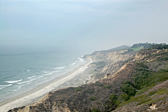
Update:  I played around with this link in the comments, and got this, which is OK but I introduced some noise, but with some practice I got better.

Test_beach

After practicing, I tried it with my photos out the window of the London Eye and saw a great improvement, with before and after below:

BeforeAfter

Nothing substitutes, of course, for taking the right picture with the right initial settings at the right time of day, something I need a lot of practice on.

On the upside, I took some closeups of flowers that just looked gorgeous:

Flower

I Told You So (Health Care Edition)

For about a year now, I have been arguing that public funding of health care will be used as a Trojan Horse to introduce a near fascist micro-regulation of our lives.  I argue that if the government is funding health care, then they will claim a financial stake in your health, and begin regulating everything from your food intake to your exercise habits, even your risk choices (e.g. snowboarding).  I made this argument here and here, among other places.  The general reaction has been, "gee Coyote, nice theoretical argument but you can put your tinfoil hat away now.  You are being paranoid."

Well, check this out:    (via Reason)

Another doctor who examined the journal report was Dr. Brian
McCrindle, a childhood obesity expert and professor of pediatrics with
a pediatric hospital in Toronto.

He warned that the looming problem must be addressed.

"The wave of heart disease and stroke could totally swamp the public health care system," he said.

He warned that lawmakers had to take a broader view of the looming
problem "” and consider doing things such as banning trans fats and
legislating against direct advertising of junk food toward children.

"It's not going to be enough any more just to say to the consumer 'You have to change your behavior,'" he said.

Notice that he left the second half of his last sentence unsaid.  That second half is "the government is going to have to force them."  Of course, none of this is an issue if we all have personal responsibility for our own health care costs and therefore for the consequences of our own decisions.

Postscript:  By the way, for anyone older than 30 who grew up in the sixties and seventies when all the intelligentsia were painting pictures of Malthusian starvation nightmares, this is GOOD news:

The percentages of overweight children also are expected to increase
significantly in the Middle East and Southeast Asia. Mexico, Chile,
Brazil and Egypt have rates comparable to fully industrialized nations,
James said.

He estimated that, for example, one in five children in China will be overweight by 2010.

The reason for this is not because of some evil corporate conspiracy (though that's what the article attributes it to) but due to the fact that these kids are simply not starving to death any more.  I am absolutely sure that the public health "crisis" from these overweight kids is less of a problem than the public health crisis of 30 years ago, when they were all malnourished and dying of being, well, severely underweight.  I mean, are there any of you out there in the over 40 crowd who didn't get the "there are starving kids in China" guilt trip growing up when you didn't eat your dinner?

Olympics Question

In a previous post, I discussed decision anchoring in judged events.  This week I have a simpler question:  Whose idea was it to give out CD-ROM's this time instead of regular medals?

Cdrom

Is this some kind of weird prelude to a Microsoft takeover of the games?  Or maybe these are just remaindered "Glitter" DVD's.  By the way, this picture does not do her justice, but Tanith Belbin is pretty hot.  She came in third in ESPN's page 2 hottest female athlete survey.  Better pictures here.

More on Sqeezebox

I bought myself a squeezebox digital music server for my Christmas present to myself.  I absolutely love this thing.  I have finally ripped about 400 of my CD's onto my computer in my office at home, using a FLAC loss-less compression.  I chose FLAC because it was supported in firmware by the squeezebox (which thereby reduces the load on the network and the server) and because it was loss-less.  Hard disk space is just too cheap nowadays - for home use, there is no reason to use anything but loss-less ripping of your CD's. 

The really cool part, though, is that the music menu and server controls can be accessed over the network.  That means that you can choose music, change the volume, etc from any PC on the network.  OR, even better, from any handheld.  I have a Dell Axim with wifi capability now sitting on my coffee table.  To pick any of my 400 CD's, I just scroll through the menu on my Axim, or search via the search function, and hit play, and the music starts.  Love it!

Pocketpc

My wife, who has about 400 CD's of her own, has resisted the whole digital thing, in large part because of the process of selecting music.  Up until now, she could find a CD on the shelf (which she keeps much more organized than I do) and pop it in a CD faster than she could find it using some front-panel menu on a server.  But she loves this setup now and browsing on the handheld, and I may soon be getting to enjoy the fun of ripping another 400 CDs.

Right now, we are going to buy 2 more of these things to put in other rooms.  The server software will control any number of the Squeezebox devices in different rooms, and all the rooms can have different music playing or the same thing playing.  Highly recommended for those looking for a music-only server (you will have to look elsewhere if you are also looking to serve pictures and streaming video).

PS-  By the way, I described previously the little blogger vanity function that comes with this device.

Oh The Weather Outside is Frightful...

...not

Today
Dec 23
Mostly Sunny
77°/46°

0%

77°F

Sat
Dec 24
Sunny
76°/45°

0%

76°F

Sun
Dec 25
Partly Cloudy
78°/45°

20%

78°F

Merry Christmas from Paradise Valley and the Coyote Clan!  Every year for our Christmas card, we try to do something unique.  We always end up with a homemade card that costs 10x more than a nice store-bought one.  This year was no exception, burning through any number of expensive HP ink cartridges.  I used a neat free program called Andrea Mosaic that creates a photo mosaic of any picture you choose using a folder full of secondary pictures used as the tiles.  This is a very easy project with the free software and I have found it a sure-fire way to impress people.  Nothing a geek loves more than the reaction of "How did you do that?"

Christmastreeforweb

Also, I think I set the record for most pictures of my kids included in a single Christmas card, with something like 300 in this mosaic.
Update: Actually, I see that this is an older version, since I can see side-by-side picture repeats in the mosaic and in a later version I learned to make the program not do this, but you get the idea.

Kate Groves Wins Rising Star Fashion Award!

Yeah!  Last night my wife won the Arizona Rising Star Fashion Award for best new Arizona accessory designer for her funky handbags at Kate Groves Creations.  It was an interesting evening, being about the only male, and perhaps the only straight male, in a room of about 100 women.  I will try to supply pictures, including some of her award, but right now I am piling my family on an airplane for Hawaii (yes, you can email me your condolences, but someone has to support the hotel industry).  I will leave you with some pictures of her bags:

Kate_groves_purses

Shortcomings of Powerpoint Presentations

For nearly six years I was a consultant at McKinsey and for another six I held corporate staff roles and marketing leadership roles.  In these twelve years, I did a lot of presenting.  By the end of those 12 years, I felt like I knew about functionality in PowerPoint that the guys in Redmond didn't know about.  But by the end of those 12 years, I had nearly abandoned Powerpoint as a medium and I avoid it like the plague today. 

The main reason is that I don't like to be a slave to my slides.  So many presenters become trapped by their slides, redefining the presentation as getting through the slides in a given amount of time rather than getting their message across.  Today, I like to present to people, looking them in the eye, without any other visual effects to take their attention away from me or my message.  I will use a flip chart or a computer projector from time to time - there is always a need to punctuate your points with data and charts and pictures, but I don't leave them up there after they have had their impact.  The projector goes off and focus is back on me and my message. 

At one company we made presentations using 2 or even 3 projectors
simultaneously, projecting multiple slides all at one time.  I remember
several key strategy presentations I gave using a hundred or more
slides.  Today, I know I could give those presentations better with
just 5 slides showing the key market research and cost data that drove
the decision, and then explaining the logic of our plan without any distractions behind me.

There is nothing I hate more than bulleted text slide after bulleted text slide.  There are only two possibilities from these slides:  Either they are easy to read, but then their message is so generic as to be meaningless; or they contain real content, making them hard to read in a presentation.  I prefer the latter, but save them for a leave behind that people can flip through after I am done.

Anyway, so much for my patented 20 minute semi-off-topic introduction to the real point of this post.  Via gongol.com comes this interesting analysis of how the use of PowerPoint might be affecting the quality of scientific presentations, and specifically looks at how PowerPoint may have impeded quality understanding of the risks that led to the Columbia accident.

Postscript: I must give credit where credit is due.  McKinsey takes the art of presentation very seriously, and did more for me than anyone in making me a good presenter of complex information, either in verbal or written form.  Their pyramid principal for writing was more useful to me than anything I learned in six years at Princeton and Harvard about the subject of communication.

More Map Fun

Lately I have been playing with Google Earth - I love flying from outer-space right down to my house.  However, this caught my eye yesterday.  As the risk of being the last person who has seen it, A9 (owned by Amazon) has a mapping program that shows pictures of the ground level view wherever you put the cursor.  Not all roads, by any means, are covered, so turn on the "mark streets containing images" box to see with blue lines where they have pictures.  I found the user interface for scrolling the maps around and zooming pretty counter-intuitive, so its kind of immature, but it is an interesting idea to be able to know what your destination looks like and maybe look at landmarks for key intersections.  A9's original product was a yellow pages that showed what your search results looked like and plotted them on a map.

Some Final Observations from Paris (with Pictures!)

Its good to be back in the USA, though my wife and I had a great time in Paris.  In the extended post, I have some pictures from our trip.  However, don't expect any tourist sites.  My business-related travelogue includes pictures of a gas station, a few cool new cars, my restaurant bill from hell, and other stuff...

Continue reading ‘Some Final Observations from Paris (with Pictures!)’ »

Random Impressions of Paris

After a couple of days here, some impressions:

  • The airline flights that dump you off in Europe at 7am which seemed so convivial when I was consulting are less so when I am a tourist.  We had the experience of arriving at our hotel about 8am, which of course did not yet have a room anywhere near ready.  We had a nice day walking around, but we sure were exhausted by the time we got to our room and had a nap.  Note:  American Airlines 767's have very very uncomfortable business class seats - really a disgrace nowadays.
  • The Louvre is magnificent, but is ridiculously big.  It is impossible to digest.  You really have to find a branch of art, like the Flemish painters, and stay in that area.  The Musee d'Orsay, which focuses on 19th century French art, is much more digestible.  Also, it has a cool location in a train station, which was a very important part of 19th century life.
  • The French smoking thing has been joked about so much it is almost a caricature, but it is still a shock the first time in a restaurant.  We observed many American smokers reveling in their smoking freedom.  I wonder if there is a business opportunity to sponsor smoking trips to Paris, much like those Asia sex trips to Thailand.
  • Wow, the food is expensive!  $50-80 entrees in some places, and for that you can get two slices of tenderloin.  It was good though, and we have yet to have a bad, or even so-so, meal.
  • I would feel safer in a golf cart than some of the cars here.  You can really see the trade-offs with fuel economy we make in the US by having crash test standards.  Over here with no crash tests and $6.00 gas, you get lots of tiny cars.  Mini-coopers look average to large-sized here.
  • The Champs d'elysees was amazing on Sunday afternoon - a sea of people going up the hill.  It looked like those pictures of the start of the NY marathon, but it went as far as the eye can see.  Amazingly, with all this foot traffic past the door, half the businesses were closed that day (welcome to Europe, I guess)
  • There are more shoe stores here than fast food restaurants in Phoenix.  And my wife has stopped in every one of them

Will the Airport Police Publish the Contents of Your Luggage?

NFL running back Onterrio Smith was apparently detained at the Twin Cities airport for possessing a device used to beat drug tests:

A search of a bag Smith was carrying April 21 turned up several
vials of dried urine and a device called "The Original
Whizzinator," which includes a fake penis, bladder and athletic
supporter.

Lets be clear on this - the device, is as far as I know completely legal.  Mr. Smith is not even in violation of NFL rules for possessing one in an airport - only actually strapping this bad boy on in an actual drug test would violate rules.  Apparently the police mistook the vials of dried urine for cocaine (I can already picture a future Will Farrell movie with a scene based on such a mix up).

Here is what scares me - why do we know about this?  Once it was determined that Mr. Smith did not possess any illegal devices or substances, he should have been left to go on his way.  Why are the airport police handing this story to the press?  Why were Mr. Smith's employers in the NFL notified?  Why isn't Mr. Smith and the contents of his luggage owed privacy?  What's next, stories about famous women found with vibrators in their luggage?


Do US Soldiers Need Better Weapons Training?

Italian communist Giuliana Sgrena claimed to have been specifically targeted by US troops, and had hundreds, perhaps thousands of rounds shot at her oncoming vehicle from a US checkpoint.  She even claims to have been shot at by a tank.  We mourn the loss of and the needless death of her translator, but must observe that, based on her story, US soldiers don't seem to be able to hit the broadside of a barn.  Courtesy of LGF, here's her car:

Sgrenacarap1lgclick to enlarge image

Note that the front end, which should have taken the brunt, looks almost pristine.  One hit in the windshield, one in the left-front tire, and one or more in the drivers side window.  More pictures here.  More too at Captains Quarters.

Further, Ms Sgrena

said her car was hit by 300 to 400 bullets from an armored vehicle. She said she
was picking up handfuls of spent rounds from the seats.

OK, maybe I was wrong.  If hundreds of rounds went into the car, they must have all gone through that same single hole on the windshield.  That's GREAT shooting.  So I guess what is really needed is better weapons penetration.  Its a pretty pathetic bullet from an armored vehicle that would enter a car and have so little energy left that it would just land on the seats in piles.

Look, here is some advice.  Take it from the CBS memo forgers.  If you are going to make something up, know your subject.  If you are going to forge a memo from a typewriter, make sure you know how typewriters worked.  And if you are going to exaggerate a story about military weapons, make sure you understand weapons.  Rounds entering the car would not build up in a pile on the seat so that she could scoop them up - they would have embedded in things.  And, if enough rounds were fired that they started building up on the seats, then no one would be alive to scoop them up. 

I have no doubt that this was a harrowing experience for all concerned, especially in the midst of their exhilaration at being released.  It was a tragedy that neither the drivers nor the Italian government knew enough about the rules of engagement on that road to recognize that speeding toward a checkpoint might be dangerous.  But it is also clear that Ms. Sgrena is exploiting the death of her comrade for personal and political gain, just as the Italian government is exploiting the incident to take attention away from the fact that they basically just established a bounty for kidnapping westerners.


My 11-Year-old on Freedom and America

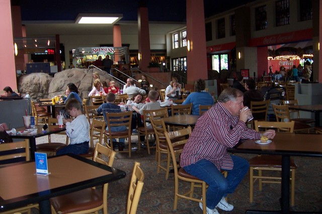
My son had a class project to take pictures of things that represented the good things about America, as well as some of its problems.  He did it pretty much on his own, and I only really saw it when it was done.  Most pictures were pretty typical of such kids' products (a flag, statue of liberty, pretty mountains) while a couple were fairly typical of my son (of eleven pictures, two were of professional baseball stadiums).  There was one picture I thought, while probably the most prosaic, was, with his caption, the most powerful.  Though its a bit over-dramatic, I actually am pleased that he understands just how different other countries can be (grammar needs some work):

100_0696

Caption:  "People sitting and eating and
joking around that is freedom, not being forced into a wall with a gun at your
back."

New Floor for the Atrium

As promised (threatened?) here is a report on my home improvement project from this weekend.

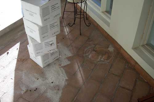
We have a small (about 10x15) atrium area in the center of the house.  We have never really been happy with this area, and wanted to develop it as a sitting area when the weather is nice out.  We put in a ceiling fan and ordered some relatively inexpensive furniture, which of course won't get delivered for decades.  However, we were dissatisfied with the floor.  The original owners had a dirt floor, but the plants all apparently died.  They then laid in brick paving stones in the atrium.  Today, many of these paving stones are cracked and water stained, but I did not really have the energy or the money to dig them up and start over.

Last Friday we were at the Phoenix home show and saw a 12"x12" outdoor wooden interlocking floor tile advertised (they are called "interlocking keruing floor tiles").  The tiles have strips of finished wood that looks like teak (but are keruing, whatver that is) attached to a flexible rubber mat.  See the pictures below for the top and bottom respectively (click on any picture to get a larger version):

Pr_top  Pr_bottom

They can be laid with all the strips running the same way, or, as we did it, alternating for a parquet look.  The tiles were $3.25 each, not cheap but less expensive than alternatives, so we purchased enough to cover the area.  They look pretty good, but not perfect - you can see the plastic milk-crate pattern through the wood strips if you look at the right angle.

Here is the area before - note the water stains and the sand which is filling in big cracks and dips in the pavers:

Pr_before

Here is the floor after about 15 minutes -- they do go down fast.  They just lay on the ground with no adhesive.  The design of the bottoms keeps them from sliding around. 

Pr_middle

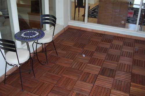
And finally, here we are mostly done.  The company offers edge pieces that are designed like little ramps so a mat of these tiles can stand alone, but we did not need them since I was filling a depressed space wall-to-wall.  Here is the final effect:

Pr_after2

We love the result.  I am just finishing a few diagonal cuts to finish off the last side - these were really the only hard part of the job.  I made them with some careful measuring and a circular saw (got a new one with a laser guide - awesome!)

Pr_almost_done

Anyway, this is not really the kind of thing I normally blog, but this product was something I had never seen before and came out so well and was so easy to put down, I had to share.  Besides, if VodkaPundit can share this (which made me really jealous by the way), I thought I could show my weekend project too.

Even More Niche Blogs

I try to keep on the lookout for odd, niche blogs out there.  Previously I linked to the remote (as in TV remote) blog and the NFL Cheerleader Blog

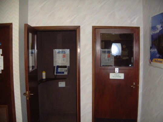
The niche blog today is the Payphone Project, which is both a photo blog as well as a news site about payphones.  Make sure to look at the pictures, but here is my favorite-- The Antarctic Payphone at Scott Base, Antarctica  (uhhh, anyone here have 426 quarters they can lend me?)

Kiwiphonebooth

Though I must admit that this one on Lake Victoria is cool:

Lake_victoria_solar_payphone_01

I actually first ran into this site when I was working in the online directory world at Whitepages.com

Update: While I called this a niche, it must be a big niche, because the Payphone Project has competitors (and here, and jeez, here too)

Coming soon: Carnival of the Payphones?

Home Improvements

Blogging is light this weekend due to home improvements.  However, we found a cool new product for our house at the Phoenix home show, and, when I finish getting it installed, I will share some pictures.

Tsunami Before and After Part 2

Best laid plans.... I try to run a small business and economics blog and 90% of the hits I have gotten over the last 2 days have been on Tsunami before and after pictures.  OK, well, I have have been updating the original before and after post with links to people who really are blogging the tsunami and its aftermath.  Nature has some amazing before-after satellite shots, including these, which are wider angle views of the original shots I posted:

Beforeafter1a_1 Tsunamibeforeafter1b_1

These shots are chilling, and help explain the death toll better than any single photos I have seen:

Tsunamibeforeafter2a Tsunamibeforeafter2b

Makes me think of Atlantis.  Hat tip to the Nature site to Marginal Revolution.

For more before and after images, look here and  here and here (in this last link see the powerpoint download in the lower left).  This site has a ton of tsunami blog links, including pictures and video.  Here is a link-filled roundup (new 1/4) and an older one here, and another here.  And here is a dedicated blogHere is a 1/5 roundup of Indian blog posts about the tsunami and its aftermath.  And here is a local blog with news.  And here is the Amazon Red Cross donation page.

Update:  A more recent roundup as of 1/11 here.

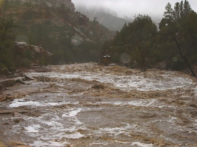
Strange Substance Spotted in Arizona Rivers

This week, an odd substance has been spotted in Arizona rivers.  Courtesy of a commenter badassredskin on Fark.com, some good Sedona flood before and after pictures:

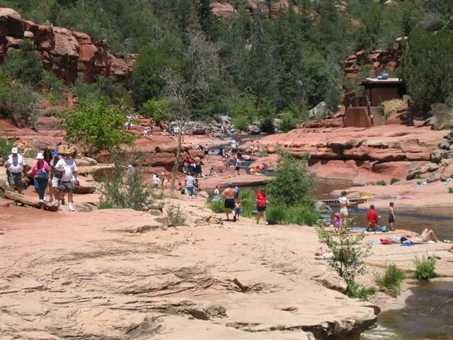
Slide Rock Park, near Sedona before (note bathroom building for reference)


Same park, more recently:

This has made a real mess of the Oak Creek Canyon near Sedona, which by the way I consider one of the most beautiful spots on earth.  Slide Rock Park is a great park, though I am a bit biased since my company runs the concession store at Slide Rock Park.  Our building at this park is fine, but we have had several of our campgrounds in this canyon flooded.

Too bad the weather was not like this for these guys!

Tsunami Before and After

A whole peninsula, wiped clean.  Ugly.  Thanks to LGF for the link.

Beforeafter

Update:  The wider angle view of these photos are even more dramatic - note the new bay where there used to be farms:

Beforeafter1a  Tsunamibeforeafter1b

More of these side-by-side tsunami before-after photo pairs are here.

Update #2:  We are getting a lot of Google hits on this.  For more before and after images, look here and  here and here (in this last link see the powerpoint download in the lower left).  This site has a ton of tsunami blog links, including pictures and video.  Here is a link-filled roundup (new 1/4) and an older one here, and another here.  And here is a dedicated blogHere is a 1/5 roundup of Indian blog posts about the tsunami and its aftermath.  And here is a local blog with news.  And here is the Amazon Red Cross donation page.

We in Phoenix Support Our Troops

Hats off to ex-Arizona Cardinals cheerleeder and Phoenix resident Sarah Coggin for being part of the work to support our troops by visiting them overseas.  And here is more on other cheerleader visits here at the NFL Cheerleader Blog (as I have said in the past, if I could get paid to write that blog, my life would be set).  And shame on you cynics who think that I posted this just to have an excuse to get a cheerleader picture on the front page.  I actually did it to get two cheerleader pictures up:

Sarah1  Joint2