Deceptive Chart of the Day from Kevin Drum and Mother Jones to Desperately Sell the "Austerity" Hypothesis
Update: OK, I pulled together the data and did what Drum should have done, is take the graph back to pre-recession levels. Shouldn't it be even better if the increase in spending came during the recession rather than after? See update here.
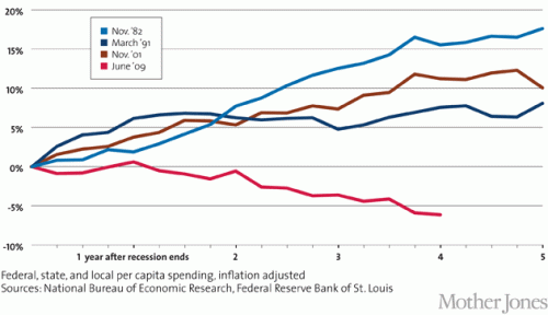
Kevin Drum complains about US government austerity (I know, I know, only some cocooned progressive could describe recent history as austerity, but let's deal with his argument). He uses this chart to "prove" that we have been austere vs. other recessions, and thus austerity helps explain why recovery from this recession has been particularly slow. Here is his chart
This is absurdly disingenuous. Why? Simple -- it is impossible to evaluate post recession spending without looking at what spending did during the recession. All these numbers begin after the recession is over. But what if, in the current recession, we increased spending much more than in other recessions. We would still be at a higher level vs. pre-recession spending now, despite a lack of further increases after the recession.
In the time before this chart even starts, total state, local, Federal spending increased from 2007 to 2008 by 10.2%. It increased another 11.1 % from 2008 to 2009. So he starts the chart at the peak, only AFTER spending had increased in response to the recession by 22.5%. Had he started the chart at the correct date and not at a self-serving one, my guess is that it would have shown that in this recession we increased spending more than any other recent recession, not less. So went digging for some data.
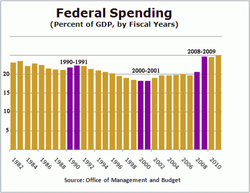
I actually have a day job, so I don't have time to create a chart of total government spending since 1981, so I will look at just Federal spending, but it makes my point. I scavenged this chart from Factcheck.org. The purple bars are the year that each of Drum's data series begin plus the year prior (which is excluded from Drum's chart). Essentially the growth in spending between the two purple lines is the growth left out just ahead of when Drum started each data series in his chart. The chart did not go back to 1981 so I could not do that year.
Hopefully, you can see why I say that Drum is disingenuous for not going back to pre-recession numbers. In this case, you can see the current recession has an unprecedented pop in spending in the year before Drum starts his data series, so it is not surprising that post recession spending might be flatter (remember, the pairs of purple lines are essentially the change in spending the year before each of Drum's data series). In fact, it is very clear that relative to the pre-recession year of 2008 (really 2007, but I will give him a small break), even after 5 years of "austerity" our federal spending as a percent of GDP will be far higher than in any other recession he considers. In no previous recession in this era did post recession spending end up more than 2 points higher (as a percent of GDP) than pre-recession levels. In this recession, we are likely to end up 4-5 points higher.
By the way, isn't it possible that he has cause and effect reversed? He argues that post-recession recovery was faster in other recessions because government spending kept increasing over five years after the recession is over. But isn't it just possible that the truth is the reverse -- that government spending increased more rapidly after other recessions because recovery was faster, thus increasing tax revenues. Congress then promptly spent the new revenues on new toys.
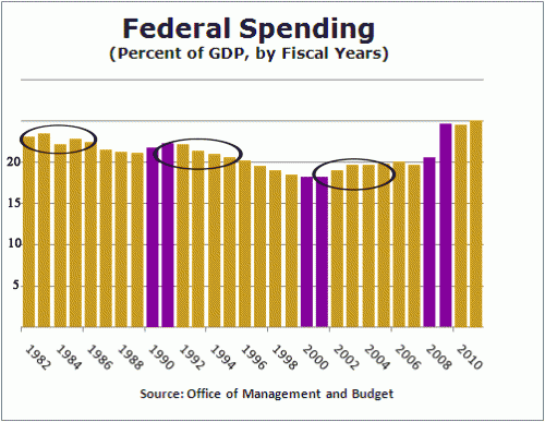
Let's look at the same chart, highlighted in a different way. I will circle the 4-5 years included in each of Drum's data series:
You can see that despite the fact that government spending in these prior recessions was increasing in real terms, it was falling in two our of three of them as a percentage of GDP (the third increased due to war spending in Afghanistan and Iraq, spending which I, and I suspect Drum, would hesitate to call stimulative, particular since he and others at the time called it a jobless recovery).
How can it be that spending was increasing but falling as a percent of GDP? Because the GDP was growing really fast, faster than government spending. This does not prove my point, but is a good indicator that recovery is likely leading spending increases, rather than the other way around.


