When They Finally Do the Study the Right Way
Over the last few years, there has been a lot of arguing back and forth about income mobility. Typically, folks, particularly on the left, look at changes in median incomes and declare that since median incomes aren't moving much, there is not income mobility. I have criticized this approach to the problem on a number of occasions. For example, I have argued that median income numbers are skewed downwards because tens of millions of low-skill new immigrants have entered the job market over the last several decades. As I wrote here,
If you really want to know what the current median wage is on an apples
to apples basis back to 1970, take the current reported median wage and
count up about 10 million spots, and that should be the number -- and
it will be much higher.
What you really have to do is take the same people, and follow their progress through tax returns or whatever data is available. What this type study finds, time and again, is that income mobility remains high in this country. And what happens, time and again, is the media and politicians ignore the study in favor of the more flawed approaches that support their narrative better.
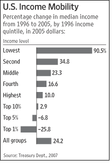
Well, the study has been performed again, and the results are the same: Income mobility remains high in this country, especially for the poorest 20%.

They say a picture is worth a thousand words, and in one chart 60% of the hot air in the Democratic Presidential debates is refuted.
By the way, it is worth noting the drop in income of the top 1%, because it helps to point out a flaw in the usual income distribution numbers we see. In 2002, I showed no income on my 1040 (because I was starting a new business). In the income distribution numbers for 2002, my family and I showed up in the bottom 20%, living on less than a $1 a day. Of course, that is an absurd characterization. On the opposite end of the scale, imagine a small business owner plugging along making $80,000 or so a year, comfortably middle class, and then in one year sells his business for $1 million. In that year's statistics, he is rich. The next year when his capital gains go away, it looks like he has gotten poorer, when no such thing happened.
Of course, some are still struggling, though my suspicion is that this is less related to structural issues in the economy or availability of opportunity than with cultural issues.
I suspect your earnings history is similar to mine, since I am also self-employed. If you took my reported income from each year & graphed it as a distribution, it would look much worse than the distribution for the country as a whole. There would be a large group of destitute poor (while I was in school or starting my business), a few middle class points, and a couple of upper-middle class years. Most people probably don't have such a skewed distribution, but I would guess that even a typical person, if they looked at their annual social security statement & plotted their lifetime earnings, would find that most of the income inequality we find in the national statistics could be found just in the graph of their single life. Almost everyone with middle class to upper class income would have several years of reported poverty level wages while they were in college. I would love to know how much of the supposed stagnation in the lower income levels is due to the increasing numbers of middle class to upper middle class people spending more time in college or retirement, where reported wages are either reduced or non-existent.
To take it a step further, if we just look at our extended families, including cousins, I think almost everyone would find members at all levels of economic income, even though all the members would have come from a single socio-economic foundation. Most of the distribution would be age based, with especially young & old people making little, and the 30-60 year olds earning much more. And, here, it would be obvious (at least it is in my family) how much of those differences are the result of school success, career decisions, and family matters.
It's sad how when people debate these societal issues, they don't even bother to consider the most obvious observatins of their own lives, families & experiences, when a useful statistic helps justify their political biases.
That's a great chart.
Here’s the link to the WSJ editorial with the chart:
http://www.opinionjournal.com/
editorial/feature.html?id=110010855