Graphics Fail
One of the classic mistakes in graphics is the height / volume fail. This is how it works: the length of an object is used to portray some sort of relative metric. But in the quest to make the graphic prettier, the object is turned into a 2D, or worse, 3D object. This means that for a linear dimension where one object is 2x as long as another, its area is actually 4x the other and its volume is 8x. The eye tends to notice the area or volume, so that the difference is exaggerated.
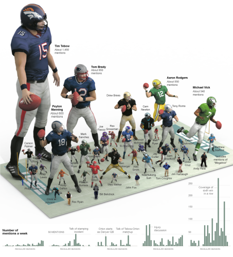
This NY Times graph is a great example of this fail (via here)
The Tebow character is, by the data, supposed to be about 1.7x the Brady character. And this may be true of the heights, but visually it looks something like 4x larger because the eye is processing something in between area and volume, distorting one's impression of the data. The problem is made worse by the fact that the characters are arrayed over a 3D plane. Is there perspective at work? Is Rodgers smaller than Peyton Manning because his figure is at the back, or because of the data? The Vick figure, by the data, should be smaller than the Rodgers figure but due to tricks of perspective, it looks larger to me.
This and much more is explained in this Edward Tufte book, the Visual Display of Quantitative Information. You will find this book on a surprising number of geek shelves (next to a tattered copy of Goedel-Escher-Bach) but it is virtually unknown in the general populace. Every USA Today graphics maker should be forced to read it.
