Archive for the ‘Trend That Is Not A Trend’ Category.

Climate "Disruption" and Publication Bias

Quite a while ago I wrote an article about climate publication bias called Summer of the Shark.

let's take a step back to 2001 and the "Summer of the Shark." The media hysteria began in early July, when a young boy was bitten by a shark on a beach in Florida. Subsequent attacks received breathless media coverage, up to and including near-nightly footage from TV helicopters of swimming sharks. Until the 9/11 attacks, sharks were the third biggest story of the year as measured by the time dedicated to it on the three major broadcast networks' news shows.

Through this coverage, Americans were left with a strong impression that something unusual was happening -- that an unprecedented number of shark attacks were occurring in that year, and the media dedicated endless coverage to speculation by various "experts" as to the cause of this sharp increase in attacks.

Except there was one problem -- there was no sharp increase in attacks.  In the year 2001, five people died in 76 shark attacks.  However, just a year earlier, 12 people had died in 85 attacks.  The data showed that 2001 actually was  a down year for shark attacks.

The point is that it is easy for people to mistake the frequency of publication about a certain phenomenon for the frequency of occurrence of the phenomenon itself.  Here is a good example I saw the other day:

An emaciated polar bear was spotted in a Russian industrial city this week, just the latest account of polar bears wandering far from their hunting grounds to look for food.

Officials in the Russian city of Norilsk warned residents about the bear Tuesday.  They added that it was the first spotted in the area in over 40 years.

I am willing to bet my entire bourbon collection that a) hungry polar bears occasionally invaded Siberian towns in previous decades and b) news of such polar bear activity from towns like Norilsk did NOT make the American news.  But readers (even the author of the article) are left to believe there is a trend here because they remember seeing similar stories recently but don't remember seeing such stories earlier in their life.

Extrapolating Trends from A Single Data Point: The Once In A Lifetime Event

Most of you know I agree there is man-made global warming but am skeptical the extent will be anywhere near most forecasts you see in the media.  For some reason, this earns me the title of "denier."  However, I find that the climate discussion has become boring in the extreme, and I have mostly moved on from it.  But I am still interested in analytical abuses in the media, and long-time readers will know that my favorite is the positing of a trend using but a single data point.  My example today happens to be from climate.

It starts with this tweet:

Obviously he is reacting to the recent hurricane in North Carolina, which turns out to be pretty run of the mill but the media has portrayed as some sort of armageddon.  I could have pulled roughly similar quotes from all kinds of sources.  Several networks did long pieces over the weekend claiming an upward trend in hurricanes without any trend data, but merely from the fact that one made landfall recently.  But anyone who claims be defending science should be held, I think, to a higher standard in making scientific claims.

As I asked the March for Science tweeter:  If, say, there is a trend towards more or stronger hurricanes, why does no one ever show a trend chart? They just declare the trend from one data point, like a single hurricane landfall. Every long-term hurricane & cyclonic energy trend chart I have seen is flat to down.  (This is not primarily a climate post but I will post some hurricane trend charts at the end).

There is certainly an upwards trend in the media labelling storms as "once in a lifetime" but it is doubtful that there is actually an underlying trend in storm severity. Even the slightly more meaningful term "100-year _____" is abused.

Consider a 100-year flood in North Carolina, almost certainly a once in a lifetime event for someone in that state unless they live really long.  Since North Carolina is .027% of the world's landmass, there will be, on average, 37 hundred-year floods over land areas the size of North Carolina every single year.   That's 37 once-in-a-lifetime North-Carolina-sized floods somewhere in the world every single year.  Heck, there should be 3-4 thousand-year floods of North Carolina size somewhere in the world every year -- that's three or four once in a millenium floods!  And this same math applies to 100-year heat waves, droughts, snow storms -- you name it.

We can learn a couple of things from this.  First, living through "once in a lifetime" storms every year, somewhere in the world, is not abnormal -- it is expected.  Second, one can see how choices in media coverage could drive an apparent trend.  If the media covered maybe 3 or 4 of these 37 floods when I was young, but covers every one today, it will appear that there is a trend since I hear so much more about them.  But in fact, nothing will have changed except the media.  I will remind you what I wrote on this topic waaaay back in 2012.

Let's take a step back to 2001 and the "Summer of the Shark." The media hysteria began in early July, when a young boy was bitten by a shark on a beach in Florida. Subsequent attacks received breathless media coverage, up to and including near-nightly footage from TV helicopters of swimming sharks. Until the 9/11 attacks, sharks were the third biggest story of the year as measured by the time dedicated to it on the three major broadcast networks' news shows.

Through this coverage, Americans were left with a strong impression that something unusual was happening -- that an unprecedented number of shark attacks were occurring in that year, and the media dedicated endless coverage to speculation by various "experts" as to the cause of this sharp increase in attacks.

Except there was one problem -- there was no sharp increase in attacks.  In the year 2001, five people died in 76 shark attacks.  However, just a year earlier, 12 people had died in 85 attacks.  The data showed that 2001 actually was  a down year for shark attacks.

Once you start looking for this type of thing, the extrapolation of a trend from at most one data point, you will see it everywhere.

For those still hanging around to the end, here are a couple of actual trend charts on hurricanes (the adjusted line attempts to correct for the fact that earlier eras with no satellites or radar tended to miss some hurricanes) (source at NOAA):

Below are two charts that look beyond just the Atlantic at global cyclones, both from this source.  The first is frequency:

The second looks at accumulated cyclonic energy, which is a sort of time integral of the energy in all active cyclonic storms around the world

Later in the tweetstorm, the same tweeter mentioned as a fact, again without data, "Climate change is increasing drought frequency, impacting everything from agriculture to health. Some studies suggest the consequences of droughts include increased violence and war."  There has been no upward trend in US droughts (negative is more drought-y.

Finally, in the spirit of full disclosure, of all the zillions of things (not directly related to temperature) in weather effects that are blamed on global warming, this is the only one I have found that shows an upward trend recently and could logically be attributed to warming.  Whether this is related to warming or independent or a data measurement issue is (if folks were honest) not well understood

Media Extrapolating a Trend From A Single Data Point: 2018 Heat Wave Edition

This article in something called Inside Climate News seems to be typical of many I have seen this year:  Because we have had much attention in the media on heat waves this year, there must be an upward trend in heat waves and that is a warning signal that man-made global warming is destroying the planet.  Typical of these articles are a couple of features

  1. Declaration of a trend without any actual trend data, but just a single data point of events this year
  2. Unstated implication that there must be a trend because the author can't remember another year when heat wave stories were so prevalent in the media
  3. Unproven link to man-made global warming, because I guess both involve warmth.

I have no idea if well-publicized heat waves this year are a harbinger of an accelerating global warming trend.  But since we are discussing "trends" it struck me as useful to actually liven up the discussion with some actual trend data, ie data for more than one summer.  There is a real danger to extrapolating trends from volume of media coverage, as I discussed here.  If you don't want to click through, I have a funny story in the postscript.

First, our most reliable temperature trend data does not really show a spike in temperatures this summer.  Remember, a heat wave that covered the entire US would only affect 6% of the world's landmass and <2% of the world's total area (source).  You can easily see the trend upwards several tenths of a degree over the last 40 years, but it is impossible to see much unique about the last 3 months of summer.

Second, there really is no substantial upward trend in US heat wave index (from right off the EPA's web site, as are all of the following charts.  Look at the source for yourself to make sure I am not playing games).  Note that all of the following charts are through 2016 and do NOT include the recent summer but are pretty meaningful none-the-less.

Third, in most of the country, there is actually a downward trend rather than upward trend in extreme heat days.

Pretty much everyone agrees, skeptics included, that the world and the US has warmed.  So why are extreme heat days down in many locations, and certain down from the 1930's?  This defies our intuition.  The explanation is in part due to a feature of global warming that is seldom explained well by the media, that much of the warming we see and as predicted in climate models is in the night.  We are seeing some increase in hot daytime highs, but really not at an unprecedented level over the last century.  BUT, we see MUCH more of a trend in hot daily lows, which basically means warming evenings.

I spoke at Amherst College a while back and here was their temperature trends, broken up between daily highs and nighttime lows.  All of Amherst's temperature trend since 1950 has not been in increased daytime highs but higher nighttime lows.  This is a pattern you see repeated over and over at nearly every temperature station.

This is why I consider media reports of heat waves, at least of the scope we have seen to date, absolutely irrelevant to "proving" the world is warming.

Postscript:  Here is the story everyone should keep in mind when extrapolating from media coverage volume to underlying trends:

let's take a step back to 2001 and the "Summer of the Shark." The media hysteria began in early July, when a young boy was bitten by a shark on a beach in Florida. Subsequent attacks received breathless media coverage, up to and including near-nightly footage from TV helicopters of swimming sharks. Until the 9/11 attacks, sharks were the third biggest story of the year as measured by the time dedicated to it on the three major broadcast networks' news shows.

Through this coverage, Americans were left with a strong impression that something unusual was happening -- that an unprecedented number of shark attacks were occurring in that year, and the media dedicated endless coverage to speculation by various "experts" as to the cause of this sharp increase in attacks.

Except there was one problem -- there was no sharp increase in attacks. In the year 2001, five people died in 76 shark attacks. However, just a year earlier, 12 people had died in 85 attacks. The data showed that 2001 actually was a down year for shark attacks.

Update:  I am not really an active participant in the climate scene any more, particularly when positions hardened and it was impossible to really have an interesting discussion any more.  The implicit plea in this post goes beyond climate -- if you are claiming a trend, show me the trend data.  I can be convinced.  There is clear trend data that temperatures are increasing so I believe there is an upward trend in temperatures.  Show me the same for droughts or heat waves or hurricanes and I will believe the trend about those as well, but so often the actual data never matches the arm-waving in these media sources.

Wrong Way Corrigan

I missed it, but Dan Mitchell had a good article starting from my post on Kevin Drum's unintentionally anti-Keynesian chart pair.

Readers will know from my "trend that is not a trend" series how fascinated I am by how often data referenced in the media tells exactly the opposite story as the one claimed.

Trend That is Not A Trend: Sexual Assaults on Campus

In response to the twin notions that sexual assaults are a) increasing and b) particularly prevalent on college campuses where a "rape culture" supposedly exists, comes this recent report from the DOJ on sexual assault prevalence among college aged women.

sexual-assault


Update:  For a university the size of UVA (20,000 students, presumably 10,000 women) these data imply about 200 of the current students will be sexually assaulted over their four years.  This is a depressingly large number, and makes one wonder with this many examples to choose from how Rolling Stone managed to find one case that was so obviously heavily embellished (at a minimum) or fraudulent.  200 is, however, an order of magnitude smaller than the 2000 that would be predicted by the "1 in 5" number which is repeated so uncritically by public figures.

As to the declining trend, I understand the issue of under-reporting, though most folks in the know seem to think this type of study (which includes unreported cases) is more accurate than reported crime figures.  But for under-reporting to affect the trend (rather than the absolute numbers) one would have to argue that the reporting percentage is declining, something for which I have never seen evidence and which is a proposition that defies common sense.  Over the last decades, sexual assault victims have gone from being shamed to being protected to being put on a pedestal (given our current fetishization of victimization).  It is hard in this environment to imagine sexual assault reporting rates going down.

Trend That is Not A Trend: Increase in Typhoons and Hurricanes

The science that CO2 is a greenhouse gas and causes some warming is hard to dispute.  The science that Earth is dominated by net positive feedbacks that increase modest greenhouse gas warming to catastrophic levels is very debatable.  The science that man's CO2 is already causing an increase in violent and severe weather is virtually non-existent.

Seriously, of all the different pieces of the climate debate, the one that is almost always based on pure crap are the frequent media statements linking manmade CO2 to some severe weather event.

For example, Coral Davenport in the New York Times wrote the other day:

As the torrential rains of Typhoon Hagupit flood thePhilippines, driving millions of people from their homes, the Philippine government arrived at a United Nationsclimate change summit meeting on Monday to push hard for a new international deal requiring all nations, including developing countries, to cut their use of fossil fuels.

It is a conscious pivot for the Philippines, one of Asia’s fastest-growing economies. But scientists say the nation is also among the most vulnerable to the impacts of climate change, and the Philippine government says it is suffering too many human and economic losses from the burning of fossil fuels....

A series of scientific reports have linked the burning of fossil fuels with rising sea levels and more powerful typhoons, like those that have battered the island nation.

It is telling that Ms. Davenport did not bother to link or name any of these scientific reports.  Even the IPCC, which many skeptics believe to be exaggerating manmade climate change dangers, refused in its last report to link any current severe weather events with manmade CO2.

Roger Pielke responded today with charts from two different recent studies on typhoon activity in the Phillipines.  Spot the supposed upward manmade trend.  Or not:

kubotachan2009

c2789-wpac-50-10-weinkleetal


I am not a huge fan of landfalling cyclonic storm counts because whether they make landfall or not can be totally random and potentially disguise trends.  A better metric is the total energy of cyclonic storms, land-falling or not, where again there is no trend.

Via the Weather Underground, here is Accumulated Cyclonic Energy for the Western Pacific (lower numbers represent fewer cyclonic storms with less total strength):

ace-west-pacific


And here, by the way, is the ACE for the whole globe:


ace-global

Remember this when you see the next storm inevitably blamed on manmade global warming.  If anything, we are actually in a fairly unprecedented (in the last century and a half) hurricane drought.

Trend That Is Not A Trend: Rape Culture

From Mark Perry:

click to enlarge

I suppose one could argue that there is some change in reporting rates, since rape is well-know to be an under-reported crime.  However, I would struggle to argue that under-reporting rates are going up (which is what it would take to be the prime driver of the trend above).  If anything, my guess is that reporting rates are rising such that the chart above actually understates the improvement.

PS-  Folks commenting on this post saying that by reporting a declining trend I demonstrate that I don't care about rape or don't treat it seriously are idiots.  I have lived through dozens of data-free media scares and witch hunts  -- global cooling, global warming, the great pre-school sexual abuse witch hunt, about 20 different narcotics related scares (vodka tampons, anyone?).    Data is useful.    In this case, knowing there is improvement means we can look for what is driving the improvement and do more of it (though Kevin Drum would likely attribute it to unleaded gasoline).

"Trend that is not a trend" is an occasional feature on this blog.  I could probably write three stories a day on this topic if I wished.  The media is filled with stories of supposed trends based on single data points or anecdotes rather than, you know, actual trend data.  More stories of this type are here.  It is not unusual to find that the trend data often support a trend in the opposite direction as claimed by media articles.  I have a related category I have started of trends extrapolated from single data points.

Trend That Is Not A Trend: Wildfires (At Least Not This Year)

From the White House:

click to enlarge

From the Federal Government's National Inter-agency Fire Center wildfire tracking page today

click to enlarge


The White House letter demonstrates the behavior that drives me crazy and caused me to start this feature in the first place.  They point to 14 fires in California and imply that this proves some kind of trend.  But how can an individual data point say anything about a trend?  In fact, as you can see above, there almost 50,000 wildfires by this point each year.  So what does the existence of 14 mean, one way or another, in establishing a trend?

Just to show that I don't underestimate the impact of fire, one of these two fires referenced in the White House letter is actually threatening my business near Burney, California and has caused us substantial losses due to lost revenue (for some odd reason people don't like to come out to a park when the air is filled with smoke and ash -- go figure).


PS -- There is an upward trend in the data vs. the 1950s and 1960s which is likely tied somewhat to climate but also somewhat to forest management practices.  Academics have had trouble separating the two.


Quick: From Media Reporting and Obama Speeches, What Is Your Impression of Wildfire Severity This Year

Wildfires are becoming a perennial favorite of our "Trend that is not a trend" series, showing how media creates trends out of single data points and even out of thin air.  Often, the evidence behind trends in media stories tends to be ... the increasing volume of media stories on that topic.  Thus the "Summer of the Shark" media fiasco.

About 98 out of 100 people I might ask would say that this is a record year for wildfires in the US.  In fact, it is, so far, one of the slowest wildfire seasons in recent memory.

Here is a screencap of the data from the National Inter-agency Fire Center.  Here is the link so you can see for yourself (though of course the data will be different over time since it shows year to date data for the day you check).

click to enlarge


Note that there is no apples to oranges BS here -- all data for all years are for Jan 1 to July 24 of that year.  So far this year, the number of fires is 31% below average and the total acres burned is nearly 60% below average.

Postscript:  By the way, I have every reason to hate wildfires.  A wildfire in the Sedona area shut down my largest business for the year, pretty much wiping out our company's earnings for the year.

Postscript #2:  There is clearly a trend in the data for acres burned (see whole database here).  I am not denying the trend, though we can argue how much is climate and how much is forest management and how much is simply more human contact with the wilderness.   What I object to is using individual events, particularly individual events in below-average years, as proof of the trend


Trend That Is Not A Trend: Creating a Trend From Measurement Changes

I was watching some excellent videos of recent Phoenix dust storms roll across the city.  I started thinking about a joke story:

Scientists report that the number of Phoenix dust storms have likely increased substantially since 1990.  Before that date, almost no cell phone videos exist of large dust storms in Phoenix.  Today, one can find hundreds of such videos on Youtube, mostly from the last three or four years.  Obviously we are seeing some sort of climate change

This would clearly be absurd -- there has been a change in measurement technology.  No cell phone cameras existed before 1990.  But equally absurd examples can be found every day.

  • With the summer of the shark, an increase in frequency of media coverage of shark attacks was mistaken for an increase in frequency of shark attacks themselves.
  • With tornadoes, improving detection of smaller twisters (e.g. by doppler radar and storm chasers)  has been mistaken by many (cough Al Gore cough) for an increase in the frequency of tornadoes.  In fact, all evidence points to declining tornado frequency
  • With electrical grid disturbances, a trend was created solely by the government owner of the data making a push with power companies to provide more complete reporting.
  • I have wondered whether the so-called cancer epidemic in India is real, or the results of better diagnosis and longer life spans

Postscript:  I remember when I first saw one of these storms rolling towards me after I moved to Phoenix.  Perhaps I should not have read Stephen King's The Mist, but I honestly wondered for a minute if I would live to regret not hopping in my car and racing to stay ahead of the wall coming towards me.


"Trend that is not a trend" is an occasional feature on this blog.  I could probably write three stories a day on this topic if I wished.  The media is filled with stories of supposed trends based on single data points or anecdotes rather than, you know, actual trend data.  More stories of this type are here.  It is not unusual to find that the trend data often support a trend in the opposite direction as claimed by media articles.

Trend that is Not A Trend: Millennials Living At Home After Graduation

Supposedly, there is this huge trend in Millennials graduating college, failing to find a satisfactory job, and ending up living at home.  Almost every media outlet known to man has written about it.  They have anecdotes and pictures of individuals to prove it.  But there does not seem to be an actual trend:

livingathome


It turns out that the share of young people 18-24 not in college but living at home has actually fallen.  Any surge in young adults living at home is all from college kids, due to this odd definition the Census uses

It is important to note that the Current Population Survey counts students living in dormitories as living in their parents' home.

Campus housing, for some reason, counts in the census as living at home with your parents.  And since college attendance is growing, thus you get this trend that is not a trend.


"Trend that is not a trend" is an occasional feature on this blog.  I could probably write three stories a day on this topic if I wished.  The media is filled with stories of supposed trends based on single data points or anecdotes rather than, you know, actual trend data.  More stories of this type are here.  It is not unusual to find that the trend data often support a trend in the opposite direction as claimed by media articles.

Trend That Is Not A Trend: Changes in Data Definition or Measurement Technology

This chart illustrates a data analysis mistake that is absolutely endemic to many of the most famous climate charts.  Marc Morano screencapped this from a new EPA web site  (update:  Actually originally from Pat Michaels at Cato)

The figure below is a portion of a screen capture from the “Heat-Related Deaths” section of the EPA’s new “Climate Change Indicators” website. It is labeled “Deaths Classified as ‘Heat-Related’ in the United States, 1979–2010.”

click to enlarge

The key is in the footnote, which says

Between 1998 and 1999, the World Health Organization revised the international codes used to classify causes of death. As a result, data from earlier than 1999 cannot easily be compared with data from 1999 and later.

So, in other words, this chart is totally bogus.  There is an essentially flat trend up to the 1998 switch in data definition and an essentially flat trend after 1998.  There is a step-change upwards in 1998 due to the data redefinition.  This makes this chart useless unless your purpose is to fool generally ignorant people that there is an upwards trend, and then it is very useful.  It is not, however, good science.

Other examples of this step change in a metric occurring at a data redefinition or change in measurement technique can be found in

  • The hockey stick  (and here)
  • Ocean heat content  (sorry, can't find the link but the shift from using thermometers in pails dipped from ships to the ARGO floats caused a one time step change in ocean heat content measurements)
  • Tornadoes
  • Hurricanes

Uggh. Can We Please Not Make These Sort of Truncated-Scale Charts?

Truncating the Y-axis scale on charts to exaggerate apparent trends makes me crazy.  Example

click to enlarge

By the way, while I am complaining, there is ZERO reason in this chart to show each bar in a different color.  The color adds no value and only serves to distract.


Is This Trend Really A Trend?

From the AZ Republic

Cancer is skyrocketing worldwide and urgent steps are needed to curtail a catastrophic rise in incidents of the disease, the World Health Organization said in a report this week.

New cancer cases are expected to soar globally from an estimated 14 million in 2012 to 22 million new cases a year within the next 20 years.

Cancer deaths are expected to jump from about 8.2 million to 13 million a year.

I guess my question is, is there really an epidemic of new cancers, or can this be explained by:

  • Better and earlier identification of cancers that always existed but went undiagnosed.
  • A reduction in early death and disease that allows more people to grow old into the years where cancers are common

In both these explanations, increases in cancer diagnoses could easily be, counter-intuitively, caused by improving local medical care rather than any environmental or genetic factor.

The article seems to imply that the explosion is due to environmental and nutrition issues.  I am certainly willing to believe that rising incomes allow more people to smoke, causing cancer issues.  But my guess is that most of this increase is from my two explanations.  Far be it for me to suggest that folks who depend on fear-driven funding of cancer care might exaggerate the scope of the "epidemic".

Trend That Is Not A Trend: Crumbling Infrastructure

How many articles have you read on "American's Crumbling Infrastructure"?  If you are like me, you are frequently left with the impression that deferred maintenance on infrastructure is increasing over time.  As is often the case in the media, a trend is implied but no actual trend data is presented.  Instead you will get scary single data points (e.g. 66,749 of the nation’s 607,380 bridges were structurally deficient).

It turns out, according to Chris Edwards at Cato, this is yet another implied trend that is not actually a trend.  The data is easily available, but never makes it into the article

bridge1

Trend That is Not A Trend: Rolling Stone Wildfire Article

Rolling Stone brings us an absolutely great example of an article that claims a trend without actually showing the trend data, and where the actual data point to a trend in the opposite direction as the one claimed.

I won't go into the conclusions of the article.  Suffice it to say it is as polemical as anything I have read of late and could be subtitled "the Tea Party and Republicans suck."  Apparently Republicans are wrong to criticize government wildfire management and do so only because they suck, and the government should not spend any effort to fight wildfires that threaten private property but does so only because Republicans, who suck, make them.  Or something.

What I want to delve into is the claim by the author that wildfires are increasing due to global warming, and only evil Republicans (who suck) could possibly deny this obvious trend (numbers in parenthesis added so I can reference passages below):

 But the United States is facing an even more basic question: How should we manage fire, given the fact that, thanks to climate change, the destruction potential for wildfires across the nation has never been greater? In the past decade alone, at least 10 states – from Alaska to Florida – have been hit by the largest or most destructive wildfires in their respective histories (1). Nationally, the cost of fighting fires has increased from $1.1 billion in 1994 to $2.7 billion in 2011.(2)

The line separating "fire season" from the rest of the year is becoming blurry. A wildfire that began in Colorado in early October continued smoldering into May of this year. Arizona's first wildfire of 2013 began in February, months ahead of the traditional firefighting season(3). A year-round fire season may be the new normal. The danger is particularly acute in the Intermountain West, but with drought and record-high temperatures in the Northwest, Midwest, South and Southeast over the past several years, the threat is spreading to the point that few regions can be considered safe....

For wildland firefighters, the debate about global warming was over years ago. "On the fire lines, it is clear," fire geographer Michael Medler told a House committee in 2007. "Global warming is changing fire behavior, creating longer fire seasons and causing more frequent, large-scale, high-severity wildfires."...(4)

Scientists have cited climate change as a major contributor in some of the biggest wildfires in recent years, including the massive Siberian fires during a record heat wave in 2010 and the bushfires that killed 173 people in Australia in 2009.(5)...

The problem is especially acute in Arizona, where average annual temperatures have risen nearly three-quarters of a degree Fahrenheit each decade since 1970, making it the fastest­-warming state in the nation. Over the same period, the average annual number of Arizona wildfires on more than 1,000 acres has nearly quadrupled, a record unsurpassed by any other state and matched only by Idaho. One-quarter of Arizona's signature ponderosa pine and mixed-conifer forests have burned in just the past decade. (6)...

At a Senate hearing in June, United States Forest Service Chief Thomas Tidwell testified that the average wildfire today burns twice as many acres as it did 40 years ago(7). "In 2012, over 9.3 million acres burned in the United States," he said – an area larger than New Jersey, Connecticut and Delaware combined. Tidwell warned that the outlook for this year's fire season was particularly grave, with nearly 400 million acres – more than double the size of Texas – at a moderate-to-high risk of burning.(8)

These are the 8 statements I can find to support an upward trend in fires.  And you will note, I hope, that none of them include the most obvious data - what has the actual trend been in number of US wildfires and acres burned.  Each of these is either a statement of opinion or a data point related to fire severity in a particular year, but none actually address the point at hand:  are we getting more and larger fires?

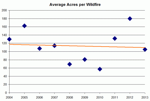
Maybe the data does not exist.  But in fact it does, and I will say there is absolutely no way, no way, the author has not seen the data.  The reason it is not in this article is because it does not fit the "reporters" point of view so it is left out.  Here is where the US government tracks fires by year, at the National Interagency Fire Center.   To save you clicking through, here is the data as of this moment:

click to enlarge fires 2013 to date


Well what do you know?  The number of fires and the acres burned in 2013 are not some sort of record high -- in fact they actually are the, respectively, lowest and second lowest numbers of the last 10 years.  In fact, both the number of fires and the total acres burned are running a third below average.

The one thing this does not address is the size of fires.  The author implies that there are more fires burning more acres, which we see is clearly wrong, but perhaps the fires are getting larger?  Well, 2012 was indeed an outlier year in that fires were larger than average, but 2013 has returned to the trend which has actually been flat to down, again exactly opposite of the author's contention (data below is just math from chart above)

Click to enlarge


In the rest of the post, I will briefly walk through his 8 statements highlighted above and show why they exhibit many of the classic fallacies in trying to assert a trend where none exists.  In the postscript, I will address one other inconsistency from the article as to the cause of these fires which is a pretty hilarious of how to turn any data to supporting you hypothesis, even if it is unrelated.  Now to his 8 statements:

(1) Again, no trend here, this is simply a single data point.  He says that  10 states have set in one year or another in the last decade a record for one of two variables related to fires.  With 50 states and 2 variables, we have 100 measurements that can potentially hit a record in any one year.  So if we have measured fires and fire damage for about 100 years (about the age of the US Forest Service), then we would expect on average 10 new records every decade, exactly what the author found.  Further, at least one of these -- costliness of the fires -- should be increasing over time due to higher property valuations and inflation, factors I am betting the author did not adjust for.

(2)  This cost increase over 17 years represents a 5.4% per year inflation.  It is very possible this is entirely due to changes in firefighting unit costs and methods rather than any change in underlying fire counts.

(3) This is idiotic, a desperate reach by an author with an axe to grind.  Wildfires in Arizona often occur out of fire season.   Having a single fire in the winter means nothing.

(4) Again, we know the data does not support the point.  If the data does not support your point, find some "authority" that will say it is true.  There is always someone somewhere who will say anything is true.

(5) It is true that there are scientists who have blamed global warming for these fires.  Left unmentioned is that there are also scientists who think that it is impossible to parse the effect of a 0.5C increase in global temperatures from all the other potential causes of individual weather events and disasters.  If there is no data to support a trend in the mean, it is absolutely irresponsible to claim causality in isolated data points in the tails of the distribution

(6) The idea that temperatures in Arizona have risen 3/4 a degree F for four decades is madness.  Not even close.  This would be 3F, and there is simply no basis in any reputable data base I have seen to support this.  It is potentially possible to take a few AZ urban thermometers to see temperature increases of this magnitude, but they would be measuring mostly urban heat island effects, and not rural temperatures that drive wildfires (more discussion here).  The statement that "the average annual number of Arizona wildfires on more than 1,000 acres has nearly quadrupled" is so awkwardly worded we have to suspect the author is reaching here.  In fact, since wildfires average about 100 acres, the 1000 acre fire is going to be rare.  My bet is that this is a volatility in small numbers (e.g. 1 to 4) rather than a real trend.  His final statement that "One-quarter of Arizona's signature ponderosa pine and mixed-conifer forests have burned in just the past decade" is extremely disingenuous.  The reader will be forgiven for thinking that a quarter of the trees in Arizona have burned.  But in fact this only means there have been fires in a quarter of the forests -- a single tree in one forest burning would likely count for this metric as a forest which burned.

(7) This may well be true, but means nothing really.  It is more likely, particularly given the evidence of the rest of the article, to be due to forest management processes than global warming.

(8)  This is a data point, not a trend.  Is this a lot or a little?  And remember, no matter how much he says is at risk (and remember this man is testifying to get more budget money out of Congress, so he is going to exaggerate) the actual acreage burning is flat to down.

Postscript:  The article contains one of the most blatant data bait and switches I have ever seen.  The following quote is taken as-is in the article and has no breaks or editing and nothing left out.   Here is what you are going to see.  All the way up to the last paragraph, the author tells a compelling story that the fires are due to a series of USFS firefighting and fuel-management policies.  Fair enough.   His last paragraph says that Republicans are the big problem for opposing... opposing what?  Changes to the USFS fire management practices?  No, for opposing the Obama climate change plan. What??  He just spent paragraphs building a case that this is a fire and fuel management issue, but suddenly Republicans suck for opposing the climate change bill?

Like most land in the West, Yarnell is part of an ecosystem that evolved with fire. "The area has become unhealthy and unnatural," Hawes says, "because fires have been suppressed." Yarnell is in chaparral, a mix of small juniper, oak and manzanita trees, brush and grasses. For centuries, fires swept across the chaparral periodically, clearing out and resetting the "fuel load." But beginning in the early 1900s, U.S. wildfire policy was dominated by fire suppression, formalized in 1936 as "the 10 a.m. rule" – fires were to be extinguished by the morning after they were spotted; no exceptions. Back in the day, the logic behind the rule appeared sound: If you stop a fire when it's small, it won't become big. But wildland ecosystems need fire as much as they need rain, and it had been some 45 years since a large fire burned around Yarnell. Hawes estimates that there could have been up to five times more fuel to feed the Yarnell Hill fire than was natural.

The speed and intensity of a fire in overgrown chaparral is a wildland firefighter's nightmare, according to Rick Heron, part of another Arizona crew that worked on the Yarnell Hill fire. Volatile resins and waxy leaves make manzanita "gasoline in plant form," says Heron. He's worked chaparral fires where five-foot-tall manzanitas produced 25-foot-high flames. Then there are the decades of dried-up grasses, easily ignitable, and the quick-burning material known as "fine" or "flash" fuels. "That's the stuff that gets you," says Heron. "The fine, flashy fuels are just insane. It doesn't look like it's going to be a problem. But when the fire turns on you, man, you can't outdrive it. Let alone outrun it."

Beginning with the Forest Service in 1978, the 10 a.m. rule was gradually replaced by a plan that gave federal agencies the discretion to allow fires to burn where appropriate. But putting fire back in the landscape has proved harder to do in practice, where political pressures often trump science and best-management practices. That was the case last year when the Forest Service once again made fire suppression its default position. Fire managers were ordered to wage an "aggressive initial attack" on fires, and had to seek permission to deviate from this practice. The change was made for financial reasons. Faced with skyrocketing costs of battling major blazes and simultaneous cuts to the Forest Service firefighting budget, earlier suppression would, it was hoped, keep wildfires small and thus reduce the cost of battling big fires.

Some critics think election-year politics may have played a role in the decision. "The political liability of a house burning down is greater than the political liability of having a firefighter die," says Kierán Suckling, head of the Tucson-based Center for Biological Diversity. "If they die, you just hope that the public narrative is that they were American heroes."

The problem will only get worse as extremist Republicans and conservative Democrats foster a climate of malign neglect. Even before President Obama unveiled a new climate-change initiative days before the fire, House Speaker John Boehner dismissed the reported proposal as "absolutely crazy." Before he was elected to the Senate last November, Jeff Flake, then an Arizona congressman, fought to prohibit the National Science Foundation from funding research on developing a new model for international climate-change analysis, part of a program he called "meritless." The biggest contributor to Flake's Senate campaign was the Club for Growth, whose founder, Stephen Moore, called global warming "the biggest myth of the last one hundred years."

By the way, the Yarnell firefighters did not die due to global warming or even the 10am rule.  They died due to stupidity.  Whether their own or their leaders may never be clear, but I have yet to meet a single firefighter that thought they had any business being where they were and as out of communication as they were.


Trend That Is Not A Trend: Dan Brown is an Idiot Edition

I just finished reading Dan Brown's new novel Inferno.  Dan Brown novels tend to be love-it-or-hate-it things for me.  They are structured exactly like computer adventure games, with a series of quests and puzzles that lead to the next quest or puzzle which eventually reveal a larger story line and a final confrontation.  Just as this sort of adventure game can be engaging or tedious and repetitive, so too can be Dan Brown books.  The Da Vinci Code is excellent, the others are meh, just overly-convoluted snipe hunts.

So I had expected to either love or hate Inferno.  It turns out it was awful, but for an entirely unexpected reason:  for some insane reason, Dan Brown seems to have come under the spell of Paul Ehrlich doomsters, and has crafted a book with a deep fear of population growth that is right out of the 1970's.

Mild spoilers follow (mild meaning most of this is revealed in the first third of the book)

It is clear from almost the beginning of the book that Brown's hero, Robert Langdon, is on the trail of some sort of mad genius who is convinced that the Earth is headed for a horrible collapse due to human population growth.  This character is enamored of the medieval black death and believes that the best thing for modern man would be some sort of repetition of this kind of plague.

The exhausting part for any rational person trying to read this book is that it is clear that the author Brown mostly agrees with this character.  We know this because all of the arguments characters marshal against the villain are so lame and half-hearted.  In general, the tone of the response to this man is "yes, you are absolutely correct that human population growth will inevitably lead to a complete catastrophe but your idea of a plague is a bad solution."

By the end of the book, everyone formerly opposed to this scientist have come around to reluctantly agreeing with his point of view.  If you ever read Tom Clancy's Rainbow 6, where an environmental group tries to kill off most of the world's population, this is essentially the same plot written, incredibly, by an author that seems to agree with the basic idea.  If you are not convinced that Dan Brown himself agrees with the terrorist, I will also provide one more convincing piece of evidence -- though since it is a much bigger spoiler I will leave it for the end below the fold.  If you have read the book or don't intend to, skip below the fold and then come back.

This idea of catastrophic population growth is idiotic.  Accelerating population growth is a trend that is not a trend.

There is absolutely no trend towards out of control population growth.   In fact, the trends actually run in the opposite direction, with birth rates and population growth rates falling such that most demographers foresee an Earth stabilizing around 9-10 billion people and possibly falling in population after that.  Since Dan Brown uses senior UN officials in the book to agree that population growth will result in disaster, I will use UN figures.  These are from a 2005 UN population report.

First, population growth rates have been falling for decades and will continue to fall.  They are falling in every part of the world.

click to enlarge

A cynic might argue that this is due to death and disease, but in fact birth rates are falling everywhere

pop2

This data is about 10 years old but Wikipedia summarizes the most recent UN data and shows this trend has continued (TFR is total fertility rate):

World historical TFR (1950–2015)
UN, medium variant, 2010 rev.[2]
Years TFR
1950–1955 4.95
1955–1960 4.89
1960–1965 4.91
1965–1970 4.85
1970–1975 4.45
1975–1980 3.84
1980–1985 3.59
1985–1990 3.39
1990–1995 3.04
1995–2000 2.79
2000–2005 2.62
2005–2010 2.52
2010–2015 2.36


People focus on the amount the world population has increased over the last 60 years to produce shock numbers, but the real stunner is the drop in fertility rates -- nearly in half, which is really astounding.  I still have my treasured first edition of Ehrlich's Population Bomb.  It is hilarious reading, all the more so because he gets everything so wrong, yet the media still tends to take him seriously.

The recurring theme in Inferno is that man's greatest problem is that he has successfully tackled many diseases and thus increased life expectancy, and it is this longer life expectancy that will be the roots of mankind's Malthusian downfall.

However, exactly the opposite is true.  There is a ton of scientific work that says that longer life spans lead to lower fertility rates  (the other thing that most contributes to lower fertility rates is economic growth).  Here is a chart right out of the UN study linked above showing a clear inverse correlation between life expectancy and birth rates.   Correlation is not causation, but this is backed by a ton of other empirical evidence to support causation.

pop3

Wow.

There is no trend towards accelerating population growth -- the trend is in the opposite direction, to deceleration.  And folks who have underestimated man's ingenuity in feeding larger populations have always turned our to be wrong.  Ehrlich said there was no way --- absolutely no way -- India could feed an additional 200 million people by 1980.  Well, in 2013 it feeds an additional 800 million people to a better standard that the country was fed in Ehrlich's time.  Hell, we could probably feed an additional half billion more just by repealing laws that put a significant amount of America's food production into automotive fuels.

PostScript / Large spoiler and more discussion below the fold 

Continue reading ‘Trend That Is Not A Trend: Dan Brown is an Idiot Edition’ »

New Feature Here: Trend That Is Not A Trend

Some have asked me why I have not updated my climate blog in a while.  Frankly, the climate debate has become like the movie Groundhog Day, with the same handful of scientists releasing the same flawed studies making the same mistakes.  What used to be exciting is frankly boring.  I still blog here on updated climate news, and perhaps the IPCC will give us new things to write about soon, but for now most of my climate work will just be making appearances and presentations  (let me know if you have a large group, I don't charge any sort of fee).

For a while now I have been contemplating a new focus area, perhaps even a new blog.  I call this new focus "trend that is not a trend."  It refers to the tendency I find in the media to cite a trend without any supporting data, sometimes even when the actual trend in the data turns out to have the opposite sign.  Sometimes the reporter is motivated by conventional wisdom, sometimes by passion in advocating for a certain issue, and sometimes they are fooled by their own coverage, mistaking increases in coverage of a phenomenon for increases in the phenomenon itself (for example, this year everyone believes wildfires are up, when in fact this is a very low year).  We get a lot of this type of thing in climate, so it will give me a chance to continue to blog on climate but from a slightly different angle.

The best way to explain the phenomenon is with an example, and the Arizona Republic presented me with a great one today, in the form of an article by Joan Lowy of the Associated Press.  This in an article that reads more like an editorial than a news story.  It is about the Federal requirement for railroads to put safety electronics called Positive Train Control (PTC) on trains by a certain date.  The author has a pretty clear narrative that this is an absolutely critical piece of equipment for the public good, and that railroads are using scheming and lobbying to unfairly delay and dilute this critical mandate (seriously, I am not exaggerating the tone, you can read it for yourself.)

My point, however, is not to challenge the basic premise of the article, but to address this statement in her opening paragraph (emphasis added).

Despite a rash of deadly train crashes, the railroad industry’s allies in Congress are trying to push back the deadline for installing technology to prevent the most catastrophic types of collisions until at least 2020, half a century after accident investigators first called for such safety measures.

The reporter is claiming a "rash of deadly train crashes"  -- in other words, she is saying, or at least implying, that there is an upward trend in deadly train crashes.  So let's ask ourselves if this claimed trend actually exists.  She says it so baldly, right there in the first seven words, that surely it must be true, right?

Here is the only data she cites:

The National Transportation Safety Board has investigated 27 train crashes that took 63 lives, injured nearly 1,200 and caused millions of dollars in damage over the past decade that officials say could have been prevented had the safety system been in place.

Astute readers will note that this is not a trend, it is one data point.   Has the number increased or decreased over the decade?  For comparable decades, are 27 crashes and 63 deaths a lot or a little?  Is it a "rash", or a tapering off?  We have no idea.   As we get further into this series, readers will be surprised at how often the media uses single data points to "prove" a trend.

The only other evidence we get of a "rash" are three examples:

  • The July high speed rail accident in Spain, which killed scores of people.  Of course, readers may note that she actually had to go to another country for her first example, an example involving high-speed passenger rail which has very little in common with private railroads in the US.
  • A 2008 crash blamed on inattention of a Metrolink driver -- a government employee on a government train, which sort of undermines the basic thrust of the story that this is about evil private railroads using lobbying to endanger the public.  Few readers are likely to consider a 2008 crash to constitute a recent "rash."
  • A 2005 crash at a private freight railroad that killed 9 people from a chlorine gas leak.  Fewer readers are likely to consider a 2005 crash to constitute a recent "rash".

So let's go to the data.  It is actually very easy to find, and I would be surprised if Ms. Lowy did not actually have this data in her hands.  It is at the Federal Railway Administration Office of Safety Analysis.  2013 data is only current through June and seems to be set up on an October -September fiscal year.  So I ran the data only for October-June of every year to make sure the results were comparable to 2013.  Each year in the data below is actually 9 months of data.

By the way, when one is looking at railroad fatalities, one needs to understand that railroads do kill a lot of people every year, but the vast, vast majority of these -- 99% or more -- are killed at grade crossings.  People still do not understand that a freight train takes miles to stop.  (see postscript below, but as an aside, I would be willing to make a bet: Since deaths at grade crossings outnumber deaths from collisions by about 100:1, I would be willing to bet any amount of money that I could take the capital the author wants railroads to invest in PTC and save far more lives by investing it in grade crossing protection.  People like Ms. Lowy who advocate for these regulations never, ever seem to consider prioritization and tradeoffs.)

Anyway, looking at the data, here is the data for people killed each year in US railroad accidents (as usual click to enlarge any of the charts):

click to enlarge

So, rather than a "rash", we have just the opposite -- the lowest number of deaths in a decade.  One.  I will admit that technically she said rash of "fatal accidents" and this is data on fatalities, but I'm going to make a reasonable assumption that one death means one fatal accident -- which certainly cannot be higher than the number of fatal accidents in previous years and is likely lower.

Most of you will agree that this makes the author's opening statement a joke.  Believe it or not -- and this happens a surprising number of times -- this journalist is claiming a trend that not only does not exist, but is of the opposite sign.  But let's go further with a few other charts.  Maybe we just got lucky and there is a rash of accidents but just not fatal ones:

click to enlarge

Not only is there not a "rash" but the number of accidents have actually been cut in half.   But let's give the author one last try at a benefit of the doubt.  She says the technology she is advocating reduces human error caused accidents.  The FRA actually tracks these separately.  I wonder what that trend is?

click to enlarge

LOL, if anything it declines more.    The only thing I can possibly find in her favor is that number of train accident injuries spiked in 2013 after 10 years of declining, but since fatalities and accidents went down, the odds are this is a statistical anomaly and not part of any trend.

Postscript:  To my point above, 1 person died from train accidents in the last 9 months or so.  We don't know why or how they died, but let's just say it was preventable by PTC.  The author is therefore castigating railroads for not racing ahead with hundreds of millions to prevent one death, when the railroads know their chief focus for reducing preventable deaths should be on the 588 other people who died on the railroad in the same period, mainly from grade crossing and trespasser/pedestrian accidents.

Do Reporters Even Look At Their Own Charts?

A Wall Street Journal article today looks at problems at Sears in their critical appliance business.  I have no problem believing that Sears is in trouble, and at various times over the past decade (full disclosure here) have held small short positions in Sears.  The author argues that the Sears appliance business has had a number of missteps, and is contributing to Sears growing losses, propositions with which I cannot argue, in part because there is no data provided to confirm or deny the connection between problems in the appliance business and Sears' profitability woes.

The other theme of the article is that recent missteps in the appliance business, particularly the 2009 switch from Whirlpool to Samsung and LG to manufacture its in-house Kenmore brand, is hurting its market share in the retail appliance business, and leading the the growth in market share at Home Depot and Loews.   But the author's own data belie this conclusion.  Here is the market share chart she includes:

MK-CF765_SEARS_G_20130822175404


While Sears may have lost a couple of points of market share since 2008, and 2013 does not look like a particularly good year so far, the vast majority of its market share loss occurred from 2002-2008, long before most of the recent problems profiled in the article.  In fact, its more likely that the loss coincided with Sears reorganization with Kmart a decade ago, events referred to only briefly in the article.

Look, I have no insider knowledge here, just a pet peeve that trends referenced in an article should match trends in the data.  But Sears is a tired old retailer.  Many of its peers from the same era are dying or dead.  People are shifting their shopping away from the malls where Sears is located.  Lowes and Home Depot were both juggernauts during this period.  I would have said that a story could equally well have been written that despite all the confusion in their business, they have done a pretty descent job arresting the decline in their market share over the last five years.  Of course they are likely dead in the long run.

Postscript:  Oddly, I witnessed a similar Sears private label fracas when I worked for Emerson Electric over a decade ago.  For years and years, Emerson (not the folks who make the cheap radios and TVs) manufactured many of the Sears Craftsman hand tools and power tools.  Sears got tough one year, and negotiated a better deal of some sort with someone else, and an entire division of Emerson saw its sales basically going to zero.  So Emerson bought a bunch of orange paint and plastic, went to Home Depot, and cut a deal for a private label tool line at Home Depot (Emerson separately owns the Rigid tool company, so a lot of the items were branded Rigid).  Emerson ended up in potentially better shape (I did not stay long enough to see how it turned out), partnered with a growing rather than a declining franchise.