Posts tagged ‘Heritage Foundation’

Hey, We Are Getting Some Support

The Competitive Enterprise Institute has been all over the shutdown of private businesses that take no money from the Federal government, but have been closed by the Administration none-the-less.  The Daily Caller has an article up that includes some quotes from yours truly

During the government shutdown, the Obama administration has forced the closure of privately owned parks, stoking calls from lawyers for park owners to take legal action against the federal government.

“As a lawyer who once worked for the government, I assume there is no legal authority for this because these private tourist attractions were not shut down in prior ‘government shutdowns,’ even under Bill Clinton, who understood how to play political hardball,” Hans Bader, senior attorney at the Competitive Enterprise Institute wrote in an email.

A lawyer with the conservative Heritage Foundation said that the Obama administration’s actions were likely illegal and that business owners forced to close shop should sue.

“They should immediately file a lawsuit and seek a temporary injunction against the government,” said Former Justice Department lawyer Hans Von Spakovsky.

Which is what we are doing right at this moment.  Several other groups are winning similar suits.

Another example (though I am told the Cliff House case was greatly aided by connections they had with Nancy Pelosi).

Measuring the Government

I have not had time to go through this in depth to see what the methodology looks like, but the Heritage Foundation tries to craft an index of government dependency.  I am not sure the Left can really refute the trend, especially since this is essentially what Obama is taking credit for in "Julia."  The difference, of course, is one's evaluation of whether this is good or bad.

Money Does Not Corrupt Politics, State Power Corrupts Politics

Kevin Drum asks whether money corrupts politics, and comes to the conclusion that it does.  I disagree.

Money does not corrupt politics, the expansion of state power corrupts politics.  Every time the state gains a new power to take money from person A and give it to person B, or to throttle company A's business in favor of company B, private individuals start to scheme how they might access that power to their own benefit.

Think back to the much smaller US government of the 19th century.  Don't you long for the day when political corruption mainly meant packing the Post Office with one's kin?  It is absolutely no coincidence that the largest political scandal of that century (the Crédit Mobilier) accompanied the largest expansion of Federal power in that century (the Federally-funded construction of the Transcontinental Railroad).

Political corruption follows the power.  Sure, this power is often bought in dollars, but if we were to entirely ban money from the political process, the corruptions would remain.  And it would shift payment from money to other goods, like quid pro quo's, barter, and access to grass roots labor supplies.  Anyone remember machine politics?

Here is an example from an Administration schooled from an early age in Chicago machine politics

The Heritage Foundation has issued a new report that charges the Obama administration sent presidential earmarks, taxpayer dollars, to Democratic lawmakers to help convince them to vote for controversial proposals such as cap and trade and the health care bill.

“When you examine the recipients of those grants, there were at least 32 vulnerable house Democrats who received significant federal grant money during the run-up or directly after the votes on those pieces of legislation,” says Lachlan Markay, one of the authors of the report.

The amount of earmarks spiked around the time of difficult votes such as cap and trade, then dropped, only to spike again around controversial financial regulations known as Dodd/Frank, and spiked the most just before the vote on the health care bill....

On their websites, lawmakers didn’t advertise their votes, but did tout at length the money they’d gotten for various local projects.

“As a way to counteract the negative voter sentiment that would come from voting for unpopular legislation,” says Markay. “These were attempts to make sure that constituents knew they were bringing money home to their district.”...

Numbers from the non-partisan Congressional Research Service show that the value of administration earmarks under President Obama increased by a 126 percent in his first two years in office and the actual number of administrative earmarks increased by 54 percent.

Those are dramatic increases that are 11 times more than Congress itself increased earmarks, which the White House did not explain today.

By the way, of all the ways that access to political power can be bought, political spending under our current rules is by far the most transparent.   Just as in narcotics or prostitution, a ban wouldn't eliminate it, it would simply drive it further underground and into other forms of currency.

Health Care Bill Timeline

I am sure there are more landmines hidden in the Senate Bill, but the Heritage Foundation has parsed an implementation schedule from the most recent bill:

2010: Physician Medicare payments decrease 21% effective March 1, 2010

2011: "Annual Fee" tax on health insurance, allocated according to share of total premiums. Begins at $2 billion in 2011, then increases to $4 billion in 2012, $7 billion in 2013, $9 billion in the years 2014, 2015, and 2016, and eventually $10 billion for 2017 and every year thereafter. Two insurers in Nebraska and one in Michigan are exempt from this tax.

2012: Medicare payment penalties for hospitals with the highest readmission rates for selected conditions.

2013: Medicare tax increased from 2.9% to 3.8% for incomes over $250,000 (joint filers) or $200,000 (all others). (This is stated as an increase of 0.9 percentage points, to only the employee's share of the FICA tax.)

2014: Individual mandate begins: Tax penalties for not having insurance begin at $95 or 0.5% of income, whichever is higher, rising to $495 or 1% of income in 2015 and $750 or 2% of income thereafter (indexed for inflation after 2016). These penalties are per adult, half that amount per child, to a maximum of three times the per-adult amount per family. The penalty is capped at the national average premium for the "bronze" plan.

2015: Establishment of Independent Medicare Advisory Board (IMAB) to recommend cuts in Medicare benefits; these cuts will go into effect automatically unless Congress passes, and the President signs, an override bill.

2016: Individual mandate penalty rises to $750 per adult ($375 per child), maximum $2,250 per family, or 2% of family income, whichever is higher (capped at the national average premium for the "bronze" plan). After 2016, the penalty will be increased each year to adjust for inflation.

There is a link in the original to a more detailed timeline.  There is a lot more that is left out of this brief timeline, see it here.

Poverty Ain't What it Used to Be

The Heritage Foundation has an interesting study out on the population that lives below the poverty line.  While we typically get lots of headlines like "A million more people in poverty,"  the real headline should be "Poverty ain't what it used to be."  Create a mental image for yourself about poverty then read the first part of the article.

I won't repeat the studies points -- you can read them at the link or you have probably seen the study already linked around the blogosphere (e.g. Captains Quarters, Cato-at-Liberty, Reason, Maggie's Farm).  Reading the descriptions, its clear that most of our visual images and assumptions about US "poverty" don't line up well with this list.   This is by design.  Progressives who want more transfer payments and more government interventionism work hard to create a stark mental image of poverty through anecdotes, and then try to apply that mental image to a much larger population based on a very different definition of poverty than in this mental image. 

However, this approach may be set to backfire.  By defining poverty broadly to try to pump up the numbers, they are at risk of people losing sympathy for the poor.  I can see the progressive reaction now -- they are going to say (correctly) that buried in these numbers are a hard core of people who are really destitute.  And they are correct.  But they only have themselves to blame for burying these folks in a larger group whose lives don't match our mental picture of poverty.  And the poverty numbers aren't the only place where this approach is taken. 

I am sure you have heard the commercials that say something like one in six kids in America are hungry.  It's a crock.  There are at most perhaps 2-3 million people in this country who are really destitute.  The Census department found that only 6% of the people below the poverty line, about 2 million people, reported they sometimes did not have enough food to eat.  Sure, that sucks.  Which is why I volunteer with my kids at the local food bank.  But it's way, way short of the numbers activists try to use to justify huge new government programs and transfers.

Other thoughts

One issue not discussed, but covered in other studies, is the transience of people in the bottom quintile of income.  Most of us imagine the same people in poverty survey after survey, and again that is probably true for the hard core of 2-3 million.  But many of the rest move out of poverty over time.  In particular, we have had a huge influx of immigrants (legal and illegal) over the last several decades.  These folks are all counted in the poverty numbers.  Many immigrants arrive below the poverty line, and then work their way out of it. 

In a related post, Brad DeLong looks at what life was like even for the well off in 1900, and one can easily come to the conclusion that being poor today might be better than well off in 1900.  I made a similar point in this post, when I compared the life of the very rich in 1850 to the middle class today.  All of this is empirical proof that wealth is not zero-sum, as assumed by progressives, but is created and expends.  My post of the zero-sum wealth fallacy is here.

I've made the point for a long time that our poor are better off than the middle class in most countries of the world.  This living space comparison is an example - our poor typically have more living space in their homes than the middle class in Europe, or the well-to-do in many other countries.  But there is always that issue of income inequality that is raised, to which I typically answer "so what?"  If the poor are better off in the US, does it matter if the rich are really, really better off?  Note sometime the language that is always used in income inequality discussions.  You will hear folks talking about the "share of total income" as if income is a spring bubbling up in the desert, spewing a fixed amount of wealth, and the rich are the piggy folks up front getting more than their fair share of this limited resource. 

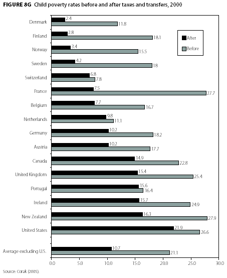
Leftish studies love to show how the US economic model is so much more heartless than those wonderful Europeans.   Below is a typical chart they use, and it will bring us full circle to our original point about measuring poverty.
Study1

Wow, those heartless damn Americans!  Letting those children suffer.  But wait, we talked earlier about definitions of poverty - how do they define poverty here?  It turns out that poverty is defined as income 50% or less of the median income in that country.  Yes, you heard that right -- the standard for poverty changes country to country.  So the US has the worst results here because in large part, since it has the highest median income of any country in this survey, it has been given the highest poverty line.  Of COURSE we will have higher poverty numbers if you give us a higher poverty bar.  The honest way to do this study would be to set an absolute poverty line and apply it to each country on a purchasing power parity basis.  But of course, the progressives would not like the results of such an honest study.

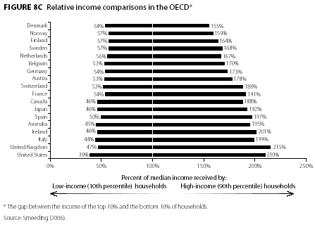
BUT, someone in this study made a mistake -- they should lose their socialist decoder card for this.  Because in a fit of honesty, they actually restated one of their charts on a relatively fair basis.  Here is the original income equality chart:
Study3

You get the point, the US sucks as always -- our poor are the poorest.  But are they?  Again, the standard in each line is the median income of that country, so it is a changing standard in each case.  But what if we restated it all to a common dollar amount.  This is where the progressives fell into a fit of honesty.  They restated this chart so that every bar is a percentage of the US median income.

Study2

Now we see the real story - except for Norway and Switzerland, our poorest folks are about on par with those in other western countries, and this is WITHOUT the crushing burden of welfare state regulation and taxation.  Further, the poor in the US are much more mobile than those in other country -- the ranks of our poor will have turned over much more than any of these other countries in 10 years.  Finally, my bet is that if you did this chart without recent immigrants, the US poor would best most every country in Europe in terms of income -- US has a lot of immigration and it is disproportionately poor vs. immigration into other European countries (note that most poverty numbers include illegal immigrants, but most official immigration numbers do not include illegal immigrants).

So, if our poor are doing just as well, then I leave it as an exercise to give any rational reason why the fact that our rich are doing much better matters one damn bit.

Employment Surveys

I am not an economist, and would rather not stray too far off track, but the recent payroll numbers are raising interesting questions about the nature of business and employment in this country. Recent jobs growth numbers and unemployment numbers have been fine, with about the same unemployment numbers as we saw in November of 1996 when both parties agreed that the economy was pretty good.

However, as the total jobs growth numbers have lagged GDP growth, a number of people have scratched their heads to wonder why. One interesting fact is that when you survey households rather than employers, the jobs growth numbers look substantially better. Many are pointing to this household survey to say that the economy is changing - that more people are starting their own business or consulting and so are missed in the payroll numbers. This is a good theory, but its force is mitigated by the fact that the sample size, survey process, and error rates for the household survey are all much worse than the payroll survey.

Heritage Foundation argues that the household data is right and is better reflecting reality. Economic Policy Institute argues the opposite.

As a relatively new convert from the corporate world to small business, I can tell you that anecdotally, a good number of the people who left (voluntarily or not) the corporate world early in this decade have not gone back, and are, like me, now self-employed. I just had my 15th business school reunion and the proportion of small people self-employed or running small businesses is up a startling amount since the 10th reunion.