We see all kinds of alarmist spin being attempted on the CRU emails. For those who are interested, this is best layman's article I have found to discuss the now-famous Michael Mann "trick," what it is, and the obfuscation in the CRU's response.
I have at least one experience with the core alarmist community responding where I pointed out an error. The responses I got in that case are very similar to the ones today for the CRU - basically the responses either are tangential to the basic point or try to retroactively change the alarmists original assertions. They are responses that stand up only if the questioner is unwilling or unable to do the smallest amount of verification work (in other words, they work with most of the media).
The series of posts began with this image from the recent US government climate assessment. Its point was to provide electric grid outages as a proxy measurement variable for severe weather, the point being that severe weather must have increased.

I thought this chart smelled funny
This chart screams one thing at me: Basis change. Somehow, the basis for the data is changing in the period. Either reporting has been increased, or definitions have changed, or there is something about the grid that makes it more sensitive to weather, or whatever (this is a problem in tornado charts, as improving detection technologies seem to create an upward incidence trend in smaller tornadoes where one probably does not exist). But there is NO WAY the weather is changing this fast, and readers should treat this whole report as a pile of garbage if it is written by people who uncritically accept this chart.
So I called the owner of the data set at the EIA
He said that there may be an underlying upward trend out there (particularly in thunderstorms) but that most of the increase in this chart is from improvements in data gathering. In 1997, the EIA (and Makins himself) took over the compilation of this data, which had previously been haphazard, and made a big push to get all utilities to report as required. They made a second change and push for reporting in 2001, and again in 2007/2008. He told me that most of this slope is due to better reporting, and not necessarily any underlying trend. In fact, he said there still is some under-reporting by smaller utilities he wants to improve so that the graph will likely go higher in the future....
At the end of the day, this disturbance data is not a good proxy for severe weather.
The author of that section of the report, Evan Mills, responded and then I dealt with his response here. Here is just one example of the BS we have to slog through every time we criticize even a tangential analysis like this. See the links for his whole response, but he says in part:
As noted in the caption to the figure on page 58 of our report (shown above)"”which was masked in the blogger's critique [ed. actually it was not masked- the source I got the chart from had left off the caption]"”we expressly state a quite different finding than that imputed by the blogger, noting with care that we do not attribute these events to anthropogenic climate change, but do consider the grid vulnerable to extreme weather today and increasingly so as climate change progresses, i.e.:
"Although the figure does not demonstrate a cause-effect relationship between climate change and grid disruption, it does suggest that weather and climate extremes often have important effects on grid disruptions."
The associated text in the report states the following, citing a major peer-reviewed federal study on the energy sector's vulnerability to climate change:
"The electricity grid is also vulnerable to climate change effects, from temperature changes to severe weather events."
This was pretty amazing - citing his chart's caption but hoping that somehow I or other readers would miss the very first line of the caption which he fails to quote:
To Dr. Mills' point that I misinterpreted him "” if all he wanted to say was that the electrical grid could be disturbed by weather or was vulnerable to climate change, fine. I mean, duh. If there are more tornadoes knocking about, more electrical lines will come down. But if that was Dr. Mills ONLY point, then why did he write (emphasis added):
The number of incidents caused by extreme weather has increased tenfold since 1992. The portion of all events that are caused by weather-related phenomena has more than tripled from about 20 percent in the early 1990s to about 65 percent in recent years. The weather-related events are more severe"¦
He is saying flat out that the grid IS being disturbed 10x more often and more severely by weather. It doesn't even say "reported" incidents or "may have" "” it is quite definitive. So which one of us is trying to create a straw man? It is these statements that I previously claimed the data did not support, and I stand by my analysis on that.
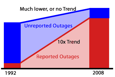
I deconstructed a lot of the rest of his longer post, and you can follow it all, but the bottom line is that if a you are drawing a trend line between two points, and you have much more data missing from the begginning end point than the end, your trend is going to be SNAFU'd. Period. No point in arguing about it. See the chart below. It represents the situation at hand. The red is the reported data. The blue is the unreported data, which declines as a percentage of the total due to a push for better data reporting by the database owners. My point was simply that the red trend line was meaningless. Its amazing to me that even accepting the basics of this picture, Dr. Mills wants to fight that conclusion.

I am reminded by one of the now-famous quotes from the CRU emails
I really wish I could be more positive about the Kyrgyzstan material, but I swear I pulled every trick out of my sleeve trying to milk something out of that. I don't think it'd be productive to try and juggle the chronology statistics any more than I already have - they just are what they are...
Yep, sometimes the measured results from nature are what they are. Well, I actually that most of the time they are what they are, but not in climate apparently. Never give up a flawed analysis that yields the "right" answer without a fight. I concluded:
Look Dr. Mills, I don't have an axe to grind here. This is one chart out of bazillions making a minor point. But the data set you are using is garbage, so why do you stand by it with such tenacity? Can't anyone just admit "you know, on thinking about it, there are way to many problems with this data set to declare a trend exists.


