If you have never checked out JunkScience.com, you should. They do a nice job of providing balance and fact-based analysis for many science "stories" in the media, particularly those where the science is driven by political correctness or a litigation and/or political agenda. The spend a lot of time on global warming, mainly because there is just so much bad science there to criticize, but they range all over, from the latest food Nazi threats to the latest chemical contamination panic.
Last week, they release their 10 most embarrassing moments of 2004. One example:
10. University of Arkansas researchers attacked the Atkins Diet in January with a report linking a high-carbohydrate diet with weight loss, saying it was possible to lose weight without cutting calories and without exercising. What they didn't reveal, however, was that the study subjects who lost weight actually ate 400-600 calories per day less than those who didn't lose weight.
Never, ever, ever trust a science story in the press. The press has no idea how to use or manipulate data (if they had been able to do math, they would not have been journalism majors in the first place). The press generally publishes science stories by cribbing 95% of the story from activists press releases. Even when there is data in the story, rather than just bald unsupported declarations, it is either seriously flawed, or more humorously, contradicts the text of the story.
I can't resist supporting this statement with a couple of examples from JunkScience.com.
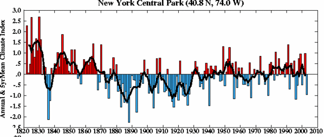
This is a temperature chart for Central Park, NY. It gets a lot of play in the press as a "common sense" proof of global warming, and comes right off the NASA climate site:

Now, lets ignore the fact that urbanization could be causing a local temperature increase that does not reflect a general climate trend. Lets, however, select our time frame a little differently. Lets take the whole data set, which goes back further, rather than this set chosen by activists to make their point. The same data over a longer trend looks like this:

OOPS! Gee, I am not sure Central Park looks much warmer. In fact, you could argue it is cooler. Hmmmm. Ask yourself if you really think it was an accident that the year with the single lowest temperature in the middle of the second graph was used as the starting point for the first.
OK, one other, because I can't resist. There is some debate (though perhaps not enough) about what temperature data set to use - ground level readings, satellite data, balloons, etc. It might not stun you to learn that out of 3-5 alternative temperature data sets, global warming activists choose not the middle or the average but the single set (ground temperatures) that show by far the most warming to date. By coincidence, this data set is perhaps the least reliable, since it never has had anything like 100% area coverage, it is subject to the most human error, and it is influenced by urban warming effects.
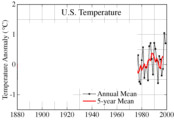
However, if you want to use ground data, certainly the most reliable is data for the United States, where data has been taken over a larger coverage area for more time with more consistent standards than any other location. Global Warming activists will love to show this chart of US temperatures since about 1978:

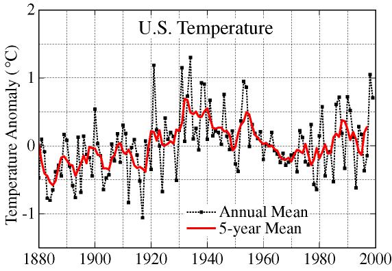
Wow, that looks bad - looks like a nearly one degree Celsius rise in less than 25 years. This is the "hockey stick" climatologists refer to. Let's leave aside that this same rise is not visible in satellite data or other measurement approaches. Like the NYC data, lets take a longer time span. Can you guess why this chart begins in 1978?

So we are not even at the high's for the last 100 years - those occured in the 1930's (you remember - drought, dust bowl, etc?)
OK, that's just a taste - check out their web site for more. In addition, you can read my post on the Kyoto treaty to find other skeptics of global warming, as well as some specific information about how Kyoto is more an anti-American treaty than an environmental treaty.
UPDATE
Based on some responses I have gotten, its probably best that I point out that the reason for posting the charts above was not to "disprove" global warming. It was to just make the point that you need to be careful with any science you see in the media. If you look here or here, you will see where I am on global warming, which basically that manmade warming probably exists but is being overstated for a variety of reasons. In fact, my whole point here is really that you CAN'T prove or disprove something as complex, chaotic, and poorly understood as climate change with 2 or 3 charts.

