Denying the Climate Catastrophe: 3. Feedbacks
This is the third chapter of an ongoing series. Other parts of the series are here:
- Introduction
- Greenhouse Gas Theory
- Feedbacks (this article)
- A) Actual Temperature Data; B) Problems with the Surface Temperature Record
- Attribution of Past Warming: A) Arguments for it being Man-Made; B) Natural Attribution
- Climate Models vs. Actual Temperatures
- Are We Already Seeing Climate Change
- The Lukewarmer Middle Ground
- A Low-Cost Insurance Policy
We ended the last chapter on the greenhouse gas theory with this:
So whence comes the catastrophe? As mentioned in the introduction, the catastrophe comes from a second, independent theory that the Earth's climate system is dominated by strong positive feedbacks that multiply greenhouse warming many times into a catastrophe.
In this chapter, we will discuss this second, independent theory: that the Earth's climate system is dominated by positive feedbacks. I suppose the first question is, "What do we mean by feedback?"
In a strict sense, feedback is the connection of the output of a system to its input, creating a process that is circular: A system creates an output based on some initial input, that output changes the system's input, which then changes its output, which then in turn changes its input, etc.
Typically, there are two types of feedback: negative and positive. Negative feedback is a bit like the ball in the trough in the illustration above. If we tap the ball, it moves, but that movement creates new forces (e.g. gravity and the walls of the trough) that tend to send the ball back where it started. Negative feedback tends to attenuate any input to a system -- meaning that for any given push on the system, the output will end up being less than one might have expected from the push.
Positive feedback is more like the ball sitting on top of the hill. Even a small tap will send it rolling very far away, because the shape of the hill and gravity tend to push the ball even further in the direction of the tap. Positive feedback amplifies or multiplies any input to a system, meaning that even small pushes can lead to very large results.
The climate temperature system has a mix of positive and negative feedbacks.
For example, consider cumulus clouds. If the Earth warms, more water tends to evaporate from the oceans, and some of that water will form big fluffy white clouds. These clouds act as an umbrella for the Earth, reflecting heat back into space. So as more clouds form due to warming, there is a net new cooling effect that offsets some of the original warming. The amount of warming we might have expected is smaller due to the negative feedback of cloud formation.
On the other side, consider ice and snow. Ice and snow reflect sunlight back into space and keep the Earth cooler than it would be without the ice and snow cover. As the world warms, ice and snow will melt and thus reflect less sunlight back into space, having the effect of warming the Earth even more. So an initial warming leads to more warming, amplifying the effect of the initial warming.
Since we know both types of feedback exist, what we care about is the net effect -- does negative or positive feedback dominate? In every catastrophic forecast you have seen for global warming, in nearly every climate model the IPCC uses, the authors have assumed that the climate is dominated by strong positive feedbacks that multiply incremental warming from greenhouse gasses many times.
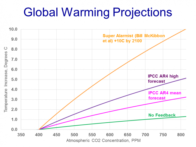
This is the result:
As a reminder, the green line is the warming from increases in atmospheric CO2 concentration solely from the greenhouse gas effect, without any feedbacks taken into account. It is generally agreed to be a warming rate of about 1.2C per doubling of CO2 concentrations, with which I and many (or most) science-based skeptics agree. The other lines, then, are a variety of forecasts for warming after feedbacks are taken into account. You can see that all these forecasts assume positive feedback, as the effect is multiplicative of the initial greenhouse gas warming (the pink, purple, and orange lines are approximately 3x, 5x, and 10x the green line, implying very high levels of positive feedback).
The pink line is the mean forecast from the 4th IPCC, implying a temperature sensitivity to CO2 of about 3C. The purple line is the high end of the IPCC forecast band, implying a temperature sensitivity of 5C. And the highest is not from a mathematical model per se, but from the mouth of Bill McKibben (sorry for the misspelling in the chart) who has on several occasions threatened that we could see as much as 10C of warming from CO2 by the end of the century.
Skeptics have pointed out a myriad of issues with the climate computer models that develop these forecasts, but I will leave those aside for now. Suffice it to say that the models exclude many important aspects of the climate and are subject to hand tuning that allows modellers to produce pretty much any output they like.
But I do want to say a few words about computer models and scientific proof. Despite what you will hear from the media, and even from the mouths of prominent alarmist scientists, computer models do not and cannot constitute "proof" of any sort. Computer models are merely tools we use to derive the predicted values of physical parameters from complex hypotheses. They are no different than the pen and paper computations an 18th century researcher might have made for the position of Saturn from Newton's celestial mechanics equations. The "proof" comes when we take these predicted values and compare them against actual measurements over time and find that they are or are not accurate predictions. Newton's laws were proved as his equations' outputs for Saturn's position were compared to Saturn's actual measured position (and in fact they were disproved, to a small extent, when Mercury's position did not accurately match and Einstein has to fix things a bit). Similarly, hypotheses about global warming will be proved or disproved when the predictions of various models are compared to actual temperatures.
So we can't really get much further until we get to actual observations of the climate, which we will address in the next several chapters. But I want to make sure that the two-part theory that leads to catastrophic global warming is clear.
This is the portion of the warming due to greenhouse gas theory:
As you can see, the portion due to greenhouse gas theory is relatively small and likely not catastrophic. The catastrophe comes from the second independent theory that the Earth's climate system is dominated by strong (very strong!) positive feedbacks.
It is the positive feedback that causes the catastrophe, not greenhouse gas theory. So in debating catastrophic man-made global warming theory, we should be spending most of our time debating the theory that the climate is dominated by strong positive feedbacks, rather than debating the greenhouse gas theory.
But in fact, this does not happen in the mainstream media. If you are an average consumer of climate news, I will be you have never heard a discussion in the media about this second theory.
And this second theory is far from settled. If on the "settled" scale from 1-10, greenhouse gas theory is an 8 or 9, this theory of strong positive feedbacks dominating the climate is about a 2. In fact, there is plenty of evidence that not only are scientists estimating feedbacks incorrectly, but that they don't even have the sign right and that net feedbacks may be negative.
This is a bit hard to communicate to a layman, but the positive feedbacks assumed by the most alarmist and catastrophic climate forecasts are very, very high. Way higher than one might expect in advance upon encountering a new system. This assumption of strong positive feedbacks is one that might even offend the sensibilities of the natural scientist. Natural systems that are long-term stable (and certainly for all its variation the climate system has remained in a pretty narrow range for millions and millions of years) are typically not dominated by positive feedbacks, they are dominated by negative feedbacks.
If in fact our climate temperature system is dominated by negative feedbacks, the future warming forecast would actually be below the green line:
OK, without getting in and criticizing the details of these models (which would by the way be a pointless wack-a-mole game because there are dozens of them) the best way to assess the validity of these various forecasts is to now consult actual observations. Which we will begin to do in our next chapter, part 4a on actual temperature measurements.




Hey, I looked into this pretty thoroughly before I was convinced.
Seriously, though, go look up the stuff that you doubt me on.
When the data is all out there, it's kinda hard to just ignore it and say that the other person is lying.
Oops, meant to add this:
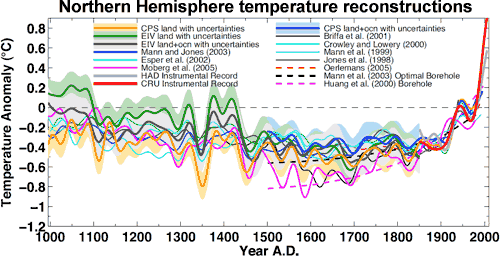
Okay, so one of fifteen reconstructions for the Northern hemisphere shows that the MCA was as warm as today.. and you take that as fair grounds to say that it was? Despite the other fourteen reconstructions that don't show this?
...am I really understanding you correctly there?
Not to mention, this isn't even global. I mean, I really don't see how anyone can say that the MCA was as warm as today. The evidence just doesn't show it.
There are plenty of sources that say higher. Remember, I'm trying to stick to the AR5 here.
Even the AR5 shows southern hemisphere as well as northern warming in that time, just not as great.
Sorry, do you mean plenty of sources within the AR5, or outside of it? (The context leaves me unsure).
I'd love to see some of those!
Though, really, we want to use global reconstructions as often as possible, because regional sites will obviously vary more than the global average. So if you have links to global reconstructions or meta-studies showing that it was warmer in the MCA, I'd really love to see it!
But generally, the more comprehensive the reconstruction, and the more datasets it includes, the more it shows that it's warmer today than the MCA. Marcott et al (2013) is the latest and greatest there, I think, constructed from 73 different records.
Sources outside. But you seem to be trying to push me into a position I'm not taking ...
I know that our actions have increased the average temperature of the world. The debate is how much feedbacks amplify or dampen that. If you take out the minimum response, just CO2 (and CO2 equivalent) greenhouse effects without any feedbacks, the natural underlying temperatures fall below most of the AR5 reconstructions of the MWP, not just one of them.
Haha, my apologies. Which part am I getting wrong?
I'm not sure that I'm parsing this correctly. Are you saying that without the feedbacks, we can't explain the MCA?
Not only detail lost in the summaries, but even underlying analysis. It's not the science staff that writes the summaries. It's done under political supervision. The "conclusions" that are given (and not given), the phraseology they're written in, the implied prescriptions for government action.
There's more than one aspect to solar activity. You have the visible light output which goes down with more sunspots, so you would think that the more sunspots, the less the solar activity. But the magnetic field instability and solar wind increase. Those actually put out more energy total than is lost in the visible spectrum. There's no question that there's a strong correlation between sunspots and total irradiance. Unfortunately, the question about sunspots and climate has gotten so entangled that it's hard to find references solely on the solar physics.
Yes, we've been affecting climate to a minor degree for a long time. You even left out the black carbon (soot) deposits on snow and ice reducing albedo. The question is how much. The Earth really is a very big place. Even today there are vast swaths of land with very few people, although it's hard for people in developed areas to get a feel for just how big it is. We humans do have a tendency to overestimate our importance. :)
Prior to the surge in industrial output during and after WWII, the net effects would seem to have been minimal. Total population has also exploded since 1900. Fortunately the rate of increase has dropped from over 2% annually at its peak to just over 1%.
True on the Milankovitch. I was just thinking of precession. Sloppy :(
Meh. I was sloppy on the bit about chaos. Though, that issue is a bit tricky anyway, as there's both the IPCC bit that gets oft-quoted (and oft-misunderstood), plus the very real possibility that even the statistical description of climate is actually chaotic. (It just hasn't been demonstrated yet).
Eh, I see that go both ways. A lot of people say that we couldn't have much effect on the Earth; we're just puny little humans.
In the absence of evidence, I prefer not to assume either way. And then, to go out and actually collect evidence. :-p
We've come to pretty much dominate the land biospheres. For instance, humans and our livestock comprise 98% of the terrestrial mammal biomass.
https://xkcd.com/1338/
We really are in the Anthropocene now.
All I'm saying is that the underlying "natural" climate was warmer during the MWP than now. If the 1000 year cycle holds then that's just one more thing that needs to be taken into account when subtracting out the natural background changes in order to determine the responses to human caused changes. It's not even a major point because that pattern isn't very precise, at least not on the time scales we're discussing now.
We're only beginning to scratch the surface of what underlying cycles exist, much less what their duration is, how they coincide and how and when they reinforce or ameliorate each other. If we can't reasonably accurately model the natural patterns, then we can't determine even a probability of future patterns.
My model agrees with your model and is pretty close to this model and that model ... but the actual measurements? Not so much. Comparison to reality, both past and future, is the ultimate test of any model. The higher the assumed sensitivity, the farther from reality the models are.
Not so puny any more, but that's fairly recent.
Have you ever gone on a long drive through the mountain states or the southwest or central and western Canada? Hour after hour after hour of rarely seeing anything human ... and that's from interstates and fairly major highways. Go on an ocean cruise and see nothing else human for days on end.
I love xkcd - it's on my new tab page so I never miss one. We do tend to breed the biggest mammals around for consumption. More chow for the buck :)
the underlying "natural" climate was warmer during the MWP than now.
Some just cling to their beliefs, regardless.
Best,
D

Ahh, okay, that makes more sense as to what you were saying.
I haven't seen much evidence for a 1000-year cycle. Well, back up, let's take it as an open question. Say we take all the paleoclimate data from before 1850 or 1900 (since the amount of natural cycle after that is in dispute), and we use DFT or some other form of period analysis to find out if there are natural cycles before then.
Do you think we'd find any statistically significant cycles? I don't think so. We do find the short-term solar cycles, and AMO, and the PDO, but nothing longer than that until you get to the Milankovitch cycles, which are externally forced.
If we don't have observational evidence that for a 1000-year cycle - and I'm not seeing it - you'd need a good mechanism that would explain why we'd expect to have such natural variability, and as such it'd probably need to be externally forced rather than internal. But.. we don't have that, either.
Internally-forced cycles will also tend to have a smaller amplitude, because the longer they take, the more their energy is diffused away. Heat diffuses away, cold and warm waters mix, etc. These tend to dissipate the driving forces behind such cycles and reduce their impact. That's not to say that it's impossible, but in the absence of a mechanism, and in the absence of data actually showing a 1000-year cycle... eh, it doesn't look good.
Eh. I just don't see evidence for this. There's natural variability, sure - solar, volcanic, etc. But it's external, and there's not much to suggest that it's cyclical, vs stochastic.
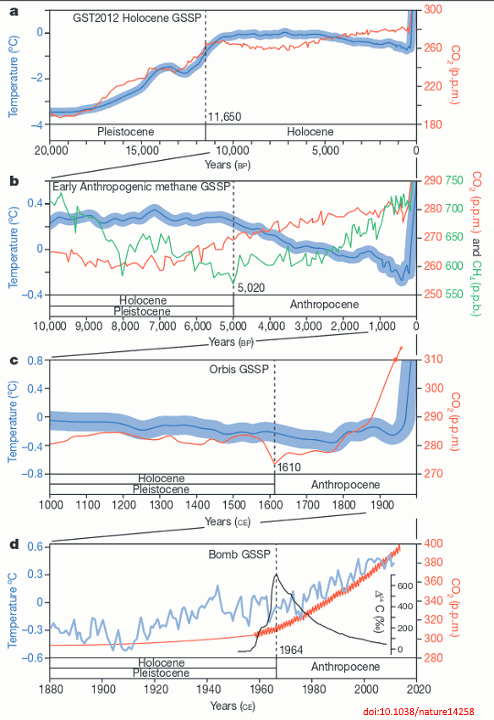
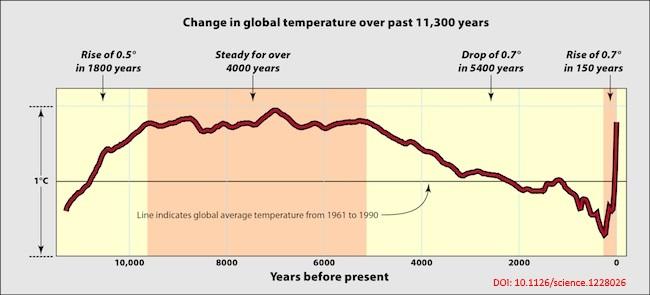
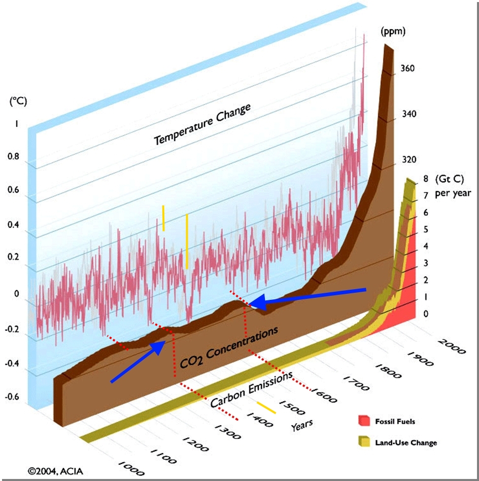
Besides. Does this really look like a 1000-year natural cycle to you?
Another way to approach the question is this: which of the following explanations is stronger? And how much so?:
- CO2 causes warming, warmer air holds more water vapor, and water vapor causes more warming. ---> CO2 caused the recent warming.
- There are cycles that doesn't show up in the paleoclimate data, that we have no reason to expect, and these are causing the recent warming.
Of course, it's not all-or-nothing; obviously it could be a mix of the two. But given the data, the Milankovitch cycles would have us cooling right now, not warming -- see the last 5 millennia. So the other natural cycles would need to counteract the Milankovitch cycles, and then some.
Here's other sites with even more information than I've run across before on the 1000 year cycles ...
http://www.longrangeweather.com/global_temperatures.htm
and
http://www.nature.com/articles/srep03611
and
http://jonova.s3.amazonaws.com/graphs/lappi/gisp-last-10000-new.png
If you don't like the IPCC's numbers then take it up with them.
NOAA's adjustments reduce the long-term warming trend.
See figure 2 in the famous Karl et al paper published last summer in the journal Science.
I used the IPCC's numbers, thanks! They refute you!
Best,
D
Chapter 5, Subchapter 5.3.5 Temperature Variations During the Last 2000 Years, Figure 5.7
Yes, I use this figure quite often. And?
Best,
D
Then you either need to work on your reading comprehension or graphical interpretation skills. Why don't you toddle on out and let the adults talk until and unless you ever have something of substance to offer?
So you can't explain why this figure gives you good feels?
Weird.
Best,
D