Posts tagged ‘survival rates’

Actually Dr. Krugman, They Are Unrelated

Via Cafe Hayek, Paul Krugman says:

And surely the fact that the United States is the only major advanced nation without some form of universal health care is at least part of the reason life expectancy is much lower in America than in Canada or Western Europe.

If I were a cynical person, I might think that the tortured and overly coy syntax of this statement is due to the fact that Krugman knows very well that the causation he is implying here is simply not the case.  Rather than rehash this age-old issue here on Coyote Blog, let's roll tape from a post a few years ago:

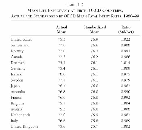
Supporters of government medicine often quote a statistic that shows life expectancy in the US lower than most European nations with government-run health systems.  But what they never mention is that this ranking is mainly due to lifestyle and social factors that have nothing to do with health care.  Removing just two factors - death from accidents (mainly car crashes) and murders - vaults the US to the top of the list.  Here, via Carpe Diem, are the raw and corrected numbers:

lifeexpectancy

And so I will fire back and say, "And surely the fact that the United States is the only major advanced nation without some form of universal health care is at least part of the reason life expectancy related to health care outcomes is so much higher in America than in Canada or Western Europe.

And check out the other chart in that post from that study:

US cancer survival rates dwarf, yes dwarf those of other western nations.    Even black males in the US, who one would suppose to be the victims of our rapacious health care system, have higher cancer survival rates than the average in most western nations (black American women seem to have uniquely poor cancer survival rates, I am not sure why.  Early detection issues?)

All this data came originally from a post at Carpe Diem, which I refer you to for source links and methodologies.

Thought for the Day - Health Care and Education

The most frequent justification I see from the Left for increasing government involvement and control of the health care system is that the US spends more per capita on health care than any other country but apparently gets little extra benefit from the spending in terms of health outcomes**.

Intriguingly, the exact same statement can be made of the American education system, which is already nearly fully nationalized.  We spend more per capita than any other country and get only middling results.  I wonder why those who use high spending with modest results as a justification for rethinking the health care system do not come to the same conclusion for the public education system?

To some extent, the US spends more on education and health care because we think are critical and because we are wealthier.  We spend on items way down the Pareto chart where we get less bang for the buck because we can.   And to my mind, it's no coincidence that both health care and education are dominated by third part expenditures.  Take the price value decision making out of the ultimate consumers hands, and, well, the whole price-value equation is bound to get screwed up.

** There are several reasons US often looks bad in these health comparisons.  The first is that we have a lot of life-shortening habits (eating, smoking, driving, crime) completely out of control of the health care industry.  So our lifespans are shorter, but control for those exogenous factors and our health care system looks among the best.  Check out this data, which shows that correcting for crime and accidents, US has the highest life expectancy in the world.

The other problem is the data is often cherry-picked by academics sympathetic to the state health care model.  As seen in the link above, we have the highest cancer survival rates in the world, and the highest life expectancy for people who reach 65.   Even our supposed out-groups, such as black males, have higher cancer survival rates in the US than the average in most European countries.  But you seldom see these metrics included in comparisons.

I also refer you to an oldie but goodie, showing how a study failed to correct for differences in lifestyles between countries.

I Do Not Think That Word Means What You Think It Means

Today's word in question:  "safe"

The Environmental Protection Agency is holding public hearings today to review a proposed safe exposure limit for dioxin, a known carcinogen and endocrine disruptor produced as a common industrial byproduct.

It's all but impossible to avoid exposure to dioxin. Research done by the Environmental Working Group has shown that adults are exposed to 1,200 times more dioxin than the EPA is calling safe "” mostly through eating meat, dairy and shellfish "” and mothers pass it on to babies in the womb and in breast milk. A nursing infant ingests an amount 77 times higher than what the EPA has proposed as safe exposure. (Formula is also widely contaminated with the stuff.)

If you tell me that despite falling cancer incidence and survival rates and longer life-spans, we are all exposed to a chemical at 1200x its "safe" level, I might argue that we have defined the safe level too low.  Of course, the author draws just the opposite conclusion, arguing the standard needs to be tightened.

Two observations

  1. Things are getting better.  Apparently dioxin emissions (mostly from burning trash) have fallen by 90+% over the last twenty years.  In the blog post above, the author lambastes the EPA for dragging its feet on this standard for 30 years, but the lack of it sure does not seem to have been a problem

  2. I am not sure how setting a dioxin standard by the EPA is going to help.  Since most dioxin makes its way into the food chain (such as into dairy products), I suppose this would then give the government license to pound dairy farmers for the dioxin content of their products.  But what does this get us, and how is this the dairy farmers' fault?  For the last 30 years, as described at this site, the EPA and voluntary efforts by emitters have been working step by step through the pie chart above, knocking off the worst emitters.   You can see that clearly in the change of mix and the overall reduction.  This seems like a smart strategy.

The Oft-Missed Component When Evaluating European Socialized Health Care

Yes, the Europeans pay less per person for health care.  Is the care as good?

Well, when life-expectancies are adjusted for things that are not amenable to the health care system (like murder rates), Americans have the highest life expectancy in the world, and by far the highest cancer survival rates.

The prices we pay for drugs and medical devices, while high, effectively subsidize the entire world's medical R&D.

Oh yes, and we don't have to wait 6 months to get treated.  The wait time issue is often poo-poo'd by elites in the political debate, but it seems to be an important issue for real people:

In a survey, people were asked how they felt about various forms of medical care for a urinary tract infection or for influenza. While people preferred traditional, office-based care, they would opt to see a nurse-practitioner at a retail clinic if they could save at least $31.42. They would wait one day or more for an appointment if they would save at least $82.12.

The researchers concluded that the appointment wait period is the most important determining factors in an individual's choice on where to seek care for minor health problems such as influenza. Primary-care doctors who fear their business will be undercut by the growing popularity of retail health clinics may want to offer more same-day appointments and walk-in hours."
...


"This study is the first in the United States to quantify the relative importance of and the utility associated with the main attributes of retail clinics. The utility (willingness to pay) associated with receiving same-day care is more than twice the utility associated with receiving care from a physician. Primary care physician practices, especially in competitive markets, are therefore likely to derive greater competitive advantage by addressing patient convenience features (such as same-day scheduling, walk-in hours, and extended hours) than by reducing fees."

Follow the link for more and a link to the original study.  Patient convenience is the LAST thing government health care systems design for, but apparently, what actual people most want.

I say over and over, yes, we could reduce the cost of medical care (but by increasing the accountability of individuals for paying for their own care, exactly the opposite direction taken by the Obama plan).  But a big reason that we pay more is not because we are stupid and incompetent, but because we can because we are wealthier.  It is incontrovertible that we are wealthier per capital than the Europeans -- is it surprising that we would choose to spend a large portion of this extra wealth on our health?

US Medicine -- Best In The World

Supporters of government medicine often quote a statistic that shows life expectancy in the US lower than most European nations with government-run health systems.  But what they never mention is that this ranking is mainly due to lifestyle and social factors that have nothing to do with health care.  Removing just two factors - death from accidents (mainly car crashes) and murders - vaults the US to the top of the list.  Here, via Carpe Diem, are the raw and corrected numbers:

lifeexpectancy

The Mark Perry post linked above has links in turn to the study itself and its methodology.  You may have seen stats that say that, using raw data, the US has the best life expectancy once you reach age 65.  This is just another way of correcting out higher accident and murder rates, as these tend to affect younger folks.

My guess is that if one corrected for other lifestyle issues and environmental factors that increase the incidence rates of things like heart disease in the US (discussion here), then the US lead would be even more stark.  If one takes the left at its word that the US starts in a health care "hole" with poor diet, obesity, environmental problems, etc., then the US medical care system, despite starting in a hole, is able to still raise US life expectancies above other countries.

One big reason is cancer survival rates, which dwarf those in Europe.  It is at such leading and expensive edges of medicine where one might expect the US system to get much better results, and it does.

But it is often said that this is only for the rich -- that the poor in the US don't benefit.  Well, this is a difficult proposition to test, as income mobility (which is very real in this country no matter how much the left denies it) makes correlation of income (say by quartile) and life expectancy impossible.  During a person's lifetime, they might inhabit several different quartiles.

A proxy I think the left might accept is one  of race.  If one assumes that African-Americans are among the systematically disenfranchised in the health care system, then it should show up in their stats.  The results are something that gives ammunition to both sides of the debate.

cancer

Clearly, there are two tiers, as African Americans have poorer cancer survival rates than white Americans.  But, for many types of cancer, African-Americans have higher survival rates than they would in many European countries.

This is the endless do-loop of inequality debates.  Is inequality OK if it results the folks lower on the totem pole being better off than in a more egalitarian society.  For me, the answer seems obvious.  Absolute well-being seems far more meaningful than relative well-being.  But I am not necessarily in the strong majority on this.  I had a professor that used to poll his class -- he would ask them if they would prefer a society where the gap between rich and poor was narrower but where the poor were, on an absolute basis, worse off than in the less equal society.  He reported the vote almost always split about 50/50.  (of course the is a purely utilitarian formulation of the question.  Adding in individual liberties issues makes the question far more stark, as to achieve an egalitarian society one must give up both wealth and liberty.)

Why Does The US Appear to Have Higher Infant Mortality?

I am sure you have seen various rankings where the US falls way behind other western nations in terms of infant mortality.  This stat is jumped on by the left as justification for just how cold and heartless America is, and just how enlightened socialized medicine must be.  However, no one seems to bother to check the statistic itself (certainly the media is too incompetent to do so, particularly when it fits their narrative).  Statistics like this that are measured across nations are notoriously unreliable, as individual nations may have different definitions or methods for gathering the data.

And, in fact, this turns out to be the case with infant mortality, a fact I first reported here (related post on medical definitions driving national statistics here).  This week, Mark Perry links to an article further illuminating the issue:

The main
factors affecting early infant survival are birth weight and
prematurity. The way that these factors are reported "” and how such
babies are treated statistically "” tells a different story than what
the numbers reveal.  Low
birth weight infants are not counted against the "live birth"
statistics for many countries reporting low infant mortality rates.

According
to the way statistics are calculated in Canada, Germany, and Austria, a
premature baby weighing less than 500 kg is not considered a living
child.

But
in the U.S., such very low birth weight babies are considered live
births. The mortality rate of such babies "” considered "unsalvageable"
outside of the U.S. and therefore never alive
"” is extraordinarily
high; up to 869 per 1,000 in the first month of life alone. This skews
U.S. infant mortality statistics.Norway
boasts one of the lowest infant mortality rates in the world. But when
the main determinant of mortality "” weight at birth "” is factored in,
Norway has no better survival rates than the United States....

In the United States, all infants who show signs of life at birth
(take a breath, move voluntarily, have a heartbeat) are considered
alive.

If a child in Hong Kong or Japan is born alive but dies within the
first 24 hours of birth, he or she is reported as a "miscarriage" and
does not affect the country's reported infant mortality rates....

Efforts to salvage these tiny babies reflect this classification. Since
2000, 42 of the world's 52 surviving babies weighing less than 400g
(0.9 lbs.) were born in the United States.

Hmm, so in the US we actually try to save low-birthweight babies rather than label them unsalvageable.  Wow, we sure have a cold and heartless system here.  [disclosure:  My nephew was a very pre-mature, very low-birthweight baby who could have fit in the palm of your hand at birth and survived by the full application of American medical technology.  He is doing great today]

Uncovering Some Really Bad Science

Kevin Drum thinks he has a killer analysis supporting government health care.  In a post he titles sarcastically "Best Healthcare In the World, Baby," Drum shares this chart:
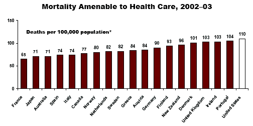
Blog_deaths_amenable_healthcare

The implication is that the US has the worst healthcare system, because, according to this study, the US has the highest rates of "amenable mortality," defined as deaths that are "potentially preventable with timely and effective health care."

I get caught from time to time linking to studies that turn out to have crappy methodology.  However, I do try to do a little due diligence each time to at least look at their approach, particularly when the authors are claiming to measure something so non-objective as mortality that was "potentially preventable."

So, when in doubt, let's look at what the author's have to say about their methodology.  The press release is here, which gets us nowhere.  From there, though, one can link to here and then download the article from Health Affairs via pdf  (the site is gated but I found that if you go through the press release site you can get in for free).

The wording of the study and the chart as quoted by Mr. Drum seem to imply that someone has gone through a sampling of medical histories to look at deaths to decide if they were preventable deaths.  Some studies like this have been conducted.  This is not one of them.  The authors do not look at any patient data.

Here is what they actually did:  They arbitrarily defined a handful of conditions as "amenable" to care.  These are:

Ischemic Heart Disease (IHD)
Other circulatory diseases
Neoplasms (some cancers)
Diabetes
Respiratory diseases
Surgical conditions and medical errors
Infectious Diseases.
Perinatal, congenital, and maternal conditions
Other (very small)

All the study does is show how many people died in each country from this set of diseases and conditions.  Period.  It doesn't determine if they got care or if they in particular could have been saved, but just that they died of one of the above list of conditions.  This study was not an effort to identify people who died when their particular condition should have been preventable or amenable to care;  all it measures is the number of people in each country who died from list of conditions.  If Joe is talking to me and in the next second flops over instantly dead of a massive heart attack, the author's consider him to have died of a disease amenable to care.

We can learn something by looking at the breakdown of the data.  If you can't read the table below, click on it for a larger version
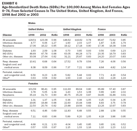
Amenablediseases_2

Let's take the data for men.   The study makes a big point of saying that France is much better than the US, so we will use those two countries.   In 2003, France has an "amenable disease" death rate 56 points lower than the US.  But we can see that almost this whole gap, or 42 points of it, comes from heart and circulatory diseases.  The incidence of these diseases are highly related to diet and lifestyle.  In fact, it is well established that the US has a comparatively high incidence rate of these diseases, much higher than France.  This makes it entirely possible that this mortality difference is entirely due to lifestyle differences and disease incidence rates rather than the relative merits of health care systems. In fact, this study is close to meaningless.  If they really wanted to make a point about the quality of health care systems, they would compare them on relative mortality with a denominator of the disease incidence rate, not a denominator of total population.

But in their discussion, the study's authors reveal themselves to be, if I am reading them right, complete idiots in terms of statistical methods.  The authors acknowledge that lifestyle differences may be a problem in their data.  This is how they say they solved this problem:

It is important to recognize that the development of any list of indicators of amenable mortality involves a degree of judgment, as a death from any cause is typically the final event in a complex chain of processes that include issues related to underlying social and economic factors, lifestyles, and preventive and curative health care. As a consequence, interpretation of findings requires an understanding of the natural history and scope for prevention and treatment of the condition in question. Thus, in the case of IHD, we find accumulating evidence that suggests that advances in health care have contributed to declining mortality from this condition in many countries, yet it is equally clear that large international differences in mortality predated the advent of effective health care, reflecting factors such as diet and rates of smoking and physical activity.16 To account for this variation, we included only half of the mortality from IHD, although, based on the available evidence, figures between, say, 25 percent and 70 percent would be equally justifiable.

I have a very smart reader group, so my sense is that many of you already see the gaffe here.  The author's posit that 50% of heart disease may be due to lifestyle, though the number might be higher or lower.   So to correct for this, they reduce every country's heart disease number (IHD) by a fixed amount of 50%.  WTF??  This corrects for NOTHING.  All this does is reduce the weighting of IHD in the total measure. 

Look, if the problem is that lifestyle contribution to heart disease varies by country, then the percentage of IHD deaths that need to be removed because the deaths are lifestyle related will vary by country.  If the US has the "worst" lifestyle, and the number for lifestyle deaths is about 50% there, it is going to be less than 50% in every country.  The correction, if an accurate one could be created, needs to be applied to the variance between nations, not to the base numbers.  Careful multiple regressions might or might not have sorted the two sets of causes apart, but dividing by 50% doesn't do anything.  This mistake is not just wrong, it is LAUGHABLE, and calls into question the author's qualification to say anything on this topic.  They may be fine doctors, but they don't know squat about data analysis.

There may be nuggets of concern for the US lurking in this data.  I don't know how they measure deaths from surgical conditions and medical errors, but its not good to be higher on this.  Though again, you have to be careful.  The US has far more surgeries than most other countries per capita, so we have more surgical deaths.  Also, medical error data is notoriously difficult to compare country to country because reporting standards and processes are so different.  In the US, when the government measures medical errors, it is a neutral third party to the error.  In Europe, the government, as healthcare provider, is often the source of the error, calling into question how aggressive these countries may be in defining "an error."  Infant mortality data is a good example of such a trap.  The US often looks worse than European nations on infant mortality because it is defined as infant deaths as a percentage of live births.  But the US has the most advanced neo-natal capabilities in the world.  Many pregnancies that would result in a "born dead" in other countries result in a live birth in the US.  Since these rescued births are much more problematic, their death rate is much higher.

There is good news for the US in the study.  The item on this list most amenable to intensive medical intervention is cancer (neoplasms in the study above).  In that category, despite a higher incidence rate than many of these countries, the US has one of the lowest mortality rates as a percentage of the total population, which implies that our cancer mortality in the US as a percentage of cancer incidence is much better than these countries.  This shows our much higher 5-year cancer survival rates.

Update:  I thought this was pretty clear, but some of the commenters are confused.  The halving of IHD numbers was applied to all countries, not just the US.  So the actual male US IHD number is about 100 before halving and the actual French number is about 40.  Again, this halving only reduces the weighting of IHD in the total index; it in no way corrects for differences in incidence rate.