Posts tagged ‘BLS’

Yet Again, Forgetting the Mix

I like reading Zero Hedge, though their laudable cynicism about government and financial markets sometimes edges into conspiracy theory.

Anyway, I wanted to highlight something in a post there today about BLS data.  Various writers at the site have claimed for years that government economic data is being manipulated.  I am not sure I buy it -- I distrust government a lot but am not sure their employees could sustain such a fraud over months and years.  And besides, once you manipulate data one time to juice some metric, you have to keep doing it or the metric just reverses the next month.   Corporations that play special quarter-end inventory games to increase reported sales learn this very quickly.  Where there are apparent errors, I am much more willing to assume incompetence than conspiracy.

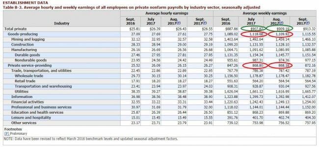
The example this week is from the BLS payrolls data, and I will quote from the article and show their chart:

Another way of showing the July to August data:

  • Goods-Producing Weekly Earnings declined -0.8% from $1,118.68 to $1,109.92
  • Private Service-Providing Weekly Earnings declined -0.1% from $868.80 to $868.18
  • And yet, Total Private Hourly Earnings rose 0.2% from $907.82 to %909.19

What the above shows is, in a word, impossible: one can not have the two subcomponents of a sum-total decline, while the total increases. The math does not work.

Certainly this is an interesting catch and if I were producing the data I would take these observations as a reason to check my work.  But the author is wrong to say that this is "impossible".  The reason is that these are not, as he says, two sub-components of a sum. They are two sub-components of a weighted average.  Total private average weekly earnings is going to be the goods producing weekly average times number of goods producing hours plus service producing weekly average times the number of service producing hours all over the total combined hours.

From this I hope you can see that even if the both sub averages go down, the total average can go up if the weights change.  Specifically, the total average can still go up if there is a mix shift from service providing to goods producing hours, since the average weekly wages of the latter are much higher than the former.  I will confess it would have to be a pretty big jump in mix.  The percent goods producing hours would have to rise from 15.6% to almost 17%, which strikes me as a very large jump for one month.  So I am not claiming this is what happened, but people miss the mix changes all the time.  I had to explain it constantly back in my corporate days.   Another example here.
Why Minimum Wage Increases are a Terrible Anti-Poverty Program

The other day when I expressed my (temporary) ennui about blogging, I said I was tired of posting about things like "why the minimum wage is a terrible anti-poverty program" and getting back one line comments such as "you hate poor people."  In looking back at that post, I realize I actually haven't put in one place my reasons why minimum wage increases are a bad way to fight poverty.  So here they are:

1.  Only a tiny minority of workers make the minimum wage.  Something like 5% of hourly workers, and 3% of all workers, are paid minimum wage or less.  This number is not quite right for two reasons.  One, many states have higher minimum wages than the Federal rate and this analysis by the BLS is done at the Federal rate only.  Thus this understates the number of minimum wage workers in those higher minimum wage states.  But, these numbers also exclude tips, which about half these workers receive.  If one reasonably includes tip income, these numbers are overstated.  On balance, if one looks carefully state by state and excludes workers who get tips, the percentage of all workers who make the minimum wage holds around 3%.

Further, about half (53% by the source above) of minimum wage earners are 24 years old and under.  These are not the folks activists generally picture when they say "A family cannot live on that wage..."   Thus only about 1.5% of all workers are people 25 and older making minimum wage.  The target for this "anti-poverty" program is thus truly tiny.

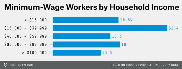
2.  Most minimum wage earners are not poor.  The vast majority of minimum wage jobs are held as second jobs or held by second earners in a household or by the kids of affluent households (source)

casselman-minwage


Most of the data I have seen points to about a third of minimum wage jobs held by earners in families below the poverty line.  So 2/3 of the increased wages from a minimum wage increase go to non-poor households (it is actually probably more than this given #4 below).

3.  Most people in poverty don't make the minimum wage.  In fact, the typically hourly income of the poor appears to be around $14 an hour.  The problem is not the hourly rate, the problem is the availability of work.  The poor are poor because they don't get enough job hours.

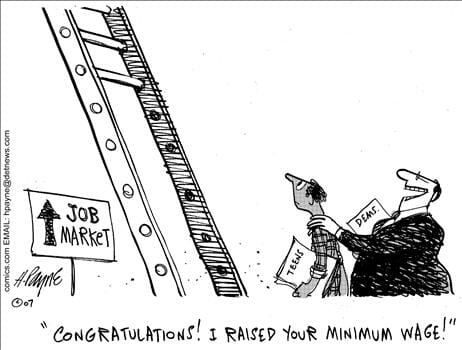
4. Minimum wage increases kill unskilled labor hours.  You can certainly find Leftish studies that point to niche situations where a minimum wage increase maybe kindof didn't hurt employment.  But in general I think most people understand that when you raise the price of something, people will use less of it.  In this case, businesses will find ways to hire less unskilled labor as the price of such labor rises with the minimum wage.  Even if businesses hire the same number of people after a minimum wage increase, they likely will demand and get more skilled and experienced employees for this money, which likely will leave the poor out in the cold just as much as if the job were eliminated.

minwage


If one replaces the words "minimum wage" with "starting wage for new unskilled workers", the problem becomes more obvious.

5. Minimum wage laws ignore substantial non-monetary benefits of entry-level jobs.   Many young workers or poor workers with a spotty work record need to build a reliable work history to get better work in the future, just as a young couple must build their credit history with small purchases before they can take out a mortgage.  Further, many folks without much experience in the job market are missing critical skills -- by these I am not talking about sophisticated things like CNC machine tool programming.   I am referring to prosaic skills you likely take for granted (check your privilege!) such as showing up reliably each day for work,  overcoming the typical frictions of working with diverse teammates, and working to achieve management-set goals via a defined process.  I wrote a lot more about these here.  By defining acceptable compensation of jobs only as dollars of pay rather than to include softer skills and such, these wages disproportionately discriminate against unskilled and inexperienced workers.

Your Arguments Are Totally Idiotic, Which I Know Even Though I Didn't Read Your Article

Since I am not a very large blogger, and not overtly political (most of the time), I seldom have my articles end up in organized trolling campaigns.  But over the last week I had a flood of comments on this three-year-old article about teacher salaries.  This sudden interest in an old article (particularly when many others more prominent than I have written on the topic more recently) puzzled me until I saw that the Center for American Progress had come out with a study saying that, surprise, teacher salaries were way too low.

I seldom participate in comments wars on my own articles, and prefer to post updates or clarifications in the article itself for all to see.  However, this was particularly frustrating when it was clear that most commentators were coming to the site with some preconceived notion of what the article said, and did not feel the need to actually read the article before commenting.  So, we end up with numerous folks saying "what about all the overtime work", as if I totally ignored that thought and hadn't even considered it, when there was a whole section on teacher overtime in the article.  I finally lost it when I got a comment that said "I don't know where this guy gets his numbers..."  This is a total cop-out response I see in comments all the time.  It allows one to imply the numbers are shady or unsourced without having to actually provide specific criticisms of the data.  I responded:

On the Internet, underlined bits of text, often in a different color, are called “links”.  By clicking on these “links” with your cursor, you will go to other sites.  In the case of this article, the source of data are all from the BLS, a part of the Federal Department of Labor.  The “links” will take you directly to the pages where the data was taken (though since 3 years have passed the links may lead you to newer versions of the data). 

There were also a number of comments along the lines of "well, I don't make anything like those numbers" to which I was forced to respond

In a distribution of millions of values, all the values in the distribution don’t normally match the average.  Some will be above and some will be below.  Though an average is different from a median, it is fairly safe to assume that something like half** of teachers make less than the numbers in the article and half make above those numbers.  As discussed in my second update, if you are in a rural area, you are more likely to be in the “below” category.  If you are in an urban area, you are more likely to be above

** with salary data, since the floor is typically closer to the average than the ceiling (salaries can't go below zero but can in theory go infinitely high), the median is generally below the mean, so likely more than half of teachers make less than the average.

The Teacher Salary Myth -- Are Teacher Underpaid?

My new column in Forbes addresses a topic I wrote about over 6 years ago, and got a ton of feedback on.

The problem with salaries for government workers like teachers is that, in a monopoly (particularly one enforced by law), the usual checks and balances on compensation simply don’t exist.  Let’s say a private school gives its teachers a big raise, and has to raise its tuitions to pay for those higher salaries.  Parents are then left with a choice as to whether to accept the higher tuitions, or to look elsewhere.  If they accept the higher fees, then great — the teachers make more money which is justified by the fact that their customers percieve them to be offering higher value.  If they do not accept the higher tuition, the school withers and either changes its practices or goes out of business.

But what happens when the state overpays for teachers (or any government employee)?  Generally, the govenrment simply demands more taxes.  Sure, voters can push back, but seldom do they win in a game dominated by concentrated benefits but dispersed costs.  On a per capita basis, teachers always have more to fight for than taxpayers, and are so well-organized they often are one of the dominant powers in electing officials in states like California.  This leads to the financially unhealthy situation of a teachers’ union negotiating across the table from officials who owe their office to the teachers’ union.

We might expect this actually to lead to inflated rather than parsimonious wages.  To see if this is true, we have a couple of different sources of data within the Bureau of Labor Statistics (BLS) to help us.

Click through to see the numbers, which tell the story pretty clearly

More Thoughts On Recent Employment Losses

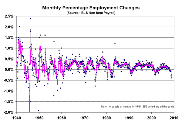
I posted some data this morning showing the current jobs report ranked not on absolute job losses but as a percentage of the total work force.  I have now pulled the whole data set from the BLS, which goes back to about 1939, and this is what the entire monthly series looks like of employment changes as a percentage of total employment (the purple line is a 3-month moving average).

jobs1

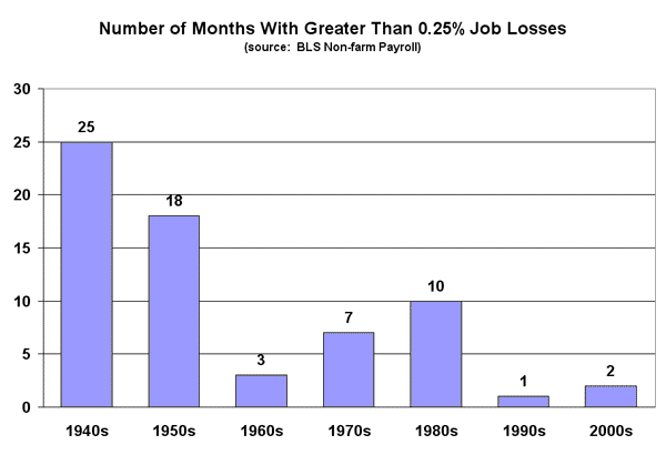
Folks familiar with this data base may know of reasons the data has become less volatile (perhaps improved seasonal adjustments?) but never-the-less, I have a hard time reconciling this with the popular leftish notion that the decline of traditional American manufacturers (e.g. autos) and unions have led to increasing risk and job/income volatility.  I played around with a couple of ways to summarize the trends.  Here is the number of substantially negative (monthly losses greater than 0.25% of the workforce) jobs reports per decade:

jobs2

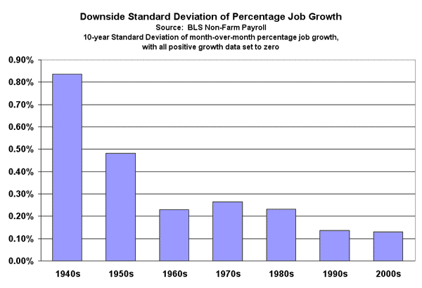
And here is a metric of the volatility of the jobs number.  Since most folks don't really buy the classic economic argument that "risk" equates to volatility up or down, but feel that risk is only to the downside, I have looked at what is sometimes called the downside standard deviation of the jobs change numbers, in which all monthly data greater than zero are set to zero, and then a normal standard deviation is taken on the data.

jobs3

Um, I Think It is Time To Introduce You to the Term "Incremental"

The US Conference of Mayors has introduced a "study" extending on Obama's idea of millions of new green jobs:

A major shift to renewable energy and efficiency
is expected to produce 4.2 million new environmentally friendly "green"
jobs over the next three decades, according to a study commissioned by
the nation's mayors.

The study to be released Thursday by the U.S. Conference of Mayors,
says that about 750,000 people work today in what can be considered
green jobs from scientists and engineers researching alternative fuels
to makers of wind turbines and more energy-efficient products.

But that's less than one half of 1 percent of total employment. By
2038, another 4.2 million green jobs are expected to be added,
accounting for 10 percent of new job growth over the next 30 years,
according to the report by Global Insight, Inc.

Well, lets leave aside the measurement issue of making forecasts and establishing targets for metrics like "green jobs" that can be defined however the hell someone wants.  For example, if they really were to define "green jobs" as they say above "makers of ... more energy-efficient products," then nearly everyone in industrial America already has a green job.  Every car made today is more fuel-efficient than the equivalent car made 20 years ago, every motor more efficient, every machine more productive.

But lets discuss that word "incremental."  Politicians NEVER, EVER cite job growth projections that are truly incremental.  For example, tariff program X might be billed as saving 100 jobs in the steel industry, but what about the jobs lost in the steel-consuming industries due to higher costs?  The same is most certainly true in this whole "green jobs" fiasco.  It is the perfect political promise - impossible to define, impossible to measure, and therefore impossible to establish any accountability.  Everyone who makes the promise knows in his/her heart the jobs are not truly incremental, while everyone who hears the promise wants to believe they are incremental.  Politics thrives on this type of asymmetry.

I looked before at the impossibility of these numbers being incremental, but here is a second bite of the apple.  The article says specifically:

The report, being presented at a mayor's conference in Miami, predicts
the biggest job gain will be from the increased use of alternative
transportation fuels, with 1.5 million additional jobs, followed by the
renewable power generating sector with 1.2 million new jobs.

Let's take the second number first.  Here are the current US employment numbers for the US power generation field:

Construction of power generation facilities:           137,000
Power generation and supply:           399,000
Production of power gen. equipment           105,000

That yields a total of 641,000.  So is it really reasonable to think that these green plans will triple power generation employment?  If so, then I hate to see what my electricity bill is going to look like.

The fuel sector is similar.  There are about 338,000 people employed in petroleum extraction, refining, transportation and wholesale -- a number that includes many people related to other oil products that are not fuels.  Add in about 100,000 for industry supplies and you get perhaps 450,000 jobs current tied to fuel production plus 840,000 jobs in fuel retailing (ie gas stations).  How are we going to add 1.5 million net new jobs to a fuel production sector with 450,000** currently?  And if we do, what is going to happen to prices and taxes?  And if the investments push us away from liquid fuels to electricity, don't we have to count as a loss 840,000 retail sector jobs selling a product no longer needed?

** Your reaction may be that these job numbers look low.  They are all from the BLS here.  Here is a quick way to convince yourself there really are not that many people working in the US oil and gas industry:  Despite years of mismanagement and government subsidies, politicians continue to fawn over auto companies.  Despite years of excellence at what they do, politicians demonize oil companies.  The reason has nothing to do with their relative performance, ethics, importance to the country, greed, etc.  The difference is that the auto companies and their suppliers employ millions of voters.  Oil companies employ but a few.

This is such ridiculous garbage as to be unbelieveable, but every paper in the country will print this credulously.  Because if journalists were good with numbers, they wouldn't be journalists, they'd be doing something that pays better.

Minimum Wages and the Supply and Demand for Labor

In a post that is a nice follow-on to this one about wages in trucking, Russel Roberts has a nice post about people making minimum wage:

According to Current Population Survey estimates for 2006, 76.5
million American workers were paid at hourly rates, representing 59.7
percent of all wage and salary workers.1
Of those paid by the hour, 409,000 were reported as earning exactly
$5.15, the prevailing Federal minimum wage. Another 1.3 million were
reported as earning wages below the minimum.2
Together, these 1.7 million workers with wages at or below the minimum
made up 2.2 percent of all hourly-paid workers.

Correcting for higher state minimum wages, but also adjusting for illegal immigrants (who are a special case with super-low bargaining power) and factoring in salaried workers (who by law to be salaried have to be making much more than minimum wage) one still finds that less than 2% or less make minimum wage, about half of whom are under 25.  Roberts has a follow-on post with comments from Tim Worstall to say that even this number may be too high:

Unfortunately, on the page he's taken his information from he's missed one thing which makes his case even stronger.

Nearly three in four workers earning $5.15 or less in 2006 were
employed in service occupations, mostly in food preparation and service
jobs.

That's your waitron units and barkeeps folks. And what do we know
about people who do these sorts of jobs? Well, perhaps you have to have
actually done them (as I have, everything from the graveyard shift in a
Denny's to tending bar around the corner from this guy's
place): they all make tips. In fact, so much so that there is (or at
least used to be when that BLS report was prepared) a special minimum
wage for those in such jobs, one lower than the official Federal
minimum wage.

For example, way back when, the min. wage was $3.35 an hour. Waiters
got $2.01. You didn't really care because even serving pancakes at 5 am
you made another $25-$30 a shift ($50-$150 in a decent place). Barkeeps
got $3.35 plus tips.

The BLS numbers are reporting what employers paid employees, not
what people are actually earning. So we might in fact say that while
the number being paid the minimum wage or less is 2.2% of the workforce, the number actually earning that figure is more like 0.5%.

As an aside, speaking of bargaining power, it strikes me that prostitution is an excellent example of supply and demand in labor markets trumping government mandates.  Prostitutes have absolutely no power to run to the government for help over minimum wage or work condition violations.  They have only limited power to get government help even when they are the victim of violence from those who pay them.  But on an hourly basis, the most succesful make far more than most Americans.

Those Dang Illegal Immigrants Taking All of Our Jobs

Via TJIC and Mark Perry come this excellent observation:

State unemployment rates for April were released last week by the
BLS, and there are now 18 states that have set historical record-low
jobless rates in the last year

Here are the 18 states with historical record-low jobless rates"¦

"¦California: 4.7% in November 2006
"¦Arizona: 3.9% in March 2007
"¦New Mexico: 3.5% in February 2007
"¦Texas: 4.2% in April 2007"¦

I wonder where our economy would be without those 15 million Mexican immigrants.  Negative unemployment?