Extrapolating Trends from A Single Data Point: The Once In A Lifetime Event
Most of you know I agree there is man-made global warming but am skeptical the extent will be anywhere near most forecasts you see in the media. For some reason, this earns me the title of "denier." However, I find that the climate discussion has become boring in the extreme, and I have mostly moved on from it. But I am still interested in analytical abuses in the media, and long-time readers will know that my favorite is the positing of a trend using but a single data point. My example today happens to be from climate.
It starts with this tweet:
As extreme weather events become more common, we're living through "once in lifetime storms" every year. Our most immediate understanding of their severity is loss of life and damages.
— March for Science (@ScienceMarchDC) September 18, 2018
Obviously he is reacting to the recent hurricane in North Carolina, which turns out to be pretty run of the mill but the media has portrayed as some sort of armageddon. I could have pulled roughly similar quotes from all kinds of sources. Several networks did long pieces over the weekend claiming an upward trend in hurricanes without any trend data, but merely from the fact that one made landfall recently. But anyone who claims be defending science should be held, I think, to a higher standard in making scientific claims.
As I asked the March for Science tweeter: If, say, there is a trend towards more or stronger hurricanes, why does no one ever show a trend chart? They just declare the trend from one data point, like a single hurricane landfall. Every long-term hurricane & cyclonic energy trend chart I have seen is flat to down. (This is not primarily a climate post but I will post some hurricane trend charts at the end).
There is certainly an upwards trend in the media labelling storms as "once in a lifetime" but it is doubtful that there is actually an underlying trend in storm severity. Even the slightly more meaningful term "100-year _____" is abused.
Consider a 100-year flood in North Carolina, almost certainly a once in a lifetime event for someone in that state unless they live really long. Since North Carolina is .027% of the world's landmass, there will be, on average, 37 hundred-year floods over land areas the size of North Carolina every single year. That's 37 once-in-a-lifetime North-Carolina-sized floods somewhere in the world every single year. Heck, there should be 3-4 thousand-year floods of North Carolina size somewhere in the world every year -- that's three or four once in a millenium floods! And this same math applies to 100-year heat waves, droughts, snow storms -- you name it.
We can learn a couple of things from this. First, living through "once in a lifetime" storms every year, somewhere in the world, is not abnormal -- it is expected. Second, one can see how choices in media coverage could drive an apparent trend. If the media covered maybe 3 or 4 of these 37 floods when I was young, but covers every one today, it will appear that there is a trend since I hear so much more about them. But in fact, nothing will have changed except the media. I will remind you what I wrote on this topic waaaay back in 2012.
Let's take a step back to 2001 and the "Summer of the Shark." The media hysteria began in early July, when a young boy was bitten by a shark on a beach in Florida. Subsequent attacks received breathless media coverage, up to and including near-nightly footage from TV helicopters of swimming sharks. Until the 9/11 attacks, sharks were the third biggest story of the year as measured by the time dedicated to it on the three major broadcast networks' news shows.
Through this coverage, Americans were left with a strong impression that something unusual was happening -- that an unprecedented number of shark attacks were occurring in that year, and the media dedicated endless coverage to speculation by various "experts" as to the cause of this sharp increase in attacks.
Except there was one problem -- there was no sharp increase in attacks. In the year 2001, five people died in 76 shark attacks. However, just a year earlier, 12 people had died in 85 attacks. The data showed that 2001 actually was a down year for shark attacks.
Once you start looking for this type of thing, the extrapolation of a trend from at most one data point, you will see it everywhere.
For those still hanging around to the end, here are a couple of actual trend charts on hurricanes (the adjusted line attempts to correct for the fact that earlier eras with no satellites or radar tended to miss some hurricanes) (source at NOAA):

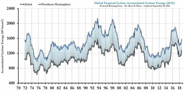
Below are two charts that look beyond just the Atlantic at global cyclones, both from this source. The first is frequency:

The second looks at accumulated cyclonic energy, which is a sort of time integral of the energy in all active cyclonic storms around the world
Later in the tweetstorm, the same tweeter mentioned as a fact, again without data, "Climate change is increasing drought frequency, impacting everything from agriculture to health. Some studies suggest the consequences of droughts include increased violence and war." There has been no upward trend in US droughts (negative is more drought-y.

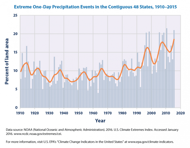
Finally, in the spirit of full disclosure, of all the zillions of things (not directly related to temperature) in weather effects that are blamed on global warming, this is the only one I have found that shows an upward trend recently and could logically be attributed to warming. Whether this is related to warming or independent or a data measurement issue is (if folks were honest) not well understood