Probability of A Stock Market Correction
The Wall Street Journal has a good article on investor sentiment, relying heavily on the work by Robert Shiller. He argues that investor sentiment looks much more like a hindcast than a forecast. In other words, investors tend to be optimistic after the market just rose, and pessimistic after the market just fell.
The more stocks go up and the faster they rise, the more likely you become to expect more of the same. And when they go down, your expectations fall with them. Investors are often told not to get caught up in other people’s emotions — but it’s at least as important not to get swept away by your own.
New research hammers that point home. Finance professors William Goetzmann and Robert Shiller of Yale, along with Dasol Kim of Case Western Reserve University, have analyzed the Yale surveys and found that investors’ forecasts regularly look more like aftercasts — simple projections of the recent past into the future.
I have no reason not to believe this to be true.
But I think there is something a little wrong with this logic:
You can ask yourself one of the key questions: What are the odds of a one-day crash of at least 12% in the U.S. stock market over the next six months?
You probably answered at least 10% — even though that is roughly 10 times the likely chance of a disastrous daily crash in the coming six months, based on the historical record. (The 87 years from 1929 through 2015 consisted of 174 six-month periods. But, with only two single-day crashes of at least 12% over that span, such declines occurred in just over 1% of the half-year periods.)
Remarkably, professional investors exaggerate the odds almost as badly as individual investors do. Over time, both groups overall have tended to put the odds of a crash at around 20%, with the institutional investors’ estimates ranging only about one to three percentage points below that.
Again, I have no problem with the statement that most people, in a given year, overestimate the chance of a stock market crash. 20%, for any random year, is likely a high estimate. But that is not the same as saying it is a high estimate for this year. One could argue that we know more about our current year than to treat it simply as a random year. For example:
- We are in the midst of what is soon to be the 2nd longest bull market in the market's history. Are the odds of a significant correction higher on a particular day 2500 days into a bull market than on a random day in history?
- Stock prices have risen faster than earning for 5 years. Is a market correction more likely in that environment than on a random day?
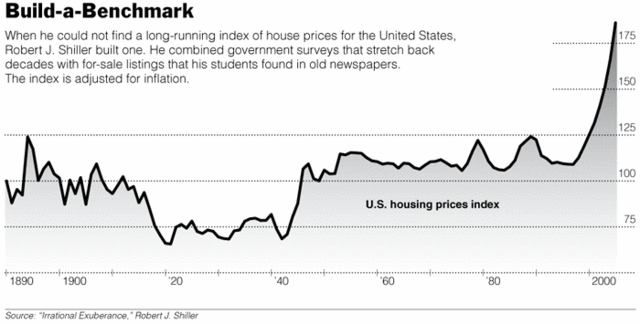
- Shiller's CAPE is close to the third highest it has ever been, and at a level that has nearly always been followed by a large correction. Should I treat today's risk of correction as just the last century's average or is it realistically higher?
I don't think 10-20% is a bad estimate given where we are.

