More on the Housing Bubble
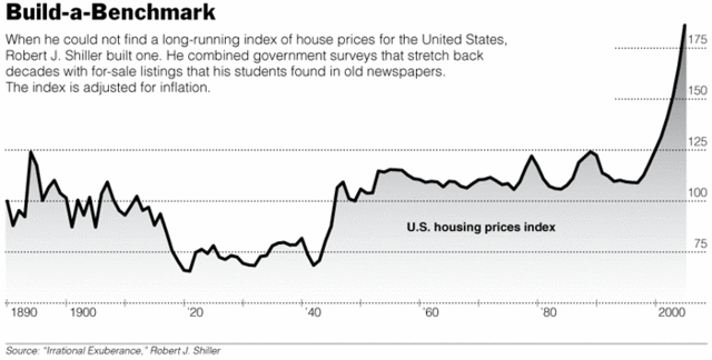
I can't check the guy's methodology, but Robert Shiller claims in the NY Times to have built a better, more accurate measure of housing prices. You might ask, don't we already have that - I always see things like "median home sales price" in the paper? The problem with existing metrics is that they don't correct for mix. If a lot of large houses in the pricey part of town sell, median home prices will rise just given the mix shift of the sample. What you really want is a price index for equivalent home sales, something that corrects for things like square feet, inflation, and perhaps zip code. This is what Shiller claims to have done, and the results are dramatic. He shows that real housing prices have been flat for most of the century, right up until the last decade, where they have increased dramatically.
I can't think of any structural change that would explain this (except maybe a change in relationship between mortgage rates and inflation) so it certainly creates a flashing red light saying "bubble".
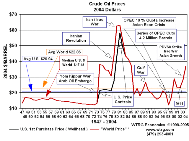
By the way, isn't it interesting that people can see the graph above and immediately think "prices are due to crash" but when they see this very similar chart:
...and think that prices will keep going up and up and up.
Hat tip to Marginal Revolution. Other posts on housing prices here, here and here. More on oil prices here.


I'm not familiar with how the index is calculated, but I wonder if the inflow of foreign dollars into housing could explain a good piece of the structural change in housing prices. At least for certain geographies it must have some impact. Weak dollar drives up foreign investment in domestic properties drives up prices which in turn drives up average price per domestic homeowner (since both the numerator and denominator of that ratio work in the same direction) ...
I want to see the same index from the UK, where the entire Southeast of the country has been seeing Los Angeles-size price inflation since The War, with no sign of a bubble collapse. (Chronic housing shortages will do that to ya.)
I posted the same graph on catallarchy and asked about fundamentals other than low interest rates which might contribute. The one good answer was the exclusion of $250K single/$500K marriage of cap gains on the sale of your home from taxes, which is pretty significant and happened in the mid-90s when that spike started.
You can see lots of ways that would contribute, for example some ways of spending money to improve a house which weren't profitable now are. hmm, I should post that...
You might also want to take a look at a graph over at Mover Mike's place on the oil/gold price ratio. It certainly looks like something's going to happen but I have no idea what.