Illustrating the Corruption in Climate Science
Long-time readers know that while I believe the evidence for warming over the last 100 years is strong, the evidence of negative knock-on effects from this warming (hurricanes, tornadoes, sea level, etc) is really weak, often the weakest part of an climate report. Here is one example.
In the most recent National Climate Assessment written by our betters in the US Government, this chart was used to illustrate increasing hurricane intensity.
I will begin with the positive: The use of a metric for total hurricane energy rather than something like hurricane counts or landfalls is a huge improvement over past reports and a much better metric to test changes over time in hurricane frequency and intensity. Now here is the bad news -- the North Atlantic hurricane date is based on a cherry-picked time interval that creates a trend where none exists, and the authors HAD to know it. The odds that this is just sloppiness or incompetence rather than outright obfuscation are low.
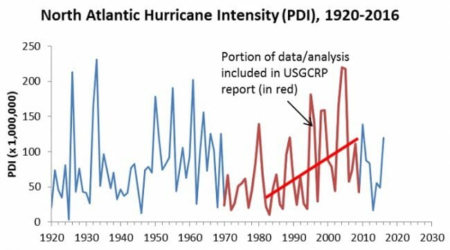
Pat Michaels had Ryan Maue (the scientist who creates most of the hurricane intensity databases) calculate this same metric back to 1920. This is what the chart looks like, with the cherry-picked dates in the Assessment chart shown in red
That red trend line is just as dishonest as can be. It is super hard to see any sort of long term trend here, just a multi-decadal cycality that hurricane scientists used to acknowledge before they started extrapolating individual sine waves into long-term upward trends. This is particularly true since the advent of many new hurricane observation tools, such as aircraft and space photography, mean that numbers before 1960 may well be underestimated.
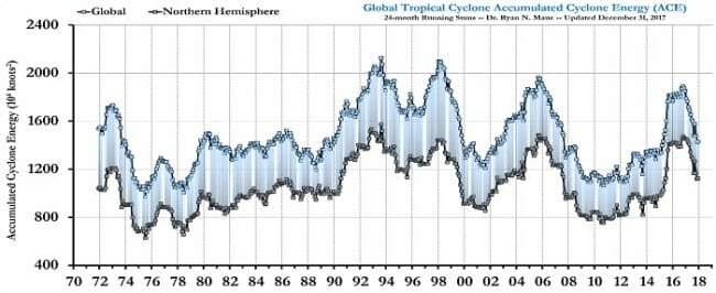
In fact, when you look beyond just the North Atlantic and look at all the world's oceans, there is not even a trend in hurricane intensity over the period since 1970 (accumulated cyclonic energy is a slightly different but related way to measure the time integral of hurricane intensity).


