Worst Chart of the Day: Political Rather Than Mathematical Calculation of Trend Lines
Update: Make sure to see bottom of post, I have run the numbers from the source and the chart below is proven to be totally BS.
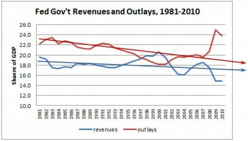
In an effort to paint the current budget deficit as a tax shortfall (ie we don't take enough of others people's money) rather than a spending problem, Kevin Drum offers this chart:

OK, I was going to talk about how they cherry-picked the start date (which is the peak of spending at that time since WWII) and the end date (the left off the ugly 2011). But I just can't bring myself to talk about anything else except those trendlines. Not sure what algorithm Drum uses to create the trendlines -- they seem suspicious but surely someone in the science-based, reality-based community would not just draw them on by eye!
It is just incredibly disingenuous (and ballsy) to try to portray 2009 and 2010, which represented the highest numbers since WWII, as a declining trend line falling faster than revenues.
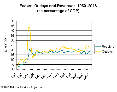
Postscript: Here is the longer view, from here, with projections which I presume come from the Obama budget. I think if I took 1950 as a start point I would get pretty different trend lines.
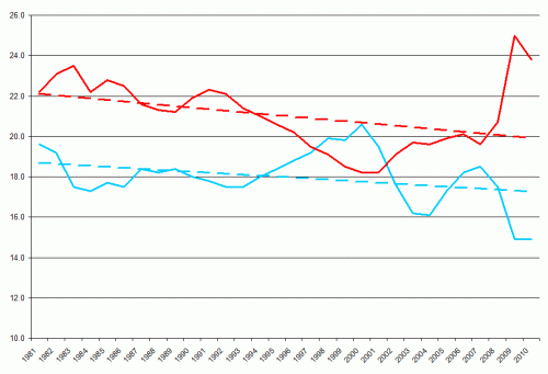
 Update: Here is the data right from the Federal web site with Excel adding a linear trend. Sure looks like Drum is wildly exaggerating. Just as in Drum's chart, red is outlays as a percentage of GDP, blue is collections.
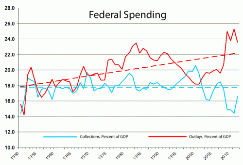
So lets look at the longer trend. WWII was obviously an anomaly, so we will jump to 1950 to make sure we are well past it. And we will go through 2012, because those projections are probably pretty good (though optimistic on the spending side).
Here is Drum's chart, with the longer trend and actual mathematically rather than politically calculated trend lines.
Hmmmm. Revenue or spending problem. You make the call.

