Worst Chart of the Day: Political Rather Than Mathematical Calculation of Trend Lines
Update: Make sure to see bottom of post, I have run the numbers from the source and the chart below is proven to be totally BS.
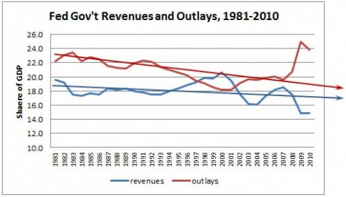
In an effort to paint the current budget deficit as a tax shortfall (ie we don't take enough of others people's money) rather than a spending problem, Kevin Drum offers this chart:

OK, I was going to talk about how they cherry-picked the start date (which is the peak of spending at that time since WWII) and the end date (the left off the ugly 2011). But I just can't bring myself to talk about anything else except those trendlines. Not sure what algorithm Drum uses to create the trendlines -- they seem suspicious but surely someone in the science-based, reality-based community would not just draw them on by eye!
It is just incredibly disingenuous (and ballsy) to try to portray 2009 and 2010, which represented the highest numbers since WWII, as a declining trend line falling faster than revenues.
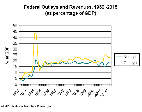
Postscript: Here is the longer view, from here, with projections which I presume come from the Obama budget. I think if I took 1950 as a start point I would get pretty different trend lines.
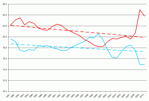
 Update: Here is the data right from the Federal web site with Excel adding a linear trend. Sure looks like Drum is wildly exaggerating. Just as in Drum's chart, red is outlays as a percentage of GDP, blue is collections.
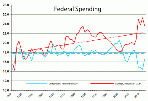
So lets look at the longer trend. WWII was obviously an anomaly, so we will jump to 1950 to make sure we are well past it. And we will go through 2012, because those projections are probably pretty good (though optimistic on the spending side).
Here is Drum's chart, with the longer trend and actual mathematically rather than politically calculated trend lines.
Hmmmm. Revenue or spending problem. You make the call.


Even using 1981 as a start, I don't know how that trendline has a negative slope.
Revenue or spending problem? Whose money is it? Too many with power and influence honestly and passionately believe that it all belongs to the Federal Government, and we should be happy with whatever they allot us. Alex Taborrok posted on a related subject at Marginal Revolution, having to do with what percentage of taxpayers use gov't services. People actually think that taking a tax deduction (like mortgage interest) is consuming a service in the same way as being a medicaid recipient. We've got a serious cultural problem to deal with.
Once again we see the ridiculous concept that federal government spending should be proportional to Gross Domestic Product. The GDP increases in the USA have been caused partly by population increases but mostly by improved productivity and efficiency of private sector agriculture, manufacturing, and service businesses (despite the negative effects of big, highly regulatory governments on GDP). A bigger GDP does not indicate that the federal government can and should spend more. Similarly, a recession does not indicate that federal government spending should fall in proportion to the temporarily reduced GDP. Thus, the graphs above are of little value. The Y-axes should be inflation-adjusted federal spending with a weighted adjustment for population increase (federal spending should not increase as fast as population, because much federal spending has no relationship to population).
A graph of properly adjusted federal revenues and spending since 1950 would show steep rises in federal government annual revenues and steeper rises in federal government annual spending. Our rising GDP per person has enabled the federal government to massively increase spending without pauperizing its most productive residents. That doesn't mean that the increased spending was justified or appropriate.
The trend line looks about right for the time period in Drum's graph. There are thirty data points in that graph, and the overall trend is downwards; a two-year spike at the end isn't going to cause a reversal of a trend line calculated over thirty years.
The problem is twofold:
1. He chose to start the graph at a point when spending was at an all-time high, excluding World War II.
2. 2009 and 2010 are is a clear divergence from the trend which he inexplicably declines to acknowledge. Why he thinks he can get away with lying about the numbers when they're right there for everyone to see, I don't know.
Actually, I do know. Mother Jones readers will see what they want to see. I'm not sure that they can actually see anything other than the trend lines.
It's also worth keeping in mind that the long-term trend has been for military spending to decline. Domestic spending in 2011 is projected to come to 20.2% of GDP compared to 17.4% in 1983, even though total spending is only 1.8% of GDP more.
And of course, %GDP obscures the explosive growth in spending. In real per capita terms, domestic spending has nearly doubled since 1983.
Wait -- what do you mean politically calculated trend lines? The trend lines you obtain from Excel seem similar to the ones Drum calculated. How are they different, and how does that affect the conclusion one can draw?
Wait -- what do you mean politically calculated trend lines? The trend lines you obtain from Excel seem similar to the ones Drum calculated. How are they different, and how does that affect the conclusion one can draw? What fitting mechanism are you accusing Drum of using?
May I suggest you look at my charts, which are drawn directly from Treasury and BEA data, with an estimate for Q2/11 GDP. They can be found here:
http://scottgrannis.blogspot.com/2011/07/federal-budget-update.html
There are three charts, two of which show data as a % of GDP, and one of which shows raw data for spending and tax revenues.
In the text of the post I argue that revenues are rising, as they usually do, but spending is set to increase a lot if nothing is done. Therefore the problem lies in spending, not in tax rates.
I think we are looking at Political Science in action.
Sukrit, when you look at the numbers - in Drum's chart, the trendline for spending starts at about 23 and ends at 19, for a total of 4%/30 years. Coyote's actually calculated trendline starts at 22 and ends at 20, for a total of 2%/30 years. Interestingly...the revenues trendlines are almost identical to one another.
So, on top of choosing the starting and ending points to showcase what he wants to see, Drum then doubled the trend because those start/end points weren't enough for his case. The most charitable explanation is that he didn't calculate them at all, just estimated the trend by eye, and his own beliefs combined with a little error made it easy to get the trend wrong. A less charitable explanation is that he did calculate them (which would explain why the revenues trendlines match so well), but then discarded the spending trendline and drew his own.
All this said, a linear trend is clearly not the right way to look at the data anyway. Not when it's so easy to see the results of various policy shifts from the raw data.
Some people should not be allowed to use computer statistical and charting tools, since they do not understand the crucial assumptions underlying the valid use of those tools. Or perhaps they choose not to understand.
Drum wants it to be true so badly, that he will overlook anything contrary to his thesis. Sukrit as well.
Drum is used to the sound of his own voice in the liberal echo chamber, his own image in the mirror. Kind of like the guy in the White House, quoted the other day as saying, "Don't call my bluff." What else is it, Mr. President?
Warren,
I've pointed this out before, but you give Drum too much credit when you criticize him for deliberately misleading people based on his start point. He's not smart enough to mislead. Hell, he's not even smart enough to understand that his trend line on spending is pointing downwards when every day he advocates higher and higher spending, without recognizing the disconnect.
There's only one answer:
Kevin Drum Is An Innumerate Hack