Good News, Really
Believe it or not, I think this picture is actually good news:
This is a little flawed, since we would expect a constant trend to be a constant percent increase each year, which would be upward curving on this chart, not a straight line trend (it would be straight on a log scale). Never-the-less, it makes a point (by the way, it is interesting the 1980's are considered the decade of greed on Wall Street rather than the 1990s, from this chart).
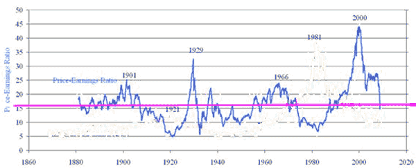
Here is a better way to make my point. We get a similar chart if we look at PE ratios for the S&P500 (the chart below is on trailing 10 year average earnings).
Why is this anything but depressing? Because I get the sense that many people, without any other general indicator of how bad things are in the financial markets, are using the steep drops in the stock market as a proxy measure. The stock market looks like a disaster, so everything else must be a disaster.
But in a large sense, at least so far, all the stock market has done in the last 2 weeks is return to historical norms. This tells me that there is nothing about the current level of the stock market that is screaming disaster signals. In fact, the current level of the stock market is screaming normalcy.
Of course, this does not mean the drop will stop here. PE's in the worst of times have headed on down to 5 (which would be about DOW 3000, yuk). And corrections seldom stop at the mean - they usually over-correct on below the mean. But seen on these charts, this recent move looks more like the completion of the correction to the late 1990's bubble rather than necessarily an indicator of current financial disaster.

