Good News, Really
Believe it or not, I think this picture is actually good news:
This is a little flawed, since we would expect a constant trend to be a constant percent increase each year, which would be upward curving on this chart, not a straight line trend (it would be straight on a log scale). Never-the-less, it makes a point (by the way, it is interesting the 1980's are considered the decade of greed on Wall Street rather than the 1990s, from this chart).
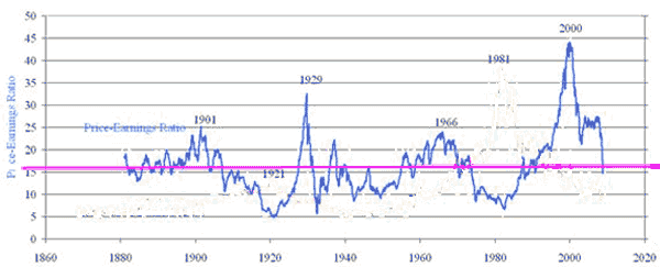
Here is a better way to make my point. We get a similar chart if we look at PE ratios for the S&P500 (the chart below is on trailing 10 year average earnings).
Why is this anything but depressing? Because I get the sense that many people, without any other general indicator of how bad things are in the financial markets, are using the steep drops in the stock market as a proxy measure. The stock market looks like a disaster, so everything else must be a disaster.
But in a large sense, at least so far, all the stock market has done in the last 2 weeks is return to historical norms. This tells me that there is nothing about the current level of the stock market that is screaming disaster signals. In fact, the current level of the stock market is screaming normalcy.
Of course, this does not mean the drop will stop here. PE's in the worst of times have headed on down to 5 (which would be about DOW 3000, yuk). And corrections seldom stop at the mean - they usually over-correct on below the mean. But seen on these charts, this recent move looks more like the completion of the correction to the late 1990's bubble rather than necessarily an indicator of current financial disaster.


The second graph is interesting.
The first one needs to be presented in log to prove the point, since the stock market is a growth process.
Starting points make a huge difference (see climate graphs for example).
Regarding the first chart, it doesn't make sense to start at 1982, since the period from 1982-2000 had an unusually high growth rate.
The second chart is a bit misleading, as profits have for the past several years been anomalously high. They can, and likely will, decline, which would require stocks to fall further to maintain the P/E ratio.
Given the improvements in productivity growth the last several years, it's probably even better than the charts show since they focus on historical trends and trailing PE ratios rather than PE growth. Granted earnings growth is liable to hit a down blip the next year between lower consumption and higher interest rates on corporate debt, but barring major tax increases, that's temporary. Of course, the major tax increases are pretty much a done deal at this point...
Whatever the scale, the first graph more or less makes the point that the bubble that is bursting now started in 1995, when the Clinton administration started to use the CRA to force banks into lending to people with poor credit ratings. This, combined with low interest rates maintained thanks to inflation being held in check by Chinese imports, allowed for the mess that is unwinding now. Next time you hear anyone saying how during Bill Clinton's presidency the economy was better managed than before or after, punch him for me, will you?
One of the neat thing about doing the work is you get to pick the parameters.
I happen to thing the graphs as presented look like interesting stuff to me. I am about as Joe Six Pack as you can get without owning a pickup truck (used to) with a gun rack (never did that),, but that does look to me like wat I thing I see--sound economy with an overlay of berzerk finance.
Great for us young'ns, everything is cheaper.
Stan: Actually, 1982 is as good a starting point as any. If you went back further, the trend line would even be flatter. From 1928 to 1981, the DJIA only grew by about 700 points. Real growth in the average started around 1982.